The Living Room Paint Guide That Will Finally Make Your Home Feel Like You
There’s a moment — maybe you’ve had it — where you walk into someone else’s home and feel something shift inside you. The walls are the right color. The light falls just so. Everything breathes. You stand there thinking, why doesn’t my living room feel like this? More often than not, the answer is paint.
—
1. Why the Living Room Is the Most Emotionally Loaded Room in Your Home
Before we talk about swatches and sheens, let’s talk about why this room matters so much. The living room isn’t just a place where furniture lives. It’s where your family collapses after hard days, where guests form their first impressions, where Sunday mornings stretch out slow and golden. It carries emotional weight that no other room in your home quite matches.
That’s exactly why choosing a paint color for it feels so paralyzing. You’re not just picking a hex code — you’re deciding how the room feels. Warm or cool? Energizing or calming? Intimate and cozy, or open and airy? Every color choice is, in a quiet way, a declaration about how you want to live.
“The right paint color doesn’t just change your walls — it changes how you feel every single time you walk through the door.”
Color psychologists have long understood that the hues surrounding us affect our mood, our breathing, even our sense of time. A deep navy blue can make an evening feel more luxurious. A creamy white can make a cluttered week feel somehow manageable. Understanding this emotional dimension is the first step to making a paint choice you’ll love for years, not just months.
—
2. The Undertone Trap: Why “White” Is Never Just White
Here’s something that trips up even experienced decorators: every paint color has an undertone, and undertones are everything. That “warm white” you loved on the swatch card? On your north-facing wall with cool afternoon light, it might pull green or gray in ways you never expected. That soft beige? It could turn distinctly pink once it’s surrounded by your warm-toned wood floors.
Understanding undertones is genuinely one of the most useful skills you can develop as a home decorator. Warm undertones include red, yellow, and orange — they create coziness and feel welcoming in natural light. Cool undertones include blue, green, and purple — they feel crisp and modern, and they handle artificial lighting particularly well.
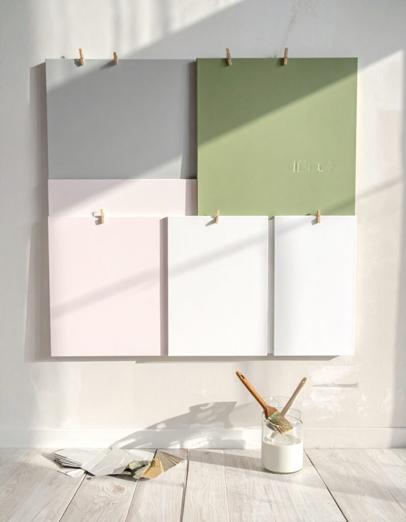
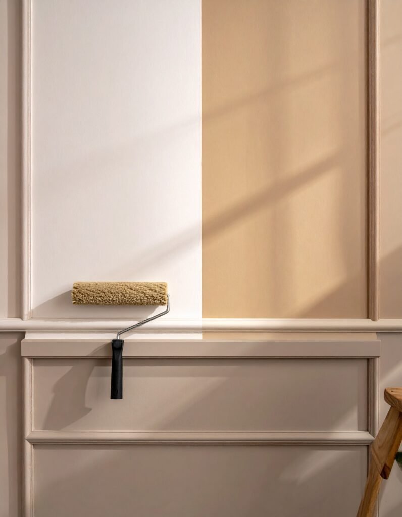
The practical takeaway: always test paint samples on your actual walls, in the actual light conditions of your actual room. A 2×2 inch swatch on a store card will lie to you. A large painted patch on your wall — viewed morning, midday, and evening — will tell you the truth.
—
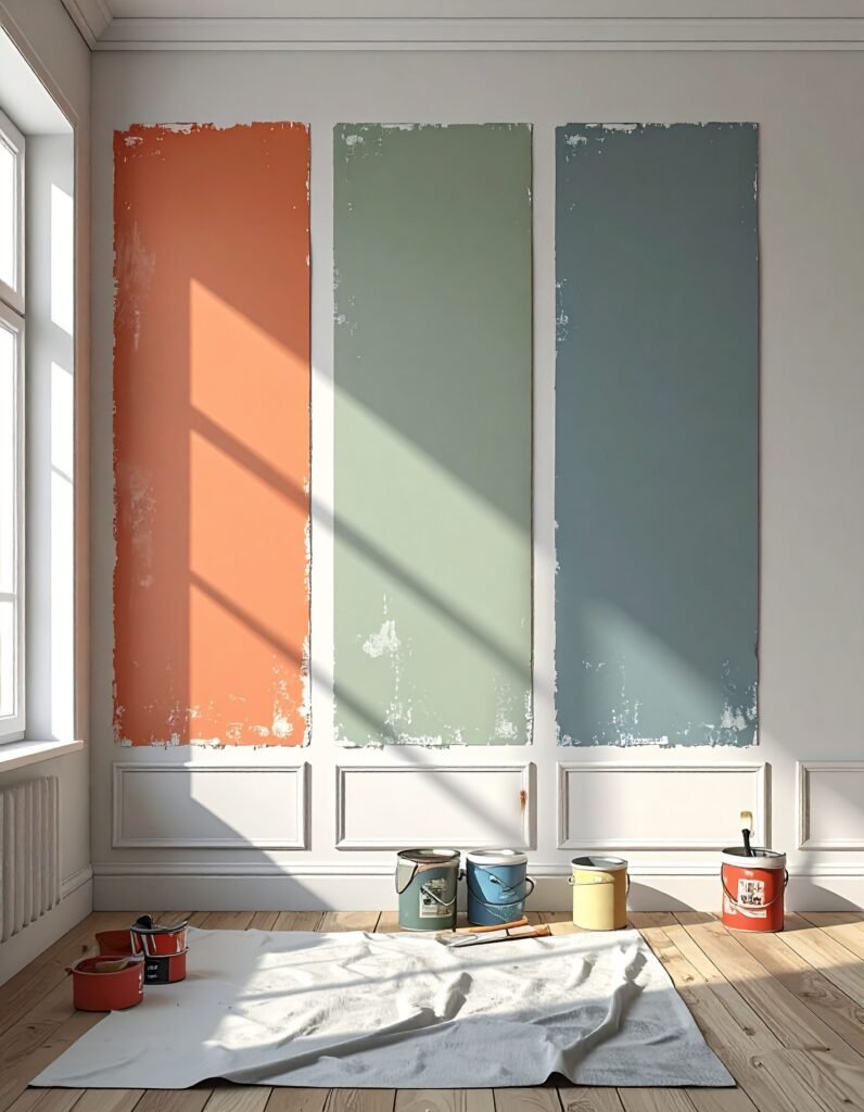
3. The Living Room Colors That Are Trending Right Now (And Why They Work)
Let’s get specific. As of recent years, a handful of living room paint colors have been saving rooms from beige mediocrity — and they deserve your attention.
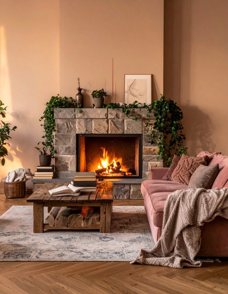
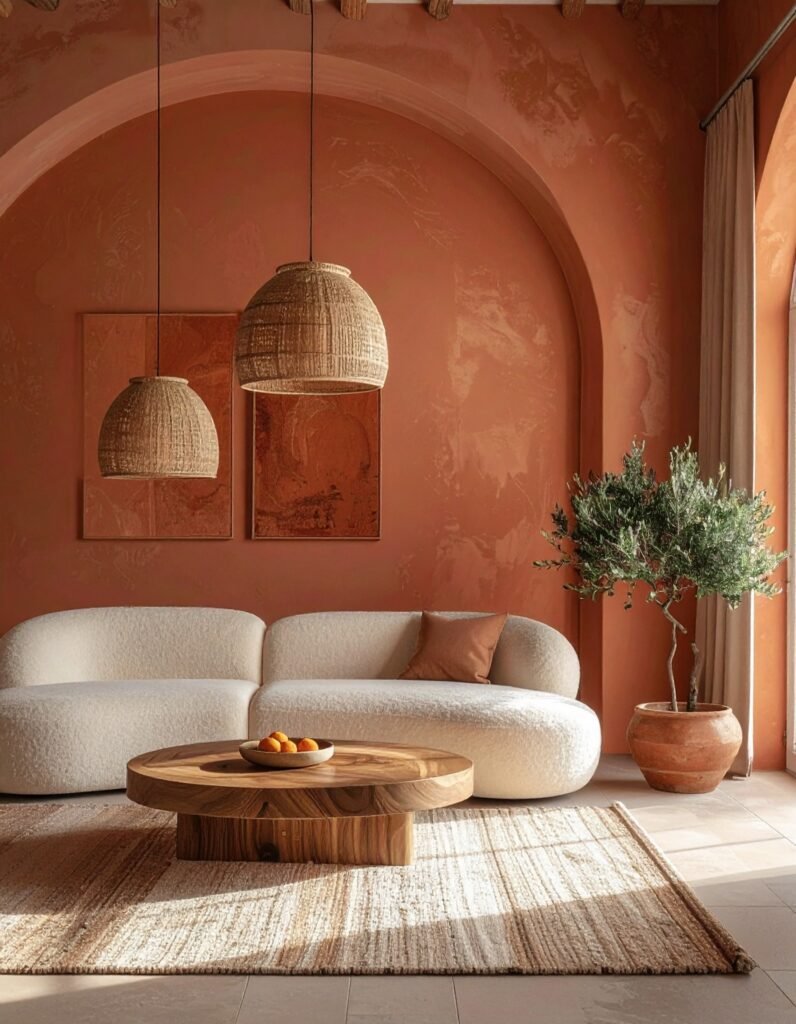
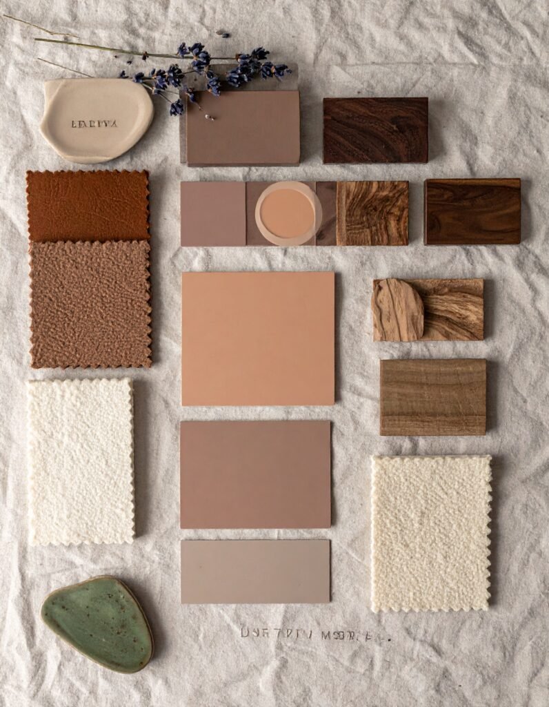
Warm terracotta and earthy clay tones have surged in popularity because they do something remarkable: they feel both ancient and completely fresh. They bring the warmth of natural materials indoors, pair beautifully with linen, rattan, and wood, and glow under candlelight in a way that cooler colors simply can’t replicate.
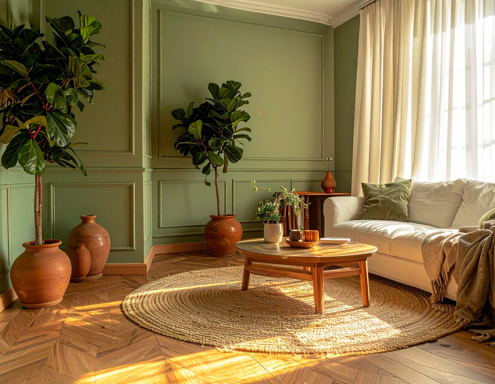
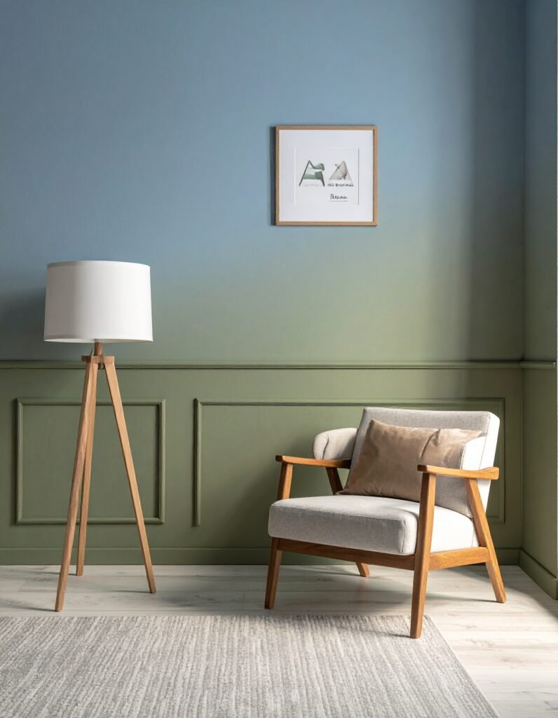
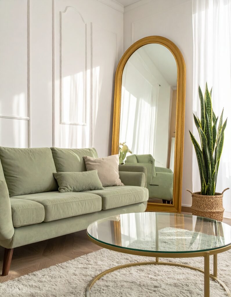
Dusty sage green has become a favorite of interior designers for its ability to read as neutral while still being distinctly interesting. It bridges the gap between warm and cool, works with nearly every wood tone, and brings a quiet, botanical calm to a room that feels genuinely restorative.
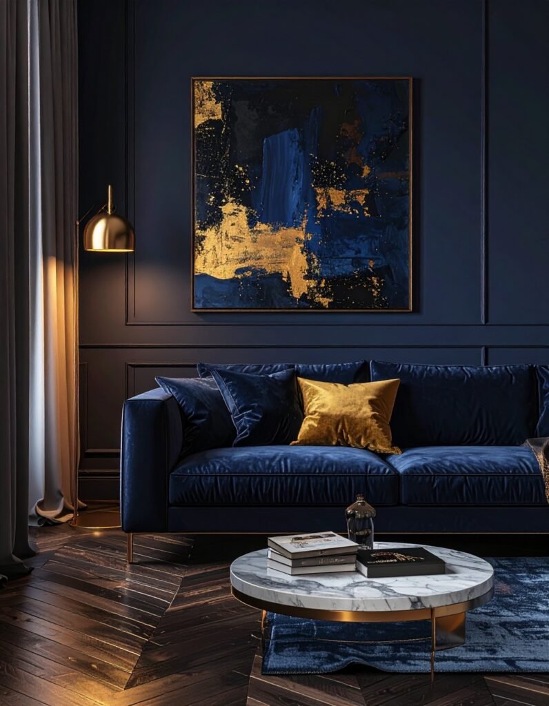
Deep moody hues — forest green, navy, charcoal, even black — are no longer reserved for bold design risk-takers. Used thoughtfully, they create cozy, jewel-box living rooms that feel sophisticated and intimate rather than dark and oppressive.
Warm off-whites and complex creams remain timeless for a reason. They function as a canvas that lets your furniture, art, and accessories do the talking — but they do it with far more warmth and character than a stark, pure white ever could.
—
4. How Light — Natural and Artificial — Changes Everything
Imagine you’ve tested your dream color and loved it. You painted the whole room. And now, at 7pm under your overhead lights, it looks nothing like what you expected. This is one of the most common — and heartbreaking — painting mistakes people make, and it comes down to light.
Natural light is the most flattering and accurate revealer of color. North-facing rooms receive cool, consistent light all day — colors will look slightly cooler and less saturated here. South-facing rooms get warm, generous light for most of the day — they can handle deeper, bolder colors without feeling cave-like. East-facing rooms glow warm in the morning and cool down by afternoon. West-facing rooms do the opposite.
Artificial lighting matters just as much. Warm-toned bulbs (2700K-3000K) enhance warm paint colors beautifully but can muddy cool tones. Daylight bulbs (5000K-6500K) show colors more accurately but can make warm walls feel washed out. If your living room relies heavily on artificial light in the evenings — which most do — test your paint samples under those exact conditions before committing.
—
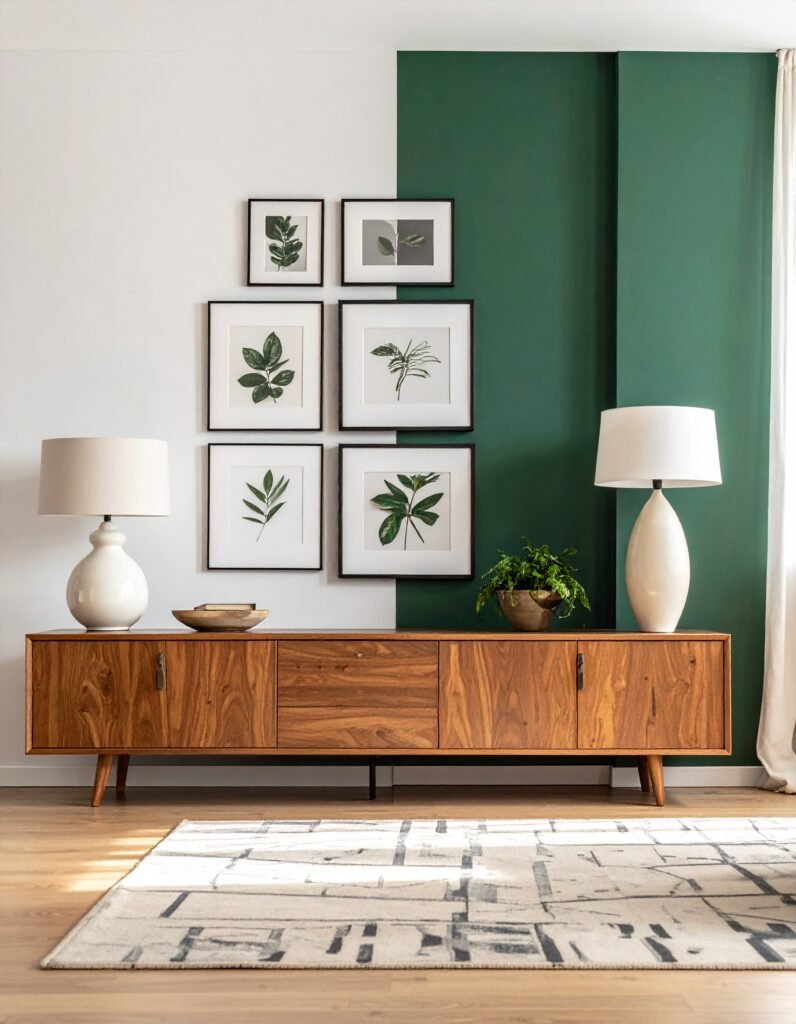
5. Accent Walls: Bold Statement or Decorating Cliché?
The accent wall debate has been going on for decades, and honestly? Both sides have a point. Done poorly, a single dark or colorful wall can feel like an afterthought — a decoration compromise that satisfies no one. Done well, it can completely transform a room’s architecture, create visual depth, and give the space a focal point it was missing.
The key is intentionality. An accent wall works when it highlights something meaningful — a fireplace, a built-in bookshelf, a beautiful piece of art, or the wall behind a bed or sofa. It works when the color is deeply considered in relation to the rest of the room, not just slapped on for contrast.
“An accent wall should feel like a deliberate design decision, not a dare you made to yourself at the paint store.”
If you love the idea of an accent wall but worry about commitment, consider painting a partial wall, a niche, or architectural detail instead. A painted arch or the interior of a built-in bookcase can deliver the same visual punch with far less risk — and far more considered style.
—
6. The Power of Paint Finish: Matte, Eggshell, Satin, and Beyond
Color gets all the attention, but finish is what gives paint its personality. The same color in a flat matte versus a satin finish will look and feel completely different — and perform completely differently over time.
Flat/matte finish absorbs light rather than reflecting it, which means it hides imperfections beautifully. It creates a velvety, sophisticated surface that feels luxurious in deep or complex colors. The downside: it’s harder to clean and shows scuffs more readily — not ideal if you have children or pets.
Eggshell finish is the workhorse of living room paint. It has a very subtle sheen — barely perceptible, but enough to reflect a little light and hold up to occasional cleaning. It hits the sweet spot between beauty and practicality for most homes.
Satin finish is slightly more reflective and more durable than eggshell — a great option if your living room gets heavy use or if you want to add a subtle luminosity to your color choice. It works particularly well with deeper colors.
For most living rooms, eggshell is the answer. But if you’re painting a small, dark room and want to bounce as much light as possible, a satin finish in a light color can make a surprising difference.
—
7. The Psychology of Color: What Each Hue Does to a Room
Color psychology isn’t pseudoscience — it’s a well-documented field that interior designers use every day. Here’s a honest breakdown of what the most popular living room colors actually do to a space and the people in it.
Blue in its softer forms promotes calm, lowers heart rate, and makes spaces feel larger. Deep navy, however, creates intimacy and a sense of luxurious enclosure — think of the feeling of a private library.
Green connects us instinctively to nature. Studies consistently show that green environments reduce anxiety and promote a sense of restoration. It’s no coincidence that “restorative environments” in wellness design lean heavily on green palettes.
Yellow and warm ochre stimulate optimism and energy. Used carefully — particularly in muted, earthy versions rather than bright canary yellow — they can make a living room feel genuinely joyful without being overwhelming.
Warm neutrals (beige, greige, warm white, clay) create a sense of safety, stability, and ease. They’re emotionally undemanding in the best possible way — they let the room feel effortless, and they let people relax more completely.
Charcoal and black used as wall colors create an enveloping sense of intimacy and drama. Contrary to popular instinct, a dark room doesn’t always feel small — it often feels intentional and luxurious in a way that lighter rooms can’t achieve.
—
8. How to Create Cohesion Between Your Living Room and Adjacent Spaces
One of the challenges unique to open-plan homes — and a growing majority of homes are at least partially open-plan — is creating paint cohesion between spaces that flow into one another. A living room that opens into a kitchen or dining area needs to be considered as part of a visual conversation, not an isolated decision.
The most reliable approach is to choose a dominant color or a color family and use it across connected spaces in varying shades or applications. A warm terracotta living room might flow into a creamy white kitchen that shares those warm undertones, creating visual continuity without monotony.
Alternatively, you can use a consistent neutral on all walls and differentiate spaces through accent colors, textiles, and furniture — giving each area its own personality while the room as a whole feels unified and intentional.
—
9. Small Living Room? Here’s How to Use Paint to Make It Feel Bigger
Small living rooms are not a design problem — they’re a design opportunity. And paint is one of your most powerful tools for reshaping how a room feels spatially, without moving a single piece of furniture.
The classic advice is to paint small rooms white or very light — and there’s truth in it. Light colors reflect light and visually push walls outward. But there’s a nuance worth knowing: a warm light color (think creamy white or pale peach) will feel more expansive and welcoming than a cool light color (pale gray or icy blue), because warm tones appear to advance while cool tones recede in a way that can sometimes feel chilly rather than spacious.
“A small room painted with intention doesn’t feel small at all — it feels curated, considered, and completely deliberate.”
Another counterintuitive trick: painting a small room in a deep, moody color can actually make it feel more special rather than smaller. When all four walls, the ceiling, and the trim are painted in the same enveloping hue, the boundaries of the room dissolve and it becomes a cozy, jewel-box space that feels intimate by design.
—
10. Ceiling Color: The Fifth Wall You’re Probably Ignoring
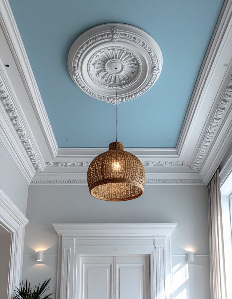
Your ceiling is a design surface, and most people are leaving it completely untouched. The default of flat white is fine — but it’s rarely transformative. Your ceiling color is a relatively low-risk, high-impact opportunity to add depth, coziness, or visual height to your living room.
Painting the ceiling a shade lighter than your walls makes the room feel taller. Painting it the same color as your walls (a monochromatic approach) wraps the room in a cocooning, enveloping warmth. Painting it a color that contrasts thoughtfully with your walls — perhaps a soft sky blue above a warm white room — adds a surprising, memorable dimension that feels fresh without feeling chaotic.
—
11. Preparing Your Walls for Paint: The Step That Determines Everything
No paint color — however perfectly chosen — can compensate for poor wall preparation. This is the unglamorous reality that separates a beautiful, lasting paint job from one that chips, peels, and disappoints within a year.
Start by cleaning walls thoroughly to remove dust, grease, and any residue. Fill cracks, nail holes, and any surface imperfections with spackle, and sand them smooth. If you’re making a dramatic color change — from very dark to very light, or vice versa — prime your walls first. Primer is not optional in these cases; it ensures true color representation and dramatically improves adhesion.
Use high-quality painter’s tape on edges and trim, and remove it while the paint is still slightly wet to prevent peeling. Two coats of quality paint, applied patiently with proper drying time between each, will always outperform three hasty coats of a cheap option.
—
12. When to Trust Your Gut (And When to Call In Help)
There’s a point in every living room painting project where you have to make peace with imperfect information and simply decide. You’ve tested samples. You’ve read articles — maybe including this one. You’ve scrolled Pinterest until your thumbs ache. And still, the perfect choice isn’t singing out at you with total certainty.
That’s normal. That’s human. Paint is one of the most reversible decorating decisions you can make — it costs less and takes less time to undo than almost any other design choice. If your gut is pulling you toward the warm terracotta over the safe greige, that instinct is worth listening to. You’ve been living in your home, in your body, with your preferences, for years. That knowledge is real data.
That said, if you’re genuinely stuck — or if you’re making a high-stakes decision about a large or complex space — consider spending an hour with an interior designer or color consultant. Many offer reasonably priced sessions specifically for paint consultations, and the clarity they provide is almost always worth every penny.
—
🌿 How to Take Care of Your Freshly Painted Living Room
A beautiful paint job deserves to be maintained with a little care and intention.
Clean gently and regularly. Dust walls with a soft microfiber cloth periodically — dust buildup dulls paint over time. For marks and smudges, use a barely damp cloth with a tiny drop of mild dish soap and blot rather than scrub.
Touch up as needed. Keep a small amount of your original paint in a sealed container for touch-ups. Minor scuffs addressed quickly will never become eyesores that require a full repaint.
Protect high-traffic areas. Around light switches, door handles, and areas where furniture sits close to walls, consider a slightly higher-sheen finish that can take more abuse — or simply check those spots more often for marks.
Let your paint cure before testing it. Most paint is dry to the touch within hours, but it takes two to four weeks to fully cure and harden. During that window, treat your walls gently — avoid scrubbing or placing furniture tight against them.
Repaint sooner than later. If you notice bubbling, flaking, or a color that’s lost its vibrancy, don’t wait until the problem becomes extensive. A fresh coat of quality paint is far easier to apply when the walls are in reasonable condition.
—
❓ FAQ
Q: How do I choose a living room paint color if I have no idea where to start? A: Begin with something you already love — a textile, a piece of art, a rug — and pull a color from it. Paint is meant to harmonize with what’s already in the room, not exist in isolation. From that starting point, test three or four samples in large patches on your walls and live with them for several days before committing.
Q: Is it worth spending more on expensive paint brands? A: Generally, yes. Premium paint brands use higher-quality pigments, binders, and additives that result in better coverage, more accurate color, and finishes that hold up longer. You’ll often need fewer coats, which can offset the higher price per gallon. In a room you’ll see every day for years, quality paint is one of the most worthwhile investments you can make.
Q: Can I paint my living room myself, or should I hire a professional? A: Most people with patience and a weekend can achieve beautiful results on their own — especially in a standard-sized living room without complex architectural details. The critical factors are prep work, quality materials, and taking your time. If your room has very high ceilings, intricate trim work, or you’re uncomfortable on ladders, professional painters are absolutely worth considering.
—
💭 Final Thought
Painting your living room is one of those rare home projects that is genuinely transformative — not just visually, but emotionally. The right color creates an atmosphere that makes coming home feel like a relief, a pleasure, a small daily gift you give yourself. It’s not about chasing trends or replicating what you saw on Pinterest. It’s about finding the color that makes your room feel like the truest version of itself.
So here’s the question worth sitting with: if your living room could feel any one thing — one single emotion — every time you walked into it, what would that be?