The Quiet Power of Neutral: How to Make a Soft Living Room Feel Anything But Boring
You walk into a room and something just settles in your chest. The colors aren’t fighting for attention. Nothing is screaming. And somehow, impossibly, it feels more alive than any bold, saturated space you’ve ever stood in. That’s what a truly well-done neutral living room does — and it’s a lot harder to pull off than people think.
—
1. Why “Neutral” Doesn’t Mean What Most People Think It Means
Here’s the thing nobody tells you when you start planning a neutral living room: beige is not a neutral. Or rather, it’s one neutral, and leaning on it exclusively is exactly why so many apartments end up feeling flat and vaguely sad, like a waiting room that’s trying its best.
True neutral design is actually a layered conversation between warm and cool tones. It’s the difference between a room that reads as “default” and one that reads as deliberately, carefully calm. Think about the distinction between warm putty, dusty greige, aged linen, soft chalk white, stone, and pale slate. Those are all technically neutral. But put the wrong ones next to each other and they’ll clash harder than cobalt and chartreuse.
The first step before buying a single throw pillow or paint tin is to hold swatches against your actual light. Morning light. Afternoon light. That golden 7pm window when everything looks better. A color that looks like warm cream in the shop can turn into a sickly yellow-green on a north-facing wall in a London flat. A soft white that photographs beautifully can feel sterile and cold in a dim Chicago apartment in January.
Understanding your room’s undertones is the unglamorous foundation that makes everything else work.
“A neutral room isn’t colorless — it’s a room where every quiet color was chosen on purpose.”
—
2. The Paint Color Trick That Interior Designers Use on Apartment Walls
Most apartment walls default to white. Your landlord’s white, which is usually a flat, slightly blue-toned white that does nothing for warmth or coziness. The good news is that even a small paint change — or if you can’t paint, the strategic placement of large textured elements — can completely shift the room’s energy.
If you can paint, look at whites with warm undertones rather than cool ones. Farrow & Ball’s “Elephant’s Breath” and “Skimming Stone” are UK favorites for a reason — they read as almost-neutral with the faintest whisper of pink and grey respectively, and they’re absolute magic in low light. For US readers, Benjamin Moore’s “White Dove” and “Pale Oak” do similar work, giving walls that creamy, lived-in quality without committing to a color that feels bold.
The trick designers use? They paint the ceiling the same color as the walls, or just one shade lighter. It removes the hard horizontal line that chops a room in two and makes ceilings read as higher. In a small apartment living room, this matters enormously. The room stops feeling like a box and starts feeling like an envelope — wrapping you rather than containing you.
If painting isn’t an option, large-format gallery walls in natural wood frames, linen curtains hung high and wide, and a textured rug all function as “soft architecture” that resets the room’s visual baseline.
—
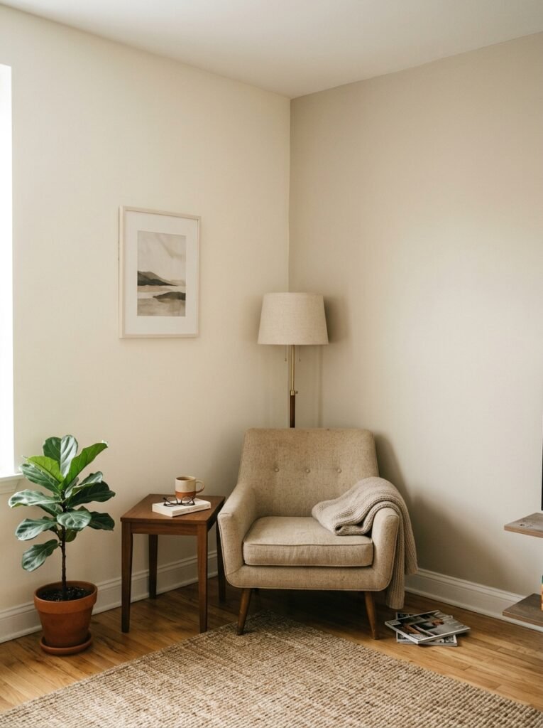
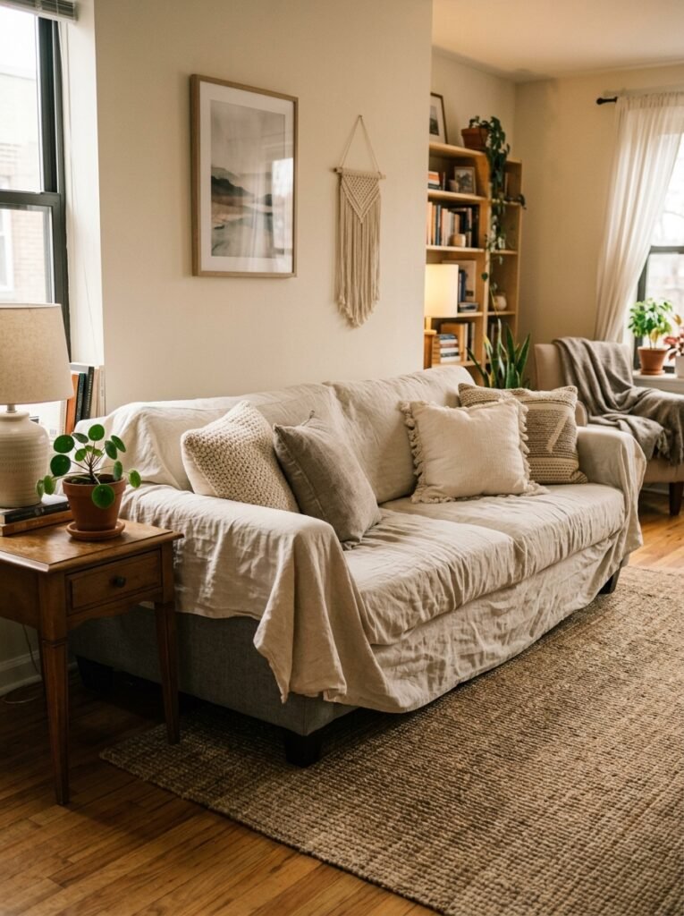
3. The Furniture Rule That Makes a Small Apartment Feel Like It Has Bones
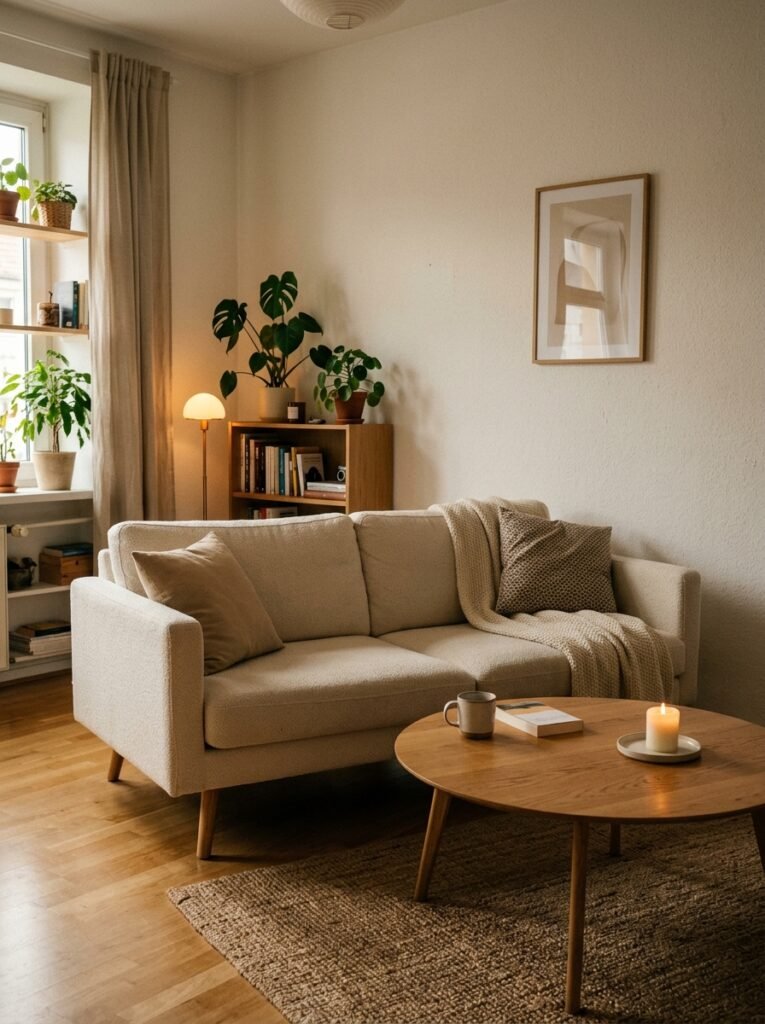
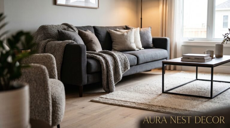
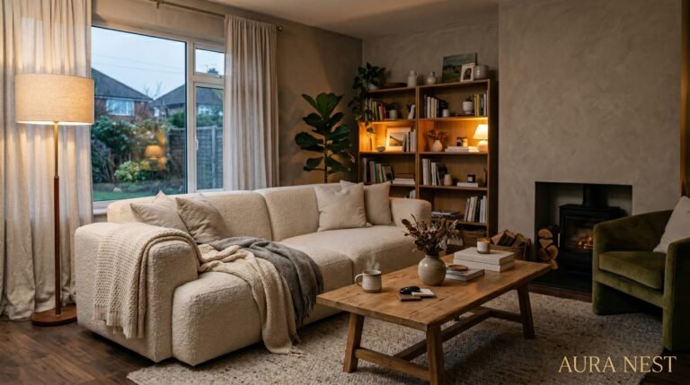
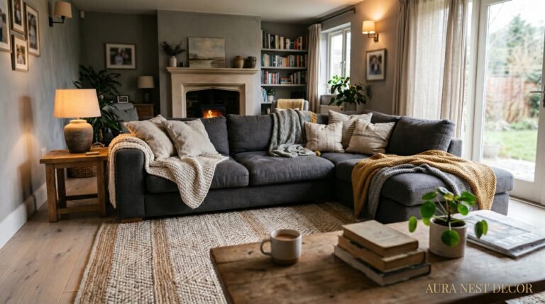
Every well-styled neutral living room has what I call an “anchor piece” — one item that carries the visual weight so everything else can be lighter and more breathable. In a neutral palette, this is even more important, because without some contrast or weight, the room starts to feel like it’s evaporating.
This doesn’t have to be a bold color. In fact, for our purposes, it shouldn’t be. Your anchor could be a deep taupe velvet sofa. A dark walnut coffee table with real presence. A stone or concrete side table that looks like it belongs in a gallery. The point is that this piece has density — visual, material, tactile density — that the rest of the room can lean against.
Once you have your anchor, everything else can breathe. Light linen chairs. An airy jute rug. Pale cushions. Gauzy curtains. These elements float around the anchor without competing with it, and the room takes on that effortless quality that looks casual but is actually very much the result of deliberate thinking.
For small apartments specifically: resist the urge to fill every corner. White space is furniture too.
—
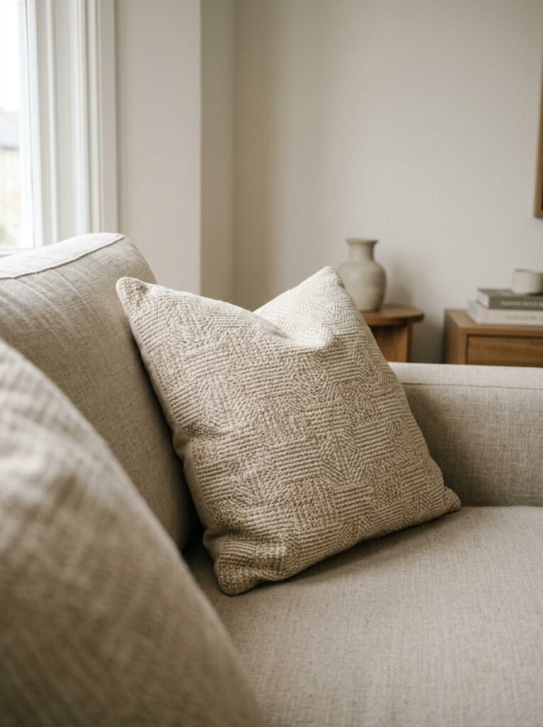
4. How Texture Does the Work That Color Usually Does
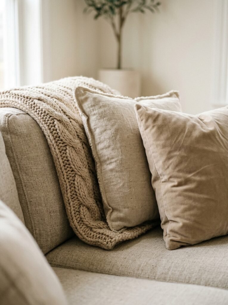
In a room where the palette is intentionally restrained, texture becomes your primary design tool. And this is where neutral living rooms either succeed spectacularly or fall into beige oblivion.
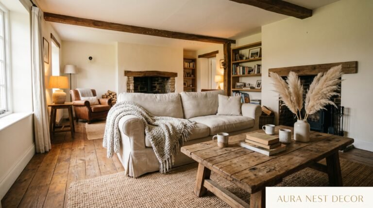
Think about what you actually feel when you sit in a beautifully done neutral room. There’s something chunky and nubby under your fingers — a bouclé cushion, maybe, or a waffle-knit throw draped over the arm of a chair. The rug is deep enough that your feet sink in slightly. There’s a ceramic vase on the shelf that looks handmade, slightly uneven, with a matte glaze that catches the light differently depending on where you’re standing.
“Texture is what makes a neutral room feel inhabited rather than staged.”
The mix matters more than any individual piece. Rough linen against smooth cotton. Matte ceramics next to polished wood. A heavy woven rug under light, leggy furniture. Every pairing creates a quiet kind of contrast that keeps the eye moving and the space feeling alive without a single jolt of color.
Specific things that consistently work in neutral living rooms: bouclé in any form, aged or natural rattan, undyed wool, linen that’s been washed enough to look slightly rumpled, raw wood with visible grain, and unglazed ceramics. These materials carry warmth and interest on their own — they don’t need color to do their job.
—
5. The Lighting Setup That Makes Every Neutral Room Look Like a Pinterest Photo
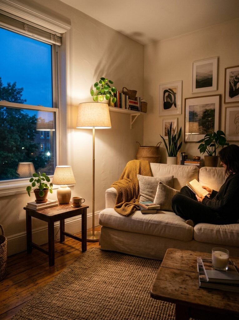
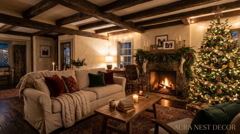
Overhead lighting is a neutral room’s worst enemy. A single ceiling fixture floods the space with flat, directionless light that erases all the beautiful texture you’ve worked so hard to layer in. The shadows disappear. The depth disappears. The room looks like a before photo.
Layer your light instead. And I mean actually layer it — not just own multiple lamps, but think about where the light pools and where it doesn’t. A floor lamp in the corner throwing warm light up toward the ceiling creates volume. A small lamp on a side table at sitting height creates intimacy. A few candles on the coffee table at 9pm create something close to magic.
For bulbs: warm white, always. Look for 2700K–3000K. In the US, that’s most “soft white” bulbs. In the UK, look for bulbs labeled “warm white” rather than “cool white” or “daylight.” The amber glow that comes from lower Kelvin bulbs does more for a neutral room than almost any styling choice — it turns flat putty walls into something that looks almost golden.
Dimmers are genuinely worth the investment if you own your space. If you’re renting, smart bulbs with adjustable warmth (Philips Hue, IKEA Tradfri) are the next best thing and are entirely removable when you leave.
—
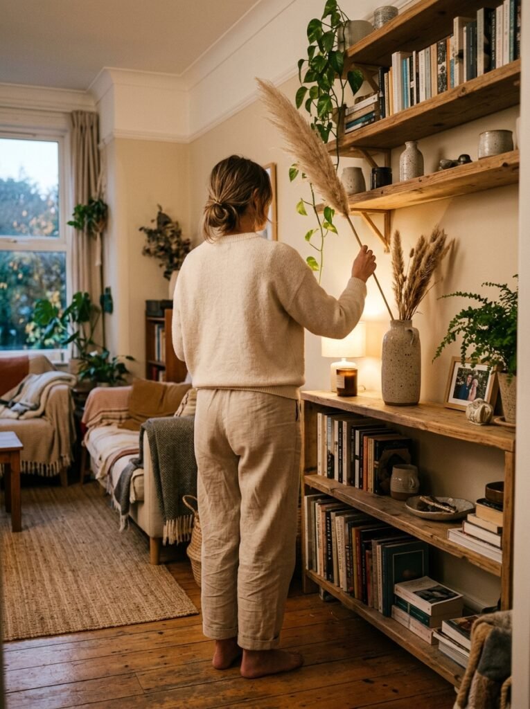
6. The Specific Shade of Green That Goes With Literally Every Neutral Palette
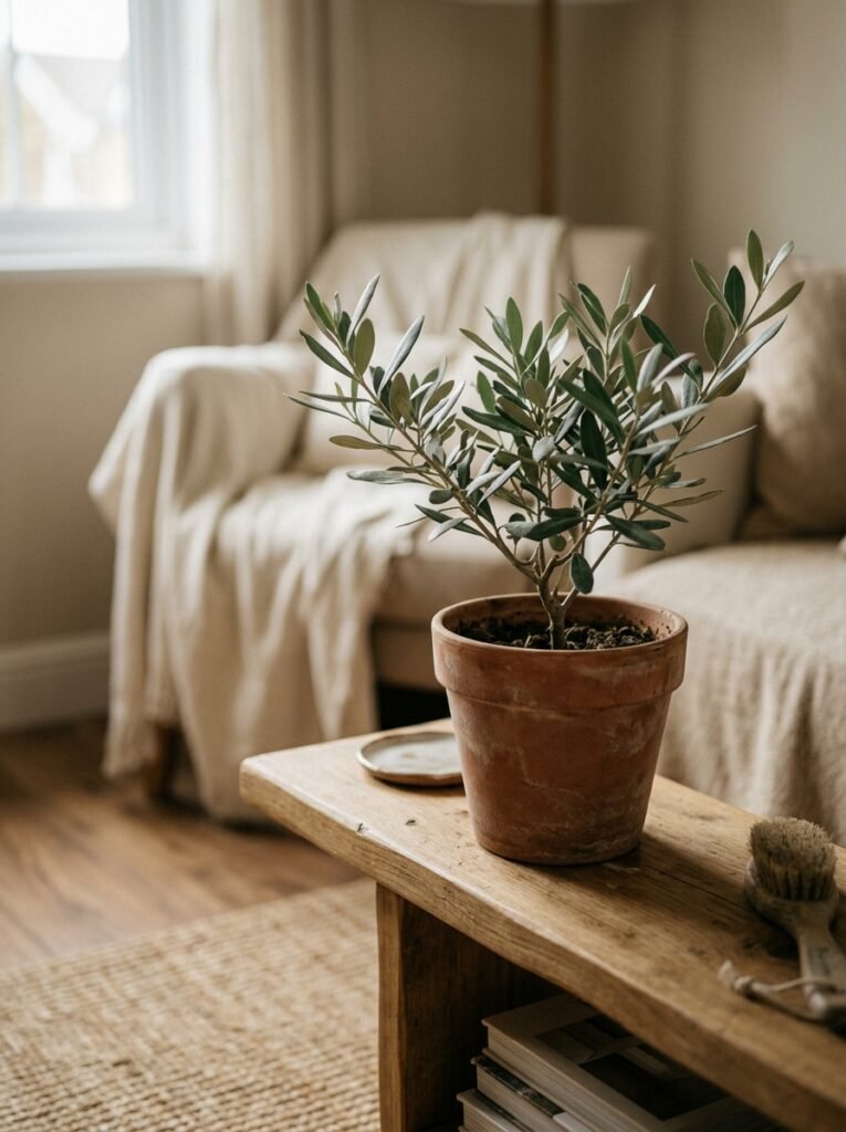
You didn’t think we’d get through a home decor article without plants, did you?
But beyond the general “add greenery” advice, there’s something specific worth saying: the type of plant and the type of pot matter as much as the presence of green itself. In a carefully neutral room, a neon-green trailing plant in a terracotta pot is a different visual experience than a deep sage olive tree in a matte white planter. Both are plants. One anchors and deepens the room. One creates a bright spot that your eye goes to first, every time.
For neutral living rooms, lean toward plants with grey-green, dusty green, or deep green tones: olive trees, eucalyptus, dusty miller, sage (actual sage, if you have light), Monstera in deep shade, tall dark-leafed snake plants, or the perpetually perfect fiddle-leaf fig. These bring green into the room in a way that reads as part of the neutral palette rather than a contrast to it.
Pair them with matte ceramic pots in white, chalk, putty, or terracotta-neutral tones. The pot is part of the composition.
And for the love of a beautifully styled shelf, please don’t use plastic. A single beautiful pot holding a healthy plant does more for a room than six cheap plastic-potted ones.
—
7. What to Do With Your Sofa When It’s Already the Wrong Color
This is the real question most apartment dwellers are actually dealing with, isn’t it? The sofa you have — the one you bought a few years ago, or the one that came with the place, or the one your mum gave you — isn’t the muted-taupe dream sofa you’re pinning at midnight. It’s grey-blue. Or it’s dark charcoal. Or it’s an optimistic terracotta that made sense at the time.
The answer is not always to cover it entirely. Work with it first.
A deep charcoal sofa in a neutral room can actually serve as your anchor piece — surround it with warm linen, pale wood, and cream textiles, and it grounds the whole space beautifully. Style it with cushions in natural tones: undyed cotton, warm oatmeal, pale clay, woven wool. The goal is to bring the rest of the room toward the sofa tonally rather than away from it.
For a sofa that feels more jarring — bright blue, heavily patterned, very saturated — a large, well-chosen throw draped over the back and arm can genuinely neutralize it. Not a cheap throw shoved on, but a thoughtfully placed one in a heavy woven natural fabric that reads as intentional.
“The sofa you have can work. You just have to stop fighting it and start framing it.”
—
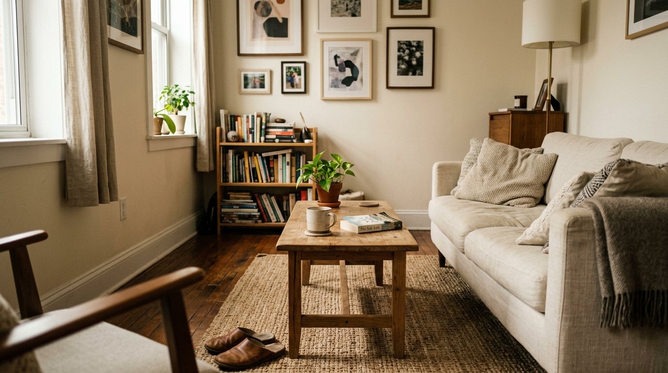
8. The Shelf Styling Approach That Doesn’t Look Cluttered or Empty
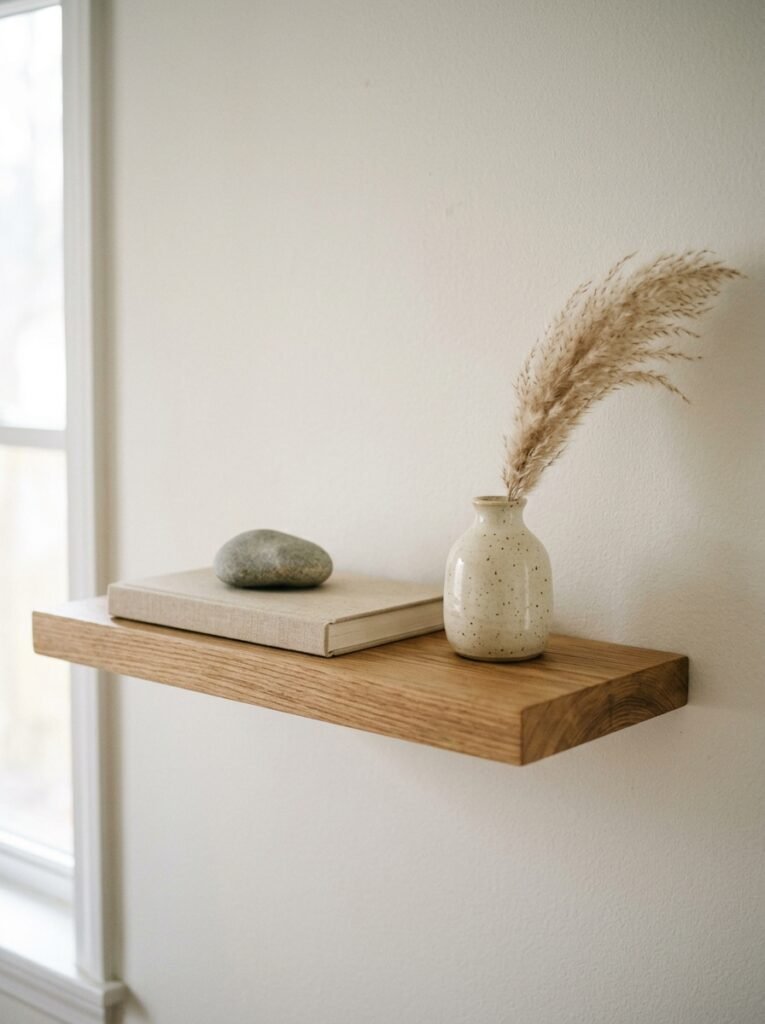
Shelves in neutral living rooms tend to go one of two ways: aggressively minimal (three objects, lots of naked shelf, vaguely Swedish) or completely overcrowded (every book ever owned, a collection of unrelated objects, and a candle that’s burned all the way down). Both feel like avoidance rather than intention.
The approach that actually works: group objects in odd numbers, vary the height dramatically, and stick to a tight material palette. In a neutral room, that means everything on the shelf should be in the same family of tones — warm terracotta, matte white, natural wood, aged brass, undyed linen book covers — with occasional intentional contrast.
Lean things. Books can lean. Small artworks can lean against larger books. A ceramic vase can sit in front of a group of books rather than beside them. These small choices create a casual, collected quality that looks lived-in rather than decorated.
And leave some gaps. Not empty in a vacant way — supported empty space, like the pause before the best part of a sentence.
—
9. The Case for One Wall That Works Harder Than the Others
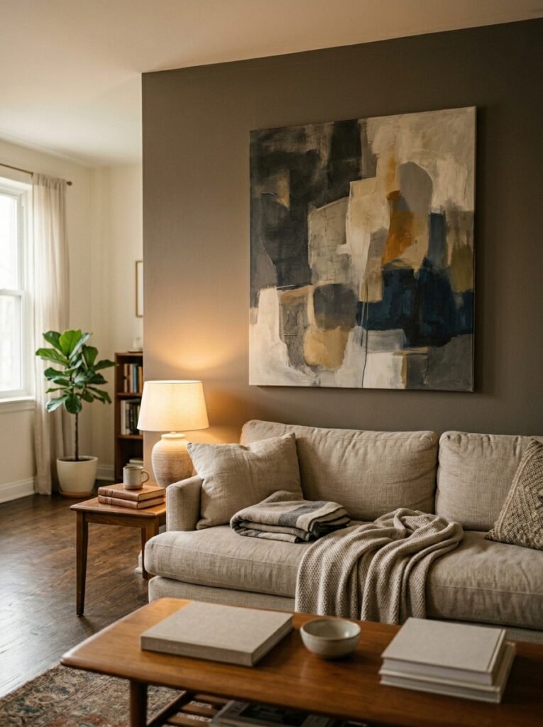
In a fully neutral apartment, a single “moment wall” can do extraordinary work. This isn’t an accent wall in the traditional sense — not a different paint color, not a bold wallpaper in a bathroom. It’s a wall that’s been given more attention than the others, so that when you stand in the doorway and look into the room, it’s the first thing that holds your gaze.
This could be: an oversized piece of art (even a simple black-and-white photograph printed large and framed simply), a gallery arrangement of 6–8 smaller pieces in matching frames, a hanging textile or macramé piece in natural fibers, or a dramatic arrangement of floating shelves with careful styling.
What makes it work in a neutral room specifically is that the texture of the wall treatment provides the visual interest, not color contrast. A large linen canvas doesn’t need to be colorful to stop you in the doorway. A grouping of monochrome photographs in thin oak frames makes a wall feel deliberate and personal.
The moment wall is the room’s signature. It’s what people notice in your Instagram photos without knowing why.
—
10. How to Use Pattern Without Letting It Take Over a Neutral Room
Pattern and neutral aren’t opposites — they’re collaborators, when you know how to use them. The rule isn’t “no pattern.” It’s “pattern in the same tonal range as the rest of the room.”
A cream cushion with a tone-on-tone woven stripe. A rug with a faded, barely-there geometric print in sand and warm grey. Curtains with a very subtle linen weave texture that catches light. A throw with a simple herringbone in oatmeal and natural. These are all patterns that reinforce the neutral palette rather than breaking it.
The one pattern type that consistently works beautifully in neutral rooms: organic, irregular patterns. Things that look like they came from nature — botanical prints in muted tones, hand-block prints with slightly imperfect repeats, abstract forms in natural pigments. These don’t fight with the calm of the space; they add quiet movement to it.
Save the bolder pattern for one item only. Let it be the rug, or a single pair of cushions, or an art print. One voice with something interesting to say. The rest of the room listens.
—
11. The Small Objects That Make a Neutral Living Room Feel Personal, Not Generic
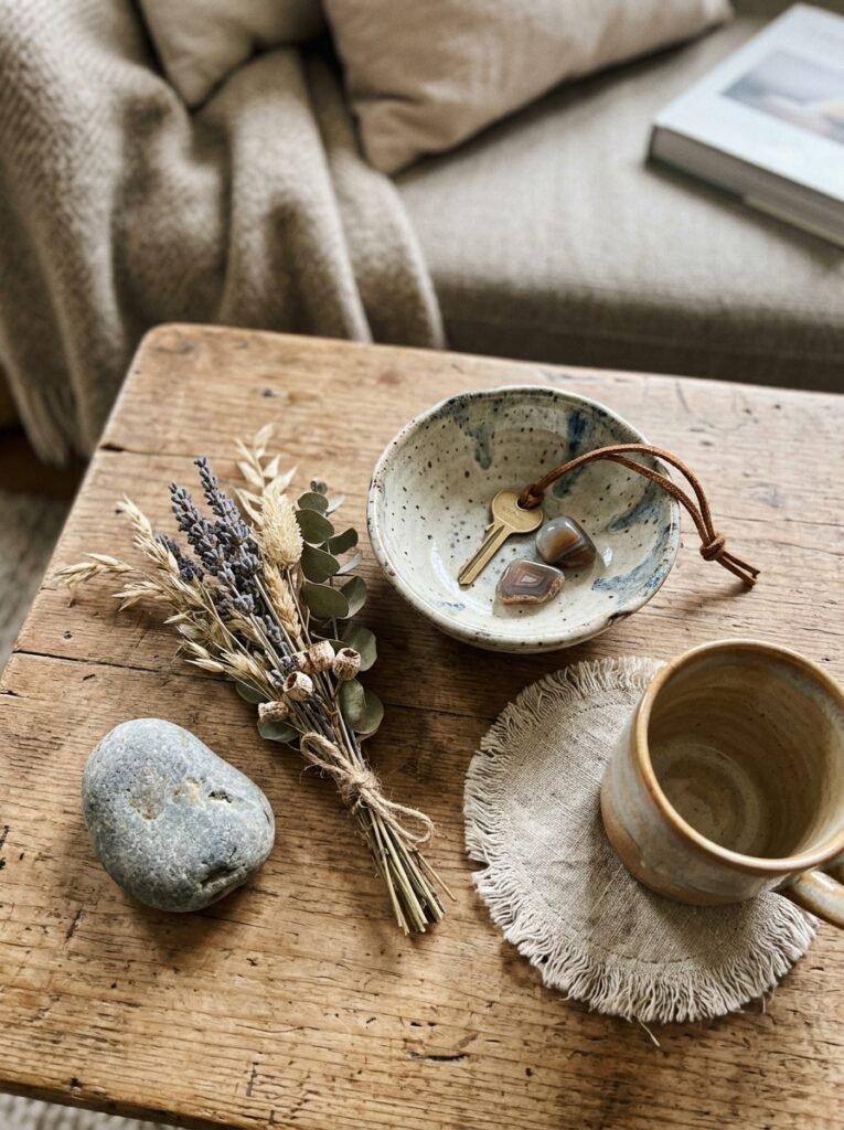
This is the part most styling advice skips entirely, and it’s arguably the most important. A perfectly executed neutral living room with no personal objects looks like a show home. Impressive. Cold. Not yours.
The answer isn’t to put out everything you own. It’s to select the objects that carry actual meaning — or that carry the right feeling — and let them stand in for all the others.
A worn hardback book you’ve read three times, placed openly on the coffee table. A small oil painting you found at a car boot sale that you can’t entirely explain but can’t stop looking at. A bowl you made in a pottery class, slightly lopsided, in a pale glaze that catches the afternoon light. A candlestick that belonged to your grandmother.
These objects don’t need to match. They just need to feel chosen rather than placed. There’s a difference that’s impossible to define and immediately obvious to sense.
—
12. The Last Thing You Add Is Usually the One That Pulls It All Together
I’ve styled enough rooms — my own and others’ — to know that the piece that makes everything click is rarely the big purchase. It’s not the sofa or the rug or even the lighting. It’s something small and specific and slightly unexpected.
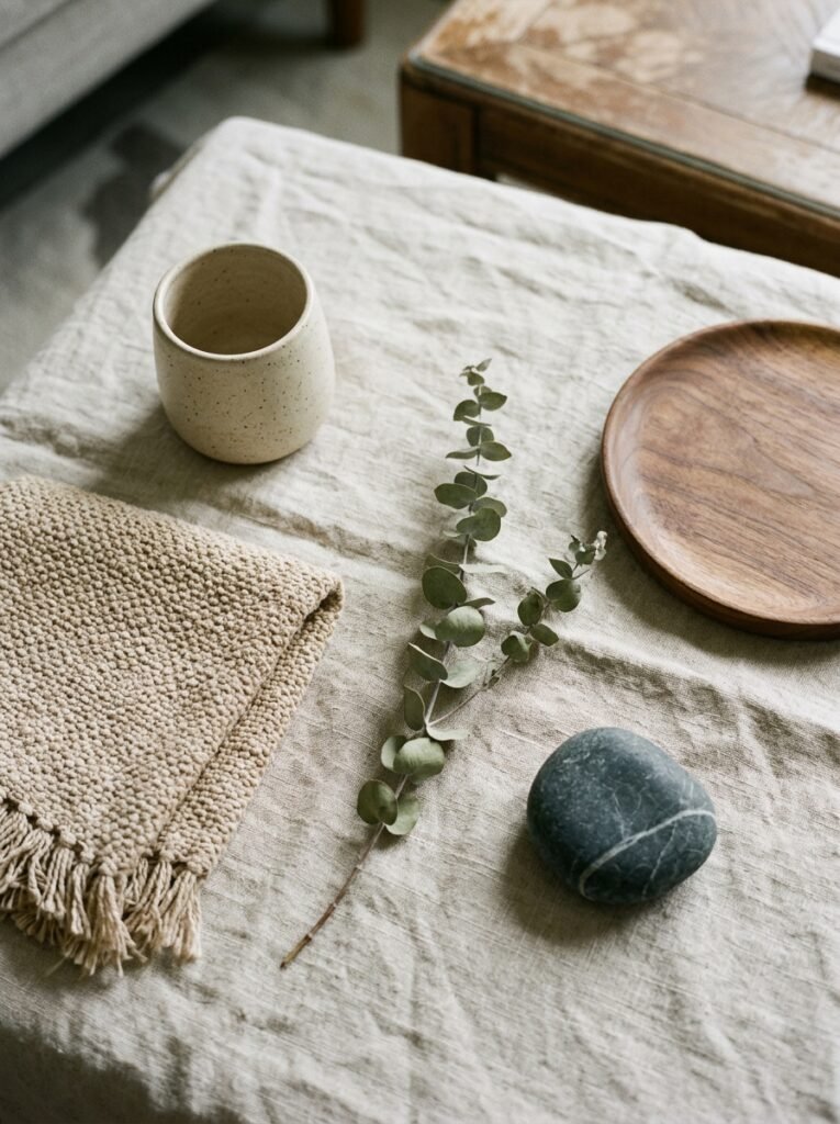
A bunch of dried pampas grass in a secondhand clay vase. A stack of oversized art books on the floor beside the sofa. A single fresh branch of eucalyptus in a glass vessel on the windowsill. A vintage French linen throw folded once and draped, not tucked.
These small, final additions do something the bigger purchases can’t: they tell you that a person lives here. That someone chose this, thought about it, cared about it. That the room is finished in the way that a good meal is finished — not because everything is done, but because nothing is missing.
That’s the feeling you’re chasing. And it’s closer than you think.
—
🌿 Quick Tips
Keep your rug at least 8×10 in a standard apartment living room — a too-small rug is the most common styling mistake in the book, and it makes even a well-decorated room look ungrounded. All four sofa legs on, or at least the front two. Always.
When buying neutrals, buy the warmer option every time. Your room will fight warmth less than you think and need it more than you expect, especially in winter light.
Curtains should hang from as close to the ceiling as possible and fall all the way to the floor. This single change adds more visual height than any paint trick.
Don’t overlight. Three well-placed lamps at different heights give you more flexibility than six lamps all at the same level. It’s about where the pools of light land, not how many sources you have.
If you’re stuck, remove things before you add things. Take half the cushions off the sofa. Take objects off the shelf. Live with less for a week. You’ll know immediately what you actually miss.
—
❓ FAQ
Q: What’s the best neutral paint color for a small living room with not much natural light? A: Go warm, not white. A cool white will look grey and flat in a low-light room, but a warm putty or greige with yellow or pink undertones will reflect what little light you have and make the room feel soft rather than dim. In the US, try Benjamin Moore’s “Pale Oak” or Sherwin-Williams “Accessible Beige.” In the UK, Farrow & Ball’s “Elephants Breath” or Little Greene’s “French Grey Light” are genuinely worth the splurge.
Q: My apartment has dark wood floors that feel really heavy. How do I make a neutral room work with them? A: A large, light-toned rug is your first move — it visually lifts the floor and gives the room a new base color to work from. Pair with lighter furniture legs (natural oak, limed wood, painted white), and use plenty of light textiles. Dark floors in a neutral room can actually be stunning, but they need to feel intentional, which means everything else reads lighter and airier than it might otherwise.
Q: How do I keep a neutral room from feeling cold and impersonal? A: Texture and warmth — specifically warm-toned light and layered natural materials — are what make neutral rooms feel alive. A neutral room goes cold when it’s all hard surfaces, cool whites, and overhead lighting. Add bouclé, linen, woven wool, warm-toned wood, and candles. Put a lamp on at 5pm. Lay a slightly imperfect handmade object somewhere visible. The room will warm up immediately.
—
💭 Final Thought
There’s a kind of quiet confidence in a room that doesn’t feel like it’s trying to impress you. A neutral living room, done with care and patience and a genuine willingness to edit, can feel more personal and more beautiful than almost any maximalist scheme — because every element had to earn its place.
The palette asks more of you, not less. And that’s exactly what makes it worth it.
What’s the one piece in your living room that you’d keep no matter what you changed around it?