The Small Living Room Glow-Up Nobody Talks About (But Everyone Needs)
You walk into a tiny living room and immediately feel it — that invisible wall, that sense of too much and not enough all at once. But here’s what the best interior designers know that most Pinterest boards won’t tell you: small doesn’t mean cramped. Small means intentional.
—
1. Why Your Wall Color Is Either Working Overtime or Quietly Killing the Room
Let’s start with the thing nobody wants to admit. Your wall color is doing more work than your sofa, your rug, and your throw pillows combined.
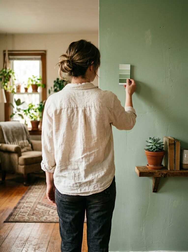
In a small living room, color isn’t decoration. It’s architecture.
A pale, cool gray might look sophisticated on a paint card at the hardware store, but on four walls of a compact flat in Manchester or a studio apartment in Chicago, it can turn your space into something that feels vaguely institutional. Like a doctor’s waiting room with better cushions.
What actually works is more nuanced — and more interesting. Warm whites with a creamy undertone (think Benjamin Moore White Dove or Farrow & Ball’s Pointing) reflect light without going stark. They make a room feel like it’s bathed in afternoon sun even on the greyest Tuesday. That warmth reads as space to the eye because our brains associate warmth with openness, with outdoors, with belonging somewhere comfortable.
The rule is simple but profound: cool colors recede. Warm colors invite. In a small space, you want to invite.
“Your wall color isn’t background. In a small room, it’s the whole conversation.”
2. The Color That Keeps Showing Up in Every Beautiful Small Living Room Right Now
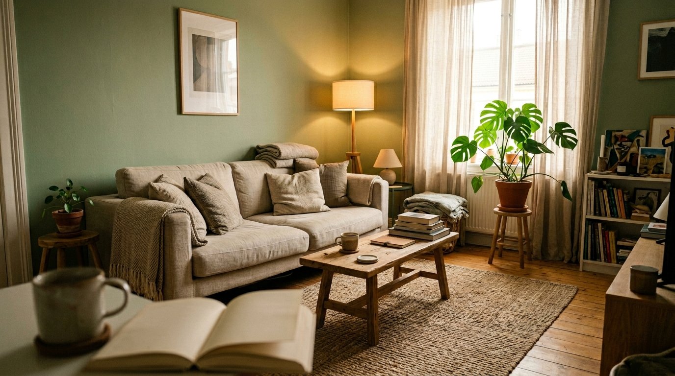
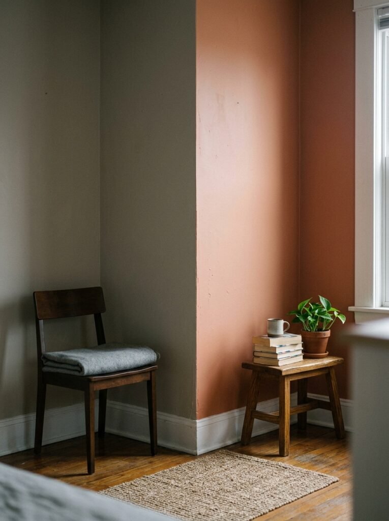
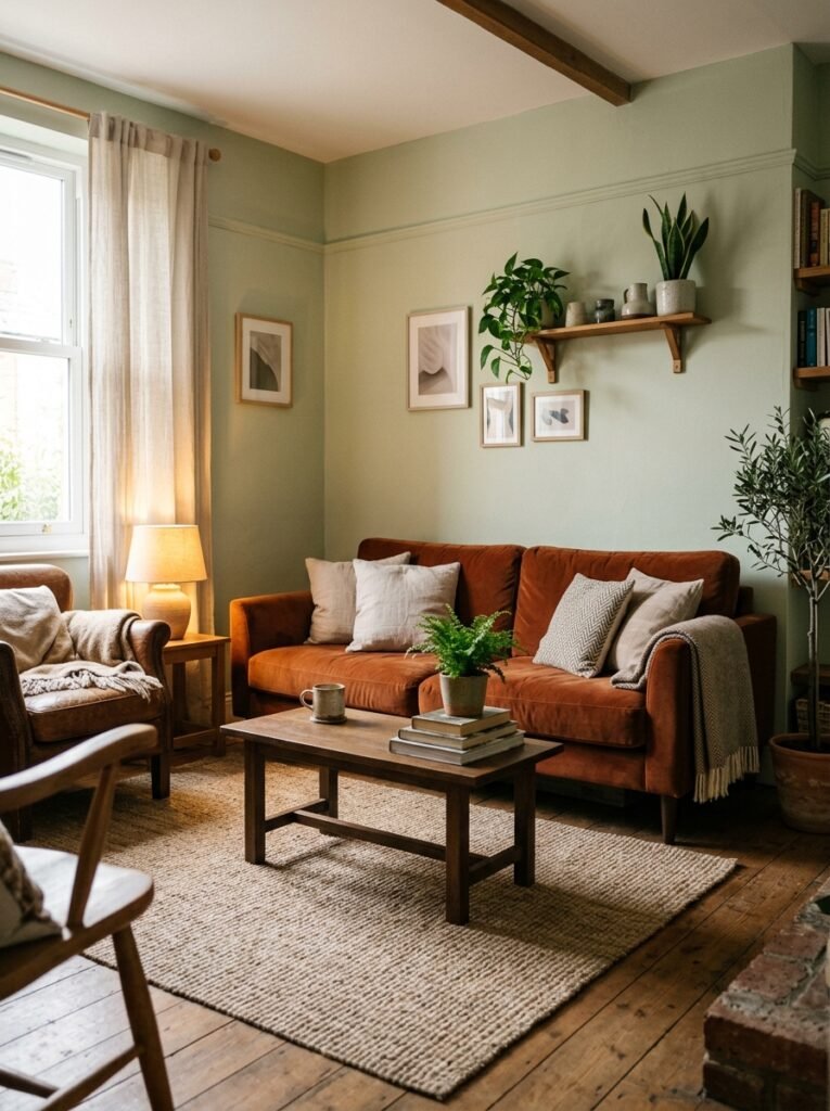
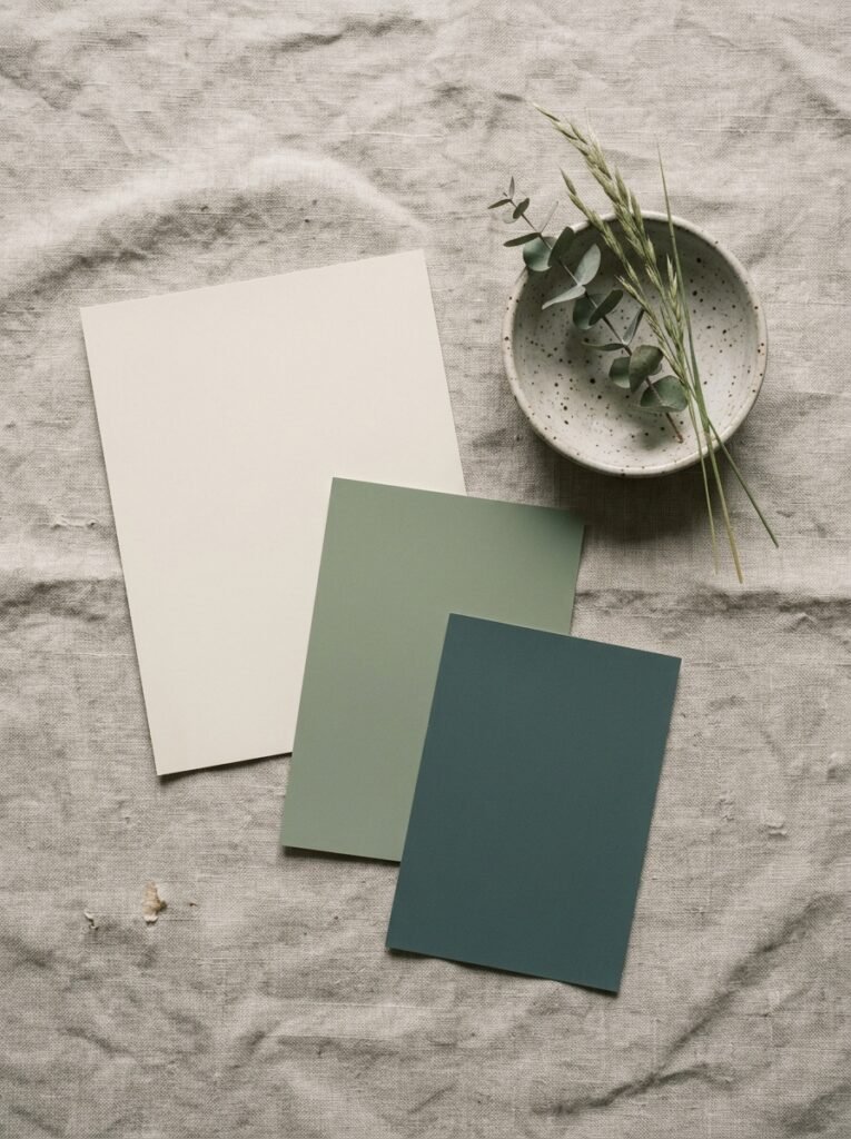
Sage green. Dusty terracotta. A very particular shade of warm taupe that sits somewhere between biscuit and blush.
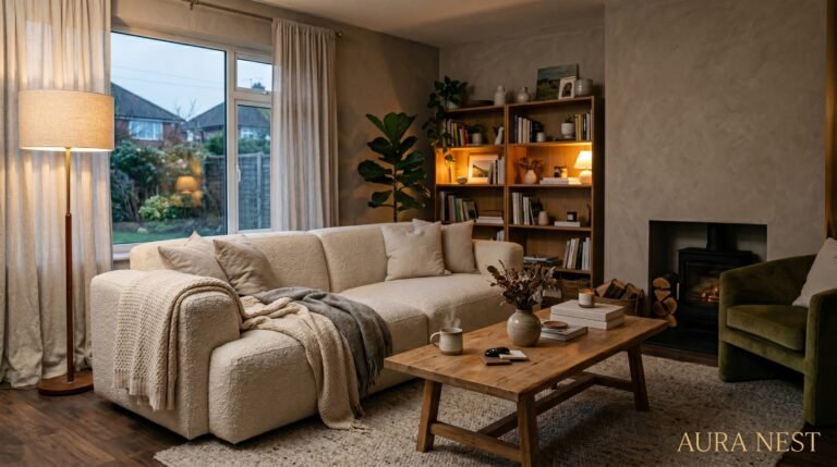
Right now, the rooms that stop your scroll — the ones you pin at 11pm with the caption “this. THIS.” — they’re almost always painted in something earthy and muted. Not beige in the boring way. Beige in the way that feels like linen, like a sunlit wall in Tuscany, like something that was always meant to be there.
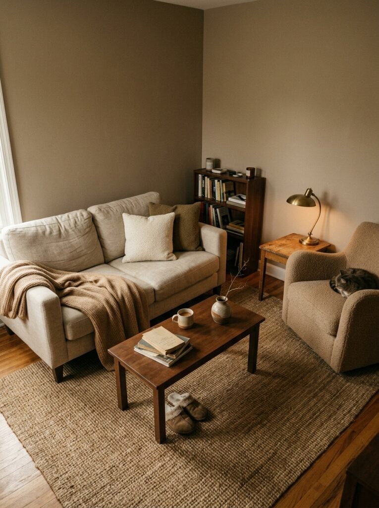
Sherwin-Williams Accessible Beige. Farrow & Ball Elephant’s Breath. Benjamin Moore Revere Pewter. These are the names that come up again and again because they do something remarkable in small spaces — they create a sense of depth without darkness.
In British homes especially, where rooms tend toward the narrower and ceilings aren’t always soaring, that earthy mid-tone is doing serious work. It doesn’t fight the light. It collaborates with it.
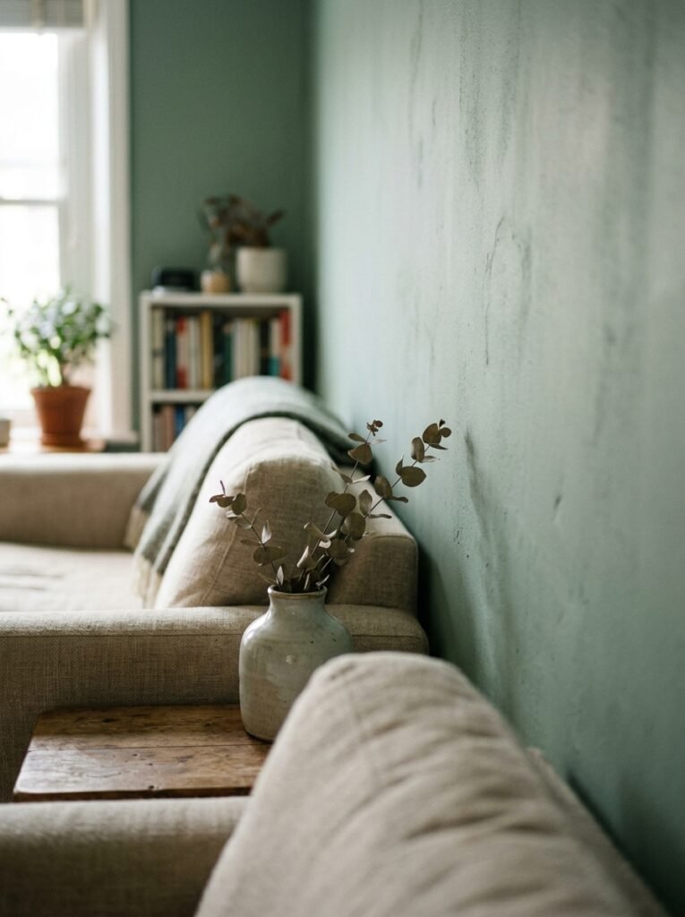
And here’s the thing about sage green. The right sage — muted, leaning gray, not screaming “herb garden” — makes a small room feel like a considered choice rather than a compromise. It signals that the person who lives there made a decision. That matters more than you think.
3. The One Rule That Makes Any Tiny Room Feel Intentional, Not Accidental
Paint the ceiling.
Not white. Not the default. Paint it the same color as your walls, or one shade lighter, or — if you’re feeling bold — one shade darker.
This is the trick that interior designers use in small spaces and almost never explain clearly. When your ceiling contrasts sharply with your walls, your eye is constantly doing the math: floor, walls, ceiling, separate, separate, separate. The room fragments. It reads small because you’re aware of all its edges simultaneously.
When the ceiling flows into the walls? Your eye stops measuring. It just… rests. The boundaries soften. The room breathes.
In apartments in New York, London, or anywhere where square footage comes at a premium, this single move can make a room feel 20% larger. That’s not a statistic. That’s just how human perception works.
Try it in a warm white or a soft putty tone first if the idea feels scary. Work up to the moment when you do your whole living room in one shade of deep clay or forest green, walls and ceiling together, and you realize you’ve created a cocoon — and that cocoons can be the coziest places in the world.
4. Why Dark Colors in Small Spaces Aren’t as Terrifying as You’ve Been Told
The advice you’ve heard a hundred times: keep small rooms light. Pale walls, white trim, minimal contrast. Open it up.
That advice isn’t wrong. But it’s incomplete.
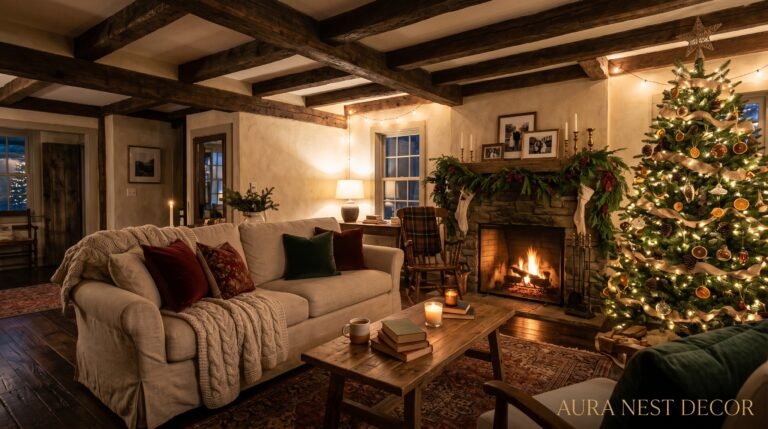
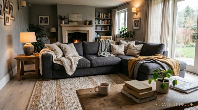
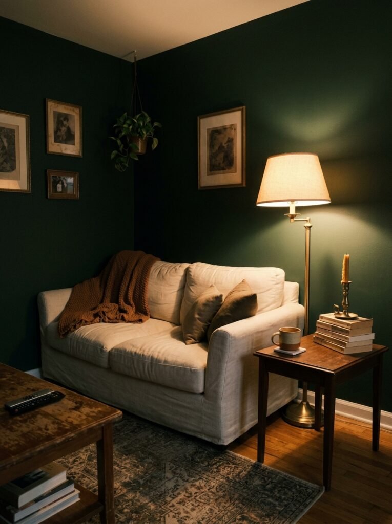
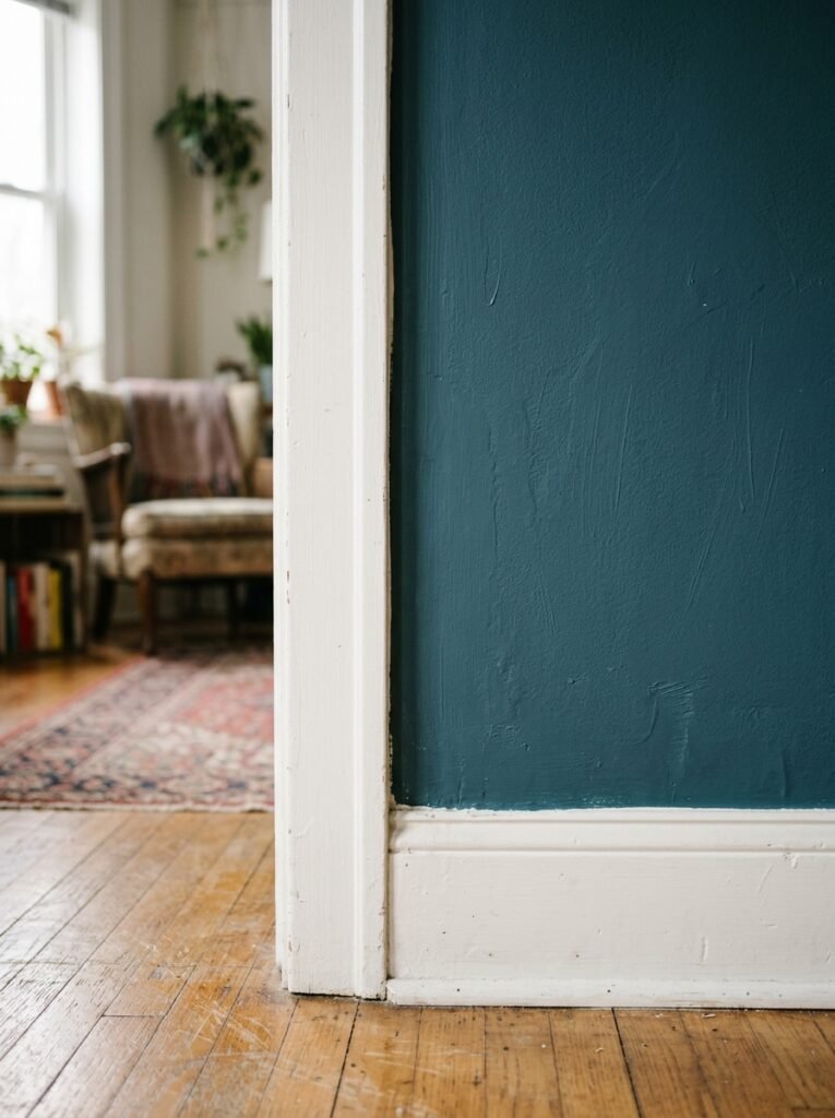
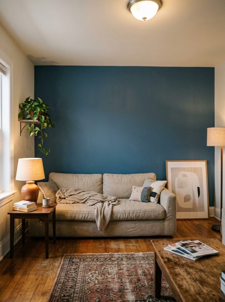
Dark walls in small living rooms — done right — don’t shrink the space. They make the space irrelevant. When your room is painted in something like Farrow & Ball Hague Blue, or a deep forest green, or an almost-black charcoal, something interesting happens. You stop noticing the room and start noticing what’s in it.
The walls recede into the background in a different way. Not by pretending to be bigger than they are, but by stepping aside and letting the light, the furniture, the objects you love do all the talking.
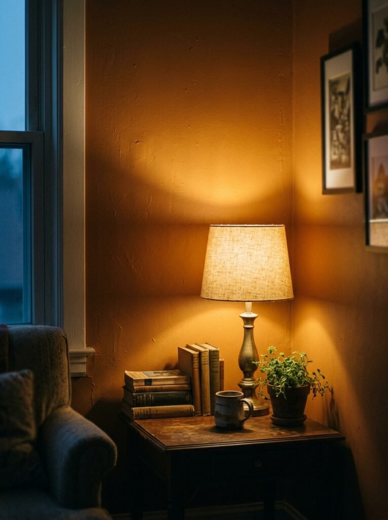
This works especially well in rooms with good natural light, or rooms where you’re mostly in them in the evenings, by lamplight. The amber glow of an Edison bulb at 7pm against a deep teal wall is one of the most beautiful things a small living room can offer. It feels intentional. Rich. Like a jewel box, not a box.
“Dark walls don’t shrink a room. They make the square footage beside the point.”
5. The Furniture Conversation Your Wall Color Has to Win
Here’s where most people go wrong. They pick the wall color last. After the sofa, after the rug, after the curtains. And then they wonder why nothing feels cohesive.
Your wall color should come first. Or at minimum, alongside your major pieces — not after them.
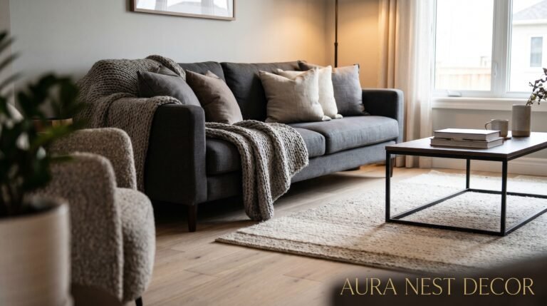
In a small living room, the relationship between wall color and furniture isn’t about matching. It’s about contrast and conversation. A cream sofa against a terracotta wall. A charcoal velvet loveseat against sage green. A warm oak coffee table against a dusty blue-gray backdrop. These aren’t accidents. They’re decisions.
The rule that holds across almost every successful small living room: choose one piece to be the hero and let the wall color support it. In an apartment with limited floor space, your sofa is usually that hero. Build out from there.
If your sofa is neutral — and most are, because most of us play it safe — your wall can afford to be more interesting. If you’ve gone for a statement sofa in a deep jewel tone, your walls should pull back to something quiet and grounding. The room can only have one lead character.
6. How Trim Color Changes Everything You Think You Know About a Small Room
Nobody talks about trim enough.
Most people default to white trim and call it done. And white trim is often exactly right — it creates crisp definition, it reads as clean and intentional. But in small living rooms where the goal is to create seamless flow and visual calm, crisp white trim can actually work against you.
Try this instead: match your trim to your walls, or go one shade lighter. What happens is remarkable. The edges of the room soften. The eye doesn’t get snagged on every corner, every doorframe, every awkward architectural bit. The room starts to feel like one deliberate thing rather than a collection of surfaces.
In older British homes with beautiful original cornicing, painting trim and cornice in the same warm tone as the walls turns those architectural details from distractions into focal points. They sit there quietly being lovely, rather than shouting “irregular ceiling height” or “odd window placement.”
In American apartments where the trim work is purely functional, matching it to the wall color is one of the easiest and cheapest ways to give the whole room a more considered, high-end feel.
7. The Accent Wall Debate, Settled Once and for All
Accent walls had their moment. That moment was roughly 2008 to 2014. We painted one wall burgundy or navy, hung a geometric mirror on it, and called it design.
Here’s where we are now: accent walls work in small living rooms only when they’re playing a specific structural role.
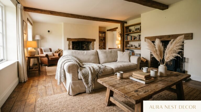
If your small living room has an awkward alcove, a chimney breast, or a recessed wall that creates natural depth — paint that. Use a deeper or contrasting color to lean into the architecture, to say “yes, this quirk is intentional.” In a London Victorian flat with a beautiful original fireplace breast, painting that feature wall in a rich forest green while keeping surrounding walls in a warm off-white is exactly right.
What doesn’t work anymore is the random accent wall — the one painted simply for variety, the one on whatever wall your TV happens to be on. It looks like a decision that ran out of confidence halfway through.
If you want contrast and interest in a small room, use it architecturally. Or skip the accent wall entirely and go with two complementary colors across the whole space — walls in one tone, ceiling in another, trim in a third. That’s not an accent wall. That’s a color story.
“An accent wall with no architectural reason is just paint that lost its nerve.”
8. The Three-Color Formula That Designers Use in Small Spaces Without Saying It Out Loud
Here’s the formula. It’s not secret. But it’s rarely stated plainly enough to be useful.
60% dominant color (your walls). 30% secondary color (your largest furniture and textiles). 10% accent (your cushions, throws, a lamp shade, a piece of art).
In a small living room, this formula isn’t a nice-to-have. It’s structural. Too many colors and the room fragments; the eye has nowhere to rest. Too few and it can feel flat, like a space no one actually lives in.
The reason small rooms feel cluttered even when they’re fairly tidy is often a color problem disguised as a stuff problem. When you have seven different accent colors competing for attention — a red cushion, a yellow throw, a teal candle, a terracotta pot — every inch of the room is shouting simultaneously. Nothing wins. Everything crowds.
Apply the 60/30/10 ratio and suddenly the room has a through-line. In practical terms: if your walls are a warm sage (60%), maybe your sofa and curtains are a natural linen or cream (30%), and your cushions and a single piece of art bring in a dusty blush or soft rust (10%). That room will feel curated, calm, and genuinely larger than it is.
9. The Lighting Trick That Changes What Your Wall Color Looks Like at Every Hour
This one matters more than people realize.
The same wall color at noon versus 6pm looks like two different paints. This isn’t a problem — it’s an opportunity. But you have to design for it intentionally.
Warm light sources (Edison bulbs, amber-toned LEDs around 2700K) will deepen warm wall colors, making terracottas richer, greens more golden, creams almost honeyed. That same warm light against a cool gray wall can make it look slightly lavender or even a little sad by evening.
In a small living room, your lighting and your wall color need to be chosen together. Take your paint samples home and look at them in the morning, at midday, in the afternoon sun if you get it, and under your actual lamps at night. What you see in those different lights is what you’re actually living with.
Layer your light sources — overhead, floor lamp, table lamp, perhaps a wall sconce or two. Multiple light sources at lower wattages create dimension and warmth in ways that a single overhead bulb simply cannot. And in a small space, that warmth reads as richness rather than size. Your room feels full without feeling stuffed.
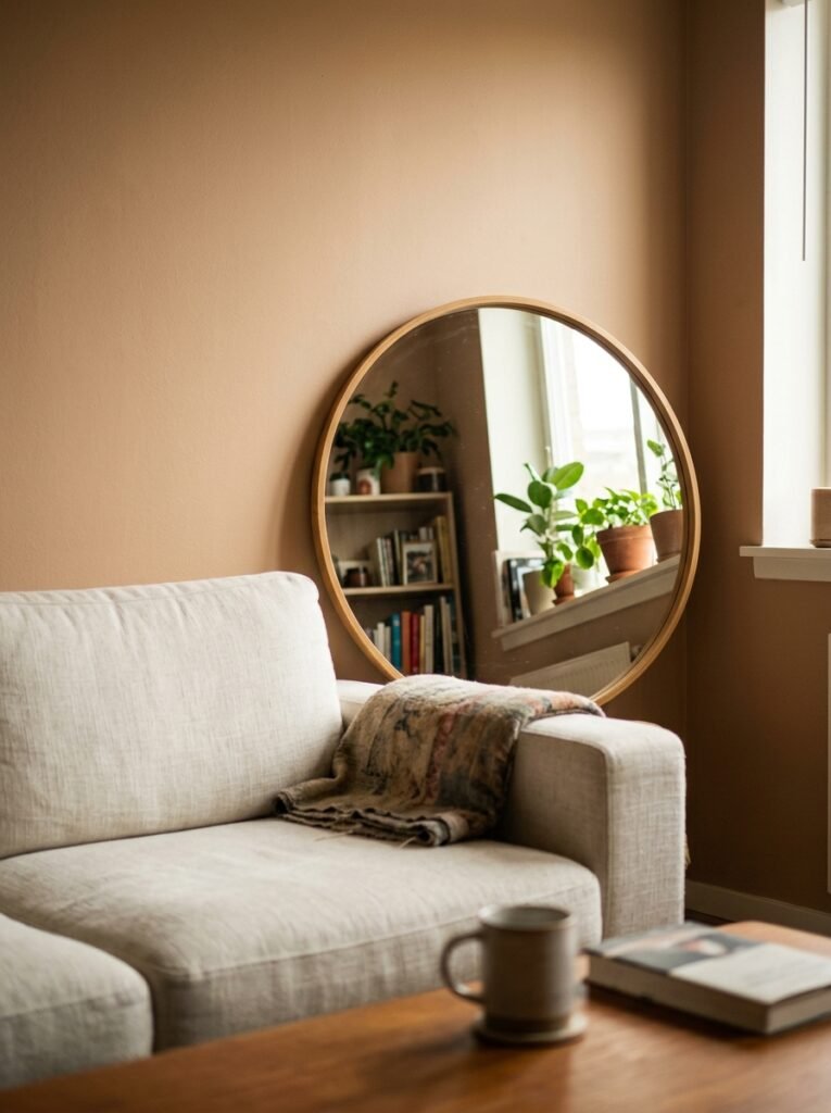
10. Mirrors Are Not Magic, But Here’s What They Actually Do
You’ve been told to use mirrors to make a small space feel larger. That’s true, but the advice is usually too vague to be useful.
Mirrors don’t just add perceived space. They move light around a room. And in a small living room, light is space.
Position a large mirror opposite or adjacent to your main window. It captures daylight and bounces it across the room, particularly illuminating the corners and walls that would otherwise sit in shadow. Those bright corners make the room feel like it extends further than it does.
But here’s the nuance: the mirror’s frame matters as much as its size in a small space. A thick, dark ornate frame introduces visual weight that can counteract the spaciousness the mirror creates. Lean toward slim frames, frameless mirrors, or antique mirrors with a slightly foxed glass — the soft imperfections make them feel like they belong rather than like something you’ve placed strategically.
In terms of wall color, mirrors are most dramatic against medium-to-dark walls where the reflected light creates genuine contrast. Against a pale wall, the effect is subtler. Neither is wrong. But if you’re going for impact, place your mirror where the contrast will sing.
11. The Mistake That Makes Small Apartments Look Like Show Homes in the Wrong Way
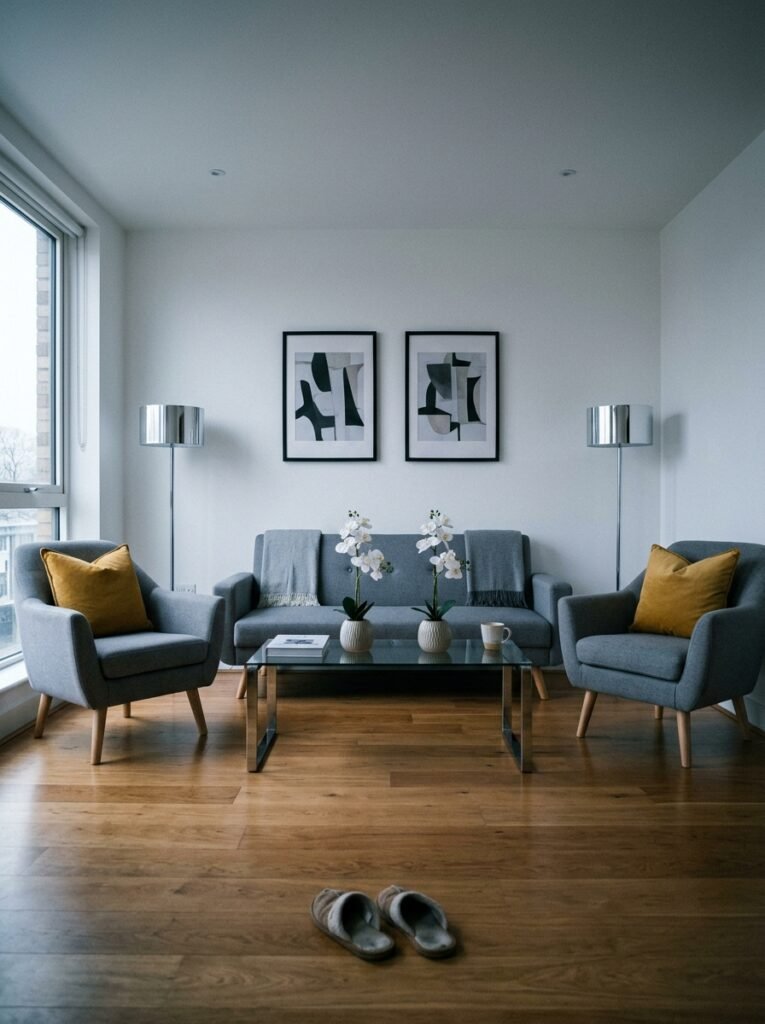
Keeping everything too light, too pale, too safe.
It’s the small-room-decorating trap. You’ve read the advice, you’ve gone with white walls and light furniture and neutral everything, and now your living room looks like a staged rental property rather than a place where a person actually lives. Beautiful in photos. Cold in person.
Here’s the truth about small spaces: they need personality more than large rooms do, not less. When you don’t have square footage on your side, you need warmth, texture, character. You need a room that feels inhabited.
That might mean one wall in a color you love but slightly fear. It might mean a vintage kilim rug in jewel tones that brings the whole floor to life. It might mean floating shelves painted the same color as the wall so your books and objects hover there without visually adding weight. It might mean a gallery wall — not the carefully curated Pinterest kind, but the real kind, with things you actually love that don’t quite match, and that’s exactly why it works.
Small rooms don’t need to be invisible. They need to be themselves.
12. The Paint Finish Nobody Warns You About in Small Spaces
Flat matte looks beautiful in design magazines. In real small living rooms, it is a nightmare.
Matte paint absorbs light rather than reflecting it, which can be gorgeous in the right context — a large room with south-facing windows. In a small, darker room, matte walls can make the space feel like it’s slowly closing in.
For small living rooms, go with an eggshell or satin finish. These finishes reflect just enough light to keep the room feeling alive without the clinical sheen of semi-gloss. They also clean more easily, which matters in the living room where life actually happens — the wine glass that tips, the small hands that touch the walls, the dog who brushes past the corner by the door.
Eggshell on walls. Semi-gloss on trim if you’ve chosen to keep it contrasting. Matte on ceiling only, where its light-absorbing quality is an asset rather than a problem.
These are not glamorous decisions. But they are the decisions that separate a room that works from a room that only almost works.
—
🌿 Quick Tips
Use paint samples on large pieces of card (at least A3 or 11×14 inches) and move them around your room at different times of day before committing — a tiny swatch on the wall tells you almost nothing.
If you’re renting and can’t paint, removable wallpaper in a warm texture or subtle pattern can do everything a paint color would do, and it comes down cleanly when you leave.
In rooms with very low ceilings, paint the ceiling very slightly lighter than your walls — it creates just enough lift without the jarring contrast of pure white.
Don’t skip the second coat. Especially with deeper colors. One coat of sage green in a small room will look unfinished and patchy in a way that will bother you every single day until you fix it.
When in doubt between two shades, choose the warmer one. Cool undertones are less forgiving in artificial light, and most of us spend our evenings under lamps, not sunlight.
—
❓ FAQ
Q: What is the best wall color to make a small living room look bigger? A: Warm whites and soft creamy off-whites are the most reliable choice — they reflect light without feeling stark. Colors like Benjamin Moore White Dove, Farrow & Ball Pointing, or Dulux Timeless all have warm undertones that read as spacious without going cold. That said, the best color is one that also feels like you, because a space that feels wrong emotionally always looks smaller than it is.
Q: Should I paint all four walls the same color in a small living room? A: Yes, in most cases. Painting all four walls the same color creates visual continuity that makes a small room feel larger and more cohesive. The eye doesn’t get interrupted at every corner. The exception is if you have a genuine architectural feature — a fireplace breast, an alcove, a chimney wall — where a deeper or contrasting color makes structural sense.
Q: Can I use dark colors in a small living room or will it make it look too small? A: You can absolutely use dark colors. Deep greens, rich blues, and warm charcoals can make a small room feel like a deliberate, cozy sanctuary rather than a cramped space. The keys are good lighting — multiple warm light sources — and keeping furniture and textiles slightly lighter to create contrast. Dark walls work best when they’re a confident choice, not a tentative one.
—
💭 Final Thought
The small living room you’re hoping to change isn’t a problem to solve. It’s a space waiting for the right conversation between color, light, and the things you actually love. All it takes is one brave paint decision — one color chosen because it feels like home, not because it follows a rule.
What would you paint it if nobody was watching?