Why Gray Is the Most Misunderstood Color in Every Apartment Living Room
You’ve painted the walls. Bought the sofa. Pulled in all the right pieces — and somehow the room still feels cold, flat, or like a waiting room at a very stylish dentist’s office. If that sounds familiar, gray isn’t the problem. How you’re using it is.
—
1. The Real Reason Gray Rooms Go Wrong (And It Has Nothing to Do With the Paint)
Here’s what nobody tells you when you fall in love with a greige sample card at the hardware store: gray is a chameleon, not a neutral. It doesn’t sit quietly in the background. It reacts — to your light, your flooring, your furniture, the direction your windows face, even the time of day. A gray that looks like warm putty at noon can turn lavender by 4pm and slate blue by evening. This is not a design flaw. It’s just physics, and once you understand it, it changes everything.
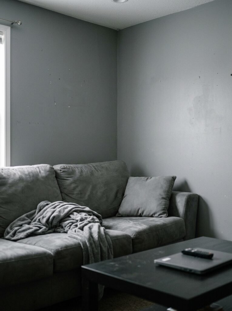
Most apartments that feel cold in gray have made the same mistake: they’ve treated gray as a blank canvas when it’s actually an active ingredient. They’ve paired it with other cool tones — chrome fixtures, icy white trim, blue-toned wood floors — without adding anything to push back against the chill. The room ends up feeling like a very expensive car park.
The fix isn’t to abandon gray. It’s to understand its undertones. Every gray has a lean. Warm grays pull toward beige, brown, or green. Cool grays pull toward blue, purple, or even pink. Before you do anything else, hold your paint chip against a piece of white paper in natural light. Whatever color you see bleeding through — that’s your undertone, and that’s what you need to either lean into or counterbalance.
“Gray doesn’t fail rooms. Rooms fail gray — by forgetting that it has a whole personality underneath.”
2. The Color Pairing That Makes a Gray Living Room Feel Like Someone Actually Lives There
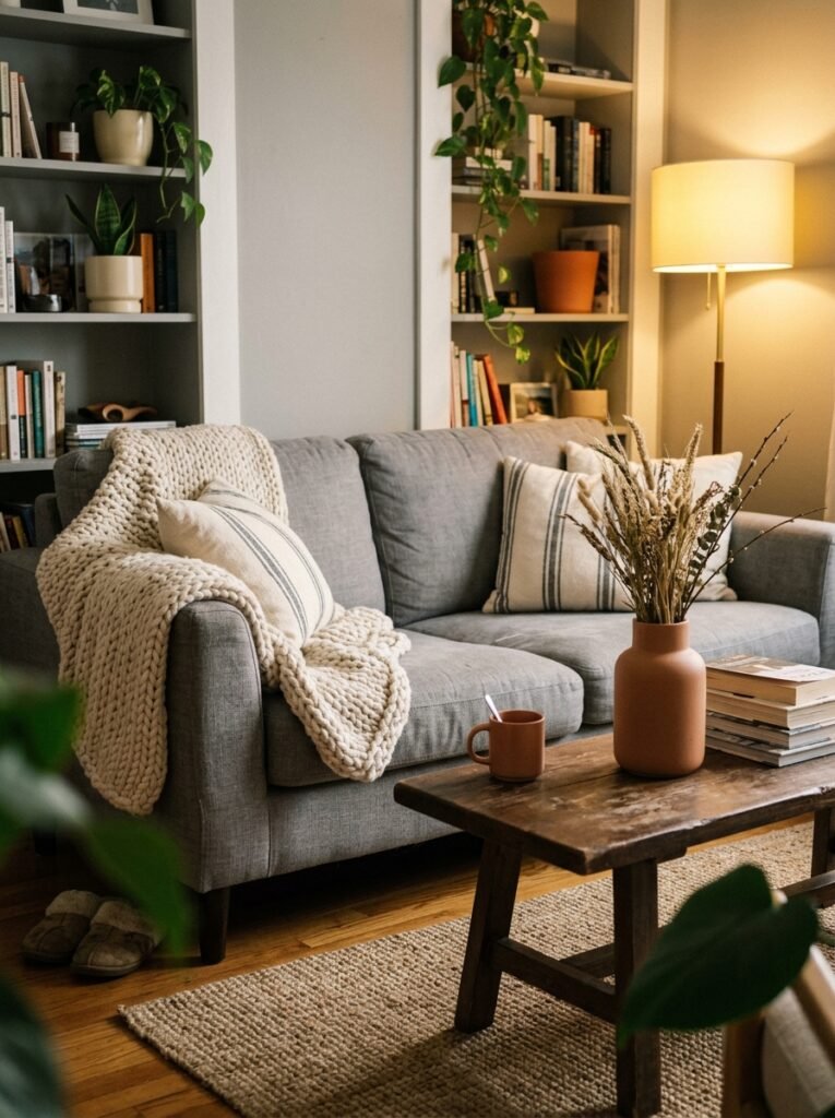
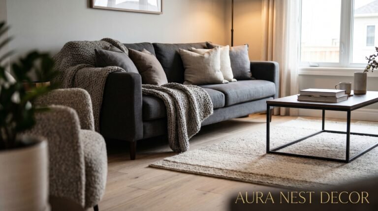
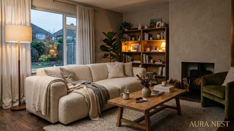
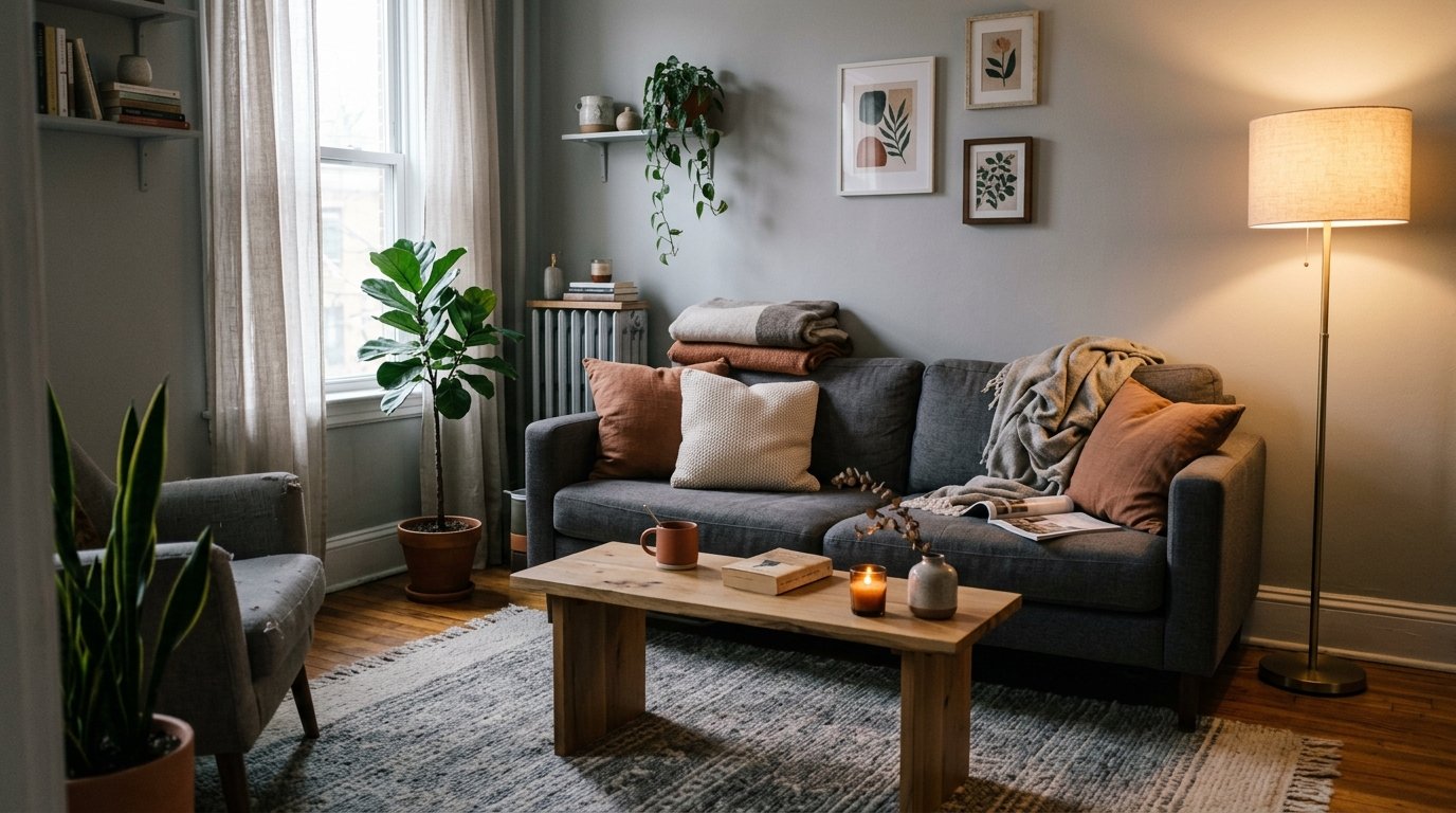
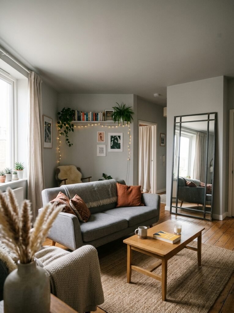
Warm white. Not bright white, not cool white. Warm white — the shade that looks almost cream in direct sun and like fresh snow in shade. This is gray’s best friend, and it’s the pairing that separates a gray room that feels inhabited from one that feels staged for a property listing.
In apartments specifically, trim matters more than most people realize. Skirting boards, window frames, built-in shelving edges — these are the outlines of your room, and when they’re painted in a warm white (think Benjamin Moore’s White Dove, or Farrow & Ball’s Pointing for the UK crowd), they create a gentle contrast against gray walls that reads as intentional, considered, and lived-in. It’s the difference between a room that looks like it was designed and one that looks like it was assembled.
Beyond the trim, bring warm white into your soft furnishings. A linen throw. A pair of cotton curtains in undyed natural fabric. A ceramic lamp base the color of old paper. These pieces absorb light differently than the walls and the trim, and together they create depth that makes a gray room feel layered instead of flat. Warm white tells your eye: something soft is here. Come closer.
3. The Color That Keeps Showing Up in Every Beautiful Gray Apartment Right Now
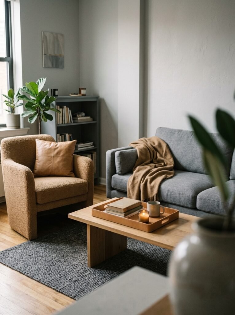
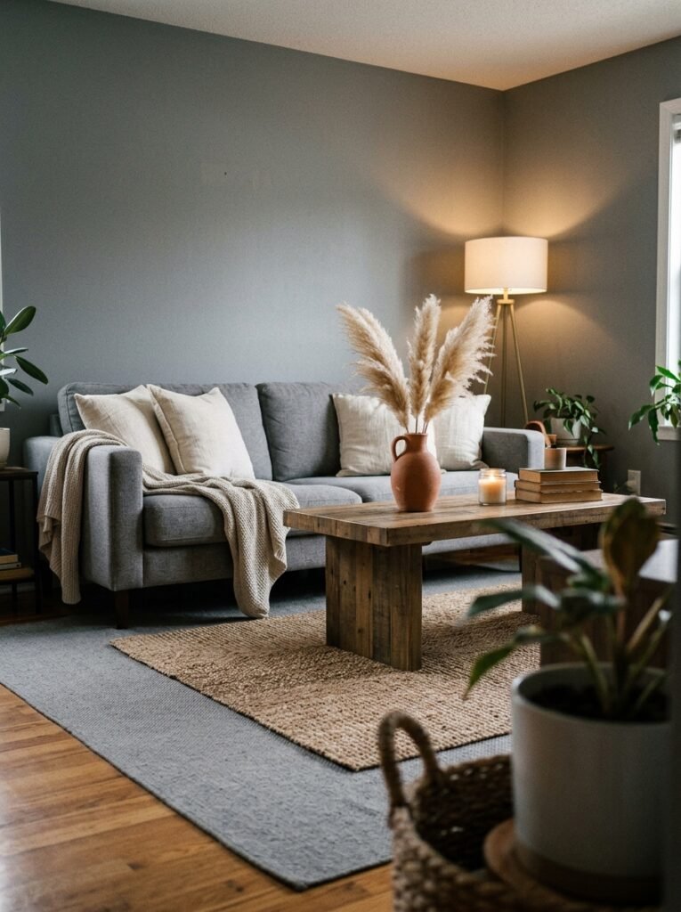
Terracotta. Before you scroll past, hear me out — because I’m not talking about burnt orange feature walls and Southwestern pottery. I’m talking about the quieter version: dusty terracotta, the shade of an old clay pot that’s been sitting in an English garden for fifteen years. Muted, weathered, almost dusty-pink in low light.
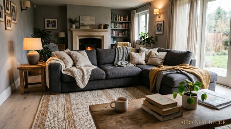
This color and gray should not work together as well as they do. They’re opposites on nearly every axis — one warm, one cool; one earthy, one architectural; one ancient, one modern. But that tension is exactly what makes the pairing so good. A gray sofa with terracotta cushions. A gray room with a terracotta-toned rug. A gray accent wall behind a shelving unit where terracotta objects — a vase, a candle holder, a stack of clay-toned books — catch the eye.
The key is restraint. You don’t need much. Two or three terracotta pieces in a gray room create a warmth that no amount of fairy lights or candles can manufacture, because the warmth is built into the color palette itself. It’s the visual equivalent of taking off your shoes at the door.
4. What Happens When You Add Forest Green to a Gray Scheme (Spoiler: It Gets Very Good)
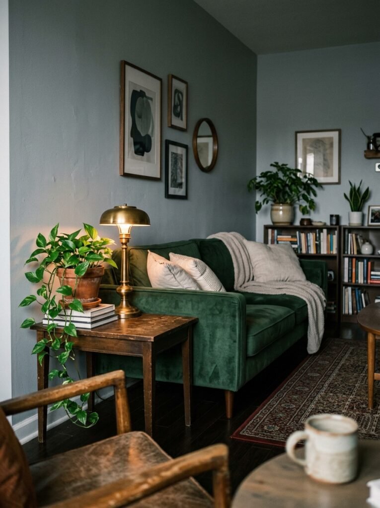
Green and gray is a combination that interior designers have known about for years but Pinterest is only now catching up with properly. Not lime green, not apple green — forest green. The deep, slightly dusty shade of fir trees in November. Almost black in some lights.
In a gray apartment living room, forest green acts as an anchor. It gives the eye somewhere definitive to land. A single forest green armchair against a gray wall stops looking like a bold choice after about three days — it starts looking like the room was always supposed to look this way. That’s the best sign you’ve got a color pairing right: when it becomes invisible because it feels inevitable.
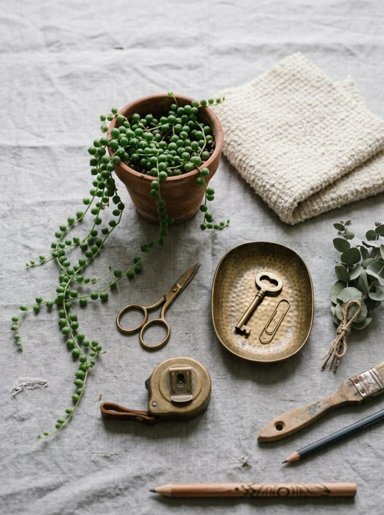
If a whole green chair feels like a commitment you’re not ready for, start with plants. And I mean real plants — a large fiddle leaf fig, a trailing pothos, a cluster of eucalyptus stems in a stone-grey vase. The green they bring into a gray room is living green, which has a warmth and texture that printed fabric can’t replicate. The contrast between the cool architectural gray and the organic irregular green of actual leaves is genuinely one of the most beautiful things you can do to an apartment living room.
“Green doesn’t just add color to a gray room — it adds proof that someone lives there.”
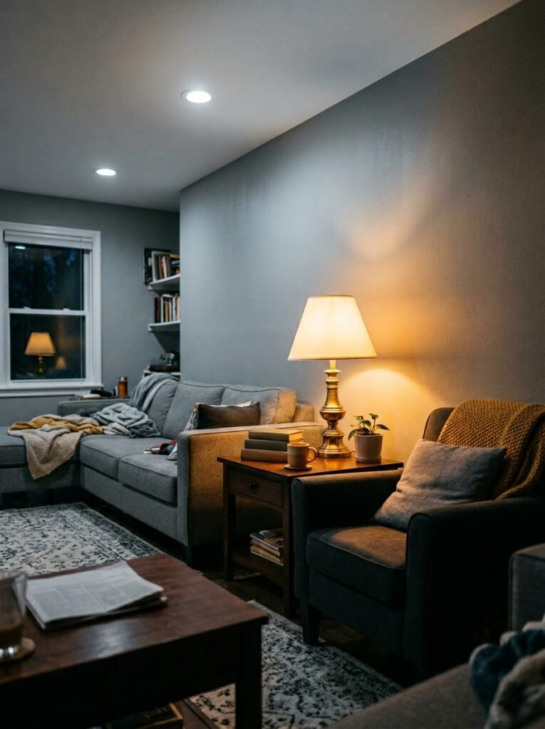
5. The Lighting Truth Every Gray Living Room Needs to Hear
No color scheme survives bad lighting. Gray is more vulnerable than most.
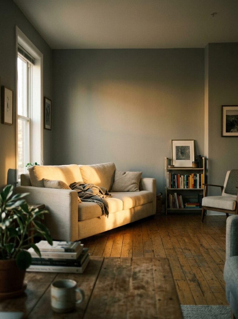
Here’s what I see constantly on Pinterest and in real apartments: a beautiful gray room photographed in golden hour sunlight that looks completely different — flatter, colder, somehow sadder — under actual artificial lighting. The mistake is ceiling lights. Specifically, overhead ceiling lights as the primary source of illumination in a living room.
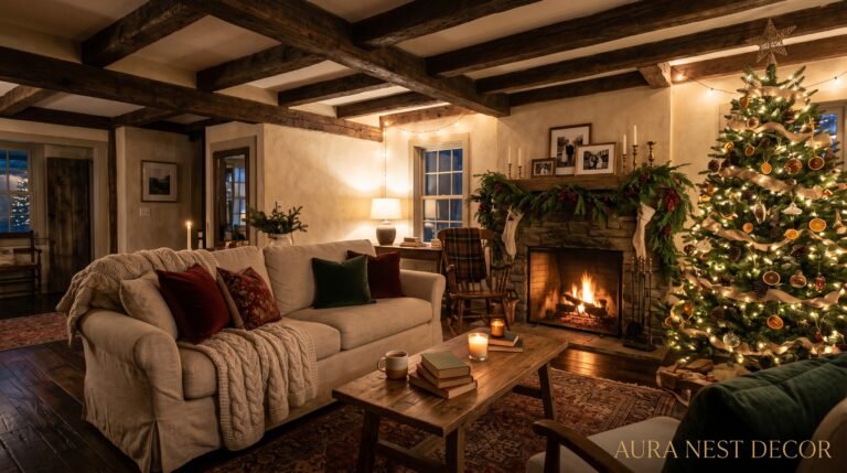
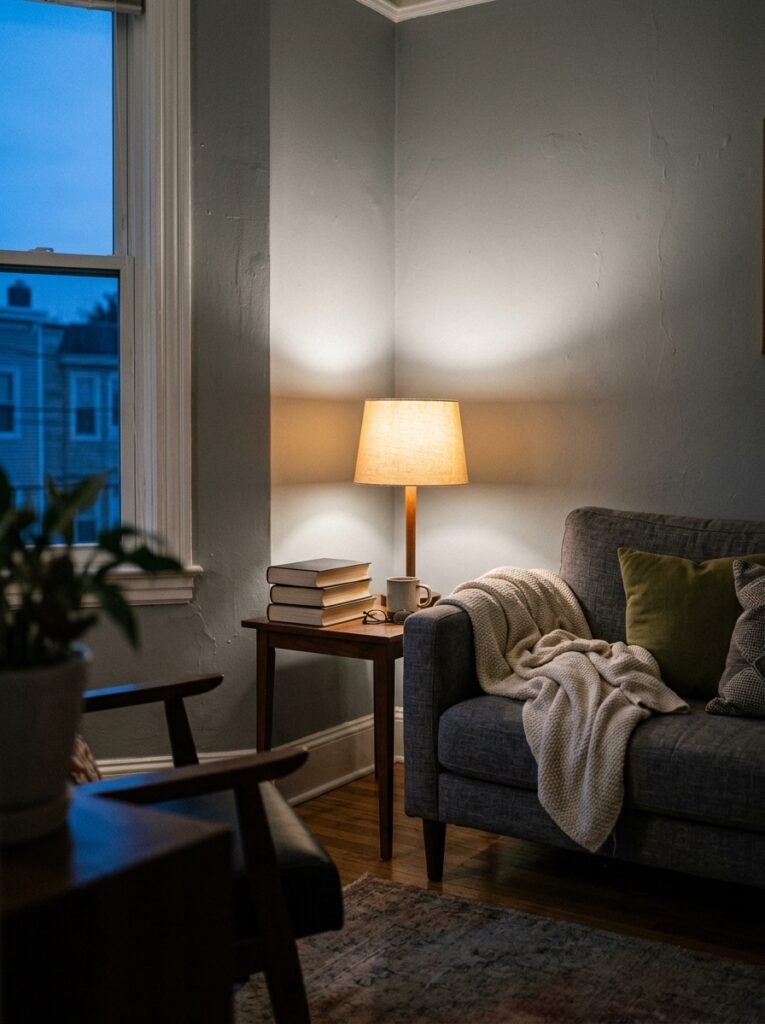
Overhead light falls down onto everything. It flattens surfaces, removes shadows, and strips out the warm tones that make gray rooms feel cozy. The fix is to layer your light low. Floor lamps. Table lamps. The amber glow of an Edison bulb at 7pm, tucked into the corner by the bookshelf, is worth more to a gray room than any overhead fixture on a dimmer switch.
In a small apartment specifically, three light sources at different heights create the illusion of more space and more warmth simultaneously. One floor lamp near the sofa. One table lamp on a side table or console. One smaller lamp — could even be a candle cluster — at a lower level. This triangulates the room, pulls the eye to multiple points, and makes gray stop looking like a backdrop and start looking like a choice.
6. The One Texture That Rescues a Flat Gray Color Scheme Every Time
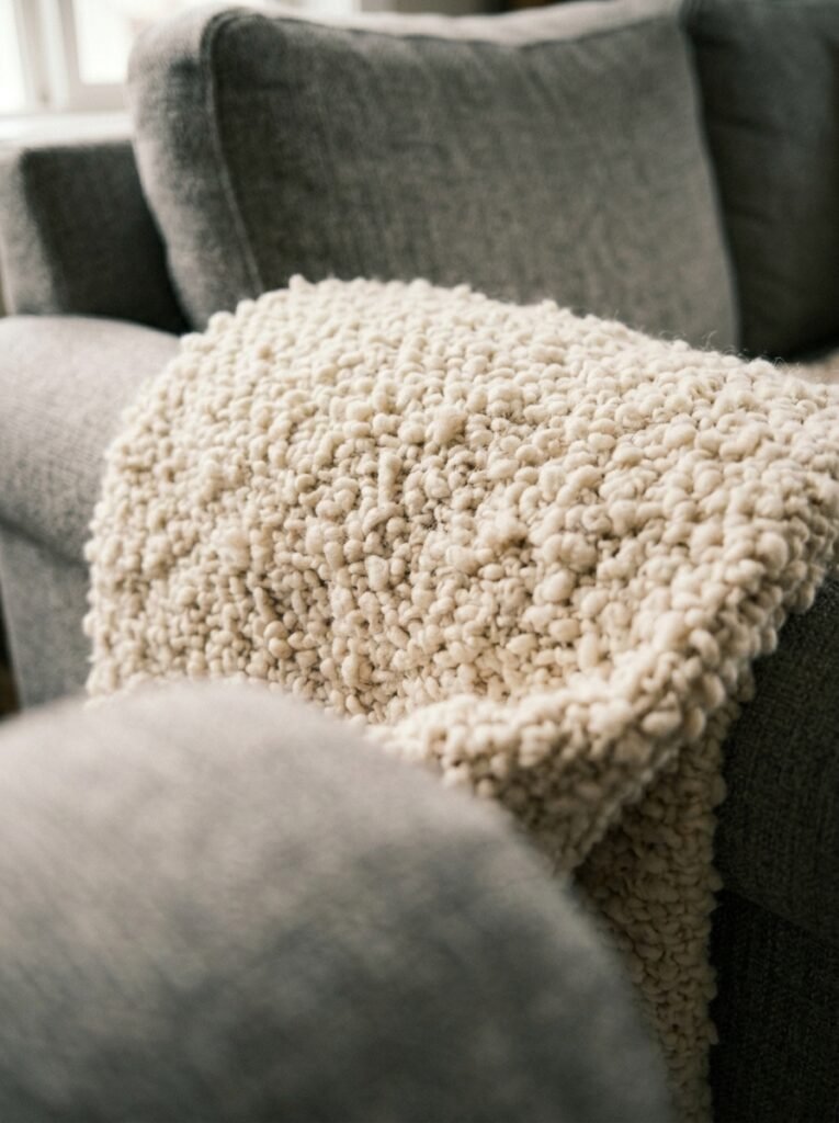
Boucle. Say it correctly: boo-clay. It’s the looped, nubby fabric that looks like a cloud decided to become upholstery, and it has quietly become the most useful texture in gray apartment living rooms because of one specific quality: it absorbs and scatters light at the same time.
A smooth gray sofa in a gray room disappears. A boucle sofa in the same gray room creates texture that catches light from every angle, giving the room visual movement even when nothing in it is actually moving. The nubby surface reads as warm in a way that smooth fabric simply doesn’t, and it pulls gray — even quite cool gray — into a register that feels cozy and considered.
Boucle doesn’t have to be the sofa. A boucle throw across the arm of a chair. A boucle cushion on a bench at the foot of a bed. A small boucle footstool. Even one piece of this texture in a gray room introduces a quality of warmth that’s hard to achieve with color alone. It’s tactile luxury that reads on screen, which is exactly why you see it everywhere on Pinterest right now.
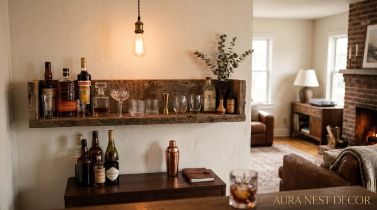
7. How Brass Saves Every Gray Apartment Living Room From Feeling Like a Hotel Lobby
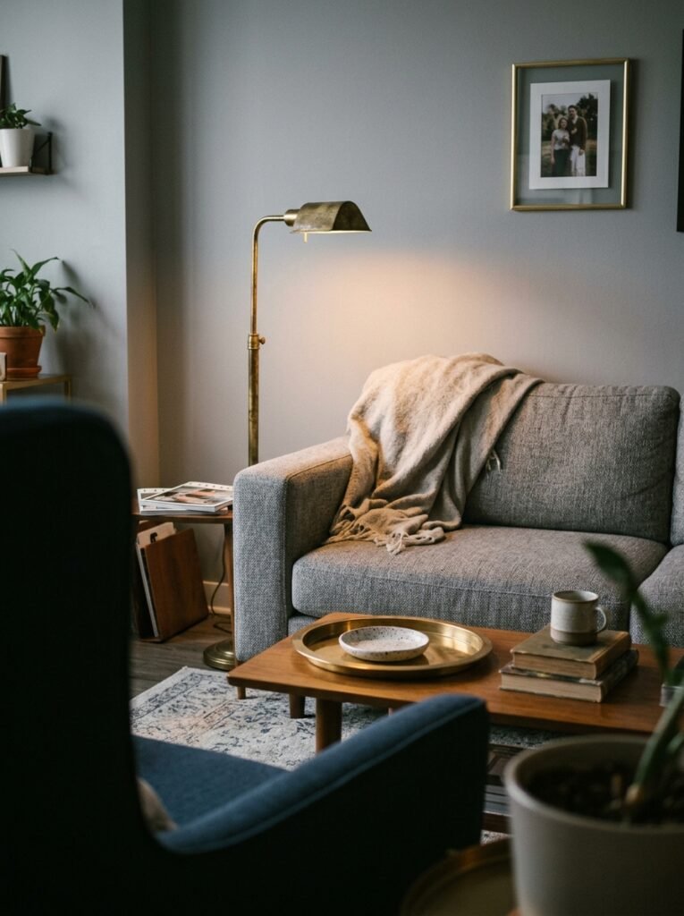
Brass. Warm, slightly unlacquered, slightly imperfect brass — not gold, not bronze, not polished yellow metal. The brass that looks like it has a little history to it.
Chrome and gray look sleek. Nickel and gray look expensive. But brass and gray look like someone made decisions with their whole personality. The warmth of brass against cool or mid-tone gray creates a richness that neither can achieve alone, and in an apartment — where you’re often working with modest square footage and rental-beige origins — richness is exactly what you’re after.
Brass shows up cheaply and beautifully in hardware. Cabinet handles. Light switch plates. Curtain rings. A floor lamp with a brass stem. A picture frame. Mirror frames. These are the smallest possible interventions and they read, collectively, as a considered design choice that took much more effort than it actually did. Nobody needs to know that you changed the cabinet handles in an afternoon and it cost you less than a dinner out.
“Brass in a gray room is the equivalent of a good leather belt with jeans. It just pulls the whole thing together.”
8. The Color That’s Hiding in Your Gray and How to Use It Deliberately
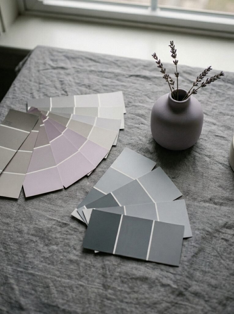
Whatever undertone your gray has — and it definitely has one — lean into it somewhere in the room. This is the design principle that separates rooms that look accidentally right from rooms that look intentionally designed.
If your gray walls have a blue undertone: bring in navy. A navy throw pillow, a navy book spine turned outward on the shelf, a navy candle on the coffee table. The blue in your gray will resonate with the navy and create a tonal palette that feels deeply sophisticated and completely deliberate.
If your gray has a green undertone: lean into sage. Sage cushions, sage ceramics, a sage linen napkin folded on a tray. This is one of the most quietly beautiful combinations in modern apartment design — cool sage and cool gray, both with their roots in the same muddy, complex color family.
If your gray has a pink or purple undertone: dusty mauve. This one surprises people. Mauve against a lilac-toned gray doesn’t read as purple — it reads as warm, slightly vintage, and very Farrow & Ball. It’s the color palette of old English country houses and new Brooklyn apartments simultaneously, and it works in both.
9. The Small Apartment Gray Trick That Makes Your Living Room Look Twice as Big
Paint your skirting boards and trim the same shade as your walls. I know. It feels wrong. Every instinct says contrast is how you define the room. But in a small apartment living room, continuous color — wall to trim to skirting board in the same gray — removes the visual interruptions that chop the room into pieces. Your eye travels around the space without stopping, and the room reads as larger, more intentional, more architectural.
This technique is borrowed from high-end interior design and it’s almost embarrassingly effective in apartment spaces. The French call it “envelopping” — wrapping a room in one color so that the architecture disappears and only the objects and people inside it remain visible. What this does to a small gray living room is remarkable: your furniture, your plants, your art, your lighting — suddenly these are the stars. The room is the stage. It stops being about the walls.
10. How to Know If Your Gray Is Working (The Late Afternoon Test)
Walk into your living room at around 4pm on a cloudy day. No lamps on. Just the ambient light coming through the windows. How does the room feel?
If it feels cold, grey in the bad sense — flat and slightly depressing — you need more warmth in the room, not in the walls. Add a warm-toned rug if you don’t have one. Swap your cushion covers for something in cream, terracotta, or warm sage. Introduce a lamp you can turn on at this exact hour.
If it feels quiet and calm — like a room that’s ready for the evening — your gray is working. That feeling is the point. A gray living room at its best is a room that gets better as the day darkens. It rewards the long evening. It looks better with a glass of wine in your hand than under the midday sun, and that is exactly the quality you want in a space where you actually live your life.
11. The Budget Gray Room Update That Changes Everything Within a Weekend
New cushion covers and a rug.
I know that sounds too simple. But the combination of a new area rug and new cushion covers is the fastest, least expensive way to completely shift the color temperature of a gray room — and in most apartments, these two elements make up a significant percentage of the visible soft furnishing. Change them and you change the room.
For a gray sofa, the cushion formula that consistently works: one pattern (something with both gray and an accent color), two plains in the accent color, one plain in cream or warm white. Five cushions. The pattern bridges the gray sofa and the accent color; the plains commit to the direction; the cream lightens the whole thing.
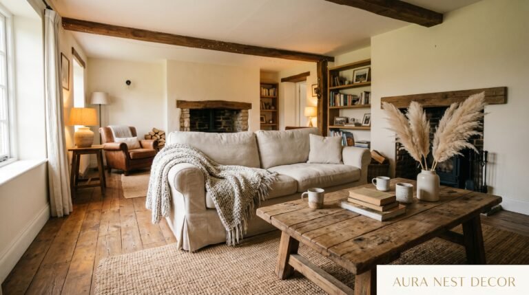
For the rug: go warmer than your instinct says. In a gray room, almost everyone’s first instinct is to choose a cool or neutral rug. Choose warm instead — jute, natural wool, a warm-toned geometric. The floor is the largest single horizontal surface in your room and its temperature sets the temperature of everything above it.
12. The Gray Apartment Room That Stays Beautiful Long After the Trend Is Over
Here’s the thing about gray that nobody wants to admit: it had a moment. Specifically, the mid-2010s. And in the aftermath, a lot of people have been busy declaring gray “over” and painting everything white or mushroom or warm terracotta instead.
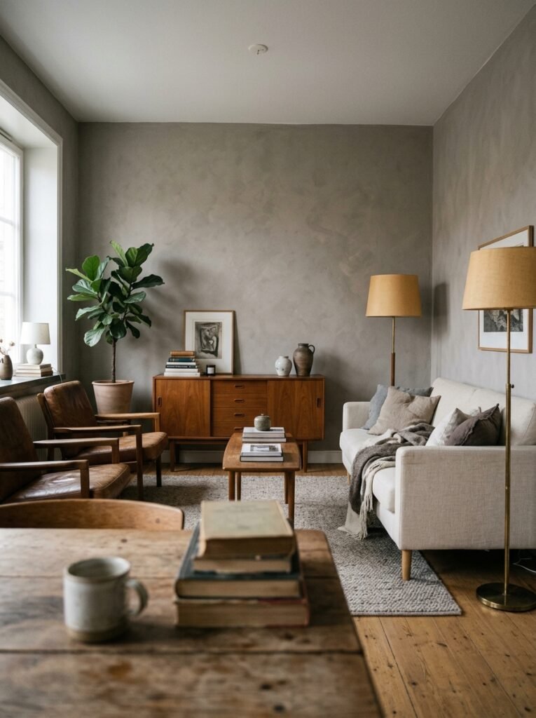
They’re wrong about what to do with that information. Gray isn’t over — cold, badly-paired, thoughtlessly-applied gray is over. The gray that shows up in the most beautiful apartments on Pinterest today isn’t the cold blue-gray of 2015 or the fifty-shades silvery gray of 2016. It’s warmer. More complex. More confident. It exists alongside natural materials — linen, wood, terracotta, stone, jute — and those materials give it a life and warmth that paint alone can never provide.
The gray apartment living room that ages well is the one where gray is one ingredient among many — not the star, not the background, but the considered framework that makes everything else look better. That version of gray never goes out of style, because it was never really about gray at all.
—
🌿 Quick Tips
Give your gray walls a fighting chance by testing paint samples in all four corners of the room — not just one patch. The light hits each wall differently and the undertones will shift dramatically depending on where you look.
Never choose curtains in the same gray as your walls. You’ll lose the window entirely. Go lighter, warmer, or completely different.
If your rental apartment has gray carpets you can’t change, use a large rug over the top. This isn’t cheating — it’s literally what designers do.
Scent matters in a gray room more than in other color schemes. Gray is visually cool, so fill it with warm scents — amber, cedarwood, vanilla, smoke. Your nervous system will read “cozy” even when the walls are silver.
One large piece of art beats three small pieces in a gray room, every time. A single oversized print with warm tones anchors the whole wall and gives the gray something to exist alongside.
—
❓ FAQ
Q: What is the best paint color for a small gray apartment living room that doesn’t get much natural light? A: Reach for warm grays — specifically those with a beige or greige undertone rather than a blue or purple one. In low-light rooms, cool grays will look almost dingy by 3pm. Farrow & Ball’s Mole’s Breath, Benjamin Moore’s Revere Pewter, or Dulux’s Polished Pebble are all warm-gray shades that hold their warmth even in north-facing rooms. Pair with warm-white trim and you’ve got a combination that genuinely works in dim light.
Q: Can I use gray in an open-plan apartment living room without it feeling like a corporate space? A: Yes, and the key is texture and variation. An open-plan space in a single flat gray can feel institutional — so break it up with textured fabrics, natural wood elements, plants, and varied lighting zones. Use the same color family throughout but vary the tones slightly between sitting and dining areas. Let the materials do the warmth-work that the walls can’t do alone.
Q: Gray sofa or gray walls — which should I commit to first in a small living room? A: Start with the sofa if you’re renting; start with the walls if you own. The sofa is the more flexible purchase — paint can be changed for far less money than a new sofa. If you’re buying a sofa first, go slightly warmer in your gray than you think you need to, and make sure it has a warm undertone rather than a cold blue-gray. The room can then be built around it.
—
💭 Final Thought
Gray is not a safe choice. It never was. The rooms that get it right are the ones where someone made a hundred small decisions — this lamp here, that rug, these cushions, this wood, this green — and each of those decisions pushed warmth back into a color that is genuinely, stubbornly cool. The result is a room that feels like a long exhale. The question is: which small decision are you making this weekend?