The Orange Living Room That Made Me Stop Scrolling — And Then Stop Renting Beige
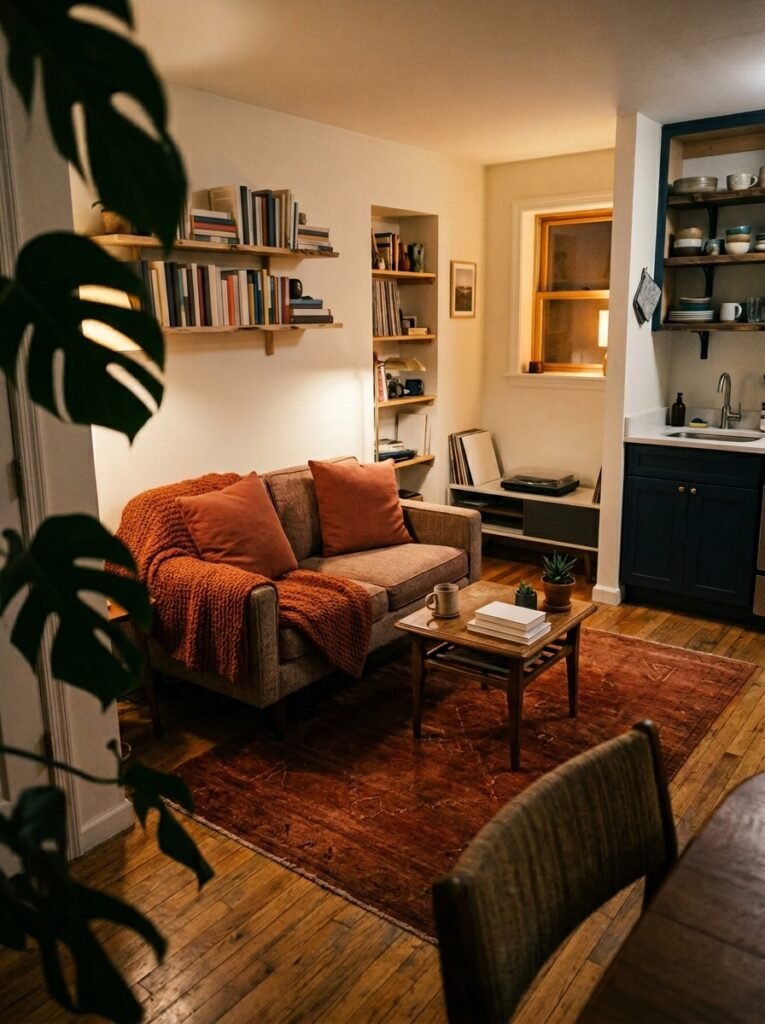
You walked into someone’s apartment and something just hit differently. The walls weren’t white. The sofa wasn’t grey. There was this deep, burnt, slightly unexpected shade of orange on a single armchair and suddenly the whole room had a personality you wanted to borrow.
That’s what orange does. And if you’ve been afraid to let it into your living room, this is your sign.
—
1. Why Orange Is the Color Having the Quietly Confident Moment Right Now
It’s not the orange of fast food signs or 80s wallpaper. Let’s get that out of the way immediately.
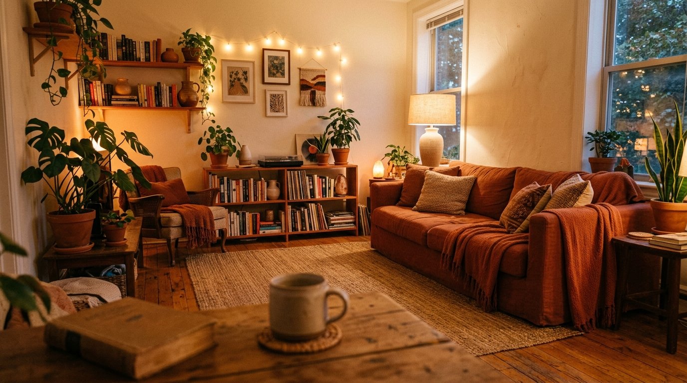
The orange that’s taking over Pinterest boards and design blogs right now is something richer. Deeper. More considered. Think burnt sienna. Terracotta that’s been left in the sun. The inside of a ripe persimmon. These are tones with warmth baked into them — the kind that make a room feel like it was designed by someone who actually lives there.
Designers have been whispering about this shift for a couple of years, but it’s fully arrived now. The exhaustion with greige — that flat, non-committal beige-grey that overtook every rental apartment and new build from 2015 to 2023 — is real. People want their homes to feel like something. Orange, in its earthier iterations, delivers that feeling without screaming. It sits quietly against natural linen, deep olive, and warm wood like it’s always belonged there. It plays beautifully with the resurgence of warm-toned maximalism and the continued popularity of earthy, nature-inspired palettes.
The best part about it for apartment dwellers? You don’t need to own the walls to use it. Orange works hard even when it’s not structural.
“The best orange living rooms don’t look designed. They look lived in — and completely intentional at the same time.”
2. The Terracotta Sofa Question — Is It Actually Livable?
Here’s the thing nobody tells you about a terracotta or burnt orange sofa: it goes with almost everything.
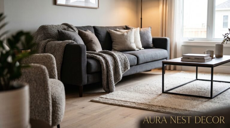
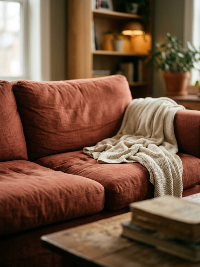
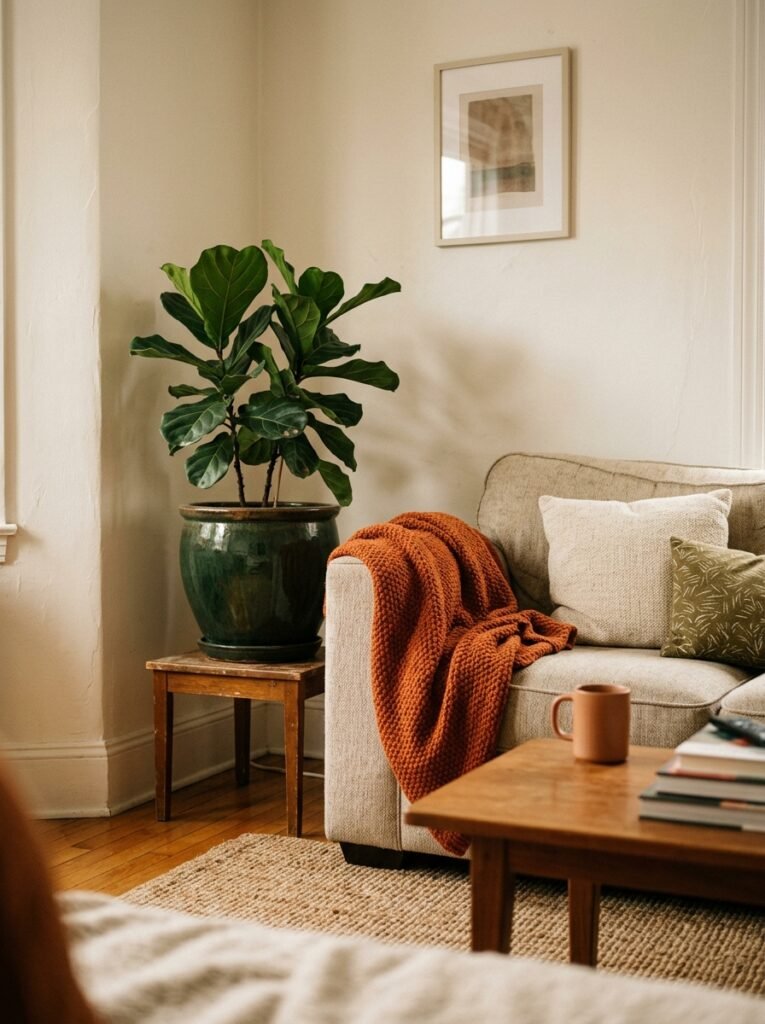
Seriously. Try it against white walls — stunning. Against a dark navy accent wall — dramatic and gorgeous. Against warm taupe plaster — that’s basically a hug you can sit on. The fear people have around a colored sofa is that it will date or that it will dominate the room. And look, a neon orange couch from a fast furniture store might do both of those things. But a properly toned, terracotta or rust-orange sofa in velvet, boucle, or textured linen? That’s a piece of furniture that earns its keep for years.
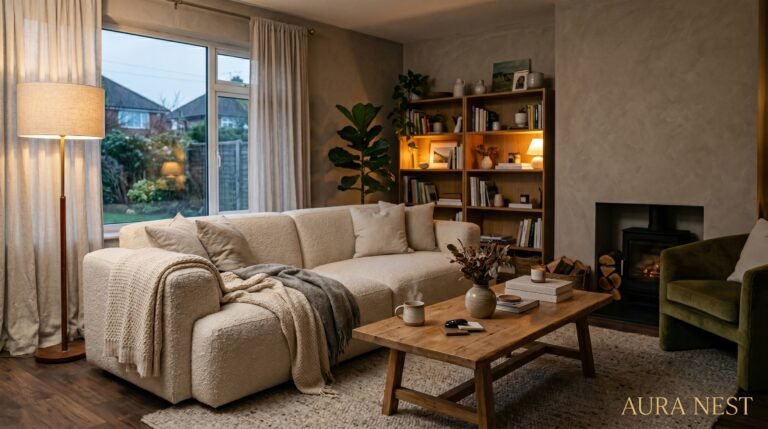
In smaller apartments — whether you’re in a one-bed in Hackney or a studio in Portland — the sofa is often the anchor of the entire living space. Choosing it thoughtfully changes the whole equation. A terracotta velvet sofa in an otherwise minimal room reads as art. You don’t need as many other things to make the space feel finished. One good throw in cream or olive, a jute rug, a single trailing plant, and you’re done. The sofa is doing the talking. Let it.
If a full sofa feels like too much commitment, consider a loveseat or a two-seater in a warm orange-adjacent tone. Same impact. Slightly less surface area.
3. The Accent Wall Argument — And Why One Orange Wall Changes Everything
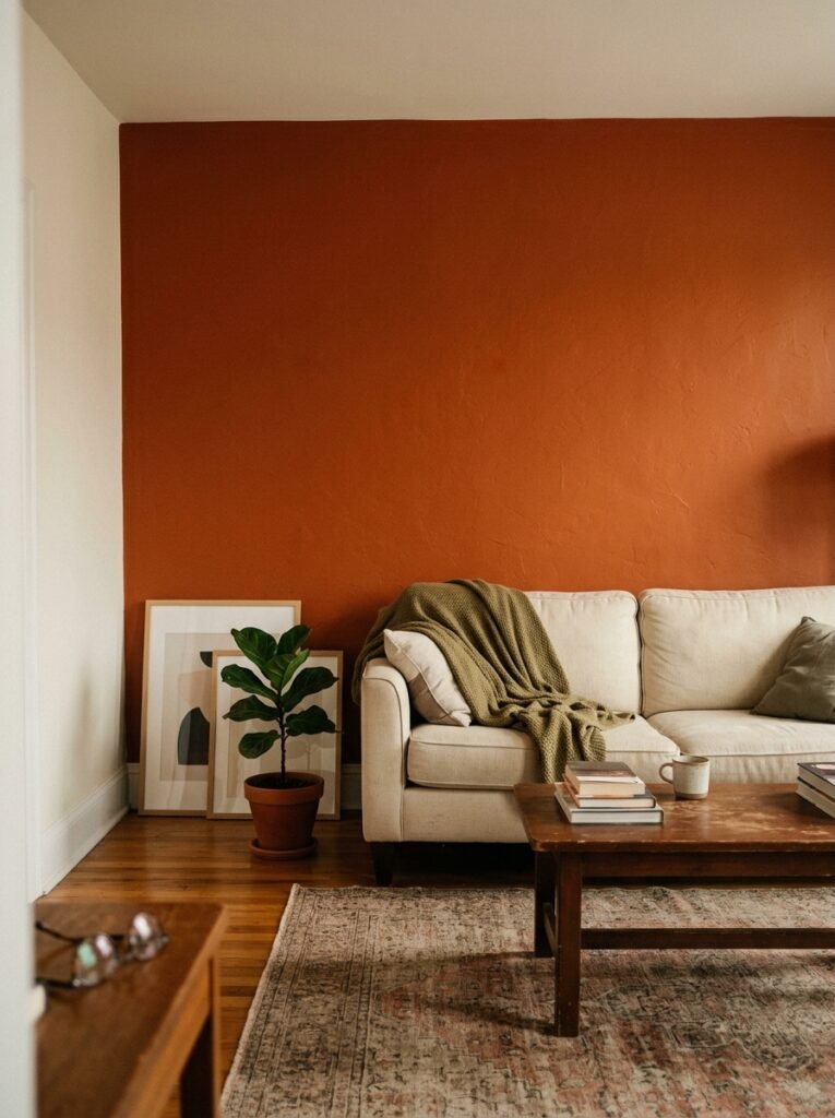
There is a very simple formula that works reliably, every single time.
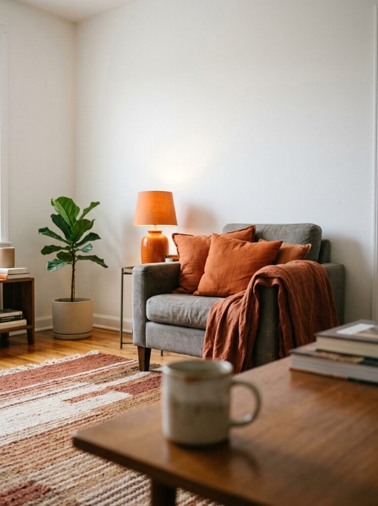
One wall. Deep orange or terracotta paint. Everything else stays neutral. Room transformed.
The mistake people make is going too bright. A saturated, high-visibility orange is a choice that requires enormous confidence and, frankly, the right light. Most apartments — especially north-facing London flats or rooms with small windows — will fight back against a very loud orange and the effect can tip from bold to claustrophobic. But a muted terracotta, a burnt adobe, a clay-toned matte paint? Those absorb light beautifully and create a kind of warmth that no amount of throw pillows on a white wall can manufacture.
Paint choices worth seeking out: terracotta-adjacent tones from Farrow & Ball, Benjamin Moore’s adobe and clay ranges, or even a well-chosen shade from your local DIY store’s own brand — the quality gap has genuinely narrowed. The finish matters too. Matte or eggshell on an accent wall reads warm and intentional. Gloss would be a mistake.
And if you can’t paint? Renters, hear me: peel-and-stick wallpaper panels, large-format art prints in warm terracotta tones clustered together, and fabric wall hangings can do almost the same work. You’d be surprised.
4. What to Do When Your Apartment Gets Zero Natural Light
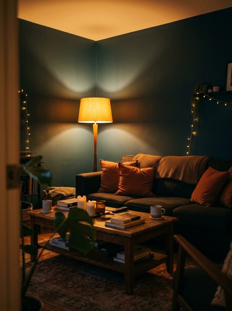
Orange and low light: it sounds like a risk, but stay with me.
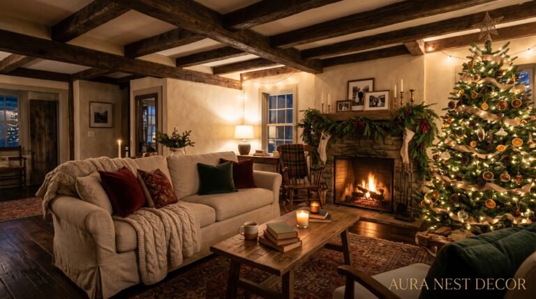
Cool colors in dark rooms make them feel like caves. Pale grey, icy blue, stark white — these can read beautifully in light-flooded spaces but in a north-facing apartment living room, they just amplify the gloom. Warm tones do the opposite. A burnt orange or deep amber in a low-light room actually adds the warmth the sun isn’t providing. The wall, the sofa, the cushion — it becomes your light source.
The amber glow of an Edison bulb at 7pm against a terracotta wall is one of the coziest things you can manufacture in a small apartment. Pair warm orange decor with warm white bulbs (2700K or lower), layered lighting — a floor lamp in one corner, a table lamp at eye level, candles if you can — and suddenly the lack of sunlight becomes a mood rather than a problem.
Mirrors help too. A large, round mirror in warm gold or brass, hung opposite even a modest window, bounces what light there is and adds depth. The orange tones catch it and glow.
“Dark apartments don’t need more light. They need warmer light — and orange is the shortcut no one talks about.”
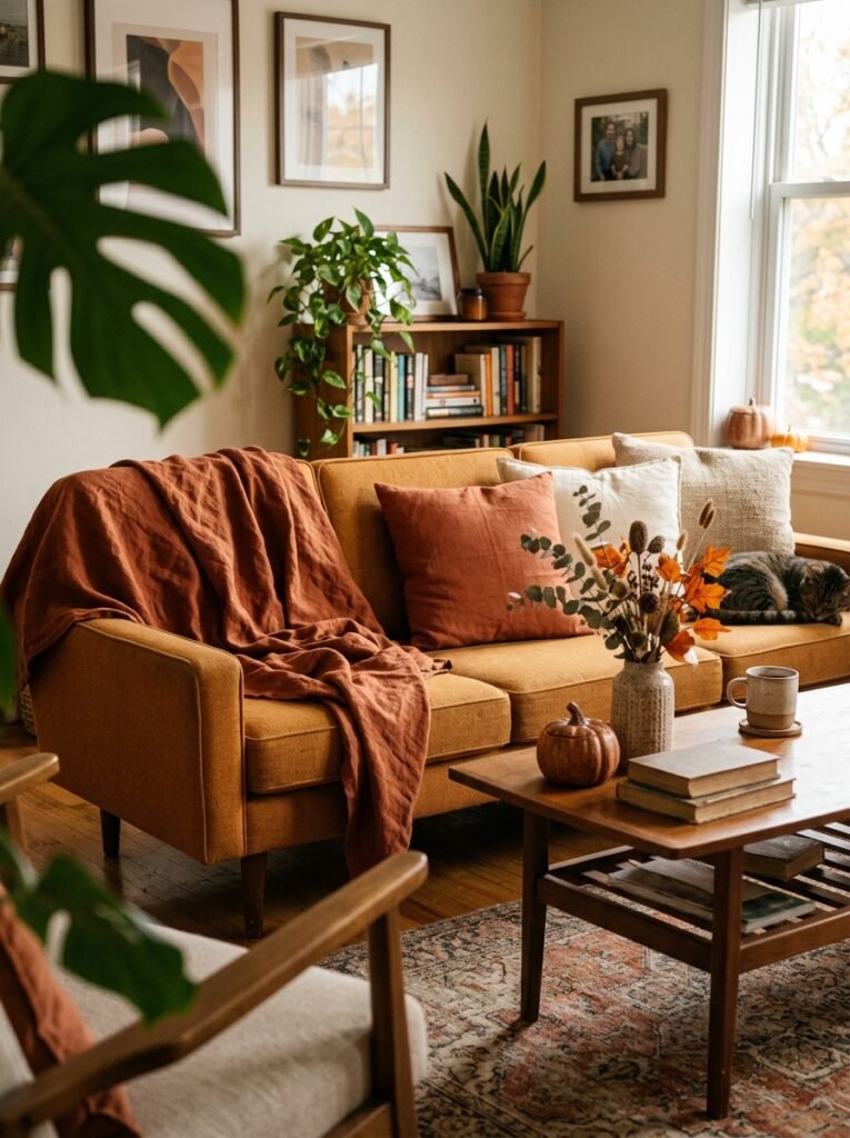
5. The Orange-and-Green Combination That Keeps Appearing in Every Beautiful Apartment Right Now
If orange is the color of the moment, olive green is its perfect partner.
There’s something about the pairing of burnt orange and muted olive that feels ancient and completely contemporary at the same time. It’s the palette of Mediterranean tiles, of autumn forests, of every perfectly curated flat lay on a design account you’ve saved twelve times. In practice: an orange sofa with olive green cushions. A terracotta accent wall with trailing pothos or a large fiddle leaf in a warm green pot. A warm orange rug with an olive linen chair.
These two colors share the same underlying warmth, which is why they never clash. Orange sits in the red-yellow family; olive sits in the yellow-green family. The yellow in both creates harmony. It’s that simple.
For apartments, this combination is especially useful because olive green reads as neutral in context. You can use it in large quantities — a full armchair, curtains, even a rug — without it feeling overwhelming, because it grounds the orange rather than competing with it. Add a touch of cream and natural wood and you have a complete palette that needs no further additions. Resist the urge to add more.
6. The Rug That Ties It All Together (And Why You’re Probably Thinking Too Small)
Rugs are underestimated. Not in principle — everyone knows they matter — but in practice, most people choose one that’s too small and too safe.
In an apartment living room, the rug is architecture. It defines the space. It tells the sofa and the coffee table where they belong. A rug that doesn’t extend past the furniture legs is doing nothing except getting in the way of vacuum cleaners.
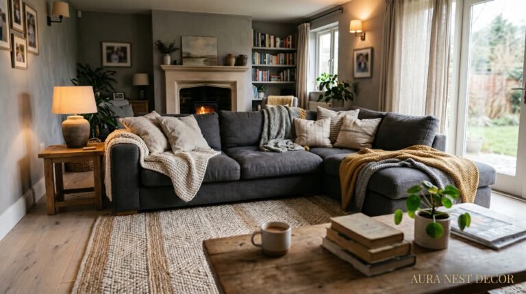
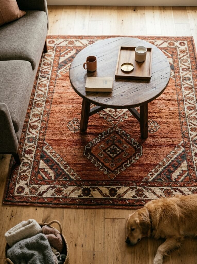
For an orange-toned living room, the rug options are genuinely exciting. A cream or natural jute rug grounds the orange without competing — safe choice, beautiful result. A Moroccan-style rug with orange, rust, and cream geometric patterns pulls the room into a collected, well-traveled aesthetic. A kilim in warm terracotta and navy makes the whole space feel like it was assembled over years, not an afternoon. A deep teal or forest green rug against an orange sofa is a combination that makes interior designers stop and take photos.
Go larger than you think you need. If you’re questioning between a 5×8 and an 8×10, get the 8×10.
7. How to Use Orange in a Rental Without Touching a Single Wall
The orange apartment dream is not exclusive to homeowners.
Renters have been quietly building some of the most creative, color-rich interiors precisely because they can’t touch the walls. Constraints breed creativity. Here’s what actually works.
Textiles first. A warm terracotta throw draped over a grey or neutral sofa is the single highest-impact, lowest-commitment change you can make in under five minutes. A set of burnt orange velvet cushions — two or three, not one lone cushion looking abandoned — instantly shifts the temperature of a room. Large floor cushions in warm orange tones add color at ground level, which is an unusual choice that always reads as intentional.
Large artwork in warm orange, amber, and rust tones creates the impression of an accent wall without any paint. Group three or four prints together — different sizes, same warm palette — and you’ve essentially hung an accent wall.
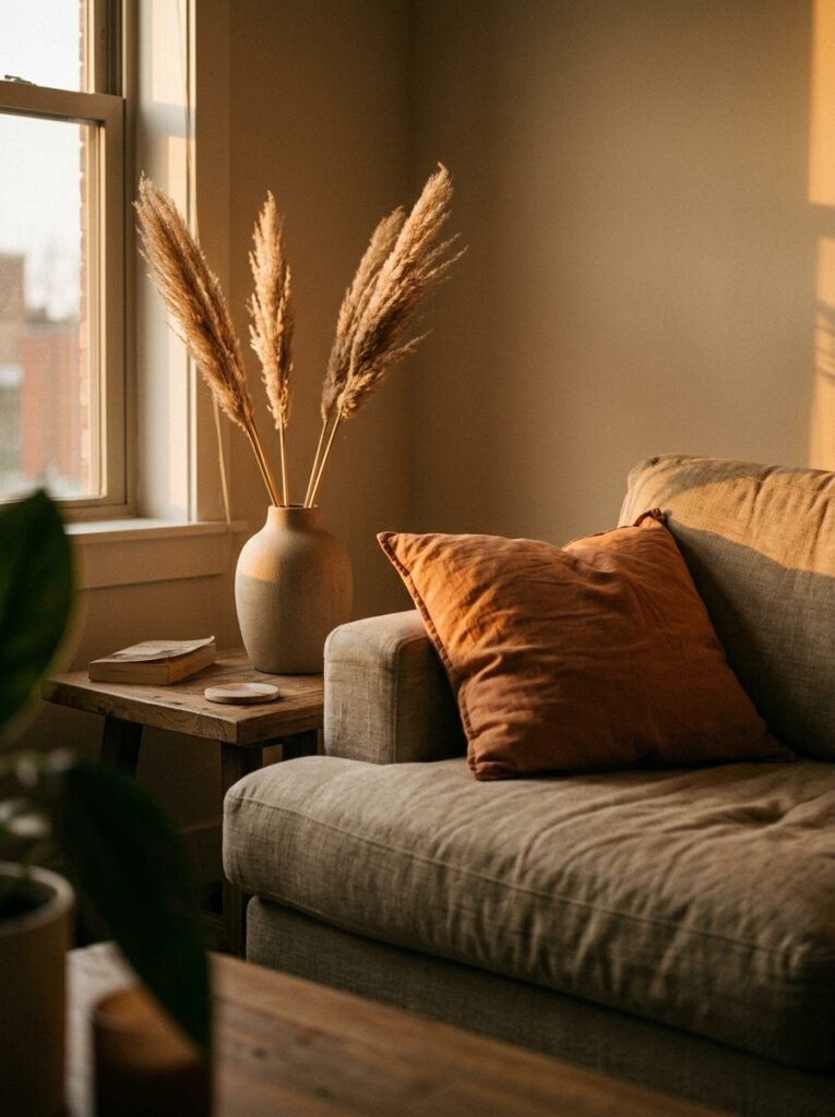
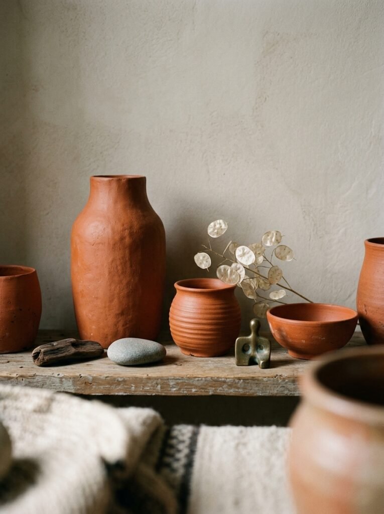
Orange ceramic vases, bowls, and candle holders on shelves and coffee tables add color in pockets, the way real rooms accumulate things over time. One large terracotta vase with dried pampas grass or a sculptural branch is doing the work of three smaller decorative objects.
“You don’t need to own your walls to own your room. Orange exists in fabric, ceramics, art, and light — and it travels.”
8. The Art of Mixing Orange With Other Colors Without Creating Chaos
Orange is bolder than beige and needs a little more thought to partner well. Here’s what works and what doesn’t.
Works beautifully: Cream and off-white (soft, timeless). Warm wood tones — pine, oak, walnut (natural grounding). Olive and sage green (see section 5). Navy blue (high contrast, dramatic, works especially in larger rooms). Warm brass and gold metal finishes. Rust and brown-adjacent tones for a tonal, earthy look.
Use with care: Cool grey (the clash is subtle but real — the orange will look muddy and the grey will look cold). Cool-toned white (similar problem — they fight each other). Bright yellow (too much warmth in a small space, can feel overwhelming). Bright red (too close on the color wheel, can read as aggressive).
The rule that holds in almost every situation: keep the orange warm, keep the accents warm, and let one or two neutrals breathe between them. The neutrals are doing the same job as silence in a good conversation — without them, everything is noise.
9. Orange in the Small Apartment Living Room — Under 400 Square Feet
Small rooms and color have a complicated reputation. “Use light colors to make a room feel bigger” is advice so widespread that it’s essentially become interior design law. But it isn’t law. It’s a guideline that suits certain aesthetics and certain people.
A small living room with warm orange tones, layered textiles, plants, and soft lighting doesn’t feel small. It feels intimate. There’s a difference. A room that feels intimate is a room people want to stay in. A room that’s been painted pale grey to feel “bigger” often just feels hollow.
In a small apartment space, edit ruthlessly. The orange makes a statement — let it. You don’t need six decorative objects on every surface. Choose three things you genuinely love and give them space to breathe. A terracotta sofa, a good rug, a plant, and warm lighting. That’s a room.
10. The Thing Nobody Says About Orange Decor: It Ages Like Leather
Here’s an observation that took me a while to articulate.
Orange and terracotta tones, in quality materials, tend to improve over time rather than date. A terracotta velvet cushion that’s been lived with for two years has a depth and softness that it didn’t have on day one. A burnished orange ceramic vase develops a character. Warm tones in natural materials — linen, jute, rattan, clay — belong to a color family that feels older than trend cycles.
Compare that to a room built entirely around a very specific contemporary aesthetic — the perfectly clinical grey and white with rose gold hardware, for instance. Give that five years. The specific-ness of it dates it precisely because it was so of-the-moment. Warmth, earthiness, and orange-adjacent tones have been part of human domestic life for centuries. Terracotta pots. Adobe walls. Ochre pigments. These aren’t trends. They’re the palette of homes made by people who had to work with what the earth gave them.
When you choose orange for your apartment, you’re borrowing from something that predates interior design as an industry.
11. The One Piece of Orange Decor That Always Looks Expensive
If you’re building slowly — one piece at a time, which is honestly the best approach — start with this.
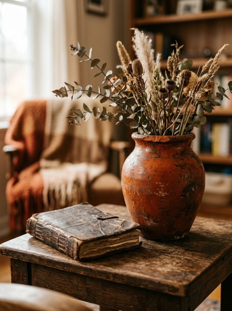
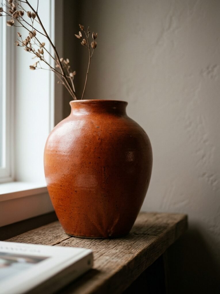
A large terracotta or burnt orange ceramic vase. Tall, simple, sculptural. No flowers required.
A good vase in this color, standing on the floor next to a sofa or on a console table or shelf, reads immediately as considered. It has weight. It has substance. It suggests that the person who lives there has taste rather than just a shopping habit. And unlike a throw pillow or a rug, a good ceramic holds its value aesthetically for years without wearing or washing or fading.
Pair it with a dried branch, a stem of dried eucalyptus, or nothing at all. The simplicity is the point. In a room that’s building a warm, orange-influenced palette, this piece anchors everything without demanding too much attention.
12. Building the Orange Living Room One Season at a Time
You don’t have to do this all at once. In fact, you probably shouldn’t.
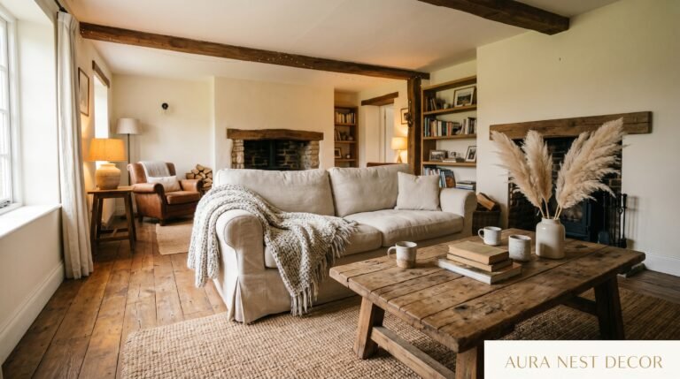
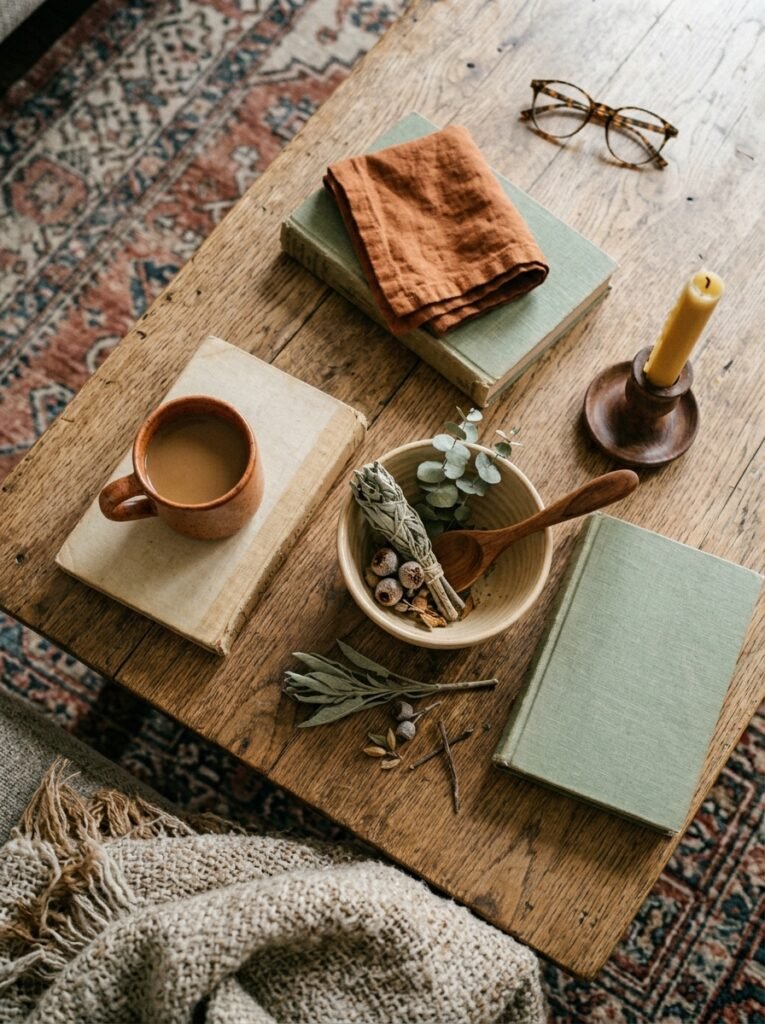
The homes that look the most beautiful and the most personal are almost never the result of a single shopping session. They’re built up over time — a rug found at a market, a cushion from a trip, a lamp that was a gift, a vase that caught the light in a shop window and came home in a tote bag. That accumulation is what gives a room its character.
With orange as your through-line, this process becomes surprisingly coherent. Start with one anchor piece — the rug, the sofa, or a statement ceramic. Then add textiles. Then lighting. Then art. Then plants. Let each addition settle before you add the next. Notice what the room needs rather than what the shopping cart suggests.
The orange living room you end up with will be yours in a way that a room assembled in a weekend from a single store never quite can be.
—
🌿 Quick Tips
The peel-and-stick terracotta wallpaper panels have gotten genuinely good — if you rent, they’re worth every penny and leave no trace when you leave.
Burnt orange and warm brass is the combination that keeps working regardless of what else changes around it. Swap out one set of drawer handles or a lamp base and watch the whole room shift.
Don’t mix too many orange tones in a small space — choose one hero shade and let the others come through in texture rather than introducing a completely different hue.
If you’re nervous, cushions first. You can return cushions. You can’t unlearn a bad paint choice at midnight.
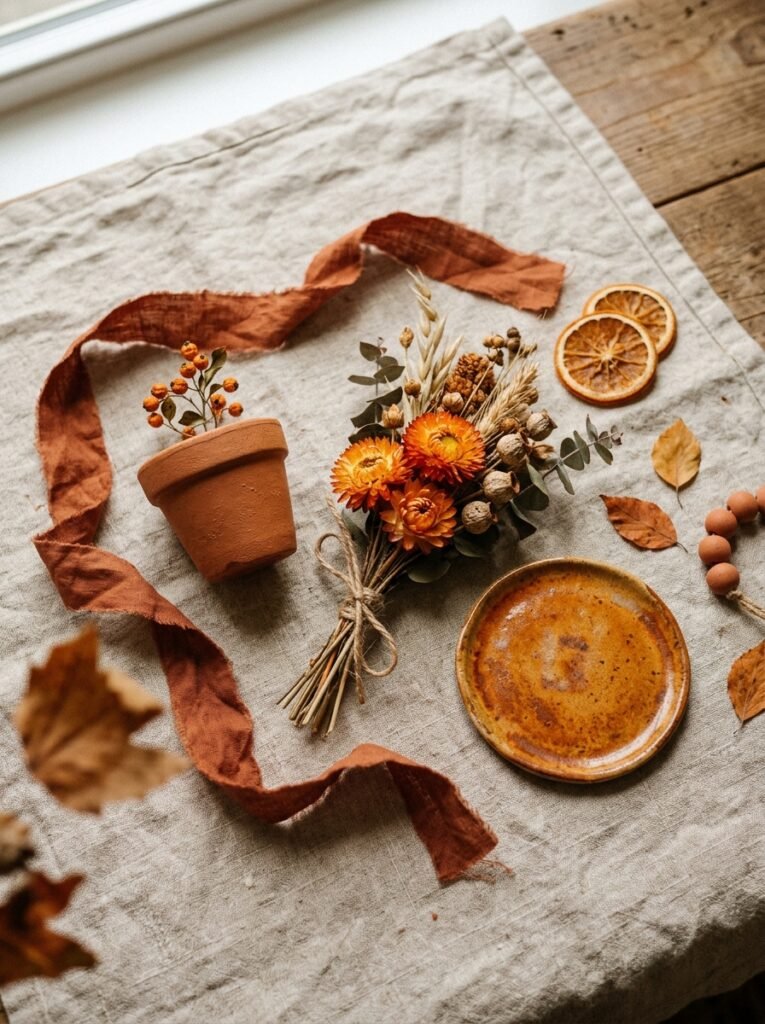
Dried flowers and grasses — pampas, wheat, lunaria — in a terracotta pot cost almost nothing and contribute enormously to the warm, collected feeling of an orange-palette room.
—
❓ FAQ
Q: Will an orange living room make my apartment feel smaller? A: Not if you use warm, muted tones rather than bright, saturated orange. Burnt terracotta and clay tones create intimacy rather than claustrophobia. Balance them with natural materials like jute, linen, and wood, and keep the furniture edited and low-profile. The room will feel warm and intentional, not cramped.
Q: What colors go with orange in a living room without clashing? A: Cream, warm white, olive green, navy blue, warm wood tones, and brass or gold metals all work beautifully. Avoid cool greys and icy whites — they fight with orange’s warmth and leave both colors looking worse. Earthy, warm, nature-derived palettes are orange’s natural home.
Q: Can I use orange in a north-facing apartment room that doesn’t get much light? A: Orange is actually one of the best choices for low-light rooms. Warm terracotta tones generate their own warmth visually, while cool colors in dark rooms amplify gloom. Pair warm orange decor with warm white bulbs (2700K or lower) and layered lighting for an effect that feels intentional rather than compensatory.
—
💭 Final Thought
Orange, in the right form, doesn’t shout. It settles. It wraps a room around you like the last hour of an October afternoon, that specific time when the light comes through the window sideways and makes everything look like it was worth keeping.
Your apartment doesn’t have to be beige because that’s what was already there when you moved in.
What would your living room feel like if you let one thing in it be brave?