Why Grey, Black, and White Living Rooms Look Even Better When You Break the Rules a Little
You’ve pinned a hundred grey living rooms and none of them quite look like yours in your head. That’s the thing about this palette — it sounds simple, even boring, until you walk into a room that nails it and suddenly you can’t stop staring. This is how you build one of those rooms.
—
1. The Reason Grey Living Rooms Feel Flat (And How to Fix It Before You Buy a Single Thing)
Here’s what nobody tells you upfront: grey isn’t one color. It’s fifty. And the reason so many grey rooms look cold, lifeless, or somehow sad isn’t the grey itself — it’s picking greys that don’t talk to each other.
Warm grey and cool grey in the same room will quietly fight each other and you won’t be able to name what’s wrong, you’ll just feel vaguely unsettled. Like something’s off but you can’t put your finger on it.
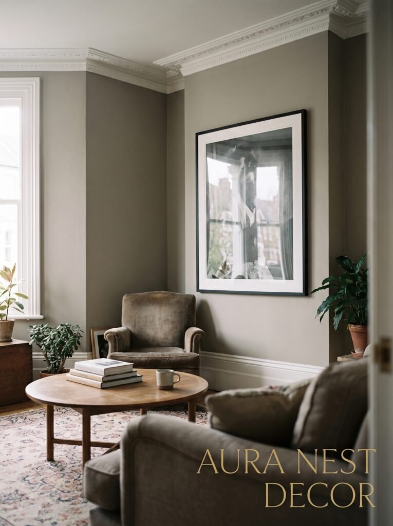
So before anything else, decide which direction you’re going. Warm greys lean toward putty, taupe, greige — they’ve got a little yellow or brown underneath. Cool greys lean blue, green, sometimes almost lavender. Neither is wrong, but you’ve got to pick a lane.
The black and white elements you add later will anchor everything — and that’s actually where this palette gets interesting, because black and white are neutral in theory but they carry enormous visual weight in practice. A single black frame on a white wall. A dark throw on a light sofa. These aren’t decorating accidents. They’re decisions.
Once you’ve settled on warm or cool, the room starts to make sense. And then the fun actually begins.
“Pick your grey like you’re picking a mood for the whole room — because honestly, you are.”
—
2. The Sofa Decision That Makes or Breaks the Whole Room
Let’s talk about the sofa, because it’s the biggest commitment in here and people get it wrong in a really specific way.
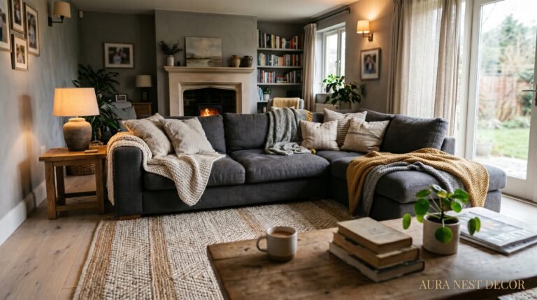
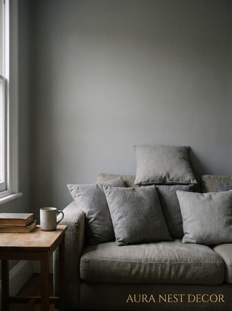
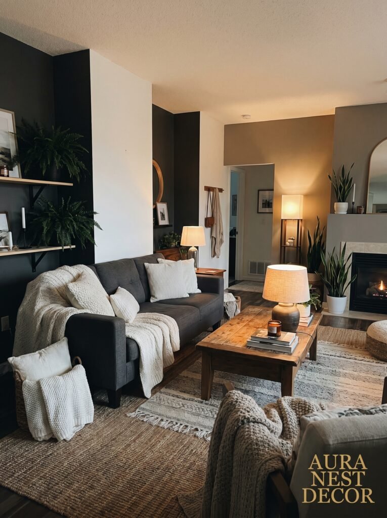
They go grey sofa, grey walls, and then wonder why the room feels like a waiting room at a dentist’s office. Don’t do that. If your walls are going grey, your sofa should go darker or lighter — not the same. That contrast is what stops everything from blurring together.
A deep charcoal sofa against pale grey walls is genuinely beautiful. So is a pale, almost-white linen sofa against a dramatic dark grey wall. What doesn’t work is a medium grey sofa against medium grey walls. It just disappears.
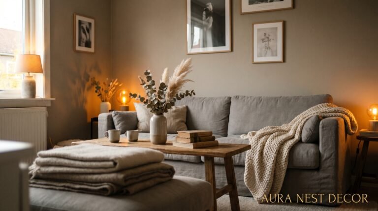
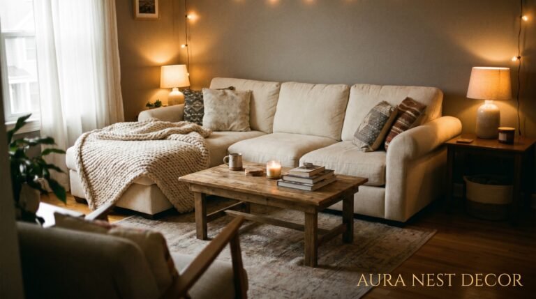
White sofas scare people and honestly, I get it. But a cream or off-white sofa in a grey room does something almost magical with the light. It bounces it. The room feels airier even if nothing else changes.
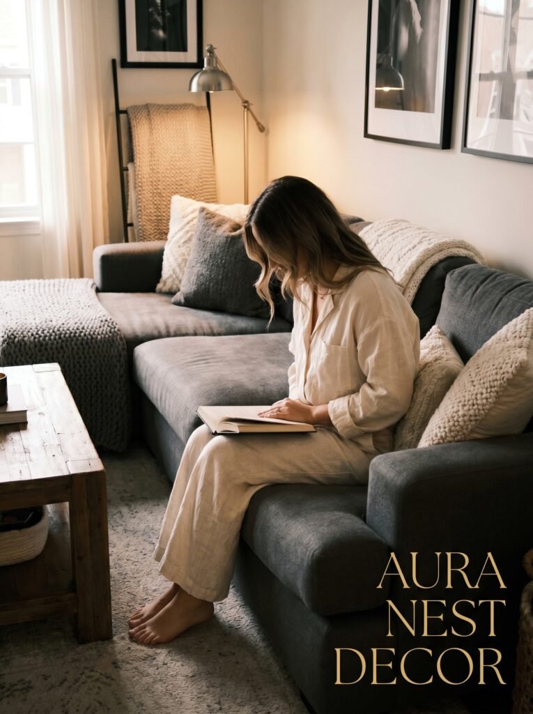
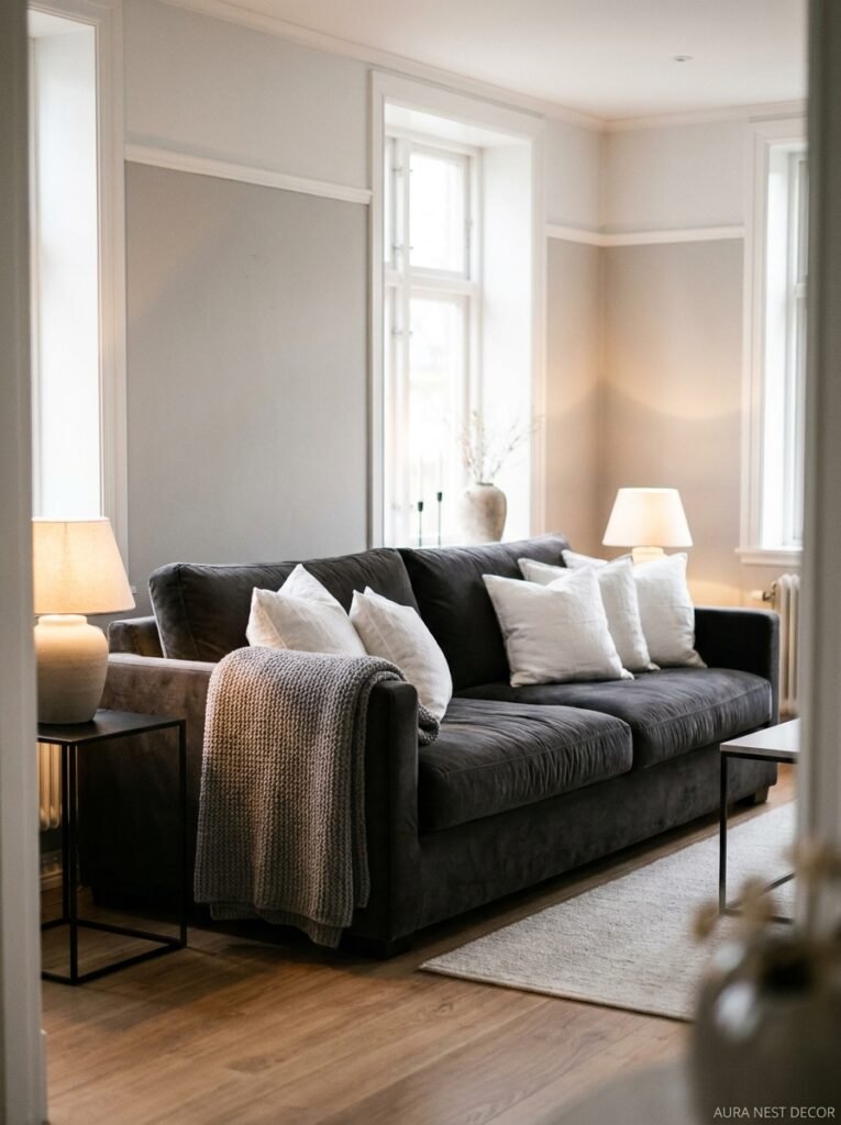
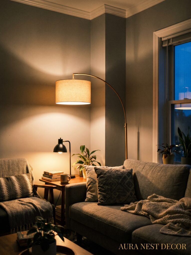
Black sofa, meanwhile — bold. It grounds the whole thing. It reads more editorial, more considered. If you go black sofa, you need softness EVERYWHERE else. Chunky cream knit throw. Natural wood coffee table. Lots of texture. Otherwise it tips into cold.
—
3. The Wall Color That Actually Works in Both US and UK Homes (Even the Awkward-Shaped Ones)
Okay so this is where I have opinions.
Farrow & Ball’s Purbeck Stone is doing a lot of heavy lifting in British homes right now and honestly it deserves every bit of praise it gets — it’s that elusive warm-grey-without-being-beige. For American homes with different light (especially if you’re in a sunnier southern state), Sherwin-Williams Agreeable Gray has been a go-to for years and there’s a reason it keeps winning. Warm, soft, works with almost everything.
But here’s what I think gets overlooked: the ceiling.
Most people paint it white and move on. Fine. Normal. But a ceiling painted the same grey as the walls, just one or two shades lighter, does something to a room’s proportions that feels almost architectural. The room feels taller and more finished at the same time, which sounds impossible but isn’t.
Try it in a smaller room first if you’re nervous. A grey ceiling in a reading nook or a home office is low-risk and usually instantly converts skeptics.
Dark walls — near-black, deep charcoal — work particularly well in rooms that don’t get a ton of natural light, which feels counterintuitive. But a dark room painted a dark color feels intentional and cozy rather than just dim and depressing. The key is lighting, which we’ll get to.
—
4. What to Put on the Floors (And Why Beige Rugs Are the Enemy)
Beige rugs in a grey room. I see it all the time. Please stop.
Beige pulls the warm undertone out of everything around it and makes grey look sad and dingy rather than cool and collected. If you want warmth in your rug, go proper warm — a rust-brown, a deep terracotta, an actual caramel. That contrast works because it’s contrast, not an accidental almost-match.
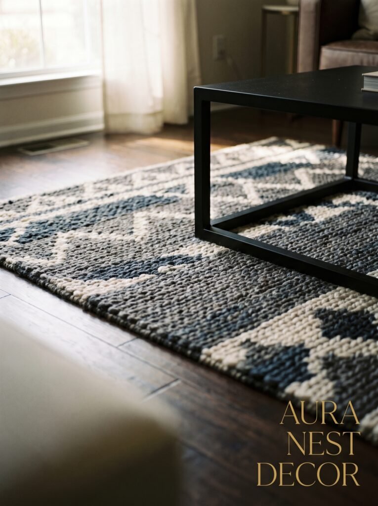
For a grey, black, and white room specifically, a rug with some black in it is an absolute anchor. Even just a dark geometric print, a black-and-white stripe, a charcoal abstract. It ties the floor into the whole scheme without you having to think too hard about it.
Natural fiber rugs — jute, sisal, seagrass — do well here too because they bring in texture and that slightly organic feeling that keeps the room from feeling too rigid. A black-and-white palette can look a bit severe if everything is smooth and hard-edged, and a jute rug quietly fixes that without demanding any attention.
For hardwood floors: darker stains play beautifully into a grey room. Lighter blonde wood works too but needs more black elsewhere to keep things anchored. And if you’ve got carpet — grey carpet under a grey room — same issue as the sofa problem. Create contrast.
“A rug in this palette isn’t background noise. It’s the sentence that ties the whole paragraph together.”
—
5. Lighting That Makes Grey Feel Warm Instead of Clinical
This is possibly the most important thing I’ll say in this entire article.
Grey rooms live or die by their lighting. And I don’t mean just “get some lamps.” I mean — think about what your room looks like at 6pm in November. That’s when you’ll know if you’ve done it right.
Overhead lighting in a grey room often looks terrible. That flat, slightly harsh glow from a ceiling fixture makes grey walls look blue and cold and wrong. The fix is layers — and you want light coming from multiple points at multiple heights.
Floor lamps in corners. Table lamps on side tables. A pendant over a reading chair. Even candles, if you’re the sort of person who actually lights them (I aspire to be). The warm amber of Edison bulbs specifically — not the cool white ones — does something almost alchemical to a grey room at dusk. The walls look warmer, the textures show up better, the whole thing feels like a room you want to be in.
Dimmer switches. Get them. Worth every penny and whatever minor hassle the installation involves.
In the US and UK both, natural light varies enormously by room orientation. North-facing rooms in the UK can be brutal — they need all the warm-toned lighting help they can get. South-facing rooms in the American South can be so bright that cool greys suddenly work perfectly. Pay attention to your specific room’s light before you commit to paint.
—
6. The Texture Rule That Nobody Actually Follows (But Should)
All grey, black, and white, and nothing happening on the walls — that’s where rooms die.
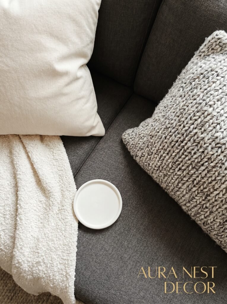
Texture is how this palette breathes. And I don’t mean a single chunky knit pillow. I mean intentional layering of different surfaces so your eye keeps finding something interesting no matter where it lands.
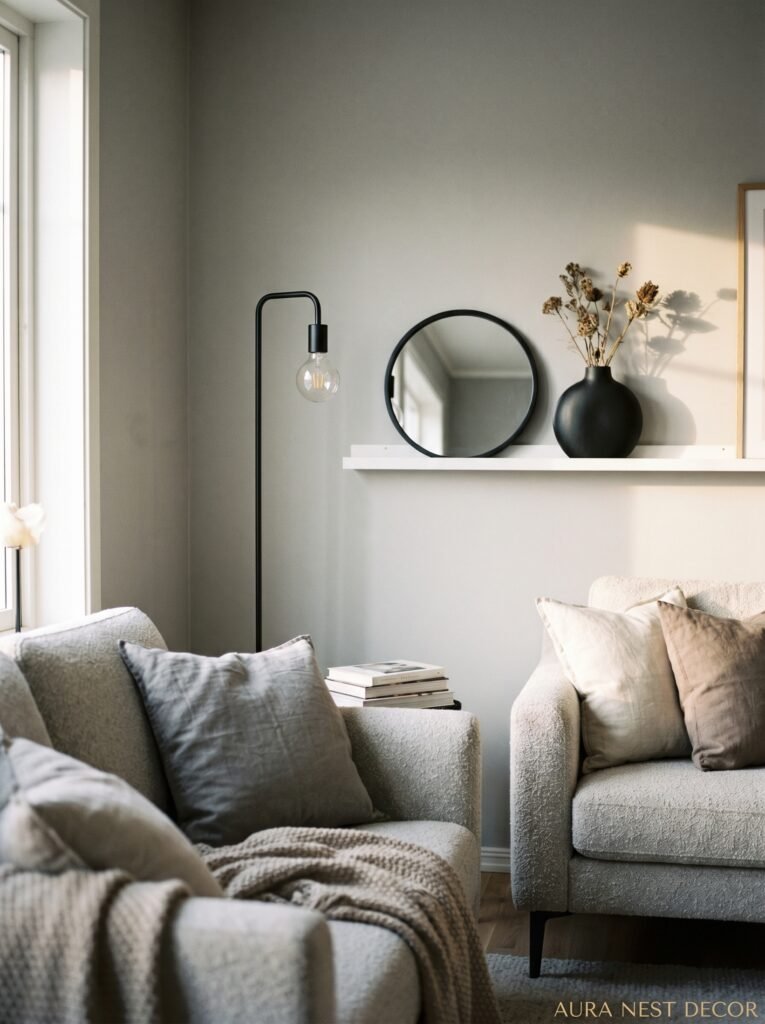
A linen sofa. A velvet pillow. A wool throw. A smooth marble tray on a rough wood coffee table. A rattan basket next to a sleek black side table. These combinations work because they’re creating visual contrast through texture the same way you’re creating it through color.
Walls, too. A textured plaster finish in grey reads completely differently than a flat-painted grey wall. Limewash paint is having an enormous moment right now and in a grey palette it’s stunning — that slightly chalky, uneven finish gives the wall actual depth and movement, especially in changing light.
Don’t forget metal. Brushed steel, matte black fixtures, antique bronze — metals in this palette add glamour without shouting. A matte black picture frame. A brushed silver vase. Small things. Big difference.
—
7. How to Add Black Without the Room Looking Like a Gothification Project
Black is intimidating. People want to use it, then they chicken out and end up with maybe one candle holder and it just looks random.
But black in a grey and white room isn’t gothic and it isn’t cold if you use it intentionally. Think of it as the punctuation. It’s the thing that tells your eye where to stop, what to pay attention to.
Black picture frames clustered on a gallery wall. A black console table. Black window frames — if you’re in a position to choose or replace them — are absolutely stunning in a white or grey room, both in traditional UK terrace houses and in more modern American open-plan spaces.
Matte black hardware on kitchen cabinets visible from the living room. A single black-painted wall in an alcove. A black ceramic lamp base.
The trick is using it in at least three places so it feels like a choice, not an accident. One black element reads as something that was just there. Three reads as a palette decision. And there’s a huge perceptual difference between the two even if you can’t quite articulate why.
“Black isn’t harsh in a grey room. It’s the thing that makes everything else make sense.”
—
8. White Isn’t Neutral Here — It’s Doing the Most Work of All Three Colors
White in a grey and black room is the relief. It’s the exhale. And when there’s not enough of it, rooms start to feel heavy even if the grey is light.
Think about where your white comes from. Trim. Ceiling. Pillows. Lampshades. White candles in black holders (beautiful, by the way). A white marble fireplace surround — genuinely stunning in a dark grey room, it just pops.
But — and this matters — not all whites work here either. A stark, cold bright white next to a warm grey looks wrong in exactly the same way mismatched greys do. If you’re going warm grey, go warm white — something slightly creamy, slightly off. Benjamin Moore White Dove is the American answer. In the UK, Farrow & Ball All White or Strong White does this beautifully.
White art is also underrated. Black frame, white abstract print or line drawing. Incredibly chic and costs almost nothing if you’re sourcing digitally.
—
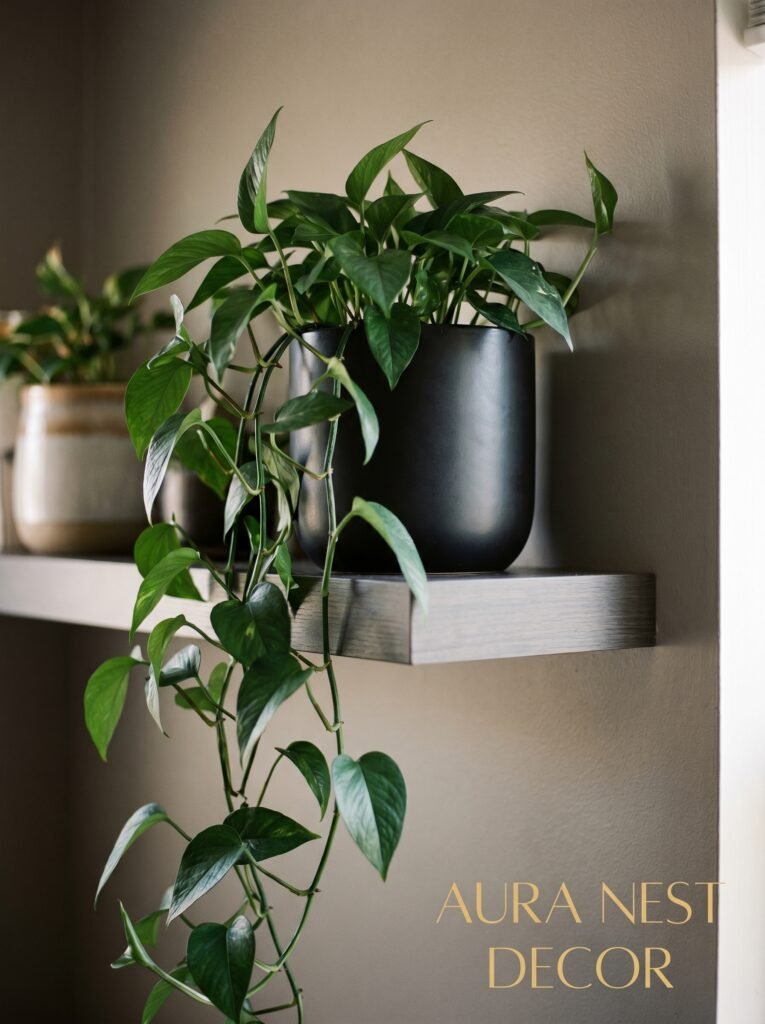
9. The Plants-and-Grey Situation (Yes, There’s a Right Answer)
Not all plants belong in a grey room. I know that sounds fussy but stay with me.
Big, floppy, vibrantly green tropical plants can look slightly wrong in a tight monochrome palette — the green reads too warm, too lush, and creates a color competition rather than a complement.
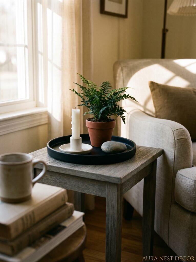
What works brilliantly? Dark, dramatic plants. A fiddle leaf fig with its deep structured leaves. A snake plant with its sharp, vertical presence. Eucalyptus — dried or fresh — in a black or concrete pot. Olive trees, if you’ve got the light for them, are extraordinary in grey rooms. That silvery-green tone is perfect.
Dried pampas grass in a black vase. A cactus in a white ceramic pot. Anything with structure and relative calm rather than wild tropical abundance.
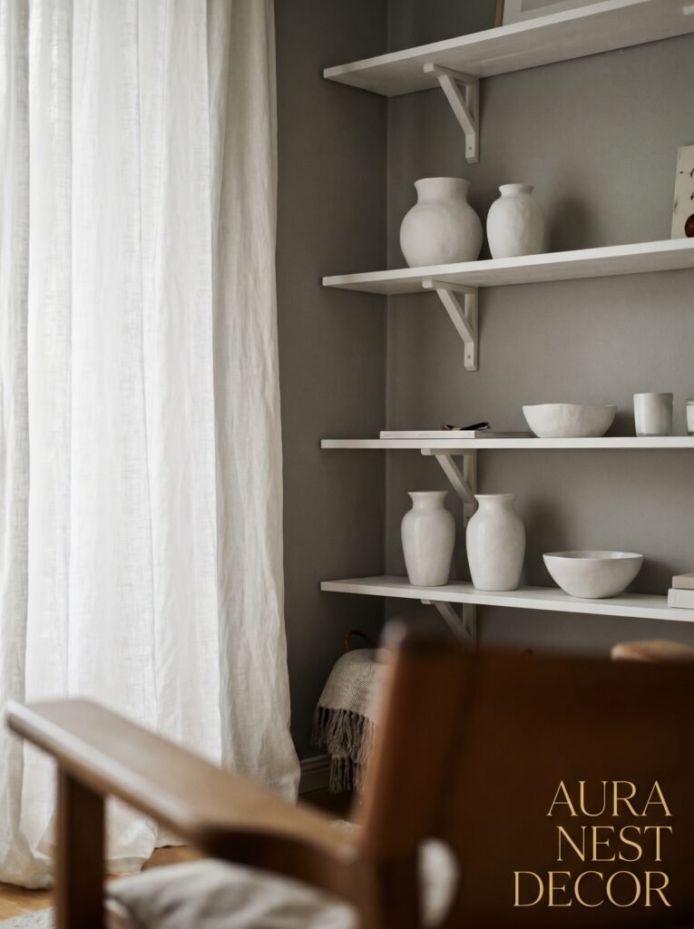
The containers matter as much as the plants. Concrete pots. Matte black ceramic. White ribbed terracotta. These are the right homes for plants in this palette.
—
10. How a Fireplace Changes Everything About This Palette
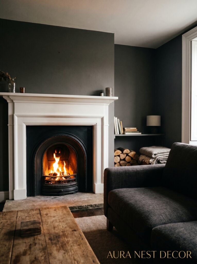
If you have a fireplace — gas, wood-burning, electric, doesn’t matter — it becomes the natural focal point and grey wraps around it in the most beautiful way.
Paint the chimney breast a shade darker than the walls and suddenly you’ve got depth and architecture even if the house is completely standard. A white or marble fireplace surround against a dark grey wall is a classic for a reason. And the flicker of actual fire — or a good electric flame — is the warmest, most flattering light source a grey room can have.
If you don’t have a fireplace, by the way, fake focal points work. A console table with a large mirror above it, framed heavily in black. A floor-to-ceiling gallery wall. A painted arch on a wall in a deeper grey. These give the room a place to land.
—
11. The Little Details That Separate Pinterest-Worthy From Just Fine
Coffee table books with black or white covers, stacked casually. A single oversized candle in a concrete holder. A thin-stemmed glass vase. A grey linen curtain with just enough pooling on the floor to look effortless.
Side note — curtains get undersized constantly. They should be wide enough to cover well past the window frame and long enough to touch or nearly touch the floor. A curtain that just skims the window itself makes ceilings look low and rooms look unfinished, regardless of palette.
Black cabinet hardware. A sheepskin rug draped over a grey sofa arm. An art print leaned against the wall instead of hung — very casual, very Pinterest, and somehow looks more intentional than a nail in the wrong spot.
None of these are expensive. Most of them are almost free if you’ve already got things around the house that fit.
—
12. The Version of This Room That Actually Feels Cozy (Not Like a Design Hotel)
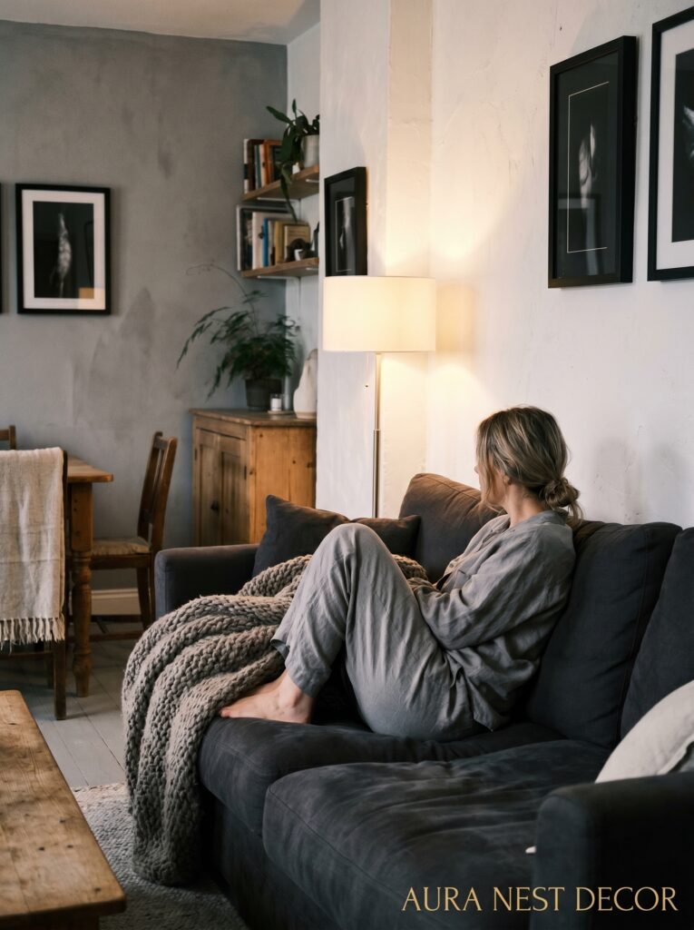
Here’s the thing. Grey, black, and white CAN look cold. It CAN look like a showroom. If that’s your fear, here’s specifically how you warm it up.
Layers. More than you think you need. Three pillows on a two-seater. Two throws draped differently. A pouf on the floor near the sofa. A tray of gathered things — candles, a small book, a sprig of something dried — on the coffee table.
Wood tones. Even in a strict monochrome palette, natural wood warms everything. A honey-toned wood coffee table, some floating shelves, a side table in oak — these don’t break the palette, they just stop it from feeling sterile.
And honestly? The things that live in the room. A well-read novel left open on the sofa arm. A half-burned candle. A blanket that’s actually been used. Perfection is what makes rooms feel cold, not the color palette. Let it be a little lived in.
That’s when grey stops being a color scheme and starts being a feeling.
—
❓ FAQ
Q: Will a grey, black, and white living room feel too cold and clinical? A: Only if you skip texture and warm lighting — those two things are what make the difference between cozy and sterile. Layer different fabrics, use warm-toned bulbs, and add natural wood elements and you won’t have a cold room, you’ll have a beautiful one.
Q: What accent colors work with grey, black, and white without ruining the palette? A: Warm metallics like brass and bronze add warmth without introducing a full accent color. If you do want a pop of actual color, dusty blush, rust, or a muted sage green all complement this palette without competing with it — just keep the accent small and deliberate.
Q: Is this palette hard to keep looking clean? A: White elements show dust and dark elements show pet hair, so there’s some maintenance involved — but practically speaking it’s not dramatically harder than any other palette. A lint roller near the sofa and a weekly wipe of light surfaces keeps it looking sharp.
—
💭 Final Thoughts
Grey rooms done well are genuinely some of the most satisfying rooms to be in — there’s a reason this palette keeps coming back. It’s calm without being boring, and it rewards the small details in a way that busier color schemes often don’t. The textures show up, the light matters, the little objects on your coffee table actually get noticed.
Don’t rush it. Build it slowly, one good piece at a time, and let the room tell you what it needs next.
What’s the one thing in your living room right now that you think might be fighting the rest of the space?