Why Grey Living Rooms Feel Like a Hug (and How to Actually Pull It Off)
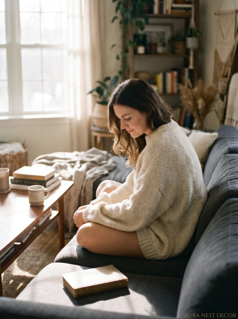
You walk into a grey living room that’s done right and you immediately want to sit down. Not stand there admiring it — actually sit down, tuck your feet under you, and stay. That’s the goal. That’s what this is about.
—
1. The Grey That Feels Warm vs. The Grey That Feels Like a Hospital
This is where most people go wrong. And honestly, it’s an easy mistake to make because grey looks so different on a paint swatch than it does on a wall with your actual lighting and your actual furniture sitting in front of it.
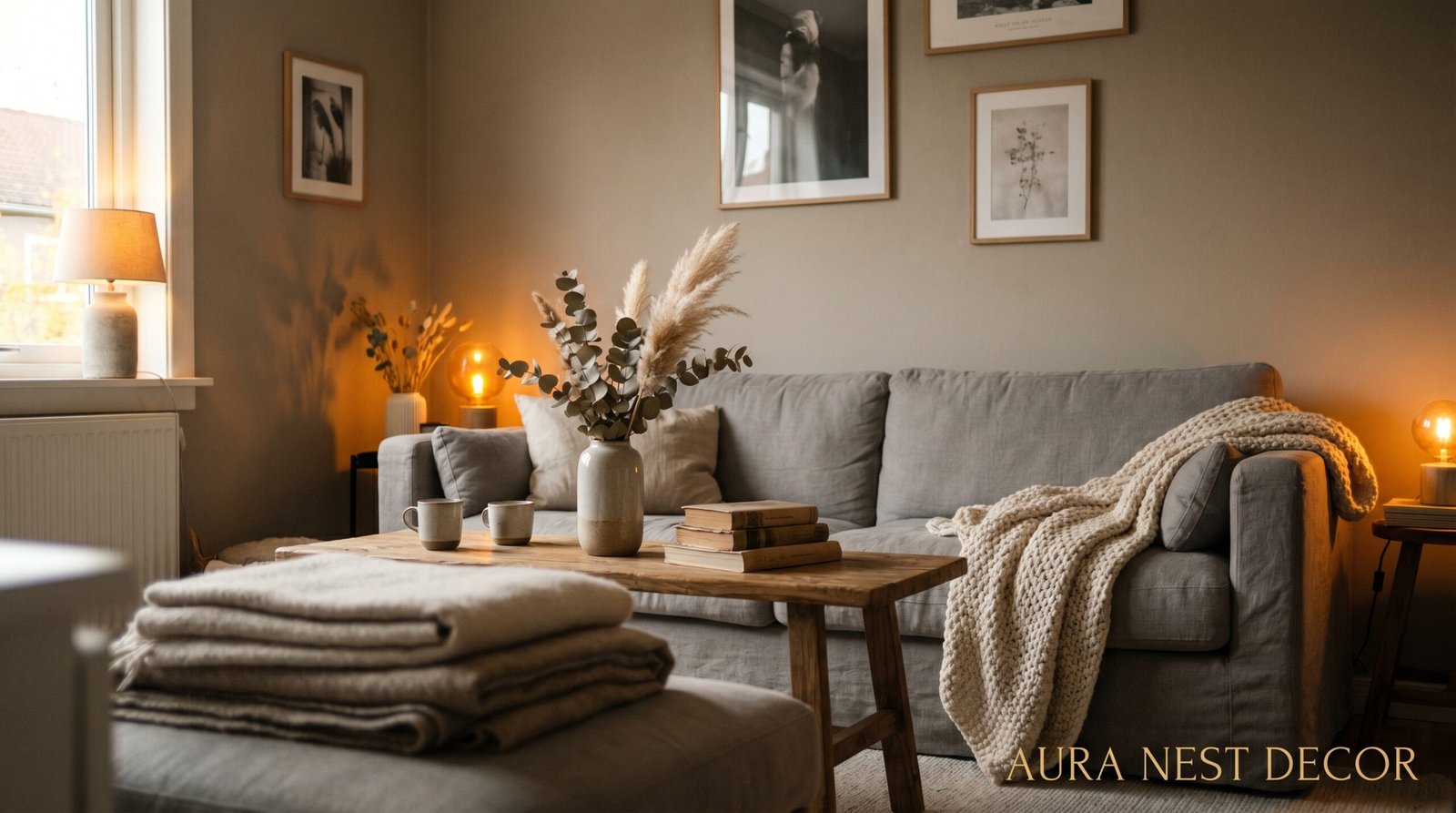
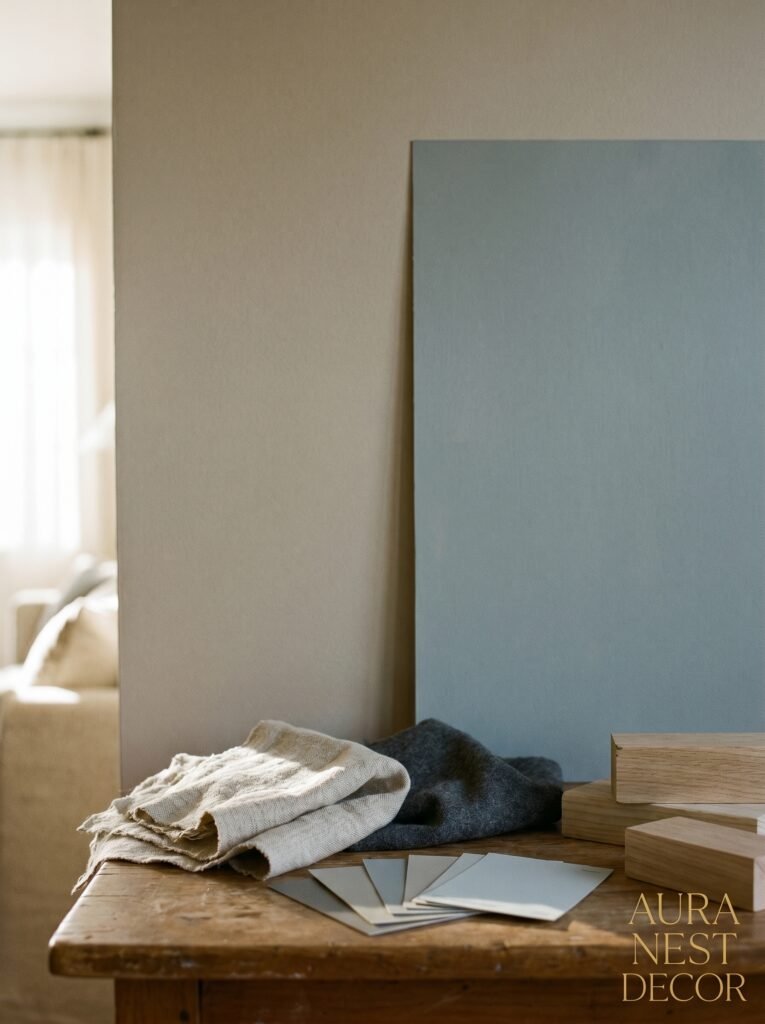
Warm greys have undertones — taupe, beige, even a whisper of blush or green. Think Benjamin Moore’s Revere Pewter or Farrow & Ball’s Elephant’s Breath (which is honestly the best paint name ever invented). These are the greys that catch lamplight in the evening and look almost golden. They breathe.
Cold greys have blue or purple undertones, and they can be stunning — but they’re unforgiving. In a north-facing room with limited natural light? They’ll feel like February in the worst possible way. If you’re working with a room that doesn’t get great light, you REALLY want to lean warm.
The test I always tell people: grab a white piece of paper and hold it against your paint sample on the wall. The grey will either look warm or cool by comparison, and you’ll see it immediately. Side note — do this at different times of day. Morning light versus evening light will show you two different rooms entirely.
And don’t skip the undertone check on your furniture either. A warm greige sofa against a cool blue-grey wall creates this weird tension that nobody can quite put their finger on but everyone feels. Everything just looks slightly off.
—
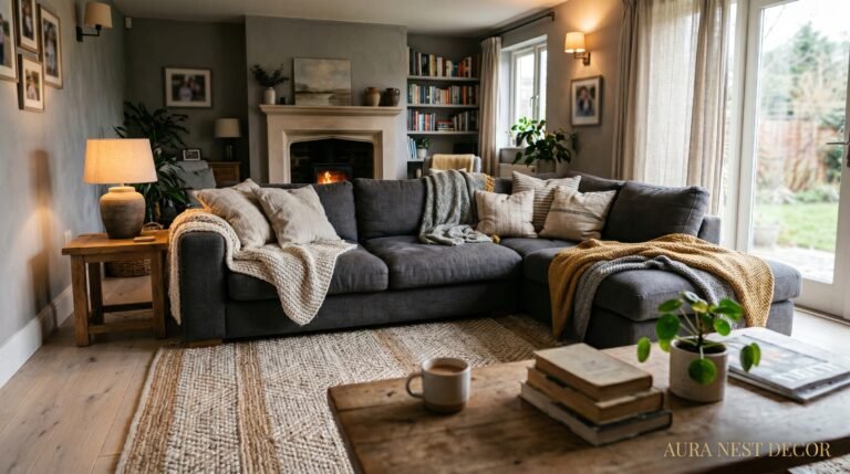
2. The Sofa Situation — Why “Grey on Grey” Is More Complicated Than It Sounds
Here’s something people don’t think about enough. A grey sofa in a grey room isn’t automatically cohesive. Done lazily, it reads as flat. Done with intention, it can be incredibly sophisticated — but you have to work for it.
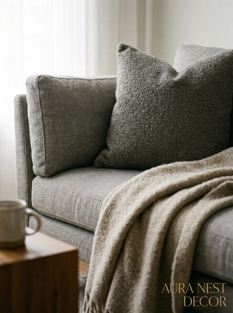
The trick is contrast in texture, not color. A chunky knit throw over a smooth linen sofa. A velvet cushion against a cotton slipcover. The room needs layers of tactile variety to stop the eye getting bored, because when everything’s the same color, the texture becomes the visual information.
My personal opinion? If you’ve got a grey sofa, go slightly darker or lighter with the walls — don’t match them. A charcoal sofa against pale dove grey walls? Gorgeous. A mid-tone sofa against mid-tone walls? Muddy. Not in a good way.
Also worth saying: grey sofas attract lint like nothing else. Light grey especially. If you’ve got pets or kids (or honestly, if you just exist), look at a mid-tone grey like a warm stone or a French grey rather than light silver. You’ll thank me in about two weeks.
For UK readers — the classic British “dull grey” sofa against magnolia walls era needs to officially be over. Please. We can do so much better.
—
3. The Colour That Keeps Showing Up in Every Beautiful Grey Living Room Right Now
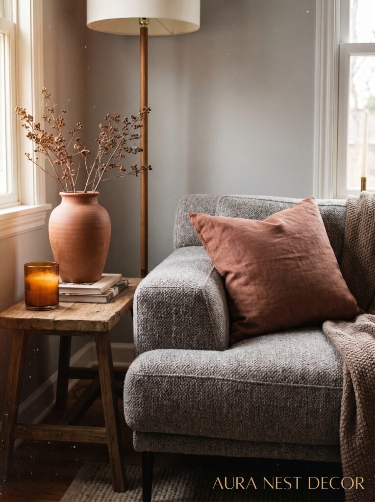
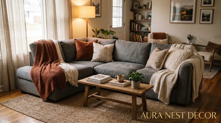
Terracotta. I know, I know — you’ve seen it everywhere. But there’s a reason. It does something to grey that almost nothing else does: it makes the grey look intentional instead of accidental.
That rust-orange warmth cuts right through the coolness of a grey room and suddenly everything looks curated. A pair of terracotta cushions on a grey sofa. A clay pot on a grey shelf. Even just an old terracotta lamp base from a charity shop.
It’s not the only option though. Dusty sage green works in the same way — slightly muted, organic, not too sweet. Brass and aged gold hardware adds warmth without adding color in a loud way. And honestly? A really good deep navy thrown in as an accent — a navy velvet cushion, a navy throw — does something unexpected and wonderful. The grey settles around it.
What doesn’t work as well as people hope: blush pink. It reads as faded very quickly in a grey room, and it’ll date your space faster than you’d think. If you love soft pinks, go more dusty, more antique rose — something that’s already got some grey in it.
—
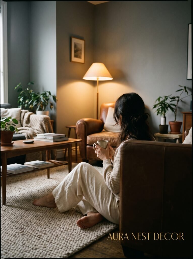
4. Lighting Is Doing at Least 40% of the Work
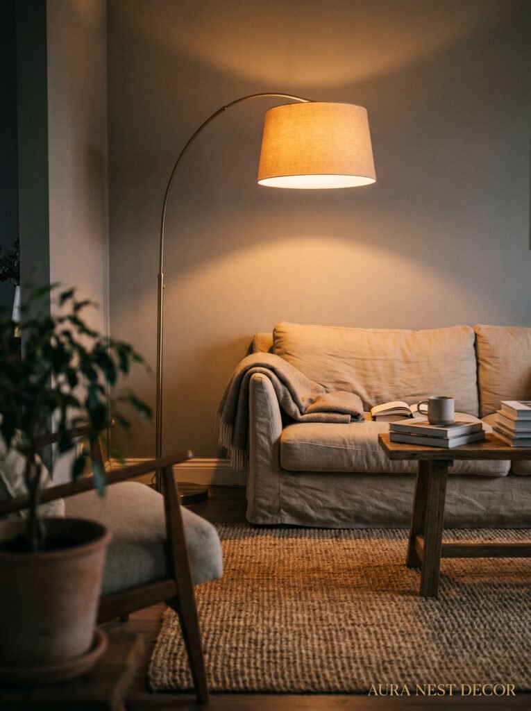
Here’s the truth nobody puts in the headline: a grey room lives or dies by its lighting. Full stop.
The colour temperature of your bulbs matters more in a grey room than in almost any other because grey is essentially a neutral canvas — it reflects and absorbs the light around it. Warm white bulbs (2700K–3000K) will make your grey walls glow like candlelight in the evening. Cool white or daylight bulbs? They’ll make even a beautiful warm grey look clinical and flat.
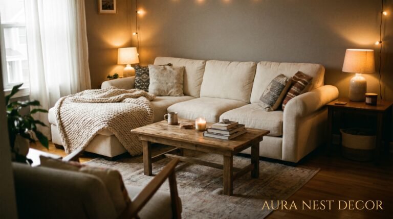
Layering your lighting is non-negotiable. Overhead lighting alone in a grey room is genuinely depressing. You need a floor lamp in at least one corner — something with a warm shade that throws light upward. Table lamps on side tables or shelves. Even fairy lights along a shelf or behind a TV unit are doing more work than you think.
The amber glow of an Edison bulb at 7pm in a grey room, hitting the textures in your throws and cushions and casting soft shadows — THAT is the look everyone’s saving to Pinterest. You can’t get there with an LED strip light pointed at the ceiling.
Mirrors are part of this conversation too. A large mirror opposite a window multiplies whatever natural light you have. In a grey room with limited windows, a well-placed mirror can be the difference between cozy and cave.
“The grey room that photographs beautifully at 7pm and the one that feels sad at 3pm are separated by exactly one floor lamp.”
—
5. The Shelf Styling Rule That Makes a Grey Room Feel Like a Home
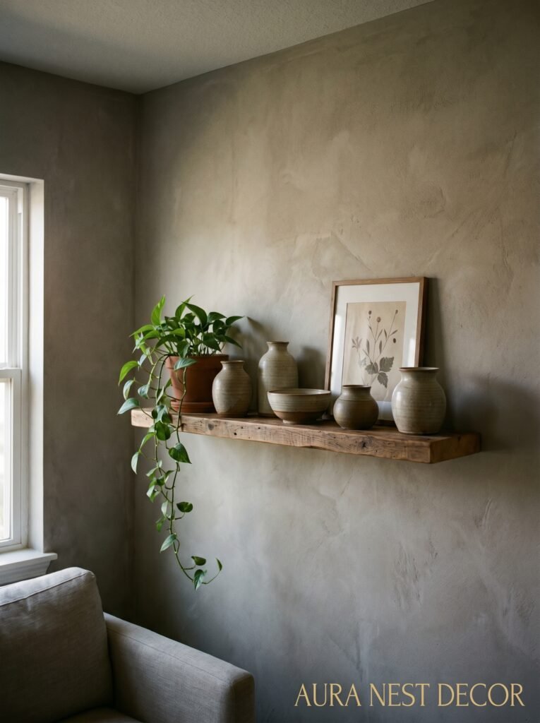
Stop styling shelves like a showroom. That’s the rule. Honestly.
In a grey room — where the backdrop is already clean and somewhat minimal — shelves can get weirdly sterile if you’re too precious about them. You need lived-in mess. Not actual mess. Curated chaos. Books turned backwards for aesthetic reasons mixed with books left normal because someone’s actually reading them. A candle that’s half-burned. A mug you keep meaning to move but haven’t because you actually use it up there sometimes.
Things that look incredible against grey walls: natural linen books, cream and white ceramics, dark wood objects, trailing plants (pothos or ivy draped over a shelf edge is genuinely one of the best things you can do in a grey room), woven baskets, anything in warm amber glass.
Height variation matters too. Not everything the same height — go tall, then medium, then something lying flat. Let things overlap slightly. The goal is for someone to look at your shelves and think “that’s their life” not “that’s from a catalogue.”
And please — dust them. I say this with love. Nothing kills the cozy vibe faster than a dusty shelf. Grey walls show every cobweb with pride.
—
6. What Happens When You Add a Lot of Wood (Spoiler: It’s Good)
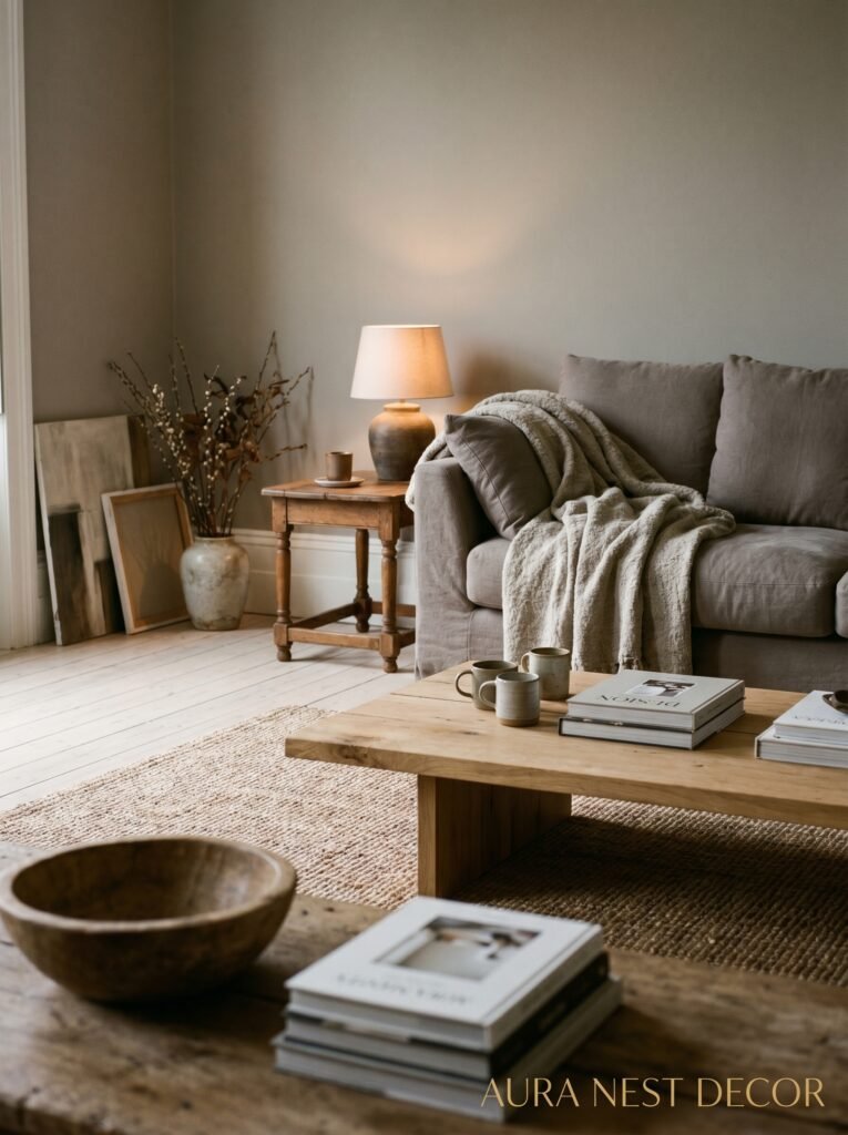
Wood and grey is almost a cheat code for cozy. The organic warmth of timber against the cool composure of grey creates this balance that feels genuinely effortless — even though it’s not, obviously, it just looks that way.
The tone of the wood matters. Medium to dark walnut-toned woods are stunning with warm grey. They’re rich and grounded. Very pale Scandi-style light wood can also work but it tends to lean cooler, which can tip a grey room back toward feeling cold rather than cozy.
Think about where the wood shows up. A wooden coffee table in a grey room is almost always a good idea. Wooden picture frames. Floating wooden shelves. A dark wood sideboard. If your floors are wood, you’re already ahead — but if you’re working with carpet, consider adding wood through furniture legs at least.
I’ve seen grey rooms with almost no wood that still work because they lean hard into linen, cotton and other natural textures instead. But for most people, adding wood is the fastest route to “warm and cozy” from “nice but cold.”
One thing: avoid mixing very different wood tones in the same space. One type of wood, used consistently, reads as intentional. Three different wood tones in the same room reads as furniture from three different phases of someone’s life. Which, same — but we can at least hide it a little.
—
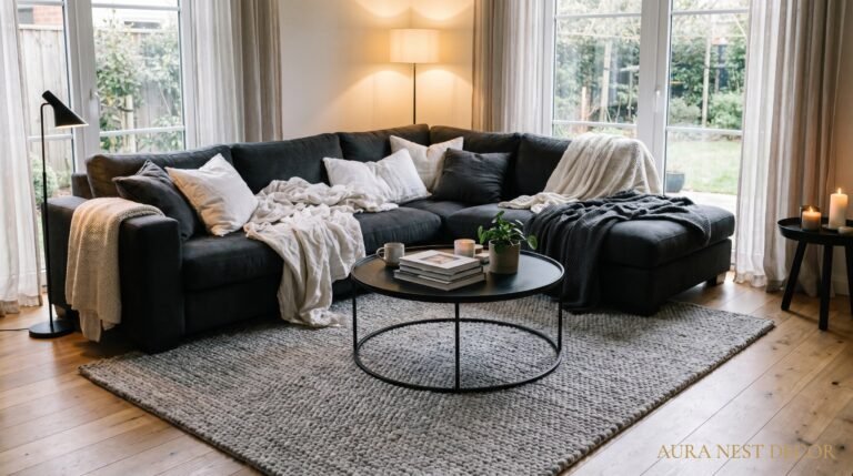
7. The Rug Is Not Optional
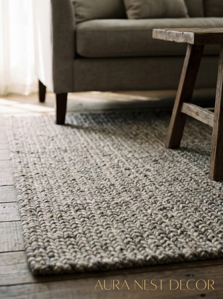
A grey living room without a rug feels unfinished. I’ll die on this hill.
The rug is what brings the seating area together into an actual zone rather than just furniture pointing at a TV. And in a grey room specifically, the rug is often your best opportunity to add warmth, pattern, and that crucial pop of texture.
Go bigger than you think. The classic mistake is a rug that only fits under the coffee table — you want your sofa’s front legs at least on the rug, ideally all four. A small rug in a grey room just looks scared.
For color: warm rugs work beautifully — terracotta tones, cream, rust, even a faded Persian-style rug with lots of mixed tones. Patterned rugs actually anchor a grey room really well because the grey walls don’t compete. They just let the rug be the thing.
Pile height matters too. A low, flat-weave rug is sleek and easy to clean (practical truth). A thick, shaggy rug is the actual definition of cozy underfoot but it needs vacuuming constantly or it starts to look sad. There’s a middle ground — a medium-pile wool or wool-blend rug is genuinely the sweet spot for most grey living rooms.
“The right rug in a grey room is the thing that makes guests stop and say ‘oh, I love your living room’ — and they’re never quite sure why.”
—
8. Curtains That Could Actually Change Your Life (Or at Least Your Room)
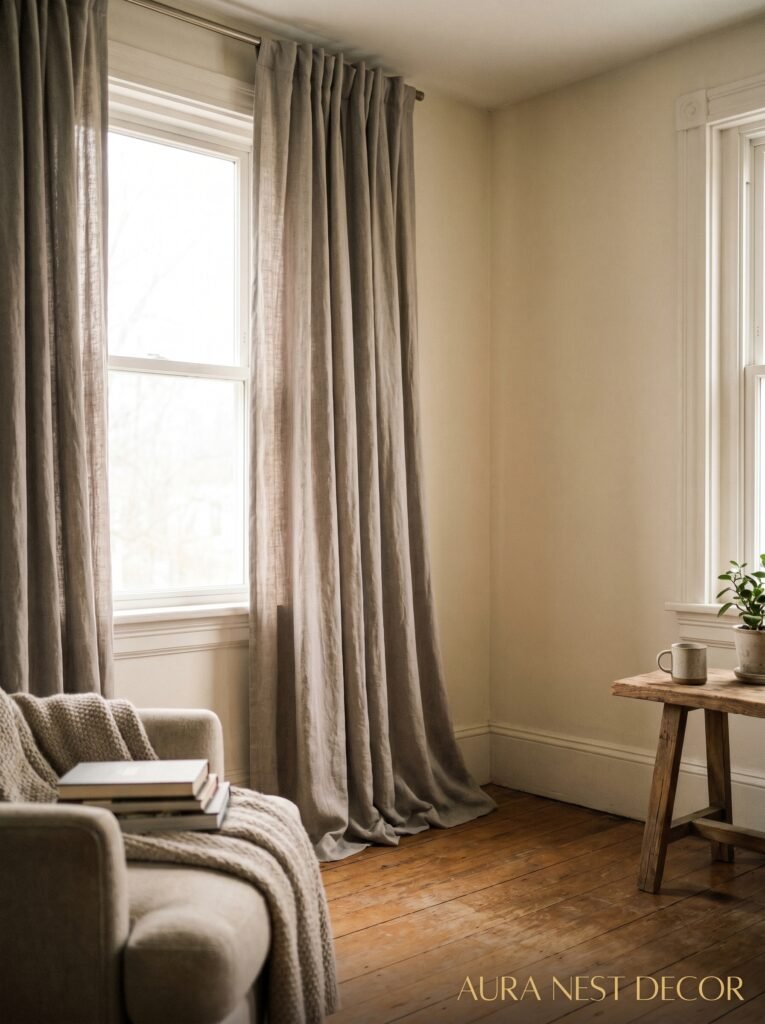
Full-length curtains make every room look better. I know that’s a big claim. But grey living rooms especially — where the color scheme is inherently restrained — need the drama and softness that floor-to-ceiling fabric provides.
Hang them HIGH. As high as you can go, ideally 6-12 inches above the window frame, and let them pool or skim the floor. This makes the ceiling look higher, the windows look bigger, and the room look like someone who knows what they’re doing lives there.
For a grey room: linen curtains in natural, cream or warm white are an incredibly reliable choice. They filter light beautifully, they add texture, and they don’t fight the walls. If you want drama, go deep — a charcoal or near-black curtain against pale grey walls looks extremely sophisticated and makes the whole room feel more intentional.
Velvet curtains. I just need to say it. Grey or warm charcoal velvet curtains in a grey living room, with the light catching the pile — it’s a lot. In the best way. It makes a room feel like you’ve arrived somewhere.
—
9. Cushions: The One Place Where You’re Actually Allowed to Go a Bit Overboard
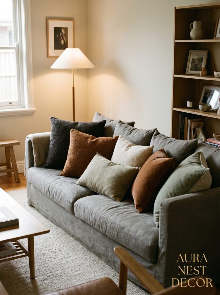
This is your creative playground. Genuinely. The grey room gives you this beautiful neutral backdrop that can hold a lot of cushion energy without looking chaotic.
Mix textures: velvet and linen and a slightly chunky knit all on the same sofa. Go for it. Vary the sizes — a large square, a medium square, a lumbar. Have an odd number. Three cushions or five, not four — even numbers on a sofa always look slightly staged.
The colors you introduce through cushions signal the whole personality of the room. Warm mustard and terracotta = cozy and autumnal. Muted sage and cream = fresh and calm. Deep navy and warm white = classic and a bit more put-together. Pick your palette and stick with it through the cushions, then echo those same tones in small objects around the room.
And don’t forget the inserts. An expensive cushion cover on a cheap flat insert is one of the most depressing things in home decor. Fill them properly — overstuffed even. Cushions should be plump. They should invite you to smash your face into them at the end of a long day. Anything less is a waste of a good cover.
—
10. The Gallery Wall That Doesn’t Look Like Everyone Else’s Gallery Wall
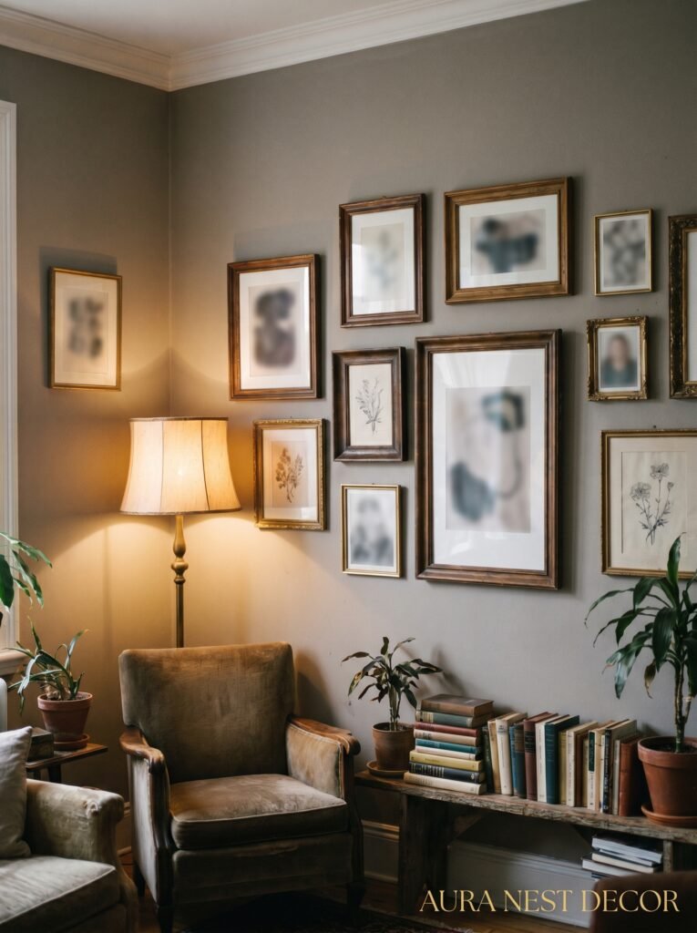
Art on grey walls is spectacular because the grey doesn’t compete. But a generic gallery wall of Ikea prints in matching black frames? We’ve all seen it. It’s fine. It’s also everywhere.
Here’s what makes a gallery wall feel personal in a grey room. Mix the frame colors — dark wood, gold, black, maybe even a natural rattan frame. Mix the sizes dramatically. Have one piece that’s genuinely large, like larger than feels comfortable, and build the others around it.
Include something that isn’t a print. A small mirror. A ceramic wall hanging. A framed piece of fabric or wallpaper. That unexpected element is what stops the eye and makes people look twice.
Content matters too. Don’t over-curate for aesthetic if it means nothing on your walls is actually meaningful. An imperfect photo you love in a great frame beats a perfectly styled print of someone else’s aesthetic every single time.
—
11. Plants That Actually Survive in a Grey Room (And Look Good Doing It)
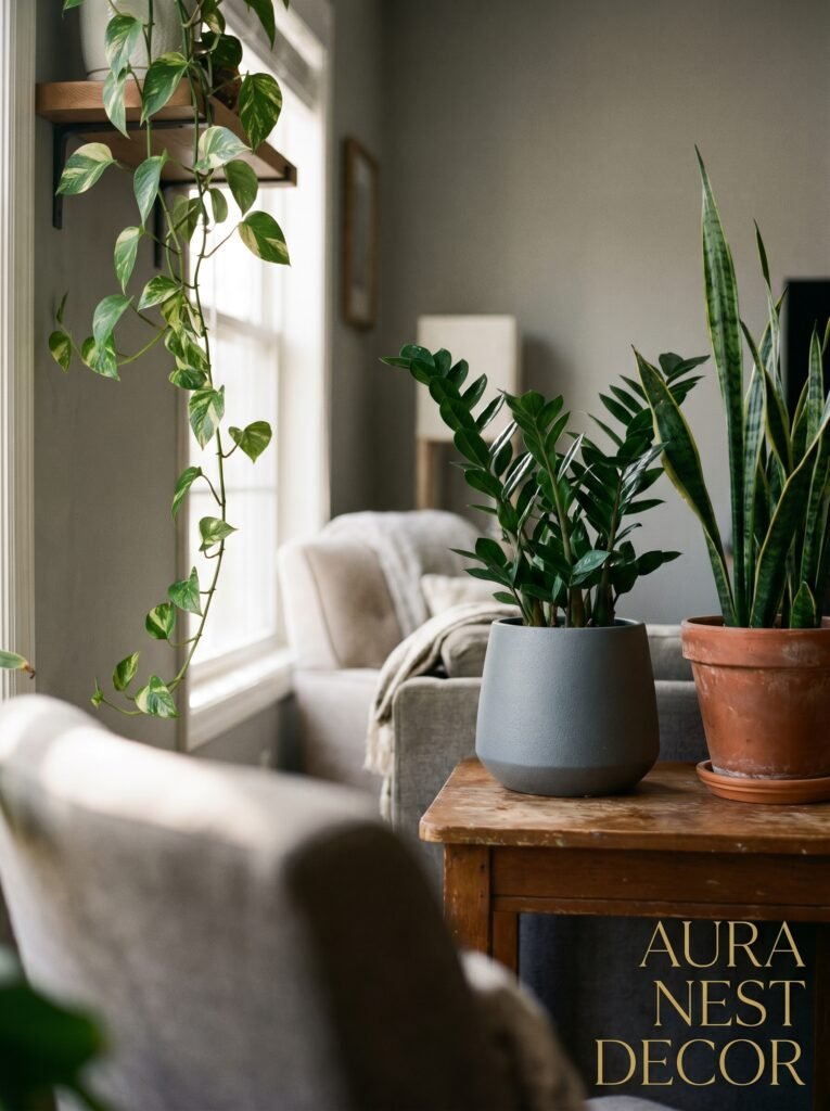
I’ll be real with you: some grey rooms don’t get great light, and that’s a challenge for plants. But there are options, and the right plant in a grey room is one of the best finishing touches you can add.
For low-light situations: pothos, snake plants, ZZ plants. All very forgiving. The pothos especially has this trailing habit that looks incredible on shelves or cascading from a high pot on a side table. It adds that organic, slightly wild element that stops a room feeling too formal.
For better-lit grey rooms: a fiddle-leaf fig in the corner, OR — my personal obsession — an olive tree in a terracotta pot. The combination of terracotta pot color and grey walls is perfect. And the silvery-green of olive leaves works so well with grey tones.
The pot matters as much as the plant. White ceramic, terracotta, matte black, woven seagrass baskets as pot covers — all good in a grey room. Shiny, brightly colored plastic pots? Not the vibe we’re going for here.
—
12. The One Thing Most People Do Last That Should Actually Come First
Before you buy anything else — before the cushions, the rug, the plants, the curtains — figure out what your grey room is actually for.
Because cozy means different things. Cozy for someone who reads alone in the evenings looks different from cozy for a family of four who watches movies together. Cozy for someone who entertains a lot looks different from cozy for someone who wants their living room to feel like a retreat from everything outside.
The physical layout tells this story. A sofa angled toward the fireplace says something. A massive sectional facing a large TV says something else. A reading chair tucked into a corner with its own lamp says I live here and I love it.
Get clear on that first. Then the grey room that emerges around it will have something most beautifully decorated rooms don’t — it’ll feel like it belongs to an actual person, not a mood board. And that’s the difference between a room that photographs well and a room that actually wraps itself around you when you come home.
—
❓ FAQ
Q: What’s the best grey paint colour for a living room that doesn’t get much sunlight? A: Go warm-toned without question. Look at Farrow & Ball Elephant’s Breath, Benjamin Moore Revere Pewter, or Dulux Warm Pewter. These all have enough beige or taupe in their undertones to stay cozy even in a north-facing room. Always test a large sample on the wall first and check it at different times of day before committing.
Q: How do I make a grey living room feel less cold and stark? A: Layer textures first — throws, rugs, cushions in natural fabrics like linen, wool and cotton. Then address your lighting: switch to warm-white bulbs around 2700K and add floor and table lamps. Wood tones through furniture and accessories do a lot of the remaining work. It doesn’t take many changes — the right rug and a floor lamp can transform the feel of a grey room faster than anything else.
Q: Can you have too much grey in a living room? A: Sort of — but the fix isn’t necessarily adding non-grey colors. It’s adding variation in tone and texture within the grey palette. Very different shades of grey (pale walls, mid-tone sofa, charcoal accessories) work beautifully together. What feels like “too much grey” is usually actually “not enough texture variation” or “not enough warm light.” Fix those and you might find you don’t need much color at all.
—
💭 Final Thoughts
A great grey living room isn’t really about grey. It’s about the feeling you’re creating — that slightly held-breath moment when someone walks in and immediately relaxes. The grey is just the quiet backdrop that lets everything else do its job.
Don’t overthink it. Get the lighting right, get a rug that’s big enough, add warmth through wood and texture, and let the room tell you what it needs from there. It’s more forgiving than you think.
What’s the one thing that’s been stopping you from getting your grey living room to feel the way you want it to?