Why Grey Is Still the Smartest Color Your Living Room Can Wear
You painted it white. Then you tried the greige. And now you keep coming back to grey — because honestly, it just works in a way nothing else quite does in a family room.
—
1. The Specific Shade of Grey That’s Eating Every Other Neutral’s Lunch Right Now
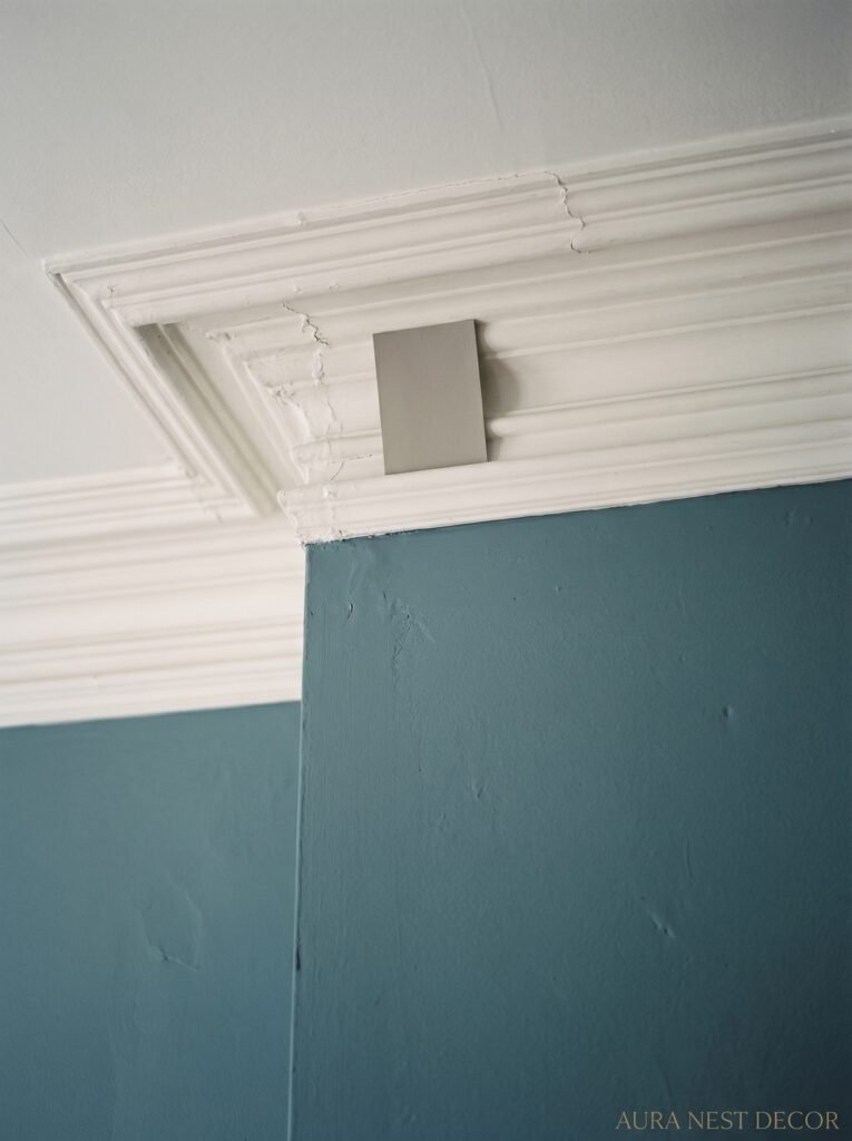
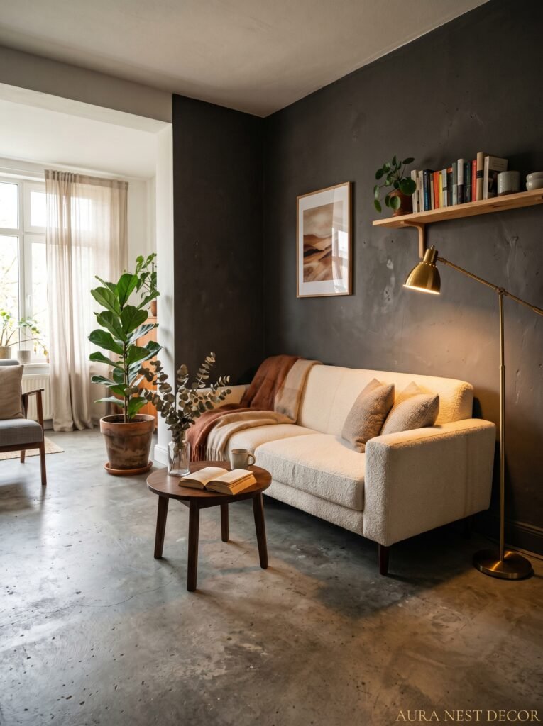
Not all greys are created equal and that distinction genuinely matters before you commit to anything. There’s a grey that looks like wet concrete under a sad British sky in February — cool, flat, kind of depressing. And then there’s the grey that looks like a cashmere sweater draped over a reading chair. One makes your family room feel like a car park. The other makes it feel like somewhere you’d actually want to spend Sunday morning.
The shades winning right now are the warm-toned ones. Think Farrow & Ball’s Mole’s Breath, or Sherwin-Williams Accessible Beige’s slightly cooler cousin. Greiges have had their moment, but what’s landing harder on Pinterest right now is grey with just the faintest whisper of brown or green undertone — not enough to name it anything other than grey, but enough to stop it reading cold.
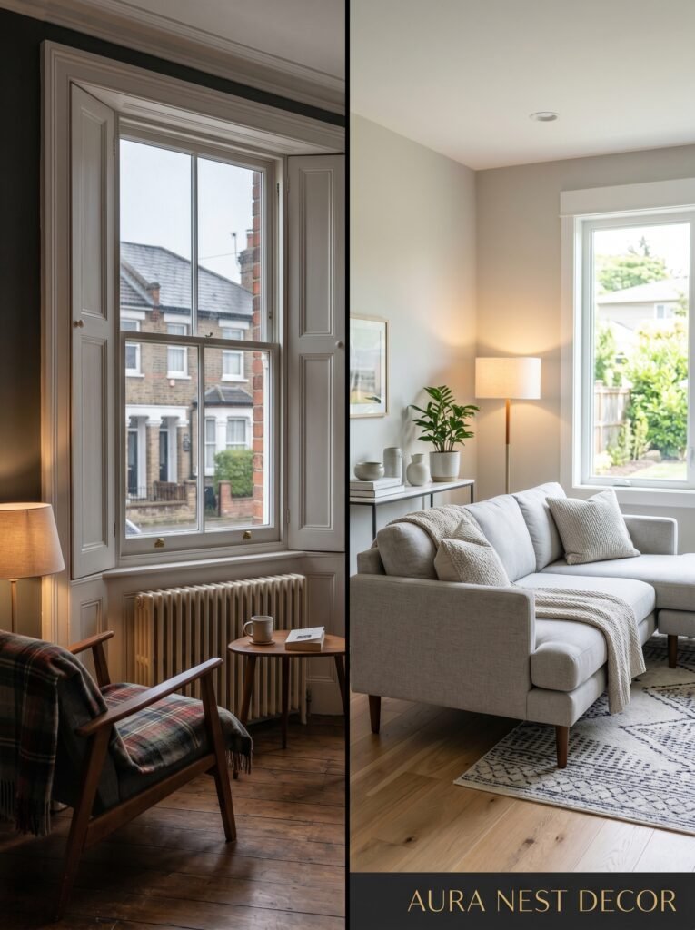
Here’s what I’d actually do: get three or four sample pots and paint big swatches — we’re talking at least 12 inches square — on different walls. Live with them for a few days. Watch what the morning light does versus the 4pm light versus your lamps at 9pm. Grey shifts MORE than almost any other color depending on the light. What looks perfect in the shop will absolutely betray you if you skip this step.
“Grey doesn’t just sit there — it moves through your room like light does, changing its mind every hour.”
2. The Sofa Situation: Why “Safe” Beige Is Not Always the Answer
There’s this assumption that if you’ve gone grey on the walls, you need to go safe and neutral everywhere else. Cream sofa. Beige throw. Maybe some jute. And look — that works! But it’s not the only option and it’s not always the most interesting one.
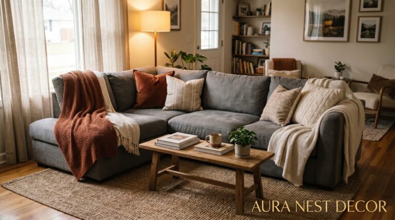
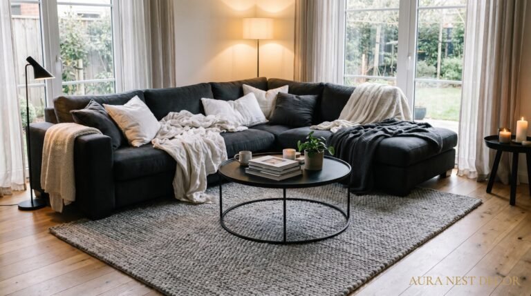
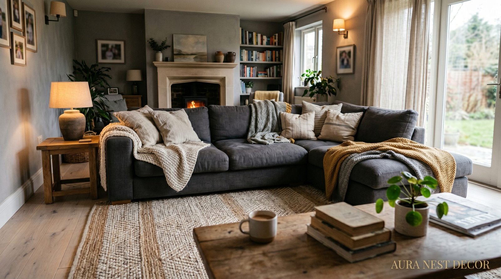
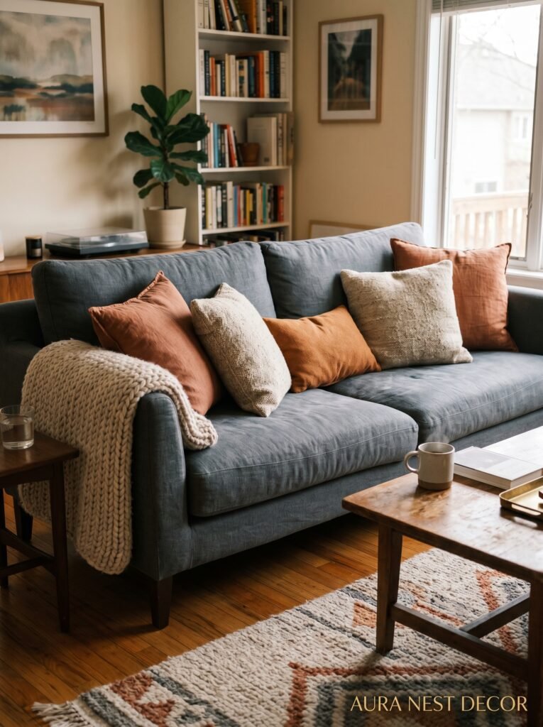
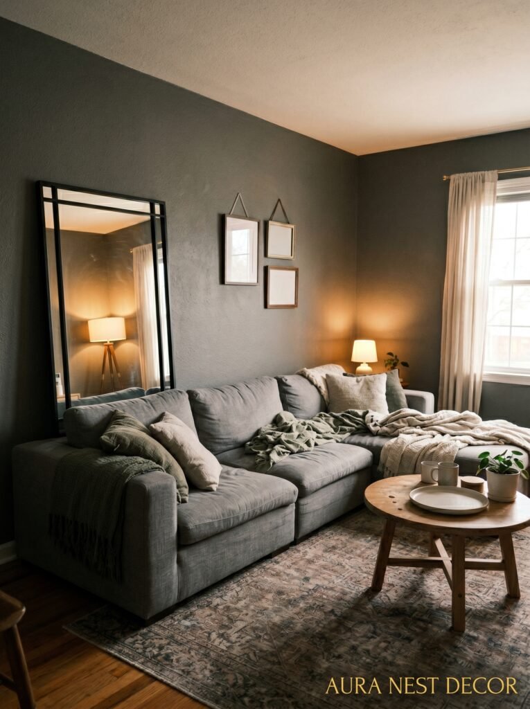
A charcoal sofa against a mid-grey wall? Done right, that tonal-on-tonal thing is genuinely stunning. You’re working in the same color family but layering depth, and the room doesn’t read as flat if you vary the textures. Velvet cushions next to a linen throw next to a knitted blanket — that’s what saves a monochromatic grey room from looking like a showroom nobody lives in.
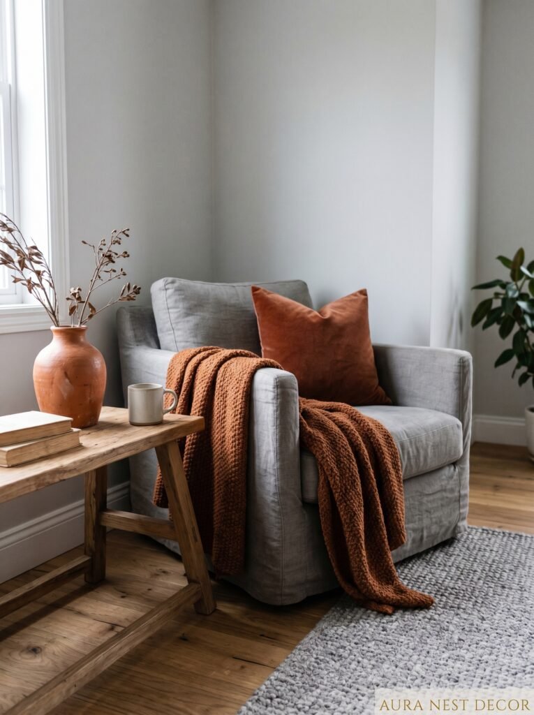
But honestly, if you want the one sofa color that holds hands beautifully with grey walls without being predictable, it’s deep forest green. I didn’t expect to love it as much as I do. There’s something about that dark green against warm grey that feels like the inside of a really old library, and not in a stuffy way — in a come-sit-down-you’re-going-nowhere way. Cognac leather works similarly. Both options are still warm, still cozy, but they give the grey something to react against.
3. The Lighting Trick That Makes a Grey Room Feel Like a Hug Instead of a Hospital
This is the one everyone skips, and it’s the reason half the grey rooms on Pinterest look aspirational and the other half look clinical. LIGHTING. It matters so much more than the exact shade of grey you pick.
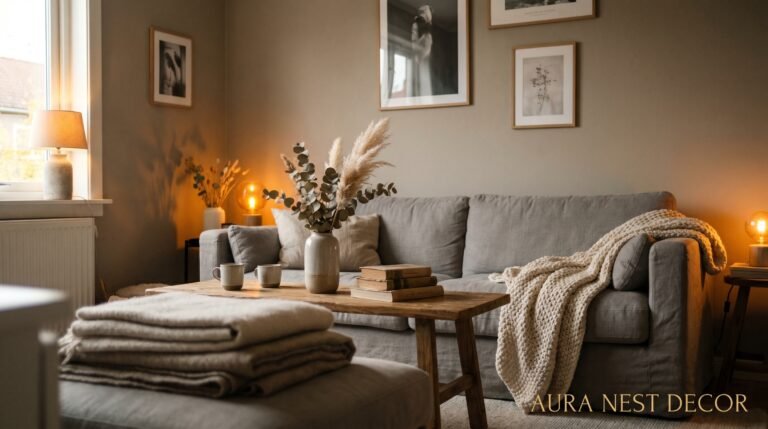
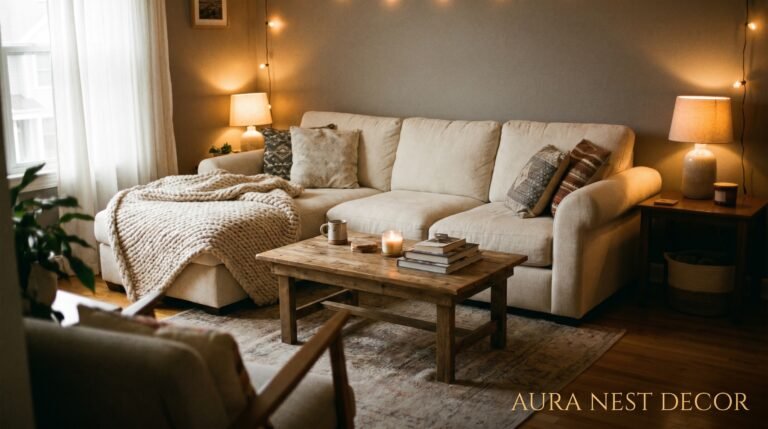
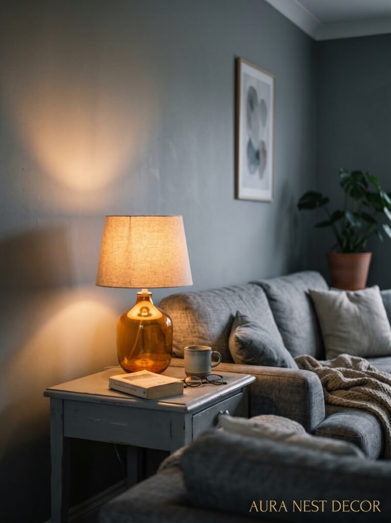
Cool white LED bulbs kill grey rooms dead. They push all that lovely grey into blue territory and suddenly your cozy family room looks like a dentist’s waiting area. What you want is warm white — bulbs rated around 2700K. They throw that amber-y, almost golden glow that wraps around the grey and makes it feel soft and lived-in.
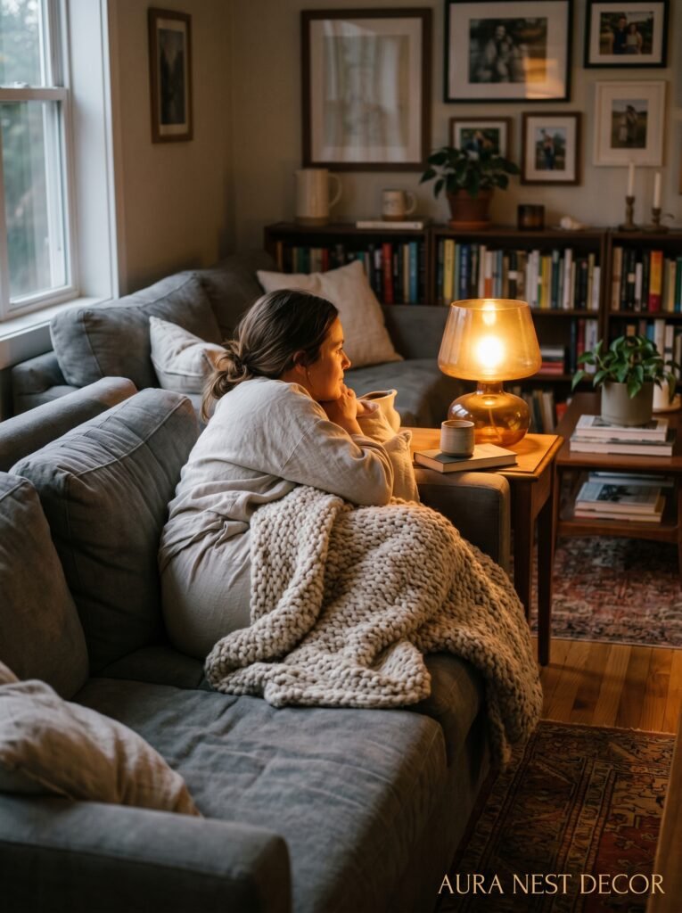
Layered light is what makes the actual difference though. One overhead fixture doing all the work? That’s flat. What you want is a floor lamp in the corner, a table lamp on the sideboard, maybe some candles on the coffee table — all running at the same time, creating these little warm pools of light at different heights. The grey on the walls starts to glow. Not literally, but sort of — it picks up warmth from all those different light sources and the whole room shifts.
Side note: dimmers are genuinely one of the best investments you can make in a grey living room. Non-negotiable for me. The difference between full brightness and 60% on a dimmer is the difference between a room that’s just fine and a room that makes people stop talking and just look.
4. Every Texture Is Doing Work — Here’s What to Put Where
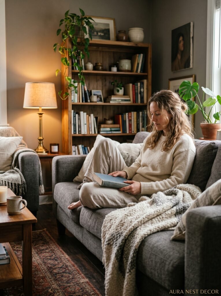
Grey is inherently sophisticated but it needs help to feel cozy rather than just cool. That help comes from texture. Lots of it, layered without overthinking it.
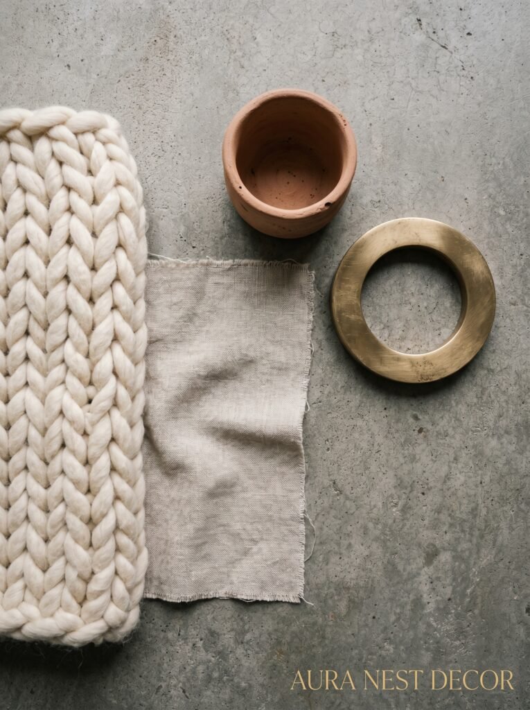
The floor is your biggest surface after the walls. A cream or oatmeal wool rug softens everything. A chunky weave or something with a bit of pile is going to do more work than a flat-woven rug — it adds visual weight and physically feels warmer to walk on. If you’ve got wooden floors, that natural grain is already contributing warmth before you’ve put a single thing on it. Grey and wood together is a pairing that genuinely can’t fail.
For the sofa, throw cushions in varying sizes and covers — mix a chunky knit, a velvet, something in a soft printed linen. You’re not going for matched and matchy. You’re going for collected. On the arms, a throw that’s slightly too big, slightly messy, like someone just got up. It signals that humans actually live here.
And then the smaller things. A clay pot with a trailing plant. A wooden tray on the coffee table. A stack of books with interesting spines. These aren’t just decor, they’re texture at a different scale — they fill in the visual gaps so the grey doesn’t feel like it’s straining to hold the room together all by itself.
“A grey room without texture is just grey. With it, it’s a whole mood.”
5. The Color That Keeps Showing Up in Every Beautiful Grey Family Room on Pinterest Right Now
Terracotta. I know. Stay with me.
It sounds like it shouldn’t work — orange-y earth tones against cool grey seems like the kind of combination someone would call a mistake. But it’s EVERYWHERE right now in the rooms that feel both current and genuinely warm, and there’s a reason. The contrast is just alive in a way that dusty pink against grey (which had its moment) just isn’t anymore.
You don’t need to go full terracotta anywhere. A throw in a burnt sienna. A couple of clay pots in different sizes on the windowsill. Maybe a terracotta-toned cushion cover in an abstract print. You’re just introducing this warm, earthy hit of color that the grey absolutely loves being next to. It grounds everything, adds warmth without adding sweetness, and it photographs beautifully if that matters to you.
Mustard is still holding its own as a grey accent too, especially in rooms that lean slightly cooler. And brass — in light fixtures, in picture frames, in a mirror frame — does something similar. Warm metals with grey is a combination that’s been going for years because it keeps working.
6. Small Grey Family Room? This Is the Rule That Changes Everything
The assumption when you’ve got a small family room is that you shouldn’t go dark or you’ll shrink the space. And conventionally that’s what people say about colour generally. But here’s the thing about grey specifically: a mid-to-dark grey on all four walls in a small room can make it feel SMALLER in square footage and bigger in atmosphere. And sometimes atmosphere is what you actually wanted.
The rooms that feel cramped in small spaces aren’t usually cramped because of the color — they’re cramped because of too much stuff, furniture that’s too big, and layout that hasn’t been thought through. Fix those things and you can go as grey as you like.
That said, if you do want to create the illusion of more space, the trick isn’t to go lighter on the walls. It’s to get your floor and ceiling lighter than your walls. Dark floor, grey walls, white ceiling? The ceiling will drop. Pale floor, grey walls, white ceiling? The ceiling lifts and the walls recede and the room breathes.
One more thing — mirrors. Big ones, leaned against the wall rather than hung (which feels more casual and current anyway). They bounce light and create depth in a grey room like nothing else.
7. What British and American Grey Rooms Actually Look Different About
This is interesting, right? Because grey is popular on both sides of the Atlantic but the rooms that come up in UK searches and the ones that dominate American Pinterest boards actually look different in this specific way.
British grey rooms tend to go darker and more atmospheric. There’s less fear of a deep, almost-charcoal living room because older British homes often have lower ceilings and smaller windows and that darkness becomes cozy rather than gloomy — if you do it right. Farrow & Ball colours are everywhere in UK interiors content, that slightly chalky, slightly historic quality to the paint finish. Lots of antique pieces, botanical prints, mixed metals.
American grey rooms on Pinterest skew lighter and airier. More of that Scandinavian-influenced grey — warm, bright, lots of white trim, cleaner lines. Open plan spaces where the grey is one element rather than the whole story. Benjamin Moore and Sherwin-Williams greys showing up constantly, often paired with shiplap or beadboard which isn’t really a thing in most British homes.
Neither approach is better. They both work. But knowing which aesthetic you’re actually drawn to before you start is genuinely useful so you don’t end up with a moody British scheme in a light-filled open-plan American home where it’ll just read as dark.
“The best grey room isn’t the one that looks best in a photo — it’s the one that looks best at 7pm on a Tuesday when everyone’s home.”
8. The Art on Your Grey Walls: Not Everything Goes
Grey is generous with what it can hold on its walls, but that doesn’t mean anything goes. Some specific thoughts on this.
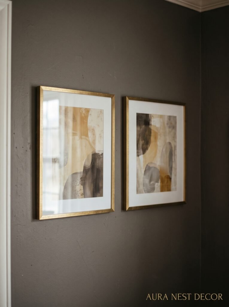
Gallery walls with matching black or dark wood frames look genuinely sharp against grey — more so than they do against white, which can make the same gallery wall look a bit scrappy. The grey gives the frames something to exist against. Big abstract prints with ochre or rust or olive are the ones that really pop. Avoid very cool-toned prints — anything with a lot of blue or purple might compete with the undertones in your grey in a way that feels unresolved.
Oversized single artwork on a grey wall? Yes, absolutely. You don’t need a gallery when you’ve got one big beautiful piece. A large print leaned against the wall rather than hung is very now and it’s forgiving if you haven’t totally committed to the wall arrangement yet.
Mirrors count as wall decor. Don’t forget that. A gorgeous arched mirror above the console or fireplace does more for a grey room than most paintings will.
9. Plants in a Grey Room: Which Ones Actually Work and Why
There’s a reason every styled grey living room on Pinterest has a plant in it somewhere. Or several. Grey is cool and still and plants bring movement and life — it’s exactly the contrast the room is asking for.
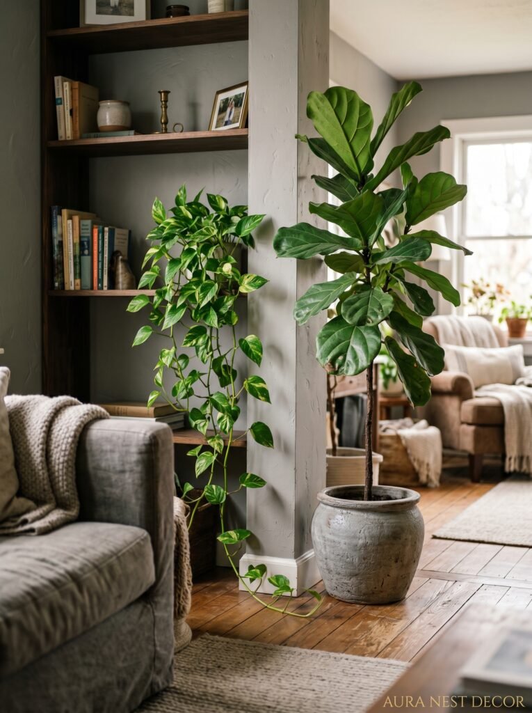
Trailing plants work especially well. Pothos, string of pearls, a long trailing devil’s ivy spilling from a high shelf — that vertical movement breaks up what can become quite a horizontal, composed room. Dark green is the obvious pairing with grey but don’t overlook deeper burgundy or near-black foliage either (the burgundy rubber plant, for instance). The drama is worth it.
Big statement plants — a fiddle leaf fig, an olive tree in a terracotta pot, a large monstera — these turn a corner of a grey room into an actual moment. If you’re going for that feel, commit to a big plant rather than a cluster of small ones. One large plant will make more impact every time.
Pale and dried botanicals also do something interesting. Dried pampas, bleached grasses, eucalyptus branches in a tall vase. They don’t add green but they add organic texture and a kind of quietly beautiful moodiness that grey rooms seem to ask for.
10. The Coffee Table Conversation Grey Rooms Are Getting Wrong
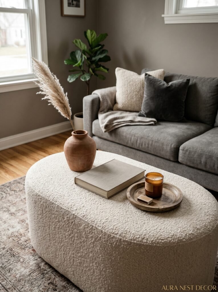
Here’s something small that makes a big difference. A lot of grey rooms on Pinterest have this very beautiful, very styled coffee table moment — marble, gold tray, a single book, a candle. And it looks incredible for photos. But it looks a bit nervous in real life, like the room is afraid to be touched.
The coffee table should look like somebody actually uses it. A stack of books — real ones you’ve read, not just spines that look nice. A candle that’s actually been burned. A mug ring that you’ve chosen to leave because honestly who cares. The remote controls in a little wooden bowl or tray rather than hidden away, because this is a FAMILY room and you watch TV in it.
The styling still matters. A tray to corral things helps. Some varied heights — a tall candle, a low flat book, a small plant. But the goal is not pristine, the goal is lived-in and lovely. There’s a difference.
11. Grey Floors, Grey Walls — Is It Too Much or Is That Exactly the Point
Tonal rooms — where floor and walls are in the same color family — are either going to feel incredibly sophisticated or incredibly depressing and the difference comes down to texture almost entirely. If your grey floor is a flat laminate and your grey walls are a flat matte paint with nothing textured anywhere else in the room, yes, it’ll feel flat and bleak. That’s a texture problem, not a color problem.
But a grey concrete floor (or grey large-format tile) with warm grey walls and loads of textured soft furnishings? That can be extraordinary. Or grey painted floorboards — which is a big move that I genuinely love — with mid-grey walls, linen curtains, and warm wood accents. That contrast of the chalky painted floor and the natural wood stops it going too monotone.
If you’re working with existing grey floors you didn’t choose, a large warm-toned rug is doing a lot of the heavy lifting here. It interrupts the floor enough that the walls and floor stop feeling like they’re in conversation with each other and start just both being a backdrop.
12. The Grey Family Room That Nobody Talks About: Getting the Curtains Actually Right
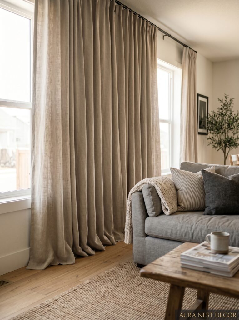
Curtains can kill a grey room or complete it and there’s surprisingly little middle ground. I’ve seen beautiful grey rooms completely undermined by the wrong window treatment. So here’s what I’ve learned from staring at too many Pinterest boards.
White or cream curtains work, but they have to be the RIGHT white — warm white, warm ivory, not the blue-white of a bright white cotton. That harsh contrast between a bright white curtain and a warm grey wall reads as unfinished. Linen natural curtains — that undyed, slightly creamy linen — are honestly the most forgiving choice for a grey room because they add texture and warmth without competing.
Floor-to-ceiling curtains, even if your windows don’t go floor to ceiling. Hang the rod high, let them pool very slightly on the floor, and suddenly your ceiling is taller, your windows are bigger, and your grey room has that expensive-home quality that’s hard to name but immediately noticeable. The length matters more than most people think.
And if you want to be bolder — dark curtains in a grey room. Charcoal, deep forest green, midnight blue. This is a completely valid choice that makes the room feel more enclosed and more deliberately atmospheric. It’s not for everyone. But if your whole vibe is cozy and intentional and you want people to walk in and feel like they’ve entered somewhere, dark curtains on a grey wall will do that for you.
—
❓ FAQ
Q: What’s the most popular grey paint color for living rooms right now? A: In the UK, Farrow & Ball’s Mole’s Breath and Purbeck Stone are consistently showing up in beautiful living room transformations — they’ve got that warm, chalky quality that reads incredibly cozy. In the US, Sherwin-Williams Repose Gray is practically a phenomenon at this point, and Benjamin Moore Revere Pewter has never really gone away. Honestly? Sample them before committing. Grey shifts enormously between lighting conditions.
Q: How do I make my grey living room feel warmer, not colder? A: Two things make the biggest difference immediately. First, swap your lightbulbs to warm white (2700K) and add lamps — ditch the single overhead light. Second, add natural textures: a wool or jute rug, linen cushion covers, a chunky throw. Those two changes alone will shift the feel of the room dramatically before you change a single paint color.
Q: Can grey walls work in a living room that doesn’t get much natural light? A: Yes, but go warm-toned and go lighter than your instincts tell you — a mid-warm grey rather than dark charcoal. Honestly the bigger intervention is the lighting: add more lamps, go warm-bulb, and use mirrors to bounce whatever light you do get. A grey room with good layered artificial lighting can feel incredibly cozy even with minimal natural light.
—
💭 Final Thoughts
Grey has been “trending” for so long that at this point it’s just a permanent option — which means the pressure is off, and you can choose it because it genuinely suits your home and how you want your family room to feel. Done with warmth and texture and actual thought, a grey family room isn’t a safe choice. It’s a generous one. The question is just what version of grey is going to feel most like you when you sink into that sofa on a Friday evening and finally exhale — so which one is that?