The Grey Living Room That Actually Feels Like a Hug (Not a Hotel Lobby)
You know that feeling when you walk into someone’s living room and just… exhale? Like your shoulders drop two inches without you even trying. That’s what a properly done grey living room does. And yet most of them don’t. Most of them feel cold, corporate, slightly sad — like a waiting room that got a rug.
Here’s how to get the version that makes people never want to leave.
—
1. The Grey That’s Actually Warm (And How to Tell Before You Buy a Whole Can of Paint)
This is where most people go wrong. Not all greys are created equal, and I cannot stress this enough. There are greys with blue undertones — sharp, icy, beautiful in a Scandi minimalist bedroom but absolutely brutal in a north-facing British living room in November. And then there are greige-leaning greys, taupe-adjacent greys, greys with green in them, with violet, with the faintest hint of pink. The undertone is EVERYTHING.
Here’s what I do before committing. I buy the paint sample, paint a large square on the wall — like A3 size, not that tiny little smear that tells you nothing — and I look at it in morning light, afternoon light, and with the lamps on at night. Same paint looks completely different at 8am versus 7pm. The warm greys (think Farrow & Ball’s Mole’s Breath, or Sherwin-Williams Agreeable Gray) go almost caramel under warm Edison lighting. That’s your target. That’s the grey that hugs.
Side note — if your room doesn’t get much natural light, lean warmer than you think you need to. You can always tone it back with accessories, you can’t fix a cave.
“The grey that works in a magazine almost never works in your actual house — find the one that works with your light, not someone else’s.”
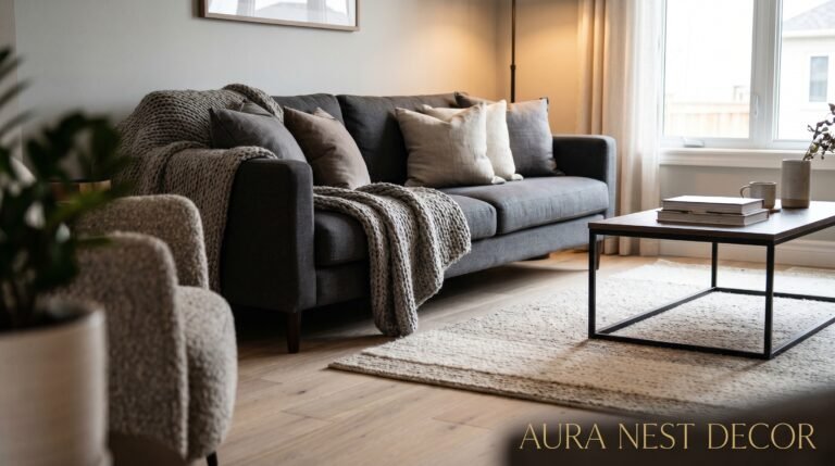
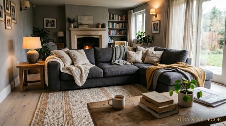
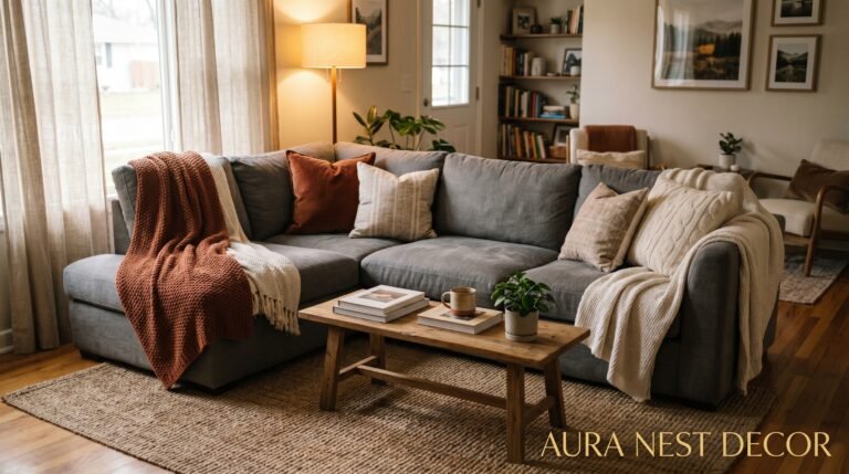
2. Why Your Sofa Color Matters Way More Than the Grey Walls
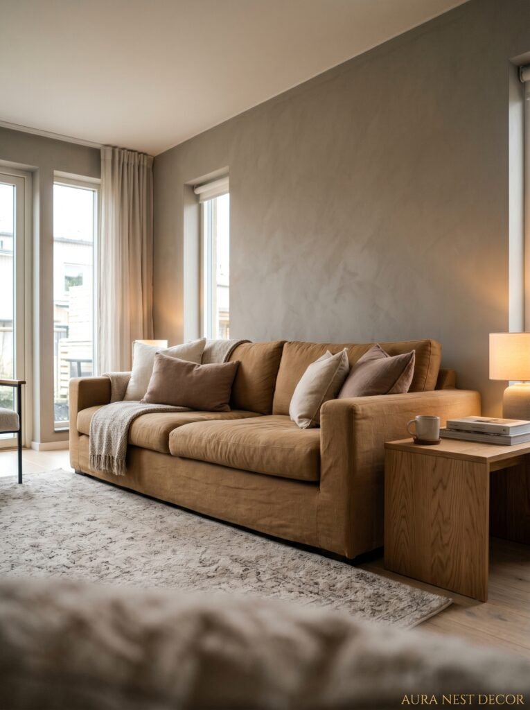
People spend ages agonizing over the wall color and then plonk a cold charcoal sofa against it and wonder why the room feels off. The sofa is the largest object in the room. It IS the room, essentially.
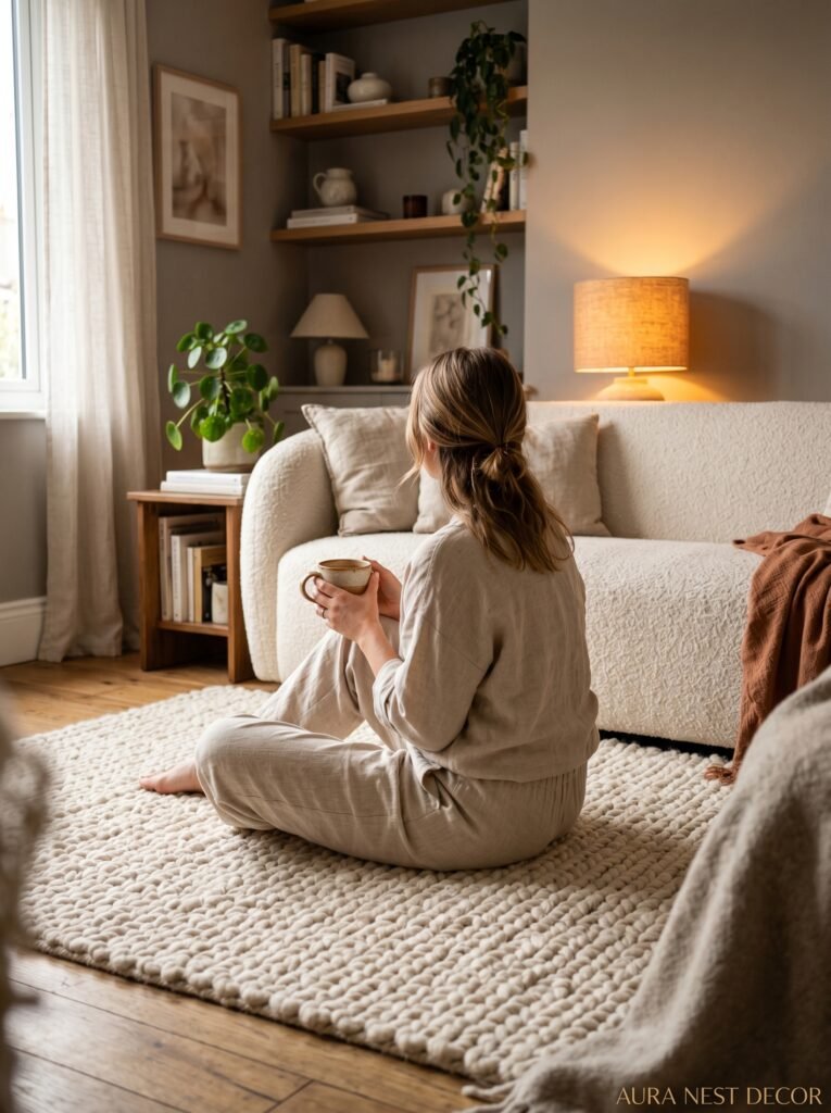
Against a warm grey wall, the sofas that sing are the unexpected ones. Not another grey sofa — please, not another grey sofa on grey walls. Think a deep terracotta linen, or an olive green velvet (and I mean VELVET, the texture matters enormously), or even a faded mustard if you’re brave. Cream boucle is having a huge moment right now and honestly it deserves to be. It photographs beautifully, it feels like a cloud, and against a warm grey it looks intentional in a way that takes no effort at all.
In US homes where rooms tend to be slightly larger, you can get away with a really dramatic sofa choice. British living rooms — particularly Victorian terraces and Edwardian semis — often need something lighter because the rooms are narrower than you’d like. Cream or natural boucle saves a lot of narrow British sitting rooms from feeling like a corridor with cushions in it.
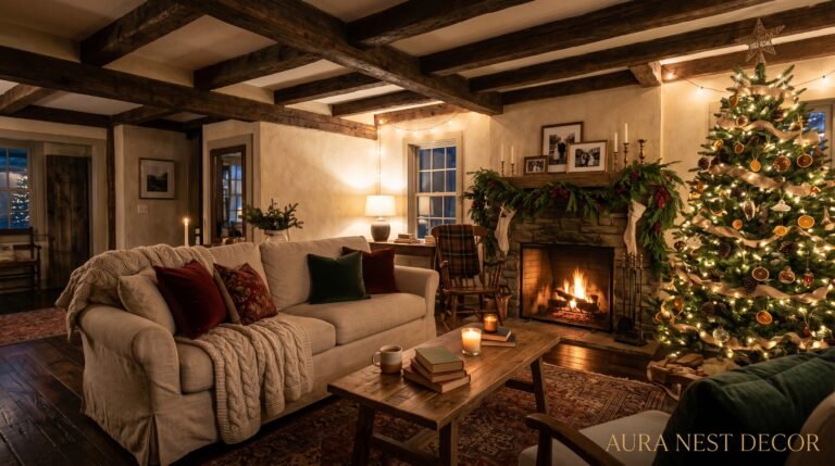
3. The Specific Lighting Situation That Makes Grey Go From Flat to Felt
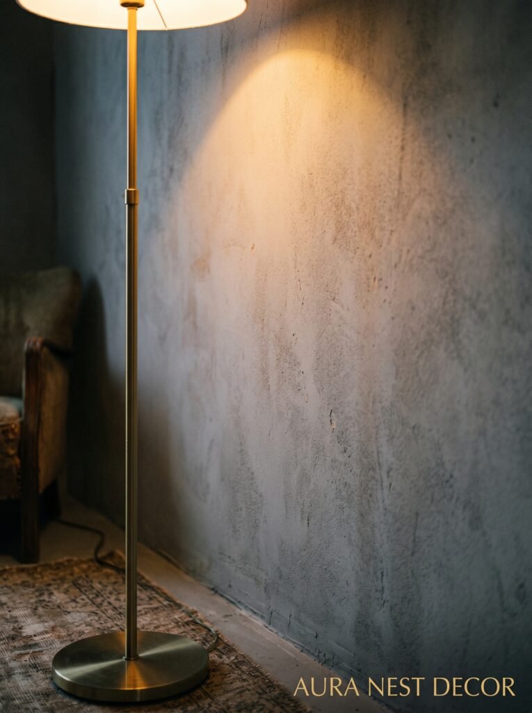
Recessed ceiling lights are the enemy of a cozy grey room. I’ll die on this hill. They flatten everything, they create this even wash of light that has no personality, and they make a grey room feel like a carpark. I’m sorry. They do.
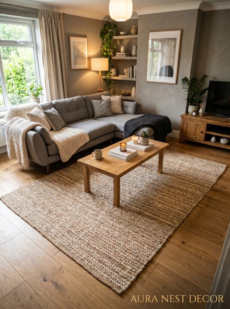
What you want instead: layers. A floor lamp in one corner — preferably one with a warm amber shade or an antique brass fitting — throwing light upward and outward. A table lamp on a side table that casts a small pool of glow. Maybe something over the coffee area. The goal is that when you turn the overhead off and flip on just the lamps at around 6pm, the room transforms. Like, genuinely transforms. The grey walls deepen and warm up, the shadows get interesting, everything feels softer.
This isn’t an expensive fix either. A decent floor lamp from IKEA or Dunelm or Target will do exactly this. The bulb matters more than the lamp. Get warm white bulbs, 2700K or lower. Not daylight bulbs. Never daylight bulbs in a living room.
4. The Texture Mix That Keeps a Grey Room From Looking Like a Showroom

A grey room without texture isn’t a grey room, it’s a grey void. And I think this is what trips people up the most on Pinterest — they see a beautiful styled photo and they notice the color, but what’s actually making the room beautiful is the way a chunky knit throw sits against a smooth linen pillow against a velvet cushion against a rough jute rug. All these different surfaces catching light differently. That’s the secret.
You don’t need a lot of it. But you need VARIETY. A flat cotton sofa, flat cotton cushions, flat cotton curtains — even if they’re all beautiful individually — will look like nothing together. Contrast is what creates visual interest, and in a neutral room, texture IS your contrast.
My go-to texture formula for a grey living room: one rough element (jute rug, woven basket, raw wood coffee table), one soft element (boucle, velvet, thick wool throw), one smooth element (glazed ceramic lamp, polished stone object, lacquered tray). Done. Doesn’t need to be complicated.
“Texture is what separates a grey room that breathes from one that sits there, doing nothing.”
5. The Greenery Rule That Actually Works in Winter
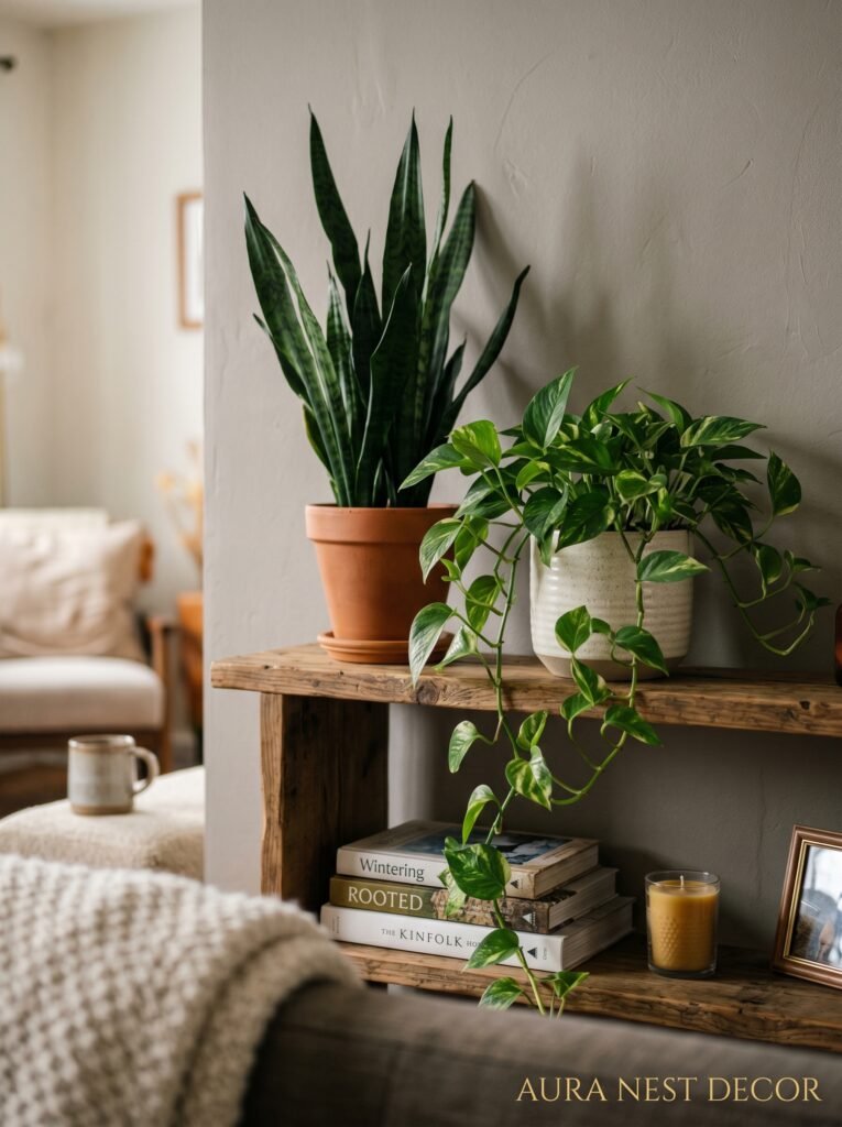
Plants in grey living rooms. Yes. But not in the way people think.
The problem with the standard advice — “just add plants!” — is that it assumes your living room is bright and warm and that you can keep things alive easily. In a north-facing British sitting room in January, or in an interior room in a US apartment, the average tropical houseplant has about six weeks before it starts looking sorry for itself.
So be selective. Cast iron plants (literally called that, you can’t kill them) look incredible in grey rooms because their dark green foliage pops beautifully against warm grey walls. ZZ plants — same story. Snake plants. These aren’t exciting but they’re ALIVE, which is more than can be said for the dry brown ghost of a fiddle leaf fig a lot of people are dragging around.
And for winter specifically? Dried grasses and pampas work harder than any living plant. I know pampas is everywhere right now, but there’s a reason. Dried eucalyptus in a simple clay or terracotta vase against a grey wall is one of the easiest and most effective things you can do to warm up a room on a budget.
6. The Coffee Table Move That Makes Everything Feel More Put Together
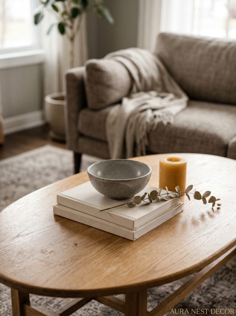
Nobody talks about this enough. The coffee table is the anchor of the seating area, and most people either have one that’s too small (it floats sadly in the middle of everything), too shiny (bouncing light around in a weird way), or so bare it looks like it’s waiting for someone to put something on it.
In a modern cozy grey living room, a raw wood or concrete-look coffee table works beautifully. Not perfect glass-smooth wood — something with grain, with a little roughness. Mango wood is brilliant for this and it’s available everywhere in both the US and UK at very reasonable prices. Against grey walls and a soft sofa, that natural wood grain just sings.
And the styling on top. Simple. Don’t overthink it. A stack of two books (turned spine-in if they’re ugly), a small textured ceramic bowl, maybe one low candle. That’s all. The coffee table doesn’t need to perform, it just needs to feel lived-in. Like someone actually sets their mug down there.
7. The Wall Art Approach That Doesn’t Make Your Grey Room Look Like an Airbnb
You know the look. A canvas print from Amazon. Slightly too small. Hung too high on the wall. Floating there alone. Happening to every grey living room in the English-speaking world.
Here’s the thing about wall art in a grey room — the grey is already doing a lot of visual work. It’s calm, it’s neutral, it creates this beautiful backdrop. So the art needs to do something against it. Not float above it, in it.
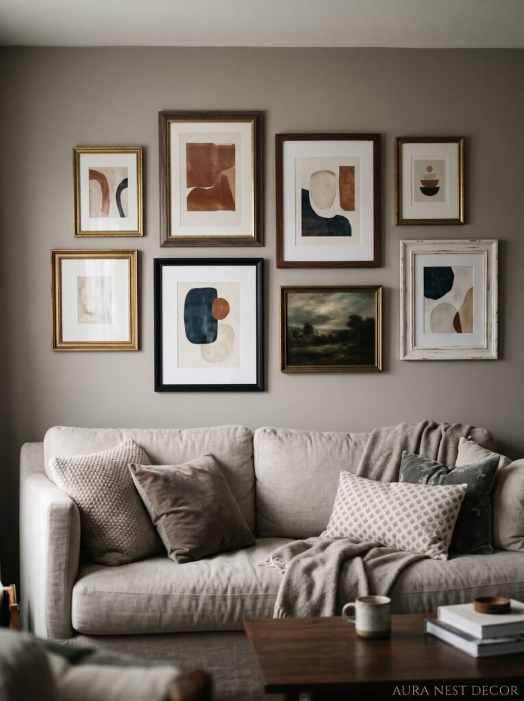
Gallery walls with a mix of frames (different sizes, different finishes, mixed black and warm wood and white) look genuinely incredible against grey. But the key is scale. You need at least one piece that’s large enough to feel intentional. Not six tiny prints in a row, at least not as the only thing you’re doing.
For color in the art — lean into earthy tones. Terracotta, rust, ochre, dark olive, warm cream. These pop against grey in a way that feels warm rather than jarring. Black and white photography is eternally beautiful against grey walls. Abstract art with warm neutrals. But probably not bright blue, not cold pink, not anything that fights the warmth you’ve worked hard to create.
“The right art doesn’t decorate a grey wall — it makes you forget the wall is even there.”
8. The One Mistake People Make With Grey Curtains (And What to Do Instead)
Grey curtains on grey walls. I understand the impulse — it’s cohesive, it’s calm — but it can read as a room that lost its nerve. Unless you’re doing a very specific tonal layering thing (different textures, slightly different shades), it often just looks like you matched things and called it done.
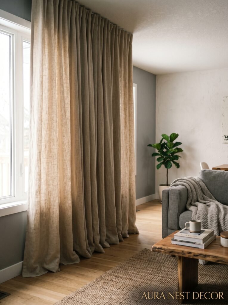
In a modern cozy grey living room, the curtains are actually a chance to bring in a little personality without committing too hard. Linen curtains in natural or warm white soften everything. Deep forest green velvet curtains against grey walls look extraordinary — the kind of thing people walk in and immediately say “oh WOW.” Dusty terracotta linen. Warm caramel. Off-white sheer layers under a darker panel.
And please, please hang them HIGH and WIDE. Rail as close to the ceiling as possible, curtains extending well past the window frame on each side. It makes windows look bigger, ceilings feel taller, the whole room more intentional. This is the single most impactful thing you can do to a living room that costs almost nothing extra. The fabric costs the same whether it hangs from a low rail or a high one.
9. How to Bring Warmth In With Metal Finishes Without Overdoing It
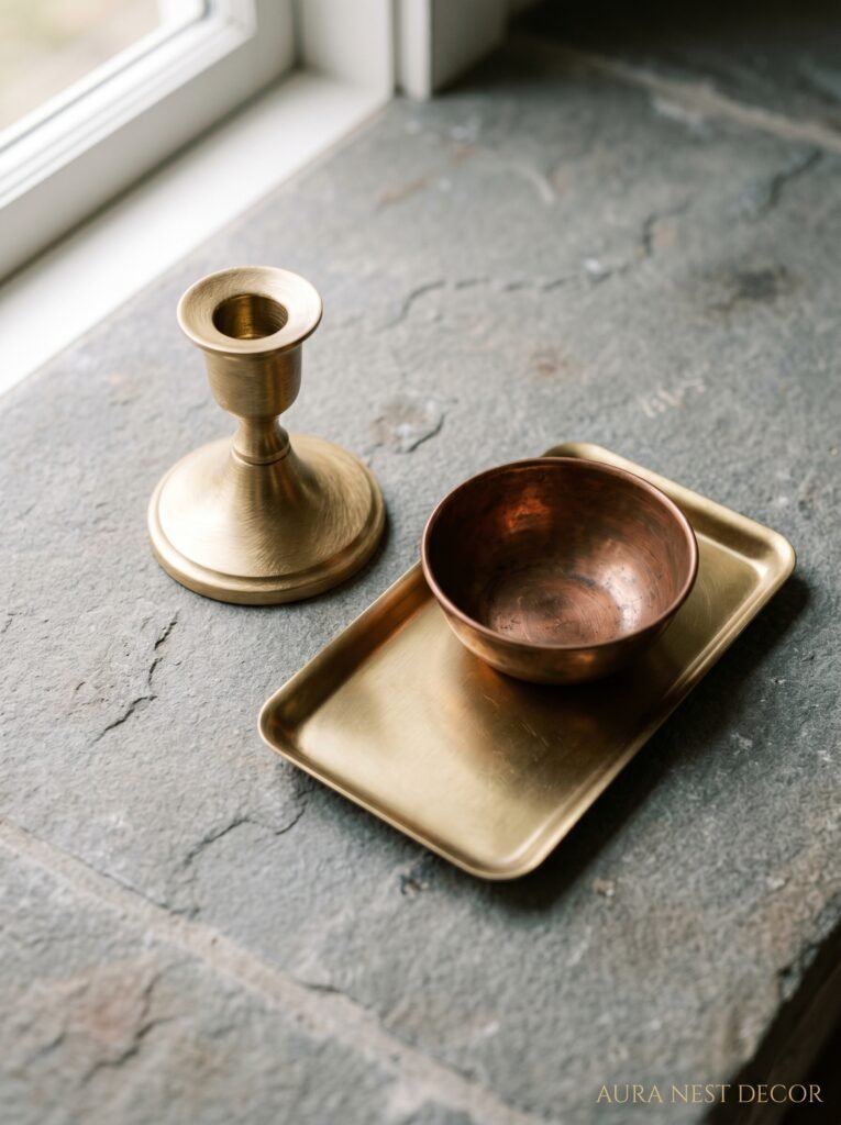
Brass and warm gold finishes in a grey room. This sounds like it shouldn’t work, and then you see it in person and understand completely. The contrast is doing something almost scientific — the warm yellow of antique brass against cool-warm grey creates this richness that neither can achieve alone.
But you don’t need much. A brass lamp base. Brass picture frame for one or two pieces of art. The handles on a console table, maybe. That’s enough. If everything is brass — every fixture, every handle, every candle holder — it stops being an accent and starts being a theme, which is a different thing entirely.
Matte black also works brilliantly in modern grey living rooms. It’s sharper, more contemporary, less warm but more graphic. If you want a room that feels more modern than cozy, lean matte black. If you want cozy with a modern edge, lean antique brass or unlacquered brass (the kind that patinas over time — honestly so beautiful).
10. The Rug That Ties a Grey Room Together Without Being Boring
Rug shopping for a grey room is one of those things that should be simple and absolutely isn’t. Because everything either matches too much (another grey rug, zero personality) or clashes in a way that makes your eye feel vaguely uncomfortable.
Here’s what I keep coming back to: warm neutral rugs with texture. A chunky hand-woven wool rug in cream and oatmeal tones. A Moroccan Beni Ourain style (or a good lookalike — they’re not cheap but there are brilliant dupes everywhere now). A faded vintage-style Persian rug in dusty rose and terracotta, which sounds like a lot but against grey walls is actually incredibly grounding.
The rule about rug size that I wish someone had told me years ago: bigger than you think. Always. In a living room, ideally all the front legs of your sofa and chairs should sit ON the rug. If the rug is floating in the middle with furniture around it like it’s been quarantined, it’s too small. A too-small rug makes a room look unfinished no matter how beautiful everything else is.
11. The Bookshelf Styling Trick That Makes Grey Rooms Look Like They Were Decorated by Someone Interesting
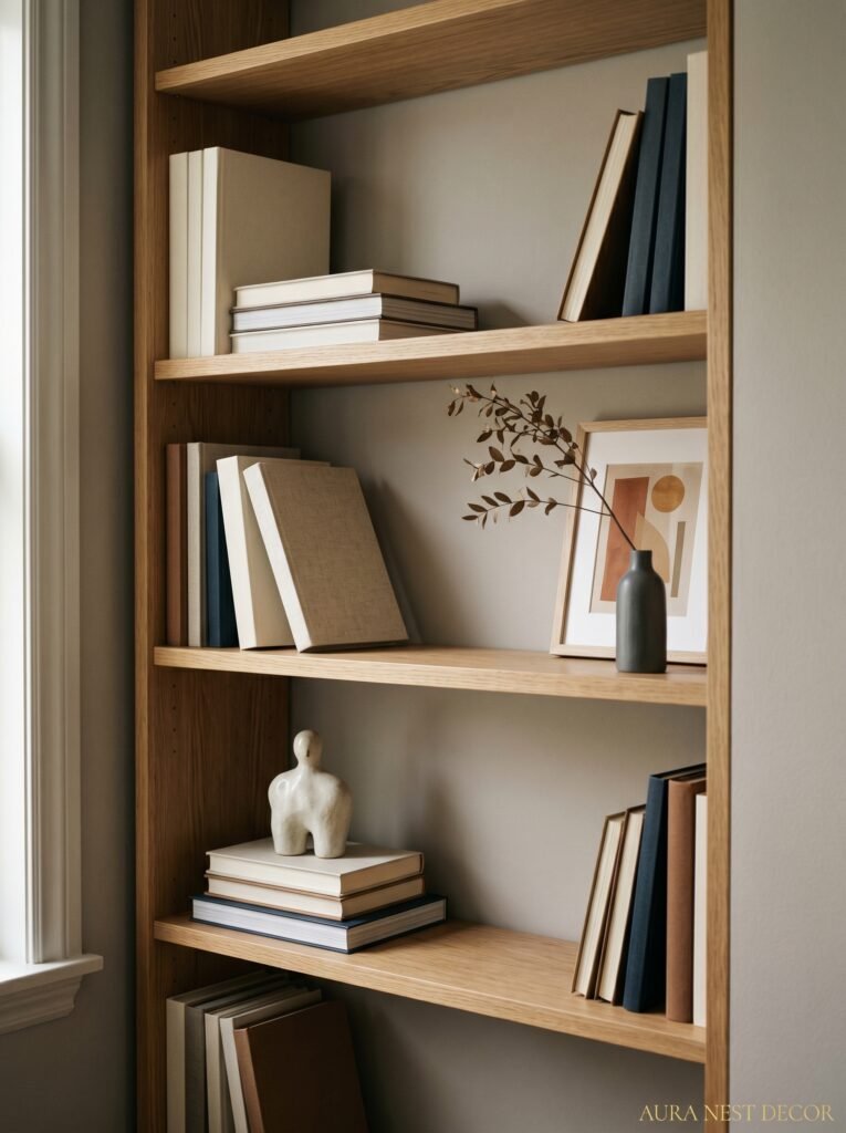
Bookshelves or built-ins in a grey living room are an opportunity most people squander. They either fill them completely with books (which can look great but usually just looks chaotic) or they go to the other extreme and put three objects very far apart, which looks like the shelves are barely being used.
The mix that works: roughly 60% books, 40% objects. And the objects need to vary in height, material, and scale. A tall ceramic vase, a small sculptural piece, a trailing plant, a framed print leaned against the back, a stack of books horizontal with something small on top. It sounds like a lot to manage but once you start playing with it you find a rhythm.
Painting the inside back of bookshelves the same grey as the walls is a very specific move that makes everything on the shelves look intentional. Or a contrasting color — a deep forest green, a warm terracotta. The back of a shelf is small enough that you can go bold without it being overwhelming.
12. The Small Objects That Secretly Make a Grey Room Feel Expensive
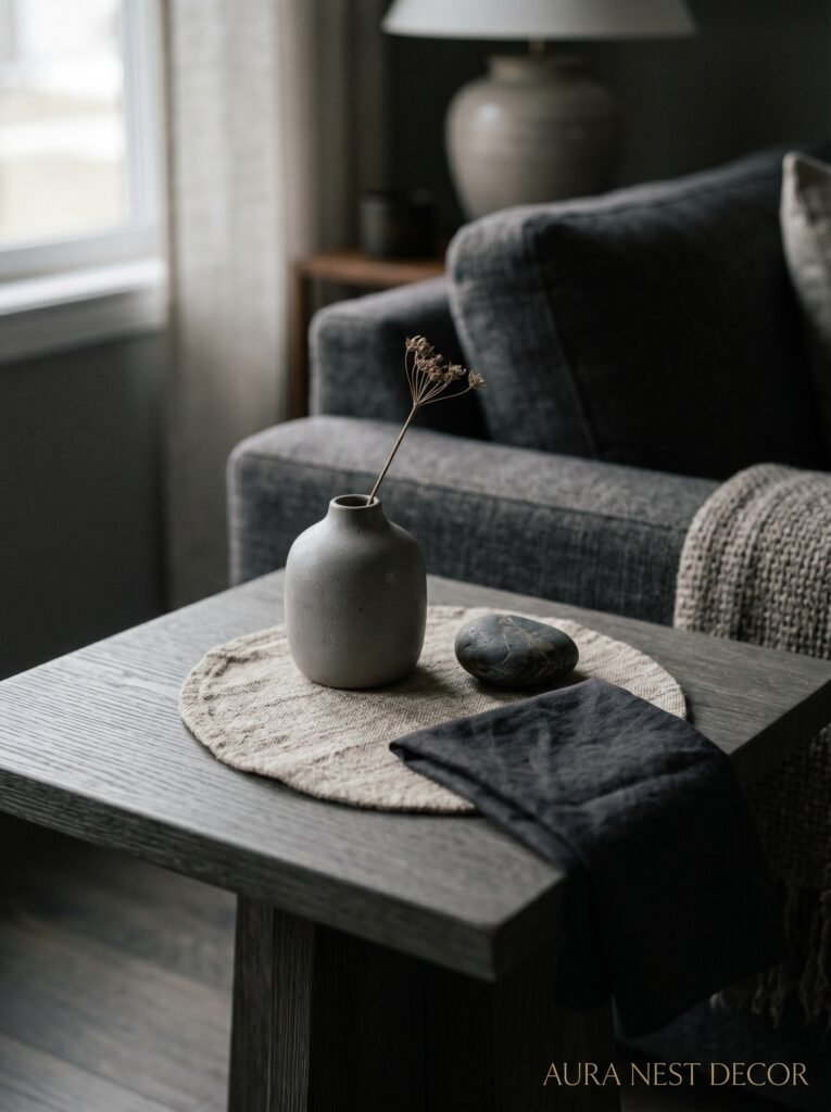
Candles. Not as a collection — as a practical thing you actually use. There’s something about a lit candle in a grey room at dusk that no other object can replicate. The scent matters too, obviously — something with amber, sandalwood, cedar, or vanilla will contribute to the cozy atmosphere in a way you feel without consciously noticing. But even visually, the small warm flame against grey walls does something.
Ceramic objects in warm tones. A small handmade bowl. A rough-textured vase in terracotta or cream. A sculptural candle holder. These things don’t need to be expensive — some of my favorites came from charity shops and church sales, and they look like they came from a boutique. Because handmade and imperfect reads as quality in a way that perfect and mass-produced sometimes doesn’t.
And books, used as actual decoration rather than just storage. A small pile on the coffee table, a couple on an end table. It says someone LIVES here. That’s the whole goal of cozy modern design, isn’t it? A home that doesn’t look like it’s performing. One that looks like someone wonderful actually inhabits it.
—
❓ FAQ
Q: What’s the best grey paint color for a north-facing living room in the UK? A: You want something with warm undertones — Mole’s Breath by Farrow & Ball is a classic for a reason, and Pebble Shore by Little Greene is gorgeous too. Avoid anything with blue or purple undertones because they’ll go icy in low northern light. Always test samples in large swatches before committing.
Q: How do I make a grey living room feel cozy without spending a lot of money? A: Lighting is your biggest bang for your buck — switching to warm-toned bulbs and adding one or two floor or table lamps makes an enormous difference for very little money. After that: a throw blanket, some candles, and a plant or dried botanicals. You don’t need to redecorate, you need to layer warmth.
Q: Can I mix different shades of grey in one living room? A: Yes, but make sure the undertones match or at least complement each other. A grey with warm undertones mixed with a grey with cool blue undertones will make the room feel disjointed in a way that’s hard to pinpoint. Stick to the same temperature family — all warm, or all cool — and varying the depth (light grey wall, darker grey cushion) works really beautifully.
—
💭 Final Thoughts
A grey living room isn’t a choice to play it safe. Done right, it’s actually one of the bolder choices you can make — because it requires you to be really intentional about everything that goes in it. The texture, the lighting, the little warm details. Grey doesn’t hide mediocre choices the way a colorful room sometimes can. But when it works, it WORKS.
And the reward is that exhale. Someone walks in and their shoulders drop. Which is really all any of us want from a living room, isn’t it?