Why Japandi Living Rooms Are Taking Over Pinterest (And Why Your Space Needs This Energy)
You know that feeling when you walk into a room and your whole body just… exhales? That’s Japandi. No clutter screaming at you, no throw pillows fighting each other for attention, just this quiet, intentional calm that somehow feels both incredibly cozy and strikingly beautiful.
—
1. What Japandi Actually Is (Because Everyone Gets This Wrong)
Most people hear “Japandi” and think it’s just beige furniture with a bamboo plant shoved in the corner. It’s not. Not even close.
Japandi is what happens when Japanese wabi-sabi — the philosophy that finds beauty in imperfection and age — collides with Scandinavian hygge, that deeply Nordic obsession with warmth and togetherness. The result isn’t a compromise between two aesthetics. It’s something entirely its own. A design language that says: this room was made carefully, and nothing in it is here by accident.
In a Japanese living room, you’d see low furniture, natural materials, deliberate empty space treated as a design element, not a problem to solve. In a Scandi home, you’d see sheepskin throws, pale wood, candles everywhere, and a kind of unpretentious warmth. Japandi borrows from both — the restraint of the East, the coziness of the North — and the tension between those two things is what makes it so compelling.
The reason it’s exploding on Pinterest right now isn’t just aesthetics. People are exhausted. Genuinely overwhelmed by visual noise in their lives, and they’re craving spaces that push back against that. A Japandi living room isn’t just pretty — it’s a physical argument for slowing down.
“A Japandi room doesn’t ask anything of you. That’s the whole point.”
—
2. The Color Story Nobody Talks About Honestly
Okay so here’s where people go wrong. They see Japandi spaces and think: gray and beige and white. Done. But that’s only half the picture.
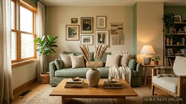
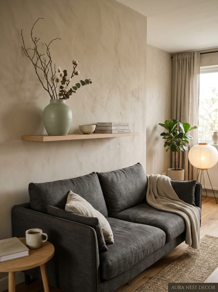
The base is quiet, yes — warm whites, mushroom tones, putty, pale linen. But the accent colors in a well-done Japandi room are actually quite specific and not quite what you’d expect. Deep forest green. Muted terracotta. Ink black used sparingly, almost like punctuation. Charcoal that’s almost — but not quite — navy.
And here’s the thing about those colors: they’re never bright. Not a single one pops. They’re almost like they’ve been left out in the sun a little too long, slightly faded, softened. Dusty and warm. That quality is called “wabi” — the beauty of something that’s aged, that has history.
If you’re working with paint (and you probably are), look for colors described as “muted,” “chalky,” or “raw.” In the US, Sherwin-Williams’ “Accessible Beige” and “Roycroft Pewter” get you close. For UK readers, Farrow & Ball’s “Mole’s Breath” and “Purbeck Stone” are genuinely perfect — not cheap, I know, but worth every penny if you’re serious about this. Little Greene’s “French Grey” is another one I keep coming back to.
The rule — if there is one — is that nothing in the room should feel loud. Even your darkest color should feel like a whisper.
—
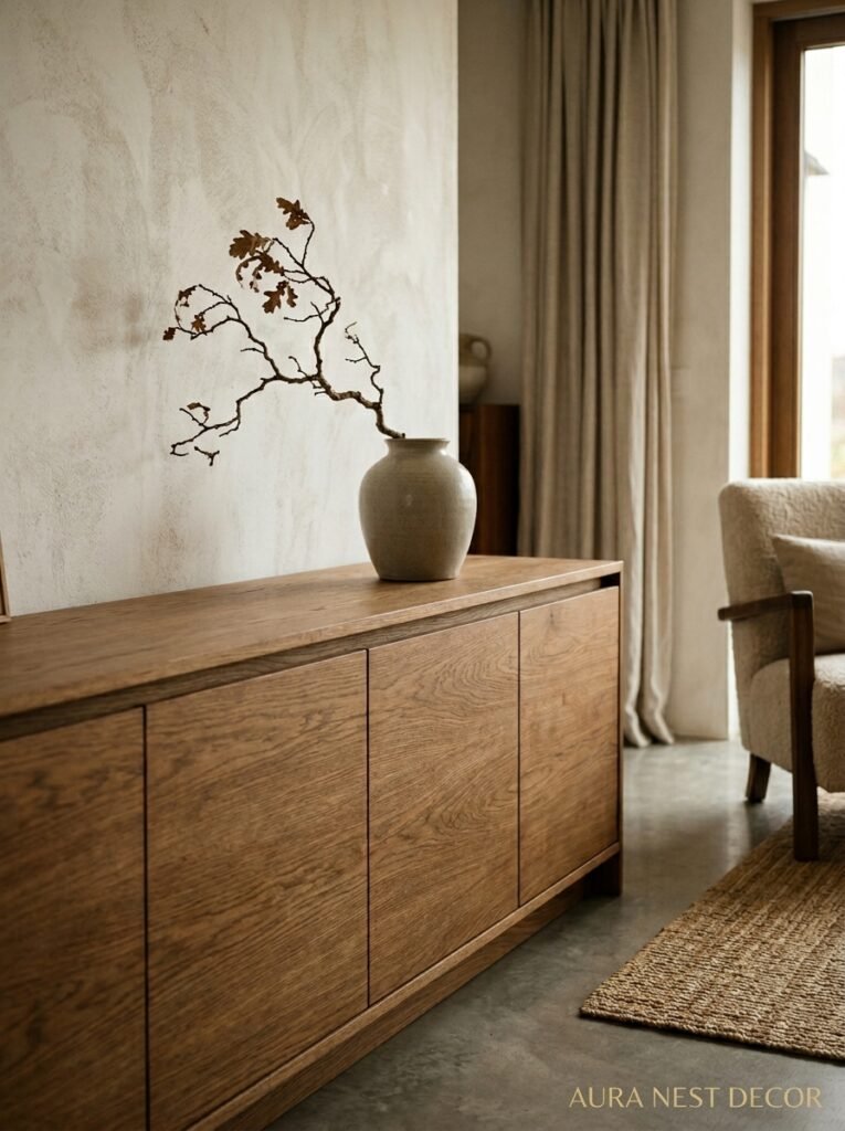
3. The Furniture Rule That Changes How You See Every Room
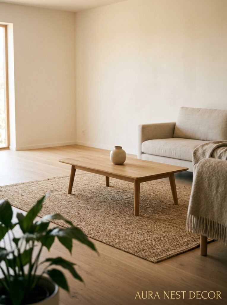
Low. Everything is low.
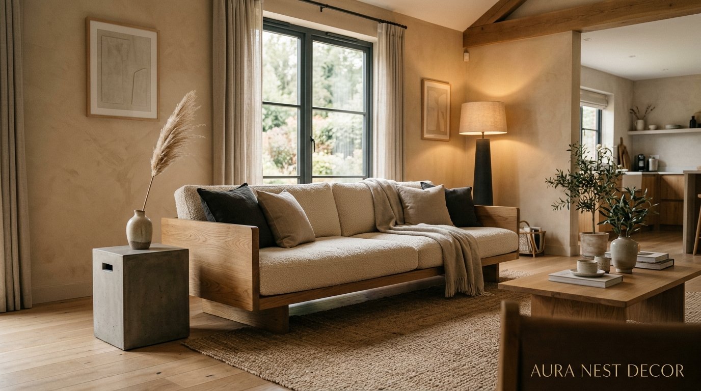
That’s the Japanese influence coming through hard. Coffee tables close to the ground, sofas with short legs or no visible legs at all, floor cushions that you actually sit on, not just style around. The ceiling feels taller when your furniture sits closer to the floor. The room breathes more. It’s not a trick exactly, it’s just physics, but it works every single time.
The Scandi side brings the material warmth — pale ash wood, solid oak in lighter stains, the occasional walnut piece for contrast. Nothing fussy. No carved legs, no ornate frames. Furniture in Japandi interiors has this quietly confident simplicity that makes you realize how much decorative detail on furniture you’d been trained to ignore.
One thing I’d push back on: you don’t need to buy all new furniture. I’ve seen people take an existing sofa, strip away the excess throw pillows (keep two, max), drop a natural fiber rug underneath, swap out a glass coffee table for a low wooden one, and suddenly the whole room shifts. It doesn’t have to be a full renovation. It has to be intentional.
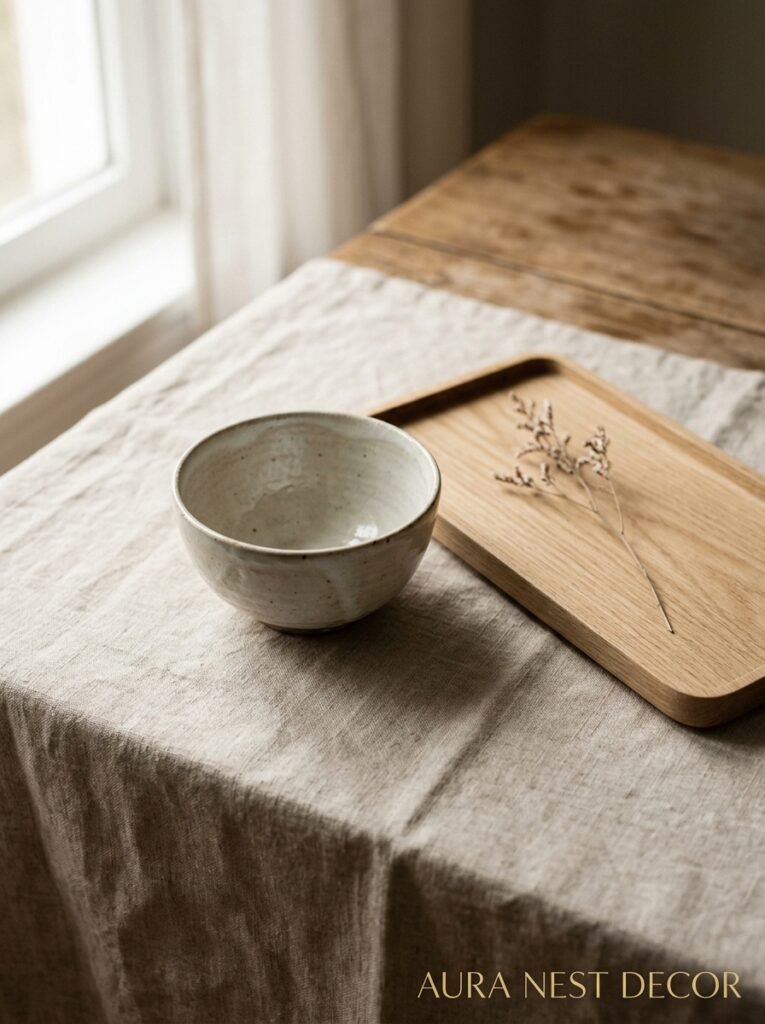
The other thing? Visible craftsmanship. You want to be able to look at a piece of furniture and understand how it was made. Dovetail joints. The grain of the wood. A visible seam on linen upholstery. These details aren’t imperfections — in wabi-sabi thinking, they’re the whole point.
—
4. Why Empty Space Is the Most Expensive-Looking Thing in Your Room
This might be the hardest mindset shift in all of Japandi design, especially if you grew up thinking a beautiful room is a full room.
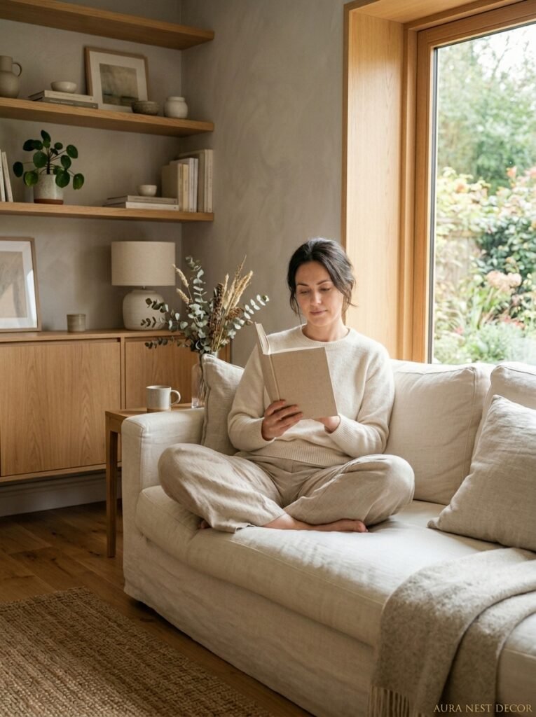
Empty space — called ma in Japanese design — isn’t absence. It’s presence. It’s a deliberate choice to let a single beautiful object breathe, to let your eye rest, to create visual silence that makes everything you do have look more considered. When you walk into a room and there’s one perfect ceramic vase on an otherwise bare shelf, your brain goes: someone chose that. Someone cared. And that registers as taste, as quality, as intention.
Contrast that with a shelf stuffed with objects. Even if every single one is beautiful, they cancel each other out. The room becomes noise.
For American and British homes — where we’re both culturally very prone to filling every surface because it feels homey — this is a genuine challenge. We associate fullness with warmth, emptiness with coldness. But Japandi retrains you. The warmth comes from materials and light, not quantity of objects.
“You don’t need more things. You need fewer things that actually mean something.”
Start with one surface. One shelf, one console table, one side table. Edit it down to one or two objects, maximum three. See how it feels for a week. I’d be genuinely surprised if you want to add anything back.
—
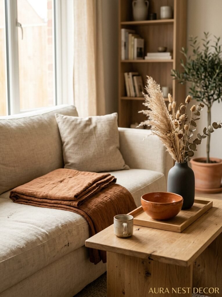
5. The Textiles That Make a Japandi Room Feel Like a Hug
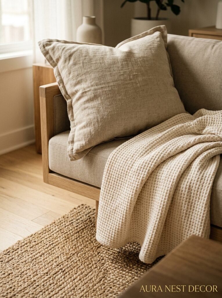
Here’s where the hygge side really comes alive. Because restraint in form doesn’t mean restraint in comfort — Japandi living rooms are SOFT. Deeply, genuinely cozy in a way that a lot of minimalist interiors fail completely to achieve.
The fabrics you’re looking for: undyed linen, heavy cotton canvas, chunky-knit wool in oatmeal or cream, sheepskin (not the dyed synthetic kind), cotton velvet in dusty tones. Texture is everything here. You’re not building a color story with your textiles — you’re building a texture story. A linen sofa with a chunky wool throw and a smooth ceramic lamp and a raw wood tray — that contrast of rough and smooth, matte and slight sheen, is what makes the room feel rich without being busy.
Rugs deserve their own mention. A natural jute or sisal rug is the obvious choice and it works, don’t get me wrong. But honestly? A slightly worn, low-pile wool rug in a natural undyed tone can be even better. Something that looks like it’s been walked on a thousand times and is better for it. Wabi-sabi, again.
Curtains: floor-to-ceiling linen, always. Let them puddle slightly at the bottom if your ceilings are high enough. The weight of them, the way they move — it adds something you can’t quite name.
—
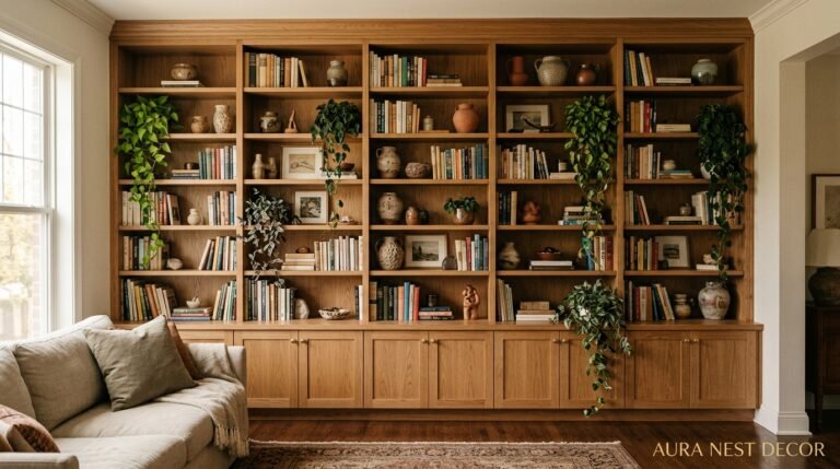
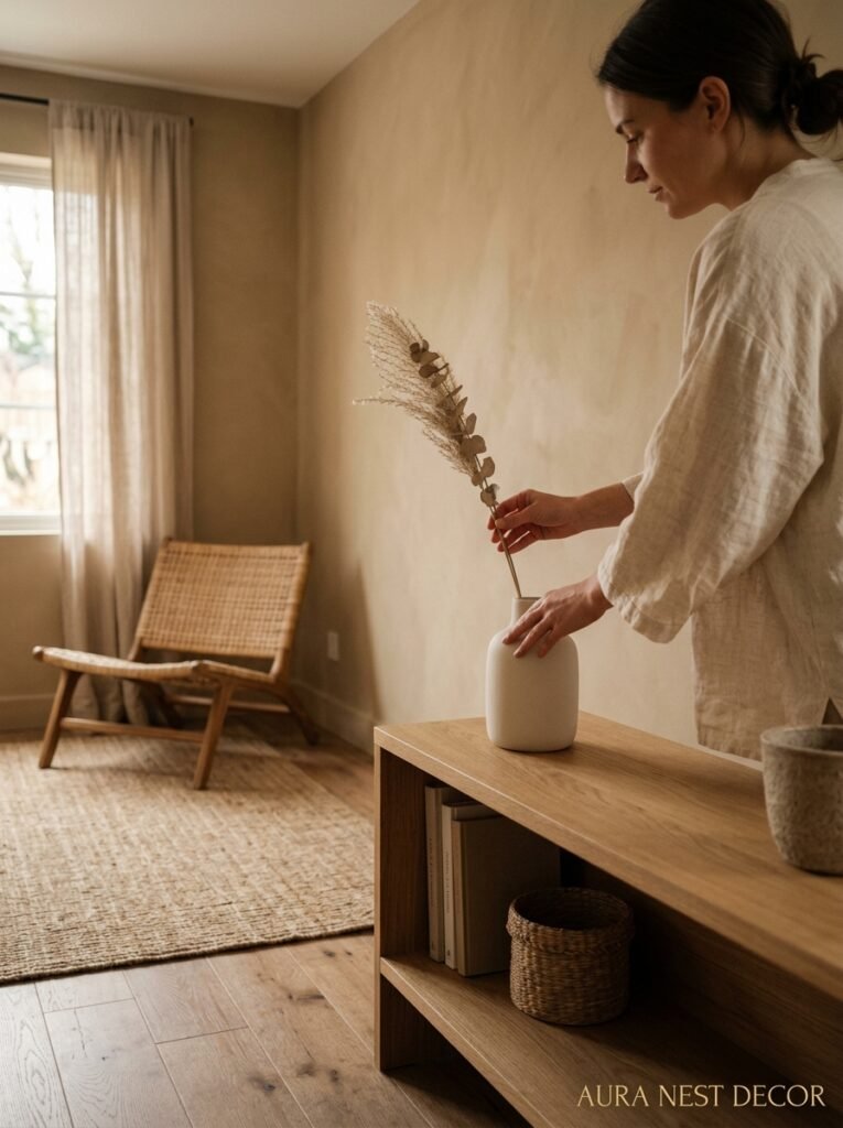
6. The One Plant That Keeps Showing Up in Every Perfect Japandi Room
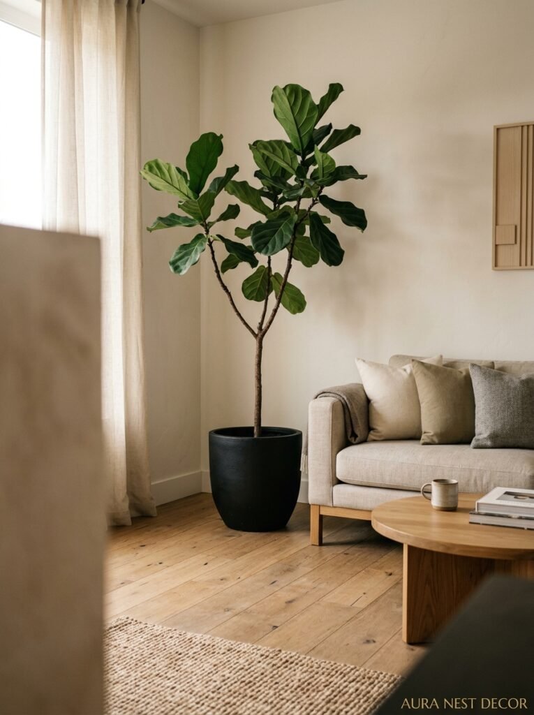
Not a monstera. Not a fiddle-leaf fig. Not those weird trailing pothos vines draped everywhere.
A single, beautiful bonsai. Or a carefully pruned olive tree in a plain terracotta pot. Or — and this one doesn’t get enough credit — a simple moss arrangement in a shallow ceramic dish.
The point is: one plant, chosen with intention, given room to be seen. Not a jungle, not a shelfie crammed with propagations. One specimen that makes you look at it and think about the time it took to grow.
Side note — dried grasses and pampas in raw, undyed shades also work brilliantly here. They add that wabi-sabi sense of age and seasonality, and they require literally zero maintenance. In the UK especially, where the light is softer and more diffused, dried botanicals look incredible against a white or pale plaster wall.
The container matters as much as the plant. Handmade ceramics with visible thumbprints in the clay, irregular shapes, slightly uneven glazes — these are more interesting than a perfect machine-made pot, and they’re easier to find than you’d think. Etsy, local makers’ markets, or honestly just charity shops if you’re patient enough.
—
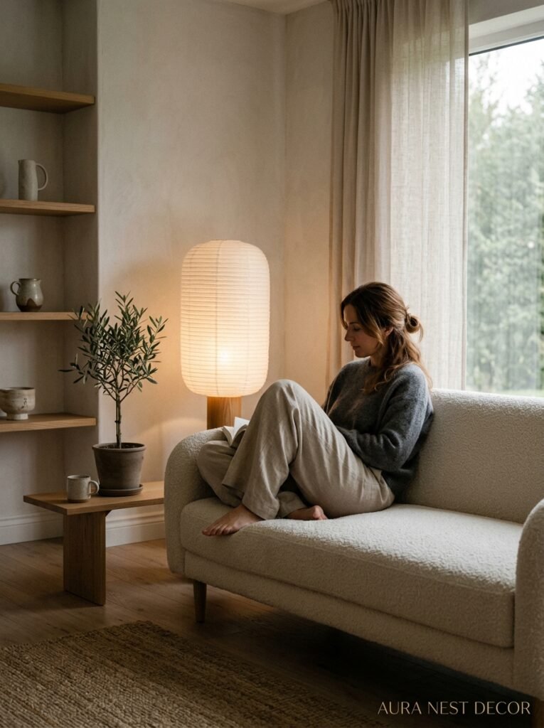
7. The Lighting Situation That Separates Good Japandi From Great Japandi

Overhead lighting. That’s your enemy. Or at least, your big dramatic overhead fixture is, unless you’re dimming it way, way down.
The amber glow of a paper lantern at 8pm, casting a warm circle of light over a low coffee table. That’s the look. That’s the feeling. Japandi rooms layer light low — table lamps, floor lamps at seated height, candles, maybe a single pendant over a reading corner. They don’t blast light from above. That kind of institutional lighting undoes everything else you’ve done.
“Light is furniture. Start treating it that way.”
For fixtures, look for washi paper pendants — they’re Japanese in origin and genuinely beautiful, and they diffuse light in this soft, warm way that no glass shade can replicate. In the UK you can find them at places like MUJI (obviously) or independent homeware shops. In the US, Schoolhouse Electric and various Etsy makers do beautiful versions.
Bulb temperature: 2700K or lower. Warm white, not daylight. Daylight bulbs in a Japandi room are a crime against the aesthetic.
Candles aren’t optional. I know that sounds dramatic, but the way candlelight moves — slightly alive, slightly unpredictable — is genuinely irreplaceable. Unscented for the living room if you’re going to have several going. Beeswax if you can get it.
—
8. The Art Question (And Why Most People Get It Wrong)

One large piece. Not a gallery wall, not five small prints clustered together, not a shelf of framed photos in matching frames.
One piece of art, hung low (lower than you think — the center at eye level when seated, not when standing), given breathing room on all sides.
The art itself in a Japandi room tends to be abstract or nature-inspired. Ink wash paintings are obviously on the nose but they work. Abstract forms in black and natural pigments. A single large-format photograph of a landscape — mountains, water, minimal horizon. Botanical drawings in simple black frames. Or honestly? A piece of calligraphy, Japanese or otherwise, that you find genuinely beautiful.
What doesn’t work: anything too colorful, too illustrative, too literal. Anything that competes for attention rather than contributing to the quiet.
And please — get it framed properly. The right frame on a piece of art changes everything. Simple natural wood or thin black metal, no ornate gold, no bright white mat boards. The frame should almost disappear.
—
9. Storage That Doesn’t Look Like Storage
One of the clever things about Japandi design is how it handles the clutter problem. Because life is messy. Remote controls exist. Books accumulate. Kids leave their stuff everywhere — or maybe that’s just my house.
The answer isn’t hiding everything in ugly plastic bins or building IKEA shelving units up to the ceiling. It’s investing in storage pieces that are beautiful enough to live in the open.
A large woven basket with a lid. A low credenza in pale ash with sliding doors. A ceramic lidded pot on the coffee table for the things you touch every day. Deep, simple wooden bowls that make keys and coins look intentional.
The idea is that your storage is of a piece with everything else in the room. Made from the same natural materials, in the same muted tones, with the same clean lines. When everything visual tells the same story, clutter sort of… recedes. Or maybe it’s the opposite, honestly — maybe it’s that when your containers are beautiful, you’re more motivated to actually put things in them.
—
10. How to Start Without Spending a Fortune
I want to be honest about this because a lot of Japandi content online is basically “spend £3,000 at MUJI and call it a day.” And that’s fine if you’ve got it, but most people don’t.
The good news is that Japandi’s philosophy is fundamentally anti-excess. It doesn’t reward buying more stuff. It rewards buying less stuff, better.
Start by editing, not buying. Go through your living room and pull out everything that doesn’t fit — the bright accent colors, the fussy decorative objects, the things you kept “just because.” Put them in a box in the garage for a month. See how the room feels without them.
Then, if you want to add: one good quality throw in natural linen or wool. One simple ceramic vase. One low-wattage lamp. That’s genuinely all you need to start shifting the feel of the space.
For affordable buys in the US: H&M Home does decent natural textiles, Target’s threshold line has some solid wood pieces, and IKEA’s STOCKHOLM and SINNERLIG ranges are more Japandi-adjacent than most people realize.
In the UK: MUJI obviously. John Lewis’s own-brand bedding and throws are actually brilliant for this. Habitat has some good pieces at reasonable prices. And honestly, eBay and Vinterior for secondhand — a genuinely beautiful secondhand ceramic lamp in the right tones will beat a new plastic-and-glass one every time.
—
11. The Seasonal Shift That Keeps Japandi Feeling Fresh
Here’s something I love about this aesthetic: it changes with the seasons without you having to do very much. Because it’s rooted in natural materials and the idea of time passing, it already has that quality built in.
In autumn and winter, lean into the hygge side. More candles, heavier textiles, dried botanicals in warm bronze and amber tones, the throw gets replaced with a heavier wool blanket. The room gets darker and warmer and more den-like. That’s not a design failure — that’s the point.
In spring and summer, the Japanese influence takes over more naturally. Less layering, fresher greens, maybe a single branch of something blooming in a tall ceramic vase. Lighter linen. The windows stay open and the curtains move.
You’re not doing a seasonal “refresh” the way fast-home-decor culture insists you must. You’re just letting the room breathe with the year. Big difference.
—
12. The One Mistake That Kills the Whole Vibe
Mixing in too much of everything “natural.”
I’ve seen this happen a lot. Someone gets excited about Japandi, they go full send on the naturals — jute rug, rattan lamp, wicker basket, bamboo tray, wooden beads, macramé wall hanging — and suddenly the room looks like a boho beach house. Which is a perfectly valid aesthetic, but it’s not this.
Japandi is edited even in its naturals. You might use jute OR rattan, but probably not both. You’ll have wood, but it’ll be in one or two specific tones, not a rainbow of pine and walnut and oak all fighting each other.
The question to ask with every addition: does this fit the quiet? Does it contribute to the calm, or does it add another note to an already-busy composition? When you start asking that about every object before it comes into the room, the whole thing gets a lot clearer. Fast.
—
❓ FAQ
Q: Can I do Japandi in a rental without being able to paint the walls? A: Honestly, yes — and sometimes rentals make it easier because magnolia or off-white walls are basically already in the right family. Lean into the furnishings, textiles, and lighting to do the heavy lifting. A natural-fiber rug and some warm-toned lamps can shift the whole mood of a room without touching a wall.
Q: Is Japandi the same as minimalism? A: Not quite. Minimalism is more dogmatic about absence — less is more, full stop. Japandi is warmer than that. It’s not trying to feel cold or stark, it genuinely wants to feel cozy. The restraint is in service of comfort, not aesthetics for aesthetics’ sake. You’d have a throw blanket in a Japandi room; a strict minimalist might not.
Q: How do I stop the room feeling too plain or boring? A: Texture is your answer, every time. When color is quiet, texture does the work. Mix matte and slightly shiny surfaces, rough-woven and smooth, heavy and lightweight. A room that’s all the same beige but has five different surface textures going on is anything but boring — it rewards looking closely, which is kind of the whole point.
—
💭 Final Thoughts
There’s something quietly radical about designing a room that asks you to slow down in it. Not because it’s a trend or because Pinterest says so, but because you genuinely need a place that doesn’t demand anything from you the second you walk in.
Japandi won’t suit every personality or every home, and I’d never try to talk you into something that doesn’t feel like you. But if you’ve ever stood in someone else’s living room and felt your shoulders drop and thought I want this — you probably already know what you’re looking for.
What would your living room look like if it was built around how you actually want to feel, rather than how you want it to look?