The Living Room Corner That’s Been Staring at You — Here’s What to Do With It
You know the corner. The one with the floor lamp you moved there temporarily in 2021 and never moved again. Maybe there’s a blanket draped over something. Maybe there’s just… nothing.
That corner deserves better. And so do you.
—
1. Why Your Brain Keeps Ignoring That Corner (and Why That’s Actually a Design Problem)
Here’s something interior designers don’t say enough: empty corners create visual anxiety. Not the dramatic kind, not the kind you notice consciously — but your eye hits a dead zone every time it scans the room, and it has nowhere to land. You register it as “something’s off” without ever pinpointing what.
Corners are spatially weird. They’re the only spot in a room where two walls meet and basically say “we don’t know what to do here either.” Most furniture is designed to sit against one wall or float in the middle. So corners get ignored by default, not by choice.
The thing is, a well-styled corner actually makes the WHOLE room feel more considered. It anchors the space. When your eye lands somewhere intentional — a tall plant, a layered reading nook, a stack of vintage books with something interesting on top — the entire room feels calmer. More finished. Like someone actually thought about it.
And someone did think about it. Corners are just design problems with a solution, and once you decide to solve it, it becomes kind of addictive honestly.
“A well-styled corner doesn’t just fill a gap — it tricks the entire room into feeling finished.”
—
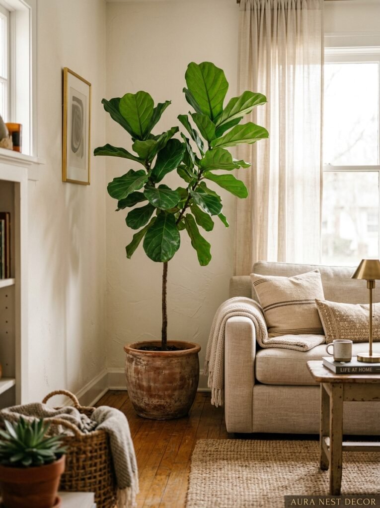
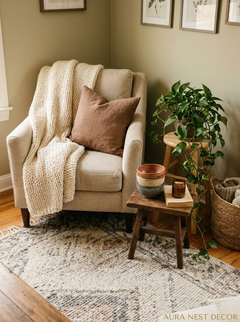
2. The Tall Plant Trick That Every Stylist Actually Uses
Not gonna lie, I resisted the tall plant thing for years. It felt too obvious. Too “every Pinterest board from 2018.”
But here’s why it keeps working: height. Rooms need vertical interest, and most furniture doesn’t give you that. A fiddle leaf fig or a tall monstera or even a dramatic dracaena pulls your eye UPWARD and suddenly your ceiling feels taller, your room feels bigger, and your corner feels intentional without being overthought.
The key is not to shove the plant into the corner like you’re hiding it. Give it room to breathe — pull it slightly forward, maybe six to eight inches off the wall, and put it in a pot that actually means something. A terracotta pot with a bit of texture. A matte black planter if your room leans modern. The pot is part of the styling, not just a vessel.
Side note — if you genuinely cannot keep plants alive (no judgment, I’ve killed things in ways that shouldn’t be possible), a really good faux tall plant now looks extraordinary. The silk ones from decent retailers? You’d have to get close. The secret is weight in the pot — fill the bottom with rocks or floral foam and cover the top with real pebbles or preserved moss so it reads as completely authentic from any normal human standing distance.
—
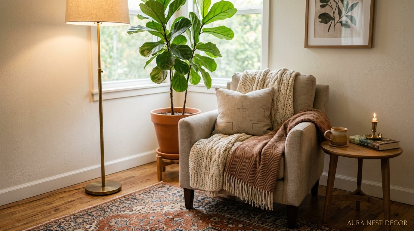
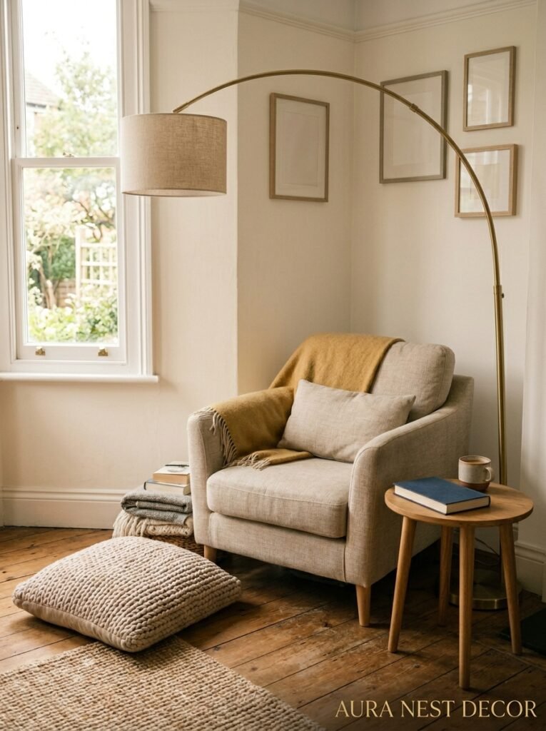
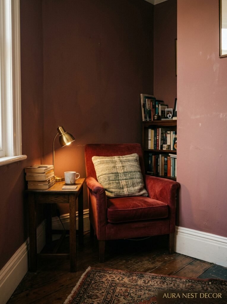
3. The Corner That Becomes a Whole Reading Nook Without Built-Ins
Here’s the version I want you to try. No construction required. No built-in shelves, no wallpaper accent (unless you want one, which — yes actually).
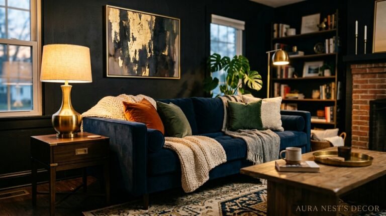
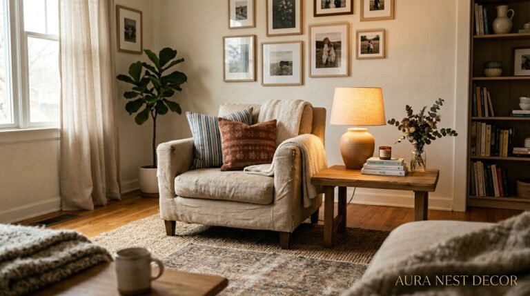
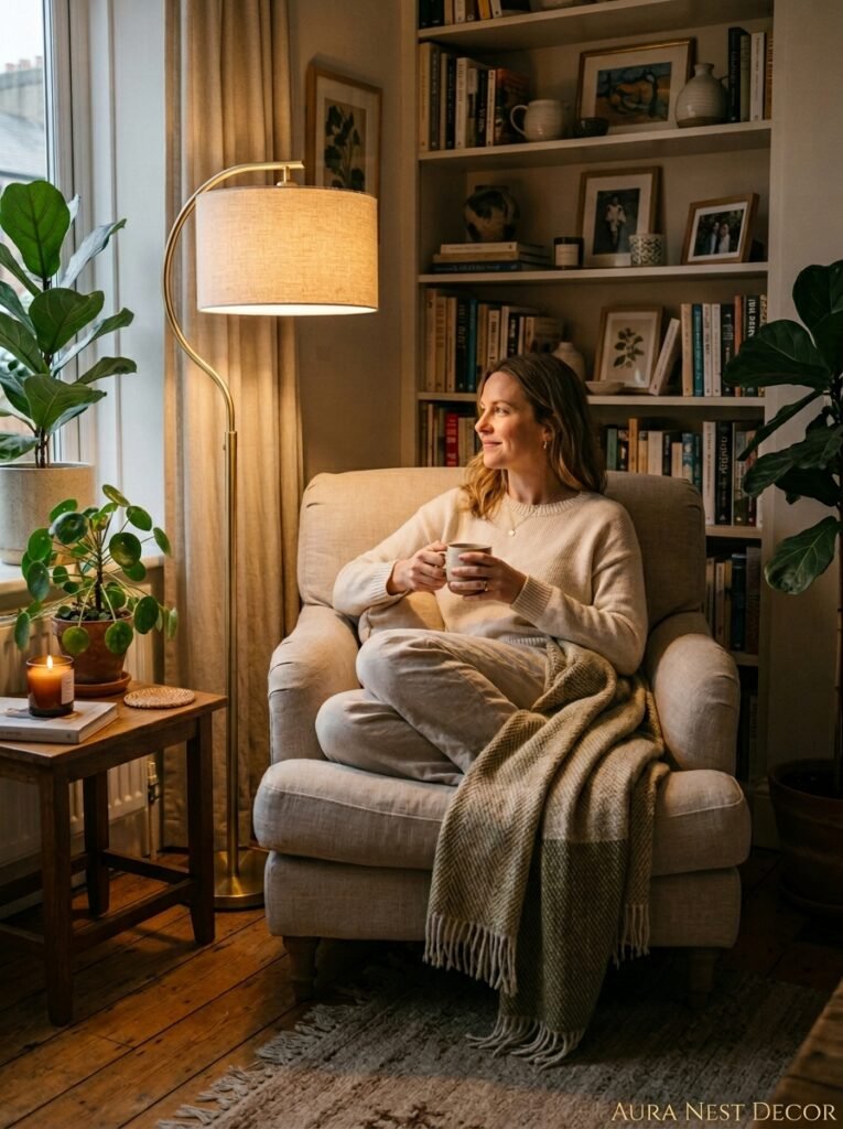
Start with an armchair angled into the corner at roughly 45 degrees. Not pushed flat against one wall. Angled. This is the move that most people don’t make and it immediately changes the geometry of the room. It signals that this corner is a destination, not a placeholder.
Add a floor lamp behind the chair, slightly taller than the back of it, and here’s the specific part — it should have a warm-toned bulb. Not white, not daylight. The amber glow of an Edison bulb at 7pm is the difference between a corner that feels designed and one that feels like a waiting room. A small side table next to the chair, just big enough for a mug and a book. A throw blanket draped imperfectly over the arm — not folded. Folded is too neat, it signals “display” rather than “lived in.”
This corner should look like someone just got up.
—
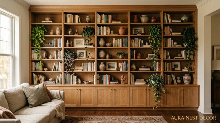
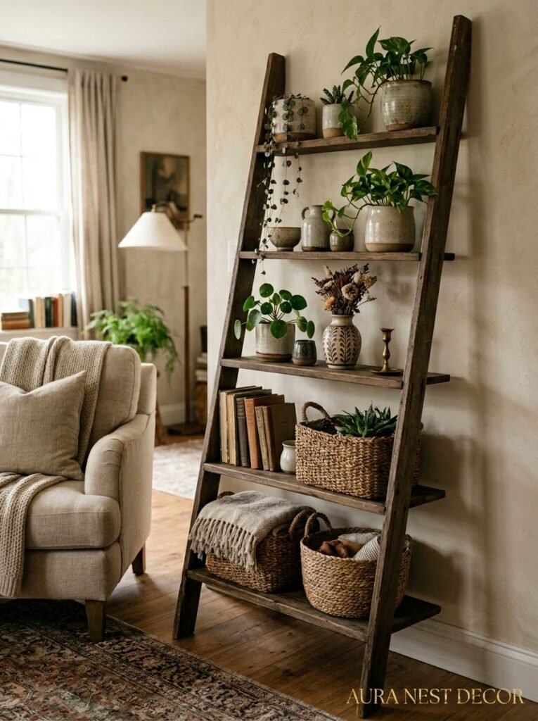
4. Shelving That Doesn’t Look Like Shelving
Tall bookshelves are the obvious answer for corners. But there’s a version of this that’s more interesting.
Floating corner shelves, staggered at different heights — not matching, not symmetrical — create something that feels more curated. Like it evolved rather than being installed in an afternoon. The trick is mixing what’s on them deliberately: one shelf is mostly books, one has a mix of objects and one plant, one is almost empty with just a candle and a piece of ceramic.
Almost empty is a choice people are afraid to make. They fill every inch because empty feels unfinished. But a shelf with breathing room communicates confidence. It says you’re not trying too hard.
The UK version of this that I keep seeing everywhere right now — and it’s honestly gorgeous — is a tall ladder shelf leaned into the corner rather than wall-mounted. No screws, no commitment, and you can move it when you get bored of it (which you will, and that’s fine). Stack books horizontally on some rungs, vertically on others. Add a small trailing plant on the top rung so it spills down. It’s a bit untidy in the best way.
“An almost-empty shelf isn’t laziness — it’s the most confident design choice in the room.”
—
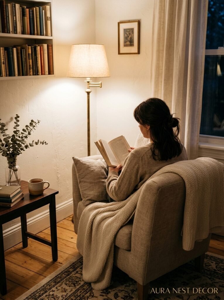
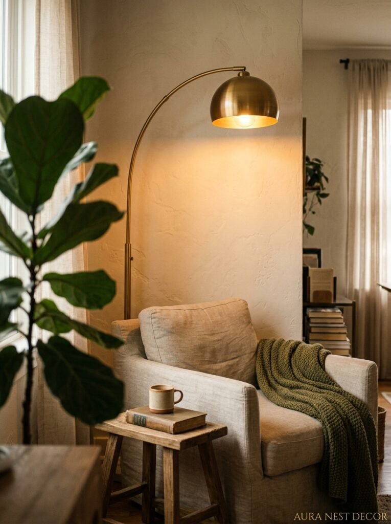
5. The One Corner Lighting Setup Worth Trying Right Now
Corner lighting is chronically underused. Most living rooms run on overhead light and maybe one lamp, and the result is a flat, slightly depressing room after dark. Corners are where you create mood.
Floor lamps are the obvious move but don’t stop there. Pair a floor lamp with something lower — a small table lamp on a low surface, or even LED strip lighting tucked behind a piece of furniture or inside a shelf. Two light sources at different heights in one corner create what lighting designers call “layered light” but what it actually feels like is: a room that’s warm and interesting at 9pm instead of a room that feels like a waiting area.
If you’ve got an awkward corner that’s too narrow for furniture, a tall arc lamp leaning over a low stool or a small sculptural object is a legitimate answer. The stool holds something — a small plant, a stack of books, a big chunky candle. The lamp lights it. Done.
Color temperature matters so much here. Go for bulbs around 2700K or lower. That’s the warm, slightly golden light that makes everyone look better and makes rooms feel like evening rather than fluorescent office. You can get this right for not a lot of money and it changes EVERYTHING about how your room feels after sunset.
—
6. Corners in Small British Terraces Specifically (Because the Rules Are Different)
If you’re in a UK terrace, you know the specific hell of the front reception room corner — oddly shaped because of the bay window or the radiator that’s inexplicably placed in a weird spot, or just the fact that Victorian houses were not designed with Pinterest in mind.
The move here is to lean into the architecture rather than fight it. That radiator? Put a slim console or a shelf directly above it — radiator covers with a flat top work really well for this, and you can style the surface beautifully while making a formerly ugly thing genuinely attractive.
The bay window corner (the bit between where the bay ends and the main wall begins) is actually one of the best spots for a small armchair or a window seat cushion placed directly on the floor with big oversized cushions behind it. Low to the ground, lots of textile, soft light — it reads as intentional and cozy and it makes use of a space that would otherwise be awkward forever.
—
7. The Art-On-the-Floor Corner That’s All Over Instagram Right Now
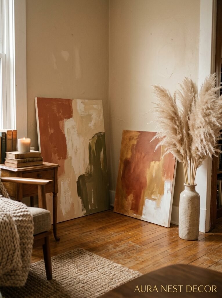
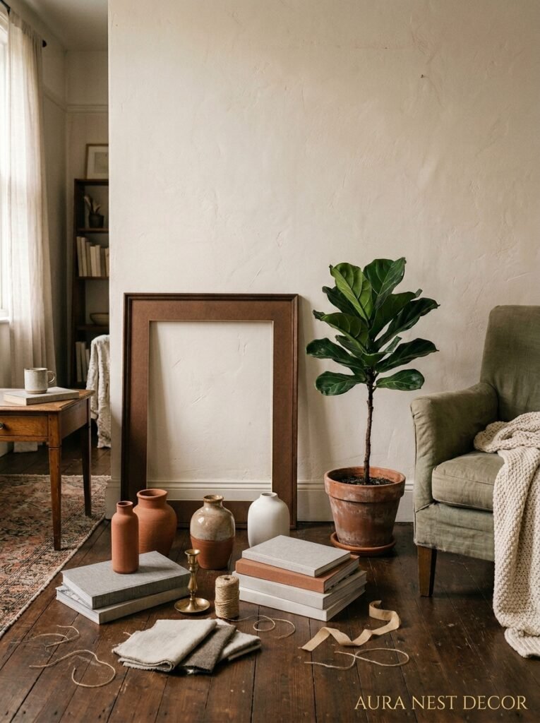
Look, I know leaning art on the floor feels wrong. Every instinct says “hang it up.” But the leaned-art corner is genuinely one of the easier, more stylish things you can do with a blank corner, and it requires one drill hole: zero.
The layered version is what makes it work. Don’t lean one painting. Lean two or three things at slightly different depths — one large canvas or mirror at the back, something smaller in front of it, maybe a framed print or a small piece of vintage furniture in front of that. A large ceramic vase or a sculptural object at the side. The layering creates depth and it makes the corner look like an intentional gallery moment rather than art you couldn’t be bothered to hang.
The mirror in this setup does something specific — it bounces light back into the room and makes the corner feel open rather than closed, which is the opposite of what you’d expect from filling a corner with stuff. Big mirror leaned against the wall plus one large plant next to it is genuinely one of the most reliable living room corners on the planet right now.
“Lean the mirror. Add the plant. Walk away. Some things are just solved.”
—
8. The “Gallery Wall Wrapped Around a Corner” — Why It’s Worth the Risk
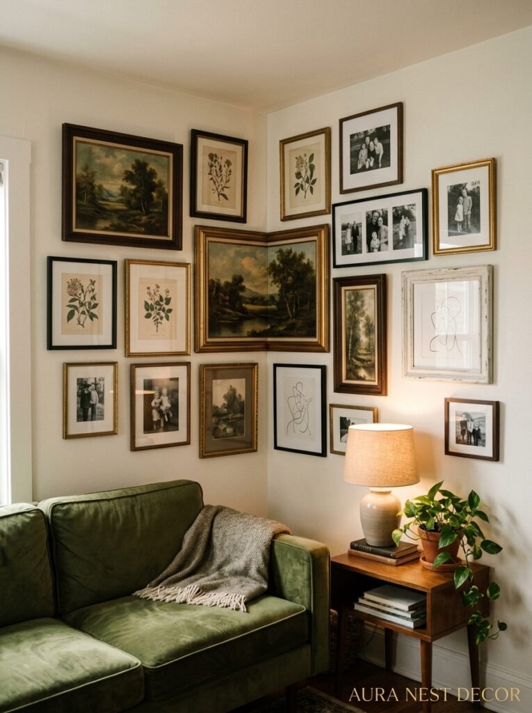
Corner gallery walls feel scary. They’re a commitment. But here’s the thing — when they work, they REALLY work, and the corner becomes the most-photographed spot in your house.
The trick is to wrap the wall at the corner point intentionally, not accidentally. You want at least one or two frames that span both sides — not a full piece, but the positioning implies the wall continues around rather than stopping. Mix sizes aggressively. An enormous frame next to a tiny one. Different mat widths. If everything’s the same depth and the same mat, it reads as a set you bought together rather than something collected over time.
The US version of this tends to run warmer — lots of warm cream mattes, wood frames, prints with earthy tones. The UK version I love right now is cooler, with black frames, botanical prints, some vintage architectural drawings, and one unexpected pop — a children’s drawing in a beautiful frame, or a photo you took on a trip that means something, not a stock-ish landscape.
Don’t plan it too carefully on paper. Put the frames on the floor first, move them around for a while, and then commit. The slight imperfection of where things land when you’re doing it for real usually looks better than the mathematically perfect version you planned.
—
9. Why the Forgotten Corner Is Actually the Best Place for a Bar Cart
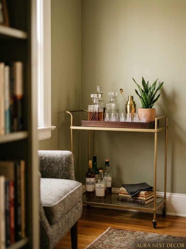
This one’s for the people who’ve been looking at bar carts and wondering where on earth they’d put one. Corner.
The bar cart corner works because it takes something that’s purely functional — drinks, glasses, bottles — and turns it into a decor moment. A brass-finished cart with a few well-chosen bottles, two or three coupe glasses hanging or placed upside down, a small ice bucket that’s also decorative, maybe a plant trailing off the edge or a small framed print leaned behind it. It becomes a destination, which is exactly what a corner needs.
In smaller rooms this is actually smarter than you’d think because the cart can be moved when you need floor space. It’s not permanent. But pushed into a corner most of the time, lit by a small lamp above or beside it, it feels like a little speakeasy moment in your own home. Which is — not a bad thing to have.
—
10. The Cozy Layering Method That Actually Works in Any Corner
Texture is the thing most people forget about when they’re styling corners. They think about what OBJECTS to put there and not how those objects feel against each other.
Here’s a framework that works almost universally: something tall (plant, lamp, or shelf), something textured (woven basket, bouclé throw, rough ceramic), something that catches light (mirror, brass object, glass vase), and something living or organic (actual plant, dried grasses, a branch).
You don’t need all four. Three of them creates a really functional corner vignette. But the texture piece is the one people skip and it’s usually the reason a corner feels styled but not quite finished. A corner with sleek, smooth objects only feels cold. One rough-textured thing — a basket, a jute rug corner, unglazed ceramic — grounds everything.
—
11. The Color Choice That Can Make One Awkward Corner Into a Feature Wall Moment
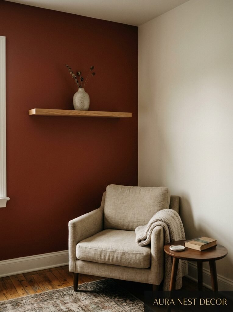
Painting a corner is genuinely underrated. Not the full room. Not even a full accent wall. One corner — two connecting walls painted in a deep, saturated color — creates a recessed, jewel-box effect that feels intentional and dramatic and is actually easier to commit to because it’s so easily reversible.
Shades I’d look at right now: deep forest green (Farrow & Ball Mizzle or Benjamin Moore Black Forest Green), a smoky terracotta, a dusty inky blue. These colors make light fittings look better, make plants POP against them, and make any furniture placed in front of them feel more important.
The corner color trick works especially well when the rest of your room is neutral. The dark corner reads as a deliberate accent. It looks like you know something other people don’t, which is kind of the whole point of a great interior choice.
—
12. The Honest Truth About How Long a Corner Actually Takes to Style Well
I’ll be real with you. The best corners I’ve ever styled took two or three rounds of trying before they landed. You put stuff there, you live with it for a week, you walk past it thirty times and realize the lamp’s too short or the plant’s too small or the whole thing is too crowded.
That’s not failure. That’s just how it works. The first version of a corner is almost never the final version, and that’s actually reassuring if you think about it — because it means you can start today with whatever you have, see how it feels, and adjust. You don’t need to buy ten new things and have it perfect on the first try.
Start with one thing you already own that has some visual weight. Put it in the corner. See how it makes you feel. Add one more thing. Subtract something. The corner will tell you what it needs if you’re paying attention.
That’s not interior designer mysticism. That’s just the process.
—
❓ FAQ
Q: What should I put in a very narrow corner where no furniture fits? A: Narrow corners are honestly perfect for tall plants, a slim floor lamp, or leaned art. A large dracaena or snake plant takes up almost no floor space but adds serious vertical interest. You can also stack a few oversized books on the floor with a small candle or object on top — low, sculptural, takes up about eight inches of floor space and still creates a vignette.
Q: How do I style a corner that has a radiator in it? A: This is such a common UK problem. A flat-top radiator cover that fits snugly against the wall is genuinely one of the best investments — it gives you a surface to style and hides what was previously just an eyesore. Style the top the way you would a console table: something tall at the back, something interesting in the middle, breathing room around the edges. Just make sure the cover allows airflow so it’s actually functional.
Q: Does putting furniture in a corner actually make a small room feel smaller? A: Not if you do it right. Angling a chair into a corner rather than pushing it flush against both walls keeps the floor more open and makes the arrangement feel like a choice rather than furniture storage. Tall, vertical styling elements (lamps, plants, shelves) draw the eye up, which makes the room feel higher and bigger. The worst thing you can do to a small room is leave corners completely empty — dead corners make everything feel unresolved.
—
💭 Final Thoughts
Corners are the rooms-within-rooms of your house. They’re the places where you can be a little bolder, a little more specific, a little more you — without committing to the whole space. Start with the corner that’s been bothering you the longest, the one you’ve been walking past for two years pretending not to notice.
What would you put there if you just… decided?