The Green and Beige Living Room Trend That’s Quietly Replacing Gray (And I’m So Here For It)
Gray had its moment. A long moment. But something warmer, softer, and honestly just better has been creeping into living rooms across the US and UK — and if your Pinterest board is anything like mine, you’ve already noticed it. Green and beige. Together. And it’s not the muddy, forgettable combo you might be picturing.
—
1. Why This Color Pairing Feels Like a Deep Breath You Didn’t Know You Needed
There’s something almost biological about the way green and beige work together in a room. And I don’t mean that in a weird way — I mean that your nervous system actually responds to these colors differently than it does to, say, a high-contrast black and white scheme or a room drowning in grey undertones.
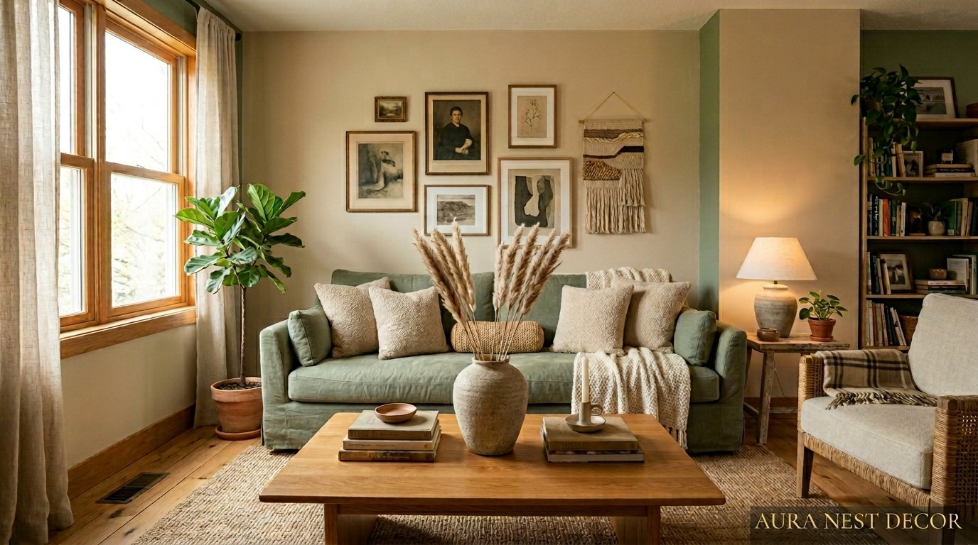
Beige is grounding. It’s the color of linen left in the sun, of dried wheat fields, of the inside of a pottery studio. It doesn’t demand anything from you. Green, on the other hand, has this quiet aliveness to it — it reminds your brain of trees and plants and outside, even when you’re completely indoors. Put them together and you’ve got a room that feels both restful AND intentional. Which is surprisingly hard to pull off.
I think that’s why gray ruled for so long — it’s safe, it’s neutral, it doesn’t commit. But green and beige? They’re neutral AND they have a point of view. That’s the thing people don’t realize until they see it in person. A well-done green and beige living room doesn’t read as “I tried something” — it reads as “I know exactly what I’m doing.”
And the range is vast. Sage green with warm oat tones reads completely differently than deep forest green against antique linen. Both are stunning. But they’re telling completely different stories.
“Beige commits to nothing. But beige with green suddenly commits to everything.”
—
2. The Specific Shade of Green That’s Everywhere Right Now (And Why It Works)
Not all greens are created equal, and this matters SO much when you’re working with beige. The greens that are dominating living rooms right now — on both sides of the Atlantic, I’ve noticed — aren’t the bright, almost-lime greens of the early 2010s. And they’re not the dark hunter greens that felt very Victorian study, very “I have a lot of leather-bound books.”
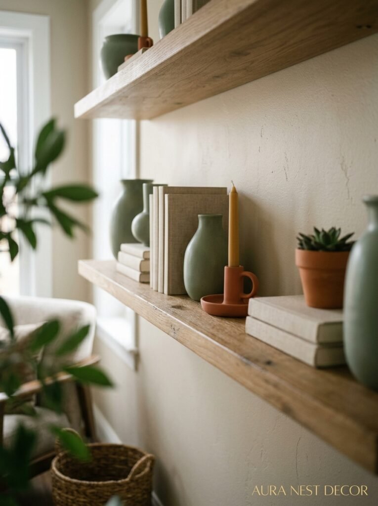
What’s showing up constantly is this middle ground. Dusty, slightly muted, earthy greens. Think sage, obviously — but sage isn’t just one thing. There’s blue-sage, which has this almost silvery quality that pairs beautifully with warm beige. And then there’s the green-sage that leans more yellow-warm, which you’d pair with a deeper, more golden beige to stop it from looking sickly.
Moss green is having a MOMENT. Particularly in the UK — I keep seeing it on Instagram and Pinterest from British interiors accounts, used on cabinetry and even on upholstery. Against the kind of warm putty-beige that’s been replacing pure white in a lot of homes, it’s genuinely stunning.
The ones to maybe approach more carefully: bright emerald and lime. They can work — but they need a very specific kind of beige (think warm sand, not cool ivory) and usually benefit from some grounding with wood tones or natural materials.
—
3. The Color That Keeps Showing Up Alongside the Green and Beige (Hint: It’s Subtle)
Okay, here’s something I’ve been thinking about. The green and beige rooms that actually look complete — not just “nice colors” but genuinely pulled together — almost always have a third player. And most people don’t even clock what it is.
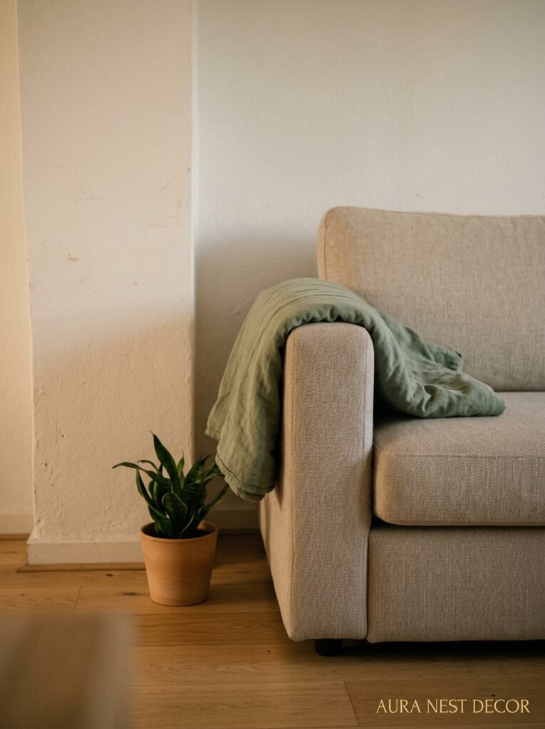
Terracotta. Or rust. Or even just a warm amber-brown.
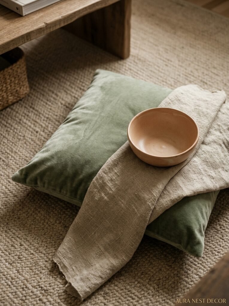
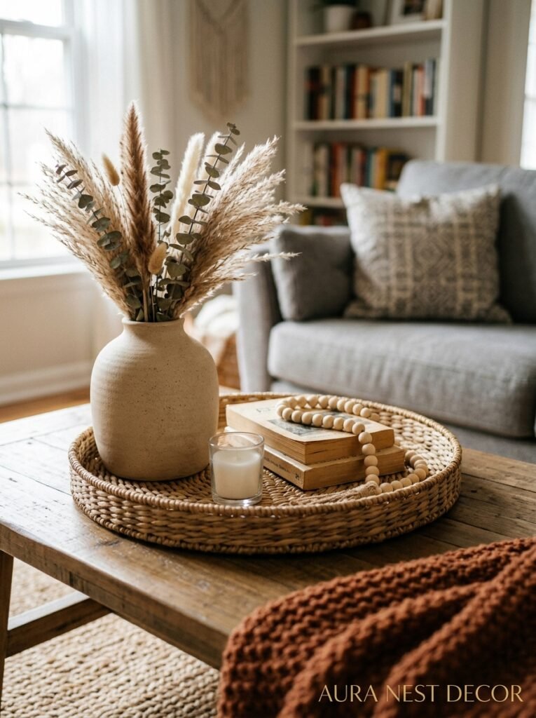
It’s not a lot. We’re talking a single throw pillow, the natural color of a ceramic pot, the warm undertone in a wooden floor. But it acts like a bridge. It picks up the warmth of the beige and adds depth that the green on its own doesn’t always provide.
Some people go with burgundy instead, which is slightly more dramatic but still works if the green is dark enough. I’ve also seen rooms where the “third color” is technically just the natural linen of the curtains or the honeyed tone of an oak coffee table — and that counts. Wood tones are doing a LOT of heavy lifting in this trend and I don’t think they get enough credit for it.
So if you’re sitting there looking at your green and beige room and thinking something feels slightly off? Bring in one warm organic element. Just one. See if it clicks.
—
4. What to Do With Your Sofa (Because This Is Where People Get Stuck)
The sofa question. It’s always the sofa question.
If you’ve already got a sofa — which, let’s be honest, most of us do, because sofas are expensive and not something you’re replacing for the sake of a color trend — then your starting point is different depending on what you’re working with.
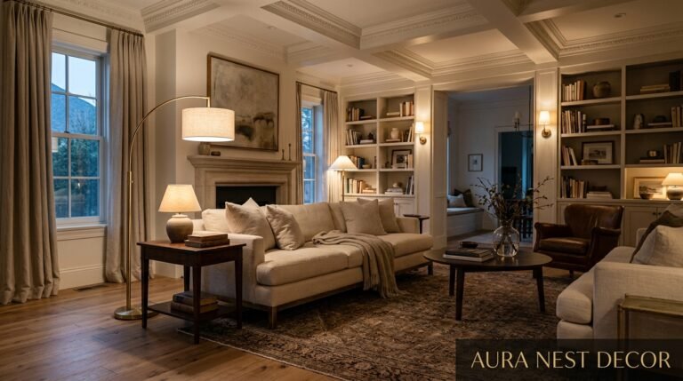
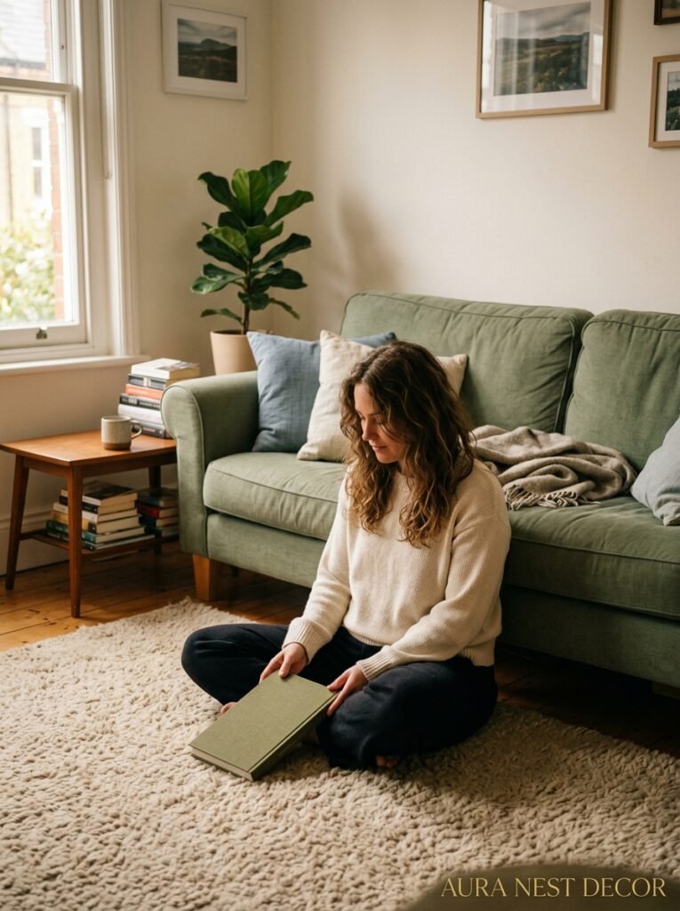
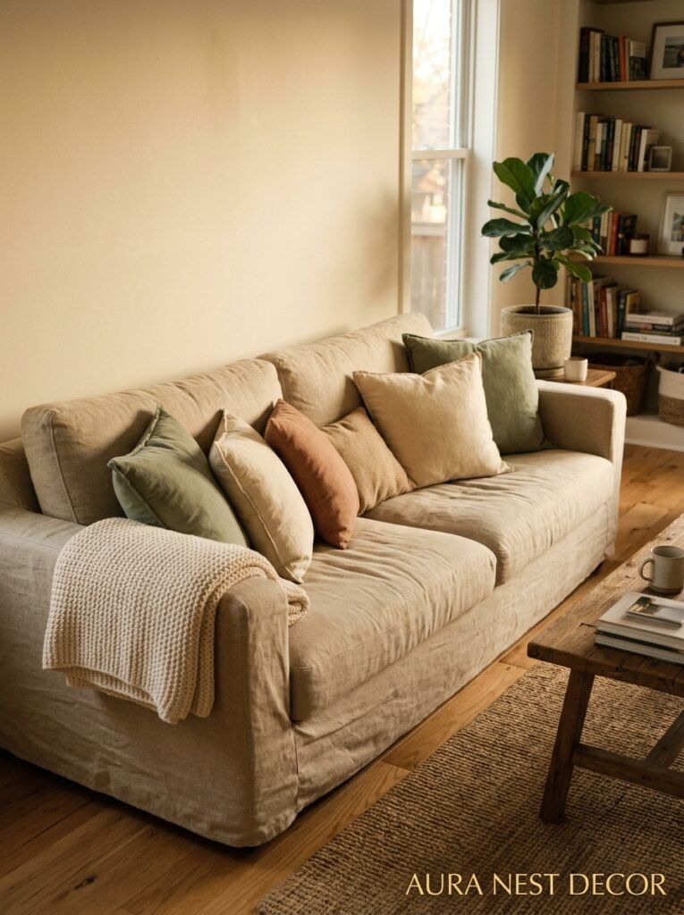
Beige or cream sofa? You’re in great shape. Honestly. Add green through your walls, your plants, your accent cushions, and you’re done. The sofa does the beige work for you, and everything else can speak to the green side of the palette.
Gray sofa? Don’t panic. A warm gray can actually bridge into beige territory better than you’d think, especially if you warm up the room with terracotta throws, wooden side tables, and plenty of natural texture. A cool gray is trickier — it might fight with the warmth of the palette. In that case, lean into a darker, more saturated green on the walls to create enough contrast that the cool sofa reads as intentional.
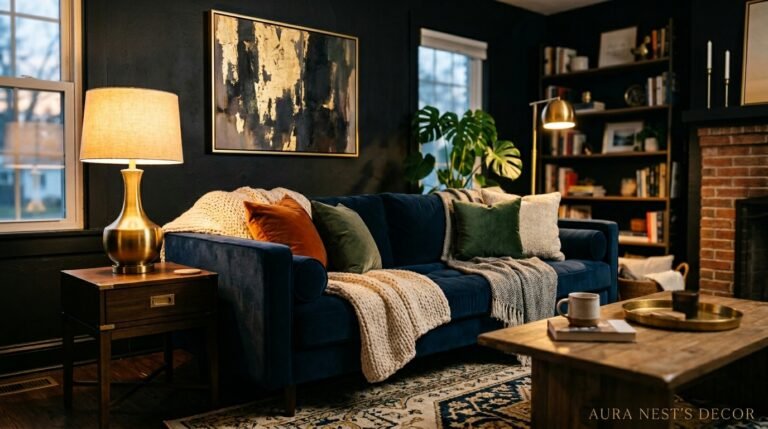
Navy or dark sofa? Surprisingly good. Deep navy acts almost like a neutral in a green and beige room, adding a richness that stops the palette from feeling too soft or washed out.
And if you ARE in the position to choose a new sofa? Warm boucle in oat or cream. That’s it. That’s the answer. You’ll thank me.
“The room isn’t the sofa. The sofa is just the anchor. Everything else does the talking.”
—
5. The Wall Situation: Paint vs. Wallpaper vs. That Other Thing People Keep Forgetting
Let’s talk walls, because there’s more than one way to do this.
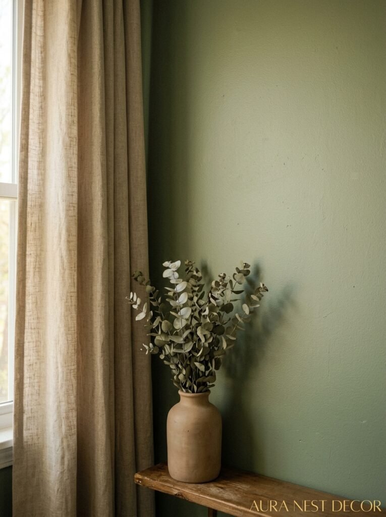
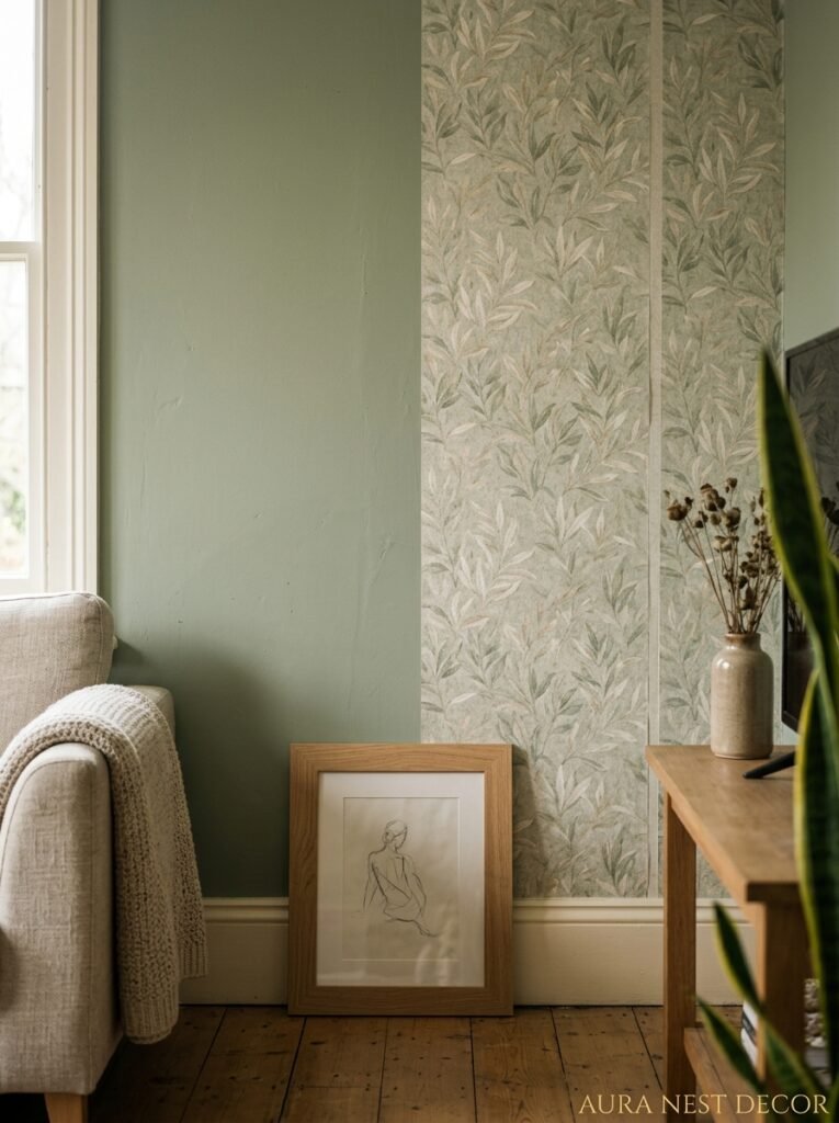
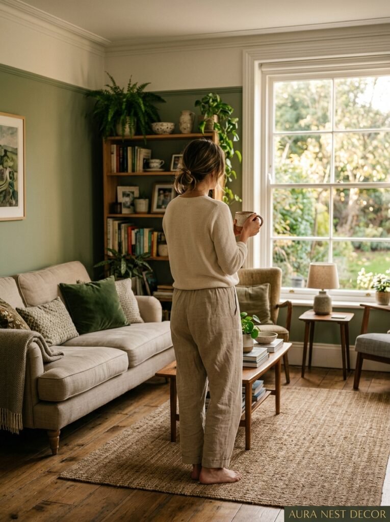
Paint is the obvious answer and, honestly, usually the right one. A soft sage or muted olive on all four walls is deeply satisfying, and the way it looks at different times of day — blue-gray in the morning, warm and green in the afternoon, almost golden at dusk — feels almost alive. Can’t recommend it enough.
But wallpaper is doing something special in the green and beige world right now. Botanical prints — not the loud, maximalist versions, but quieter ones with cream backgrounds and sage-green botanical line drawings — are creating living rooms that feel like something out of a very tasteful magazine. Very much a UK design aesthetic, though I’m starting to see it show up a lot in US homes too.
Then there’s the thing people forget: doing nothing to the walls. If you’ve got a beige or warm cream room already, sometimes the answer is to NOT paint the walls green but to bring the green in everywhere else. Plants, artwork, textiles, a velvet accent chair. The room still reads as a green and beige space, but it’s softer, more flexible, and easier to shift if you change your mind.
And honestly? That approach often photographs better. Which, if we’re being real, matters.
—
6. Textures That Make the Palette Feel Expensive Without the Price Tag
This is where the magic actually happens. Because anyone can paint a wall sage green and throw a beige pillow on a couch. What separates the rooms that look designed from the ones that look like someone just picked two colors from a swatch book is texture.
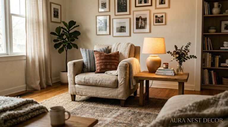
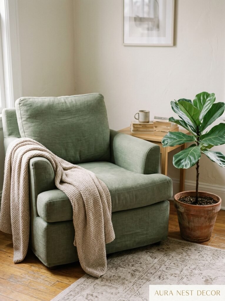
Boucle is the obvious one — and yes, it’s everywhere right now, but there’s a reason. The loopy, nubby texture of boucle in cream or oat next to a smooth painted green wall creates this visual contrast that’s just very satisfying. Linen is similar — slightly rough, slightly warm, has this organic quality that pairs beautifully with earthy tones.
Rattan and wicker are having a sustained moment, not a flash-in-the-pan trend. A rattan side table or a woven basket near the fireplace brings in that natural, handmade quality that the green and beige palette is almost begging for.
And don’t sleep on velvet. Deep green velvet against a beige room is honestly one of the more elegant moves you can make in interior design right now. A single velvet accent chair. That’s all. It doesn’t take much.
—
7. The Lighting Detail That Will Change Everything (Literally Everything)
I’m kind of obsessed with this and I’ll try not to bore you.
Green reads differently depending on your light source. This is not a minor thing — this can make or break the whole room. A sage green that looks perfect in the paint store can go slightly cold and gray under harsh white LED lighting, and that’s not what you’re going for.
What you want is warm-toned bulbs. The amber glow of a 2700K LED bulb at 7pm is a completely different experience than the stark white of a 4000K bulb. In a green and beige room, warm lighting makes the beige go golden and the green go rich. It’s the difference between a room that feels like a spa and a room that feels like a hospital corridor.
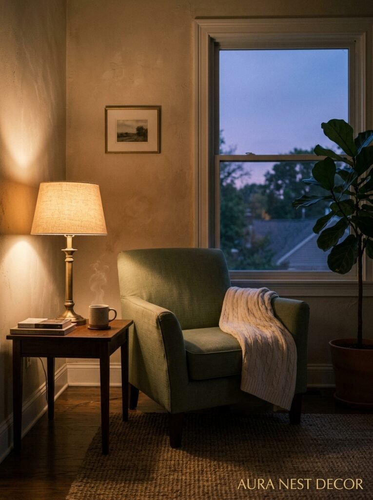
Side lighting and lamps are your friends. Overhead lighting alone tends to flatten everything. Layer it — a floor lamp in the corner, a table lamp on the sideboard, maybe some candlelight if you’re the type (I am absolutely the type). The green and beige palette LOVES soft, directional light.
And if you’ve got natural light? Work WITH it. North-facing rooms in the UK get that cooler, more diffused light that can make green look slightly blue — in which case, warm your beige tones up to compensate. South-facing rooms in the US get direct sun that’ll bring out the yellow-warmth in both colors. Know your room.
“Warm light doesn’t just illuminate a room. It decides what the room actually is.”
—
8. How to Layer Plants Without It Looking Like a Jungle (Or a Garden Center)
Plants are obviously very on-theme here, but there’s a version of this that tips from “thoughtfully green” into “hoarding ficus trees” and I want to help you avoid it.
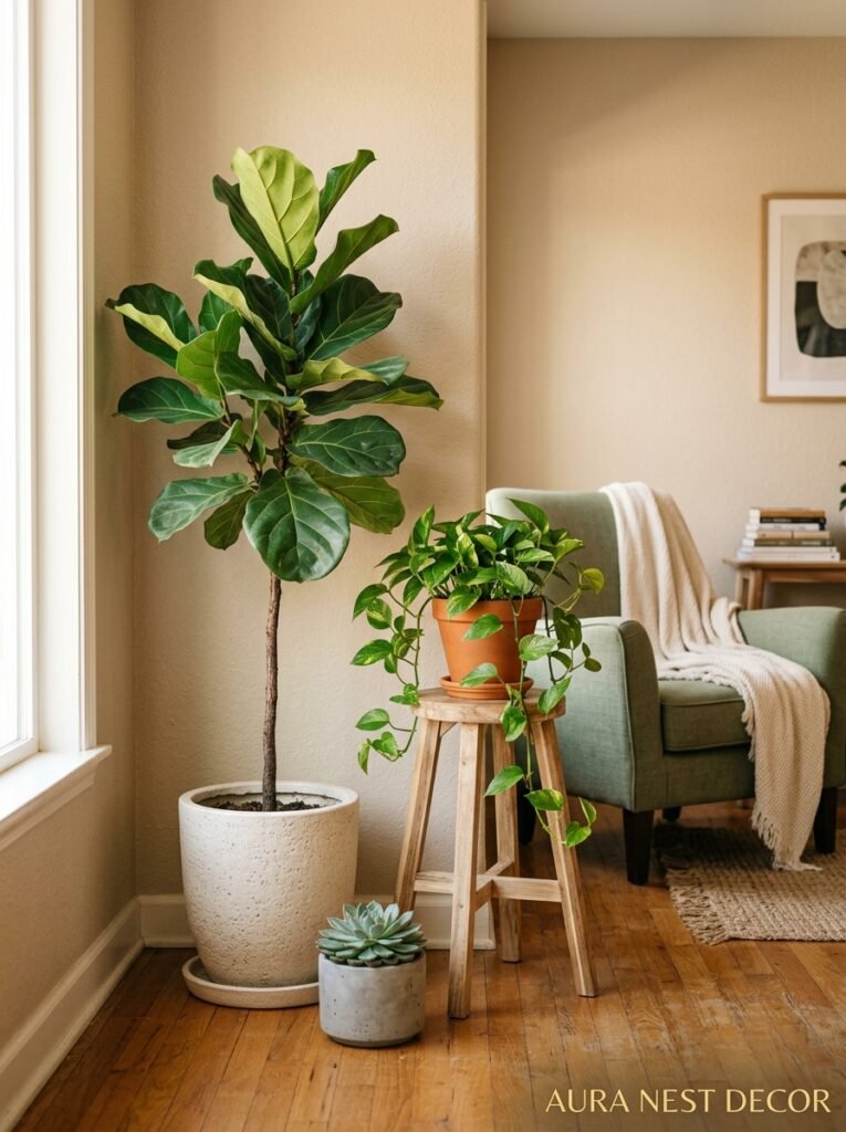
The key is varied height, not varied quantity. One trailing plant up high — maybe a pothos on a shelf, or a string of pearls in a hanging planter — paired with one big statement plant at floor level, like a fiddle leaf fig or a beautiful olive tree, is usually enough. You don’t need more than that to feel “planty.” More than that and you’re decorating around the plants instead of the other way around.
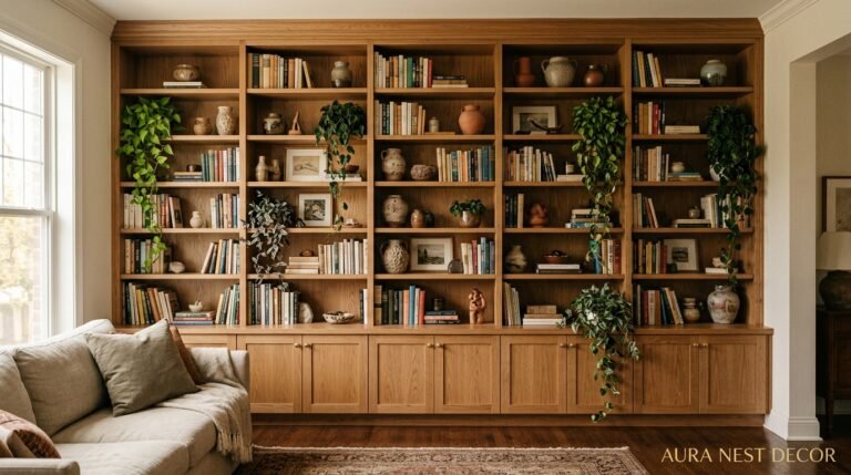
Pots matter enormously in a green and beige room. Cream, white, terracotta, and raw concrete all work beautifully. Avoid plastic pots with bright colors — they’ll pull focus in the worst possible way.
And here’s a thought that might surprise you: fake plants, in 2024, are genuinely not embarrassing anymore. The quality of high-end artificial plants has gotten to a point where you can use them strategically in hard-to-reach spots and nobody will know. I’m not saying fill your room with them. But one really convincing faux olive branch on a high shelf? Totally valid.
—
9. The One Mistake That Makes Green and Beige Look Dated Immediately
I see this a lot and I feel compelled to mention it.
When people hear “green and beige,” sometimes they go too warm. Too brown-beige, too yellow-green, and suddenly you’re not in a modern organic living room — you’re in a 1993 kitchen. There’s a fine line between “earthy and warm” and “army surplus store” and that line is usually the specific shade of green you’ve chosen.
The trick is to keep at least one of your two main colors slightly cool, or at least neutral. So if your beige is very warm and golden, balance it with a greener green that has some gray or blue in it. If your green is very warm (olive, yellow-green), pull your beige cooler — think soft putty or pale stone rather than biscuit or honey.
Also, please — I’m begging — don’t do forest green with beige carpet from the 70s unless you’re going for a very specific vintage vibe and you actually know what you’re doing. Most people are not going for that vibe.
—
10. How British and American Approaches to This Palette Are Actually Quite Different
This is something I find genuinely interesting. Not gonna lie, I spend way too much time looking at interior design accounts from both sides of the Atlantic, and the differences in how green and beige shows up in US vs. UK homes are noticeable.
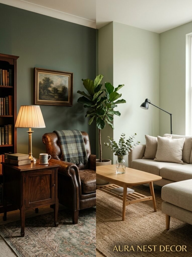
UK interiors tend to go darker and more saturated with the green. You see a lot of deep sage, forest, and olive on walls — especially in older properties where the rooms have high ceilings and can handle the weight of a darker color without feeling oppressive. The beige in UK interiors also leans more toward traditional paint-brand shades: Farrow & Ball’s “Elephant’s Breath” or “String” type tones. Warm but complex.
American interiors — particularly in the South and Midwest — tend toward a softer, more washed-out green. Sage that’s almost gray. Beige that’s barely-there. The overall effect is lighter and airier, which makes sense given the different architecture (open-plan, often less natural light from north-facing windows, more direct sun).
Neither approach is wrong. But knowing which direction your home leans — and which style resonates with you — will save you a lot of paint sample chaos.
—
11. What to Spend the Money On (And What You Can Absolutely Fake)
Budget reality check. Because not everyone is starting from scratch with an unlimited Pinterest-fantasy renovation fund.
Spend real money on: your largest textile (sofa or an area rug), your paint (cheap paint goes on badly and looks flat — just buy the decent stuff), and your lighting. These are the things that define the room. Cutting corners here shows.
But the rest? You can absolutely work with. IKEA side tables styled right look expensive. Charity shops in the UK (and thrift stores in the US) are full of the exact kind of organic ceramic and natural materials that this palette demands — and they cost almost nothing. A £3 / $4 terracotta pot from a hardware store is just as good as one from an interiors boutique.
Art is the one wildcard. I’ve seen rooms absolutely transformed by one large piece of art — and ruined by a gallery wall of things that don’t quite fit. If you’re buying one thing for the walls, buy one BIG thing. And if you can find a print with any green or botanical element, even better.
—
12. The Simplest Version of This Whole Thing (For When You Just Want to Start)
Sometimes you don’t want to overthink it. Fair enough.
Here’s the minimum viable green and beige living room: paint one wall (ideally the one behind your sofa) in a muted sage green. Leave everything else as-is for now. Add two sage or olive cushions to your sofa. Put a single cream or oat throw over the back of the sofa. Bring in one plant with a terracotta pot.
That’s it. The room will feel different immediately. And from there, you can keep going or stop — and either way, you’ve got a space that feels intentional, current, and genuinely lovely to be in.
Small moves, done consistently. That’s how the best rooms actually happen.
—
❓ FAQ
Q: What shade of green works best with beige walls? A: Muted, earthy greens tend to work best — sage, dusty olive, or moss. Avoid anything too bright or too yellow, as it can clash with warm beige tones. If your beige is very warm, lean toward a slightly cooler sage to balance the overall palette.
Q: Can I use green and beige in a small living room without it feeling heavy? A: Definitely. The key is keeping the green lighter and more muted rather than deep and saturated, and using it in accents (cushions, plants, one accent chair) rather than on all four walls. Light beige walls with green accents will open the room up rather than close it in.
Q: What flooring works best with a green and beige living room? A: Natural wood floors in warm or honey tones are ideal — they add warmth without competing with the palette. Light gray flooring can work if the green is deeper. Avoid very dark or very cold floors, which can make the room feel disconnected from the earthy vibe the palette creates.
—
💭 Final Thoughts
Green and beige isn’t a trend that’s going to disappear in two years and leave your living room looking like a time capsule. It’s grounded in something more durable than that — a genuine longing for rooms that feel calm, alive, and like they actually belong to someone. Which is maybe what we were all missing during the decade of gray.
Start small if you’re nervous. One wall, one cushion, one plant in a beautiful pot. But I think once you start, you won’t want to stop.
What’s the one thing standing between you and your green and beige living room right now?