
The Floating Shelf Styling Guide That’ll Make Your Small Living Room Look Like It Was Designed on Purpose
You know that moment when you walk into someone’s home and their shelves just look right? Not overcrowded, not bare, just… considered. I’ve spent an embarrassing amount of time trying to figure out what that actually means — and it turns out, there are some very specific things going on.
—
1. Why Most Floating Shelves Look Like an Afterthought (and How to Fix That Before You Buy Anything)
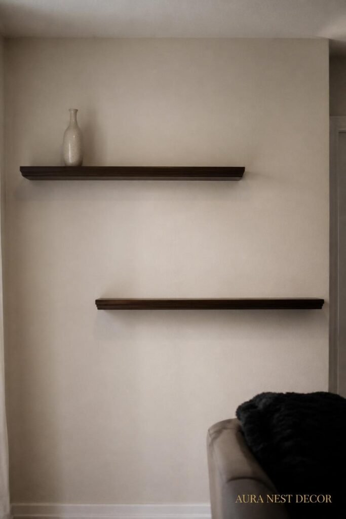
Here’s the thing nobody tells you when you’re standing in IKEA at 11am on a Saturday with a trolley full of regret: the shelf itself is maybe 20% of the result. The placement is everything.
I don’t mean height, exactly. I mean relationship — where the shelf sits relative to the sofa, the window, the light switch, the corner of the room. In a small living room, every surface is in conversation with every other surface. Your shelf isn’t floating in a vacuum. It’s floating above your lamp, beside your gallery wall, below your ceiling that might be lower than you’d like. And when you put a shelf in without thinking about those relationships first, it looks like furniture that wandered in from another room.
So before you drill a single hole: sit in your living room. Sit where you actually sit. Look up. Look across. Where does your eye want to rest? Because that’s where a shelf becomes a feature rather than just… storage with ambition.
The other thing — and this one’s kind of counterintuitive — is that small spaces don’t need fewer shelves. They need better-placed shelves. A single badly positioned shelf makes a room feel cramped. Three well-placed shelves can make it feel layered and rich. Trust that.
“The shelf isn’t the decor. The placement is.”
2. The Specific Wall Situation That Changes Everything (Alcoves Are Your Secret Weapon)
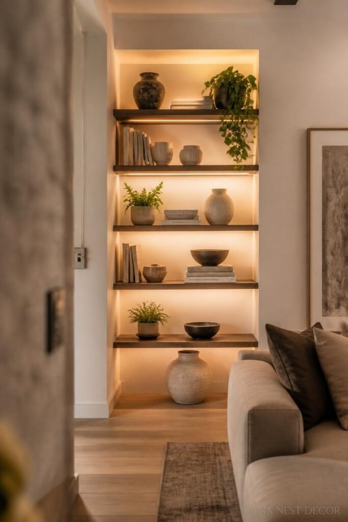
If you have an alcove — that recessed section beside a chimney breast, or a shallow nook beside a doorway — and you are not putting floating shelves in it, I need you to stop and really think about why.
Alcove shelves feel built-in without the cost of built-in furniture. They sit flush with the rest of the room. They don’t stick out and eat into your floor space. And because they’re recessed, things you put on them look deliberate, almost curated, in a way that identical items on a freestanding bookcase just… don’t.
In the UK especially, so many Victorian and Edwardian terraced homes have these perfect twin alcoves on either side of the chimney breast. Symmetry is a gift in a small space. Two matching sets of floating shelves in those alcoves, painted the same colour as the wall behind them — that’s a whole look. It costs maybe £80 in wood and paint and it looks like you had an interior designer come through.
For American ranch homes or apartments without alcoves, look for the equivalent: the wall beside a doorframe, the narrow strip of wall between a window and a corner, the space above a low sideboard. Any wall that has a natural frame around it is doing most of the work for you.
Paint the wall behind the shelf a slightly different shade than the rest of the room. Even one shade deeper. It creates depth where there wasn’t any.
3. The Color Rule Everyone Follows and the One That Actually Looks Better

Okay so conventional wisdom says: keep your shelf display neutral. Stick to a palette. Three or four tones, max. And yes, that’s basically true if you want something calm and Pinterest-presentable.
But the thing nobody says is that the shelf itself is part of that palette. Not an accessory to it.
White shelves on white walls are serene but they disappear — and in a small room that can actually be good, because it makes the objects float without a heavy border. Natural oak shelves on warm cream walls feel grounded and organic. Black shelves against a pale sage wall? Honestly stunning, especially in a modern flat or a Scandi-leaning space.
The mistake I see constantly is mixing wood tones on the shelf with a completely different wood tone two feet below on the floor. Your shelf’s undertone should roughly agree with your floor’s undertone. Warm with warm. Cool with cool. Not matchy-matchy, but not fighting either.
And then there’s paint. If you want your shelf to be a design feature and not just a plank on the wall, paint it. Contrast is interesting. A terracotta-painted shelf in an otherwise fairly neutral room is the kind of small decision that makes a space feel personal.
4. What to Put on the Top Shelf vs. the Middle Shelf vs. the One Right at Eye Level
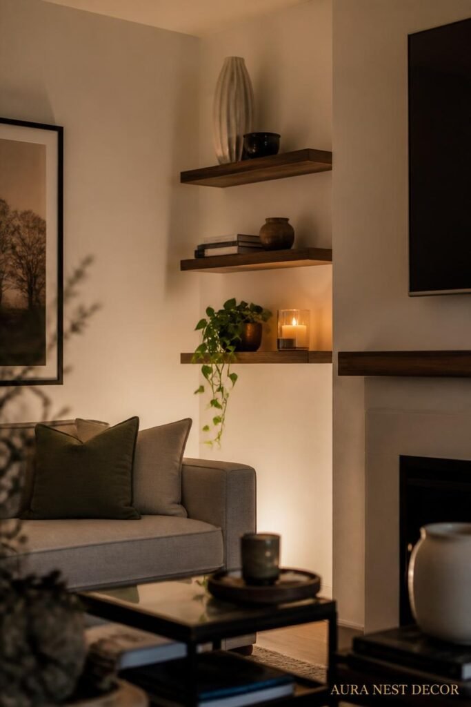
Because they’re not the same. At all.
Top shelf — especially in a small room where it might be close to the ceiling — is for height. Tall vases, a stack of books laid flat with something resting on top, a plant that trails slightly downward. Things that acknowledge the vertical space rather than fighting it. Don’t put your smallest, most detailed objects up there. They get lost.
Middle shelf, if you have one, is the hardest to style. It’s not anchored by being high or low, so it can feel random. This is where you want your strongest visual moment — a piece of art propped up, a ceramic that you genuinely love, books stacked both horizontally and vertically. Something that justifies the real estate.
Eye-level shelf is where people look first. Not your most precious objects, necessarily, but your most interesting ones. The slightly weird thrift store find, the family photo in an unusual frame, the plant you’re actually managing to keep alive. It should feel like a little surprise.
And honestly? Leave some space. Real empty space, not just the awkward gap you haven’t filled yet. Empty space is a design choice. Let it be one.
“Empty shelf space isn’t wasted — it’s breathing room, and your room needs it.”
5. The Plant Situation: Which Ones Actually Work on Shelves and Which Ones Just Die There
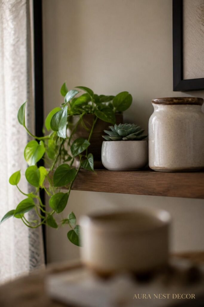
Not every plant is a shelf plant. Sorry.
Here’s the truth: most shelves don’t get enough light. They’re high up, often away from windows, and plants that need direct sun will sulk and yellow and make your shelf look sad. The plants that genuinely thrive on floating shelves in a typical living room are the ones that like indirect light and a bit of neglect.
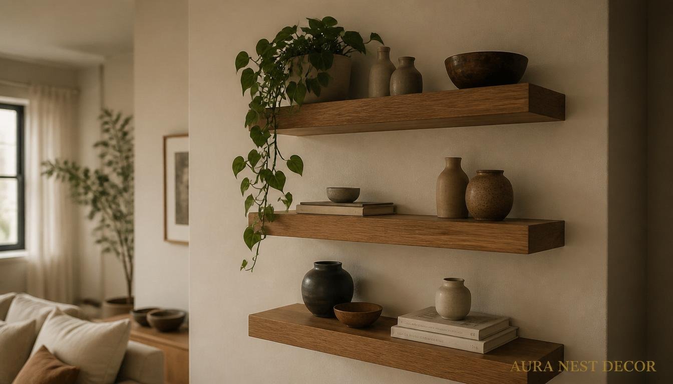
Pothos. Full stop. Trails beautifully, handles low light, tells you when it’s thirsty by going a bit dramatically limp, and looks like it cost more than it did. A single golden pothos in a terracotta pot on the end of a shelf, with a few trails hanging down the side — that’s the image. That’s what you’re going for.
Heartleaf philodendron is the slightly chicer version of the same vibe. A bit smaller, darker leaves, equally forgiving. Snake plants work if your shelves are deep enough, but they do better closer to the ground, honestly.
What doesn’t work: fiddle-leaf figs (they need space and light and a very specific attitude), anything that needs humidity, herbs (they need sun and you’ll forget to water them on a shelf). And fake plants — look, I know, I know, but fake plants on floating shelves in a nice living room almost always read as “I tried and then stopped.” A dried pampas stem or eucalyptus branch is different. That’s intentional. Fake plastic ficus is not.
6. Books as Decor, Not Just Books: The Specific Styling Trick That Works Every Time
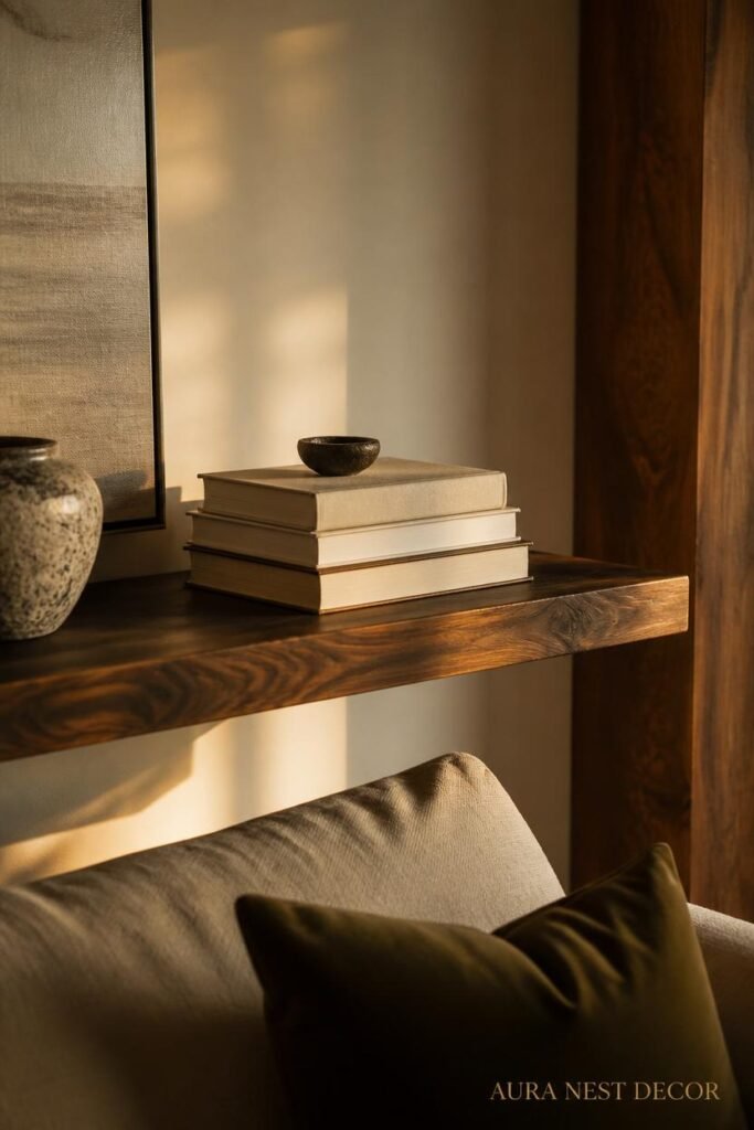
Colour-coordinated bookshelves are everywhere on Pinterest right now and honestly they look incredible. But there’s a simpler trick that works even if you don’t have a curated collection.
Mix the orientation.
Vertical books, then two or three laid flat with an object on top, then vertical again. That rhythmic change in direction draws the eye across the shelf and creates natural little moments of pause. It looks intentional because it is — you’re basically creating visual chapters.
The horizontal stacks with objects on top do two things: they create height variation so the shelf doesn’t look like a flat row of spines, and they give you somewhere to put the decorative objects that would otherwise just sit awkwardly in front of the books.
And can we talk about removing the dust jackets? I know this is controversial. But stripped hardbacks in a complementary colour palette look extraordinary on a shelf. The spines are often beautiful cloth or board. Try it with just a few and see if you hate it.
Side note — charity shops in the UK and thrift stores in the US are genuinely the move for building a visually cohesive book shelf. You can find old hardbacks in matching tones for almost nothing, and the mix of old and new spines actually looks more interesting than a collection of current titles.
7. Ceramic, Clay, and Objects That Add Texture Without Cluttering
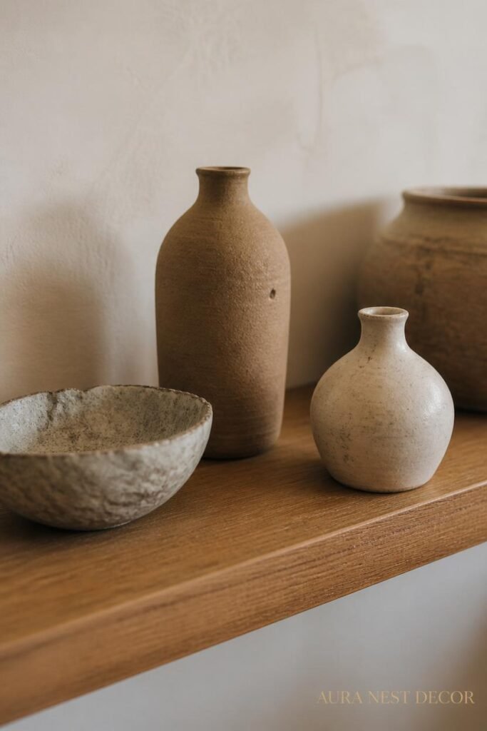
Texture is the thing that separates a styled shelf from a storage shelf. And in a small space, you can’t afford to add texture through bulky furniture — so your shelf objects have to work harder.
Handmade ceramics are genuinely the best thing you can put on a floating shelf. The slightly irregular shapes, the matte glazes, the way they catch light differently throughout the day — they make a shelf feel curated and warm even when the rest of the room is simple. You don’t need many. One or two pieces, honestly.
Etsy is obvious, but good. Erin Lightfoot, East Fork, Bison Home — these are makers doing beautiful, shelf-worthy work. In the UK, there are incredible studio potters at pretty much every craft market doing small-run ceramics that you won’t find anywhere else.
Woven objects add texture too: a small basket, a rattan ball, a bit of framed fabric. But use restraint. One woven thing per shelf, max, or it starts to feel like a coastal decor catalog from 2019.
The objects that age the worst on shelves: anything that collects dust visibly (open-weave things, overly intricate things), candles you never burn (they melt slightly and look abandoned), novelty items that felt funny in the shop and feel less funny every day after.
“One beautiful ceramic object does more work than ten decorative trinkets. Always.”
8. Lighting the Shelf: The Specific Type That Doesn’t Look Like a Hardware Store
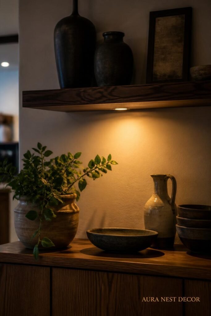
Shelf lighting is a detail that’s completely underrated in small living rooms. And it’s not about adding more light — the room has light. It’s about adding warmth specifically to that vertical surface.
Puck lights are out. They look like security features, not decor.
What works: small clip-on spotlights with warm bulbs aimed up at the shelf from below, or battery-operated LED strip lights tucked behind the front edge of the shelf casting a soft glow downward. The second option is very easy to do — command strips, battery packs, ten minutes — and the effect at 8pm with the main lights dimmed is genuinely beautiful.
The amber glow of a warm-white LED at around 2700K hitting a ceramic vase and the spines of a few well-chosen books — that’s the image that makes people save your photo on Pinterest.
In the UK, places like Ikea, Habitat, and Cox & Cox do really good understated shelf lighting. In the US, McGee & Co and even Target’s Studio McGee line have clip options that look intentional rather than rigged up.
Just make sure the wire is managed. A visible wire trailing down a white wall undoes every good styling decision above it. Cable clips from the hardware store, tucked along the bracket line. Two minutes. Do it.
9. The “Rule of Odd Numbers” Is Real But Here’s When to Break It
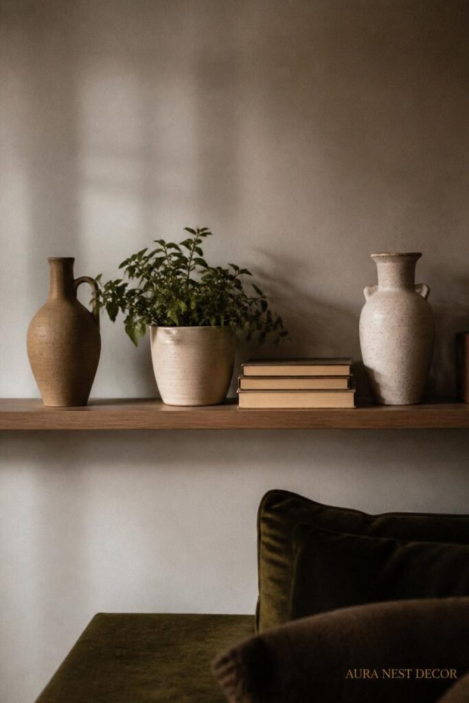
You’ve heard this one. Style in odd numbers — three objects, five objects, groups of three. And honestly? It works. Our brains read even numbers as static and balanced, odd numbers as dynamic and interesting. A cluster of three objects at different heights will almost always look better than two objects of the same height.
But in a small room on a small shelf, odd groupings can tip into crowded. Here’s when to break the rule: when your shelf is short (under three feet), two strong objects with space between them is cleaner and more deliberate than three objects jostling for position.
And the rule says nothing about HEIGHT, which is actually the more important variable. Objects at the same height regardless of whether there are two or seven of them will look flat. Vary the height within the grouping — tall thing, short thing, medium thing — and the number matters less.
10. What American and British Small Spaces Are Doing Completely Differently (and What Each Gets Right)
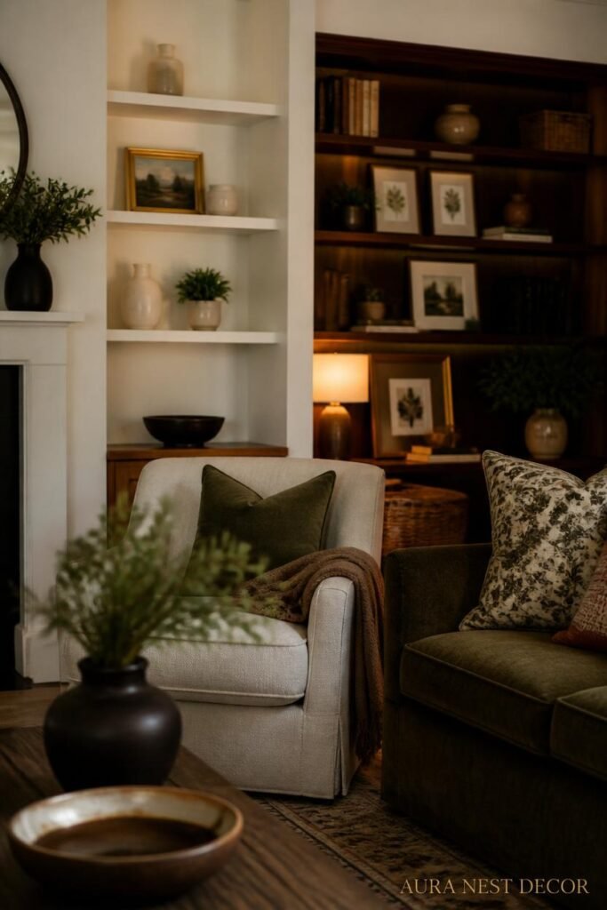
This is genuinely interesting to me. American small-space shelf styling tends to go maximalist-curated — more objects, more layers, more personality packed in. There’s a real “collected over time” vibe that I love. British styling in small spaces tends toward restraint — fewer objects, more breathing room, a stronger commitment to a single colour story.
And both approaches work. The American style is warm and personal and tells you something about who lives there. The British style is calm and considered and looks incredible in photos.
The thing they both get wrong sometimes: Americans over-fill and then the shelf looks like a yard sale that got organized. British stylists under-fill and then the shelf looks cold and not quite finished.
The answer is somewhere between them. A few strong personal objects — the kind you’d pick up and tell someone the story of — with enough space that each one gets its moment.
11. The Single Shelf That Changes a Room: Where to Put Just One
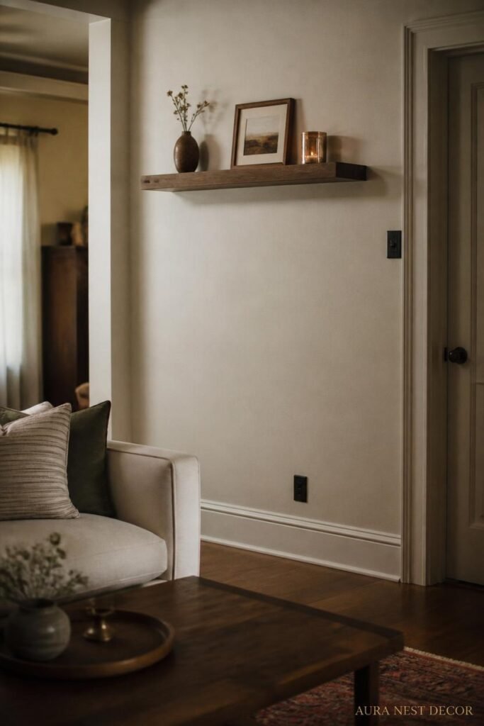
If you’re working with a genuinely tiny space — a studio flat, a box room that doubles as a sitting room, a narrow Victorian hallway that you’re trying to make feel like a room — sometimes one shelf is the right answer. But it has to be placed exactly right.
The wall you look at when you sit down. That’s where it goes. Not the wall above the TV (that’s a different challenge), not the wall you pass on the way to the kitchen. The wall you look at when you’re resting. That shelf becomes the focal point of your sitting time, and a well-styled focal point changes how the whole room feels.
One shelf, one proper lighting element beneath it, three to five objects you actually love. That’s enough. That’s more than enough.
12. The Small Detail That Ties the Whole Room Together (Nobody Talks About This)
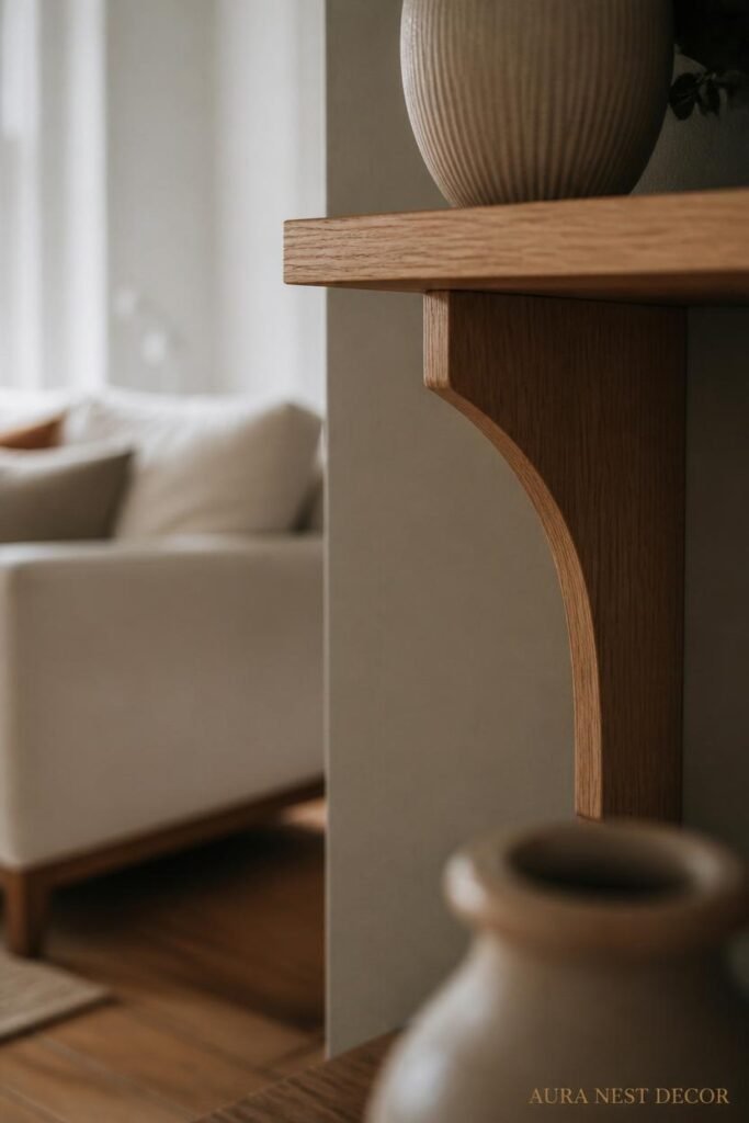
The brackets.
I know. Bear with me.
Most people pick brackets last, as an afterthought, and grab whatever fits the shelf. But in a small living room, the bracket is visible. It’s part of the visual. And the wrong bracket undermines a beautiful shelf completely.
Heavy black iron brackets in a light, airy room — too heavy. Thin gold hairpin brackets under a chunky oak shelf — wrong conversation. The bracket should echo something else already in the room. If your light fitting has black metal in it, black brackets. If your hardware is brushed brass, find brushed brass shelf brackets. It’s a tiny thing. It makes an enormous difference to whether the shelf reads as designed or just assembled.
And make sure the shelf is actually level. Sounds obvious. It isn’t always done.
—
❓ FAQ
Q: How much weight can floating shelves hold in a small living room? A: It depends entirely on how the shelf is anchored. Shelves fixed directly into wall studs or masonry with proper hardware can hold 50-75 lbs comfortably. Shelves anchored only into drywall with basic plugs can fail under as little as 20 lbs if the load isn’t distributed well. Always find your studs — or in UK plasterboard walls, use the right rawl plugs for the wall type. When in doubt, have it done professionally. A shelf falling off a wall takes a chunk of plaster with it and looks far worse than no shelf at all.
Q: What’s the best height to hang floating shelves in a living room? A: For shelves you’ll be looking at while seated, somewhere between 4.5 and 5.5 feet from the floor tends to work well — high enough to feel like a display rather than a surface to put things on, low enough that you can actually see and appreciate what’s on them. In rooms with low ceilings (common in UK period homes), mounting shelves a bit lower and keeping objects short prevents the shelf from visually lowering the ceiling further.
Q: Can you do floating shelves in a rental without losing your deposit? A: In the US, command strips rated for the appropriate weight work reasonably well for lighter shelves — check the brand’s weight limits carefully and don’t push them. In the UK, most landlords will accept small picture hook-style fixings repaired with filler before you move out, but a shelf with proper fixings may require permission. Some landlords are fine with it if you agree to patch on exit. Always ask first — a written yes from your landlord is worth far more than assuming.
—
💭 Final Thoughts
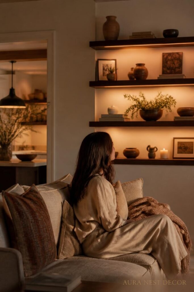
A floating shelf in a small living room isn’t really about storage — there are better ways to store things. It’s about giving yourself a surface to arrange and rearrange the things that make your home feel like your home. A corner that looks right. A little visual story. Something to sit across from on a quiet evening that feels settled and considered.
Start with one shelf in the right place, put three things on it that you genuinely love, and leave some space. See how it feels.
What’s one object you already own that you’ve never found the right place for?




