The Modern Nursery Rules Everyone Keeps Breaking (And Why That’s Actually Fine)
My friend sent me a photo of her almost-finished nursery and said, “Tell me honestly if it’s too much.” It wasn’t too much. It was perfect — warm, a little weird, completely hers. And I realized the reason it worked was because she’d ignored basically every “modern nursery” rule she’d been given.
—
1. Why the All-White Nursery Trend Is Quietly on Its Way Out
I know. I know. White nurseries photograph beautifully and they look serene on Pinterest. But here’s the thing nobody tells you until you’re actually living in one — they’re cold. Not temperature-cold, but emotionally cold. A baby doesn’t need a minimalist gallery space, they need a room that feels like a hug.
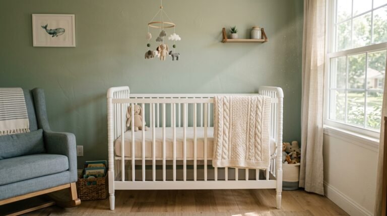
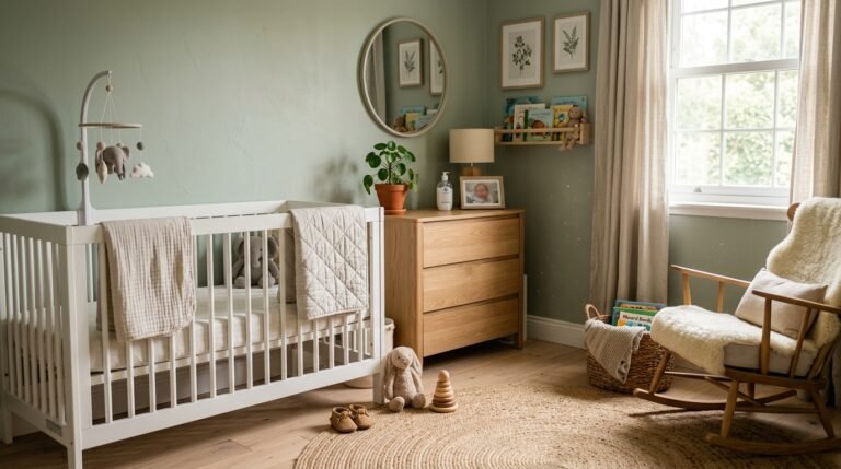
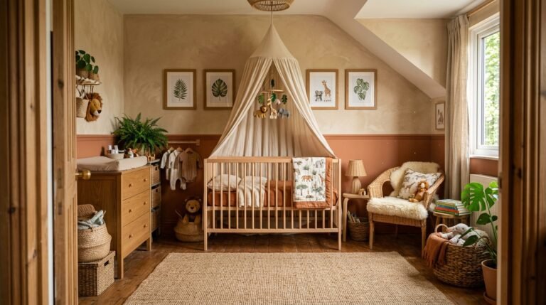
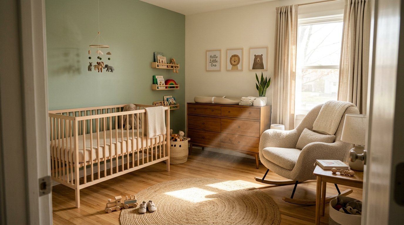
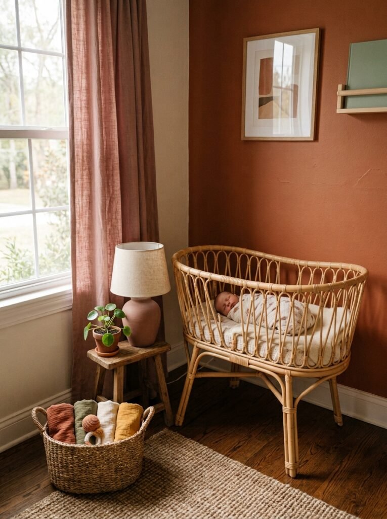
The shift happening right now is toward warm neutrals. Think clay. Terracotta. That specific shade of dusty sage that looks almost grey until the afternoon light hits it and it glows green. These colors do something white simply can’t: they make the walls feel like they’re participating in the room.
And honestly? They’re more forgiving. A smudge on an off-white wall disappears. A smudge on stark white is a crime scene.
“The best modern nursery doesn’t look sterile. It looks like someone actually lives and loves there.”
The color doesn’t have to be bold or dramatic. A barely-there warm blush, a soft linen tone that leans slightly peachy in the evening — these are the colors showing up in every nursery I genuinely love right now. Not white. Not grey. Something alive.
—
2. The Furniture Shape That’s Making Everything Look More Expensive
Rounded edges. That’s it. That’s the whole secret.
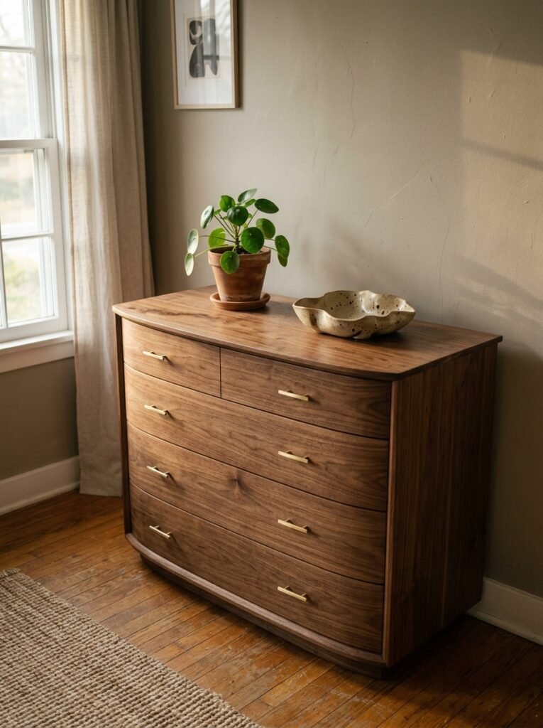
I’m serious — swap out anything with hard corners and right angles for pieces with soft, rounded profiles and the entire room reads differently. A cot with a curved headboard rail. A chest of drawers where the corners are gently chamfered. A rocking chair that looks almost oval from across the room.
This isn’t just an aesthetic thing, though it absolutely IS an aesthetic thing. Rounded furniture feels safer, softer, more intentional. It signals warmth rather than structure. And in a space that’s supposed to be the coziest room in the house, that matters.
The practical upside — and there IS one — is that rounded edges are genuinely safer when a toddler starts pulling up on furniture, which happens faster than you’re ready for. So you’re not sacrificing anything to get the look. You’re just making smarter choices that happen to look beautiful.
—
3. The Textile That Keeps Showing Up in Every Nursery Worth Pinning
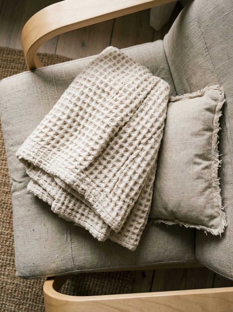
Boucle. Obviously. But also — and this is the one people sleep on — waffle-weave cotton.
Boucle is having its third or fourth major moment right now and it’s earned it, honestly. The texture photographs like a dream, it’s forgiving in real life, and a small boucle nursing chair in an off-white or oat tone is basically a cheat code for making a nursery look considered and expensive. Even if nothing else in the room is particularly fancy.
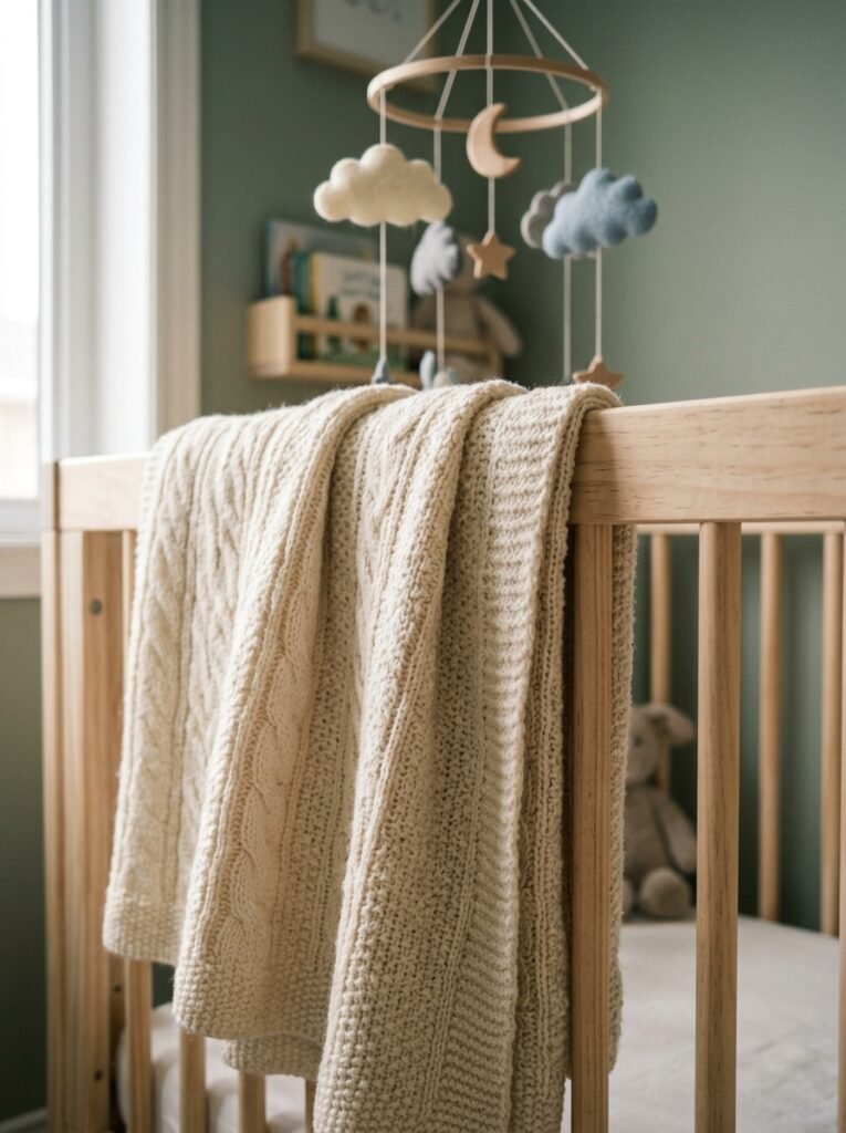
But waffle-weave cotton is the underrated player here. A waffle-weave blanket draped over the cot rail. A waffle curtain panel that filters light without blocking it completely. It adds texture without adding visual weight, which in a smaller nursery is EXACTLY what you want.
“In a nursery, texture does more work than color. It’s what makes you want to reach out and touch things.”
Avoid anything with a sheen unless you want the room to look like a hotel. Matte, tactile, soft — that’s the brief. Cotton, linen, boucle, waffle, maybe a little chunky knit if you want something seasonal. Layer them. Let them overlap. Mess is fine.
—
4. The One Layout Mistake That Makes Small Nurseries Feel Smaller
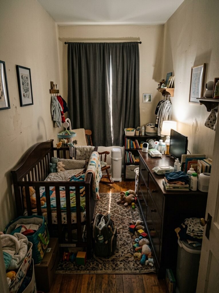
Pushing everything against the walls.
I know it feels like the logical move in a small room. Get the furniture to the edges, keep the centre clear. But it actually makes the room feel like a storage unit. Everything becomes peripheral. The eye has nothing to land on. You walk in and it feels like the room is retreating from you.
Instead, pull the cot away from the wall — even just a few inches, or fully freestanding if you have the space. Give it presence. Make it the thing you see when you open the door. A cot that floats slightly in the room anchors everything else around it and suddenly the room has a layout, not just furniture placed around the edges.
Side note — this also makes it infinitely easier to get in and reach the baby from multiple sides at 3am when you’re running on twenty minutes of sleep and questionable judgment. Practical AND beautiful. Those two things can coexist, I promise.
—
5. Why Nobody Is Doing Matching Furniture Sets Anymore (And What They’re Doing Instead)
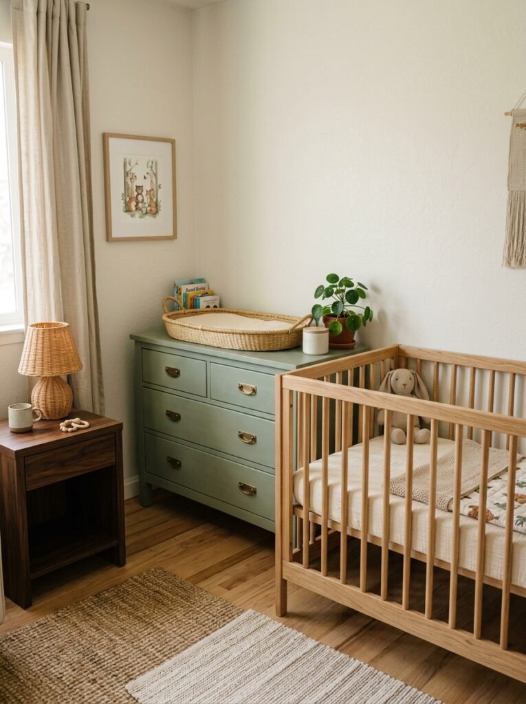
The matching-set nursery was very 2015. The cot, the dresser, the wardrobe, the changing table — all in the same finish, from the same range. It looked cohesive on paper and slightly soulless in real life.
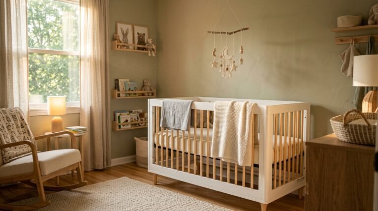
What people are doing now is mixing intentionally. A natural wood cot. A painted dresser in something muted — a warm green, a dusty blue, a chalky white that’s not quite white. A rattan changing basket on a stand. Maybe a vintage-ish wicker linen basket that you got second-hand and is somehow the most charming thing in the room.
The rule — if there is one — is to vary the finish but keep the scale consistent. Don’t mix chunky heavy pieces with delicate slim ones or it’ll look chaotic. But wood plus paint plus woven texture? That combination is basically foolproof and it’ll look good for years, through multiple redecorates and at least two strong opinions your child will develop about their own room.
—
6. Lighting That Actually Works at 4 a.m. (This Matters More Than You Think)
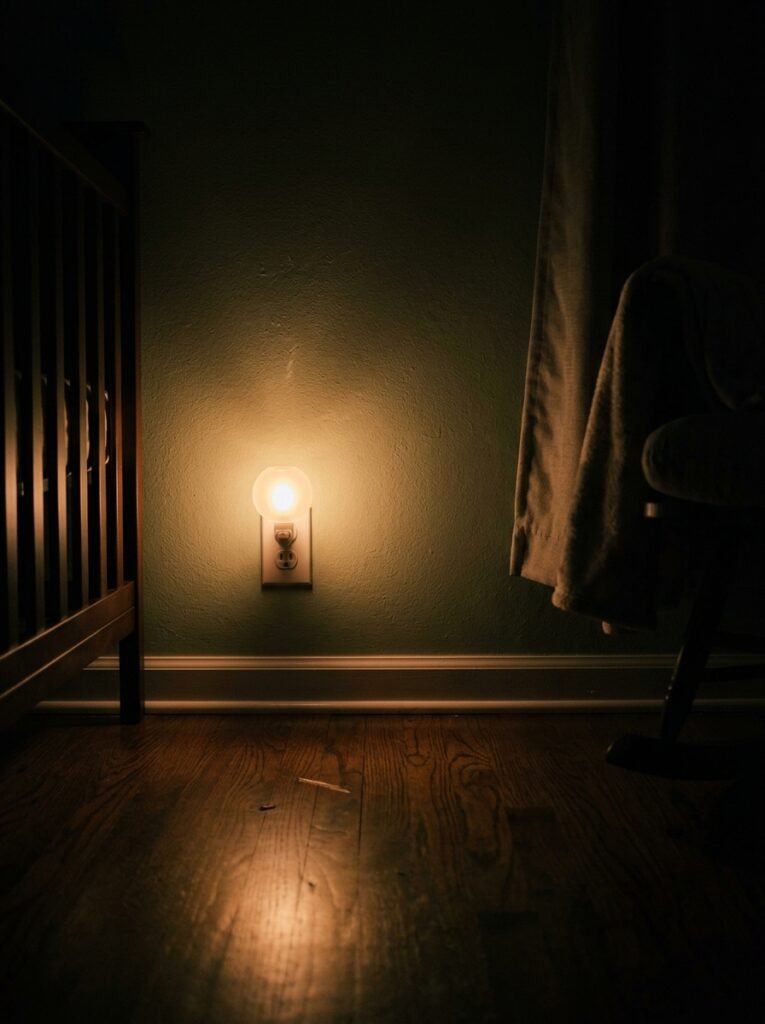
New parents get very invested in the decorative light fixture and forget entirely about the functional lighting, and I understand why — pendant lights are fun to pick out, overhead lighting is boring. But you will not think that at 4 in the morning when you’re doing a feed and the only option is the overhead light that could, I’m not exaggerating, wake a hibernating bear.
You need a dim, warm, directionable light source near the feeding chair. Full stop. Something with a switch you can tap one-handed because the other hand will always be occupied. A small plug-in lamp with a warm bulb — we’re talking 2200K to 2700K, amber all the way, nothing that reads as white or blue — placed at floor level or low on a side table.
The amber glow of a small lamp at 4am is genuinely one of the more underrated comforts of early parenthood. Everything feels a little softer, a little more manageable. The room doesn’t feel like a task to complete. It feels like a place you’re meant to be.
Decorative fixture at the top? Go wild. A curved rattan pendant, a soft sculptural paper shade, whatever makes you happy when you look up during the day. But sort the functional lighting first. Don’t skip it.
—
7. The Wall Treatment That’s Replacing Wallpaper in Modern Nurseries
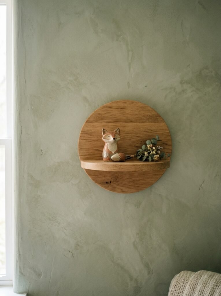
Limewash paint. And I cannot overstate how good it looks.
Not a limewash effect wallpaper, though that exists and it’s fine. Actual limewash paint, applied properly, which creates this beautifully uneven, slightly chalky, deeply textured finish that moves with the light in a way that flat paint just doesn’t. It looks ancient and current at the same time. It photographs incredibly. And in a nursery, it adds this softness to the walls that immediately makes the whole room feel intentional.
The thing people worry about is the application. It’s not technically difficult, but it is different from rolling on standard emulsion. You brush it on in loose, cross-hatching strokes and the variation is the whole point — don’t try to make it even. The unevenness IS the finish. Lean into it.
“A limewashed wall doesn’t just change the color of the room. It changes how the light behaves in it.”
If limewash feels like too much of a commitment, a textured plaster-effect paint achieves something similar with a bit less fuss. Either way, get off the flat emulsion. The walls deserve more than that.
—
8. The Floor Situation Most People Get Wrong
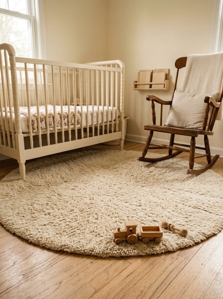
The instinct is to go for a big, plush rug. Soft underfoot, cozy, warm. Makes sense. And honestly? Not wrong, exactly, but there’s a better way to do it.
A flat-weave rug — something in a natural fiber or a cotton dhurrie — layered under a smaller, softer rug near the feeding chair. You get the defined floor zone of a large rug without committing the entire floor to something that will take about eight months to clean properly once solids start happening.
The flat-weave is washable (or at least wipe-able). It defines the room. The smaller soft rug is the luxury moment, the tactile thing, and it’s small enough that when it inevitably gets something on it — and it will — you can deal with it.
Also, if you have wooden or tiled floors: woven jute or seagrass as a base layer looks absolutely beautiful in a modern nursery. It adds warmth and texture and it’s not trying too hard. Layer a cotton rug on top and you’ve got something that looks genuinely designed.
—
9. What “Minimalist Nursery” Actually Means (Hint: Not Empty)
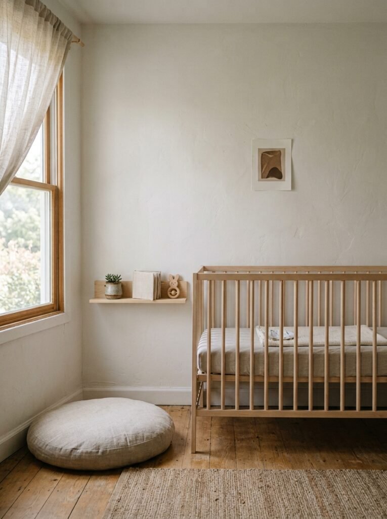
The minimalist nursery trend gets misread constantly. People see “minimal” and think “few things.” But a minimal nursery is actually about intentionality — fewer things that each mean something, not a room that looks like you’re still moving in.
One beautiful wall hanging. A shelf with three or four small objects that actually matter to you. A mobile above the cot that’s interesting, not just functional. None of these things clutter a room. They complete it.
The version of minimalism that just means empty shelves and no softness doesn’t work in a nursery because warmth and personality are load-bearing in this room. Your baby is going to spend an enormous amount of time staring at these walls. Give them something worth looking at.
—
10. The Unexpected Detail People Always Comment On
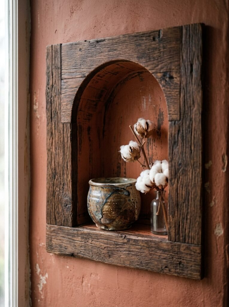
Gallery walls. No, wait — come back. Not the ones with matching black frames and art prints you’ve seen in seventeen other nurseries.
I mean one or two larger pieces hung with actual intention. A beautiful linen or cotton print, a little oversized for the wall, in a natural wood frame that doesn’t match anything else in the room but somehow works anyway. A hand-drawn illustration from an artist on a craft marketplace. An abstract piece in the room’s colors that you just… liked.
Less is so much more here. One unexpected piece does more for a room than a whole grid of coordinated prints. It says someone chose this specifically. And that specificity is what makes a room memorable.
—
11. The Plants That Actually Survive a Nursery (And Make It Look Incredible)
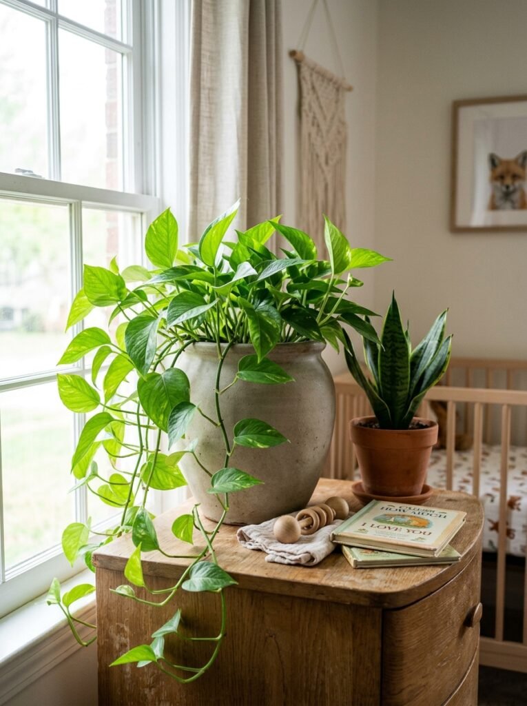
Low light, low maintenance, no drama. That’s the brief.
A pothos on a high shelf cascading down — it grows fast, it trails beautifully, and it’s nearly impossible to kill. A single large-leafed plant in a ceramic pot in the corner of the room if you get decent indirect light. An air plant on the windowsill that needs almost nothing from you.
Keep plants off the floor once the baby is mobile, obviously. But up high? On shelves, on top of the dresser, tucked into a hanging planter near the window — plants make a nursery feel like a living space in the most literal sense. They bring oxygen and that kind of quiet, organic aliveness that no decorative object can replicate.
Just don’t go overboard. Three plants, placed well, beats a jungle. This isn’t a greenhouse.
—
12. The Thing to Buy Last (Most People Buy It First)
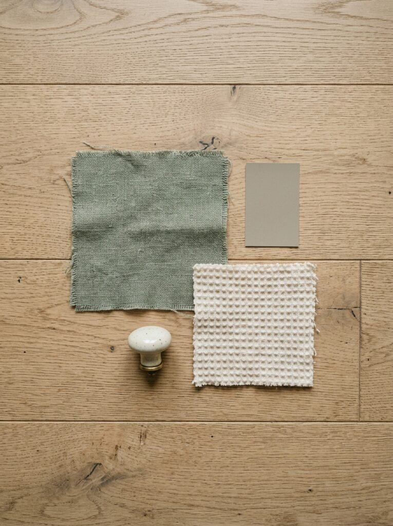
The theme.
Everyone reaches for the theme first — woodland animals, celestial, cottagecore, whatever the current Pinterest moment is pushing — and then builds backward from it. And then the theme dictates everything and the room ends up feeling like a mood board rather than a home.
Build the room first. Get the paint, the big furniture, the lighting sorted. Get the bones right. And THEN add character — the mobile, the wall art, the small accessories that lean into whatever aesthetic you’ve landed on. A room with good bones can carry almost any theme. A room built around a theme has nowhere to go when you fall out of love with it.
Which you will. Probably around month seven. So give yourself the flexibility.
—
❓ FAQ
Q: What’s the best wall color for a modern nursery in a room that doesn’t get much natural light? A: Warm tones work harder than cool ones in low-light rooms. A soft clay, a warm oat, or a peachy nude will look significantly more alive than any grey or cool white under artificial light. Avoid anything with a blue or green undertone if the room faces north — it’ll just amplify the coldness.
Q: How early should I start decorating the nursery? A: Most people start around the 20-week mark, which gives you plenty of time without the pressure of the final trimester. Don’t paint in a poorly ventilated room and don’t spend hours on stepladders toward the end of pregnancy — both common sense things that people somehow forget. The furniture doesn’t all need to arrive at once, either. Let it come together gradually.
Q: Can I make a shared bedroom work as both a nursery and a toddler’s room? A: Absolutely, and it’s worth designing for from the start if you know that’s the plan. Keep the nursery elements (soft lighting, calm textures) but choose furniture and storage that’ll grow with the child. A cot that converts to a toddler bed, open shelving that can be restocked with age-appropriate toys as they develop — plan ahead and you won’t have to redo everything in two years.
—
💭 Final Thoughts
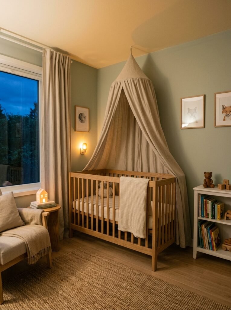
The best nurseries I’ve ever seen don’t follow a formula. They feel like the people who made them actually thought about what they wanted — not what they were supposed to want. That difference shows up on every wall, in every fabric choice, in every small decision that adds up to a room that feels right. So ignore the rules a little. Trust the instinct that says this color, this texture, this small strange thing on the shelf.
What’s the one thing you’ve seen in a nursery that stopped you mid-scroll — the detail that made the whole room make sense?