
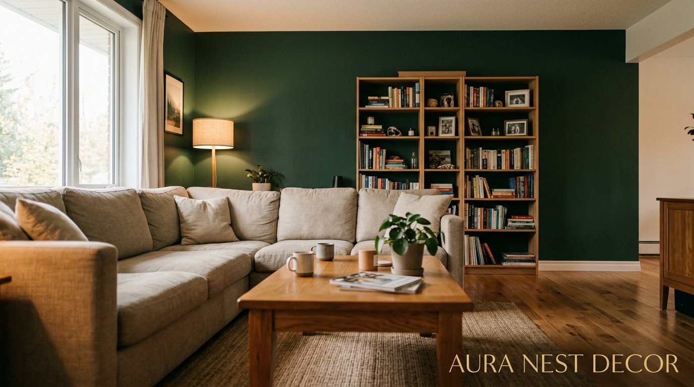
The One Green Wall That Made My Entire Living Room Feel Like It Was Designed on Purpose
You know that moment when you walk into someone’s house and the whole room just clicks? That’s what a green accent wall does when it’s done right. I’ve been obsessing over this trend for months now, and honestly, I don’t think it’s going anywhere.
—
1. Why Green Is the Color Your Living Room Has Been Missing This Whole Time
Here’s the thing about green that nobody really talks about: it’s the only color that reads as both neutral AND bold at the same time. I don’t know how it does it. Forest green feels grounded and serious. Sage feels almost like a non-color — soft, easy, barely there. And then there’s that deep bottle green that makes you feel like you’re inside a very expensive members’ club somewhere in London.
It works with wood tones the way no other color does. It works with white. It works with terracotta, which — if you’ve been on Pinterest for more than ten minutes — you already know is everywhere right now. But the reason green keeps showing up in literally every beautiful living room I save is because it connects to something biological. We’re wired to feel calm around green. Something about trees, nature, the outdoors. Whatever the science is, your nervous system knows it.
And on an accent wall specifically? Green doesn’t shout. It anchors. It gives the eye somewhere to land. The rest of your room suddenly feels more curated, more considered — even if you haven’t changed a single thing about the furniture.
“Green doesn’t shout. It anchors. And suddenly, everything else in the room makes sense.”
2. The Shades That Are Winning Right Now (And the One to Avoid)
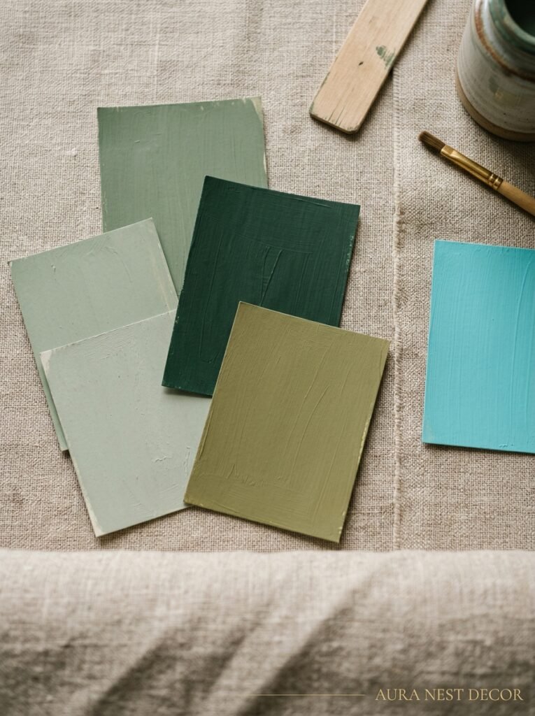
Not all greens are created equal. I learned this the hard way after painting a tiny section of my own wall something called “Herbal Garden” that turned out to be an aggressively yellow chartreuse in real life. The paint chip lied to me. It absolutely lied.
So here’s what I’ve noticed across every gorgeous green accent wall I’ve seen this year. Deep hunter green — think Farrow & Ball’s Studio Green or Sherwin-Williams’ Cascades — keeps showing up in every room that stops my scroll. It’s rich without being dramatic, dark without swallowing the light. Then there’s sage, which is having an enormous moment especially in UK interiors. It photographs beautifully and feels effortless in a way that other colors just don’t.
Olive green is the sleeper hit. More yellow-based than most greens, but in the right light — afternoon sun coming through a west-facing window — it turns golden in a way that’s genuinely stunning. Emerald reads more formal, better in larger rooms. And the one to avoid? That bright, saturated Kelly green. Unless your entire aesthetic is maximalist-grandma-chic (which, no judgment, that’s a thing), it tends to feel more playful than intentional. Save it for an entryway, not a living room.
3. Which Wall to Actually Paint (Because Most People Get This Wrong)
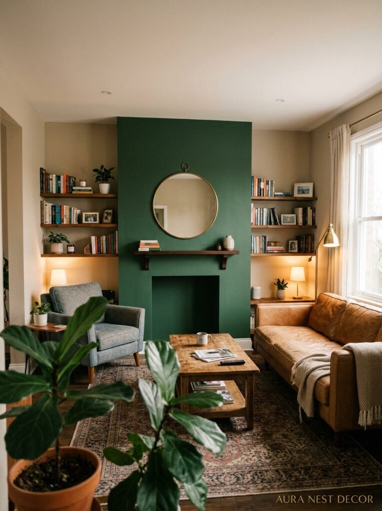
People default to the wall behind the TV. I get it — it’s the focal point, it’s obvious. But it’s not always the right answer.
The best accent wall is the one your eye goes to FIRST when you walk through the door. Usually that’s the wall directly opposite the main entrance, or the wall behind a sofa if you’re walking in from a hallway. Think about how you enter your room. Where does your gaze go naturally? That’s your wall.
There are exceptions. If your living room has a fireplace, paint that wall. Full stop. A green fireplace wall is one of those combinations that makes a room feel genuinely architectural, like it was designed rather than assembled from a furniture showroom. If you’ve got built-in shelving on one wall, that’s another great candidate — the green behind the shelves makes everything displayed in front of it look ten times more interesting. Books, plants, ceramic bits and bobs. All of it pops.
What I’d avoid: a wall with a lot of interruptions — multiple windows, a door, random outlets everywhere. The green needs room to breathe and actually do its thing.
4. The Finish Matters More Than Anyone Ever Tells You
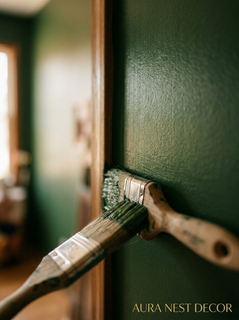
Matte or flat? Eggshell? Satin? This is where most people just shrug and pick whatever the hardware store recommends, and then they’re disappointed when the color looks different than they expected. So let me save you that experience.
For deep, moody greens — that forest green, that bottle green — matte finish is everything. It absorbs light instead of bouncing it around, which gives you that velvety, atmospheric quality. The wall looks like it has actual depth. It’s softer, quieter. More like a material than a painted surface. Side note — matte is also way better at hiding any imperfections in the wall, which if your plaster is as questionable as mine, is genuinely a selling point.
Eggshell is the compromise choice. A little bit of sheen, easy to wipe down, works well in rooms where kids or dogs are a factor. It’s fine. Not my first choice for green specifically, but practical.
Satin on a green accent wall tends to look a bit commercial, honestly. Like a restaurant that’s trying a little too hard. Unless you’re going for a very high-gloss, lacquered, intentional effect — which can actually look incredible in the right hands — I’d steer away from it.
“Matte green doesn’t just cover a wall. It changes the temperature of the entire room.”
5. What to Put On It (And Why Less Is Usually the Right Answer)
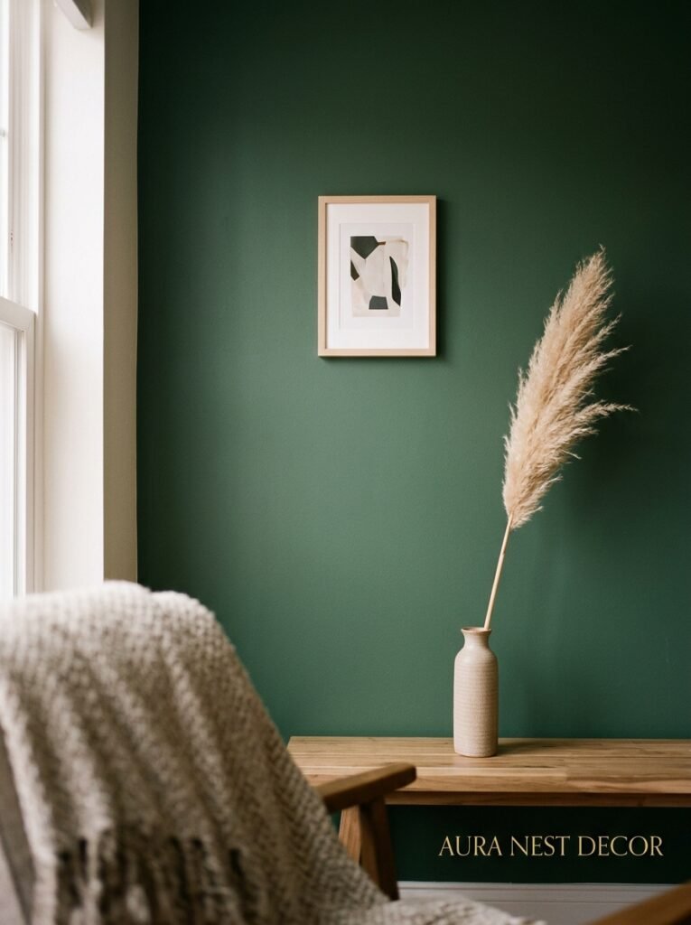
Here’s where people go wrong: they paint the wall and then feel like they need to justify it with a gallery wall and a huge statement mirror and a collection of plants and a neon sign. Please don’t.
A green accent wall works best when you let it actually be the thing. One large piece of art — ideally with warm tones, terracotta, ochre, cream — looks incredible against a dark green. Or nothing at all. A bare dark green wall with a simple wooden shelf holding three objects is more considered than a crowded, busy arrangement.
If you do want to put something on it, think in terms of contrast and texture. Rattan or wicker frames photograph beautifully against green. Natural wood — raw, warm, unfinished — feels organic and intentional. Brass or gold tones are almost offensively good against bottle or hunter green, which is probably why that combination is all over every design account I follow.
What I’d avoid: very busy prints that compete with the green, frames in the same dark tone as the wall (they disappear), or anything that feels too cool-toned — silver, chrome, icy blue-gray. The green wants warmth. Give it warmth.
6. The Furniture Pairings That Make Green Look Like a Design Decision, Not a Mistake
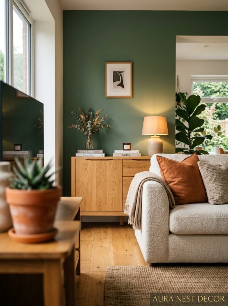
Cream or off-white sofa against a dark green wall. That’s it. That’s the post. But since I have more to say about it —
The contrast between a deeply saturated green wall and a loose-linen sofa in natural cream is one of those combinations that photographs well in EVERY light. Morning, afternoon, evening with lamps on. It never looks bad. I’ve seen it in dozens of homes and it consistently works.
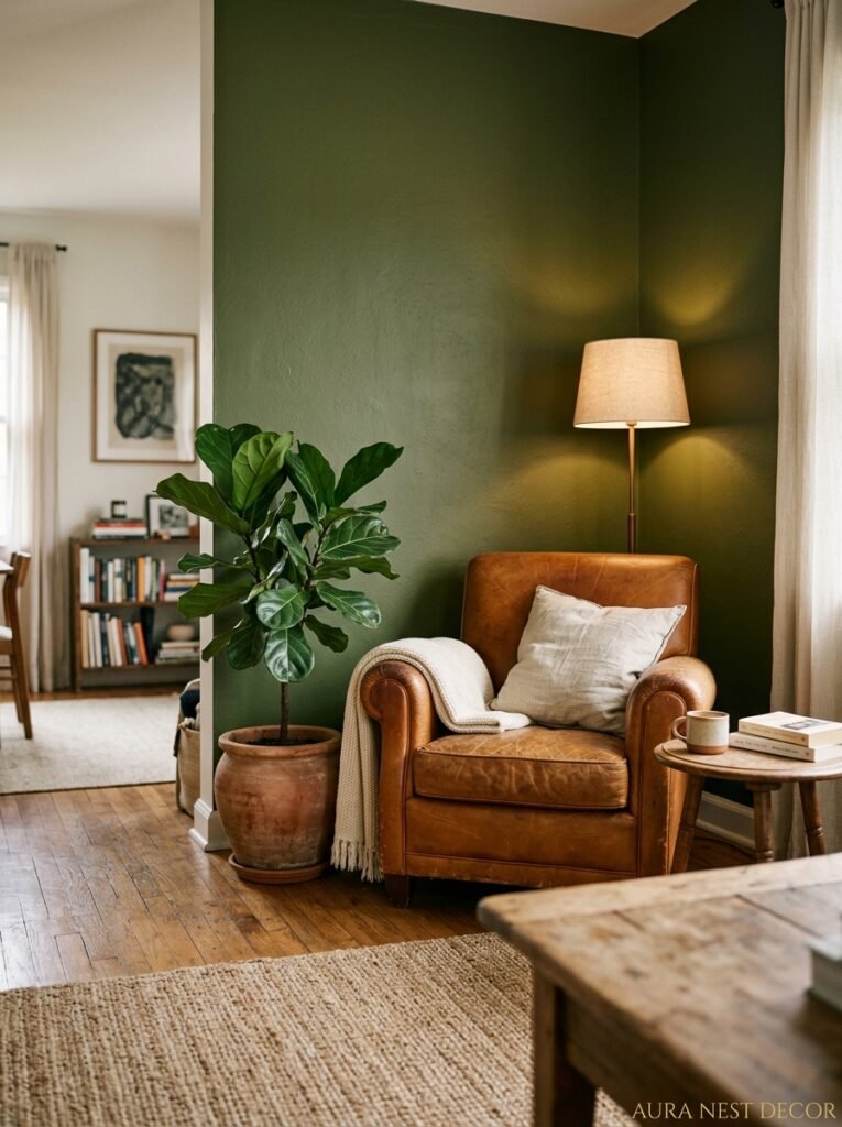
Camel leather is another one. There’s something almost English countryside about a camel leather chair in front of a forest green wall — it feels curated without looking like you tried too hard. Terracotta velvet cushions in front of dark green is the kind of color story you’d pay an interior designer several hundred pounds to tell you.
What doesn’t work? Mid-toned brown sofas. They sort of merge with the green and make the whole room feel muddy and undefined. Very cool gray — that blue-gray that was everywhere in 2018 — also tends to fight with green rather than cooperate with it. And all-white furniture can start to feel sterile, too hospital-corridor. You need at least one warm element pulling it together.
7. How Lighting Changes Green Completely (This Is Not Talked About Enough)
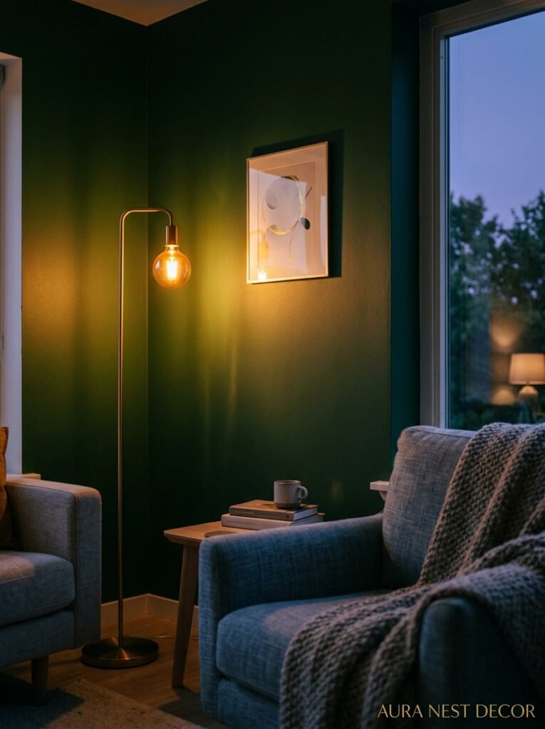
The green you love in the store or on your screen might look completely different by 6pm in your actual living room, and it’s almost entirely a lighting issue.
North-facing rooms in the UK get cool, diffused light all day. That same forest green that looks warm and rich in a south-facing California living room can take on a cooler, more blue-based tone in a north-facing British room. It’s not necessarily bad — it can feel more sophisticated, actually — but it is different. So sample. ALWAYS sample. Paint a large piece of card, move it around the room at different times of day, and live with it for a few days before committing.
Evening lighting is where green really earns its keep, though. Under warm bulbs — 2700K, amber-toned, not the cold white daylight bulbs that make everything look like a hospital — deep green looks almost lacquered. It glows in a way that feels genuinely luxurious. The amber glow of a lamp at 7pm against a bottle green wall is one of those things I can’t stop pinning. It’s so good.
Floor lamps placed in front of or beside a green accent wall will make the color look completely different than ceiling lights. Try it before you decide you don’t like it. The same wall can look flat under overhead lighting and gorgeous under a lamp.
“Under the right lamp at 7pm, a dark green wall doesn’t look painted. It looks like it was always supposed to be there.”
8. The Small Living Room Question (Because Most of Us Don’t Have Huge Open-Plan Spaces)
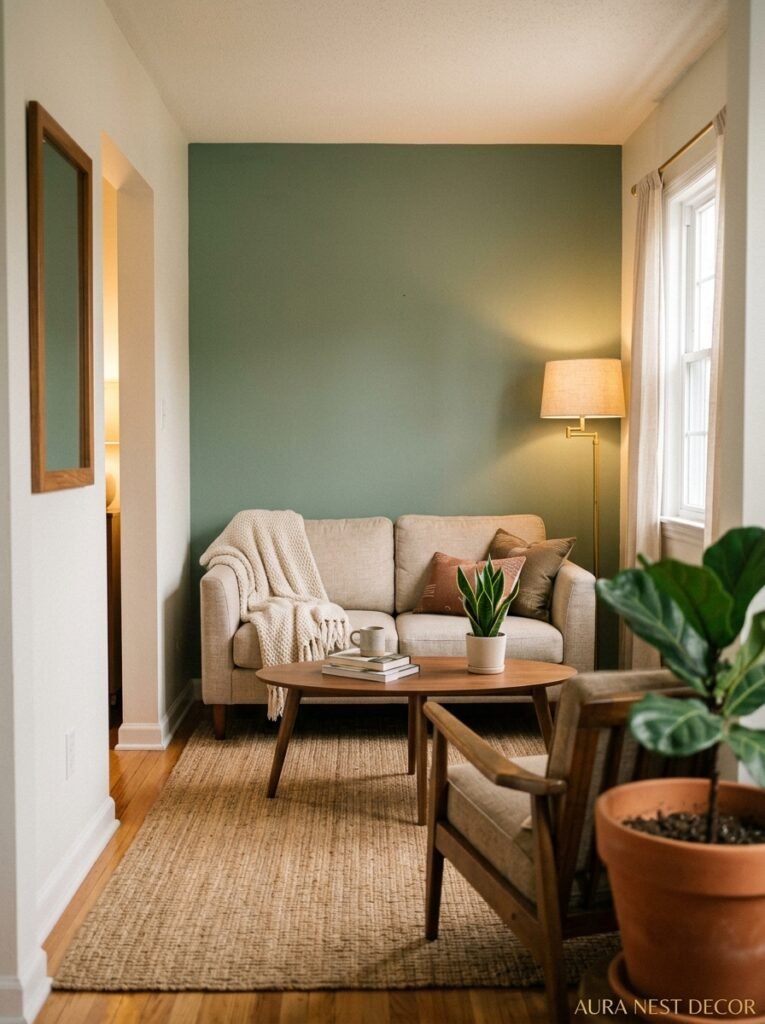
I get asked this constantly: won’t a dark green wall make a small room feel even smaller?
Maybe. But kind of not really. Here’s what I’ve actually observed — and this surprised me — a dark accent wall in a small room can make it feel more intentional and cozy rather than cramped. The key is keeping the other three walls light. Bright white or a very warm cream. This creates contrast instead of compression, and the room feels like it has a point of view rather than an identity crisis.
The ceiling matters more than people think. Keep it white. Keep it light. The moment you bring the dark color up onto the ceiling you lose the sense of height, and THAT is what makes a small room feel small. Also — mirrors on the lighter walls, not the green one. You want to bounce light back into the room from the non-green surfaces.
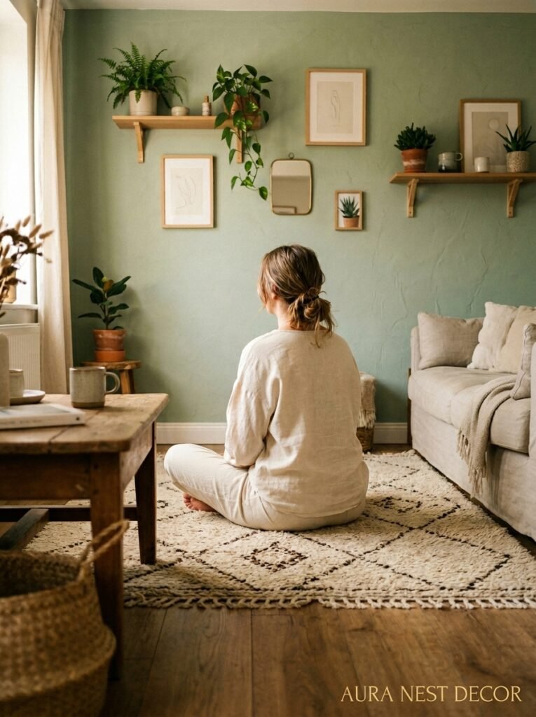
What I wouldn’t do in a genuinely tiny room (under 150 square feet, say) is go with the darkest, most saturated greens. In that case, sage or a lighter olive is your friend. You still get the warmth, the nature connection, the visual interest — but it doesn’t eat the room alive.
9. The £/$ Investment Breakdown (Because Paint Is Cheap, Mistakes Are Not)
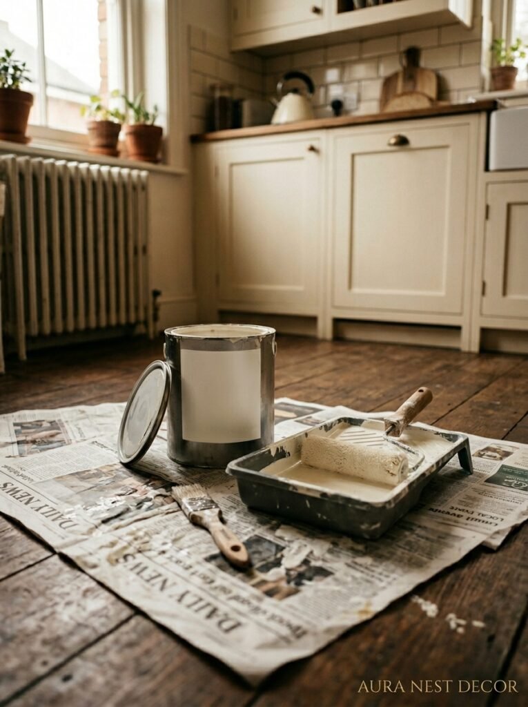
Let me be blunt about money for a second.
Paint itself is not the expensive part. A can of premium paint — Farrow & Ball, Little Greene in the UK, or Sherwin-Williams, Benjamin Moore in the US — runs anywhere from $50-$80 a gallon or £45-£65 a litre for premium options. For a single accent wall, you’re probably using one to two quarts/litres. So the paint? Not a big deal.
The primer is where people cut corners and regret it. If you’re going dark — deep green over white, or especially over a different dark color — skip the primer and you might need four coats instead of two. Buy the good primer. It’s not glamorous but it’ll save you a full extra day of painting and a lot of swearing.
The sample pots are not optional. Buy three or four. Paint large swatches, at least twelve inches square. Live with them. That £3 or $4 each you spend on samples is the best design money you’ll spend.
And if you’re hiring someone to paint it — it’s one wall, it’s not complicated. Get quotes but don’t overthink it. The labor is usually a few hours for a single room wall.
10. The Green Accent Wall Look That’s Taking Over UK Interiors Specifically
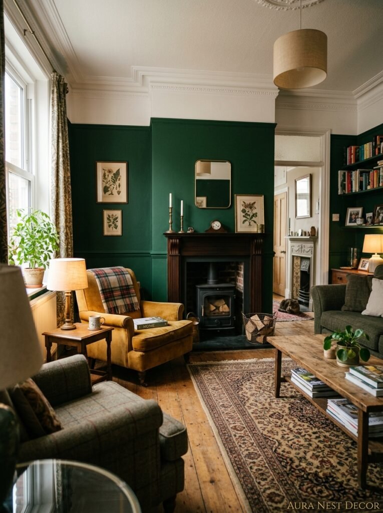
British interiors have gone full green and they’re not coming back. If you follow any UK design accounts or have spent time looking at homes styled in that particular warm, slightly maximalist, very considered way that British decorators do so well, you’ve noticed.
Farrow & Ball’s Studio Green is basically a cult. Sulking Room Pink walls paired with Calke Green woodwork. Olive and dark wood and linen and aged brass. It’s a very specific look and it’s everywhere from Glasgow to Cornwall right now. The British version of the green accent wall tends to lean darker, more Victorian-influenced, layered with pattern and texture in a way that American interiors sometimes don’t.
But what both markets share is the move away from the gray-everything aesthetic that dominated for years and years. Green is the correction. It’s warm where gray was cold, it’s alive where gray was static. And that appeal crosses the Atlantic pretty effortlessly.
11. What to Do If You’re Renting (Green Without the Commitment)
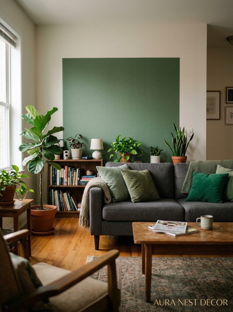
You can absolutely do this without painting. I know that’s not the same, I know, but listen.
Removable wallpaper in green — some of the textured options available now are genuinely hard to distinguish from real wallpaper from a few feet away — is a legitimate option. Brands like Tempaper and Chasing Paper in the US have deep green options that photograph beautifully. In the UK, I’ve seen really good options from Sian Zeng and smaller Etsy shops.
Big, floor-to-ceiling curtains in deep green can create the same anchoring effect as a painted wall, especially if your curtain rail is hung close to the ceiling. A rich hunter green velvet curtain panel against a white wall gives you most of the visual impact. Or — hear me out — a large format green art print. Something 36×48 inches in a simple frame, hung on the main wall. Not quite the same, but it moves the room in that direction.
And honestly? Some landlords just say yes if you ask nicely and offer to repaint before you leave. Worst they can say is no.
12. The Version of This That’s Still Going to Look Good in Five Years
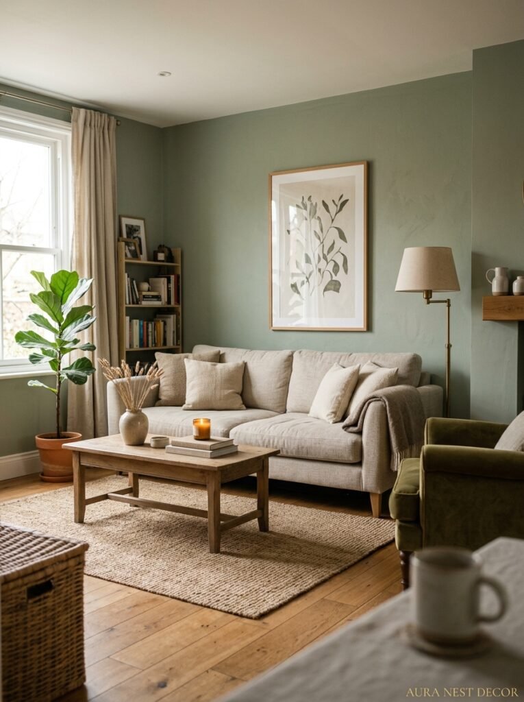
Trends are real and I won’t pretend they’re not. But some versions of this trend have legs and some don’t.
The version that’ll look dated: very on-trend accessories paired with the green, everything matchy-matchy in the exact same aesthetic, the wall treated as a backdrop for a very specific Pinterest moment rather than as part of a real room. That tends to age.
The version that lasts: a deep, complex green — one that reads differently depending on the light — paired with furniture you actually love and that serves a real function. Natural materials. A few things that mean something to you. The green becomes just part of the room, not THE room.
Think of it this way. You’re not decorating for photos. Or, okay, maybe you are a little, but the room still has to work at 8am on a Tuesday when nobody’s looking. The rooms I keep saving are the ones that feel LIVED IN alongside looking beautiful. The green wall helps. But only because everything around it feels honest.
—
❓ FAQ
Q: Will a dark green accent wall make my living room feel smaller? A: Not necessarily, and I know that sounds counterintuitive. If you keep the other three walls light — white or warm cream — the contrast actually creates a sense of depth rather than compression. Just don’t bring the dark color onto the ceiling. That’s the move that genuinely makes a room feel smaller.
Q: Which green paint colors are most recommended for a living room accent wall? A: For the UK, Farrow & Ball’s Studio Green and Little Greene’s Obsidian Green are consistently stunning. In the US, Sherwin-Williams’ Cascades and Benjamin Moore’s Tarrytown Green come up constantly. For something lighter, Sage by Sherwin-Williams or Mizzle by Farrow & Ball give you that soft, calm green that works in almost any room.
Q: Can I do a green accent wall in a rental without painting? A: Yes — removable peel-and-stick wallpaper has gotten genuinely good in the last few years. Tempaper and Chasing Paper (US) both have deep green options. Alternatively, large-scale curtain panels in deep green, hung floor-to-ceiling, create a similar anchoring effect without a single nail hole.
—
💭 Final Thoughts
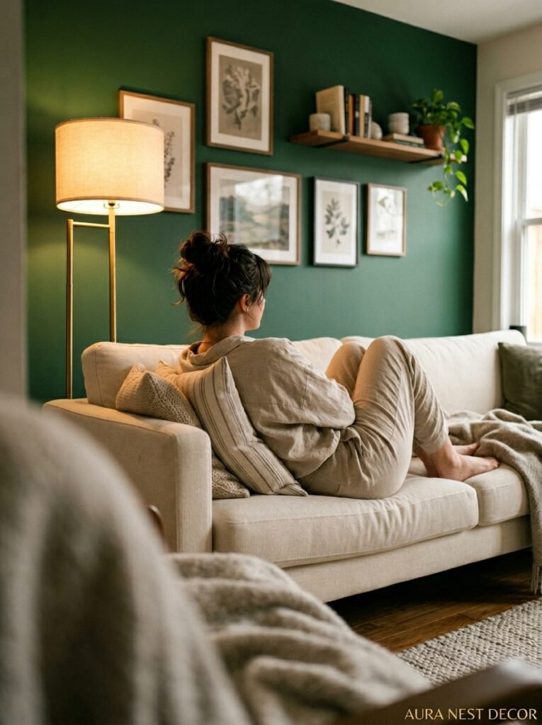
There’s something about a green accent wall that makes a living room feel like someone actually thought about it — like it’s a home someone LIVES in rather than a showroom someone’s waiting to leave. It’s one of those design decisions that costs relatively little but shifts everything around it. Done right, it makes your furniture look better, your lighting feel warmer, your room feel more like yours.
So — what’s stopping you from just buying the sample pot this weekend?




