

Why a Colorful Living Room Might Be the Most Honest Thing You Ever Do to Your Home
There’s a quiet kind of courage in choosing color — in walking past the beige paint swatches and reaching for something that actually means something to you. A colorful living room isn’t just a design choice. It’s a declaration.
—
1. The Moment You Realize Neutral Isn’t “Safe” — It’s Just Safe

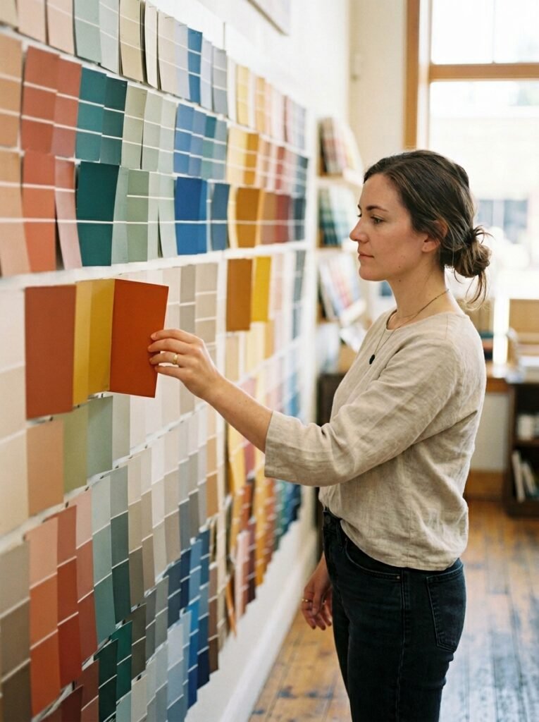
Most of us defaulted to neutral walls at some point. Greige. Off-white. “Agreeable Gray” in a flat finish. We told ourselves it was practical, resale-friendly, timeless. And while none of that is wrong exactly, there’s a quiet truth worth sitting with: neutral rooms don’t always feel like home. They feel like waiting rooms with nicer furniture.
The shift happens differently for everyone. Maybe you visited a friend’s cobalt-blue living room and felt your shoulders drop the moment you walked in. Maybe you scrolled past a terracotta-walled space on Pinterest at midnight and your heart did something unexpected. Maybe you simply got tired of your living room feeling like it belonged to someone else — someone careful, someone cautious, someone who wasn’t quite you.
Color has always been a language. And your living room — the space where you greet guests, fold into the couch after long days, host dinners that run past midnight — deserves to speak in your actual voice.
“Choosing color for your living room isn’t a design risk. It’s a design truth.”
—
2. What Color Psychology Actually Says About Living Spaces

Before you fall in love with a color and second-guess yourself out of it, it helps to understand what color actually does to a room — not in an abstract, art-school way, but in a real, lived-in, Tuesday-morning way.
Warm colors — think terracotta, rust, golden yellow, paprika — generate a sense of energy and warmth. They make spaces feel inhabited and alive. They’re the visual equivalent of a fire in the hearth. Rooms painted in warm tones tend to feel smaller and cozier, which in an open-plan living space can be a gift, not a flaw.
Cool colors — sage green, dusty blue, lavender, deep teal — have a calming, expansive quality. They slow the nervous system down in the best way. A sage green living room feels like a long exhale. A deep teal accent wall feels like depth and intention. These colors make large, boxy rooms feel deliberate and considered rather than empty.
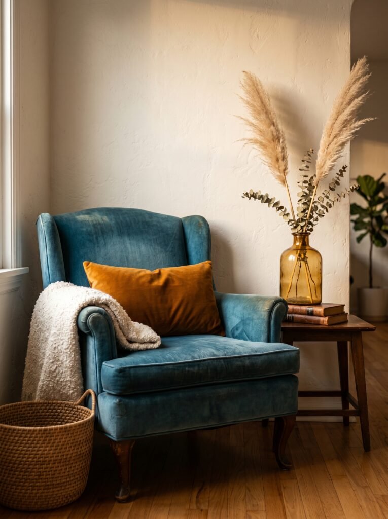
Jewel tones — emerald, sapphire, amethyst, amber — are something else entirely. Rich and saturated, they don’t whisper. They hold court. Used well, they create living rooms that feel layered, eclectic, and utterly unforgettable.
Understanding these basics doesn’t mean following rules. It means making informed choices — and then trusting your instincts anyway.
—
3. The Colorful Living Room Styles That Are Dominating Pinterest Right Now
Pinterest trends move in waves, and right now, a few colorful living room aesthetics have taken over in the best way. Knowing the vocabulary helps you shop, pin, and plan with intention.
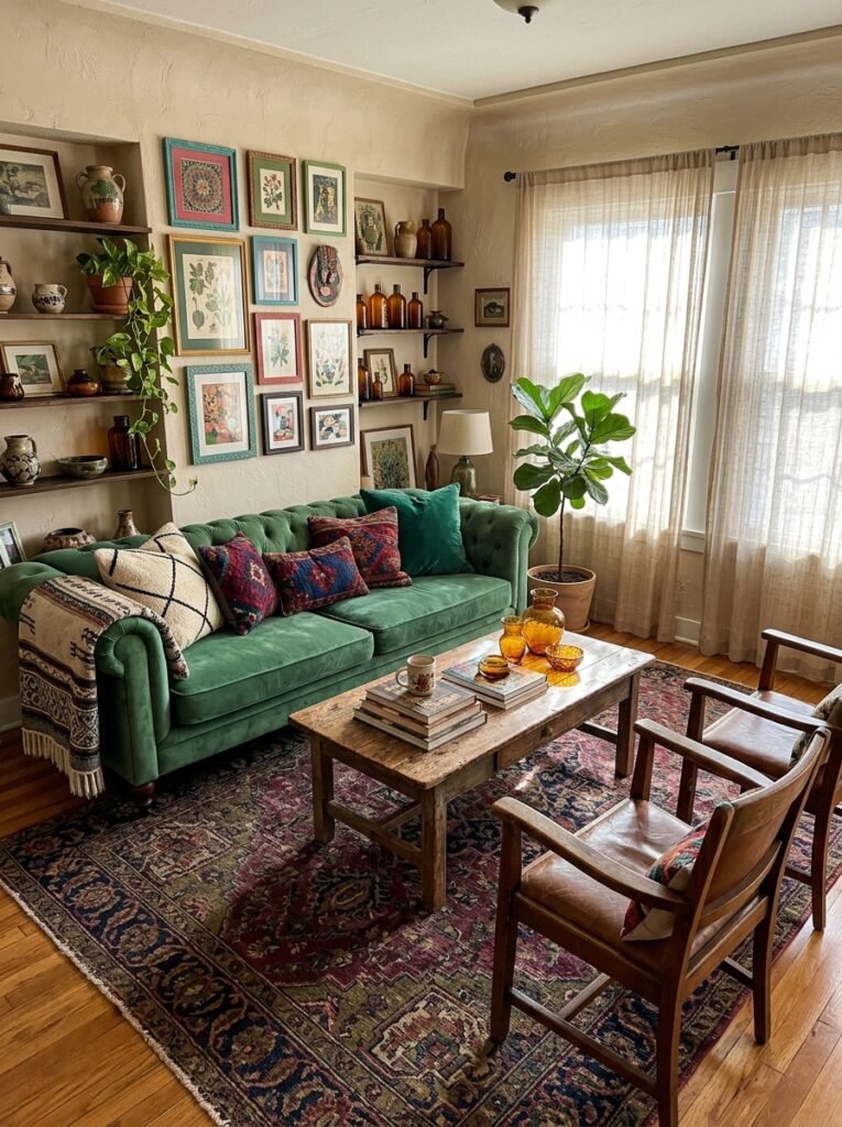
Maximalist Eclectic is perhaps the most shared right now — layered colors, mixed patterns, vintage furniture, global textiles. Nothing matches perfectly, and everything belongs. The living rooms in this category feel like they were assembled over a lifetime, not ordered from a single catalog on one Saturday afternoon.
Earthy Mediterranean brings terracotta walls, whitewashed ceilings, deep olive linens, and arched architectural details into a cohesive and deeply warm whole. It photographs beautifully in natural light and feels like a countryside house in southern Europe — unhurried and grounded.
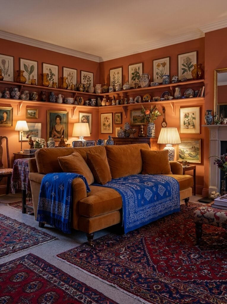
Jewel-Toned Moody leans into deep, saturated hues — forest green velvet sofas, amber bookshelves, aubergine throw pillows. These rooms feel glamorous in a timeless, Old World way. They’re designed to be lived in after dark, with candles and good conversation.
Playful Pastel is lighter but no less impactful — blush walls, mint accents, warm butter yellows. These spaces feel joyful without feeling childish. They’re the design equivalent of a great mood.
—
4. How to Start When You’re Afraid to Commit to Color
If the idea of painting your living room a deep cobalt blue sends your heart racing in a not-entirely-good way, start smaller. Color commitment doesn’t have to be all-or-nothing.
The most forgiving entry point is textiles. A richly colored area rug — say, a Persian-style rug in burgundy and gold — anchors a room in color without a single drop of paint. Layer in throw pillows in coordinating hues. Add a colorful throw draped over the sofa arm. Already, you’ve created a colorful living room without touching the walls.
From there, furniture is your next brave step. A sage green velvet sofa against a white wall is stunning and entirely reversible — you can move it, sell it, reupholster it. Same with an amber-toned armchair or an indigo accent chair. These pieces carry enormous visual weight and allow you to live with color before committing it to your walls.
Artwork is another powerful, low-risk tool. A large, colorful painting or print can introduce an entire palette into your space and serve as the visual anchor that makes your entire color scheme feel intentional rather than accidental.
—
5. The Rule of Three (And When to Happily Break It)
There’s a classic design principle suggesting you stick to three colors in any given room — a dominant, a secondary, and an accent. It’s a genuinely useful framework, especially if you’re building a colorful room for the first time and want it to feel cohesive rather than chaotic.
Pick one color to dominate — this is typically your walls, your largest sofa, or your rug. Then choose a secondary color that complements or contrasts it. Then add an accent, something unexpected that makes the other two sing. Terracotta walls, deep cream sofa, forest green accent cushions. Sage walls, oatmeal linen sofa, rust-orange pottery and candles. Cobalt blue velvet sofa, warm white walls, hammered gold side tables.
“Three colors well-chosen will always outshine thirty colors poorly placed.”
That said, once you understand the rule, give yourself permission to bend it. Maximalist rooms layer five, six, seven colors and look spectacular. The key is always repetition — if a color appears only once in a room, it reads as an accident. If it appears three or more times in different scales and textures, it reads as a decision.
—
6. Colorful Living Rooms That Feel Expensive (Without the Price Tag)
Here’s a reassuring truth that doesn’t get said enough: expensive-looking colorful rooms are less about budget and more about restraint, repetition, and texture.
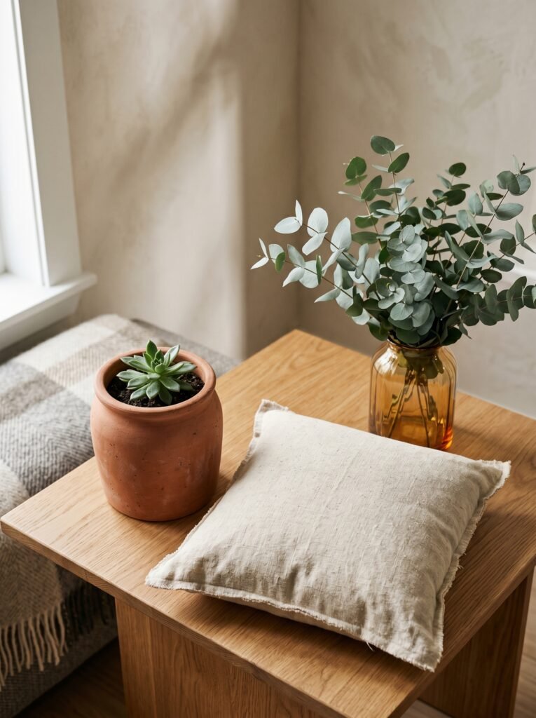
Restraint means you’re not adding every colorful thing you love into one space. You’re editing down to the things that speak to each other. The vintage amber glass vase that picks up the honey tone in your rug. The deep teal throw that mirrors the underglaze on your ceramic pot. These relationships between objects — when they’re intentional — read as sophisticated even on a thrift store budget.
Texture is equally transformative. A colorful room that relies on flat, matte surfaces alone can feel flat. But layer in a bouclé cushion, a velvet curtain, a woven rattan basket, and suddenly the light has something to interact with. The room feels rich because of its physical depth, not just its color depth.
Thrift stores, secondhand apps, and estate sales are genuinely the best places to find colorful pieces with patina — the kind of weathered, lived-in quality that new furniture from a big-box store often lacks. A slightly worn peacock-blue armchair from a vintage shop will look more beautiful and authentic than a brand-new replica.
—
7. The Most Underestimated Element: Colorful Ceilings

If there is one design detail that consistently stops Pinterest users mid-scroll, it’s a painted ceiling. And yet — it remains wildly underused in real homes.
Painting a ceiling in a rich, unexpected color does something remarkable to a room. It makes the space feel more intimate, more considered, more complete. A living room with dusty rose walls and a deep mauve ceiling feels like being inside a jewel box. A living room with sage walls and a forest green ceiling feels like being sheltered under a forest canopy.
The technical term designers use is “color drenching” — painting walls, ceiling, and sometimes trim in the same or tonal variations of one color. Done well, it’s enveloping and extraordinary. The room stops feeling like a box with a white lid and starts feeling like an actual atmosphere.
If a full color drench feels too bold, simply paint the ceiling two or three shades deeper than your wall color. It adds drama and intimacy without requiring an entirely separate palette.
—
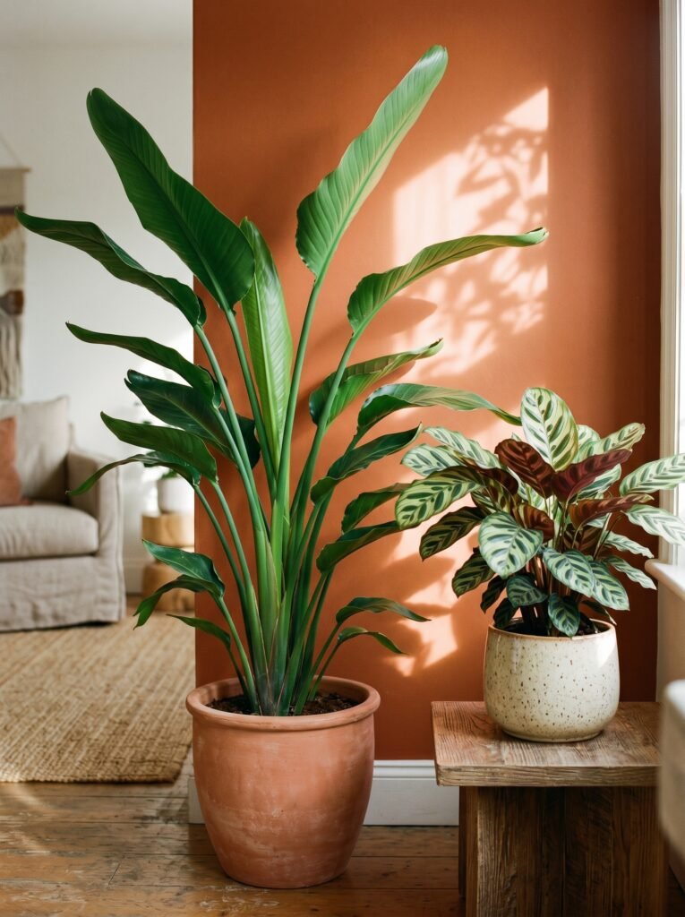
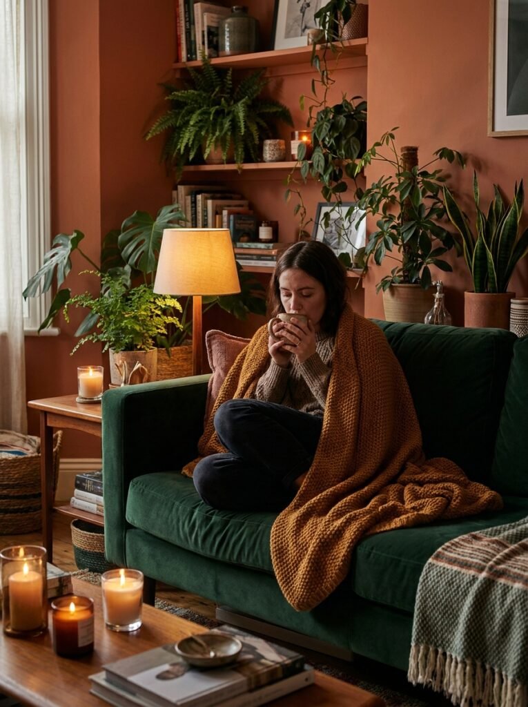
8. Plants as Living Color — The Element That Never Feels Wrong
No colorful living room discussion is complete without plants, because plants do something paint and fabric simply cannot: they bring life that changes with the light, the season, and the day.
In a colorful room, plants function as a grounding element — all that lush, breathing green keeps a vibrant space from tipping into overwhelming. They’re also colorful in their own right. A bird of paradise with its architectural leaves. A calathea with its watercolor-like patterned foliage. A fiddle leaf fig positioned in a terracotta pot against a rust-orange wall creates a layer of natural color harmony that feels effortless because it is.
Beyond aesthetics, plants improve air quality, reduce stress, and make spaces feel cared for. A living room with thriving plants says something about the person who lives there — it says they notice things. They pay attention. That energy is deeply appealing in both real life and on a curated Pinterest board.
—
9. Lighting: The Detail That Makes or Breaks Your Color Story
Here is something that experienced designers know and first-time colorful-room creators often discover too late: the same paint color looks completely different under different lighting conditions. And in a colorful room, this matters enormously.
Natural north-facing light is cool and consistent — it makes cool colors (blues, greens, lavenders) glow beautifully and can make warm colors look slightly muddy or dull. South-facing rooms are flooded with warm, generous light that makes terracotta, gold, and warm red tones absolutely incandescent.
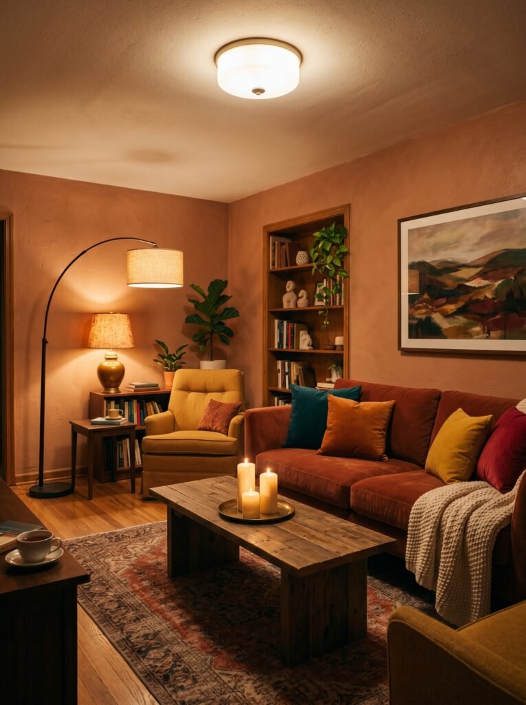
Artificial lighting tells a second story. Warm-toned bulbs (2700K-3000K) make a colorful room feel cozy and intimate — they wrap the space in a gentle amber glow that flatters most warm and jewel-toned palettes. Cool-toned bulbs (4000K and above) can make those same rich colors feel harsh or flat.
“In a colorful room, lighting isn’t an afterthought — it’s the author of the final chapter.”
Layer your lighting: an overhead fixture for general light, floor lamps for warmth, table lamps for intimacy, and candles for magic. Each layer serves a different time of day and a different emotional temperature.
—
10. How to Bring Color into a Rental (Without Losing Your Deposit)

Renting should not mean living in a beige box for years at a time. There are thoughtful, reversible ways to bring real color into a rented living room without risking your deposit or your lease.
Removable wallpaper has genuinely improved in quality and variety over the past few years. An accent wall in a bold geometric print or a lush botanical pattern creates enormous visual impact — and peels off cleanly when you leave. Several companies now make removable wallpaper specifically for renters that holds up for years without damaging walls.
Large-scale artwork and gallery walls bring color to vertical surfaces without touching paint. A collection of prints in terracotta, sage, and cream can transform a white wall into a curated, intentional space in an afternoon.
Color-blocked furniture arrangement is another underused tool — grouping your most colorful pieces together rather than scattering them creates a focal point of intentional color that reads as designed rather than mismatched.
—
11. The Colors That Photograph Best for Pinterest (And Why That Matters)

If you’re creating content for Pinterest, you already know that a stunning image is what drives saves, repins, and traffic. And some colors simply photograph better than others — particularly in the warm, golden-toned, slightly saturated style of image that consistently performs best on the platform.
Terracotta and rust tones photograph beautifully in natural light, especially in the hour or two after sunrise and before sunset. They feel warm and nostalgic on screen. Sage green and olive photograph with an earthy, grounded quality that pairs beautifully with wood tones and linen textures. Deep jewel tones — emerald, sapphire, amethyst — photograph stunningly in moody, lower-light settings where the richness of the color can really show itself.
Colors that can be tricky on camera: very bright, saturated primaries (they can read as harsh), ultra-pale pastels in low light (they disappear), and highly glossy finishes that create distracting reflections.
For Pinterest specifically, warm tones combined with layered textures and natural light almost always outperform cooler, flatter compositions. Style your shots near windows. Use real plants. Let the imperfection of a thrown blanket or a stack of books add life.
—
12. The Living Room That Grows With You
Perhaps the most beautiful thing about a colorful living room is that it isn’t static. Unlike a neutral room, which looks largely the same from year one to year ten, a colorful room can evolve — shedding a color that no longer feels right, absorbing a new one that reflects where you are now.
The terracotta phase of your twenties gives way to the deep jewel tones of a more settled decade. The playful pastels of early parenthood soften into something more intentional as the kids grow older. The maximalist mosaic of a well-traveled life accumulates slowly, piece by piece, trip by trip, year by year — until one day you look around your living room and realize it’s genuinely, completely, unmistakably yours.
This is what color does that beige never quite manages: it holds memory. That cobalt blue throw came from a market in Morocco. That amber pottery was found at an estate sale on a rainy Saturday. That terracotta wall is the exact shade you loved in a photograph taken in Portugal years before you could afford to travel there.
Color lets your home remember with you. And that, quietly, is worth more than any resale value.
—
🌿 How to Take Care of Your Colorful Living Room
A colorful room needs a little intention to stay looking as good as the day you designed it. Here are a few genuinely useful habits to maintain the vibrancy and cohesion of your space.
Rotate your textiles with the seasons — swapping out throw pillows and blankets in slightly different tonal variations keeps the room feeling fresh without requiring a full redesign. Keep your colors in conversation by ensuring each hue appears at least twice in the room. If a color is orphaned, it reads as accidental. Dust and clean regularly, because saturated colors show dust and scuff marks more visibly than neutral ones — your deep teal sofa will need gentle cleaning more attentively than a grey one. Protect upholstery and textiles from direct, prolonged sunlight, which fades even the most beautiful colors over time — use sheers or UV-filtering window film in particularly sunny rooms. And finally, don’t be afraid to edit. A colorful room that’s working doesn’t need constant addition. Remove something before you add something new.
—
❓ FAQ
Q: What is the most popular color for a colorful living room in 2024? A: Terracotta, sage green, and deep jewel tones like emerald and sapphire have dominated living room color trends. Warm earthy palettes in particular have shown enormous staying power — they photograph beautifully, feel timeless rather than trendy, and work across a wide range of furniture styles and budgets.
Q: How do I make a colorful living room feel cohesive rather than chaotic? A: Repetition is the key. When a color appears in at least three different places throughout the room — in varying scales and textures — it reads as intentional design rather than collected randomness. Anchor the room with a neutral base (a natural wood floor, a cream ceiling, an oatmeal rug) and let your chosen colors build from there.
Q: Can a small living room handle bold color? A: Absolutely — and it often looks better for it. Dark or saturated colors in a small room create intimacy and atmosphere rather than making the space feel smaller. A small living room painted in deep forest green with warm lighting and layered textures feels like a cozy, intentional sanctuary. The key is consistent color and avoiding too many competing patterns.
—
💭 Final Thought
A colorful living room isn’t for everyone — but if some part of you has been quietly drawn to color for years and keeps talking yourself back into neutrals, it might be worth asking yourself why. Your home is the one place in the world designed entirely around you. It gets to be brave if you are. It gets to be warm, and layered, and alive with the colors that have always made your heart move.
What’s the one color you’ve always wanted in your living room — but haven’t let yourself choose yet?