
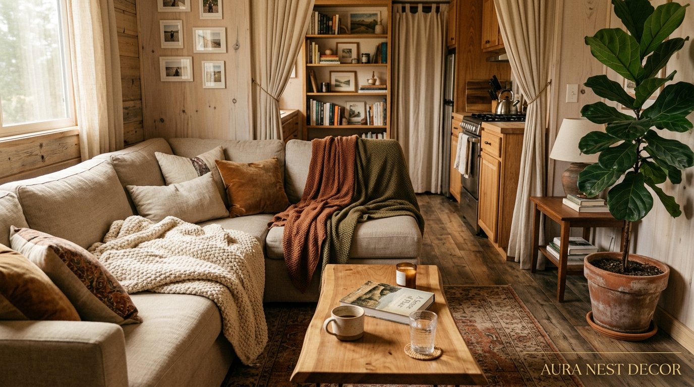
Why Mobile Home Living Rooms Are Outdesigning Regular Houses Right Now
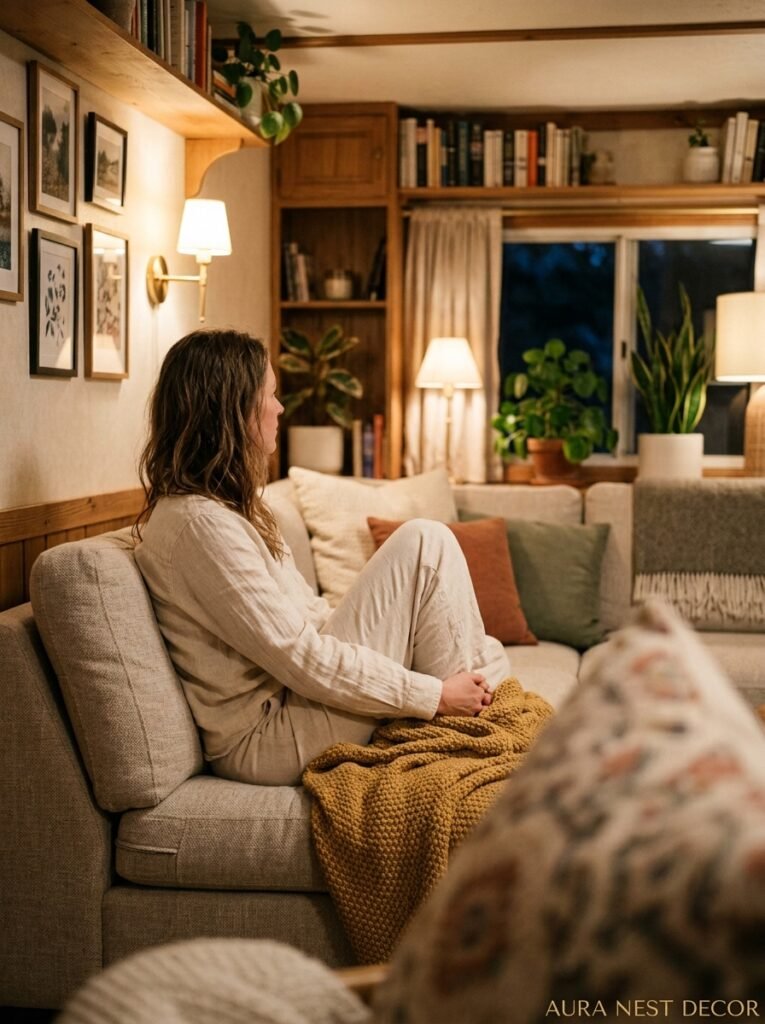
You know that feeling when you walk into a space and it just works? Everything feels intentional, nothing feels crowded, and somehow it’s cozier than a house twice its size. I’ve been seeing that more and more in mobile homes lately — and honestly, I wasn’t expecting it.
—
1. The Wall Color Choice That’s Making Mobile Home Rooms Look Massive
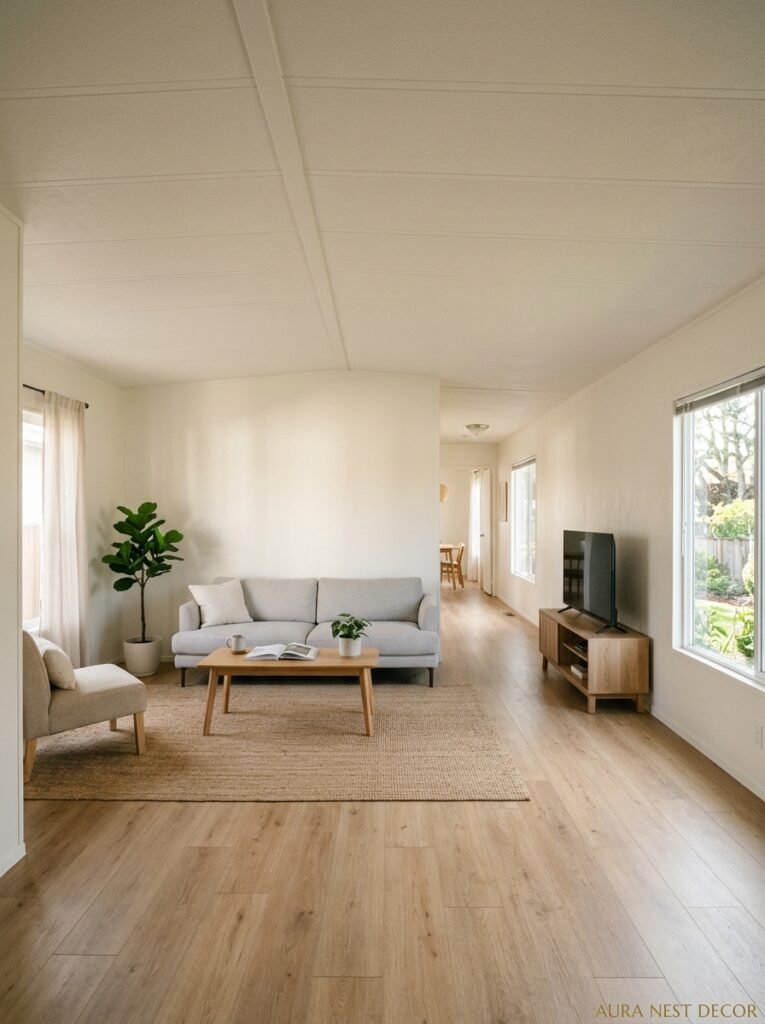
Here’s the thing people get wrong first: they go light and neutral because someone on the internet told them small spaces need white walls. And sure, sometimes that’s true. But I’ve seen deep moody colors — like a dusty sage or an almost-black forest green — do something genuinely wild to a narrow mobile home living room. They make the walls disappear.
When you can’t quite tell where the wall ends and the shadow begins, your brain stops registering the room as small. It just registers it as atmospheric. There’s a reason designers keep coming back to this trick even in bigger homes.
That said, if you’re renting or not ready to commit, there’s another move that I’m kind of obsessed with: paint just one wall. Not an accent wall in the 2005 sense — I mean choose the wall that catches the most natural light and give it something rich. Terracotta. Warm ochre. A deep dusty blue-green. Everything else stays soft or neutral. The effect is dramatic without being a whole project, and it photographs beautifully for Pinterest, not gonna lie.
Don’t underestimate what trim color does either. White trim on a colored wall is obvious. But matching your trim to your wall color — or going a shade darker — makes the room feel intentional in a way that’s hard to explain but impossible to miss.
“The right wall color doesn’t make a room look bigger. It makes you stop thinking about the size entirely.”
—
2. The Furniture Scale Rule Nobody Talks About Enough
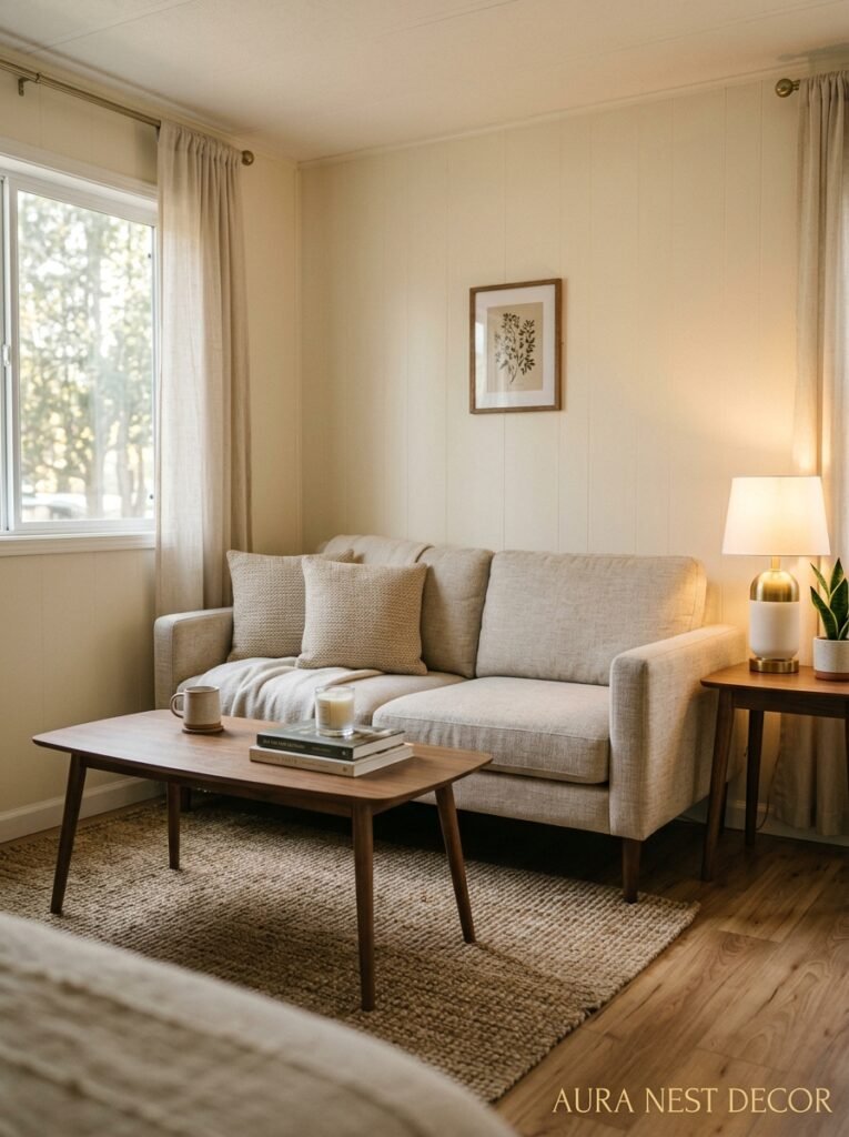
Scale. That’s the word. And it’s where most mobile home living rooms quietly fall apart.
You’d think small room equals small furniture. But that’s not really how it works. A room full of tiny furniture just looks… sad. And cluttered, paradoxically. What actually works is one anchor piece that fits the room properly — a sofa that goes almost wall-to-wall, for example — surrounded by a few smaller, lower-profile pieces. The contrast is what creates the visual logic.
In a standard mobile home living room, you’re often dealing with a width of somewhere around 12 to 14 feet. Which sounds narrow, but it’s genuinely workable if you choose a sofa with a low back (under 30 inches) and legs you can see underneath it. That gap between furniture and floor is doing real work — it keeps the sight lines open.
I’d also say: stop buying matching sets. A three-piece suite that all comes from the same box looks fine in the store. In a real living room — especially a compact one — it feels oddly corporate. Mix. Get a sofa you love, then find chairs that complement it rather than copy it. Your space will look more collected, more personal. Like a home, not a showroom.
One more thing — and I feel strongly about this. Coffee tables with storage shelves underneath are not automatically ugly. Some of them are genuinely beautiful. And in a mobile home living room, a table that pulls double duty isn’t a compromise. It’s just smart.
—
3. The Lighting Setup That Makes Everyone Who Walks In Immediately Relax
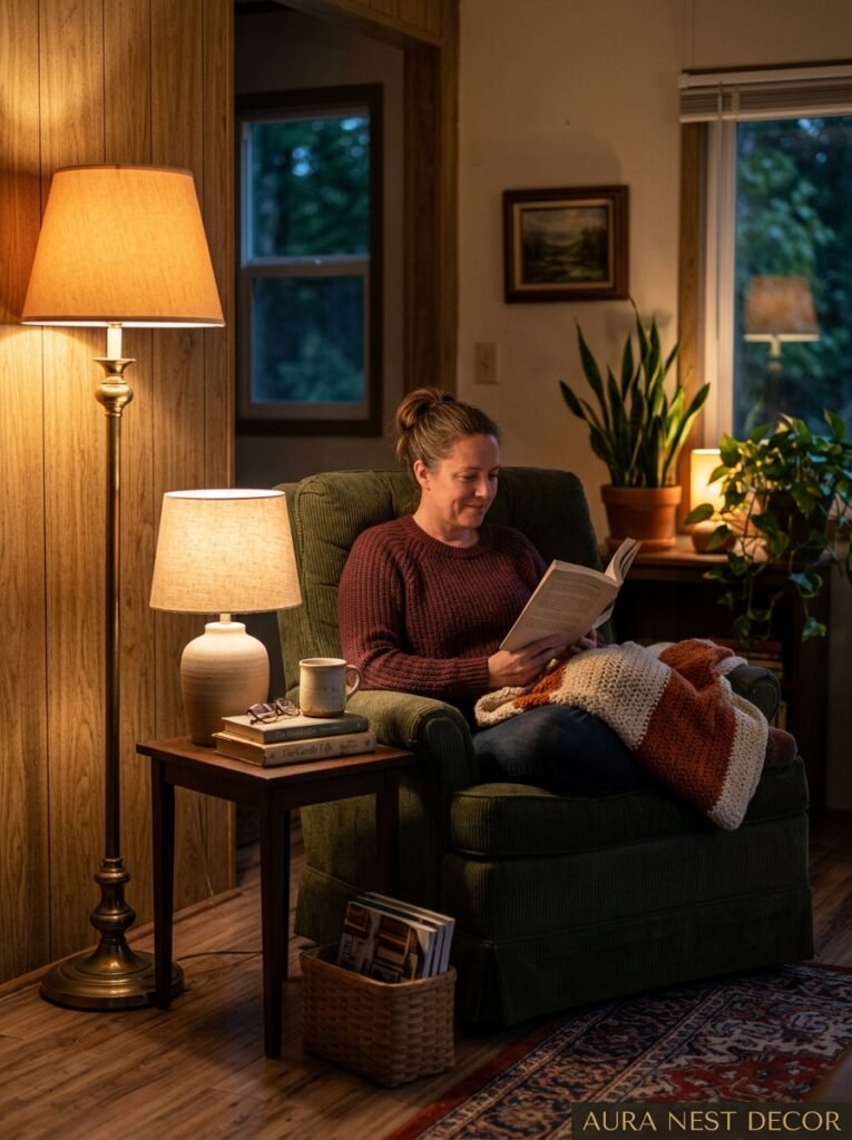
Overhead lighting is the enemy. I said what I said.
The flat overhead light that comes standard in most mobile homes — that cool, fluorescent-adjacent vibe — it’s not doing you any favors. It’s the kind of light that makes everyone look slightly tired and makes rooms feel like a waiting area at a dentist’s office.
What changes everything is layering. A floor lamp in the corner that throws light upward. A table lamp on a side table that creates a little warm pool next to the sofa. If you’ve got a bookshelf or a media unit, a small LED strip along the back or underneath the shelves. The amber glow of a lamp at 7pm feels completely different to the bleached-out overhead experience, and your room will photograph a hundred times better.
String lights, done right, aren’t just for college dorms. In a mobile home living room with high-ish ceilings or an interesting architectural detail, a warm white string light run along a shelf or around a window frame adds that slightly magical quality that’s so hard to fake with anything else.
Side note — dimmer switches. If you’re adding any actual overhead fixture (like a pendant), put it on a dimmer. Non-negotiable. The difference between 100% overhead and 40% overhead is night and day, and it costs almost nothing to do.
—
4. What to Do With the Awkward Wall Space Above the Sofa
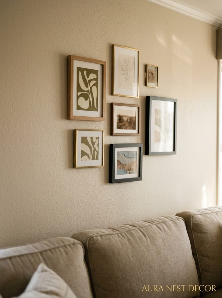
People hang things too high. That’s basically the whole problem.
Art and mirrors should be hung so that the center of the piece is roughly at eye level — around 57 to 60 inches from the floor. In a mobile home, where ceiling height is often a bit lower than a traditional house, going too high makes the ceiling feel like it’s pressing down. Go lower than you think. It’ll look intentional.
Now, gallery walls. Genuinely love them for mobile home living rooms because they fill vertical space without taking up floor space. But there’s a way to do them that looks curated and a way that looks chaotic. The secret is keeping something consistent — either the frame color, or the mat color, or the general shape of the frames — and letting everything else vary. Same-frame-color with wildly different art inside? Looks expensive. Wildly different frames with wildly different art? Looks like a craft fair.
Mirrors deserve a separate conversation. A large mirror on the wall opposite your main window isn’t a cliché — it’s physics. It doubles the light and the perceived depth. I’ve seen a simple thrifted mirror, painted frame and all, completely change how a room reads. If I had to pick one thing to add to a mobile home living room that costs under $50, it’d be a secondhand mirror every time.
“Hanging things at the wrong height is the most fixable mistake in home decor, and somehow the most common.”
—
5. The Rug Size That’s Actually Right for a Mobile Home Living Room
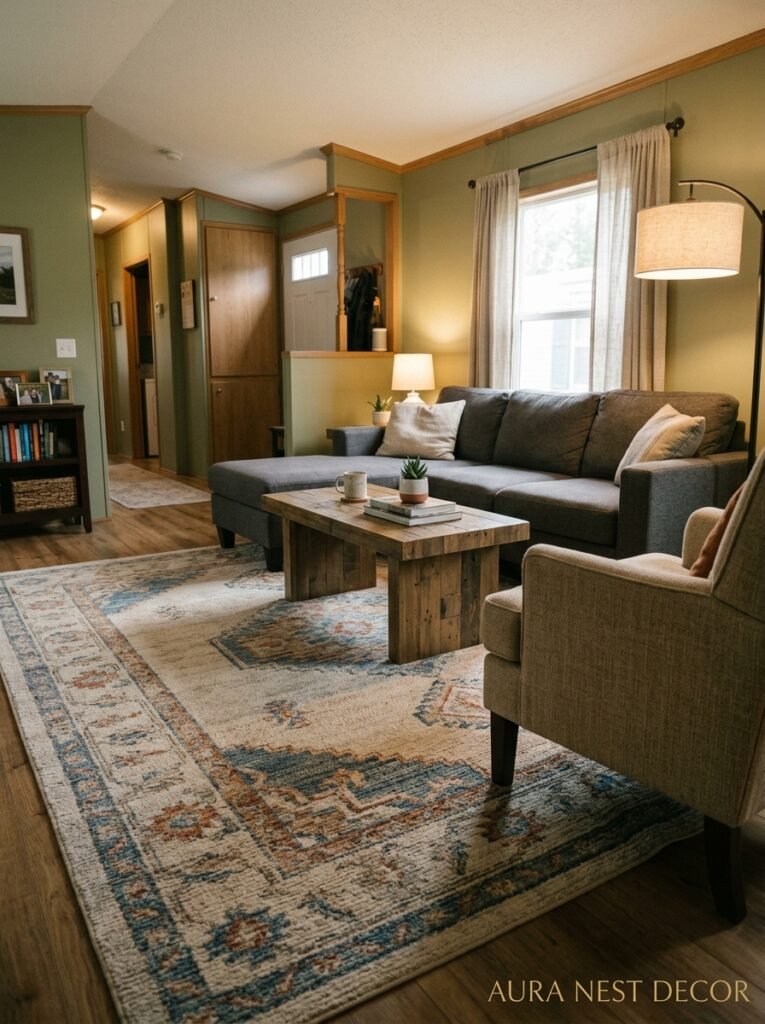
Too small. Always too small. This is basically a universal truth of home decor.
People get nervous about a rug that seems large in the shop and then bring it home and it looks like a postage stamp in the middle of the room. The standard rule — all furniture legs on the rug, or at least front legs on — exists for a reason. A rug that anchors the whole seating area visually ties the room together. A rug that’s too small just floats there looking confused.
In a mobile home living room, I’d typically look at an 8×10 foot rug as a starting point. Yes, even if the room feels compact. Especially if the room feels compact. A properly sized rug makes the seating area feel like a defined zone, and that definition is what makes a small room feel intentional rather than cramped.
Pattern is a whole thing. Large-scale patterns can actually work really well in small rooms — there’s a counterintuitive quality to them that makes the room feel like it has more to offer than you expected. What I’d avoid is a busy, high-contrast pattern if your sofa and curtains are already doing a lot visually. One statement piece at a time.
Layering rugs is also genuinely underrated. A natural jute rug underneath and a smaller patterned rug on top — you get texture, you get visual interest, and it’s one of those things that looks Pinterest-worthy without trying too hard.
—
6. How Curtains Are Either Ruining or Rescuing the Whole Room
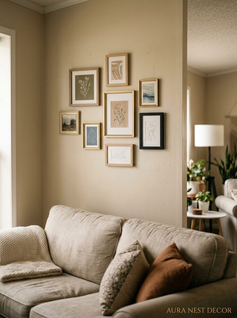
Hang them high. Hang them wide. I can’t stress this enough.
The default curtain-hanging instinct — mount the rod just above the window frame — shrinks the room. Mount the rod as close to the ceiling as possible, and extend it well beyond the window on each side (four to six inches minimum, ideally more). Now your window looks twice as tall and your ceiling looks higher and you’ve spent basically nothing.
Length matters too. Curtains that hover above the floor look accidental. They should either just skim the floor or pool slightly — those are the two options that look intentional. The in-between is just awkward.
For mobile homes specifically, linen-look curtains in a warm neutral are doing a lot of heavy lifting right now. Not literally linen, necessarily — those faux-linen polyester blends from IKEA or Amazon can look genuinely good, especially at the lower price points. The texture reads as layered and soft without being precious.
If you want to add color through curtains, I’d go for muted over bright. Dusty rose over hot pink. Sage green over lime. Mustard over yellow. The washed-out, slightly aged quality of those muted tones photographs beautifully and doesn’t fight with whatever else you’ve got going on.
—
7. The Shelving Approach That Makes a Tiny Room Feel Like a Library
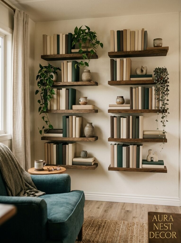
Floating shelves on a blank wall are one of the best things you can do in a mobile home living room. And I don’t just mean functionally — I mean aesthetically.
Vertical storage draws the eye up. Which makes ceilings feel higher. Which makes rooms feel bigger. It’s one of those design moves that’s doing like three things at once.
The styling of those shelves, though, is where people get stuck. Not everything on a shelf should be a book. Not everything should be a plant. The best-looking shelves mix things at different heights — a stack of books here, a small vase there, a framed photo or a candle, maybe a trailing plant that spills slightly downward. The negative space between things matters as much as the things themselves.
I’d recommend a three-to-one ratio as a rough guide: for every decorative object, one more structural element (a book, a box, a basket) and one bit of breathing room. It sounds almost too simple, but it gives the eye somewhere to rest.
Built-in shelving on either side of a TV unit — even faux built-ins made from freestanding bookcases flanking a media console — looks genuinely custom in a mobile home and adds the kind of character that makes people ask “wait, was this always here?”
“The gap between a shelf that looks styled and one that looks cluttered is almost always just negative space.”
—
8. Making the TV Wall Not the Most Boring Thing in the Room
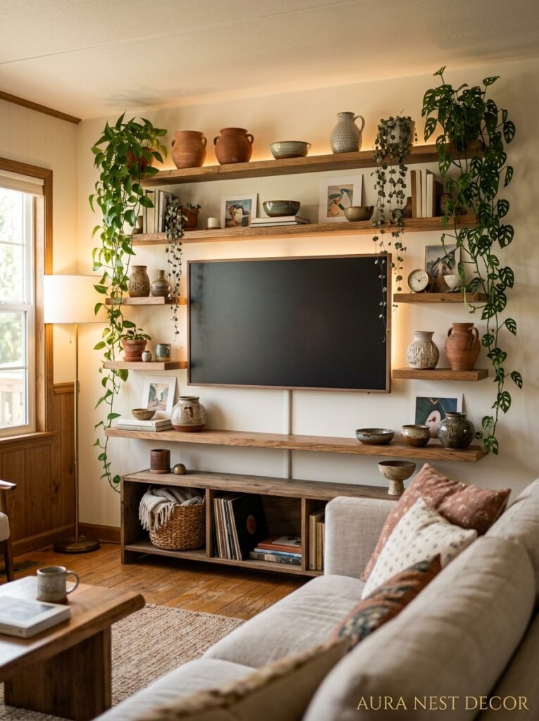
Most TV walls are just… a TV. On a wall. Maybe a console underneath. And that’s fine functionally, but it’s a missed opportunity.
Gallery wall around the TV — works, especially if the frames are thin and the pieces are calm. Don’t go too busy because the TV is already a visual focal point and you’re competing with yourself.
A shiplap or slat panel wall behind the TV is another move I keep seeing done well. You don’t need to install actual shiplap — there are peel-and-stick options, there are thin MDF strips you can paint, and there are pre-made slat panels that go up in an afternoon. The texture adds dimension and makes the TV feel like it was placed rather than just… mounted.
Console height matters more than people realize. The center of the TV screen should be roughly at eye level when you’re seated — around 42 to 48 inches from the floor in most cases. Too high, and you’ll have a neck ache by the end of any movie. Too low, and it looks like the TV is sitting on the floor. Get this right and the whole wall composition starts to feel natural.
—
9. The Plant Situation That Actually Works in Smaller Spaces
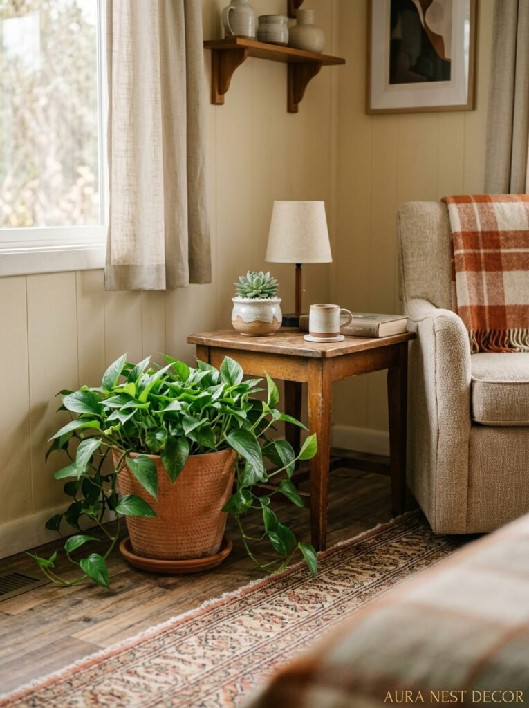
Not every plant. Not a jungle situation. Just the right plants, in the right spots.
Tall plants in corners. That’s the move. A fiddle leaf fig, a snake plant, or a monstera in a floor-standing pot placed in a corner adds height, adds life, and fills what is otherwise just… dead space. Corners are weirdly underused in most living rooms, and a large plant solves that without taking up any actual floor space in the functional sense.
For surfaces — side tables, shelves, the console — smaller plants with interesting shapes work better than big ones. A trailing pothos on a shelf looks lush and intentional. A tiny succulent just kind of disappears.
If you’re bad at keeping plants alive (no judgment, truly), the fake plant conversation has changed. There are realistic artificial stems and trailing plants that don’t look fake from more than about three feet away, which is close enough for most shelf situations. Just don’t get the shiny plastic ones. Matte, realistic-textured, in a real pot — fine. Shiny, obviously plastic — skip it.
—
10. The Throw Blanket and Pillow Situation: Where People Go Wrong
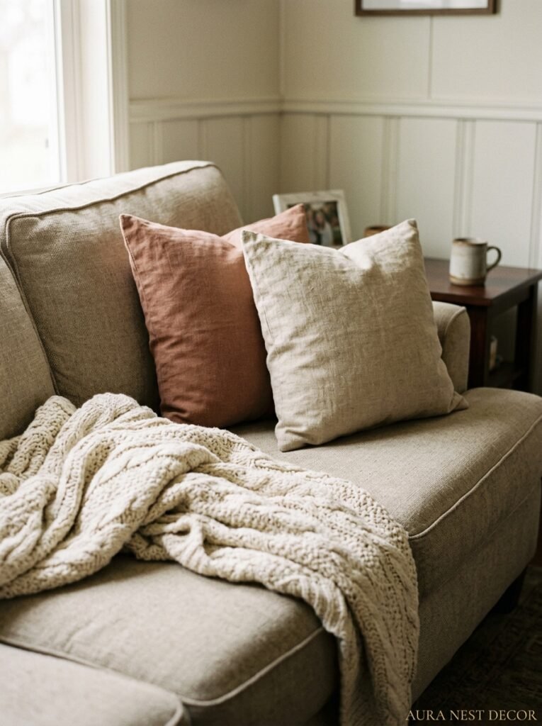
Too many pillows. That’s the first problem.
Four to six pillows on a three-seat sofa is plenty. Mixing sizes works well — two larger square pillows at the back, two smaller ones in front. If you want a lumbar pillow in a different texture or pattern, that can be the third layer. But beyond that, you’re just creating work for yourself every time you want to sit down.
Color story is the thing to get right. Your pillows don’t need to match each other. They do need to connect somehow — same family of tones, or a consistent neutral in every pillow that ties them together. One pattern, one texture, one solid — that combination almost always looks good.
Throw blankets should look casually thrown, not arranged. I know that sounds obvious but it’s actually a skill. Drape it over one arm of the sofa, let it fall naturally. Or fold it loosely in thirds and set it on the edge. What doesn’t work: perfectly folded, symmetrically placed. It looks like a catalog, not a home.
—
11. The Single Best Thing You Can Do for a Mobile Home Living Room on a Budget
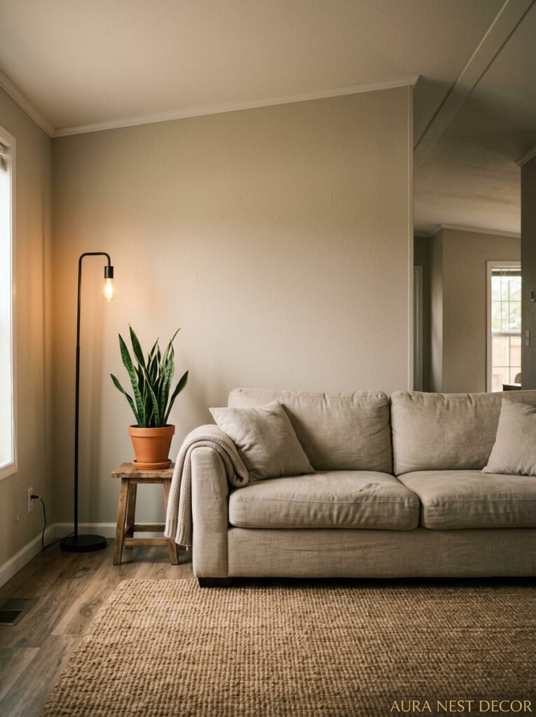
Paint. Every time. It’s not even close.
A gallon of good paint costs around $40-$60 and it changes the entire personality of a room. Not just the walls — doors, trim, an old side table, an outdated media console. Paint is the great equalizer. It makes old things look intentional and cheap things look considered.
The key is prep work. Clean surfaces, good tape, a quality brush for cutting in, and a proper roller. Don’t rush the first coat. The actual painting part is fast — it’s the prep and the patience that separate a paint job that looks amateur from one that looks like you hired someone.
If you’re painting a dark color in a small room, sample it first. Paint a large swatch (at least 12 inches by 12 inches) and look at it at different times of day and under different lighting. Colors do unexpected things in small spaces, and a color that looks warm and rich in the sample pot can look almost black in low light. Live with the swatch for a couple of days. Then commit.
—
12. The Finish That Ties a Mobile Home Living Room Together Without Anyone Knowing Why
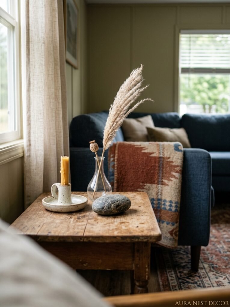
Metal finishes. All the small hardware choices — light switch covers, door handles, picture hooks, curtain rod brackets, lamp bases — they create a visual rhythm you don’t consciously notice, but you absolutely feel.
Mixing metals is fine, actually great, but there’s a way to do it. Pick one dominant metal finish (warm brass, matte black, brushed nickel) and let that appear in most of your visible hardware. Then you can have one or two accents in a different finish without it feeling accidental. The ratio matters: 80% one finish, 20% another, maximum.
Warm brass is having such a prolonged moment right now and I don’t think it’s going anywhere. Even in a mobile home with original, slightly dated fixtures, swapping out just the light switch covers and door handles for brushed brass ones creates a cohesion that’s hard to name but easy to feel. It’s one of those touches that makes people say “it just feels so put together” without knowing exactly what they’re looking at.
And honestly, that’s the whole goal, isn’t it.
—
❓ FAQ
Q: How do I make a mobile home living room feel like a “real” house? A: Honestly? Stop thinking about it that way — some of the most beautiful living rooms I’ve ever seen are in mobile homes. But practically speaking, it comes down to layered lighting, proper-scale furniture, and one or two quality anchor pieces that feel intentional. Those three things change everything.
Q: What’s the best paint color for a small mobile home living room? A: There’s no single answer, but warm neutrals like greige, soft terracotta, and muted sage are consistently flattering in compact spaces. Deep moody colors can also work brilliantly if the room gets decent natural light. Avoid cool grays unless your light is very warm — they can feel clinical.
Q: Can I really make a mobile home living room look high-end on a tight budget? A: Yes, genuinely. Paint, thrifted mirrors, properly hung curtains, and the right rug size get you about 80% of the way there. None of those things cost much. The trick is to do them all, not just one or two — it’s the combination that reads as intentional.
—
💭 Final Thoughts
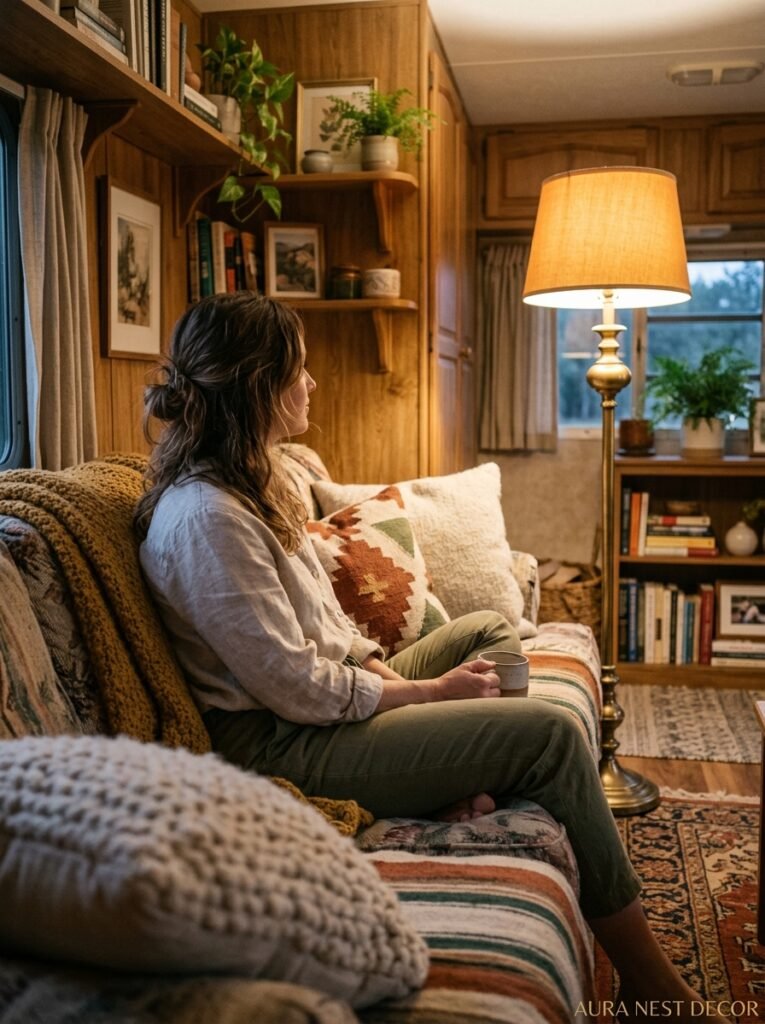
There’s something really satisfying about a space that punches way above its weight. Mobile home living rooms are doing that right now — with better design thinking, smarter material choices, and a willingness to break the “small room, small moves” rule that held people back for years. You don’t need square footage to have a beautiful space. You need intention.
What’s the one thing in your living room you’d change tomorrow if you could?




