
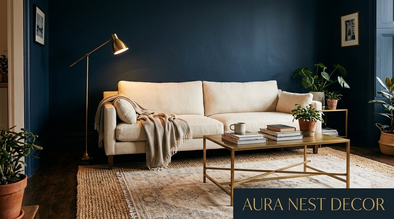
Why Navy Blue Is the Only Living Room Color Worth Committing To Right Now
You know that feeling when you walk into someone’s living room and just — stop? Everything feels right. The walls, the light, the furniture. You don’t know why it works, you just feel it in your chest. Nine times out of ten, there’s navy blue somewhere in that room.

—
1. The Color That Kept Coming Back Until I Finally Listened
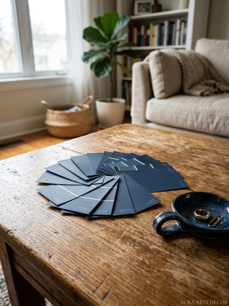
I spent two years flip-flopping between greige and sage and “warm white with character” before I admitted what I actually wanted. Navy. Deep, honest, committed navy blue. Not a dusty slate, not a muted indigo — actual navy. The kind that looks like 9pm on a clear night.
Here’s the thing about navy that no other color does: it holds the room together without taking anything away. Pale colors kind of scatter your eye around the space. Bold reds and emeralds demand attention, they SHOUT. But navy just — anchors everything. The sofas settle into it. The art pops against it. Even the light changes, gets richer, sits differently on the walls.
I’d been pinning navy living rooms for years without fully committing. Side note — there’s something so specific about the way a navy wall looks at four in the afternoon in November, when the daylight is low and golden and slanted, and the room glows instead of just being lit. I couldn’t explain it to anyone. I just knew I wanted to live inside that feeling.
So I finally did it. And I haven’t regretted it for a single day.
“Navy doesn’t just decorate a room. It gives it a point of view.”
—
2. Dark Walls Don’t Make Small Rooms Smaller — Here’s What Actually Happens
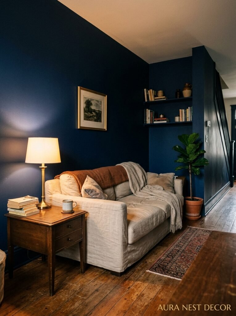
This is the thing everyone gets wrong, and I was one of them. The assumption is that dark walls shrink a space. That you need light colors to “open up” a room. But that logic only holds if you’re thinking about rooms the way a floor plan looks, flat and measured.
What dark walls actually do is remove the edges. When your walls are cream or white, your eye lands on every corner, measures every boundary, catalogs every inch of ceiling height. But when the walls are navy? The edges sort of disappear into themselves. The room doesn’t get smaller — it gets deeper. Cozier. More like a room you want to be in and less like a box you’re standing inside.
I’ve seen this work in genuinely small living rooms. A narrow Victorian terrace in London, maybe 13 feet wide max, painted in a deep navy from floor to ceiling, built-in shelves painted the same color. It should have felt claustrophobic. It felt like a library in the best possible sense — purposeful, enveloping, somehow bigger than its footprint. The trick is contrast. Light rugs, pale furniture, brass hardware, something warm and bright to pull against the depth. You need something for your eye to land on, because otherwise it can get muddy.
But please, don’t let anyone talk you out of navy in a small space. It’s often BETTER there.
—
3. The Exact Shades of Navy That Actually Work (and the Ones That Go Flat)
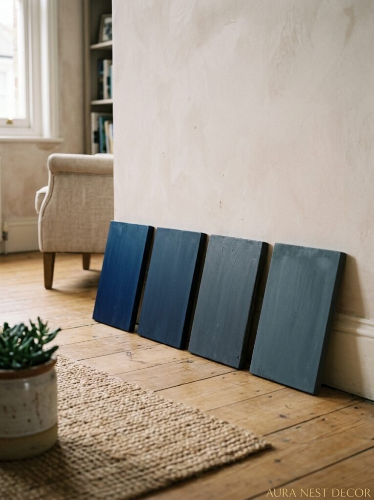
Not all navy is created equal and this took me way too long to figure out.
There’s a specific flatness that can happen with the wrong navy — it turns kind of dusty and lifeless, especially under artificial light. Like someone drained all the personality out of it. You’re going for depth, not dullness, and those are surprisingly close to each other on a paint chip.
The ones that tend to work have warmth underneath. Not a lot — navy shouldn’t tip into cobalt or purple — but a very slight underlying warmth keeps it from going cold and flat under interior lighting. Farrow & Ball’s Hague Blue is the classic, and honestly the reputation is earned. It reads differently in every light, which is kind of the whole point. Benjamin Moore’s Hale Navy has this same quality — reliable, rich, slightly warm undertones. F&B’s Stiffkey Blue goes a bit darker and more mineral, which is gorgeous in rooms with a lot of natural light.
On the other end, some navies lean heavily cool and blue-grey. Those can be beautiful in very specific situations — rooms with south-facing windows, spaces with a lot of natural white, somewhere you want the room to feel crisp rather than warm. But they’re less forgiving. They can look almost clinical under warm tungsten bulbs.
My rule of thumb: get samples, paint a big patch on the ACTUAL wall you’re planning to do, and look at it at 8am, 2pm, and 8pm. Not on a sample board. On the wall. Colors are completely different animals depending on what light they’re living in.
—
4. What to Put Against a Navy Wall (The Combinations That Keep Stopping My Scroll)
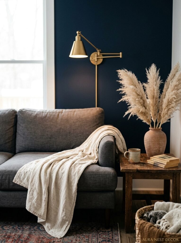
Okay, this is where it gets genuinely exciting.
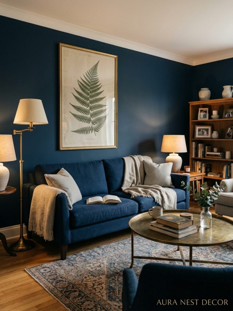
Brass is the obvious one, and I know it’s been everywhere, but there’s a reason. Against navy, unlacquered brass develops this warm, slightly aged quality that feels expensive and gathered-over-time rather than decorated-in-a-weekend. Lamp bases, door handles, side table legs, picture frames. All of it works. It’s genuinely hard to go wrong with brass on navy.
But the one that surprised me was terracotta. Deep orangey-red ceramics against a navy wall — a pot, a couple of vases, even a throw pillow in that warm rust tone — creates this contrast that’s almost Mediterranean but very intentional. It shouldn’t work on paper. It does.
Cream and natural linen are also essential. You need something warm and soft to offset all that depth. A cream linen sofa against a navy wall is one of those combinations that photographs beautifully but also just FEELS good in person, which isn’t always true. Natural textures matter here — woven baskets, jute rugs, wooden furniture with visible grain. They stop navy from feeling overly formal or a bit cold.
“The contrast does the heavy lifting. Your navy wall just has to be brave enough to let it happen.”
White is trickier than it sounds. Bright white against very deep navy can get a little stark — a bit nautical in a way that’s not always what you’re going for. If you’re doing white, go slightly off-white. Cream-white, not brilliant white. Trust me on this one.
—
5. The Living Room Layout That Makes Navy Feel Intentional Instead of Intense
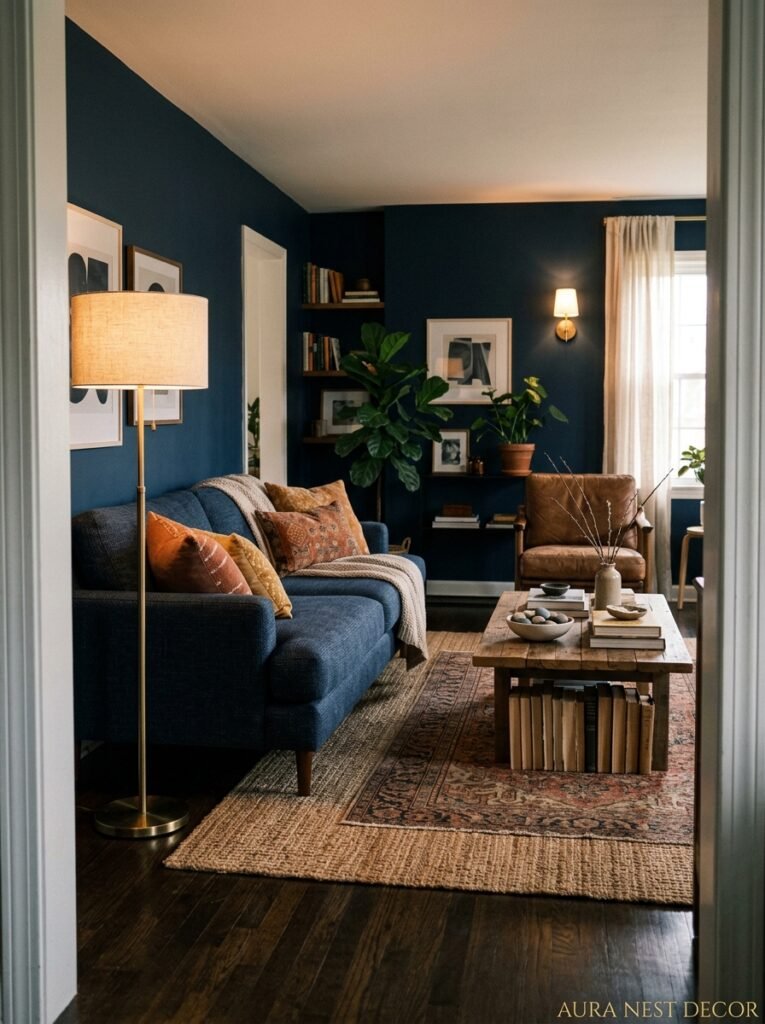
One of the things I see go wrong with navy living rooms — even beautiful ones with great paint choices and lovely furniture — is the layout doesn’t account for the weight of the color.
Navy has visual mass. It pulls the room toward it. So if you paint all four walls navy and then position all your furniture against the walls, what you end up with is this heavy frame around a big empty middle, and it feels a bit off. Almost like the room is caving inward.
What works instead is creating a furniture arrangement that fills the center with warmth and life. A sofa and two chairs pulled INTO the room, facing each other around a good rug. A coffee table with something on it — books, candles, a plant, doesn’t matter, just something organic. When the room’s center has density and warmth, the navy walls become the backdrop they’re supposed to be, not the whole story.
Also: consider doing an accent wall rather than all four sides if you’re not ready to commit. One navy wall — ideally the one with the fireplace, or behind the main sofa — can do almost as much work as all four, with a slightly softer overall effect. Not lesser. Just different.
—
6. How Lighting Changes Everything (and Why Most People Get This Wrong)
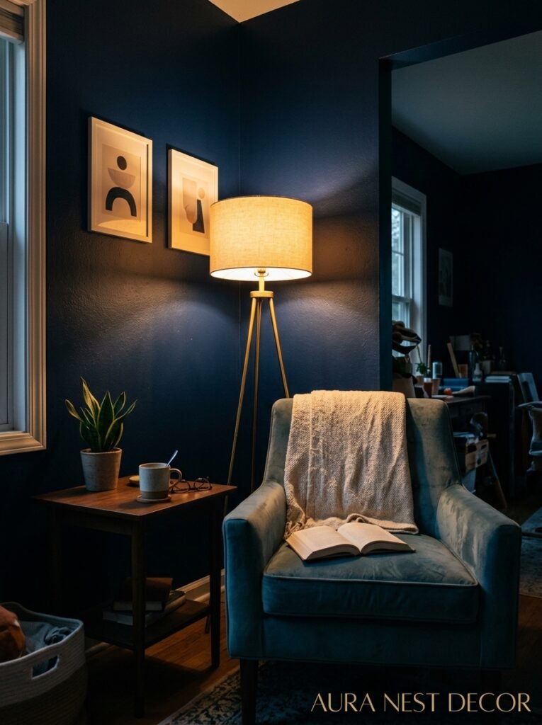
Can I be honest about something? The lighting question is the one that makes or breaks a navy room, and most people don’t think about it until it’s too late.
Navy walls absorb light. That’s part of why they’re so beautiful — they don’t bounce it back at you the way white walls do. But it also means you need MORE light sources than you would in a neutral room, and they need to be WARM.
The amber glow of an Edison bulb at 7pm against a navy wall is genuinely one of the most beautiful things a living room can be. But a cold, bright overhead light in the same room? It completely kills it. Makes the navy look harsh and institutional.
Think in layers. Overhead ambient light, warm and on a dimmer. Table lamps with fabric shades that diffuse the light softly. Maybe a floor lamp in a corner that throws light upward, which creates height and interest. Candles count — not just for atmosphere but for actual warmth of light. Even in winter when daylight is scarce, a navy room with layered warm lighting feels genuinely magical rather than dark and oppressive.
Color temperature matters. You want bulbs around 2700K — that’s the warm, slightly golden end of the spectrum. Anything above 3000K and you’re creeping into cool-white territory, which fights against everything navy is trying to do for you.
—
7. Navy Furniture Instead of Navy Walls — A Braver Move Than You’d Think
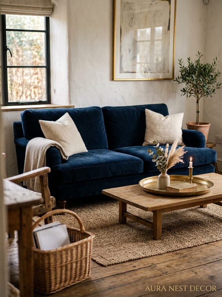
Not everyone’s ready to commit the walls. And honestly? Navy furniture in a neutral room can be just as striking, maybe more so, because it becomes the thing the whole room pivots around.
A navy velvet sofa is — and I don’t say this lightly — possibly the best single furniture investment you can make for a living room right now. Against white or off-white walls, with natural wood furniture and some brass accents, it anchors the whole space. It looks intentional from day one, without the effort and commitment of painting.
Navy armchairs are another option. Two navy armchairs flanking a fireplace, in a room that’s otherwise warm and neutral, reads as confident and interesting without being overwhelming. A navy chesterfield in a smaller sitting room — especially with wooden floors and a good rug — feels genuinely timeless.
“A navy sofa tells people you made a decision. And in home decor, decisiveness is wildly attractive.”
The texture of the fabric matters more than it does with walls. Velvet is the gold standard with navy — the pile catches light in a way that makes the color shimmer, go from deep midnight to something almost jewel-like as you move. Linen navy is more relaxed, a bit more coastal and casual. Boucle in navy? Relatively new, genuinely lovely, very of-the-moment.
—
8. The Art That Belongs on a Navy Wall (Hint: It’s Not What Instagram Told You)
Here’s where I might lose a few people, but bear with me.
The trendy choice for navy walls is large-scale abstract art in warm tones — oranges, golds, earthy reds. And it DOES look good. But it’s become so common that it’s starting to feel like a shortcut, you know? Like buying the whole aesthetic in one move rather than building it.
What I find more interesting is black and white photography. Large, well-framed black and white prints on a navy wall have this quality that’s hard to describe — the navy provides depth and richness, and the photography provides almost everything else: texture, tone, subject matter, humanity. It feels personal in a way that abstract prints often don’t.
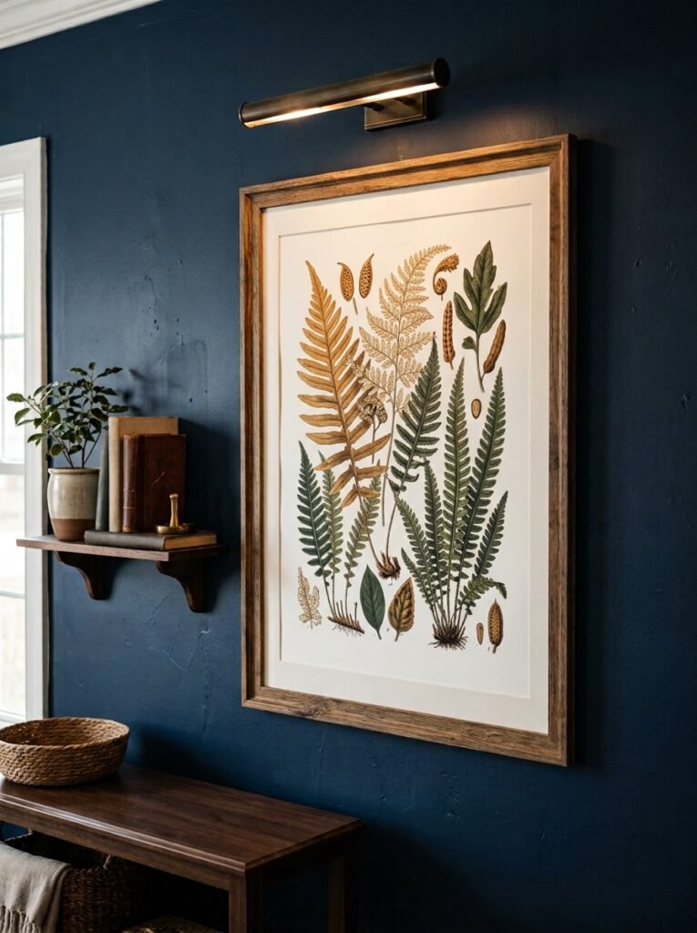
Antique botanical prints work too, especially in warmer, more traditional rooms. Gilded frames on navy walls. Old maps. Anything with a slightly worn, time-worn quality that contrasts with the freshness of the navy.
The frames matter as much as the art. Brass, warm gold, or dark wood. Avoid chrome and cool metals — they fight the warmth rather than adding to it.
—
9. The Ceiling Question That Nobody Talks About Enough
Should you paint the ceiling navy too?
I know, I know. But hear me out.
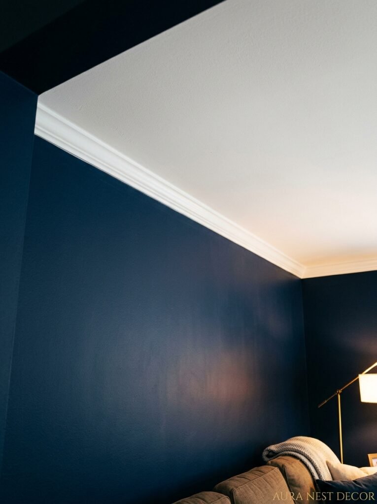
In a room with high ceilings — and especially in older British homes with coving and architectural plasterwork — a navy ceiling can be extraordinary. It creates this enclosed, intentional feeling. Like being inside something, rather than just standing in a box with four blue walls and a white lid.
The key is the ceiling height. Below about 8 feet, I’d be cautious — it can feel genuinely oppressive. But at 9 feet and above, especially with good lighting and white or pale furniture, a navy ceiling adds drama without suffocating the room.
An even more useful trick is to paint just the ceiling in the alcoves — those recessed sections beside a chimney breast where you’d typically put shelving. Navy in the alcoves, painted the same color as the wall so the shelves seem to float, with the main ceiling staying white. It adds depth and intention without the commitment of the full ceiling treatment.
—
10. Styling the Navy Living Room Through the Seasons Without Redecorating
This is one of navy’s actual superpowers that doesn’t get talked about enough.
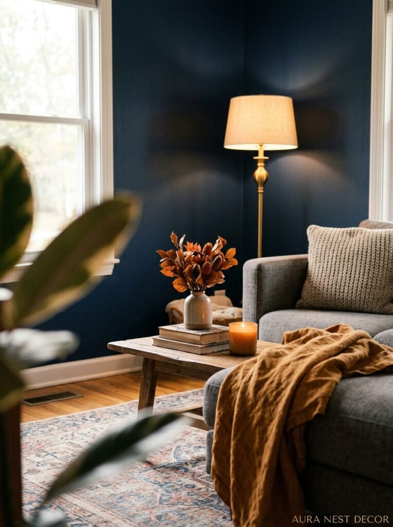
Because navy is so anchoring and neutral in its own way, you can dress the room completely differently through the year with just textiles and accessories. In summer, strip back to linen cushions in white and pale sand, natural textures, some greenery, and the navy reads as coastal and fresh. In autumn, layer in burnt orange and warm brown throws, dried grasses, amber glass. In winter, bring in deep jewel tones — emerald, burgundy — with velvet cushions and candlelight. Navy works with all of it.
This adaptability is genuinely rare. A sage green room looks different when you change the accessories, sure, but it doesn’t swing seasonally the way navy does. Navy is sort of infinitely configurable, which means you never get bored of it.
—
11. The Pinterest Mistakes That Are Quietly Ruining Beautiful Navy Rooms
I say this with love because I’ve made some of these myself.
Too much contrast can tip into a nautical theme very quickly. Red and white stripes, anchor motifs, rope details — any of these individually might be fine, but combine two or more with navy and you’ve accidentally decorated a sailboat. The coastal, nautical reference is strong with navy and you kind of have to actively work against it if that’s not the vibe you’re going for.
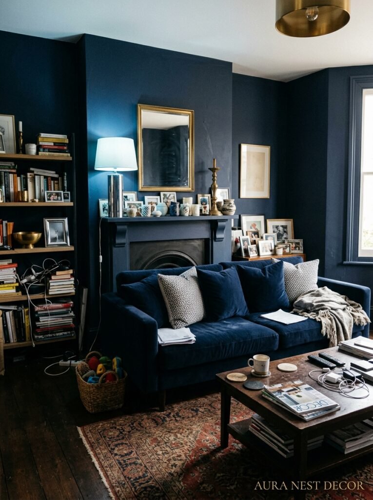
Another one: going so monochrome with the accessories that the room looks like a mood board rather than a real place someone lives. Beautiful, but cold. No mess, no books left out, no evidence of actual life. Navy rooms work best when they feel lived-in. A slightly crooked cushion. A half-read paperback. A candle that’s been burned.
And the big one — not enough warm light. I mentioned this earlier but I’ll say it again because it genuinely matters more than almost any other single decision. I’ve seen gorgeous navy rooms that looked dungeon-like in photos because the light was wrong. Cold overhead light is the enemy. Warm, layered, dimmable light is everything.
—
12. Why Navy Feels Timeless While Every Other “Bold” Color Feels Like a Year
Emerald green living rooms were everywhere two years ago. Before that it was mustard yellow. Blush pink had its moment. These colors are beautiful — genuinely — but they each feel specific to a moment, and once that moment passes, the room starts to look dated rather than interesting.
Navy doesn’t do that. There are navy rooms from the 1970s that look current. Victorian townhouses in Edinburgh painted in deep Prussian blue that don’t feel old-fashioned, just deeply themselves. American federal-style homes with navy and cream that feel classic without feeling frozen.
Part of it is that navy connects to something older and more enduring than trend cycles. It’s the color of uniforms, of the sea at dusk, of denim worn soft, of ink. It’s been part of how people decorate and dress and make things for centuries. So when you put it on your living room walls, you’re not catching a trend — you’re tapping into something with much longer legs. And that’s a genuinely good feeling when you’re staring at your walls wondering if you’ll still love them in five years.
You will.
—
❓ FAQ
Q: Will navy blue make my living room feel too dark? A: Only if your lighting’s wrong. Navy absorbs light, so you’ll want more light sources than you would in a neutral room — and they should be warm (around 2700K). With layered warm lighting and at least some lighter furniture or rugs, navy actually creates depth and coziness rather than true darkness.
Q: What’s the best navy blue paint for living rooms in the US and UK? A: Farrow & Ball’s Hague Blue is the UK go-to — expensive but genuinely worth the money for its depth and variation in different light. In the US, Benjamin Moore’s Hale Navy is the reliable standard. Sherwin-Williams Naval is another great option, slightly more accessible price-wise, with warm undertones that work well under artificial light.
Q: Does navy go with grey flooring or is it too much? A: It can work, but you need to be careful about the tone of grey. A warm, slightly taupe-grey floor with navy walls can feel sophisticated. A cool blue-grey floor alongside navy walls risks making the room feel cold and one-note. Add warmth through a rug, wooden furniture, and brass or warm-toned accessories to make sure the room doesn’t go flat.
—
💭 Final Thoughts
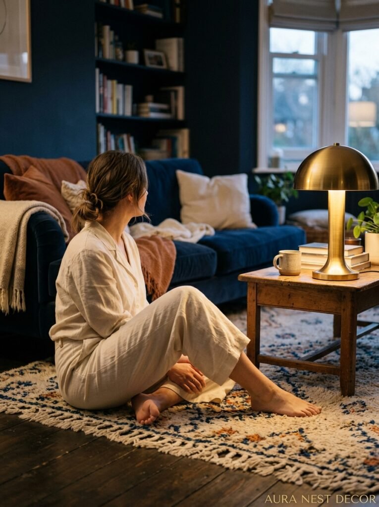
Navy blue isn’t a trend you’re chasing. It’s a decision you make when you’re done experimenting and you know what you want a room to feel like. It’s confident and warm and adaptable, and honestly, there’s nothing quite like coming home in the evening to a room with navy walls and warm lamplight — it feels like the room is glad to see you.
Start small if you need to. One wall, one sofa, one velvet armchair. But start.
What’s holding you back from the navy room you’ve been pinning for years?




