
12 Cute Living Room Ideas That Actually Look Like You Live There (Not a Showroom)
You know that feeling when you walk into someone’s living room and immediately think I want to live here? It’s not about expensive furniture or a designer budget. It’s something else entirely — a quality that’s harder to name but impossible to fake.
This is how you get it.
—
1. The Throw Blanket Situation Is More Important Than You Think
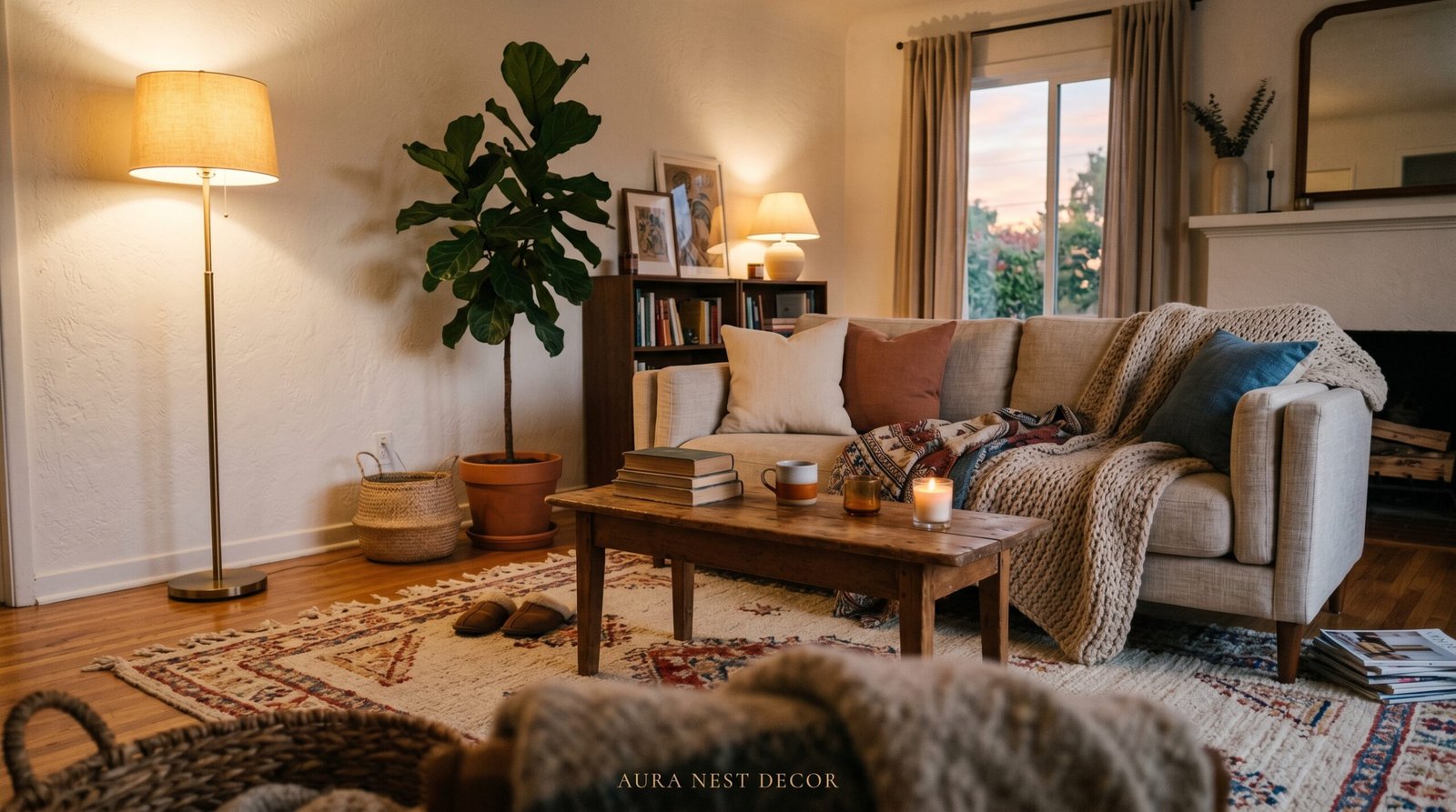
Every great living room has at least one throw blanket that looks like it was casually tossed there by someone who just got up to make tea. Not folded into a perfect square. Not hanging symmetrically over one arm of the sofa. Just there, rumpled and inviting, doing exactly what it was meant to do.
The texture matters enormously. A chunky knit in oatmeal or warm cream reads as cozy from across the room. A waffle-weave cotton in dusty sage feels relaxed and considered at the same time. What you want to avoid is anything that looks plastic or stiff — fleece blankets that came in a bag, for instance, tend to flatten out over time and lose whatever charm they had.
In the UK, mohair blends are having a real moment right now, and honestly the price points have come down enough that it’s not a luxury purchase anymore. In the US, I keep seeing Pendleton wool throws showing up in beautifully styled rooms — that weight, that pattern, it just grounds a space.
The rule: one throw per seat that feels genuinely usable. Not decorative. Usable. Your guests should want to reach for it.
“A room that looks lived-in isn’t sloppy — it’s the highest form of intentional styling.”
—
2. What Color Is Actually Working in Real Living Rooms Right Now
Not online. Not in a showroom. In actual homes that people photograph and share because they can’t help it.
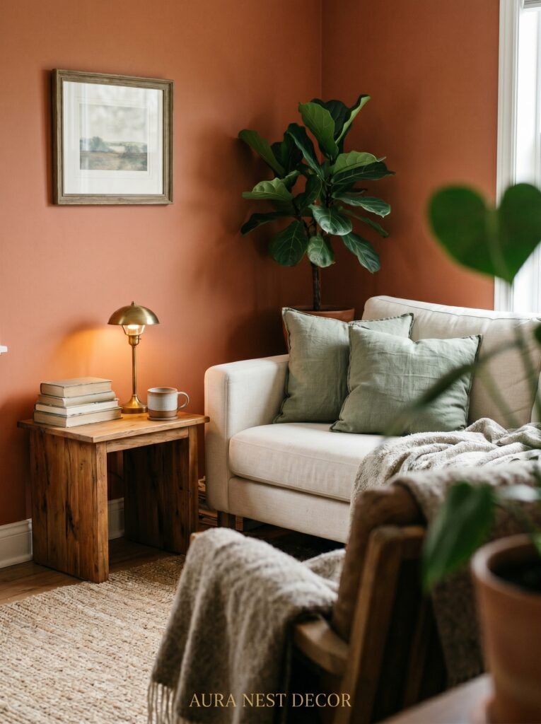
The color that keeps appearing everywhere — and I mean everywhere — is a sort of warm putty. Not quite beige, not quite taupe, not white. It’s the color of old stone or unbleached linen, and it works with absolutely everything. Timber floors. Dark velvet. Cool gray. Terracotta. It doesn’t compete. It just holds space.
If you’re painting a room and you want it to feel genuinely cute without feeling juvenile, look at shades like Farrow & Ball’s Dead Salmon, Little Greene’s Slipper Satin, or in the US, Benjamin Moore’s Pale Oak or Sherwin-Williams’ Accessible Beige. These aren’t boring neutrals. They have warmth that shifts as the light changes throughout the day, which is what makes a room feel alive rather than static.
Bold colors are absolutely working too, but they work best when they’re specific. A deep forest green on a single wall. A terracotta alcove. An inky navy bookcase. Not everywhere. Just where it counts.
—
3. The Lamp-to-Overhead-Light Ratio That Changes Everything
Here’s something no one tells you when you’re first decorating: your overhead light is probably ruining your room.
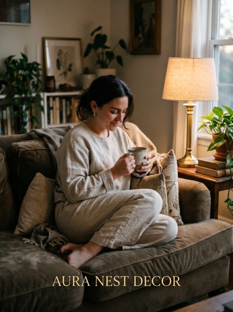
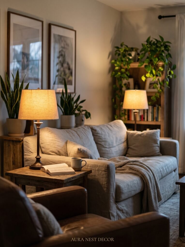
A single ceiling fixture, especially if it’s bright and central, flattens everything. It makes your room look like a waiting room. The amber glow of an Edison bulb at 7pm, coming from a floor lamp tucked into a corner — that is what makes people feel like they never want to leave.
The goal is layers. A table lamp on a side table. A floor lamp near the sofa. Candles on the coffee table (real wax, real flame — the flicker matters). Maybe a string of warm-white lights threaded along a shelf. You want your room to have depth when the sun goes down. Shadows are your friend. They make a room feel intimate and dimensional rather than exposed.
The brightness sweet spot for an evening living room is around 2700K to 3000K — that’s the technical spec for a very warm, slightly amber white. Any cooler than that and you’re back in waiting room territory. This applies whether you’re in a terraced house in Bristol or a condo in Denver.
—
4. Gallery Walls That Feel Curated Instead of Chaotic
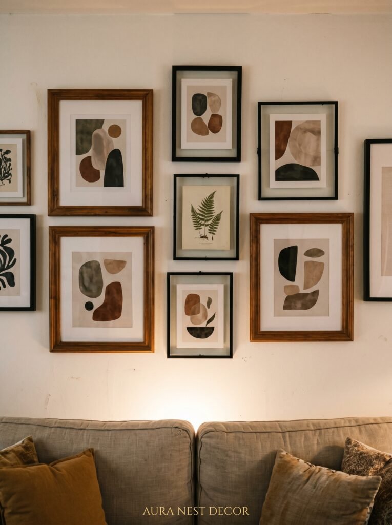
The difference between a gallery wall that looks brilliant and one that looks like controlled panic is almost entirely down to one thing: visual breathing room.
Most people cram too much in. They fill every inch of wall space because they’re afraid of empty space, and the result is a wall that makes you feel vaguely anxious without knowing why. Step back, take three things off, and you’ll immediately feel the wall relax.
What works: a mix of scales. One large anchor piece — a painting, a mirror, a photograph — and then smaller pieces around it that feel conversational rather than symmetrical. Don’t match frames unless you’re going for a very specific, intentional grid look. Mismatched frames in similar tones (lots of wood, lots of black, lots of warm gold) look far more natural.
In terms of content, the rooms I keep saving have a mix of art, personal photographs printed in black and white, and at least one piece that’s unexpected — an old botanical illustration, a vintage map, a child’s drawing framed properly. That last element is what makes it feel like yours.
“The gallery wall that stops people mid-sentence is never the most decorated one.”
—
5. Plants: The Specific Ones That Actually Look Good (Not Just “Have Plants”)
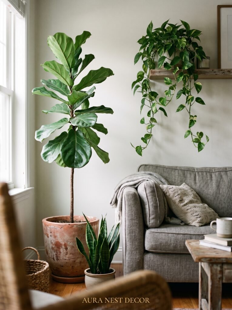
Let’s skip past “add plants for life” because you’ve heard it a thousand times. Let’s talk about which plants are doing the work in genuinely beautiful living rooms right now.
Large statement plants have outsized impact for the effort. A mature monstera in a terracotta pot in the corner of a room fills space the way a piece of furniture would — but breathes. An olive tree, if you can keep it happy near a window, brings something that feels almost Mediterranean and works brilliantly against warm putty walls or whitewash. A fiddle leaf fig, despite years of being overused in Instagram styling, still looks genuinely good when you let it grow tall.
For shelves and side tables, trailing pothos are hard to kill and look lush very quickly. A single small cactus in an interesting ceramic pot reads as intentional. Dried pampas grass, still going strong, adds texture without any maintenance at all.
The containers matter as much as the plants. Terracotta is always right. Interesting glazed ceramics in earthy tones. Woven baskets as outer pot covers. What you want to avoid is cheap plastic nursery pots left uncovered, or very generic white ceramic cylinders — they strip the character right out.
—
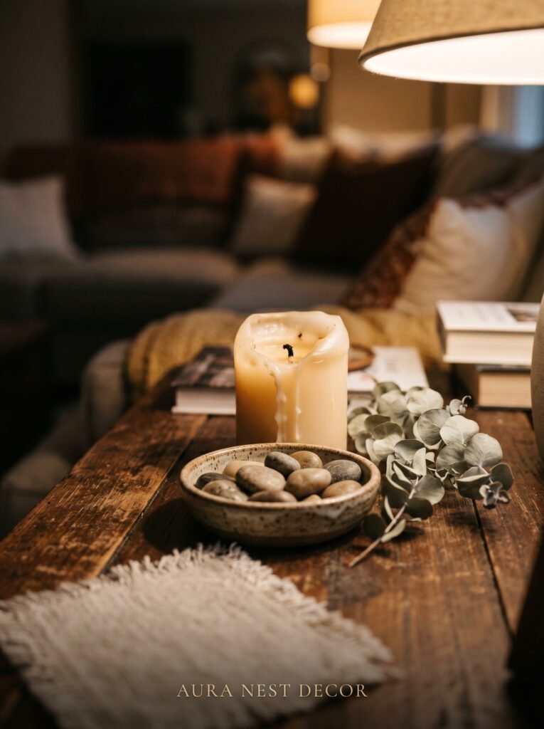
6. The Coffee Table Styling Formula That Doesn’t Look Like a Formula
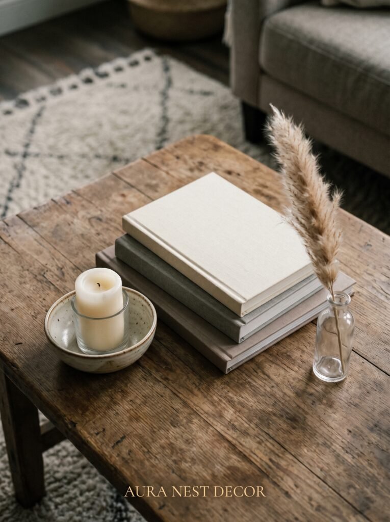
Three elements. That’s it. One tall, one flat, one organic.
Something with height — a stack of books, a vase with stems, a candle in a substantial holder. Something flat and visual — a beautiful hardcover book opened to a page you love, a ceramic tray, a decorative object that sits low. Something organic — a small plant, a handful of dried flowers, a bowl of fruit that you’ll actually eat.
What this does is create a visual triangle on the surface, which is the same principle designers use when arranging objects on a mantelpiece or shelf. Your eye travels up, across, and down. It finds somewhere to rest. The table feels styled but not staged.
The one thing that ruins coffee table styling almost universally: too many small items of similar height. Ten little objects sitting at the same level competing for attention. Choose less. Choose things with meaning, or things with great shape, and let them have space around them.
—
7. The Bookshelf Rule That Interior Designers Quietly Use Everywhere
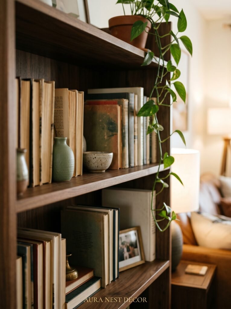
Books alone make a good bookshelf. Books plus objects make a beautiful one.
Pull every third or fourth book out and lay it horizontally, then stack two others on top of it. This breaks up the vertical monotony that makes a packed bookshelf look like a storage unit rather than a considered display. The horizontal stack also gives you a little platform for a small plant, a candle, a found object from somewhere you’ve traveled.
Remove the dust jackets from hardcover books if the spines underneath are more interesting or more cohesive color-wise. A lot of clothbound hardcovers are gorgeous — cream, dark green, burgundy — and the paper jackets can look busy and corporate in comparison.
The objects you place among the books should feel like they belong to the same world as the books. A brass magnifying glass. A small ceramic figure. A geode or piece of interesting stone. A photograph in a simple frame. Things that have weight and story.
“The best shelves tell you something real about the person who built them.”
—
8. Rugs: The Size Mistake That’s Making Your Room Look Smaller
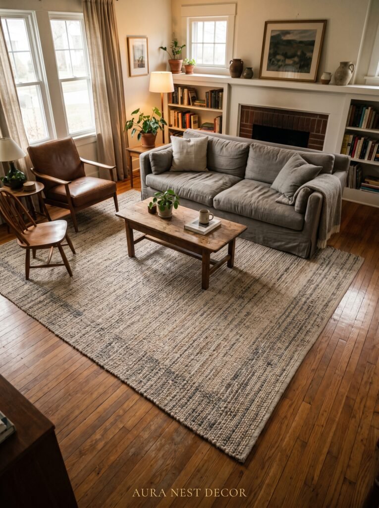
Too small. Almost every time, the rug is too small.
In a living room, the rug should sit under the front legs of every piece of furniture in the seating arrangement — at minimum. Ideally, the sofa and chairs sit fully on the rug, or with just the back legs off it. What you should never do is float a small rug in the middle of the room with all the furniture sitting around it on bare floor. That makes the room look like the furniture is avoiding something.
In practical terms, for a typical living room you’re usually looking at a 8×10 foot rug at minimum in the US, or roughly 240×300 cm in the UK. If that sounds big, it probably is — and that’s exactly the point.
Natural fiber rugs like jute and sisal are brilliant for layering under a smaller, more decorative rug. A jute base layer with a vintage-style Persian rug centered on top is one of the most reliably beautiful combinations in any living room, at any budget.
—
9. Curtains High, Curtains Wide — The Window Trick Worth Knowing
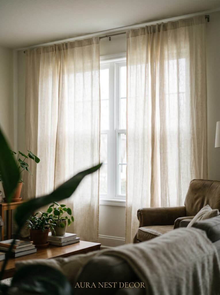
Hang your curtain rod as close to the ceiling as possible. And extend it at least 12 inches beyond the window frame on each side. This one change makes windows look taller, rooms feel bigger, and light feel more generous — even on overcast days in Manchester or Seattle.
Fabric matters too. Linen curtains in natural, undyed tones are almost universally flattering and work in modern, traditional, and eclectic spaces alike. They let light filter through beautifully rather than blocking it entirely. If you want privacy and light at the same time, linen sheers with a heavier panel layered behind are the classic combination that keeps working for a reason.
What to avoid: curtains that just cover the window. Curtains that barely brush the floor. Short curtains in a room with any height at all. These choices all visually compress the space and make rooms feel unfinished, even when everything else is beautifully done.
—
10. The Forgotten Corner That Becomes the Best Seat in the House
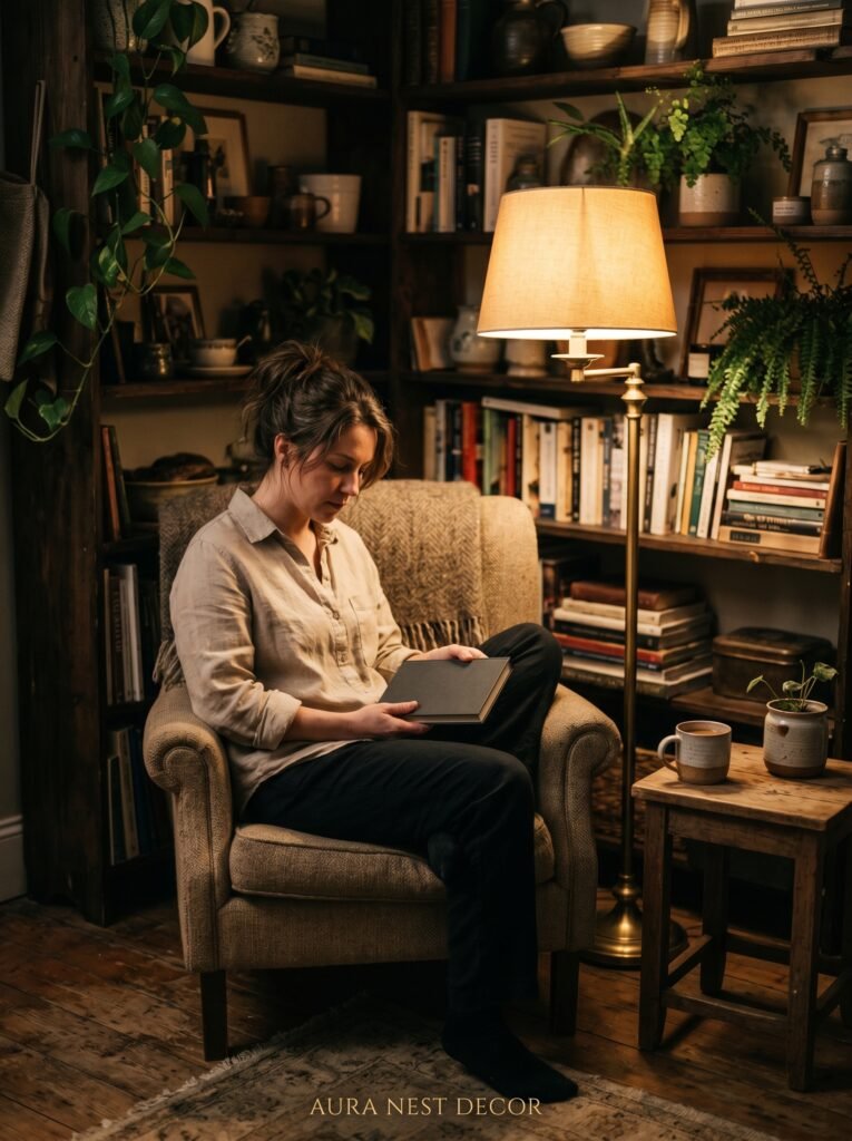
Every living room has at least one awkward corner. Too small for a full chair, too odd a shape for a console table, too far from the main seating arrangement to feel like it belongs. Most people leave them empty and vaguely apologetic.
What if you made it the best corner in the room instead?
A small armchair with good bones and interesting upholstery. A floor lamp curving over it from behind. A tiny side table just big enough for a mug. Maybe a small bookshelf or a plant. You’ve now created what designers call a reading nook, but what it actually is, is an invitation. An invitation to sit apart from everyone. To be in the room but have your own small world within it.
These corners photograph extraordinarily well for Pinterest, but more importantly, they get used. People gravitate toward them. Children claim them. Guests make a beeline for them. The corner that was nothing becomes the corner everyone wants.
—
11. Vintage Pieces — Not Because They’re Trendy, But Because They Work
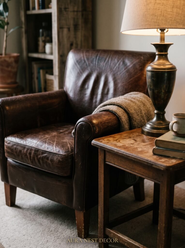
There’s a reason the most-saved living rooms on Pinterest almost always have at least one piece that isn’t new.
A vintage piece — whether it’s an old mirror with original patchy glass, a mid-century side table, a Victorian footstool, a ceramic lamp base from a market — introduces something that new things simply can’t replicate. Time. Character. The sense that this room wasn’t assembled from a single catalog.
You don’t need to be a serious antiques person to do this well. In the UK, charity shops, local markets, and Facebook Marketplace are full of genuine pieces at reasonable prices. In the US, thrift stores, estate sales, and again, Marketplace. The goal isn’t rarity or value. The goal is patina. That slight worn quality that says this object has been somewhere, belonged to someone, and has arrived here with its own history.
One vintage piece in a room of new things looks intentional and confident. It breaks the feeling that the room was decorated in a single afternoon.
—
12. The Small Sensory Details That Make People Feel Something
This is the part that gets left out of most decorating advice, because it’s hard to pin down and impossible to buy in a single shop.
The way a room smells matters more than almost anything. A candle lit an hour before guests arrive. Fresh flowers — even grocery store tulips in a plain glass vase. A diffuser with something warm and grounding, like sandalwood or orange and clove. These things work on people below the level of conscious thought. They feel welcome before they can say why.
Sound is part of it too. A room with hard floors and no soft furnishings echoes in a way that feels cold and exposed. Rugs, curtains, cushions, and bookshelves all absorb sound and make a room feel quieter, warmer, more enclosed. This is a physical reality, not just a psychological one.
And then there’s the small stuff you can’t quite articulate. The bowl of smooth stones on the shelf that you pick up without thinking. The photo that makes someone stop and ask. The imperfect handmade pot on the windowsill. The book left open on the coffee table. These are the details that make a room feel like a home rather than a set, and they cost almost nothing — they just require the courage to stop decorating and start living in the space.
—
❓ FAQ
Q: How do I make a small living room look cute without making it feel cramped? A: Scale is everything. One larger sofa almost always looks better than two smaller ones fighting for space. Get a rug that’s bigger than you think you need, hang curtains high and wide, and leave some wall space empty. Restraint reads as confidence in a small room.
Q: What’s the best budget-friendly way to refresh a living room that feels boring? A: Change the lighting first — it costs relatively little and has an outsized effect. Add one new textile (a throw or cushions in a new texture or color), rearrange what you already have, and try adding one plant. These four things together can make a room feel genuinely different.
Q: Do living room trends matter, or should I just do what I love? A: Trends are useful as a starting point and a way to discover things you might not have considered. But the rooms people love most on Pinterest are almost always the ones that feel personal rather than timely. Follow a trend if it resonates with you, not because it’s having a moment.
—
💭 Final Thoughts
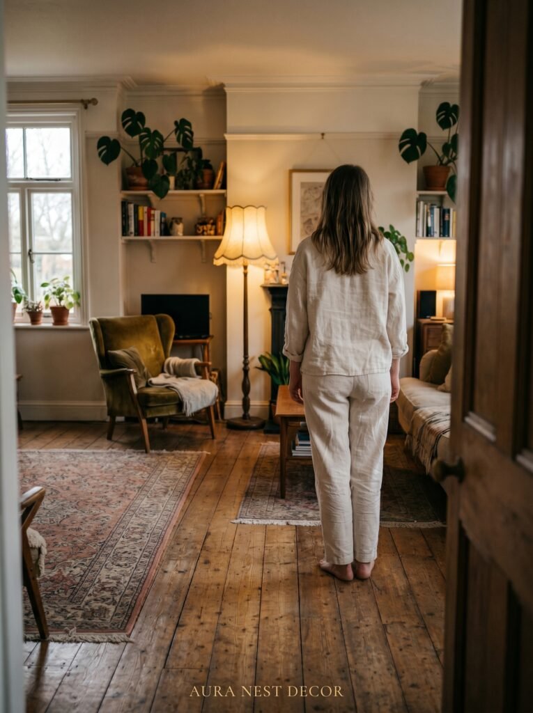
The living room isn’t a showpiece. It’s the room that holds your evenings, your conversations, your quiet mornings with coffee before anyone else is awake. It should feel like yours — warm, specific, a little imperfect in the best way.
The cutest living rooms aren’t the most decorated ones. They’re the ones where someone made real choices, kept what they loved, and wasn’t afraid to let the room look like they live there.
What’s the one change you keep putting off that would make your living room feel like home?


