
The Interior Layout Secrets That Transform a House Into a Home You Never Want to Leave
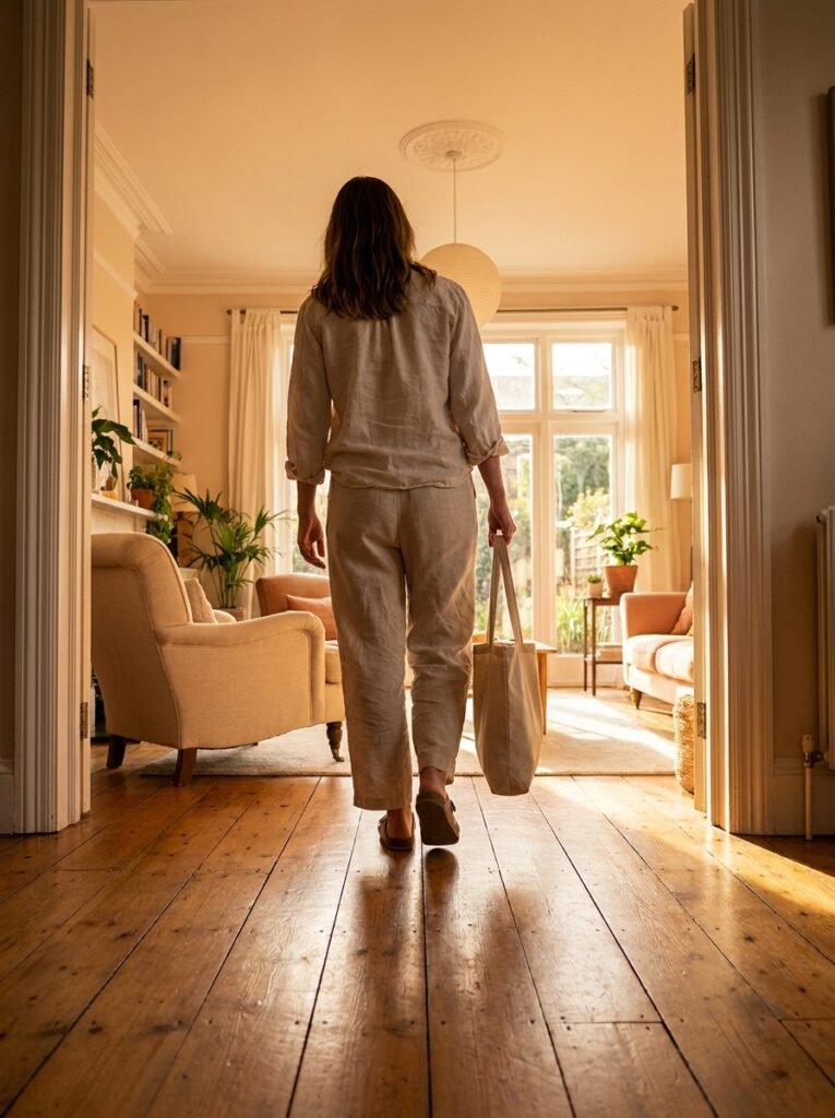
There’s a moment — maybe you’ve felt it — when you walk into a room and something just clicks. The furniture makes sense. The light feels right. You exhale without even realizing you’d been holding your breath. That feeling isn’t accidental. It’s the quiet, powerful result of a thoughtful interior layout.
—
1. Why Your Floor Plan Is the Invisible Foundation of Everything You Feel at Home
Most people start decorating by shopping for things — a sofa, a rug, a lamp they saw on Pinterest at midnight. But the truth is, beautiful objects placed in the wrong layout will never make a room feel right. The floor plan is the invisible skeleton beneath every gorgeous interior you’ve ever admired. It determines how energy moves through a space, how conversations flow, and whether a room invites you in or subtly pushes you away.
Think of your floor plan the way an architect thinks about a building — not just as walls and corners, but as a series of experiences unfolding one after another. When you walk through a front door into a cramped, poorly arranged entryway, your body tenses. When you walk into a room where the furniture is scaled correctly and positioned with intention, your nervous system actually relaxes. Interior layout is emotional design, whether we realize it or not.
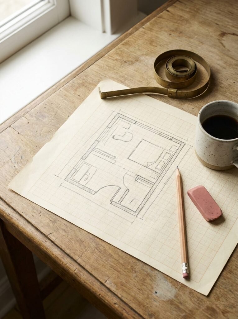
Before you move a single piece of furniture, grab a tape measure and a piece of graph paper — or use a free digital tool like RoomSketcher. Map out your room’s dimensions, note where the windows and doors sit, and mark any fixed architectural features like fireplaces or built-ins. This single step will save you from the exhausting mistake of buying pieces that are simply wrong for your space.
“A beautiful room isn’t built with beautiful things — it’s built with beautiful decisions about where those things belong.”
—
2. The Traffic Flow Rule That Every Professional Designer Swears By
Here’s a question worth sitting with: can you walk from your front door to your kitchen without zigzagging around furniture? If the answer is no, your layout is working against you — and you probably feel it as low-grade daily frustration without ever identifying the source.
Professional interior designers talk constantly about traffic flow, which is essentially the invisible pathway people naturally take through a room. The golden rule is to maintain at least 36 inches of clear walking space in main pathways, and at least 18 inches around furniture groupings. These aren’t arbitrary numbers — they come from human ergonomics, the science of how our bodies move comfortably through space.
A sofa pushed too close to a coffee table, a dining chair that bumps the wall every time someone pulls it out, a bed that forces you to shimmy sideways to reach the closet — these small friction points accumulate into a home that feels tiring to live in. Rethinking traffic flow is often the single highest-impact change you can make without spending a dollar.
Walk your room slowly. Notice where you instinctively want to move. Notice where you hesitate or redirect. Your body already knows where the layout is broken — you just need to listen.
—
3. The Anchor Furniture Principle: Start Here, Build Everything Else Around It
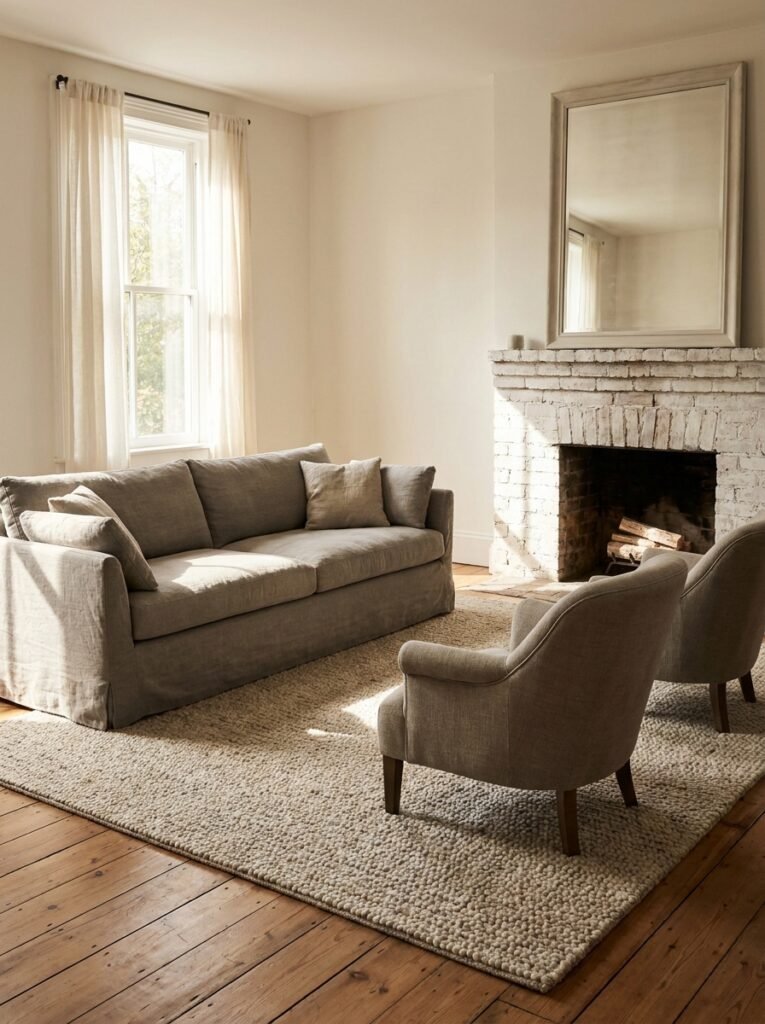
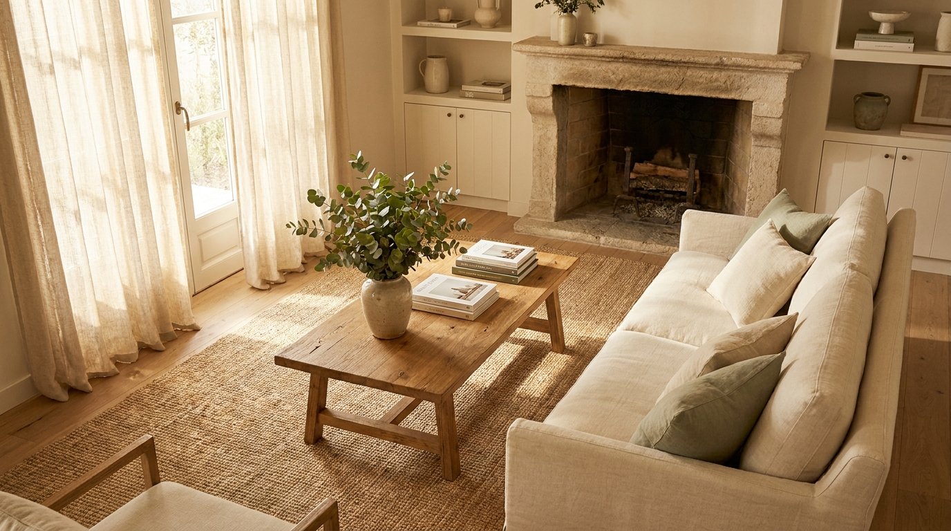
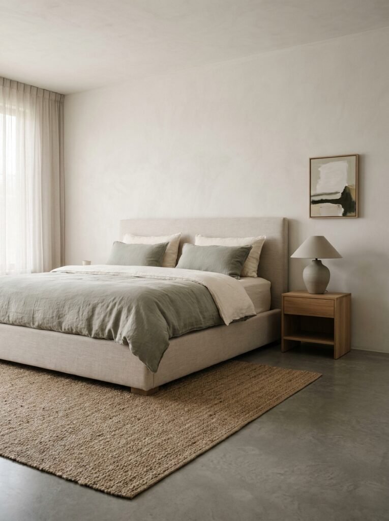
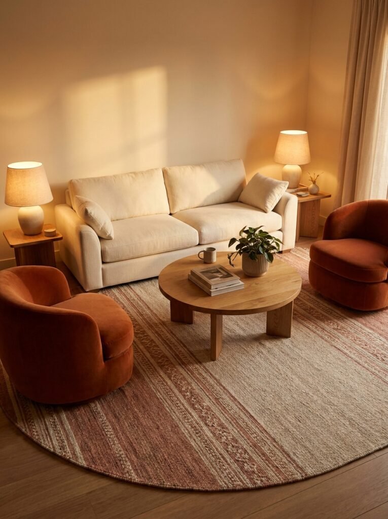
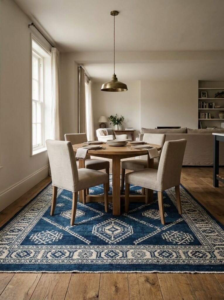
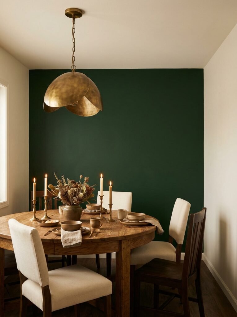
Every well-designed room has an anchor — one dominant piece of furniture that everything else responds to. In a living room, it’s almost always the sofa. In a bedroom, it’s the bed. In a dining room, it’s the table. Getting the anchor piece right, both in scale and placement, is the single most important layout decision you’ll make for that room.
The most common mistake people make? Pushing all the furniture against the walls. It feels intuitive — like it creates more space — but it actually does the opposite. It makes a room feel hollow and disconnected, like furniture waiting in a showroom rather than a home being lived in. Pull your sofa away from the wall, even just 12 inches, and watch the room suddenly feel more intimate and layered.
Your anchor piece should face the room’s natural focal point — a fireplace, a large window, a beautiful piece of art, or even a television if that’s your reality. Once that relationship is established, every other piece of furniture can be arranged in conversation with both the anchor and the focal point, creating a layout that feels cohesive and intentional rather than random.
—
4. How to Use Negative Space Like an Interior Designer (Not a Minimalist Cliché)
Negative space — the deliberate emptiness between and around objects — is one of the most misunderstood concepts in interior design. People either ignore it completely, cramming every corner with furniture and décor, or they swing to an extreme minimalism that feels cold and uninhabited. The sweet spot is somewhere beautifully in between.
Negative space in an interior layout serves a purpose that goes beyond aesthetics. It gives the eye a place to rest. It lets individual pieces breathe and be appreciated rather than competing for attention. And psychologically, it signals calm — which is exactly why high-end hotel lobbies and luxury spa interiors always feel so serene, even when they’re richly furnished.
Practically, this means leaving deliberate breathing room between your sofa and side table, between your bed and dresser, between artwork groupings on a wall. It means resisting the urge to fill every visual gap, because sometimes the gap is the design. A room with thoughtful negative space will always photograph beautifully — and more importantly, it will feel wonderful to live in every single day.
—
5. The Conversation Zone: Arranging Seating So People Actually Talk to Each Other
Imagine hosting a dinner party where your guests are all perched in different corners of the room, craning their necks to make eye contact. Sounds exhausting — and yet this scenario happens constantly in homes with poorly arranged seating. The layout of a living room, in particular, should be designed specifically to facilitate human connection.
Interior designers call this creating a “conversation zone” — a cluster of seating where people can comfortably speak without raising their voices or twisting their bodies. The ideal distance between facing seats is between 8 and 10 feet. Any farther apart and the conversation requires effort. Any closer and people feel crowded.
In a large open-plan living space, you might actually need two conversation zones — one anchored by a main sofa grouping, and a secondary one near a window seat or a pair of accent chairs. Defining these zones with rugs is a brilliant way to signal spatial boundaries without adding walls, making a large space feel both expansive and intimate at the same time.
“Rooms aren’t just decorated — they’re choreographed. Every piece of furniture is telling a person where to stand, sit, and linger.”
—
6. The Magic of Rugs: How One Layer Defines Your Entire Layout
If there is one layout tool that is consistently underestimated, it is the rug. A correctly sized rug doesn’t just add warmth and texture to a room — it literally defines the boundaries of a furniture grouping, anchors floating pieces to the floor, and makes an otherwise disconnected arrangement suddenly read as a cohesive, intentional zone.
The most common rug mistake? Going too small. A rug that’s too small makes furniture look like it’s floating in space rather than grounded together. In a living room, your rug should be large enough that at least the front two legs of every seating piece can rest on it. In a dining room, the rug should extend at least 24 inches beyond all sides of the table so chairs remain on the rug even when pulled out.
In an open-plan layout, rugs become your best tool for defining separate areas without physical barriers. A large jute rug under the living area and a patterned one under the dining table can make a single open space feel like two purposeful rooms — each with its own identity and function.
—
7. Vertical Space: The Dimension Most Home Decorators Completely Forget
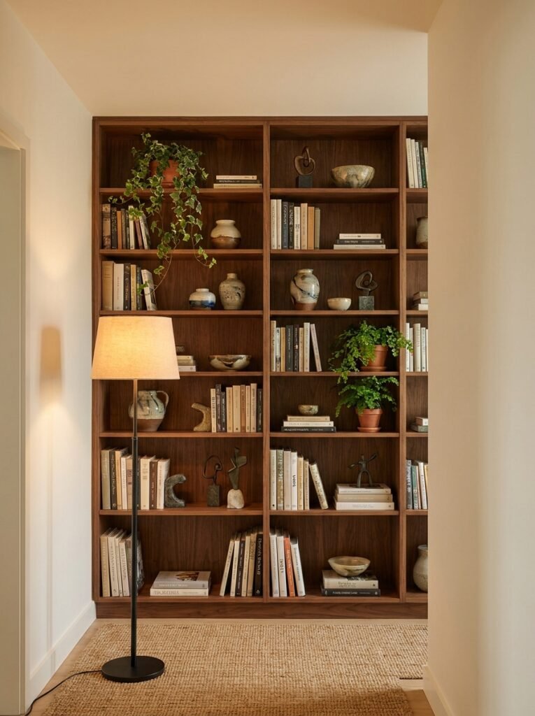
When most people think about interior layout, they think horizontally — furniture placement, floor plans, traffic flow. But vertical space is an equally powerful dimension, and most homes leave it almost entirely untapped. A room with beautifully arranged furniture but bare walls and low sightlines will still feel somehow incomplete, like a sentence missing its punctuation.
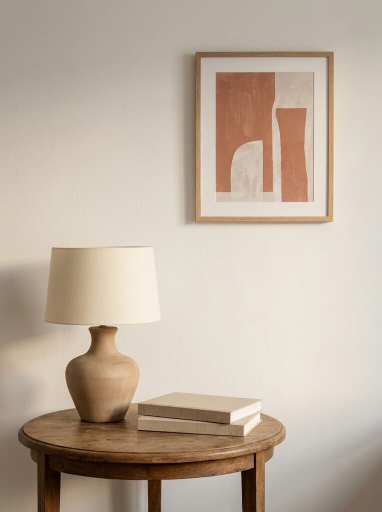
Using vertical space intelligently means drawing the eye upward. Floor-to-ceiling bookshelves make a room feel grand without requiring more square footage. Tall, slim floor lamps add height to a low-ceilinged room. Artwork hung at the right height — center point at 57 inches from the floor, which is standard gallery hanging height — connects visual elements from the floor up to the ceiling.
In small rooms especially, going vertical is a space-creating miracle. A narrow bookcase reaching ceiling height holds the same volume as a wide, sprawling one while taking up a fraction of the floor space. Pendant lights hung over a dining table or kitchen island add architectural interest at eye level while keeping surfaces clear below. Every inch of height you activate adds visual richness and perceived spaciousness to your interior.
—
8. Small Room Layouts: The Counterintuitive Tricks That Actually Work
Small rooms come with a unique kind of frustration — the feeling that no matter what you do, there simply isn’t enough space. But the surprising truth is that small rooms, when laid out with intelligence and restraint, can feel intimate and charming rather than cramped and claustrophobic. The difference lies almost entirely in the layout decisions you make.
First, resist the urge to shrink everything down. A room full of tiny furniture looks — and feels — more cluttered than one anchored by a single, well-scaled piece. A loveseat that’s the right proportion for the space will always feel better than three mismatched small chairs crammed together.
Second, use multipurpose furniture strategically. An ottoman with interior storage serves as a coffee table, extra seating, and a linen closet all at once. A daybed positioned along one wall functions as both sofa and guest bed. Built-in window seats with drawers beneath them are one of the most efficient layout choices a small room can make. The goal isn’t to minimize what’s in the room — it’s to maximize what each piece does.
—
9. Open-Plan Layouts: How to Create Definition Without Walls
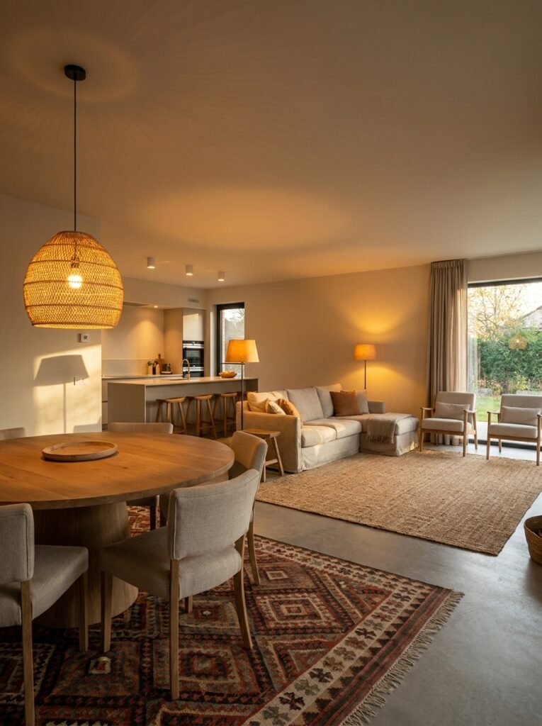
Open-plan living is one of the most beloved — and most challenging — interior layout scenarios. The freedom it offers is real: natural light travels farther, spaces feel larger, and families can be together across multiple activities simultaneously. But without thoughtful layout, an open floor plan can feel like one enormous, shapeless room that’s impossible to decorate or truly relax in.
The key is creating defined zones within the open space, using furniture, rugs, lighting, and sometimes subtle architectural additions like half-height shelving or columns. Each zone should have a clear function — cooking, eating, lounging, working — and should feel distinct enough that you know which zone you’re in without visible walls separating them.
Lighting is particularly powerful in open-plan spaces. A dramatic pendant light over a dining table, recessed lighting in the kitchen area, and warm floor lamps in the living zone each signal a different “room” within the open plan. When zones are lit differently, they feel spatially separate even when physically connected — a brilliant illusion that makes the whole layout feel both expansive and cozy.
“Open plans don’t need walls to create rooms — they need intention, light, and a rug placed in exactly the right spot.”
—
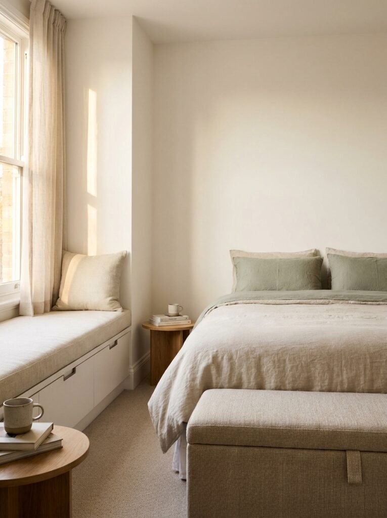
10. The Bedroom Layout Formula That Guarantees a Restful Night’s Sleep
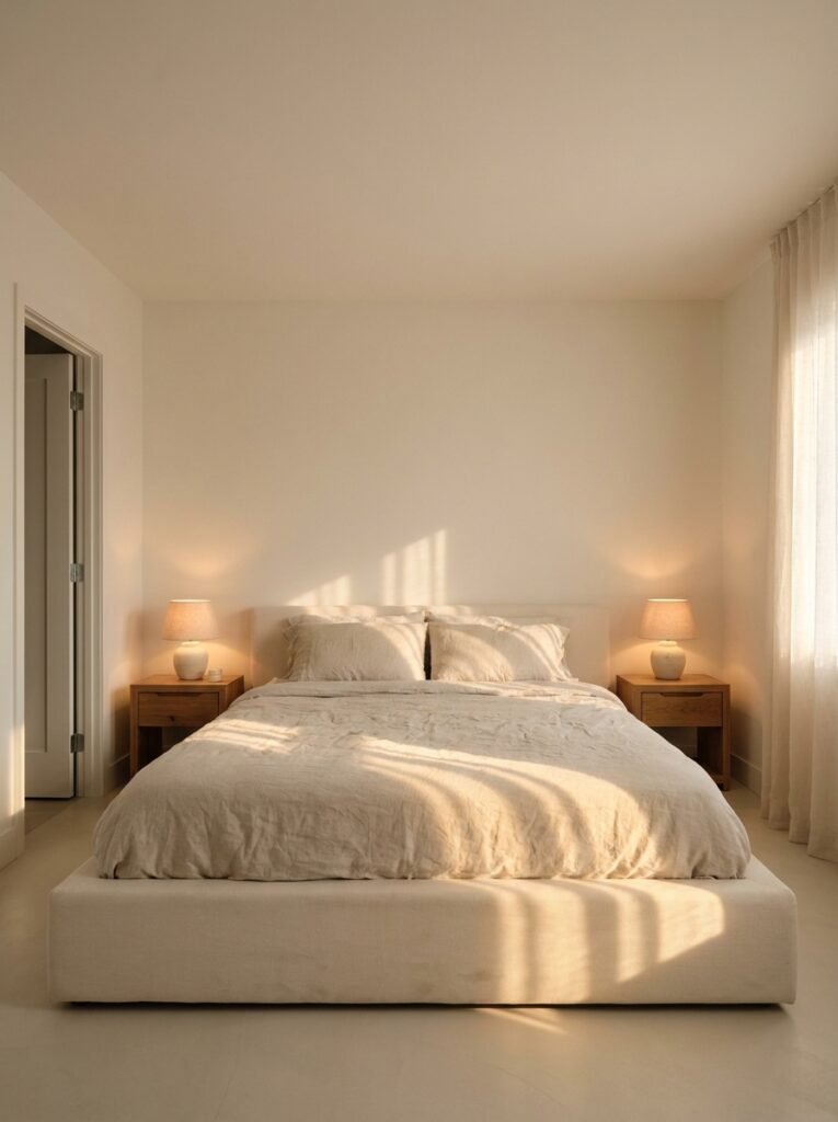
The bedroom is perhaps the room where layout has the most direct impact on your physical wellbeing. A poorly arranged bedroom — where the bed faces the door awkwardly, where there’s no room on both sides, where the dresser blocks natural morning light — contributes to poor sleep and morning grumpiness in ways you’d never consciously connect to furniture placement.
The foundational rule of bedroom layout is to position the bed so that when you’re lying in it, you can see the door without being directly in line with it. This instinctive placement — what designers sometimes reference alongside the ancient principles of feng shui — allows your nervous system to feel protected and at ease during sleep, rather than subtly alert to what might come through the door.
Beyond the bed, each side should ideally have equal space for nightstands and movement. Even if the room is small, maintaining at least 24 inches on each side of the bed makes the space feel balanced and prevents the daily friction of climbing over furniture to get to bed. Natural light should ideally land on your face in the morning rather than directly on your eyes — so consider which direction your windows face before finalizing where the head of the bed will sit.
—
11. Color and Layout: The Surprising Connection Between the Two
Color doesn’t just affect mood — it actively interacts with your layout to either reinforce or undermine the spatial experience you’re creating. A beautifully arranged room painted in the wrong color can feel smaller, more chaotic, or more disjointed than the layout actually is. Conversely, thoughtful color application can make an imperfect layout feel far more resolved.
Dark, saturated colors on all four walls visually bring walls inward, making a large room feel intimate — which can be deeply cozy in a dining room or library, but overwhelming in a small bedroom. Light, cool colors on walls recede visually, making walls seem farther away and rooms feel more spacious. This is why small rooms painted in soft whites, pale blues, and warm creams tend to feel larger than their floor plans suggest.
One particularly powerful layout technique is painting a single accent wall in a deeper color behind the primary anchor piece — the bed headboard wall, or the wall behind a fireplace. This visually reinforces the focal point your layout is already built around, adding depth and intentionality that makes the whole room feel considered and designed rather than assembled.
—
12. The Edit: Why the Final Step of Great Interior Layout Is Knowing What to Remove
There’s a reason professional interior stylists almost always remove things from a room rather than add more. The last and arguably most important step of perfecting an interior layout is editing — standing back with honest eyes and identifying what isn’t earning its place in the composition.
This isn’t minimalism for its own sake. It’s clarity. A room where every piece of furniture serves a purpose, every object has been chosen rather than simply accumulated, and every surface has been deliberately styled — that room feels like a considered work of art. A room where nothing has been edited feels busy, restless, and tiring to be in, no matter how beautiful the individual pieces might be.
Walk through your finished layout as if you’re a guest seeing it for the first time. What catches your eye immediately — and is that what you want to catch attention? What feels unnecessary or out of scale? What would you move, remove, or replace if you could? Trust those instincts. The rooms that make people gasp and reach for their phones to photograph are almost always the ones where something was bravely removed rather than added.
—
🌿 How to Take Care of Your Interior Layout Over Time
A great interior layout isn’t a one-time achievement — it’s a living system that benefits from periodic review and gentle adjustment as your life evolves.
Every six months or so, walk through each room slowly and honestly assess what’s working and what’s creating friction. Life changes — families grow, hobbies shift, remote work rearranges daily rhythms — and your layout should adapt alongside those changes rather than stay frozen in a configuration that no longer serves how you actually live.
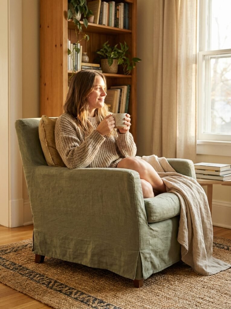
Seasonal updates are a lovely, low-cost way to refresh a layout without starting over. Moving a reading chair to a sunnier spot in winter, repositioning an outdoor bench to bring summer inside, or simply rotating which rug lives in which room can make familiar spaces feel genuinely renewed.
Finally, give yourself permission to experiment without commitment. Moving furniture costs nothing, and the willingness to try a room a different way — even if it doesn’t work — is what separates people who always love their homes from those who always wish they could change them.
—
❓ FAQ
Q: Where should I start if I want to improve my interior layout but don’t know where to begin? A: Start with the room you spend the most time in and identify the single biggest pain point — usually traffic flow or furniture scale. Address that one issue first before making any other changes, because solving one foundational problem often makes several others disappear at the same time.
Q: How do I make an awkward-shaped room look intentional and well-designed? A: Embrace the awkward angles rather than fighting them. A diagonal furniture arrangement can make an oddly shaped room feel dynamic and deliberate. Built-in shelving fitted into corners or alcoves turns architectural challenges into storage assets, and bold lighting draws the eye away from irregular proportions.
Q: Can I use interior layout principles in a rented space where I can’t make permanent changes? A: Absolutely — the most powerful layout changes require zero permanent alterations. Furniture arrangement, rug placement, lighting choices, and the intentional use of vertical space through tall bookshelves or art arrangements can completely transform a rented space while leaving every wall and floor untouched.
—
💭 Final Thought
The most profound thing about interior layout is that it’s quietly, invisibly shaping your experience of home every single day — whether you’ve thought about it or not. The rooms that make you feel calm, creative, and deeply yourself didn’t happen by accident. They were arranged that way, with care and intention, by someone who understood that how a room is laid out is ultimately a decision about how you want to live.
So here’s the question worth sitting with tonight: when you walk into your favorite room in your home, what does the layout say about how you believe you deserve to feel?