The Colorful Apartment Living Room That Finally Feels Like You
You’ve been staring at those white walls long enough. The furniture is fine, the layout works, but every time you walk in, something feels missing — like the room is waiting for someone to actually live in it. Color is the answer. And not in the timid, one-accent-pillow way you’ve been told is “safe.”
—
1. Why “Just Add a Colorful Throw” Is the Worst Advice You’ve Ever Received
Let’s start here, because you deserve honesty.
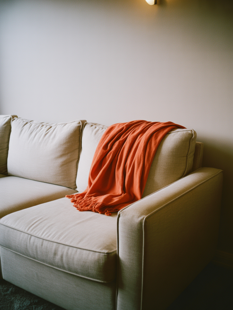
The “safe” approach to color in a rental or apartment — a mustard pillow here, a terracotta candle holder there — doesn’t work. It just creates a beige room with a few confused objects sitting in it. The pieces look borrowed, not chosen. And that’s exactly how the room feels when you walk in: like someone else’s space, lightly decorated.
Real color in a living room isn’t about accessories. It’s about commitment. Not the kind that requires drilling into walls or writing a check to your landlord. It’s a mental commitment to let the room have a personality, a point of view, a voice that says something specific when someone walks through the door.
The rooms that stop you mid-scroll on Pinterest? They’re not colorful because someone bought a green vase. They’re colorful because someone made a decision. A big rug that announces itself. A gallery wall with actual depth. Curtains that hit the floor in a jewel tone. These aren’t risks — they’re choices. And every beautiful room starts with one.
“Real color isn’t an accessory. It’s the whole argument the room is making.”
—
2. The Color That Keeps Showing Up in Every Beautiful Small Living Room Right Now
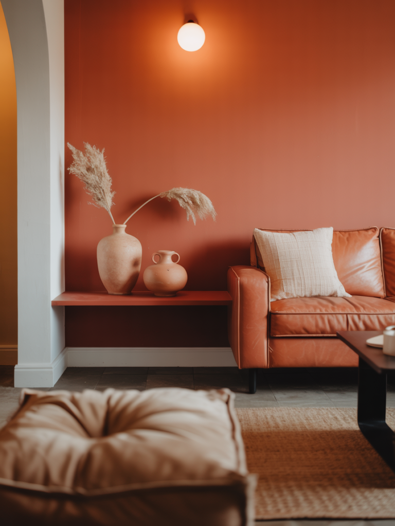
Terracotta had its moment. Navy had a long run. And sage green, bless it, is still everywhere. But the color showing up in the most interesting apartment living rooms right now — on both sides of the Atlantic — is a warm, burnt rust. Not orange. Not red. That specific hue that lives between the two, like the inside of a dried chili pepper or the color of old Moroccan tile.
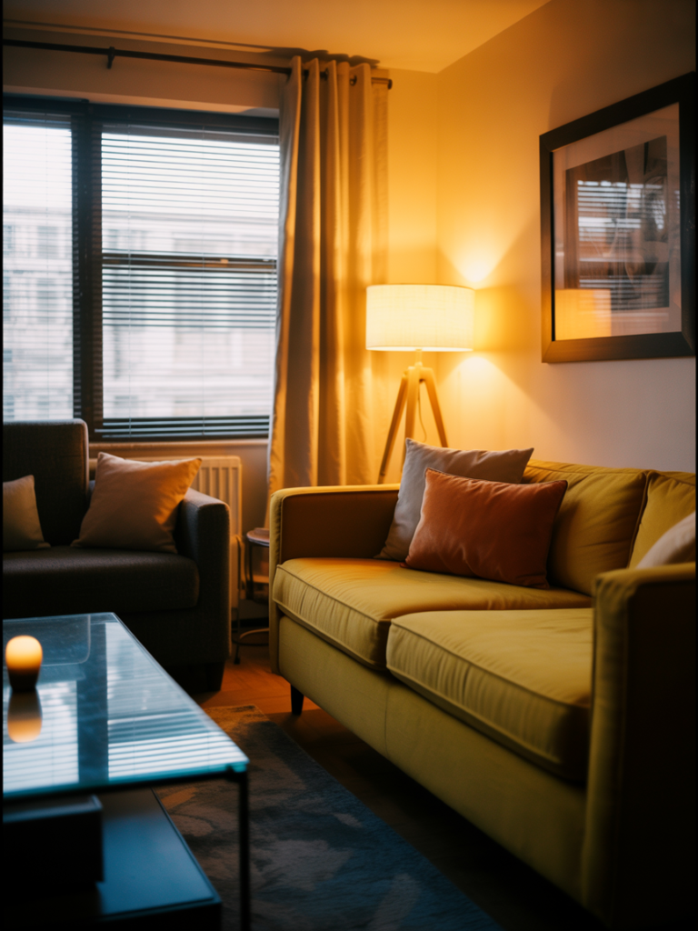
It works because it reads as neutral to other colors. You can pair it with cream, forest green, dusty pink, or even cobalt blue, and it doesn’t fight — it anchors. It’s also wildly flattering in lamplight, which matters enormously in an apartment where you’re not getting south-facing windows and a flood of natural sun at 3pm.
In a small living room, this color is best used as a foundation rather than a feature. A large area rug in burnt rust immediately grounds the space. Curtains in a similar family pull the eye upward and make ceilings feel higher. Cushion covers tie in without overdoing it. The room ends up feeling warm and considered, not like you bought everything from the same collection.
—
3. The One Rule That Makes Any Small Colorful Room Feel Intentional (Not Chaotic)
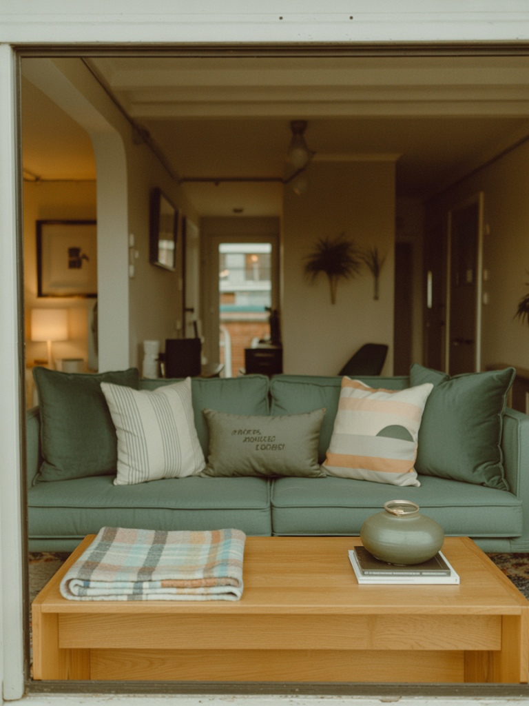
Here it is: choose one color to repeat at least three times, always at different scales.
That’s it. That’s the rule.
A deep teal might appear first in a large area rug. Then in a single throw pillow. Then as a single spine on a bookshelf. The scale changes completely each time, but the color threads through the room like a sentence that makes sense. The eye finds it, follows it, and the room feels curated rather than collected at random.
Without this anchor, color in a small space can feel overwhelming — like too many people talking at once. With it, even a room with five bold colors feels intentional, because one of them is doing the quiet work of holding everything together.
This also solves the rental problem beautifully. You’re not painting walls. You’re creating the impression of a color scheme through layering. A large rug does the heavy lifting. A lampshade, a plant pot, a paperback with a matching cover — they whisper the same note back. The room hums.
—
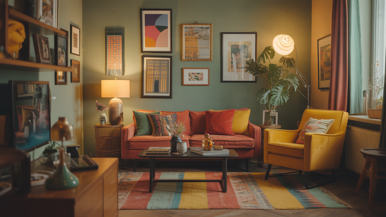
4. Gallery Walls That Don’t Look Like a Mood Board Exploded
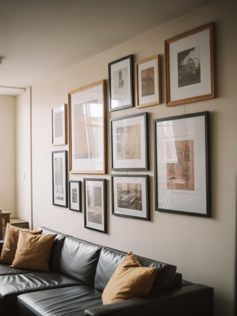
Gallery walls get a bad reputation because most of them are done wrong.
The mistake isn’t the concept — it’s the execution. Too many frames in too many sizes, without a visual logic connecting them. The result looks like a Pinterest board that jumped off the screen and landed crooked on your wall.
Here’s what actually works in a colorful apartment living room: commit to a palette within the gallery itself. Three to four colors, maximum, that echo what’s already in the room. Then vary content rather than color — a photograph next to a simple graphic print next to a painted botanical. The variety comes from the subject matter, not from wildly different colors fighting for attention.
Frame color matters, too. In a colorful room, matching all your frames (in a dark wood, black, or warm brass) actually gives the eye somewhere to rest. It sounds counterintuitive, but visual consistency in the frames makes the art and the color inside them sing louder.
One more thing: hang the gallery lower than you think. Most people hang art as if they’re decorating for a gallery space. In a living room where you’re mostly seated, the center of the gallery should sit roughly at eye level when you’re sitting down. Lower than expected. More intimate. It completely changes how the room feels.
“A gallery wall isn’t decoration. It’s evidence of a person who pays attention.”
—
5. How to Use Color When You Have a Rental’s Worst Enemy: Bad Lighting
Bad lighting ruins color. This is non-negotiable, and it’s the reason so many apartment living rooms look flat no matter what you put in them.
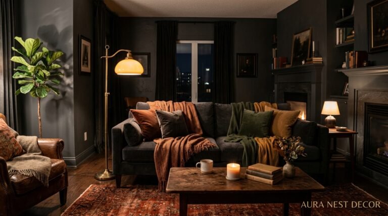
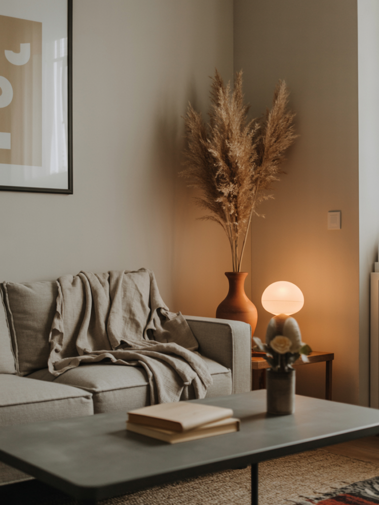
Most UK and US apartment rentals have one overhead light fixture — often a harsh, ceiling-mounted situation that casts ugly shadows and makes every color look like a pale imitation of itself. Fighting this with more overhead light doesn’t work. The solution is to go low and layered.
Floor lamps with warm-toned bulbs (look for 2700K on the packaging — that’s the amber, incandescent-style warmth you want) placed in the corners of a room pull the light outward rather than downward. Table lamps on side tables, shelves, or even the floor create pools of light that make a room feel larger and the colors in it richer.
Candlelight, even just a few good pillar candles on a coffee table or windowsill, does something to saturated colors that no light bulb fully replicates. A deep burgundy cushion in candlelight looks like velvet from a Flemish painting. In overhead fluorescent light, it looks like something you bought at a car boot sale.
Warm light is the secret ingredient in every colorful room that makes you want to stay.
—
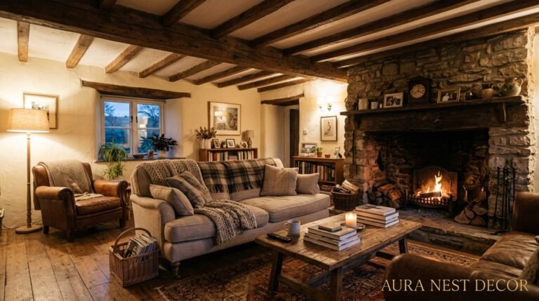
6. The Rug That Changes Everything (and the Mistake Everyone Makes Buying One)
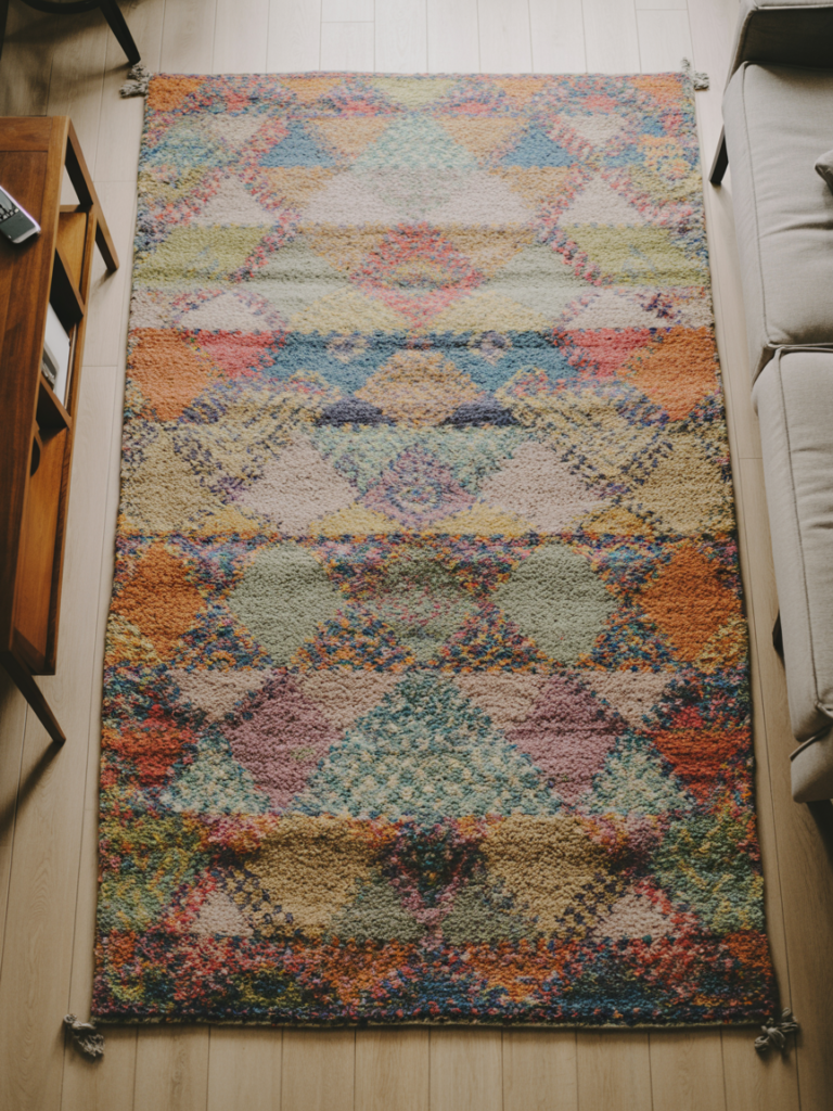
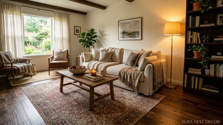
A large area rug is the single most important colorful element you can add to an apartment living room. Not the most expensive. Not the most dramatic. The most important.
Here’s why: the floor is the biggest flat surface in the room. When that surface has color, depth, and pattern, the entire room responds to it. Your furniture starts looking intentional. Your walls stop feeling bare. Even a sparse room with a beautiful rug looks considered.
The mistake almost everyone makes? Buying a rug that’s too small. It sits under the coffee table like a mat, and the furniture around it floats, disconnected. In a living room, the rug should be large enough that at minimum the front legs of every sofa and chair sit on it. Ideally, all four legs. For most living rooms, that means going bigger than feels logical in the shop.
For color specifically: a rug with multiple colors in it is actually easier to work with than a solid-color rug, because it does the styling work for you. Pull one of the rug’s colors into a cushion, another into a throw, and your palette is basically set. The rug becomes the room’s mood board.
—
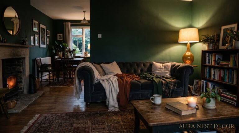
7. Curtains Are the Most Underrated Color Opportunity in Any Apartment
Most people choose curtains in white, cream, or grey because it feels safe. And then they wonder why their room, despite all the effort, still feels flat.
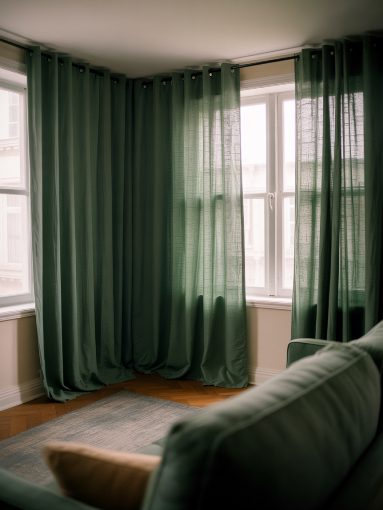
Curtains are the largest vertical surface in most living rooms. When they’re the color of the walls or a gentle neutral, they disappear — and the room loses height, drama, and warmth all at once. But when curtains are a real color? The room completely transforms.
In apartments, floor-length curtains in a rich color — forest green, deep plum, burnt amber, peacock blue — do three things simultaneously. They make ceilings feel higher because the eye travels upward. They add the sensation of depth and softness to a room that might otherwise feel boxy. And they frame the window as a feature rather than a structural necessity.
Hanging them high matters. Mount the curtain rod as close to the ceiling as possible, even if the window is small. Let the fabric pool or just kiss the floor. The drama this creates costs nothing beyond the hardware, and it’s the same trick used in every beautiful editorial interior photo you’ve ever saved.
“The color you’ve been afraid to put on your walls? Put it in your curtains instead.”
—
8. Mixing Patterns Without Losing Your Mind (or Your Security Deposit)
Pattern mixing sounds frightening. Most people avoid it entirely, or overdo it spectacularly and end up surrounded by chaos.
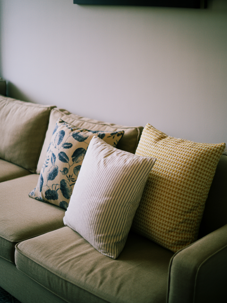
The key is scale variation. One large pattern, one medium pattern, one small. That’s your trio.
In a colorful apartment living room, this might look like: a large-scale geometric rug, a medium-scale floral cushion, and a small-scale woven textile throw. All three are patterns. All three have different sizes of repeat. And because you’ve anchored them in the same color family — the same warm rust, say, or the same teal-green — they coexist peacefully.
What breaks pattern mixing is matching the scale. Two medium-scale prints next to each other will fight constantly for attention, like two people talking over each other at a dinner party. Different scales give each pattern its own visual moment without competition.
Solid colors act as breathing room between patterns. A solid-colored cushion between two patterned ones. A plain throw over a patterned sofa. These rests in the visual rhythm are what separate a beautifully layered room from one that feels anxious.
—
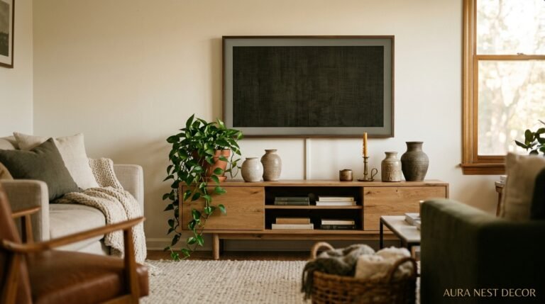
9. Bookshelves as Color Architecture (Not Just Storage)
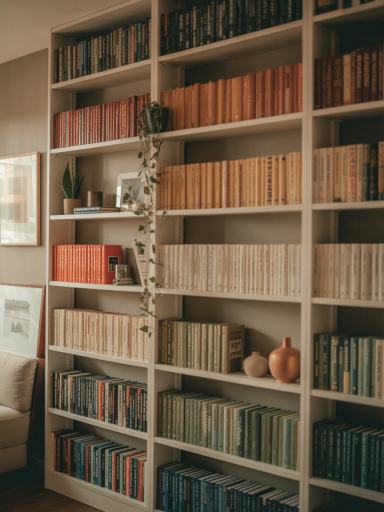
If you have a bookshelf in your apartment living room — built-in or freestanding — you have a tool for color that most people completely ignore.
The standard approach is to arrange books by size or leave them however they were unpacked. But a styled bookshelf, approached with intention, becomes one of the most effective color features in any room.
Start by grouping books by color. It looks deliberate and immediately adds visual rhythm to the shelf. Then layer in objects: a small plant, a sculptural piece, a bowl, a candle. These break the horizontal run of books and create depth, especially if objects at different heights are placed throughout.
Use the back of the shelf. In rentals, a sheet of removable peel-and-stick wallpaper on the shelf’s back wall costs almost nothing and creates an instant focal point. A rich botanical print or a deep geometric pattern visible behind the books and objects turns the shelf into a miniature room of its own.
Color-coding your shelf and mixing in meaningful objects is the difference between storage and a piece of actual interior design.
—
10. The Unexpected Colors That Work Brilliantly Together (and the Ones That Just Don’t)
Some color combinations work so well they feel almost obvious in hindsight. Others promise a lot and deliver chaos.
The combinations that genuinely sing in apartment living rooms: deep plum with warm brass and cream. Forest green with terracotta and natural wood. Dusty pink with slate blue and oatmeal. Mustard with charcoal and rust. These pairings work because one color is always doing the heavy lifting while the others support — there’s a clear visual hierarchy.
What doesn’t work as reliably: equally saturated colors placed in equal amounts. A pillow of bright teal next to a pillow of equally bright orange next to a rug of saturated navy feels relentless. The eye has nowhere to rest. The room feels like it’s shouting.
The fix is always contrast of intensity, not just of hue. One muted, one saturated. One light, one dark. Let one color dominate, one support, and one accent. This is a principle that works in every style, every budget, and every apartment on every continent. It’s as close to a universal design rule as interior decorating has.
—
11. Secondhand Finds Are Where the Most Interesting Color Lives
Fast furniture, bought new and assembled in an afternoon, tends to exist in a safe, predictable color range. Dusty grey. Off-white. Blond wood. These aren’t bad colors — they’re just cautious ones, chosen to offend nobody.
The most interesting colorful apartment living rooms almost always have at least one secondhand piece: a vintage armchair in an unexpected ochre. A mid-century side table in a warm walnut that hasn’t been manufactured in that exact tone since 1974. A velvet sofa in a deep, complex green that doesn’t exist in current production lines.
These pieces carry color history. They were made with different dyes, different production values, different aesthetic assumptions. And that age and specificity is exactly what gives them visual depth that a brand-new piece rarely replicates.
In the US, estate sales and Facebook Marketplace are gold for this. In the UK, car boot sales, charity shops, and eBay local collection listings are full of it. The color story of a beautiful apartment living room often starts with a single found object — something worn, rich in patina, and entirely individual.
—
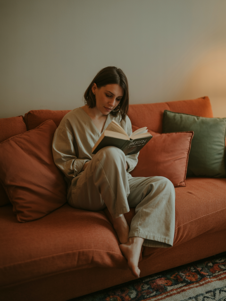
12. The Finishing Layer That Separates a Styled Room from a Decorated One
There’s a difference between a room that’s been decorated and a room that’s been styled, and it comes down to one final layer that most people forget entirely: the living stuff.
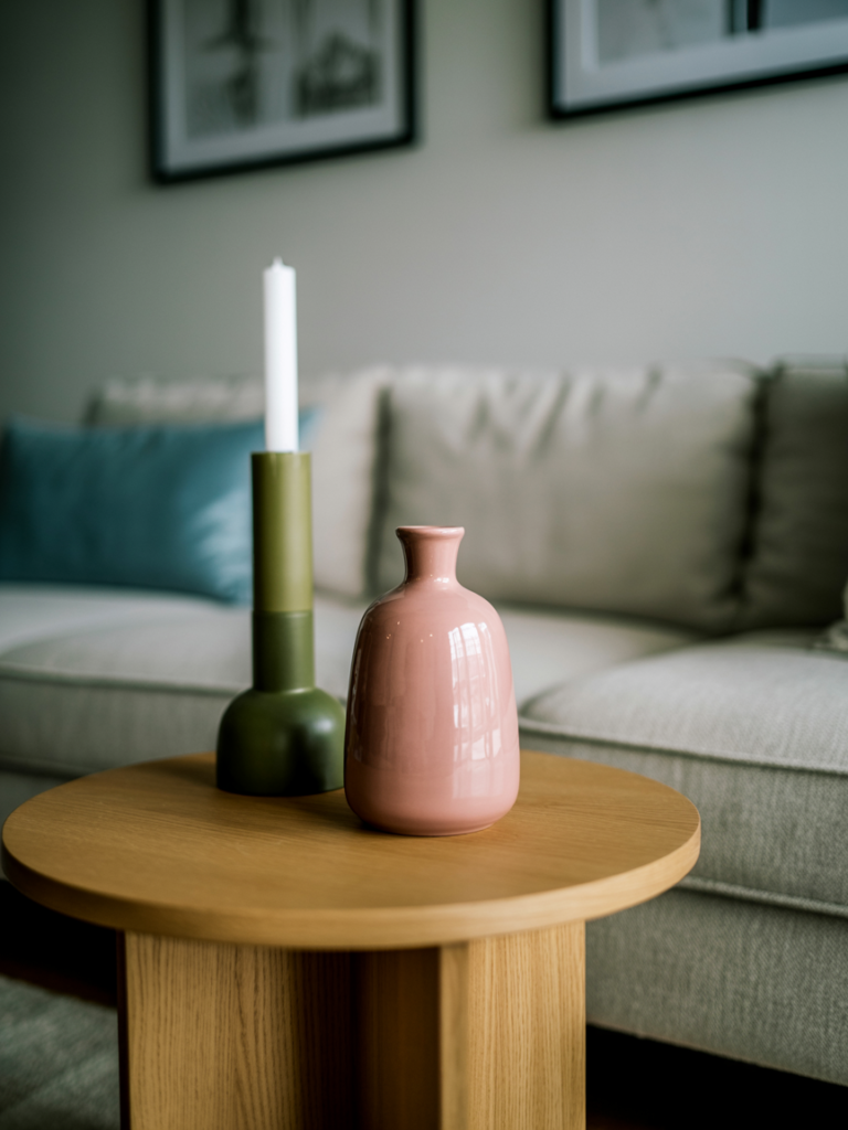
Plants. Real books with creased spines left out at angles. A half-melted candle that clearly gets used. A throw that’s not perfectly folded but is draped as if someone just stood up from under it. A ceramic jug with a few stems of dried grasses. The bowl near the door with keys and a charging cable.
This layer — imperfect, personal, specific to you — is what transforms a set of well-chosen colors and furniture into an actual room. Color can carry a space visually, but it’s the evidence of a life being lived in it that makes it feel warm.
Photographs you love. A book you’re halfway through. The plant you’ve kept alive for two years and feel quietly proud of.
That specific, personal mess of living is color too, in its own way. And it’s the layer that no shopping guide can tell you to buy, because you already have it.
—
🌿 Quick Tips
Keep throw pillows in odd numbers — three or five per sofa looks effortless; four looks like you bought a set and didn’t edit.
When in doubt about color saturation, go slightly deeper than your instinct suggests — colors always look lighter on a wall or in a large room than on a paint chip or swatch.
A single large piece of art will always do more for a room than a scattered collection of small prints — bigger, bolder, hung lower than you think.
Warm white walls (think cream or linen rather than stark white) make colors placed against them sing; cold stark white walls flatten them.
Don’t underestimate the power of a single colored door — in a small apartment, painting the interior of your front door or a single visible door in a deep, rich color creates an architectural moment that changes the whole feeling of the space.
—
❓ FAQ
Q: How do I add color to my apartment living room without being able to paint the walls? A: Focus on the large horizontal and vertical surfaces you can change: a big area rug, long curtains, and a significant piece of furniture or large-format art. These carry much more visual weight than wall color, and a well-layered room with a plain white wall and a beautiful rug will always look richer than a colorful wall with sparse, mismatched furniture.
Q: What’s the easiest way to make a small living room feel colorful without making it feel smaller? A: Use a lighter version of your chosen color family for the largest elements (the rug, the sofa) and deeper, richer versions as accents. This keeps the room feeling open while still committing to color. Hanging curtains close to the ceiling also creates height that makes the whole room feel more generous.
Q: I love color but my partner prefers neutral spaces — how do we meet in the middle? A: Start with a neutral sofa and large anchor pieces, then bring in color through everything removable and changeable: cushions, throws, rugs, curtains, art, and plants. This also has a practical advantage — you can shift the color story of the room completely without replacing any furniture. It’s the lowest-commitment, highest-impact way to live colorfully together.
—
💭 Final Thought
A colorful living room isn’t a design risk. It’s a declaration. It says: someone lives here who has opinions, who knows what they love, who decided this space was worth showing up for.
The white walls, the safe palette, the accessories chosen so as not to upset anyone — those are the risks, really. Because you spend your whole life in your home, and a room that doesn’t feel like you is a quiet kind of loss.
So: what’s the color you keep saving on Pinterest but haven’t been brave enough to actually bring home yet?