The Living Room That Feels Like a Five-Star Hotel (Without Calling a Designer)
You know that feeling when you walk into a beautifully designed space and your whole body exhales? That involuntary “oh” that escapes before you’ve even taken your coat off. That’s what we’re building here — not a showroom, not a magazine spread, but a room that actually feels like something.
Modern luxury isn’t about spending more. It’s about choosing better.
—
1. Why “Modern Luxury” Stopped Meaning White Walls and Chrome Accents
Let’s clear something up right now. The cold, clinical aesthetic that dominated interiors for about a decade — all harsh angles, zero warmth, the kind of room where you were afraid to put a cup of tea down — that’s not modern luxury anymore. It never really was.
What’s happening in the most beautiful living rooms right now is something far more interesting. There’s warmth in the materials. There’s personality in the choices. The rooms that stop people mid-scroll on Pinterest aren’t the ones that look like nobody lives in them. They’re the ones that feel curated and comfortable at the same time. That tension — between polish and ease — is the whole game.
Modern luxury in 2024 means a sofa you actually want to sink into. It means a rug with a pattern that surprises you. It means lighting that makes everyone look slightly better than they do in real life. It’s the art of making considered choices rather than expensive ones — though some things are absolutely worth the splurge, and we’ll get to exactly those things.
“The rooms worth saving aren’t the ones that look expensive. They’re the ones that feel inevitable.”
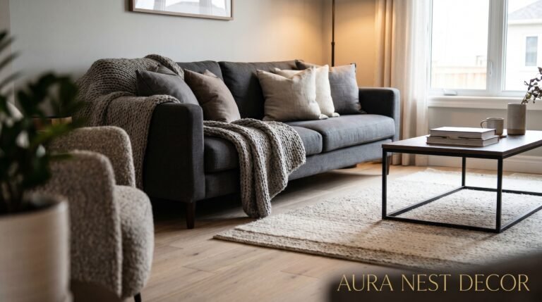
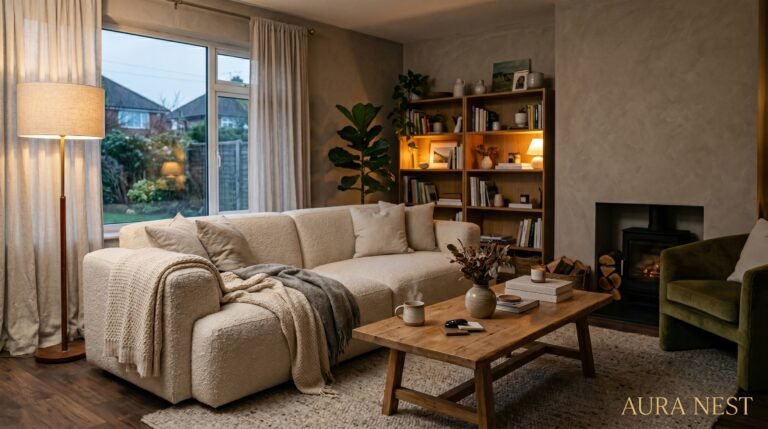
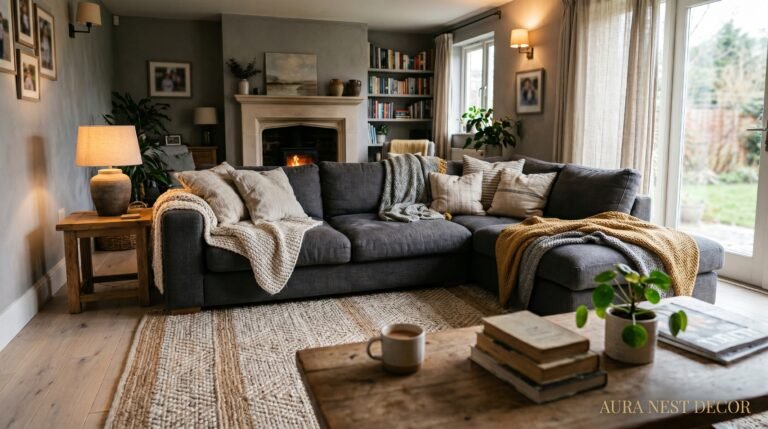
2. The Sofa Decision You’ll Either Love or Regret for Eight Years
Start here. Always start here. The sofa is the spine of the living room, and every other decision either works with it or fights against it.
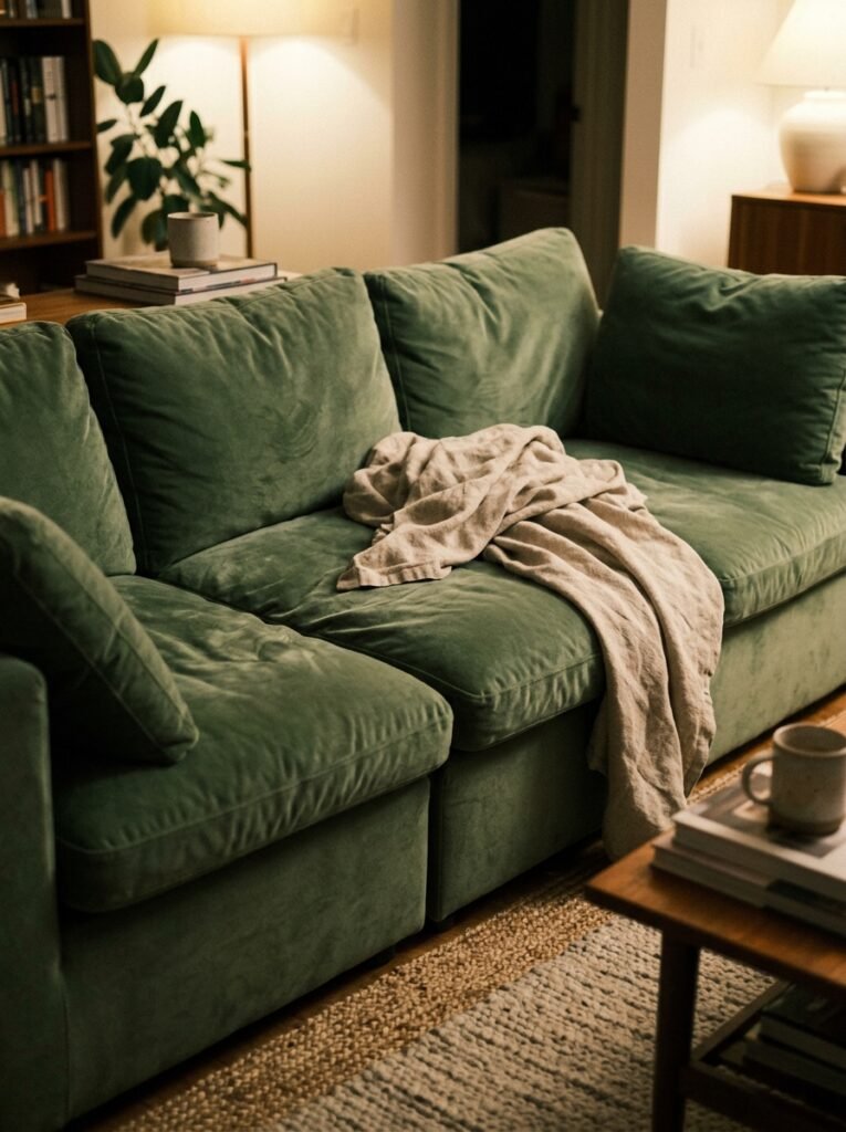
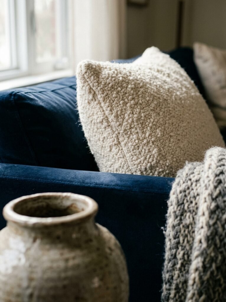
Right now, the silhouettes winning across both US and UK interiors are low-profile and wide. Deep seats. Arms that aren’t competing for attention. Sofas that look like they’ve been there for years, even when they’re brand new. Boucle is having its extended moment — that looped, textural fabric that photographs beautifully and somehow gets better with wear. Velvet in muted tones (think: sage, warm terracotta, slate blue) is another strong choice that reads as genuinely luxurious without trying too hard.
What you want to avoid is the sofa that shouts. The one with so much going on — the tufting, the nailhead trim, the scrolled arms — that everything else in the room has to be quiet to compensate. A great sofa is confident without being loud. It anchors the room, it invites you in, and it asks nothing from the pieces around it except to be complementary.
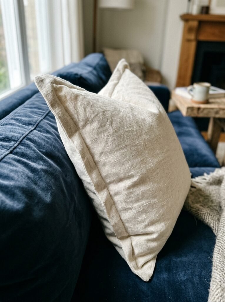
Here’s the practical part: if you’re not ready to replace your sofa, a high-quality slipcover in a linen blend or a properly tailored throw draped with intention (not desperation) can shift the entire energy of the room. It’s not settling. It’s smart.
3. The Color That Keeps Showing Up in Every Beautiful Living Room Right Now
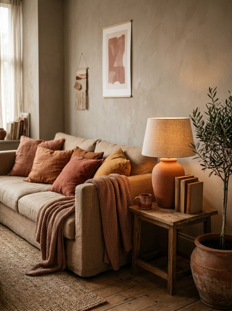
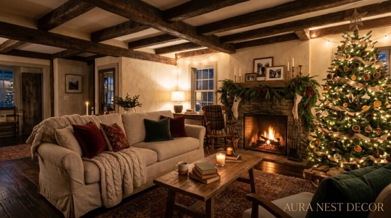
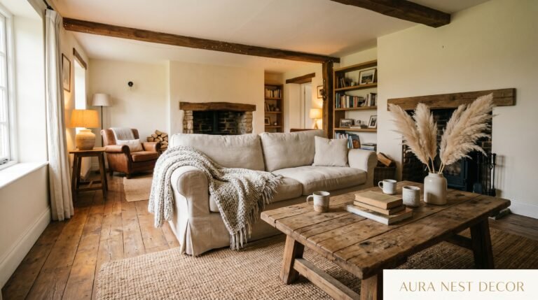
Warm neutrals have taken over completely, and honestly — good. The cold grays that were everywhere for so long worked fine in photographs and nowhere else. They made rooms feel like Tuesday in February even when it was sunny outside.
What’s replacing them is a spectrum that runs from barely-there mushroom to deep espresso, with stops at sand, caramel, and aged linen along the way. These tones do something remarkable: they make every material in the room look better. The wooden coffee table looks warmer. The plants look greener. People look more alive.
In the US, these palettes are showing up alongside richer accent colors — burgundy, forest green, the occasional deep rust. Very deliberate, very considered. In the UK, there’s a tendency to lean into heritage tones: warm bottle green, aged brass, that particular shade of off-white that’s almost cream but not quite. Both work beautifully. Both feel genuinely grown-up.
If you’re repainting and want one recommendation: look at anything in the warm greige family. Not gray. Not beige. The exact middle ground where the two meet and agree to be something better. Paint a large sample — at least A4 size, ideally bigger — and live with it through a full day before you commit.
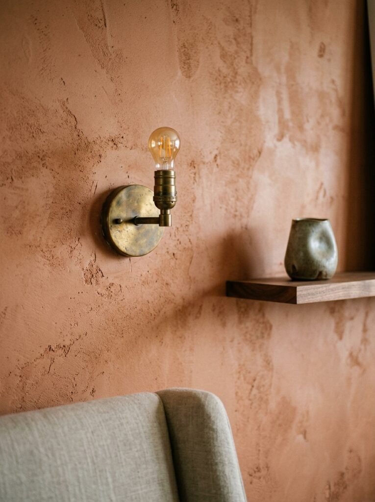
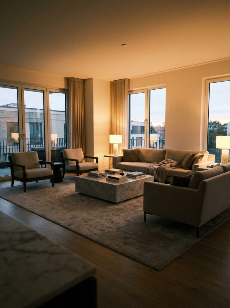
4. Lighting Is the Interior Design Secret That Nobody Talks About Enough
This is the one that changes everything and costs surprisingly little relative to its impact.
The mistake most people make is relying on a single overhead light source. One ceiling fixture, however beautiful, flattens a room. It erases shadow. It removes depth. It turns a thoughtfully designed space into something that feels like an office after hours.
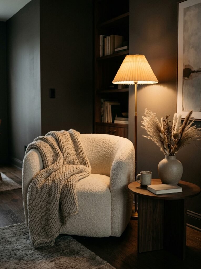
Layer it. A floor lamp in one corner — something with a warm-toned shade that throws light upward and sideways, not down. A table lamp on a sideboard or end table, something with visual weight at a lower level. Candles, if you’re the type (and you should be — even battery-operated ones in good holders do the work). And if you have overhead lighting, put it on a dimmer. This is the single cheapest upgrade in home improvement and it is genuinely life-changing.
The amber glow of an Edison bulb at 7pm, when you’ve got a lamp on either side of the room and nothing overhead, and the whole space smells faintly of whatever candle you’ve chosen — that’s luxury. That’s not a budget thing. That’s a decision.
“One dimmer switch and three lamps will do more for your living room than a complete furniture overhaul.”
5. The Rug That Makes the Whole Room Make Sense
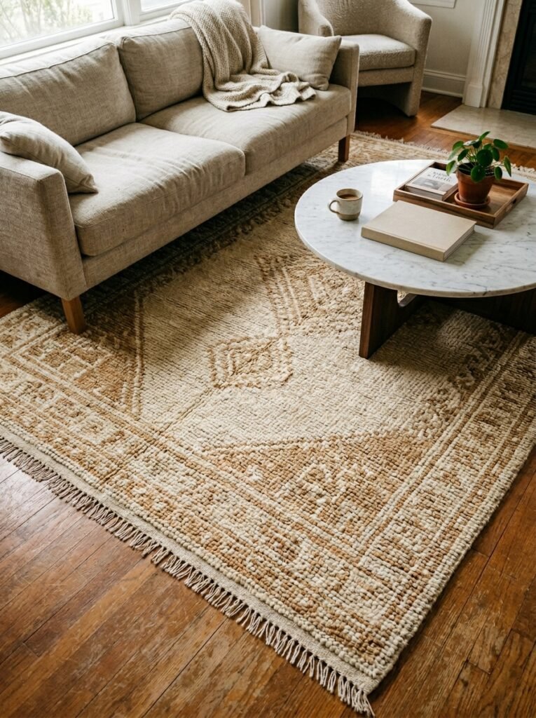
Rugs get undermined constantly. They’re bought as an afterthought, placed too small, pushed too far under the sofa, chosen in a color that matches nothing while trying to match everything.
Here’s the rule: go bigger than you think you need, every time. In a standard living room, you want all the front legs of the furniture on the rug, minimum. Better yet, everything on the rug. A rug that’s too large for a space is almost always more elegant than one that’s too small. Small rugs in living rooms look apologetic. They make the furniture look like it’s floating.
In terms of material and style, there are a few directions that consistently work for modern luxury. A vintage-style Persian or Oushak in muted tones brings immediate depth and history to a contemporary room — that mix of old and new is exactly what makes spaces feel curated rather than decorated. A thick pile in a solid warm tone reads as pure comfort. Natural fiber like jute or sisal works beautifully as a base layer, especially with a smaller decorative rug layered on top.
What to avoid: anything too busy in a bright, saturated palette unless the rest of the room is very quiet. The rug should pull the room together, not be the loudest voice in it.
6. The Art Decision That Separates a Designed Room from a Decorated One
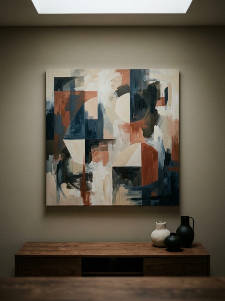
Art is where personality lives. It’s also where most people play it too safe, choose too small, or hang things too high.
Gallery walls done well are beautiful. Gallery walls done badly look like someone emptied their to-do list onto a wall. The difference is usually in the cohesion — not that every piece matches, but that they share something. A tonal connection. A consistent framing style. A thread that connects them even if you can’t immediately articulate what it is.
But honestly? One large piece done right beats a gallery wall almost every time for that immediate luxury feel. A single oversized artwork above a sofa or fireplace — something with scale and intention — creates an instant focal point that makes the whole room feel considered. It doesn’t have to be expensive. A good print, properly framed in something with weight and presence, looks extraordinary.
Hang things at eye level. Not your eye level standing up — eye level sitting down, approximately 57-60 inches from the floor to the center of the piece. It sounds specific because it is. Rooms where the art is hung correctly feel right even when people can’t explain why. Rooms where it’s too high feel slightly off, always.
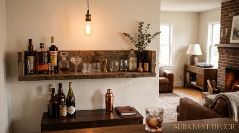
7. Mixing Metals Without It Looking Like an Accident
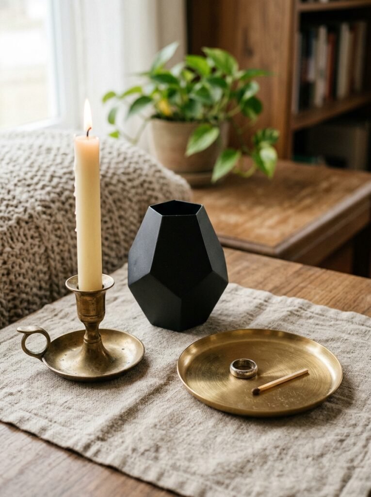
For a long time, the rule was: pick one metal and stick to it. Everything in brass, or everything in matte black, or everything in brushed nickel. Consistent, safe, a little boring.
The rooms that look genuinely current are mixing metals now, and they’re doing it with confidence. Brass and matte black together. Unlacquered brass alongside raw iron. Gold-toned accents near chrome. The key isn’t in having a rule about what goes with what — it’s in repetition. If you introduce brass, it needs to appear at least three times in the room. A lamp base, a frame, a small bowl on the coffee table. When a metal appears only once, it looks like you forgot to finish something. When it appears in a rhythm, it looks intentional.
What feels fresh right now: aged brass. Not bright, polished, yellow-gold brass, but the kind that’s slightly warm, slightly dark, slightly imperfect. It works with literally everything.
“Mixing metals only looks expensive when the same ones reappear — give each finish at least three moments in the room.”
8. The Furniture Arrangement Mistake That’s Making Your Room Feel Smaller
Most people push furniture against the walls. It feels logical — maximize the center space, keep things out of the way. It also makes rooms feel like waiting rooms.
Pull things in. Floating furniture arrangements, where the sofa sits away from the wall and faces other pieces in conversation, creates intimacy and makes rooms feel larger, counterintuitively. It defines zones. It gives the room a center of gravity. The space behind the sofa — even six or eight inches between it and the wall — changes the entire feeling of the room.
If you have a smaller living room, this still applies, just at a smaller scale. The sofa doesn’t need to be pulled far. A few inches creates the suggestion of the arrangement even if the physics don’t quite allow the full effect. Pair this with a coffee table that’s appropriately scaled — too big and the room feels crowded, too small and the sofa feels stranded — and you’ve solved most arrangement problems without buying a single new thing.
9. Texture Is the Thing You Feel Before You See It
Strip a beautifully designed room of all its texture and you have a flat, lifeless space even if the colors are perfect and the furniture is excellent. Texture is what gives a room warmth before you’ve even sat down. It’s what makes it feel lived-in and loved in the best possible way.
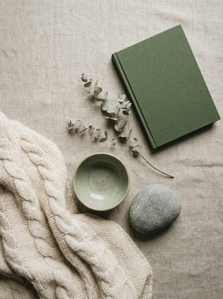
Boucle cushions on a smooth linen sofa. A ribbed ceramic vase next to a flat-lacquer tray. A knobbly wool throw over the arm of a velvet chair. These combinations are tactile stories. Your eye reads them as luxurious because they offer variety, depth, something to notice.
The mistake is keeping everything in the same texture family. All smooth, all shiny, all matte, all soft — any of these in isolation starts to feel monotonous. The contrasts are what make a room interesting. And the good news is that texture comes from some of the least expensive items in a room. Cushions. Throws. Books with textured spines. A woven basket. A clay pot. This is accessible luxury.
10. The Plant Rule That Interior Designers Never Admit They Follow
Plants transform living rooms. This isn’t news. But there’s a specific approach that separates the rooms that look genuinely styled from the ones that just have a lot of plants.
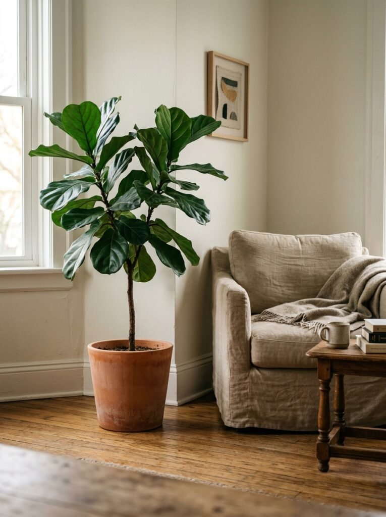
Go for fewer, bigger. One large fiddle-leaf fig or monstera makes more of a statement than seven small plants arranged on a shelf. A single olive tree in a heavy ceramic pot in a corner can anchor an entire room. Scale matters. One big plant says “this is an intentional choice.” Eight small plants says “I’m running out of counter space.”
The pot matters as much as the plant. A beautiful plant in a cheap plastic nursery pot reads as unfinished. The same plant in a warm-toned ceramic, a concrete planter, a woven basket with a liner — suddenly it’s a design object. The upgrade cost is usually minimal and the visual difference is enormous.
11. The One Rule for Styling a Coffee Table That Actually Works
The coffee table is the heart of the living room’s surface styling. It’s also the place where things pile up fastest and where the gap between “styled” and “cluttered” is thinnest.
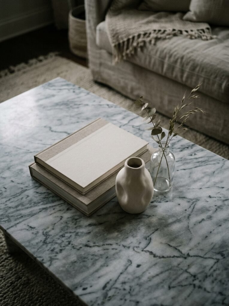
The rule is odd numbers. Three items, or five, arranged at different heights. A stack of books (always with the spines facing the same direction — horizontal, at least two or three high) forms the base. A small object on top of the books — a candle, a small sculpture, a single beautiful stone. Then something at a different height nearby: a low bowl, a cluster of objects that reads as one unit, a branch in a short vase. The eye wants to move between them. It wants levels.
What you’re not doing: covering every inch of surface. White space is a luxury. The breathing room between objects is as important as the objects themselves.
12. The Detail That Guests Notice Without Knowing Why
It’s the finishing layer. The one that separates rooms that look designed from rooms that merely look nice. And it’s almost always the smallest things.
Fresh flowers, even a single stem in a bud vase on the windowsill. A throw folded with intention rather than thrown. Cushions with inserts that are actually one size larger than the cover, so they look plump and full rather than flat and sad. Books arranged with some facing outward, covers showing, rather than all spine-out. A scent — a candle, a diffuser, something real and not synthetic — that makes people feel they’ve arrived somewhere.
These are the details that guests can’t name when you ask them what they love about your room. They’ll say something vague about it feeling “cozy” or “put-together” or just “nice.” But you’ll know. It was the throw. It was the flowers. It was the cushions that were actually filled properly.
Those details are the whole thing, really.
—
🌿 Quick Tips
Good lighting transforms a room more than any furniture purchase — a dimmer switch costs almost nothing and changes absolutely everything about how a space feels after 5pm.
Buying half as many cushions but spending twice as much on quality covers and proper inserts will always look better than the reverse.
If your art looks off but you can’t explain why, measure from the floor to center of the piece — it should be 57-60 inches. That’s it. That’s usually the whole problem.
Don’t style your coffee table until you’ve cleared it completely and let it breathe empty for ten minutes. You’ll style it better when you come back with fresh eyes.
In the UK especially: don’t fight the low natural light, work with it. Deep, rich tones and warm lighting feel intentional rather than dark. Trying to make a British living room feel like a Californian one usually ends in frustration.
—
❓ FAQ
Q: How do I make a living room look expensive on a tight budget? A: Focus on lighting first — lamps and dimmers over overhead lighting. Then look at cushion inserts and throws, which are inexpensive but dramatically change the feel of existing furniture. Finally, declutter aggressively: a well-edited room always reads as more luxurious than a full one.
Q: What’s the best sofa color for a modern luxury living room? A: Warm neutrals — stone, camel, warm grey, deep cream — have the most longevity and work with the widest range of accent colors. If you want something bolder, deep velvet tones like forest green or dusty terracotta are having a sustained moment and photograph beautifully, which matters more than it probably should.
Q: How do I mix old and new furniture without it looking mismatched? A: The key is finding a common thread — usually finish, tone, or scale. An antique wooden sideboard next to a contemporary sofa works when they share a tonal family (both warm, both cool) or when the scale feels balanced. One or two genuinely old pieces in an otherwise contemporary room look curated; too many starts to look like an estate sale.
—
💭 Final Thought
Modern luxury isn’t a look. It’s a feeling. It’s the exhale when you walk in the door, the moment the room holds you rather than demands something from you. You build it in layers, slowly, with intention — a lamp here, a rug there, the right throw at last.
The rooms people remember are never the most expensive ones. They’re the most considered.
What’s the one change to your living room you’ve been putting off that you know, deep down, would make you love it a little more?