
The Wall Above Your Couch Is Begging for a Second Chance — Here’s How to Give It One
You sit down on the couch every single day, glance up, and feel… nothing. Just blank drywall staring back at you. If your living room wall above the sofa has become the most overlooked square footage in your home, you’re not alone — and the good news is, modern farmhouse style was practically invented to fix exactly this problem.
—
1. Why the Space Above the Couch Is the Hardest Wall in the House to Get Right
It’s not the largest wall. It’s not even the most prominent one, necessarily. But it carries the most visual weight in a living room because it sits directly behind the place where people gather, relax, and spend the majority of their time at home.
Get it wrong and the whole room feels unfinished — like a sentence that just trails off. Get it right and suddenly your entire living room has a backbone.
The challenge is scale. Most people choose art or décor that’s too small. A single 8×10 print hung dead center above a six-foot sofa looks like a postage stamp on a building. The rule that works, every time: your arrangement should fill roughly two-thirds of the sofa’s width. So if your sofa is 84 inches wide, aim for a grouping — or a single large piece — that spans around 56 inches.
Modern farmhouse makes this beautifully achievable because the style doesn’t require matching sets or perfectly curated gallery walls. Salvaged wood mirrors, oversized clocks, layered frames in mismatched sizes, architectural prints — they all play nicely together under the farmhouse umbrella. The visual language is warm, collected, a little worn around the edges. Like your home has a history worth looking at.
“The wall above your couch isn’t just decoration — it’s the first thing your guests remember.”
—
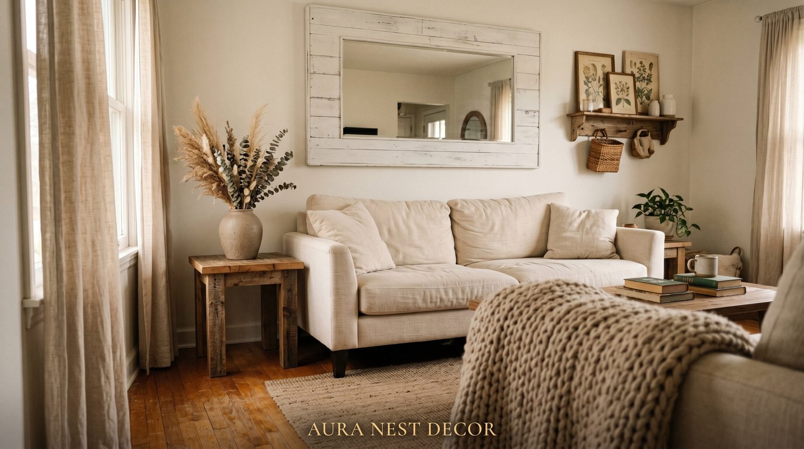
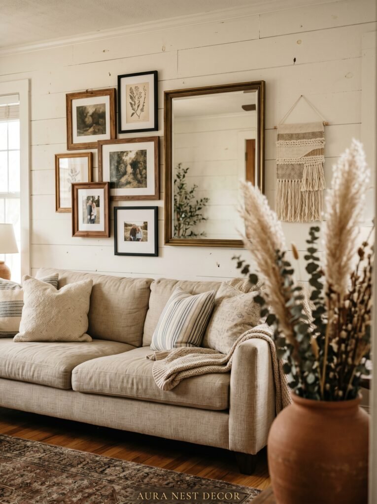
2. The Oversized Shiplap Mirror That Every Farmhouse Living Room Secretly Needs
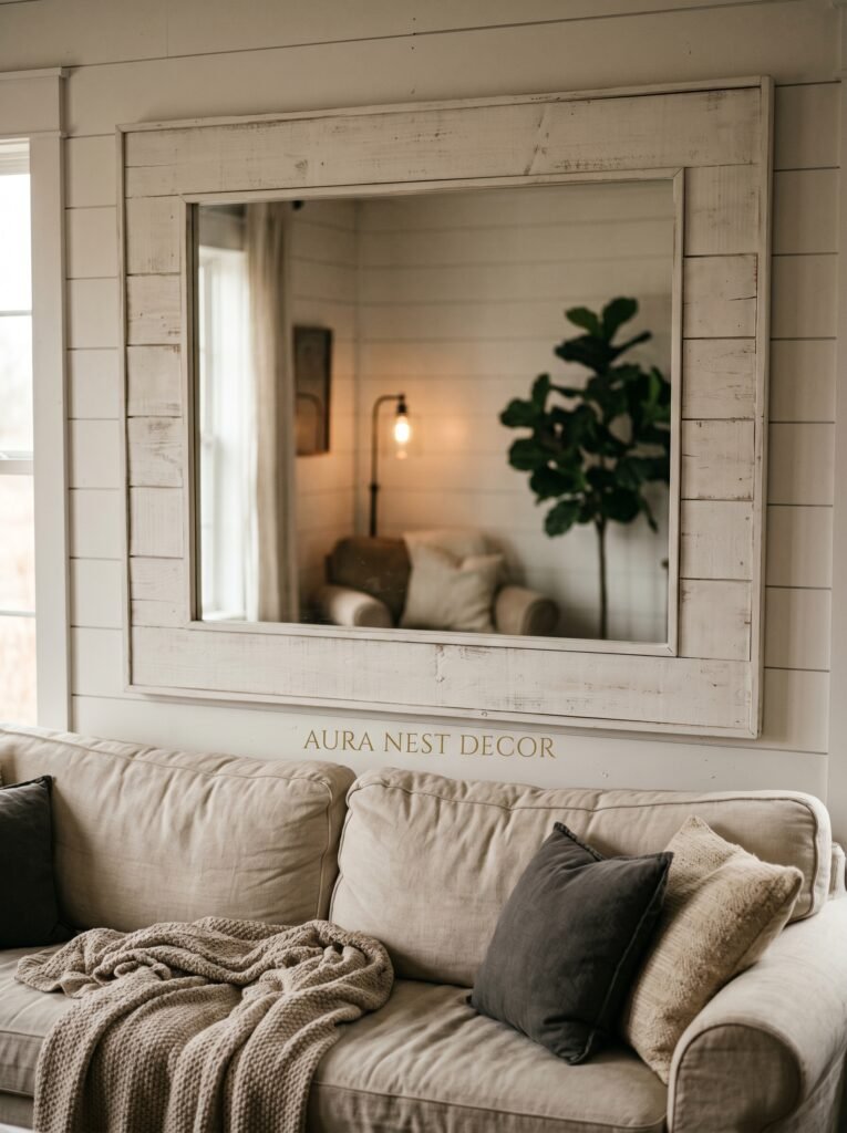
Mirrors above a couch are having a serious moment, and not the ornate gilt-framed kind. The farmhouse version is wide, architectural, and usually framed in raw or whitewashed wood — sometimes arranged in a grid of smaller panes, sometimes as one generous rectangle that reflects the whole room back at you.
What makes a mirror work so well above a sofa? Light. It catches the lamp in the corner, the afternoon sun sliding through a window, the flicker of a candle on the coffee table. A room with a large mirror feels twice as alive, especially in the evening when you’re watching the amber glow of a lamp bounce off its surface.
For modern farmhouse specifically, look for mirrors with thick, chunky frames — raw oak, stained pine, or a distressed white finish. Window-pane style mirrors (the ones divided into six or nine rectangular sections by wooden mullions) are a classic choice that feels both old and very current. They reference barn windows without being costume-y about it.
Size, again, is everything. For a standard sofa, a mirror in the 40-to-60-inch width range hits the sweet spot. Go wider if you can afford it and your wall allows it. You almost can’t go too big with a mirror in this spot.
—
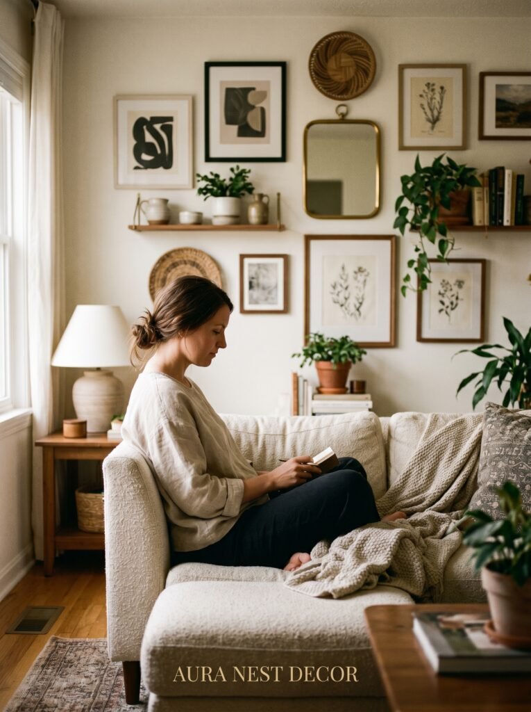
3. Gallery Walls That Actually Look Good — Because Most of Them Don’t
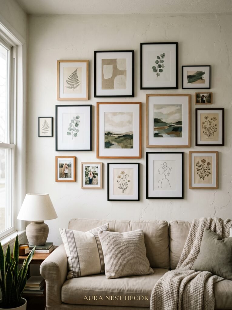
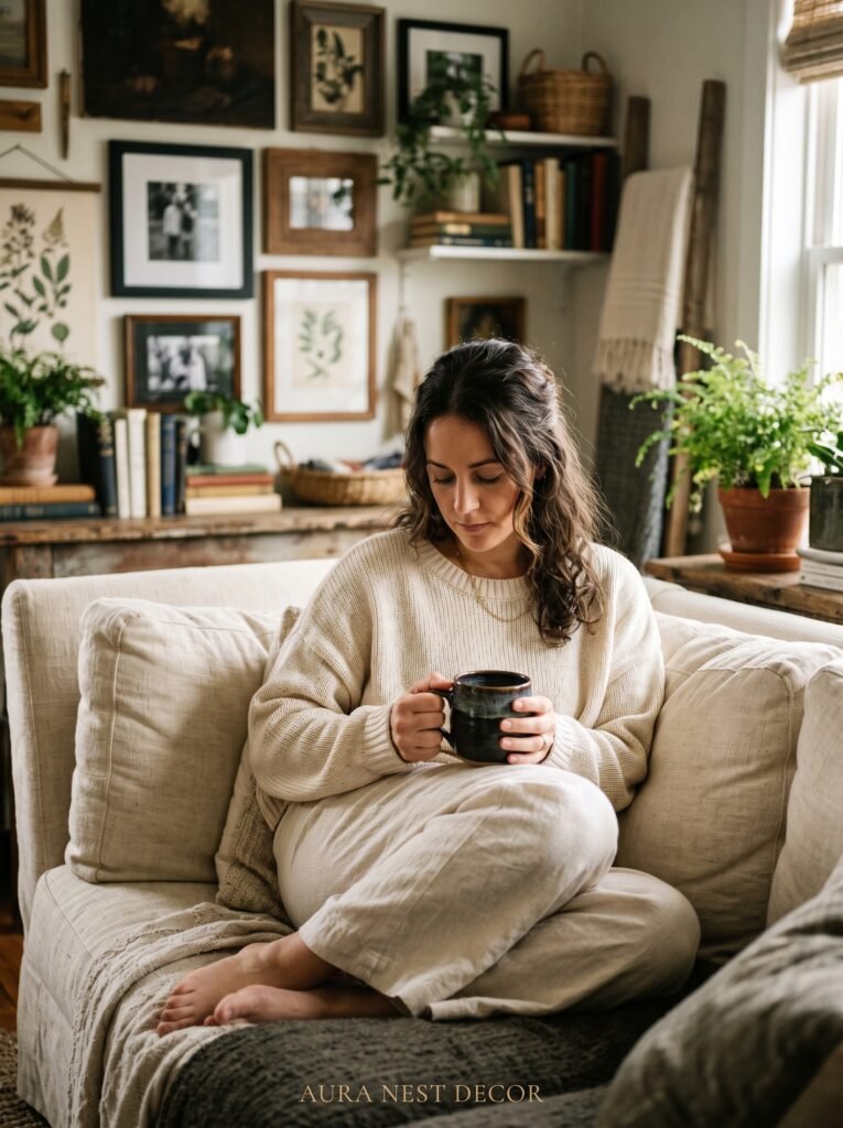
A gallery wall done badly looks like someone threw frames at the wall and hoped for the best. You’ve seen them. Frames of wildly different visual weights, no consistent color story, prints that range from a wedding photo to a motivational quote to a piece of abstract art that doesn’t know what it wants to be.
The modern farmhouse gallery wall has restraint built into it by design. Stick to a palette: cream, warm black, aged wood, and muted tones. Limit your frame colors to two — usually black and natural wood, or all black, or all white with varying sizes. The contents of the frames matter too. Think botanical prints, hand-lettered quotes in a clean font, black-and-white family photos, topographical maps, simple line drawings.
Layout is the thing most people get wrong. Before you put a single nail in the wall, lay your frames on the floor and arrange them there. Take a photo. Look at it from a few feet away. Adjust. The goal is for the grouping to feel balanced without being symmetrical — a distinction that sounds subtle but changes everything about how the finished wall reads.
One more thing: leave breathing room between frames. Three to five inches between frames is the sweet spot. Crowding kills the effect.
—
4. The Salvaged Wood Sign Trend — When It Works and When It Absolutely Doesn’t
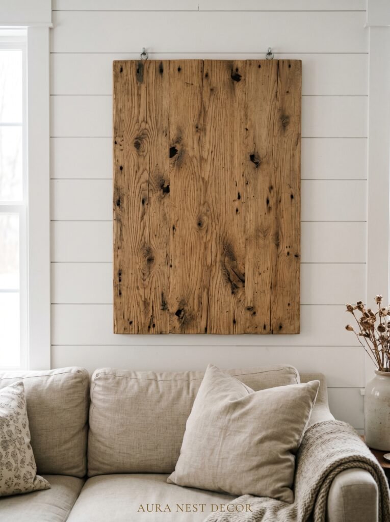
Let’s be direct. The word “GATHER” stenciled onto a plank of reclaimed barn wood peaked somewhere around 2017 and has not aged well.
But salvaged wood signage isn’t inherently the problem. The execution is. When it’s done with restraint and real craft, a wooden sign above a sofa can be genuinely stunning — something that feels like it was found rather than purchased from a big-box retailer’s seasonal home section.
What works: minimal text (or none at all), quality wood with real grain and character, hand-painted or hand-burned lettering in a font that has actual personality. House numbers. A meaningful date. A single word that your family actually lives by, not one a marketing team decided would sell. Coordinates of a meaningful place.
What doesn’t: anything mass-produced that twelve of your neighbors also own. A sign with distressed letters that aren’t actually distressed — just printed to look that way. Text that tries too hard to be wholesome.
The best version of this trend is when the wood itself is the star. A large plank with beautiful grain, a natural live edge, or reclaimed texture that carries decades of character in its surface. That kind of wood doesn’t need words.
“Buy the thing that would still feel right in your home ten years from now.”
—
5. Layering — the Technique That Makes a Wall Look Like It Was Styled by Someone Who Actually Knows What They’re Doing
Layering is the single most underused technique in home decor, and it is the reason some rooms look like they came from a magazine while identically furnished rooms look flat and forgettable.
Above a couch, layering means placing objects at different depths, not just different heights. A large mirror leaned against the wall with a smaller framed print in front of it. A wooden shelf mounted on the wall with a framed print resting on it alongside a small vase of dried pampas grass. A canvas leaned rather than hung, with a string light or a trailing vine in front.
The layered look signals that a space was lived in and loved rather than professionally staged. It reads as personal. And in modern farmhouse design, personal is everything — the style is rooted in the idea of a home that has accumulated meaning over time, not one that was finished in an afternoon.
Practically speaking: anchor with your largest piece. Then layer in a medium piece, angled or overlapping slightly. Then add small, three-dimensional objects — a candle, a small ceramic, a dried botanical — in front. The result has depth that flat arrangements simply can’t achieve.
—
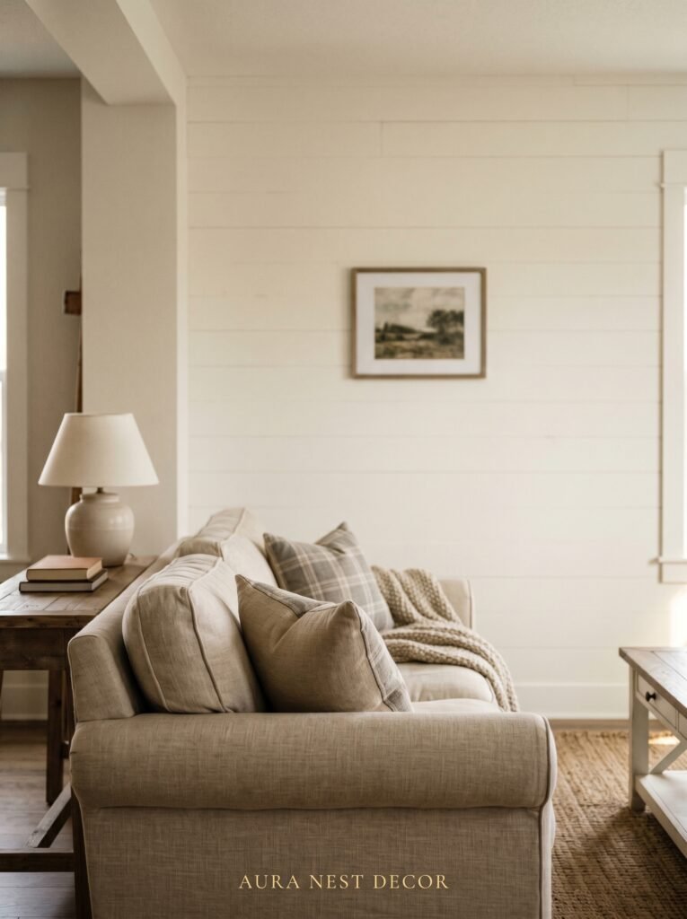
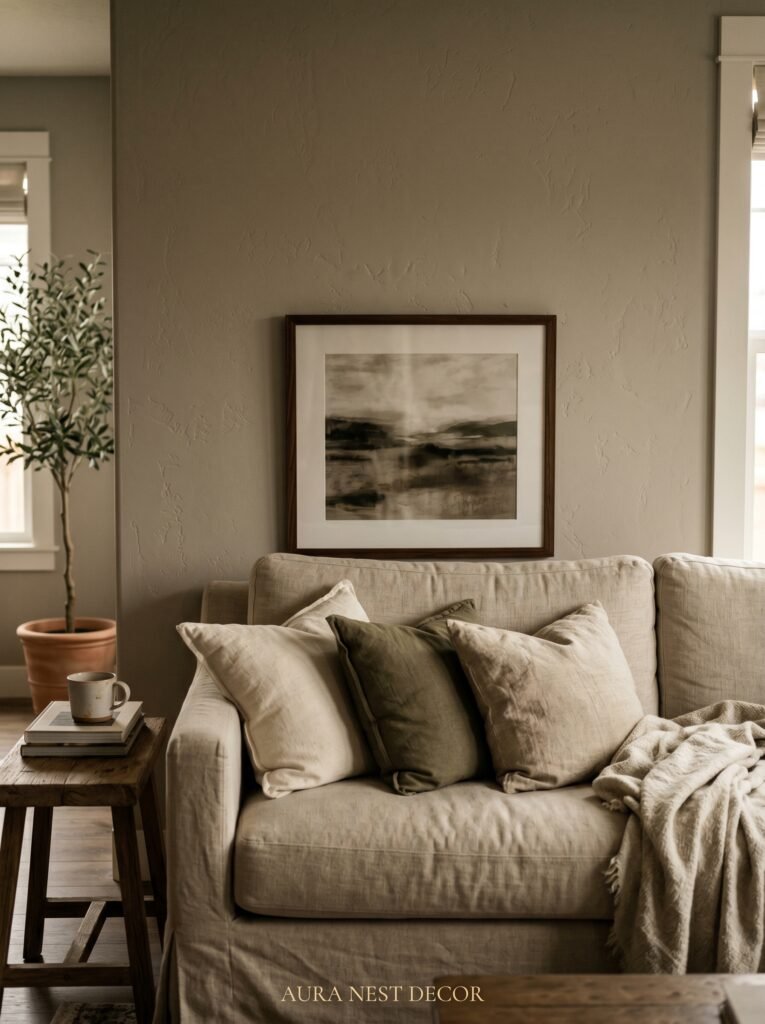
6. The Color That Keeps Showing Up in Every Beautiful Farmhouse Living Room Right Now
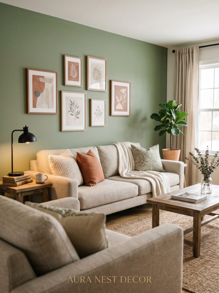
Warm cream. Not white — cream. Not beige — cream.
The difference is critical. White walls with white frames and white accents creates a look that photographs beautifully and lives coldly. Beige tips toward dated. But warm cream — the color of fresh bread crust, of old linen, of plaster that has seen some sun — creates an atmosphere that feels both contemporary and deeply rooted.
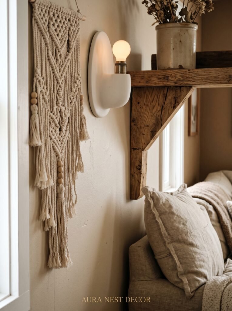
For the wall above your couch, this translates to: frames in off-white or antique white, art prints with warm undertones rather than cool grays, textiles in the vicinity of linen and oat. Woven pieces like macramé or a simple cotton tapestry (and I use that word carefully — I mean a woven textile, not a printed design) pick up this warmth beautifully.
If you’re working with darker walls — a dusty sage, a warm charcoal, a deep forest green — the rule inverts slightly. Your wall decor should include at least one element in a light, warm neutral to keep the eye from getting stuck in darkness. A cream linen print, a bleached wood frame, a pale dried flower arrangement. Something that breathes.
—
7. Dried Botanicals and What to Do With Them Before They Become a Cliché
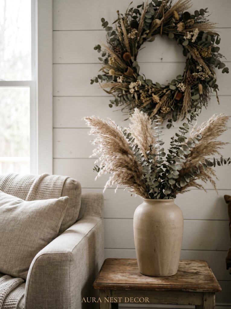
Pampas grass had its moment. It had approximately four moments. And while it is genuinely beautiful, it has become so ubiquitous in modern farmhouse spaces that walking into a room with a pampas grass stem in a woven vase now feels like a mood board come slightly too literally to life.
That said — dried botanicals above a couch can be extraordinary when chosen thoughtfully. Bundles of dried lavender hanging from a hook. A framed pressed fern. A large-scale botanical print in a hand-finished wooden frame. Lunaria (the silvery coin plant) arranged in a tall vase on a floating shelf. Dried wheat in a galvanized metal vessel.
The key is specificity. Don’t reach for the most recognizable farmhouse botanical. Reach for the one that actually means something to you, or the one that surprises. Proteas. Cotton stems. Dried hydrangeas (which age beautifully from blue-purple to antique green to dusty rose — a full year of color in one dried bunch).
Hung directly on the wall, a large bundle of dried botanicals tied with raw linen twine makes a remarkably striking statement. No frame required.
“The most beautiful rooms are decorated with things the owner actually loves, not things they thought they were supposed to love.”
—
8. Floating Shelves — the Decor That Lets You Redecorate Without Touching a Single Nail
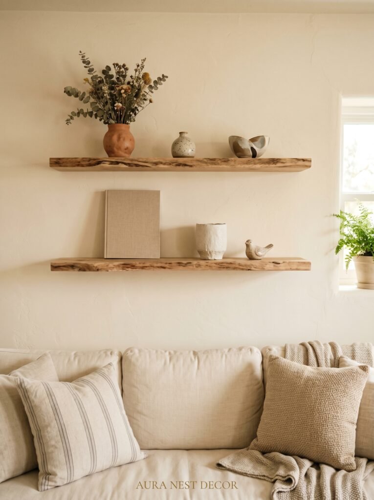
The smartest thing you can add above a couch isn’t art. It’s a shelf.
One well-placed floating shelf — or two, staggered at different heights — turns your wall into a living display that you can change with the seasons, your mood, or the arrival of something beautiful at a flea market. The commitment of wall art can feel paralyzing. A shelf gives you flexibility.
For modern farmhouse, the shelf itself matters as much as what goes on it. Raw wood with visible grain. A thick plank, not a slim modern ledge. Iron brackets in a matte black or oil-rubbed bronze finish that contrast cleanly against the wood and the wall.
What lives on the shelf: a large-scale print leaning against the wall, a small ceramic jug, a stack of beautiful hardback books, a candle in a simple vessel, a trailing string of ivy or a small potted plant. The objects should vary in height. One tall thing, one medium, one low. Negative space is allowed — even desirable.
The one thing to avoid: overcrowding. A shelf above a couch that’s packed with too many objects looks anxious. Give each piece room to be seen.
—
9. The Case for Going Big — One Single Statement Piece Instead of a Gallery
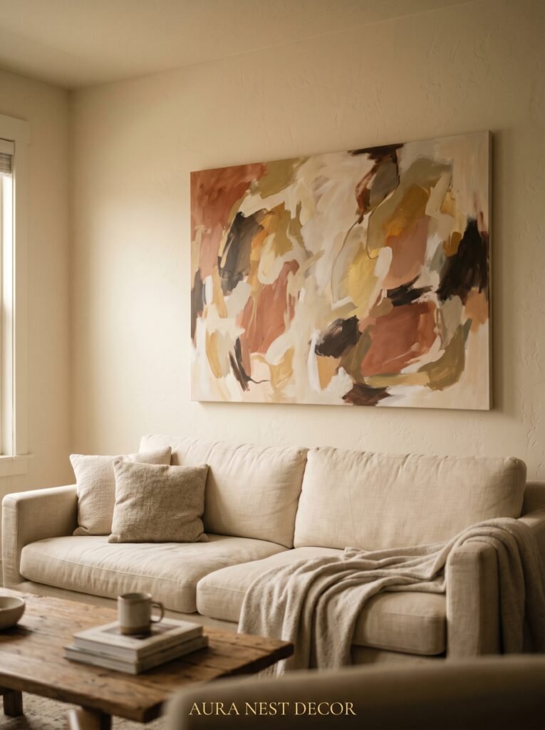
Sometimes the most confident choice is the simplest one.
One enormous piece of art, centered above the sofa, filling the wall with a single strong image or texture, makes a statement that a gallery wall can rarely match. There’s something quieter about it. Less to look at, which means you actually look — really look — at the thing on the wall.
In modern farmhouse terms, this might be: a large canvas in warm neutral tones, abstract but anchored. A wide landscape print in a natural wood frame. An oversized botanical drawing. A linen-mounted antique map. A wooden sunburst mirror so large it seems almost architectural.
The math: for a sofa in the 72-to-84-inch range, a single piece should ideally be 40 to 48 inches wide at minimum. In a room where everything else is layered and textured, a single large statement piece gives the eye somewhere to rest. That’s not minimalism. That’s confidence.
—
10. What Happens When You Hang Something Too Low — and Why It Keeps Happening
This is the most common mistake made with wall decor above sofas, and it’s responsible for more awkward rooms than bad color choices and mismatched furniture combined.
The general rule: the bottom of your artwork or arrangement should sit 8 to 10 inches above the top of the sofa back. Not 4 inches — that makes the decor look glued to the furniture. Not 18 inches — that disconnects the decor from the sofa entirely, leaving a no-man’s-land of blank wall between them.
Eight to ten inches. Measure it. Then hang.
The reason people hang low is understandable — when you’re standing in front of the wall holding the piece, instinct says to keep it at eye level. But you’ll be sitting on that sofa, not standing. Sit down, look up, and ask yourself where your eye lands naturally. That’s where the center of your arrangement should be.
—
11. Mixing Textures — the Detail That Separates a Good Room from a Great One
Modern farmhouse design is, at its core, a conversation between textures. Rough and smooth. Matte and reflective. Organic and geometric. The wall above your couch is where that conversation should be loudest.
A gallery wall that’s all flat frames and prints is fine. But add a woven textile, a hammered metal hook, a ceramic wall hanging — something with actual three-dimensional texture — and the wall starts to feel alive.
Concrete, ceramics, wicker, linen, raw metal, aged wood: these are the materials of the style. Incorporate at least one tactile, three-dimensional element into your wall arrangement and notice what happens. The eye moves differently. The space warms up in a way that no amount of warm-toned paint can replicate.
A simple macramé piece, for example — not the enormous boho wall hangings of a few years ago, but a smaller, tighter-woven piece in natural cotton — adds both texture and the work of someone’s hands. That handmade quality is central to what modern farmhouse actually means when it’s done with intention.
—
12. The Unexpected Objects That Look Incredible Above a Couch but Nobody Talks About
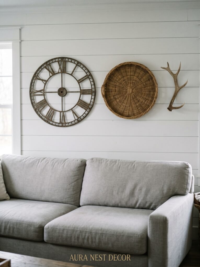
Old window frames hung on the wall. A collection of antique corbels arranged in a row. A set of hand-thrown ceramic plates in varying earthy glazes. A mounted antique clock face — just the face, not the mechanism. A piece of vintage architectural ironwork.
Modern farmhouse is generous in what it accepts. The provenance of an object — where it came from, what it was — matters more than whether it was designed to be wall art. Some of the most striking walls I’ve ever seen were built around a single inherited object, something from a grandparent’s kitchen or a flea market find, surrounded by pieces chosen to honor it.
That’s the spirit of the style, really. Not a mood board. Not a look to be purchased and assembled. A story being told slowly, object by object, until the wall feels completely and unmistakably yours.
—
❓ FAQ
Q: How high above the couch should wall decor be hung? A: The bottom of your art or arrangement should sit 8 to 10 inches above the top of the sofa back. This keeps the decor visually connected to the furniture without looking squeezed. If you have very high ceilings, you can push toward 12 inches, but don’t go further than that or the connection between sofa and wall is lost.
Q: What size art looks best above a sofa? A: As a general guide, your art or gallery grouping should span roughly two-thirds of your sofa’s width. For a standard 84-inch sofa, that means aiming for around 56 inches of visual width. Single pieces should be at least 40 inches wide to hold their own in the space — anything smaller tends to look underpowered above a full-size sofa.
Q: Can I mix different frame colors in a modern farmhouse gallery wall? A: Yes, but with limits. Two frame finishes is the comfortable maximum — black and natural wood is a classic farmhouse pairing that works brilliantly. Three or more frame colors starts to look unintentional rather than curated. Consistency in frame color is what ties a gallery wall together even when everything inside the frames is different.
—
💭 Final Thoughts
The wall above your couch is one of the most personal statements your home makes — not because it’s the grandest space, but because it’s the one everyone sits beneath, looks up at, and absorbs without always realizing it. Modern farmhouse gives you such generous permission to be specific, to be collected, to be imperfect in all the right ways.
Fill it with things that are actually yours.
And when you finally get it right — when you step back and the wall feels settled and warm and true — I wonder if you’ll understand what I mean when I say that a room can actually exhale.


