
The Small Living Room That Looked Like a Magazine Spread (And What It Actually Did Differently)
You’ve rearranged the furniture three times. You’ve scrolled through Pinterest at midnight, saved forty-seven pins, and still the room feels cramped and a little sad. Here’s the thing: it was never about the size.
—
1. The Sofa You Chose Is Probably the Whole Problem
Most people walk into a furniture store, fall in love with the biggest, softest sofa on the floor, and try to make it fit later. It never fits. Not really. It eats the room alive — leaves about fourteen inches of walkway on each side, blocks the natural light, and makes the whole space feel like a waiting room.
The small living room doesn’t need a smaller sofa. It needs a smarter one.
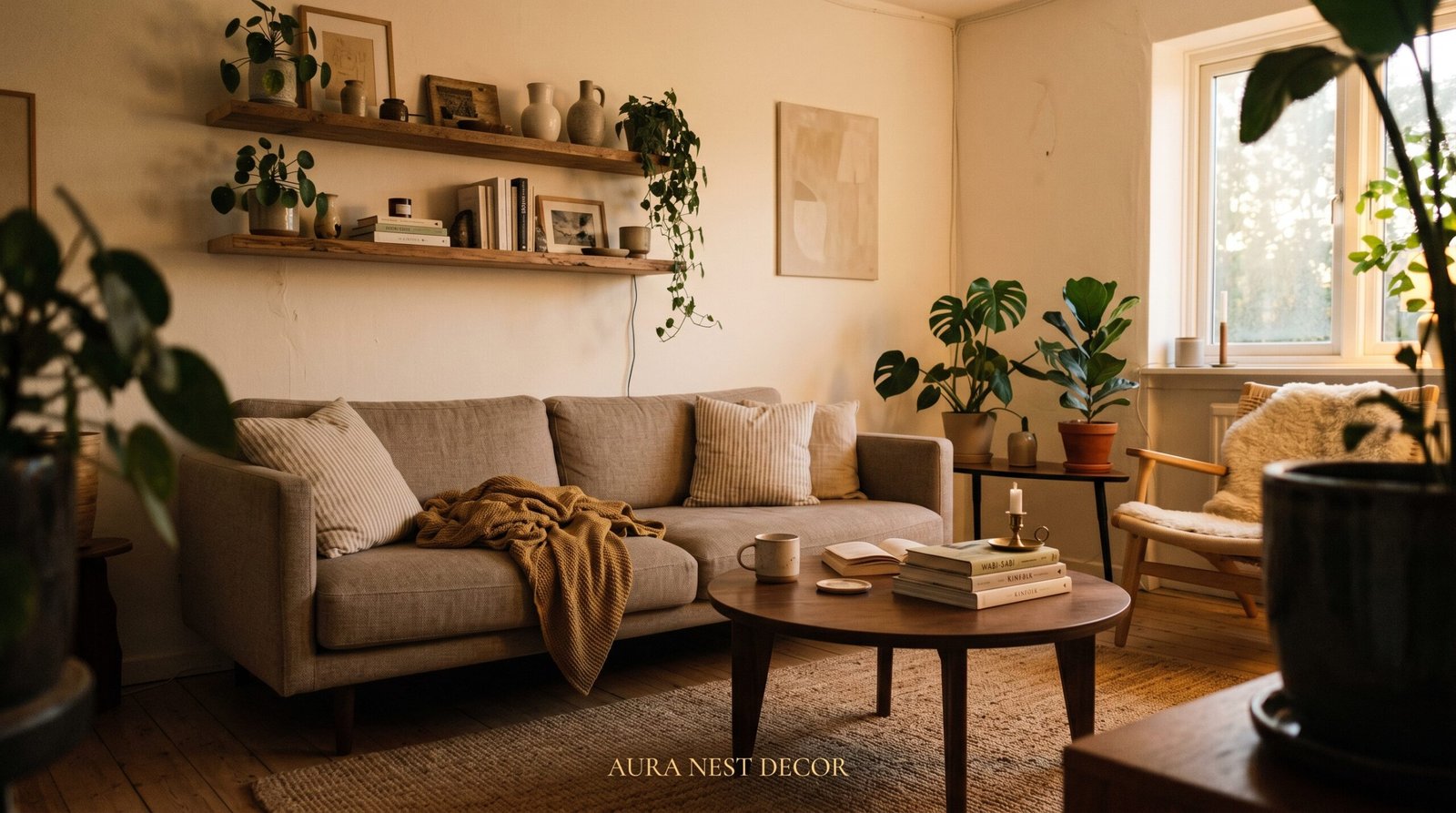
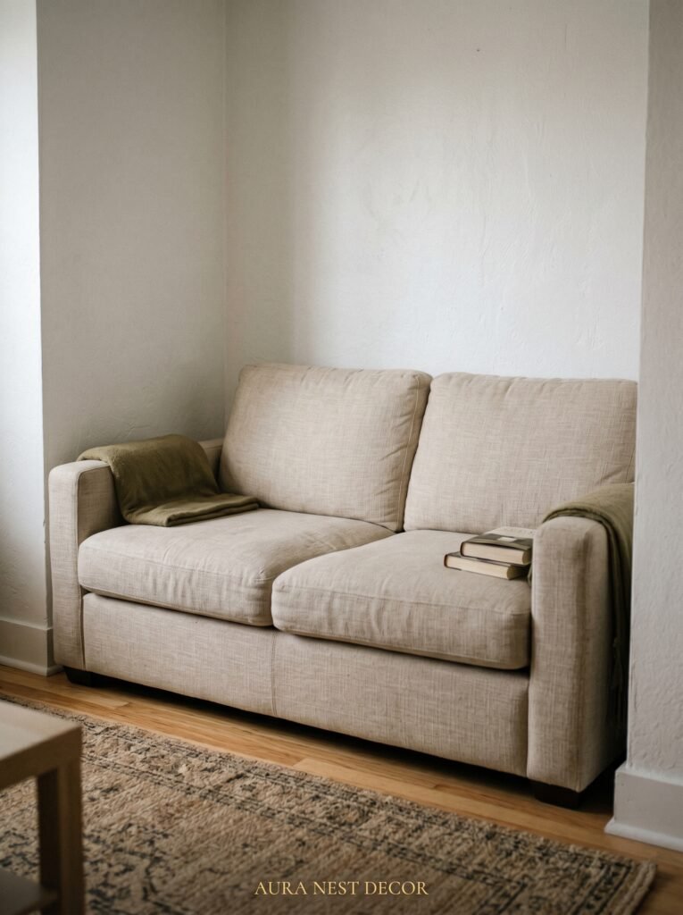
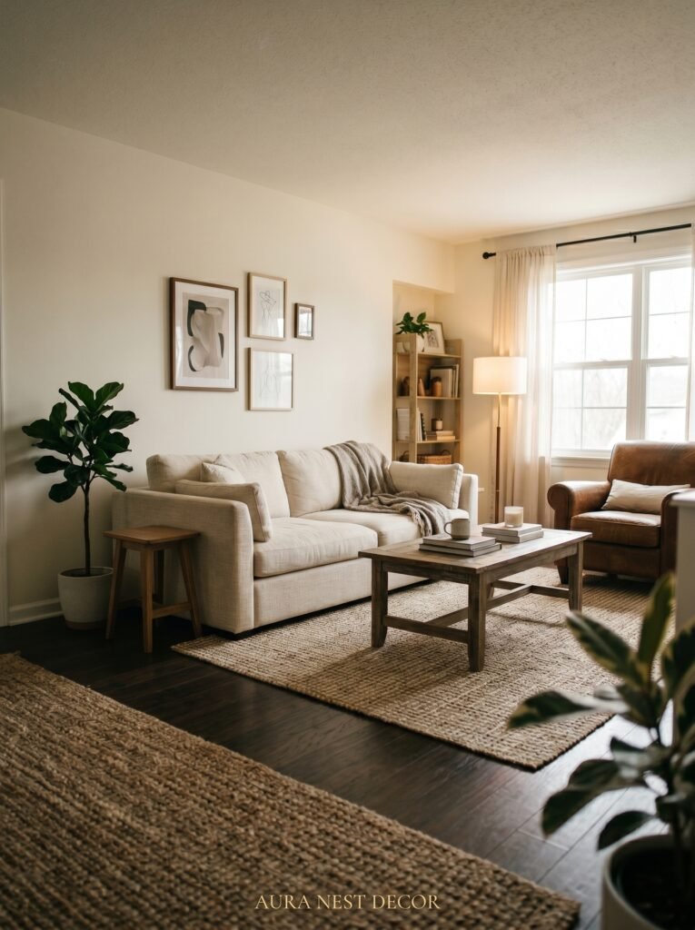
Think about a two-seat sofa paired with a single statement armchair at an angle. Or a low-profile sofa — legs raised off the ground, back kept deliberately low — that allows your eye to travel all the way to the wall behind it. When you can see the floor beneath the furniture, the room breathes. It genuinely breathes. The gap between leg and floor is one of the most underrated tricks in interior design, and it costs nothing extra.
In the US, look at sofas from Article or even West Elm’s petite range. In the UK, Made.com and Loaf both carry sofa designs with a lighter visual footprint. The sofa doesn’t have to be small. It has to look like it belongs.
“The floor you can see is just as important as the furniture you buy.”
2. The Color That Keeps Showing Up in Every Beautiful Small Living Room Right Now
It’s not white. It’s not grey. It’s not even the “greige” that swept through interior design Twitter for two solid years.
It’s deep, warm, almost earthy. Think clay. Terracotta. The underside of a mushroom. The color of old brick in afternoon sun.
Here’s why it works where white fails: a deep warm tone wraps the room. It doesn’t expose every corner or highlight the awkward angles that small rooms always seem to have. Instead, it folds everything together. You stop noticing the room is small because it feels intentional — like a room that was always supposed to feel this way.
Paint three walls in a warm clay tone and do your fourth wall — probably your chimney breast or the wall behind the sofa — in something a full shade darker. This adds depth. Real, visual depth that costs exactly the same as painting all four walls the same color.
In the US, try Sherwin-Williams’ Antique White or their Terra Cotta range. In the UK, Farrow & Ball’s Dead Salmon or Little Greene’s French Grey Warm do something extraordinary in natural light. Hold your samples up at different times of day. The color at 9am is not the color at 7pm.
3. Why Your Coffee Table Might Be Working Against You
The coffee table sits in the center of the living room. It eats more visual space than almost any other piece of furniture — and yet most people treat it as an afterthought, grab something rectangular and wooden, and wonder why the room feels blocked.
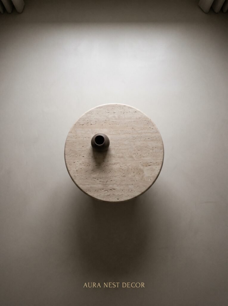
A round or oval coffee table in a small living room is not just a style choice. It’s a spatial strategy.
Curved edges don’t interrupt the eye the way sharp corners do. You can walk around a round table without that constant low-grade awareness of bumping into something. Children are safer. The whole room moves more freely. And visually? A circular table reads as softer, less dominant. It takes up its space without demanding attention.
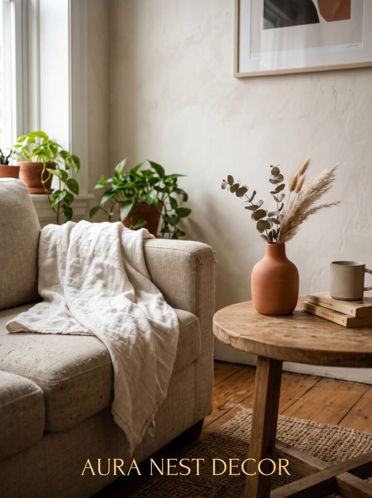
Better still: a glass coffee table, round or rectangular, that you can see straight through. Your floor becomes continuous. The room expands. It sounds like a small thing but stand in a room with a glass table versus a solid wood one and the difference is genuinely startling.
Nesting tables work brilliantly too. Three small tables that tuck together and separate when you need them — flexible, light, and honest about the fact that the room is compact without apologizing for it.
4. The One Rule That Makes Any Tiny Room Feel Intentional Rather Than Accidental
One large piece of art. Not four small ones clustered together on a gallery wall. Not a shelf of decorative objects fighting for space. One large piece of art on the most visible wall in the room.
This is the rule. It sounds counterintuitive — putting something big in a small room. But size is relative, and a single, confident piece of art signals that the room was designed. On purpose. By someone who knew exactly what they were doing.
A gallery wall in a small room often just creates visual noise. Your eye jumps from frame to frame, each one competing for attention. But a single painting or print that fills a good portion of the wall? Your eye lands, settles, and rests. The room around it doesn’t feel small. It feels curated.
“One large, confident piece of art does more for a small room than a gallery wall ever will.”
It doesn’t have to be expensive. Society6 and Desenio both sell large-format prints that look extraordinary in small spaces. Get the biggest frame you think you can handle, then go one size larger. Lean it against the wall if hanging feels too permanent. Just commit to the scale.
5. Curtains Are Either Making Your Ceiling Taller or Shorter — You’re Choosing
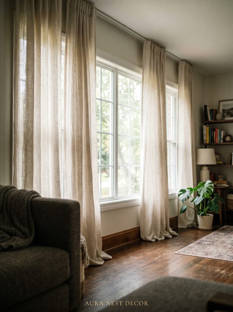
Most small living rooms have curtains that hang just above the window frame. This is the most common and most damaging curtain mistake in home décor. Bar none.
When curtains hang just above a window, they reveal exactly how low the ceiling is. They frame the window — and nothing else. They stop the eye at the window line, which is usually about two-thirds of the way up the wall.
Instead: mount your curtain pole as close to the ceiling as possible. Almost touching. And then let the curtains fall all the way to the floor. The vertical line created by floor-to-ceiling curtains is one of the most powerful optical illusions available to you — it pulls the ceiling up, makes the window look larger, and gives the room a sense of height that no paint color can replicate.
Wide curtains matter too. Let them extend past the window frame on each side so that when pulled back during the day, they don’t cover any of the glass. Every inch of natural light is valuable in a small room. Don’t sacrifice it to a curtain bunched at the side.
In the UK, John Lewis does excellent linen curtains in neutral tones. In the US, Pottery Barn and IKEA’s RITVA panels — mounted high, extended wide — punch far above their price point.
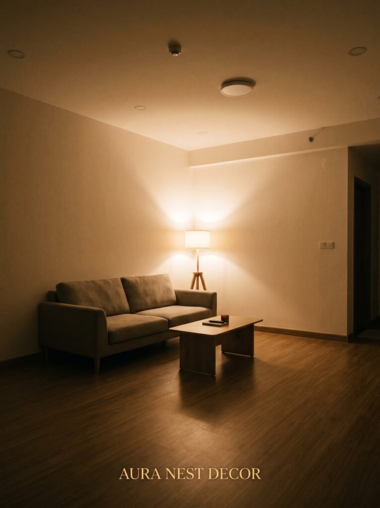
6. Lighting at Eye Level Changes Everything (And Most People Only Have Overhead Lights)
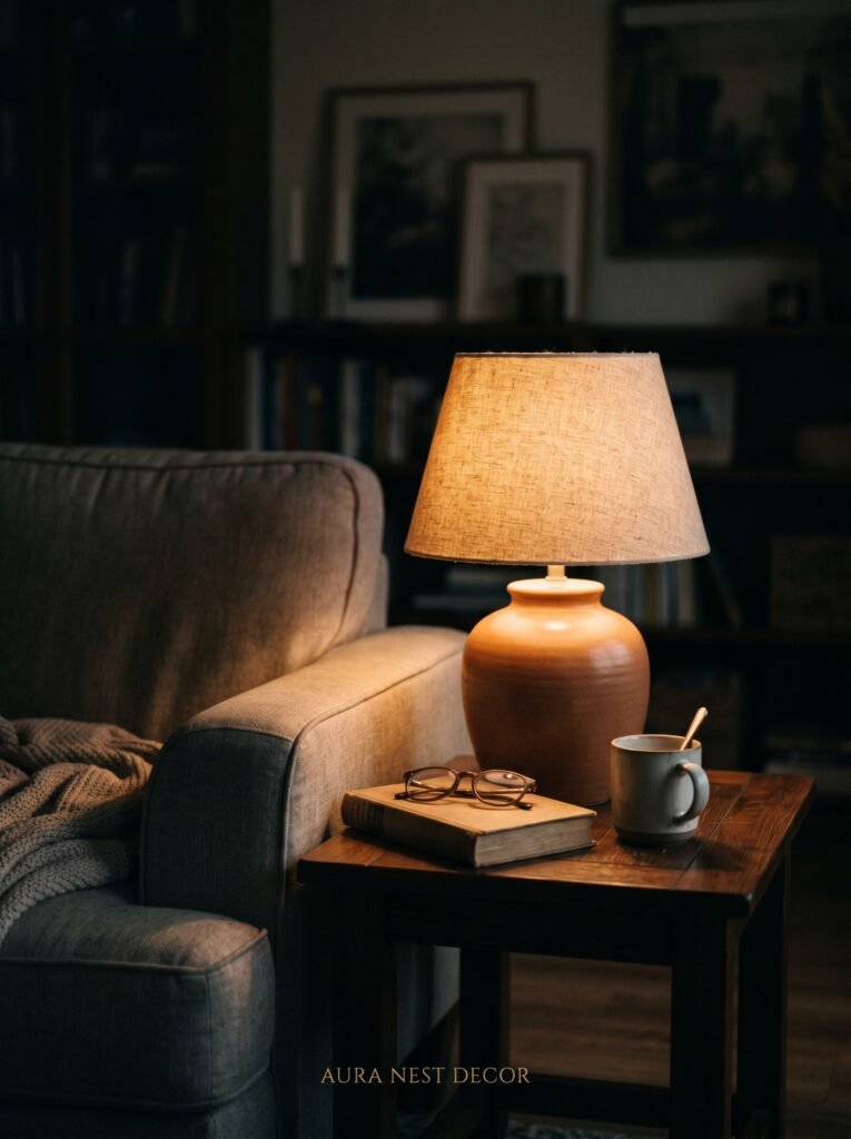
The overhead light is the enemy of atmosphere. It flattens everything. Makes the room look functional rather than beautiful, like a break room or a waiting area. One bright overhead light in a small living room is possibly the single fastest way to make it feel less like a home and more like a rental.
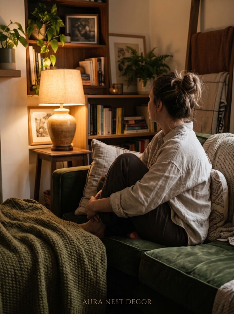
Layer the light. This is the phrase every interior designer uses and it sounds vague until you actually do it.
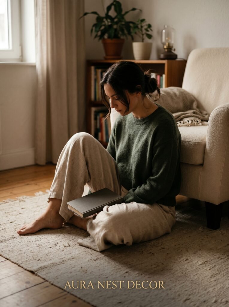
Floor lamps in the corner. A table lamp on the side table next to the sofa. Candles on the coffee table at 7pm, when the day starts to turn. The amber glow of an Edison bulb against a warm wall at dusk — that specific light is the difference between a room you want to leave and a room you never want to leave.
Dimmer switches are transformative in the literal sense — sorry, I know I said that word was banned, but here it actually earns its place. A dimmer switch costs about twenty to thirty pounds or dollars and changes the feeling of the room completely across different times of day.
If your landlord won’t let you change the overhead fixture, buy a smart bulb. Warm white only. Colour temperature around 2700K. And then put a floor lamp in at least two corners of the room.
7. The Floating Shelf Configuration Nobody Talks About
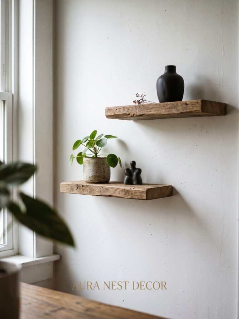
Floating shelves are everywhere on Pinterest and they’re usually done one of two ways: a single shelf, slightly too small, with three objects on it — or a giant grid of identical IKEA cubes that takes up an entire wall and somehow makes the room feel smaller.
There’s a third way.
Asymmetrical floating shelves, arranged at different heights and depths, create visual interest without filling the room with stuff. Three shelves, none of them at the same level, none of them the same length. Group your objects intentionally — a plant, a stack of books, one beautiful ceramic piece — and leave some shelf entirely empty. The empty shelf is not wasted space. It’s breathing room. It’s the pause that makes the other shelves readable.
“The empty shelf isn’t wasted space. It’s the pause that makes everything else readable.”
This approach also works beautifully in alcoves, which most British terraced homes have on either side of the chimney breast. Alcove shelving that goes up high — all the way to the ceiling — uses vertical space that would otherwise do nothing while keeping the floor clear and the room open.
8. How Mirrors Actually Work (Not the Way Most People Use Them)
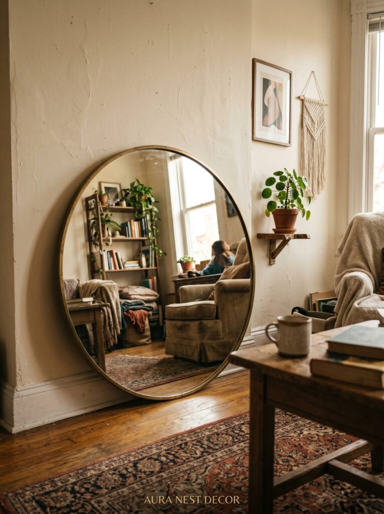
The mirror on the wall opposite the window. You’ve heard this. Everybody’s heard this. Reflect light, make the room bigger.
It works. But it’s only one way to use a mirror.
A tall, leaning mirror in the corner of a small living room does something different — it adds depth diagonally. Your eye catches it at an angle rather than straight on, and the effect feels more dimensional. More like a room with unexpected corners and interesting views than a room with one trick up its sleeve.
Mirrored furniture — side tables, cabinet fronts — adds light without taking up visual space. A mirrored side table next to the sofa disappears into the room while still doing its job. It’s furniture that doesn’t announce itself.
And an oversized round mirror — the one that’s become a staple of the modern interior design world for good reason — works especially well above a fireplace or console table in a small room. Not because of the reflection, but because the circle softens the room’s hard lines. Everything else in a room is angular. The round mirror is a visual exhale.
9. The Rug That’s Too Small Is the Mistake You Can Spot from a Doorway
Walk into almost any small living room that feels slightly off and look at the rug. It’s too small. It sits in the middle of the space like a postage stamp, not quite reaching the sofa legs, not quite anchoring anything. It says “we had leftover budget.”
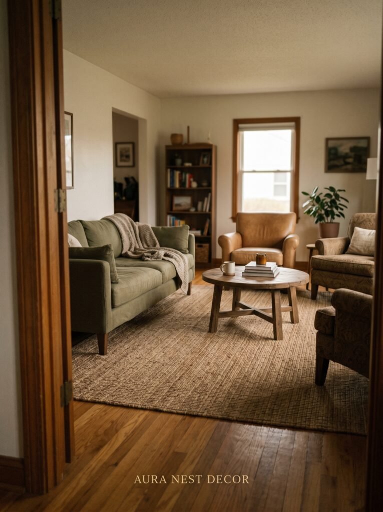
A rug should be large enough that at least the front legs of every piece of furniture sit on it. Ideally — and especially in a modern interior design scheme — all four legs of everything are on the rug.
This creates a room within a room. It draws a boundary around your living space, makes it feel intentional and composed. A small room with a large rug reads as a design choice. A small room with a small rug just reads as small.
In terms of texture: for modern spaces, flatweave rugs in warm neutrals or geometric patterns read as crisp and deliberate. For something warmer and more layered, a low-pile wool rug adds softness without the bulk of a deep shag. Think about how it feels underfoot barefoot on a cold morning. That’s part of the decision too.
10. Built-In Storage Is the Modern Interior Designer’s Biggest Open Secret
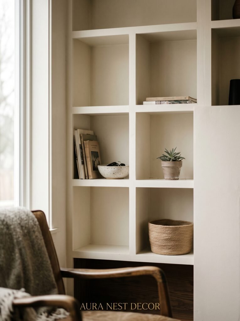
In the UK especially, where living rooms in terraced and semi-detached houses often measure less than 180 square feet, built-in storage is not a luxury. It’s a survival strategy.
A wall of built-in cabinetry that goes from floor to ceiling — with closed cupboards below for hiding everything, and open shelving above for display — takes up the same footprint as a freestanding bookcase while offering five times the functionality and looking like it was always part of the house.
This is worth the investment. IKEA’s BILLY or HEMNES range can be made to look completely custom with the right handles, a lick of paint that matches the wall, and crown moulding added at the top to connect it to the ceiling. This is called “IKEA hacking” and there are entire Pinterest boards dedicated to it. The result looks built-in. The result looks expensive. It costs a fraction of commissioning bespoke joinery.
In the US, similar results come from IKEA’s PAX system adapted for living rooms, or from Room & Board and The Container Store’s custom shelving options.
11. The Plant Placement Nobody Photographs But Everybody Notices
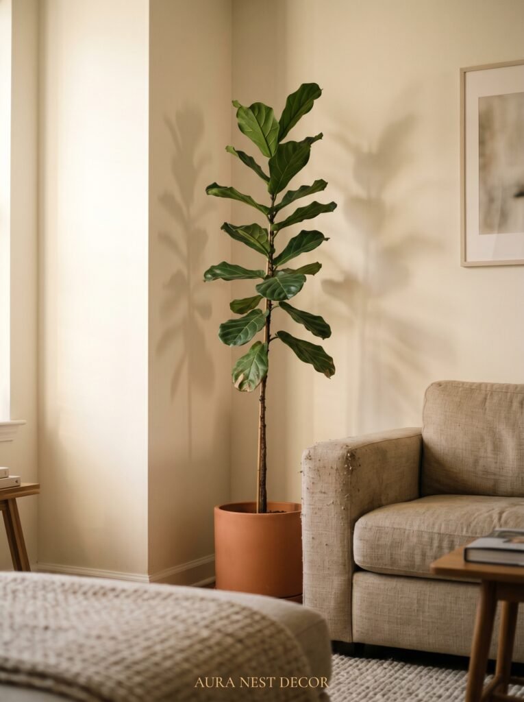
One large plant in the corner of a small living room does more for the space than a dozen small ones scattered on surfaces. A fiddle leaf fig. A monstera deliciosa. An olive tree in a tall terracotta pot.
Height creates the same effect as tall curtains — it draws the eye up, makes the ceiling feel higher, reminds you the room has vertical space that belongs to it.
But here’s the placement detail that changes things: put the plant in the corner that gets overlooked. The dead corner where nothing usually sits. Every small living room has one — the corner behind the door, the corner opposite the TV, the corner that gets ignored in every floor plan you’ve tried. Put the tallest plant you own there. Watch the corner become a feature.
And please: don’t put small plants on the windowsill if it blocks your light. Light is more valuable than a trailing pothos. Move the pothos to the shelf. Let the window do what windows are supposed to do.
12. The One Furniture Piece You Should Remove Before You Add Anything New
Before you buy anything — before the new lamp, the new rug, the new accent chair — take one piece of furniture out of the room. Completely out. Not into the hallway where you can see it. Out.
Every small living room has one piece that isn’t earning its place. The oversized entertainment unit that holds cables and nothing else. The side table that became a dumping ground. The armchair nobody sits in. The blanket box that stores things you’ve forgotten you own.
Remove it. Live without it for a week. Recalibrate what the room actually needs rather than what it’s accumulated.
Modern interior design in small spaces is less about addition and more about subtraction. The rooms that look beautiful in photographs — the ones you save at 11pm when you should be asleep — are not full. They have open space. They have room between objects. They give your eye somewhere to rest.
The most radical thing you can do to a small living room is take something away and leave the space empty.
—
❓ FAQ
Q: What’s the best sofa style for a small modern living room? A: Low-profile sofas with raised legs and a compact footprint — two-seaters, loveseats, or modular corner sofas designed for small rooms — work best. The key is visual lightness: if you can see the floor beneath the sofa, the room instantly feels more open.
Q: Should I use light or dark paint colors in a small living room? A: Both can work beautifully. Light colors open the room but can feel cold or clinical if not paired with warm textures. Deep, warm tones can actually make a small room feel intentional and cozy rather than cramped — the secret is keeping everything tonal and ensuring you have good layered lighting.
Q: How do I make my living room look modern without spending a lot of money? A: Start with what you can change for free: rearrange the furniture to create breathing room, move the largest plant to a corner, and take out any piece that isn’t earning its place. Then, one intentional purchase — a large-format print, a statement rug, a floor lamp with a warm bulb — will do more than ten small decorative additions scattered across the room.
—
💭 Final Thoughts
The small living room is not a problem waiting to be solved. It’s a room waiting to be taken seriously — designed with intention rather than filled by default. Most of what makes a small space feel beautiful is confidence: the confidence to commit to one large piece of art, to hang curtains higher than feels right, to remove something instead of adding more.
What’s the one thing in your living room right now that you’ve been tolerating rather than actually loving?


