
The Black and White Photo Wall That Made My Living Room Look Like It Belonged in a Magazine
You know that feeling when you walk into someone’s home and there’s a wall that just stops you? That’s what a well-executed black and white photo collage does. It’s personal and polished at the same time — which is a combination almost impossible to pull off, and yet somehow, this aesthetic manages it every single time.
—
1. Why Black and White Hits Differently Than Color on a Gallery Wall
Color photos on a wall fight each other. The red in one vacation shot argues with the green in another. The warm tones of a sunset clash quietly with the blue sky in the photo beside it. You end up with a wall that’s lovely but a little chaotic — sentimental, sure, but not styled.
Black and white removes all of that competition entirely.
What you’re left with is pure composition. The shapes of faces. The texture of a landscape. The way light falls across a subject. When there’s no color to distract you, the actual content of the photograph gets to do the work, and it turns out that most photographs — even ordinary, personal ones — are quietly extraordinary when you strip them back to light and shadow.
There’s something else, too. Black and white photographs feel timeless in a way that color photos simply don’t. A color photo dates itself almost immediately — the filter, the resolution, the fashion in the background. A black and white photo from last summer and one from 1965 can sit side by side on your wall and look like they’ve always belonged together. That’s the real secret. That’s why this aesthetic keeps showing up on every aspirational living room board on Pinterest right now.
“Black and white doesn’t just look good — it makes everything look like it was meant to be there.”
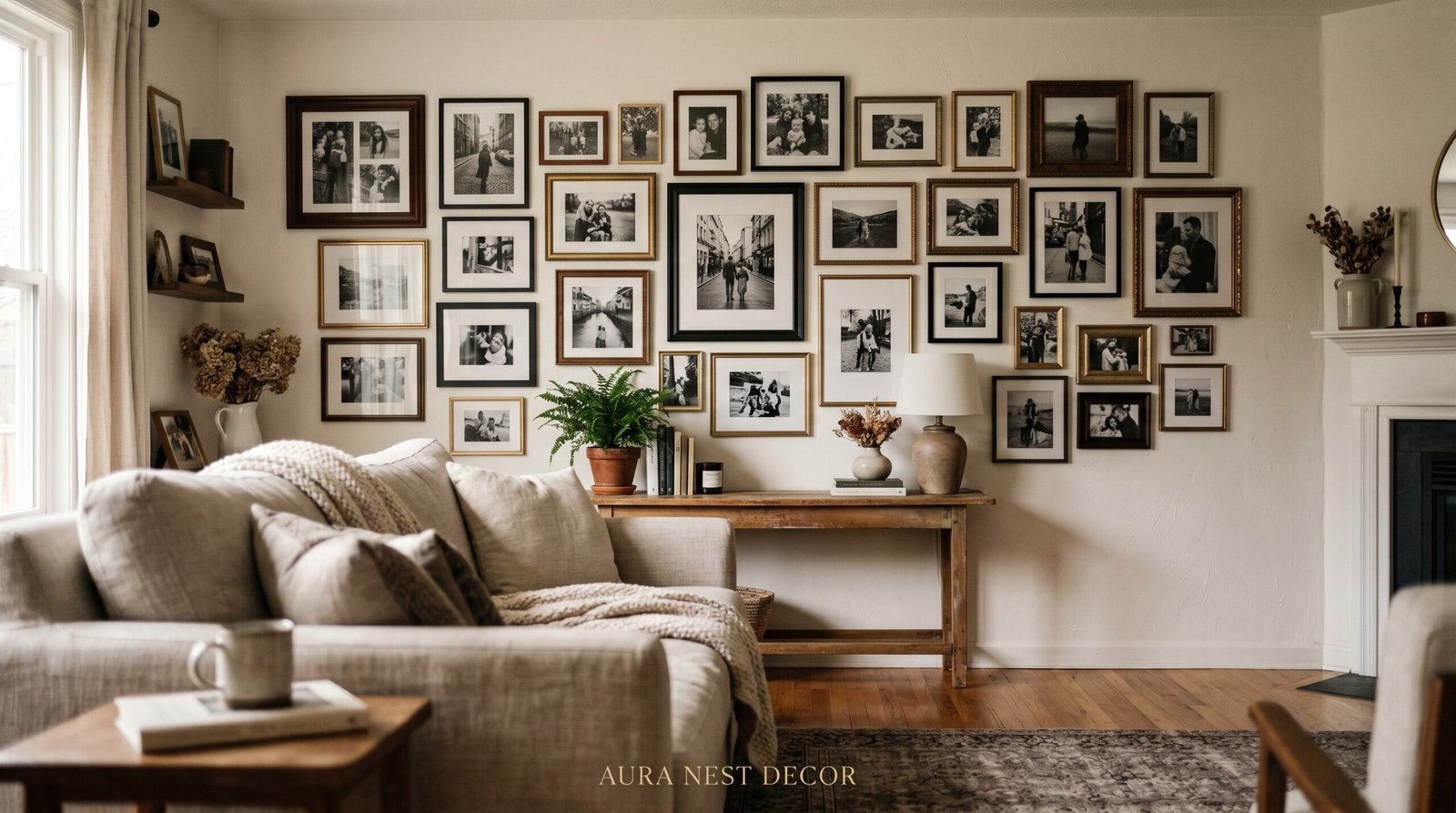
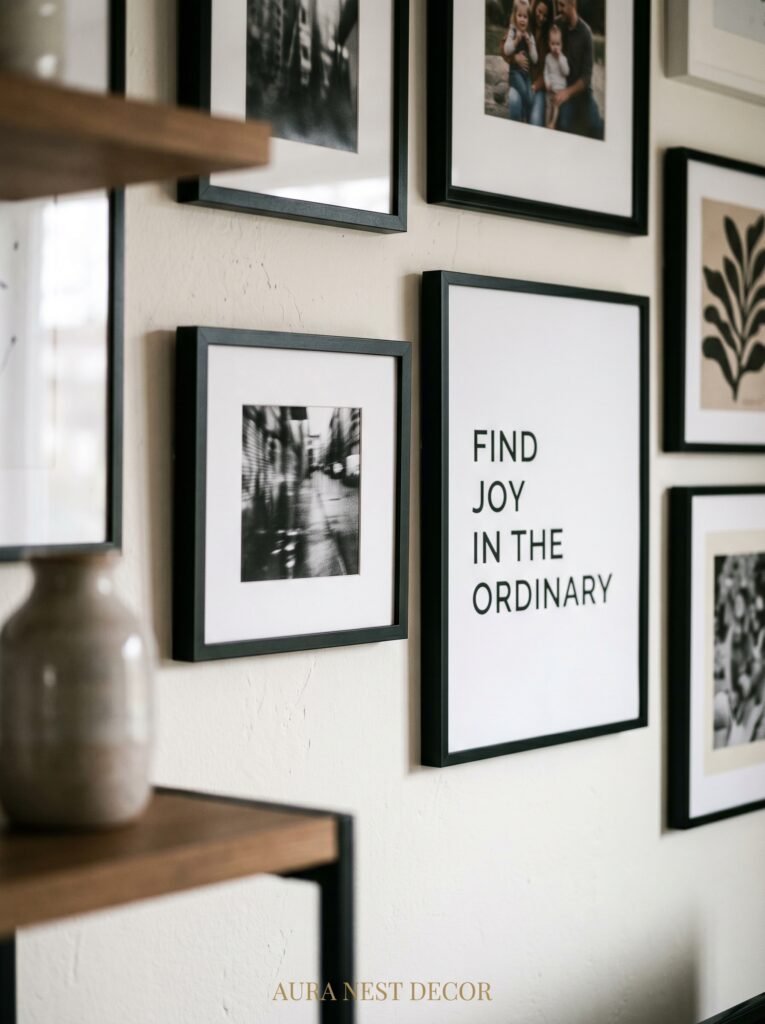
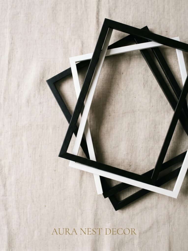
2. The Frame Game: Why Mismatched Is Often More Interesting Than Matched
There’s a version of the black and white gallery wall that uses identical thin black frames throughout, all spaced exactly two inches apart, all perfectly level. It’s clean. It works. And it photographs beautifully.
But I want to tell you about a different approach, because I think it’s actually more interesting.
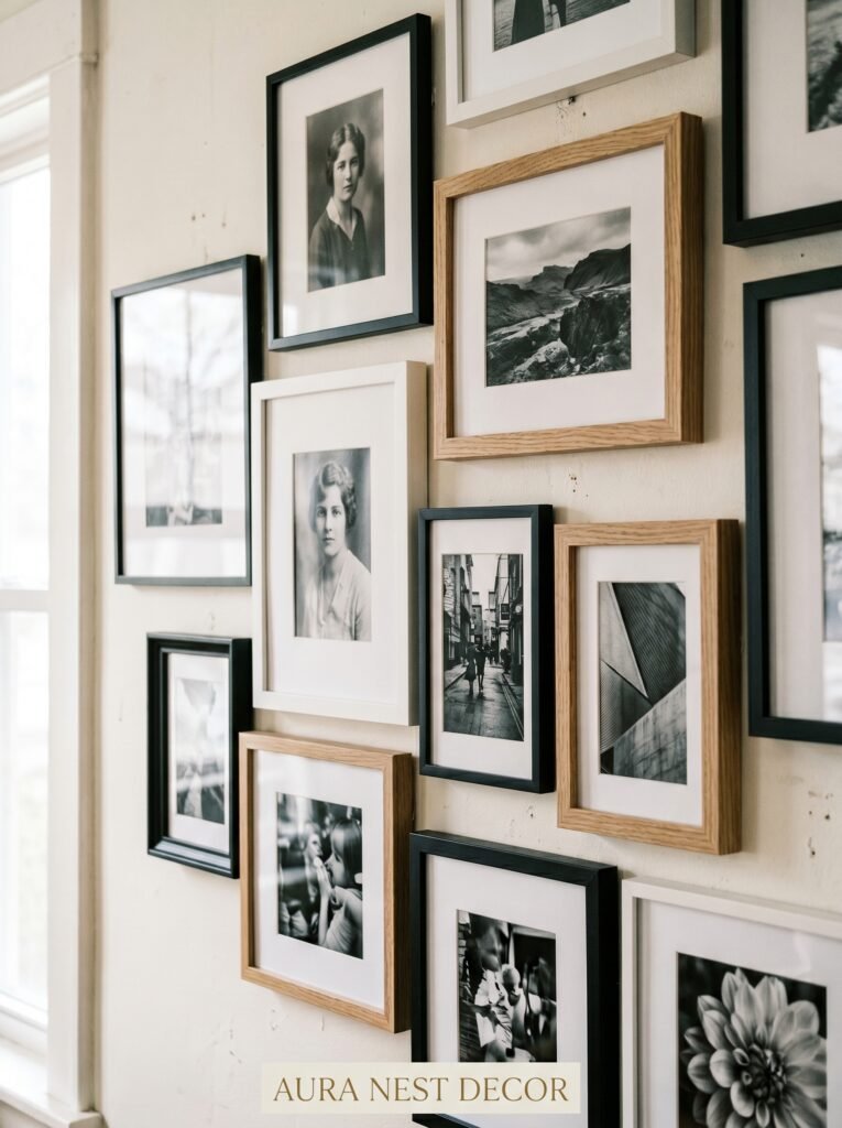
Mix your frames. Not randomly — intentionally. Try pairing sleek matte black metal frames with chunky painted white wooden ones. Add a single frame in a deep walnut or aged brass that catches the light differently from everything around it. The variety creates visual rhythm. Your eye moves across the wall rather than scanning it in one flat sweep. Each frame becomes a small pause in the composition, and the photographs inside them feel more considered, more chosen.
In the UK especially, you’ll find brilliant vintage frames at charity shops — thick, ornate, a little worn at the corners — and these look extraordinary alongside something minimal and modern. That contrast is what makes a wall feel curated rather than purchased all at once. Don’t be afraid of frames with a little history to them. They bring weight and character that no new frame can replicate, no matter how beautiful it is straight out of the box.
3. The Layout That Works Every Single Time, Even If You’ve Never Done This Before
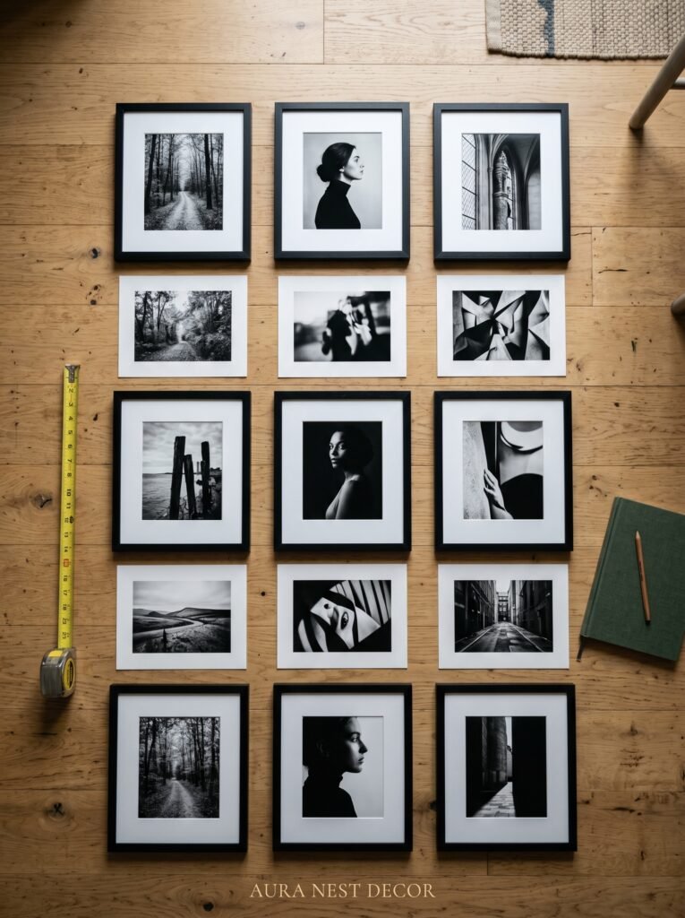
Here’s the approach I recommend for anyone starting from scratch: lead with your largest piece.
Choose one photograph — or print — that genuinely moves you. Something with strong contrast, a clear subject, a composition that would look good blown up. Print it at 16×20 or even larger. This becomes your anchor. Everything else builds around it.
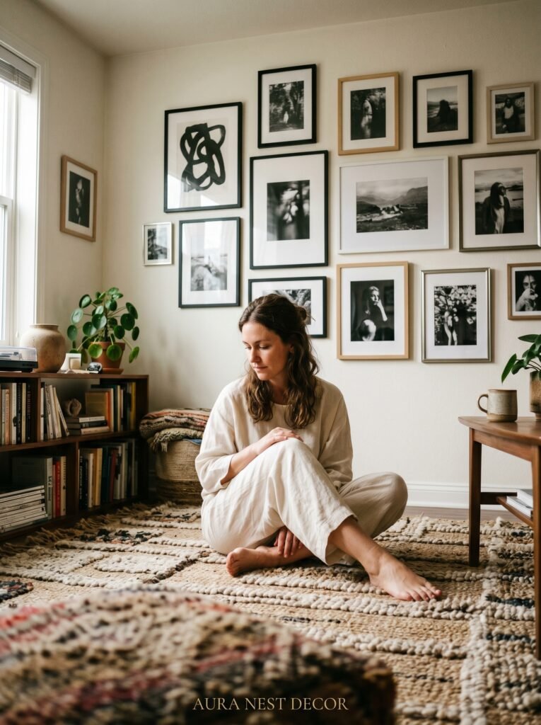
From there, work outward in clusters rather than grids. A grid is predictable. A cluster has energy. Group a vertical 8×10 with a horizontal 5×7 and a small 4×6 below it. Then, a little apart from that cluster, place a larger square print. Let the groupings breathe between each other — a gap of four to six inches between clusters feels intentional, whereas an inch feels cramped and two feet feels scattered.
Lay the whole arrangement out on the floor first. I cannot stress this enough. Spend twenty minutes moving things around on your rug before a single nail goes in the wall. Take a photo of the arrangement from above and look at it on your phone — somehow seeing it at a smaller scale on a screen gives you the same perspective as stepping back in a room, and you’ll catch things that look off before you’ve committed to anything.
4. The One Editing Trick That Makes Personal Photos Look Like Fine Art Prints
Not all black and white is the same.
This is something people don’t talk about enough. Converting a photo to grayscale on your phone and printing it will give you a flat, grey, slightly muddy result that looks nothing like the stunning high-contrast images you’re pinning. The difference comes down to editing, and it’s simpler than you think.
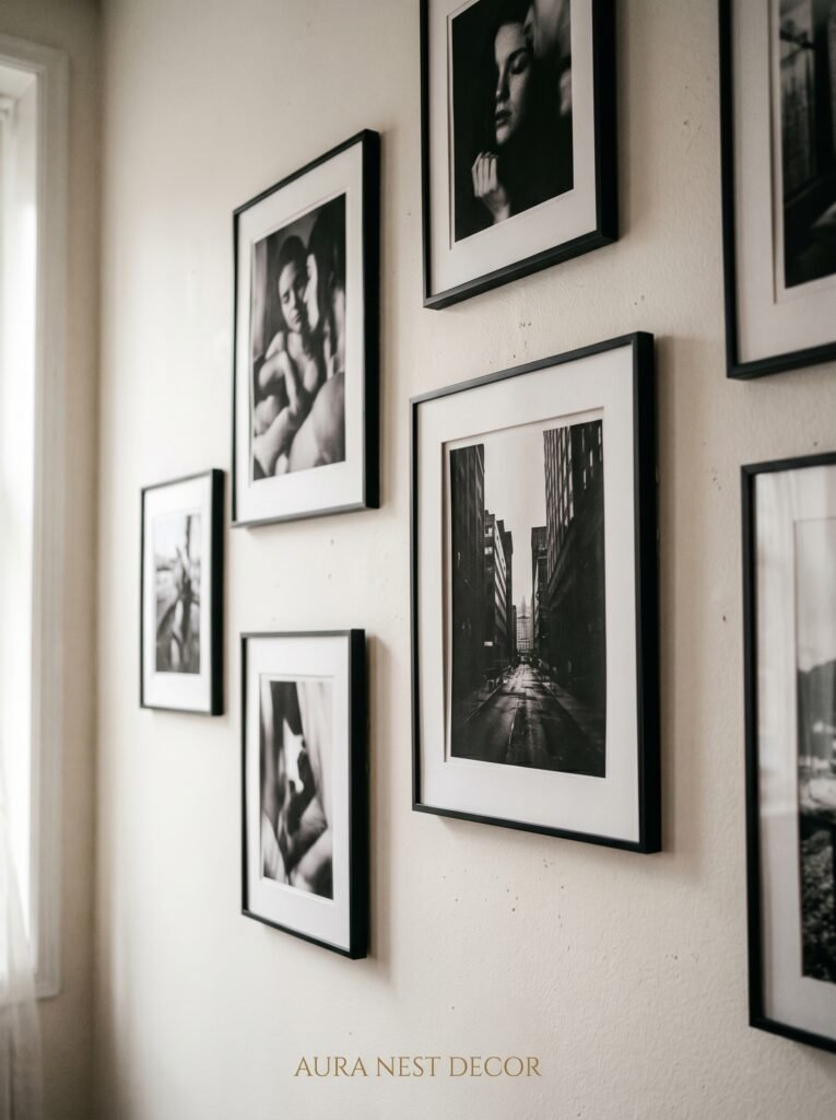
When you convert a photo to black and white, you want to push the contrast. Lift the highlights toward true white. Drop the shadows toward true black. Bring the midtone contrast up slightly. What you’re aiming for is a full range of tones — not a photograph that exists only in the grey middle. The brightest whites should be almost paper-white. The deepest shadows should be genuinely dark.
If you use the VSCO app, the B1 or B5 presets get you most of the way there and respond well to small adjustments. In Lightroom, the classic B&W conversion with a manual tone curve is even better. The goal is a photograph that prints with real punch and depth — something that doesn’t fade into the wall around it but holds its ground, commands the space it’s been given.
“The difference between a nice photo and a wall-worthy print is usually just contrast and the confidence to push it further than feels comfortable.”
5. Choosing What Actually Goes on the Wall (This Part Is More Personal Than You Think)
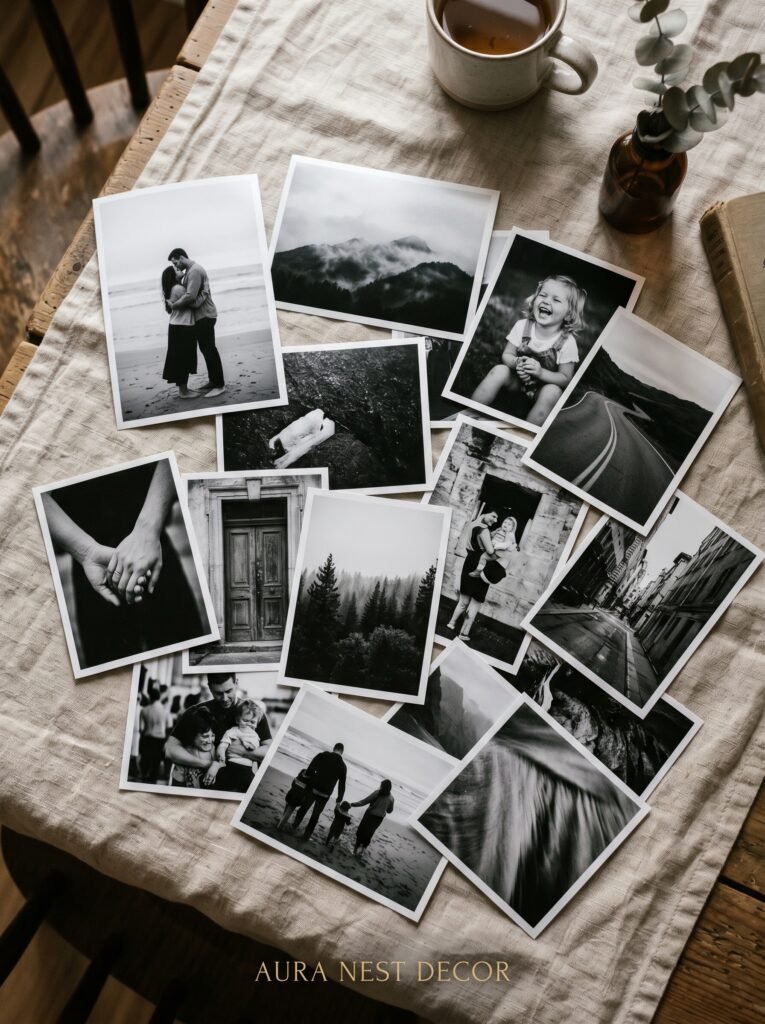
I’ve seen people use stock photography prints for black and white gallery walls and I understand the appeal — the quality is controlled, the subjects are beautiful, everything coordinates. But I want to make a case for using your own photographs, even the ones you’ve never quite known what to do with.
The holidays in Scotland, the rainy afternoon in New York, the morning light coming through your kitchen window, your dog sleeping on the couch, the view from a cliff you climbed last summer. These images, edited well and printed properly, look extraordinary on a wall. And they do something stock prints fundamentally cannot: they make the room yours.
A living room wall that stops people is one thing. A living room wall that stops people and tells a story is something else entirely. Mix the personal with the intentional. That close-up of lichen on a wall in Cornwall printed at 11×14 might look like fine art to everyone who sees it. To you, it’s Tuesday on a walking holiday. Keep both of those things. They’re not in conflict.
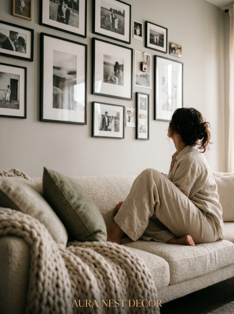
6. The Wall Color Question Everyone Asks, and the Honest Answer
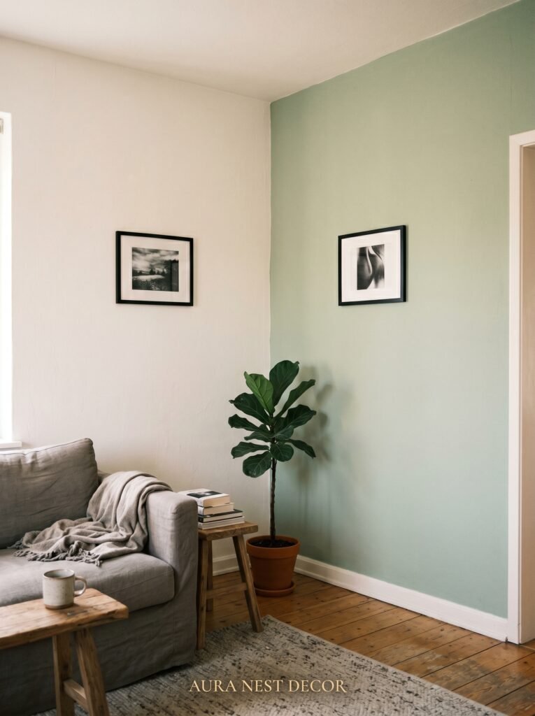
Black and white photographs look good on almost every wall color. There, I said it. But they look absolutely spectacular on a few specific ones.
Deep, moody walls — navy, forest green, charcoal, a very dark mushroom grey — give black and white photographs an almost gallery-like quality. The contrast between the dark wall and the whites in the photographs creates this dramatic, deliberate effect that feels far more considered than black and white on white. It’s a bit of a commitment and it pays off enormously.
Warm off-whites and linens are the other winning option. Not bright white — which can feel clinical and cold behind black and white photographs — but the creamy, slightly yellow-toned whites that feel soft and lived-in. Something like a vintage parchment or a very light stone. These tones warm up the photographs and make the whole wall feel welcoming rather than stark.
Avoid cool mid-tones if you can. A flat mid-grey wall behind black and white photographs tends to flatten everything. The tonal range of the photographs disappears into the wall rather than coming off it.
7. Text, Quotes, and Typography as Part of the Mix
This is a divisive one, and I’m going to be direct: a framed quote in the wrong font and the wrong context can make a thoughtfully designed gallery wall suddenly look like it belongs in a hotel corridor.
But done right, it’s wonderful.
If you want to include text or typography in a black and white collage wall, the rules are simple. Choose one typeface and use it consistently across any text elements. Go either very serif — something classical and editorial — or very sans-serif, stripped back and bold. Don’t mix the two. Print the text in black on white or white on black, and keep the frame consistent with your gallery aesthetic.
What works brilliantly: a single line of a poem you actually love, printed large and framed at an interesting size. A surname in large blocky letters as an anchor piece. A city name, a date, a coordinate. Something that means something rather than something that sounds nice.
“The best gallery walls tell you who lives there within thirty seconds of looking at them.”
8. How to Hang It Without Destroying Your Walls (or Your Weekend)
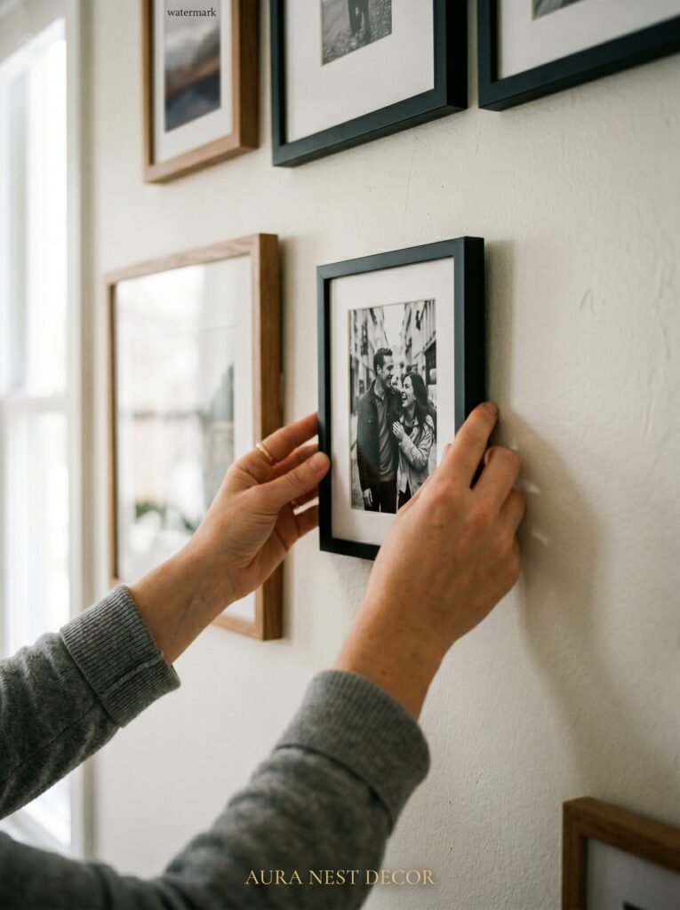
The process that has saved me enormous frustration: trace each frame onto kraft paper, cut it out, mark where the hanging hardware falls on each template, and tape the templates to the wall with painter’s tape before touching a nail.
This gives you the full visual of the arrangement on the actual wall, in the actual space. You can step back, stand in the doorway, look at it from the sofa, and adjust freely without a single hole in the plaster. When everything looks right, you tap a small nail right through each template’s hanging mark. Remove the paper. Hang the frames.
Command strips work for lightweight frames and are a sensible option if you rent, are in a UK property with particularly unforgiving plaster, or simply don’t want to commit. For heavier frames — anything over a few pounds — use proper wall anchors and spend the extra ten minutes finding the studs. A fallen frame at 2am is not the kind of surprise anyone wants.
9. The Small Details That Separate a Good Gallery Wall from a Great One
Consistency in your editing matters more than perfect frames or perfect sizing. If some photos are very high contrast and others are soft and grey, the wall will look unfinished even if the arrangement is excellent. Spend time getting all your photographs to a similar tonal language before you print.
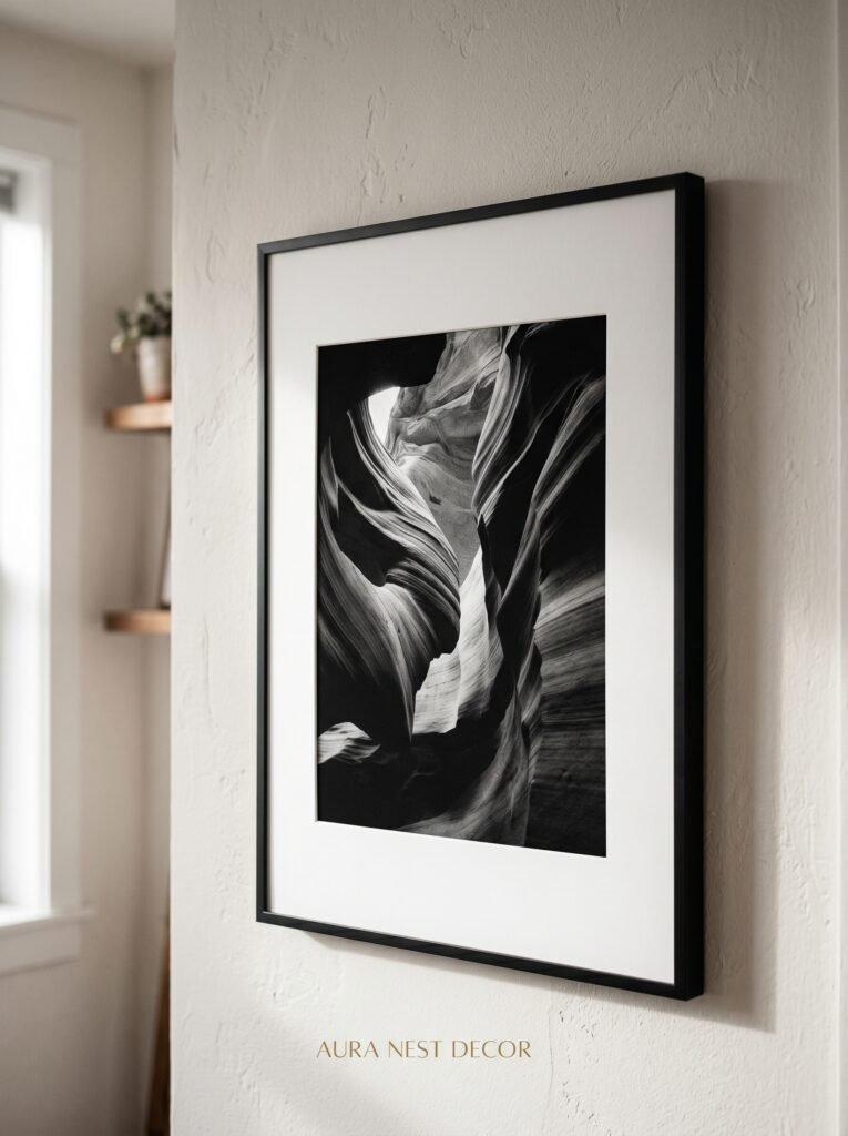
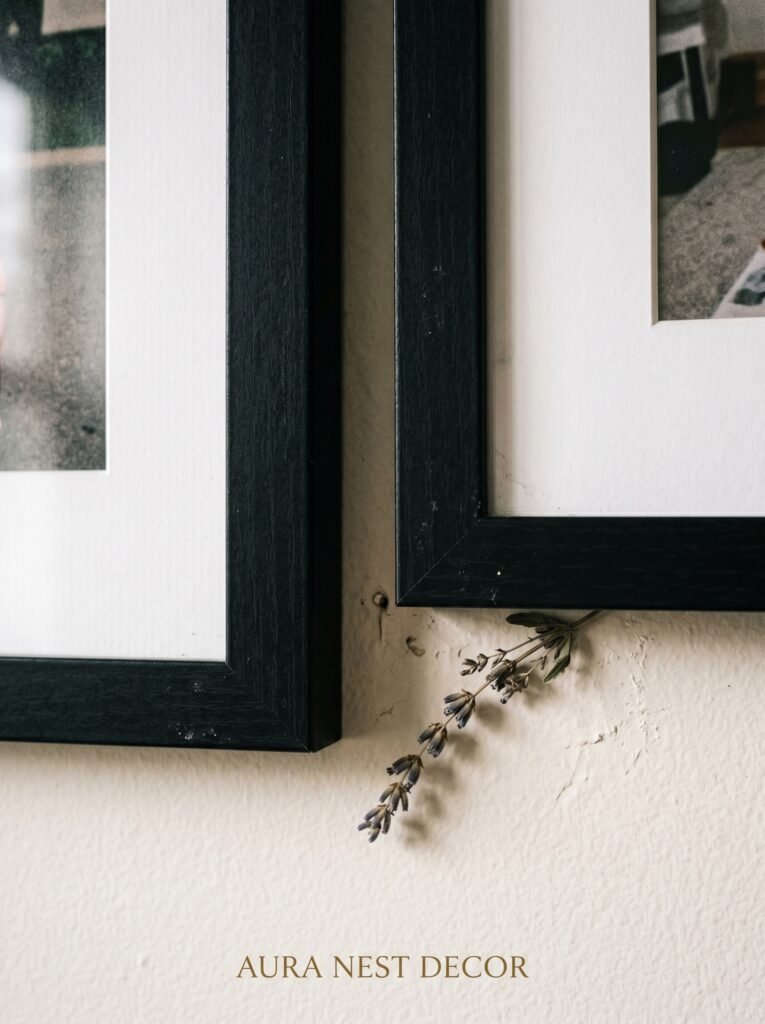
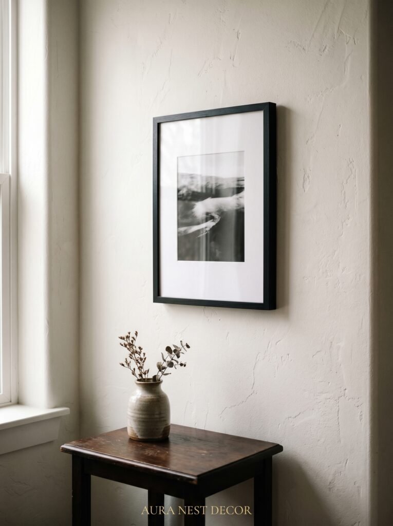
Mat boards — the white or cream borders inside a frame — add space and formality. They make a photograph feel more considered, more exhibited. Even a simple 5×7 print inside an 8×10 frame with a white mat suddenly looks important. It’s a small thing and it makes a real difference.
Glass vs. non-reflective acrylic: if you have windows across from your gallery wall, the glare from standard glass will frustrate you. Anti-reflective glass or acrylic is worth the extra cost. The photographs should be what you see, not the reflection of your lamp.
10. The Sizes That Actually Photograph Well for Pinterest (Since You’re Going to Want to Share This)
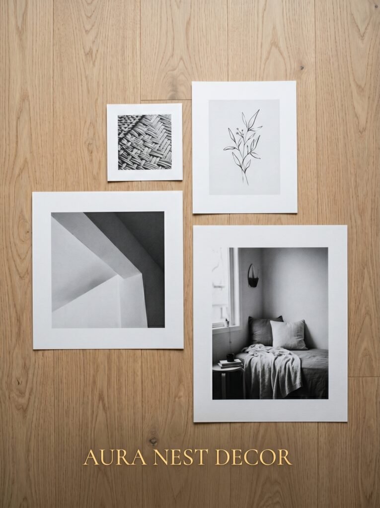
For the algorithm and for real life, variety in scale is everything. A wall of all the same size, even arranged beautifully, photographs flatly. You want at least three distinct sizes in your arrangement: something large that reads immediately from across the room, something medium that draws you closer, and something small that rewards the final step toward the wall.
My most-shared wall arrangement uses a 20×24 landscape print as the anchor, four 8×10 prints in a loose cluster to the right, three 5×7 portraits stacked vertically, two 4×6 horizontal shots tucked into corners, and one single 11×14 standing slightly apart at the far left edge. It photographs beautifully because there are layers of discovery — what reads from the hallway is not what you see when you’re standing right in front of it.
11. Where the UK High Street and US Retailers Actually Get It Right
In the US, Artifact Uprising and Nations Photo Lab both do outstanding fine art black and white printing. The matte finish — not glossy — is the one to choose for gallery walls. Glossy prints pick up glare and fingerprints and they read as amateur in a framed context. Matte has weight and texture and substance.
In the UK, Photobox and Printed.com are solid. IKEA’s RIBBA frame range remains genuinely excellent for anyone working with a budget — the proportions are right, the white interior of the frame acts as a built-in mat, and they stack and group brilliantly. The Dunelm Mill frame selection has improved a lot in recent years too, particularly for larger prints.
For vintage frames in the UK: eBay, Vinterior, and any charity shop in a market town. For the US: estate sales, Goodwill, and Chairish for anything more specific. Don’t overlook antique malls for both countries — you’ll find frames there that have thirty years of character built in, and that character is impossible to replicate.
12. The One Rule I’d Give Anyone Who’s Nervous to Start
Edit down until it makes you a little uncomfortable.
Not every photograph has to be on the wall. The wall you’re building should contain the ones that are genuinely good — the ones you’d be proud to have a stranger stand in front of. That standard sounds harsh. It isn’t. It’s just the difference between a sentimental collection and a designed space.
Choose fewer, better. Print them properly. Frame them with intention. Arrange them until the wall has rhythm and surprise and a clear point of view.
The photographs you love most deserve a wall that does them justice. Give them that.
—
❓ FAQ
Q: How many photos should a living room gallery wall have? A: There’s no fixed number, but somewhere between 9 and 20 tends to feel balanced for most living room walls. Fewer than 7 can feel sparse unless the individual pieces are very large, and more than 25 can overwhelm the space. Start with what you have and add incrementally rather than trying to fill the wall all at once.
Q: Can I mix black and white photos with color photos on the same wall? A: You can, but it takes real discipline to pull off. One approach that works is choosing 2 or 3 color photographs with a very limited palette — all with warm tones, for instance — so they don’t fight the black and white pieces. Alternatively, keep the color prints contained to one side of the arrangement rather than scattering them throughout.
Q: What’s the best way to convert photos to black and white without losing quality? A: Edit in the highest resolution available and use a dedicated editing app rather than your phone’s built-in filter. VSCO, Lightroom (mobile or desktop), and Snapseed all give you proper control over highlights, shadows, and contrast. Avoid Instagram’s black and white filters for anything going to print — they compress the image and the quality loss shows.
—
💭 Final Thoughts
There is something quietly powerful about choosing your photographs, editing them until they’re right, and committing them to a wall in your home. It’s a declaration that these moments mattered — and that the space you live in is worth caring for. A black and white gallery wall is one of the most personal things you can put in a room, and somehow also one of the most quietly sophisticated. Start with one corner. See how it makes you feel when you walk past it on an ordinary Tuesday morning. Is there a wall in your home that’s been waiting for exactly this?


