
The Simple Living Room That Actually Feels Like You
You walk into someone’s home and immediately feel it — that rare thing where the room just breathes. Nothing is fighting for attention. Nothing feels staged. It just feels like someone genuinely lives there, and loves it.
That’s the aesthetic we’re chasing.
—
1. Why “Simple” Doesn’t Mean Boring — It Means Intentional
There’s a version of minimalism that feels cold and punishing. White walls, nothing on the shelves, a sofa that looks too expensive to sit on. That’s not what we’re talking about here.
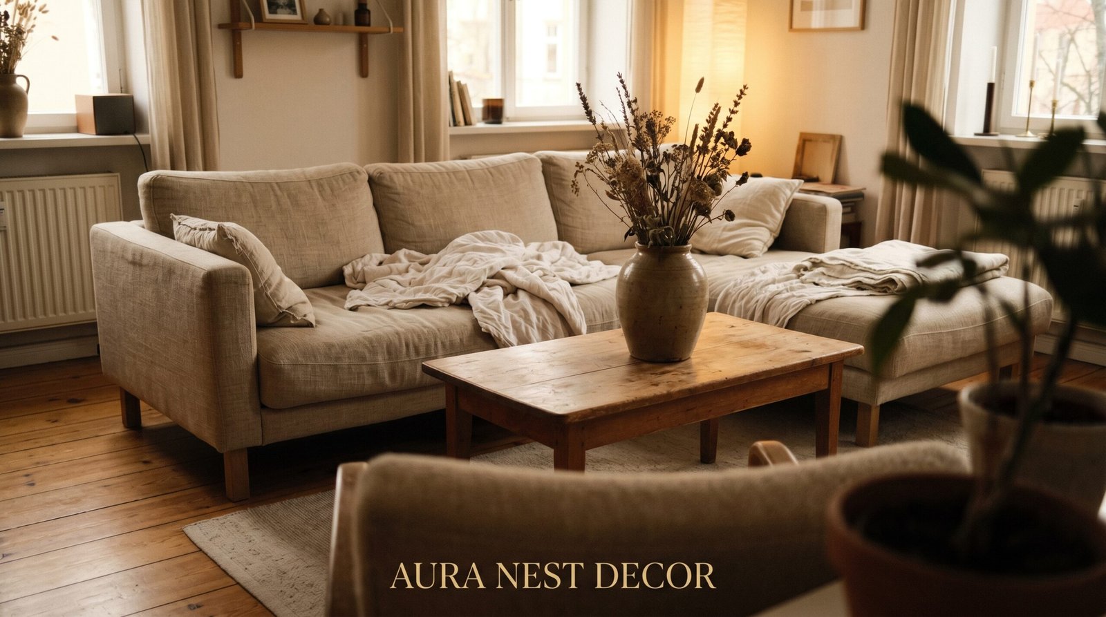
Simple, in the best possible living room sense, means every single thing in the room has a reason to be there. Not a justification — a reason. A worn linen throw is there because someone actually reaches for it on Tuesday nights. A stack of cookbooks on the coffee table is there because you genuinely re-read them. A single ceramic vase is there because it makes you happy every time you glance at it.
That distinction matters more than most people realize. Rooms that feel effortlessly beautiful aren’t empty — they’re edited. There’s a difference between a room stripped of personality and a room that only holds things that are your personality. The first feels clinical. The second feels like exhaling.
Simple aesthetic living rooms also tend to age better than heavily themed ones. When you stop chasing trends and start asking “does this feel like me?”, you end up with a space that will still feel right in five years. And that’s actually worth something.
“A room that only holds what you love never goes out of style.”
2. The Color That Keeps Showing Up in Every Beautiful Living Room Right Now
It’s not white. It’s not greige. It’s warm.
The shade getting the most attention lately is something between oat and clay — a tone that sits somewhere in the underbelly of a stone wall or the inside of a bread crust. Americans tend to call it “warm white” or “mushroom.” British decorators are more likely to say “putty” or “parchment.” Whatever you call it, the effect is the same: a room that glows.
These tones do something clever with natural light. In the morning, they look almost pale. By late afternoon, they shift warmer. By 7pm with a lamp on, they go full amber and the room feels like being wrapped in something. It’s not magic — it’s just that warm neutrals respond to light in a way that cool grays and stark whites simply don’t.
If you’re nervous about going full wall color, start with your textiles. A putty-toned linen sofa cover, oat-colored curtains, a rug that nods toward wheat. Layer those in and the room will already start to shift before you’ve touched the paint.
Paint picks to explore: Farrow & Ball’s “Elephant’s Breath,” Benjamin Moore’s “White Dove” warmed with a linen sofa, or Sherwin-Williams “Accessible Beige” — which, despite its terrifyingly dull name, goes quietly lovely in the right light.
3. The One Furniture Rule That Makes a Small Living Room Feel Intentional
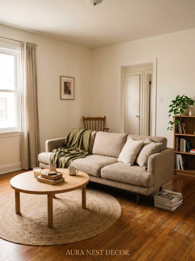
Fewer legs on the floor.
It sounds almost too simple, and yet it works every single time. When furniture sits on the floor — fully flat, no visible legs — a room automatically looks more grounded and deliberate. A low-profile sofa with a skirted base. A storage ottoman. A coffee table that sits close to the ground. The eye reads the room as calmer because there’s less visual noise at floor level.
Conversely, when you do want furniture to float and feel lighter (useful in genuinely tiny rooms), you choose pieces with visible, tapered legs consistently throughout. Matching leg heights and finishes creates rhythm. Mismatched furniture heights at different angles is what makes small rooms feel chaotic — not the size of the room itself.
The other rule that quietly changes everything: your largest piece of furniture should be the sofa, and the sofa should be positioned confidently. Pushed against a wall too far, or floating awkwardly in the center, a sofa looks lost. Give it an anchor — a large rug underneath it, a gallery wall behind it, a console table against the back — and the whole room snaps into focus.
This is especially useful in US open-plan layouts and smaller British terraced living rooms alike, where scale and proportion aren’t always cooperating.
4. What to Put on the Walls When You Don’t Want a Gallery Wall
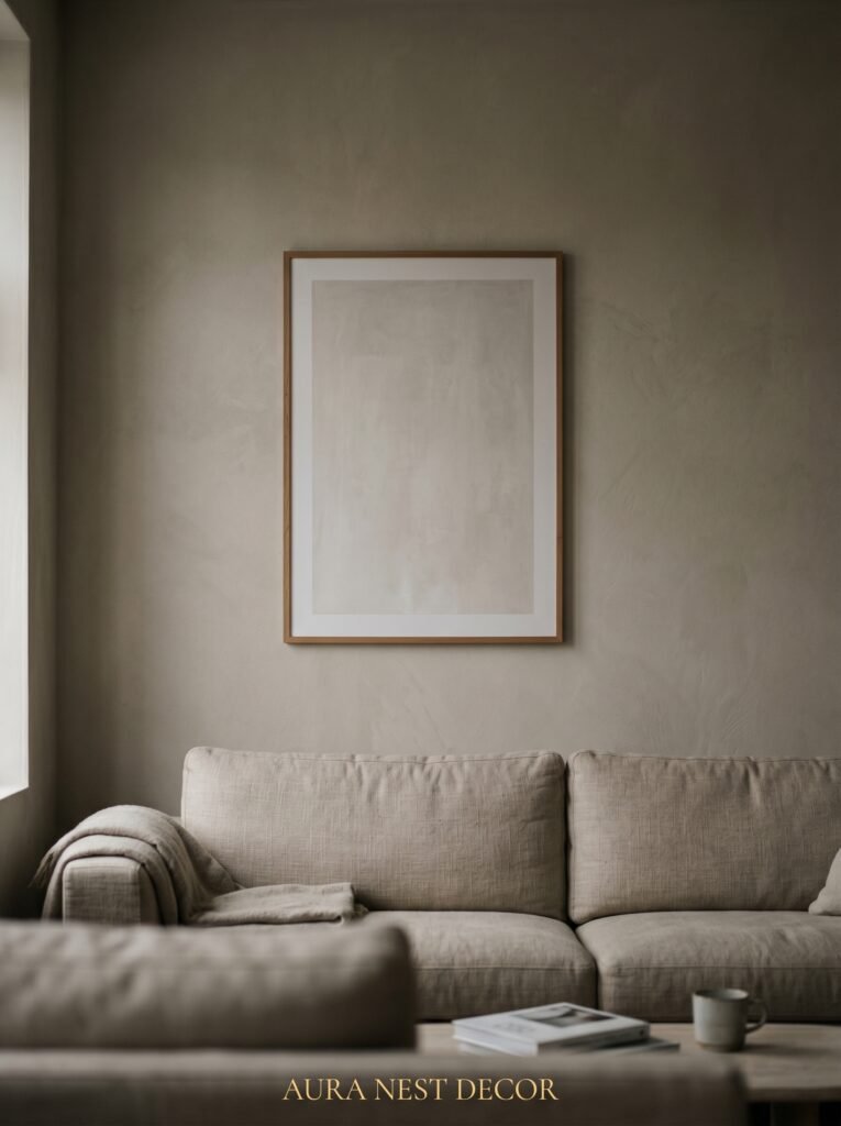
Gallery walls are everywhere. They’re also a bit exhausting, aren’t they?
The alternative — one large piece of art hung at the right height — makes a quieter, more confident statement. One piece. Not three. Not five arranged in a cluster. One.
The trick is scale. The piece should feel slightly too big. Slightly. Not absurd, but bold enough that your first instinct is “is that too much?” If you feel that tiny flutter of uncertainty, you’re probably in the right place. Small art hung on a large wall is the number one decorating mistake in living rooms — it shrinks the room and makes everything feel timid.
Height matters just as much. The general rule is to hang art so the center of the piece is at eye level, roughly 57 to 60 inches from the floor. In practice, this means most people hang things too high. Too high and the art floats, disconnected from everything below it. Lower it down and suddenly the furniture and the art are in conversation.
What kind of art? For a simple aesthetic, abstract prints work beautifully — particularly anything with earthy tones, soft organic shapes, or gestural marks. Affordable options from Society6, Desenio, or Etsy can genuinely look like gallery pieces in the right frame. A simple oak or natural wood frame tends to work across more styles than black or ornate gold.
“One oversized piece of art hung at the right height will do more for your room than an entire gallery wall ever could.”
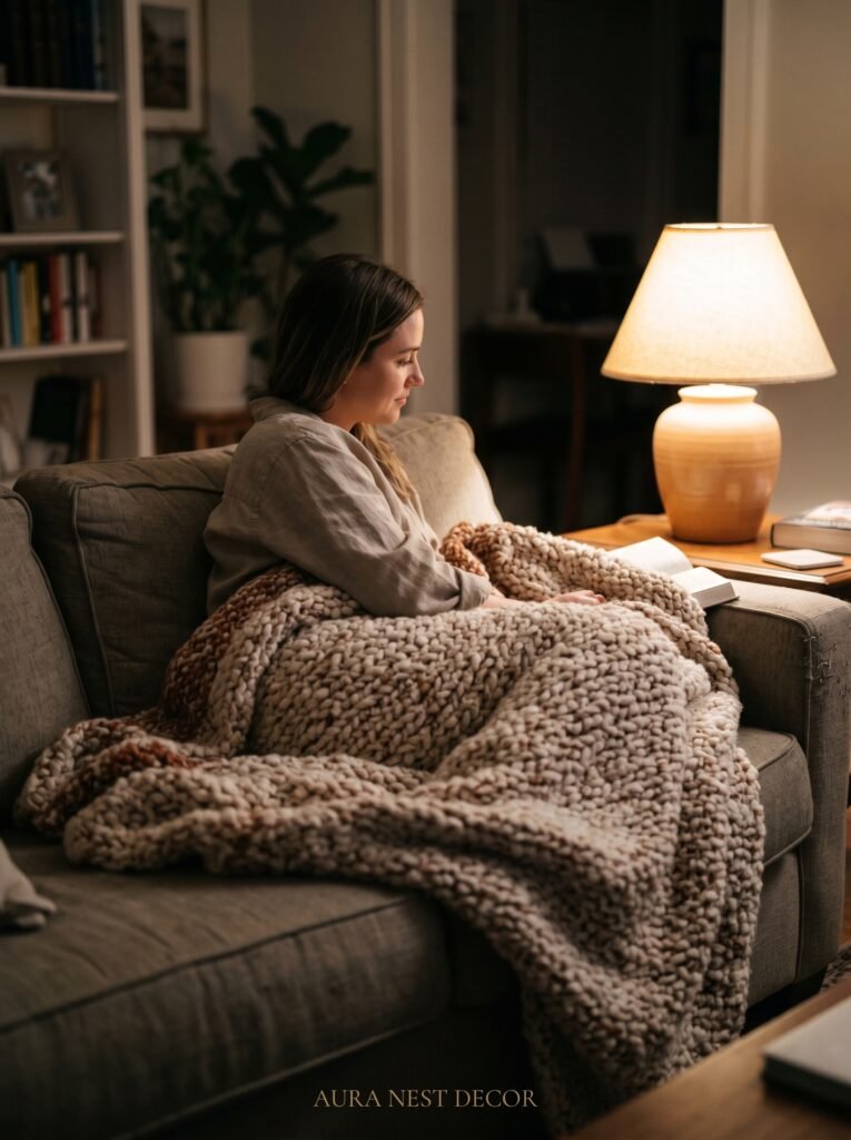
5. The Lamp Placement Secret Nobody Talks About
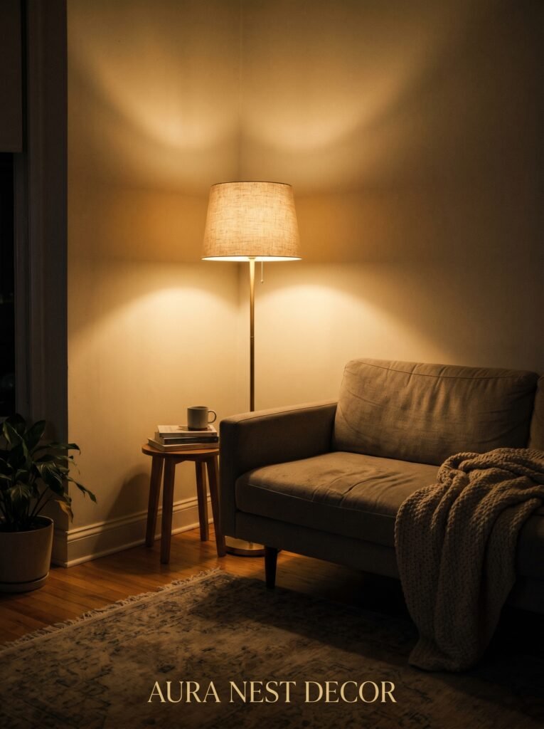
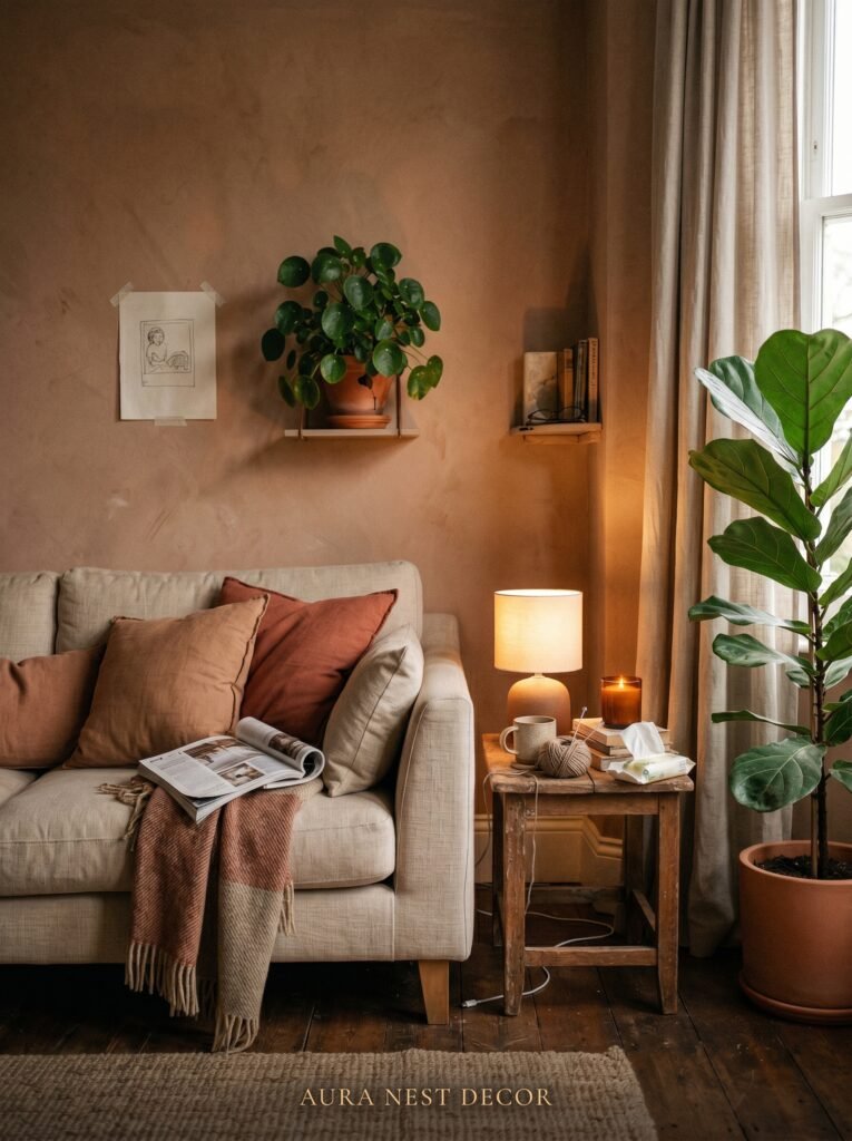
Here’s the thing about overhead lighting: it flattens a room. The flat, even light that comes from a ceiling fixture makes everything look the same — same brightness, same temperature, same level of importance. And that’s visually boring.
Lamps fix this. Not because they’re decorative (though they are), but because they create layers of light at different heights. A floor lamp in the corner behind the sofa. A table lamp on the side table. A small lamp on a shelf or console. Each one creates a little pool of warmth, and the spaces between those pools become part of the room’s character.
The most overlooked placement? A lamp in the corner. Not on a table in the corner — just a floor lamp, standing alone in the corner. It washes the wall with light and makes the room feel infinitely larger and softer. British interior designers have been doing this for decades. American rooms tend to overlook it.
Bulb temperature matters enormously here. Go warm — 2700K is the sweet spot. Anything cooler starts to feel like an office. Edison bulbs and globe bulbs at this temperature create that amber evening quality that makes even a plain room feel special.
A dimmer switch costs almost nothing and changes absolutely everything. If you do one practical thing for your living room this year, let it be that.
6. The Shelf Styling Formula That Looks Effortless But Isn’t Random
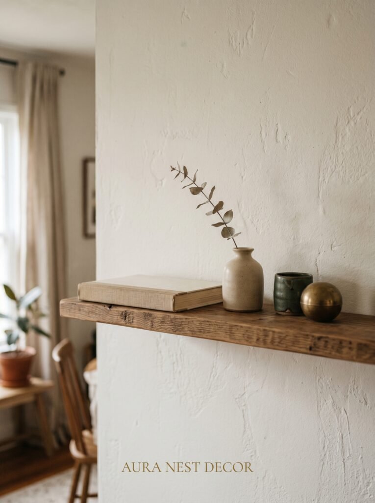
The rooms that look casually styled aren’t casual. They’re just practiced.
Shelf styling follows a loose rhythm that, once you see it, you can’t unsee. It goes: tall, medium, low. Or: object, books, organic thing. Or: dark, light, dark. The specific items matter less than the rhythm they create. When everything on a shelf is the same height, same tone, same type of object, it reads as flat. When you mix scale and texture, the eye moves and the shelf comes alive.
Books are your best friend here. Spine-out for color and texture. Cover-out for a cleaner, more intentional look. Stacking a few horizontally creates a plinth for something else to rest on top — a small plant, a candle, a found object. That combination of vertical and horizontal always looks good.
The other key: negative space. Leave some shelf empty. Americans in particular tend to fill every surface — the impulse to “make the most” of storage. But an empty stretch of shelf next to a curated grouping makes that grouping look considered rather than cluttered. Give your objects room to breathe, and they suddenly look like they were chosen rather than accumulated.
7. The Textile Layer That Changes Everything After 5pm
A room can look perfectly nice in the afternoon light and feel completely cold by evening. The fix is almost always textiles.
Not more pillows. Not a fancier throw. It’s about texture. A chunky knit blanket draped over the arm of a sofa reads differently than a flat cotton throw folded on a chair. Linen cushion covers catch light differently than velvet ones. A jute rug has a warmth to it that a flatweave rug doesn’t, even if they’re the same color.
The combination that almost always works: a large linen or cotton rug in a warm neutral, a throw in a heavier knit or bouclé, and two to three cushions in varied textures. Not varied prints — varied textures. A cotton canvas cushion, a woven cushion, a velvet one. Same palette, different surfaces.
In UK homes especially, where evenings get dark early for a good chunk of the year, this kind of layering transforms a living room from a daytime space into somewhere genuinely cozy to spend a winter evening. In American homes with climate control, it’s more aesthetic than functional — but it still works because humans respond to the visual promise of warmth as much as the actual sensation.
“A throw on the sofa isn’t decoration. It’s the difference between a room you look at and one you actually want to be in.”
8. Plants That Look Intentional, Not Like You’re Trying to Fill Space
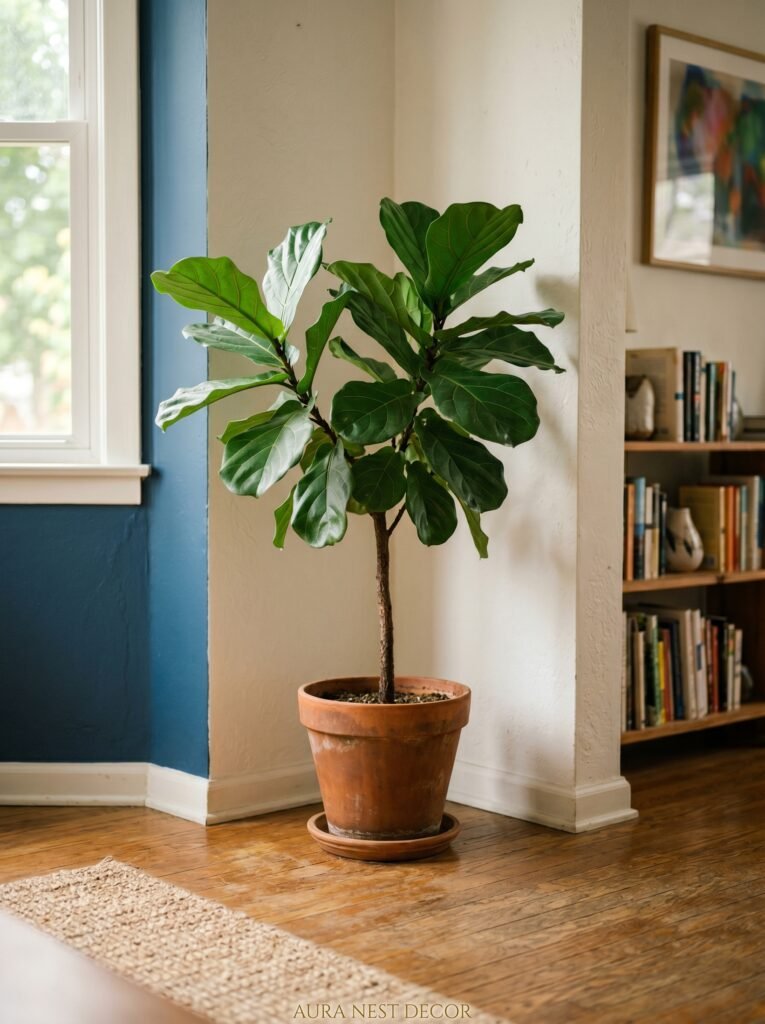
One large plant is a statement. Fifteen small plants arranged on every surface is a collection. Both can work. The mistake is the in-between — six medium plants in no particular arrangement, each one competing for attention, none of them landing.
For a simple aesthetic, commit to one or two large-format plants and let them do the work. A fiddle-leaf fig in a terracotta pot. A snake plant in a stone-look planter. A monstera in a woven basket. These read as architectural — they’re not decoration so much as structure, the same way furniture is structure.
Pot choice matters as much as plant choice. Matching your pots to your room’s palette sounds obvious, but it’s genuinely transformative. Three different plants in three different mismatched plastic pots will always look like an afterthought. The same three plants in pots of similar material — all terracotta, all white ceramic, all natural fiber — suddenly look collected and intentional.
For low-maintenance options that still look lush: pothos (practically indestructible), ZZ plant (can survive nearly anything), and olive trees (beautiful, forgiving, and very much at home in both British and American interiors right now).
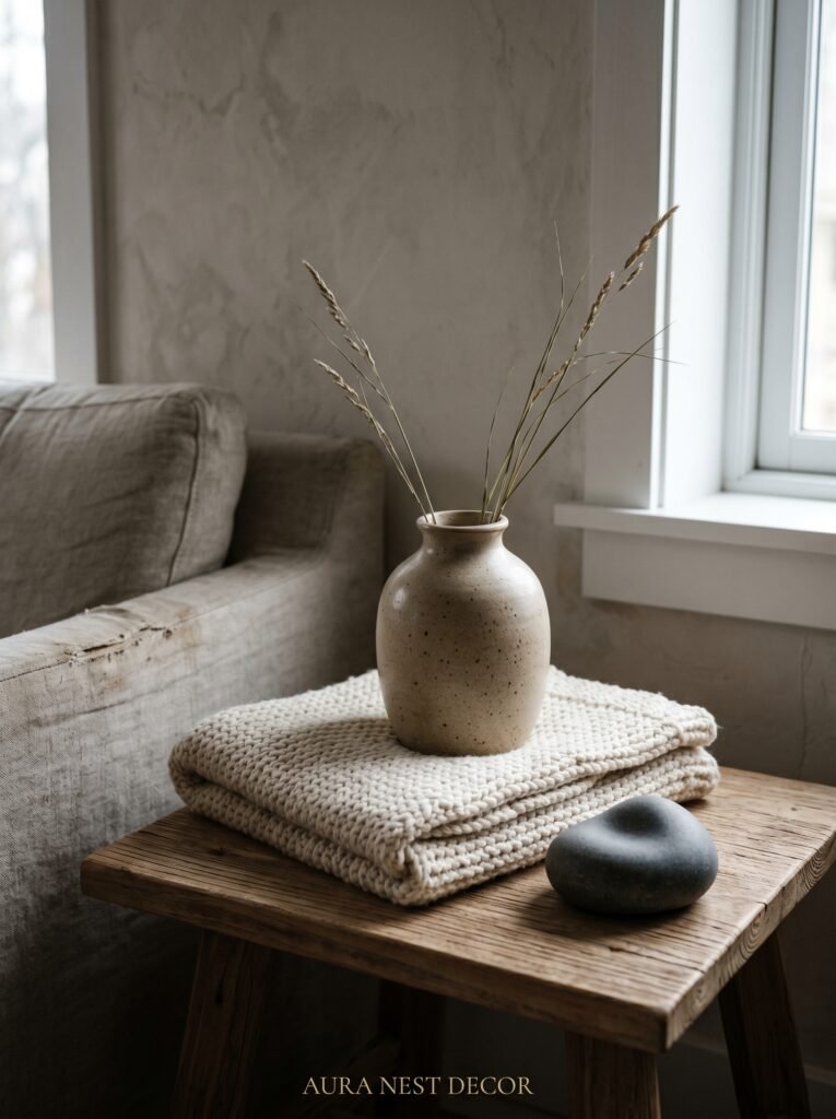
9. The Coffee Table Styling Rule That Actually Holds Up in Real Life
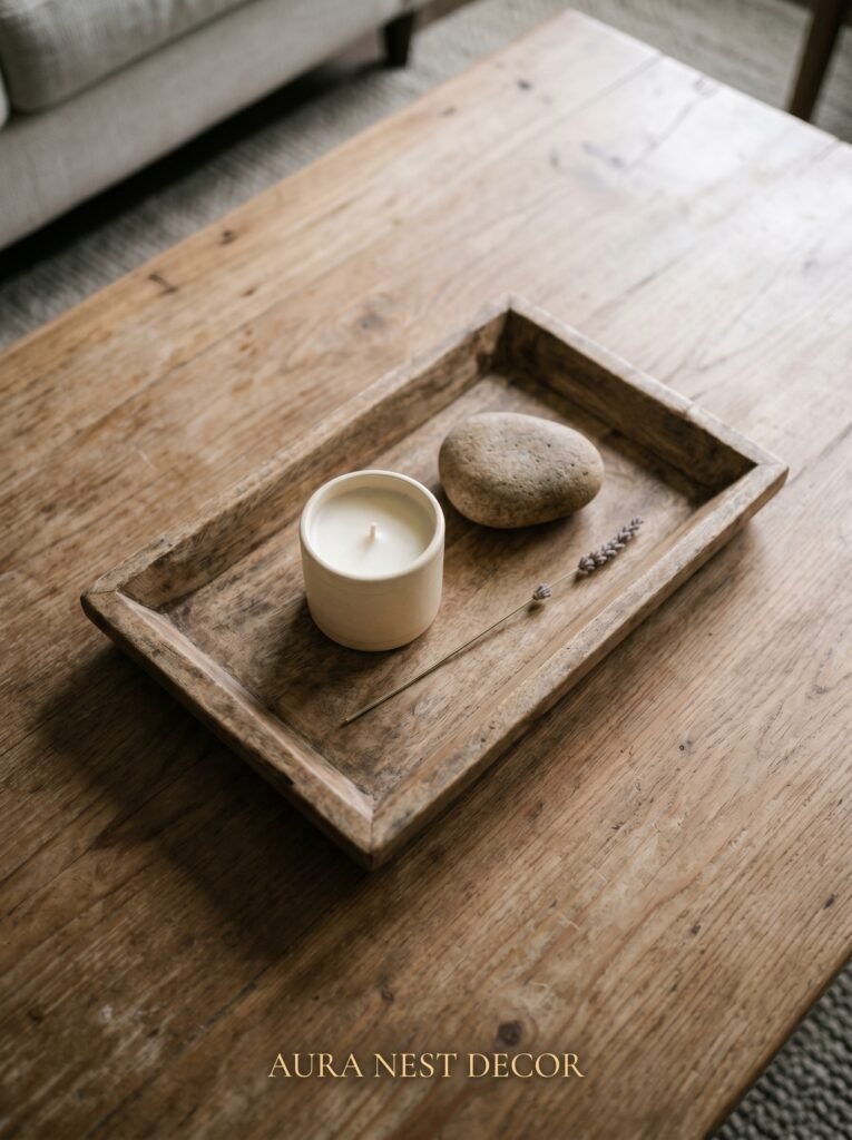
Style your coffee table for how you actually live, then make it 20% more intentional.
Most styling advice pretends people don’t put remotes, coasters, and half-drunk cups of tea on their coffee table. Real living room advice meets you where you are. So: group your practical items into a tray or low bowl, and then build the aesthetic around them. A tray corrals chaos. Once the chaos is in one contained spot, a candle next to it and a small stack of books beside it looks styled rather than messy.
The three-item rule works reliably here: one tray or contained grouping, one tall element (a vase, a candle, a single stem), one organic element (a stone, a small branch, a bowl of seasonal fruit, a pinecone). That’s it. That’s the whole formula.
Scale matters on the coffee table just as much as on the walls. A tiny vase on a large coffee table looks lost. Go bigger than you think. A substantial ceramic, a generous candle, a stack of three or four actual books rather than one. The coffee table can handle more visual weight than most people give it.
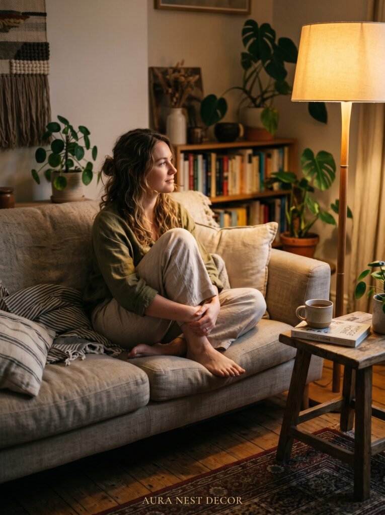
10. The Corner That Every Beautiful Living Room Has (And Most Rooms Are Missing)
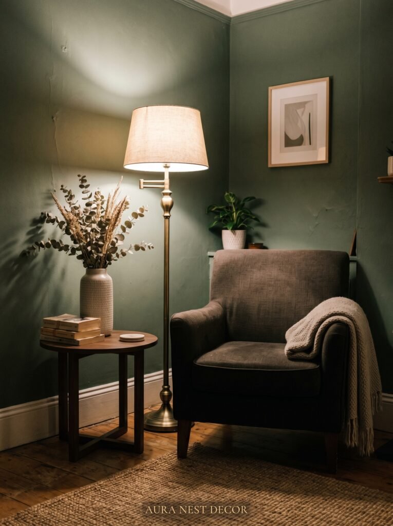
Look at any living room that photographs well — on Pinterest, in a magazine, in those beautiful home accounts that everyone follows — and you’ll almost always find a reading corner. Or at least something that functions like one.
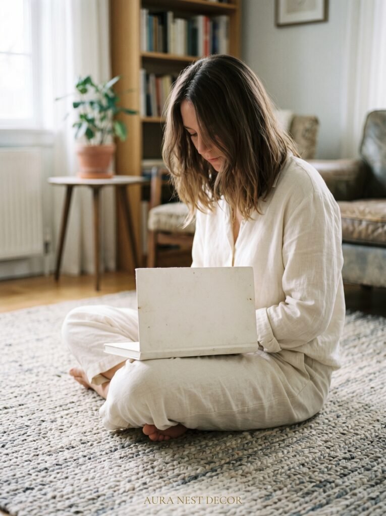
It doesn’t need to be a designated “reading nook.” It just needs to be a spot in the room that says: a person sits here, specifically, with intention. An armchair pulled slightly away from the rest of the furniture. A floor lamp beside it. A small side table within reach. Maybe a footstool. Maybe just a good rug underneath.
This corner does something important for the room as a whole — it creates a secondary conversation area, which makes larger rooms feel less bare and smaller rooms feel more layered. It also just looks like someone lives there, which is the whole point.
In a UK terraced house where the living room might be long and narrow, this corner is often what saves the room from feeling like a corridor with a sofa in it. In a larger American living room, it breaks up the furniture grouping and adds a human scale that big open-plan rooms often lack.
11. Why Scent Is the Most Underrated Part of Your Living Room Aesthetic
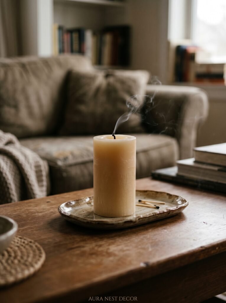
You’ve styled everything. The art is hung. The lamps are warm. The cushions have personality. And then someone walks in and the room smells like nothing, or worse, like whatever the kitchen was doing an hour ago.
Scent is the layer most people skip, and it’s the one that completes the sensory picture. A room that smells intentional feels cared for in a way that’s hard to articulate but immediately apparent.
This doesn’t mean candles burning 24/7 or a diffuser pumping fragrance into the air. It means a single candle on the coffee table lit when people are home in the evening. A dried bundle of eucalyptus hung near a vent. A cedar or vetiver room spray used once or twice a week.
For the simple aesthetic: grounding scents work best. Cedarwood, sandalwood, neroli, white tea, fig, or clean linen. These don’t announce themselves — they just make the room feel clean and lived-in and loved. The US market has some beautiful affordable options from Boy Smells and Homesick. In the UK, Wick & Tallow and Hommey both do exactly this kind of understated scent.
12. The Final Edit — How to Know When Your Room Is Actually Done

Most rooms are never “done.” But there’s a moment when they feel right, and learning to recognize it saves you from over-buying and under-appreciating what you already have.
The test: stand at the doorway. Look at the room for ten seconds without touching anything. Notice what your eye goes to first, second, third. If it travels smoothly — from the art to the sofa to the lamp to the plant — the room is working. If it snags somewhere, that’s the thing to address.
The most common culprits: something too bright in the wrong spot, a piece of furniture in an awkward angle, a shelf too crowded, a lamp at the wrong height. Usually one small adjustment — moving a lamp, swapping two cushions, taking one thing off a shelf — is all it takes.
The other test: does the room still feel like you? Not like a Pinterest board. Not like a showroom. Like someone who has opinions and preferences and a specific life. If yes — you’re done. For now. Until the next beautiful thing calls to you, and you let it in.
—
❓ FAQ
Q: How do I make my living room look aesthetic without spending a lot of money? A: Start with what you already have — edit before you buy. Remove anything that doesn’t feel intentional, rearrange the furniture, and focus on lamp placement and textiles, which have an outsized impact for low cost. A new throw, a single piece of art, and a warm-toned bulb can shift the whole feeling of a room for under $50 or £40.
Q: What’s the easiest way to make a small living room feel bigger? A: Light and line of sight. Keep the floor as clear as possible, use a rug to define the seating zone, and hang curtains high — close to the ceiling, not just above the window frame. This draws the eye upward and makes the ceiling feel taller, which makes the whole room feel more generous.
Q: How do I find my own aesthetic when I like so many different styles? A: Look at the things you’ve kept for years, not the things you’ve bought recently. What’s on your walls? What’s on your bedside table? The objects you’ve held onto across different homes and different life chapters are telling you something real about what you actually love, and that’s the starting point for a room that feels genuinely yours.
—
💭 Final Thoughts
The most beautiful living rooms aren’t the ones that followed every rule. They’re the ones where someone paused, looked at what they had, and made it honest. Simple doesn’t mean sparse — it means clear. It means every corner of the room is doing something, and nothing is there by accident.
Your living room should feel like the best version of a Tuesday evening at home. Not a photoshoot. Not a showroom. Home.
What’s the one thing in your living room that you’ve always loved but never quite known how to make the rest of the room match?


