
The Wall That Makes Everyone Stop and Actually Look: Living Room Photo Wall Ideas That Feel Like You
You know that moment when you walk into someone’s home and one wall just does something to you? Not because it’s expensive. Not because it came straight out of a catalog. But because it feels completely, unmistakably like the person who lives there.
That’s what we’re building today.
—
1. Why Most Photo Walls Feel Like a Mistake Two Years Later (and How to Avoid That)
Here’s the thing nobody tells you when you’re excitedly ordering frames at midnight: a gallery wall that isn’t anchored by a real concept will start to irritate you faster than almost any other design decision in your home. I’ve seen it happen. You hang twelve frames, stand back, and think yes — and then six months later you’re rearranging things every other weekend, adding and removing prints, never quite satisfied.
The fix isn’t more frames. It’s a point of view.
Before you buy a single frame or print a single photo, ask yourself one question: what do I want to feel when I look at this wall? Nostalgic and soft? Graphic and bold? Collected and a little chaotic, like a creative person actually lives here? Each of those answers leads you somewhere different, and committing to one of them early saves you from the second-guessing spiral entirely.
Think about your existing room first. The wall doesn’t exist in isolation. If your sofa is a deep forest green and your rug has warm ochre tones, a stark black-and-white grid of prints might look stunning — or it might feel weirdly clinical. If your living room leans into linen textures and warm wood, then sepia-toned photographs and botanical prints in aged brass frames will make the whole room exhale.
The strongest photo walls I’ve ever seen weren’t planned on a Pinterest board. They were planned from the sofa. Literally: sit on your sofa, stare at the blank wall, and imagine the feeling you want before you touch a single thing.
“A gallery wall without a point of view is just furniture for your walls.”
—
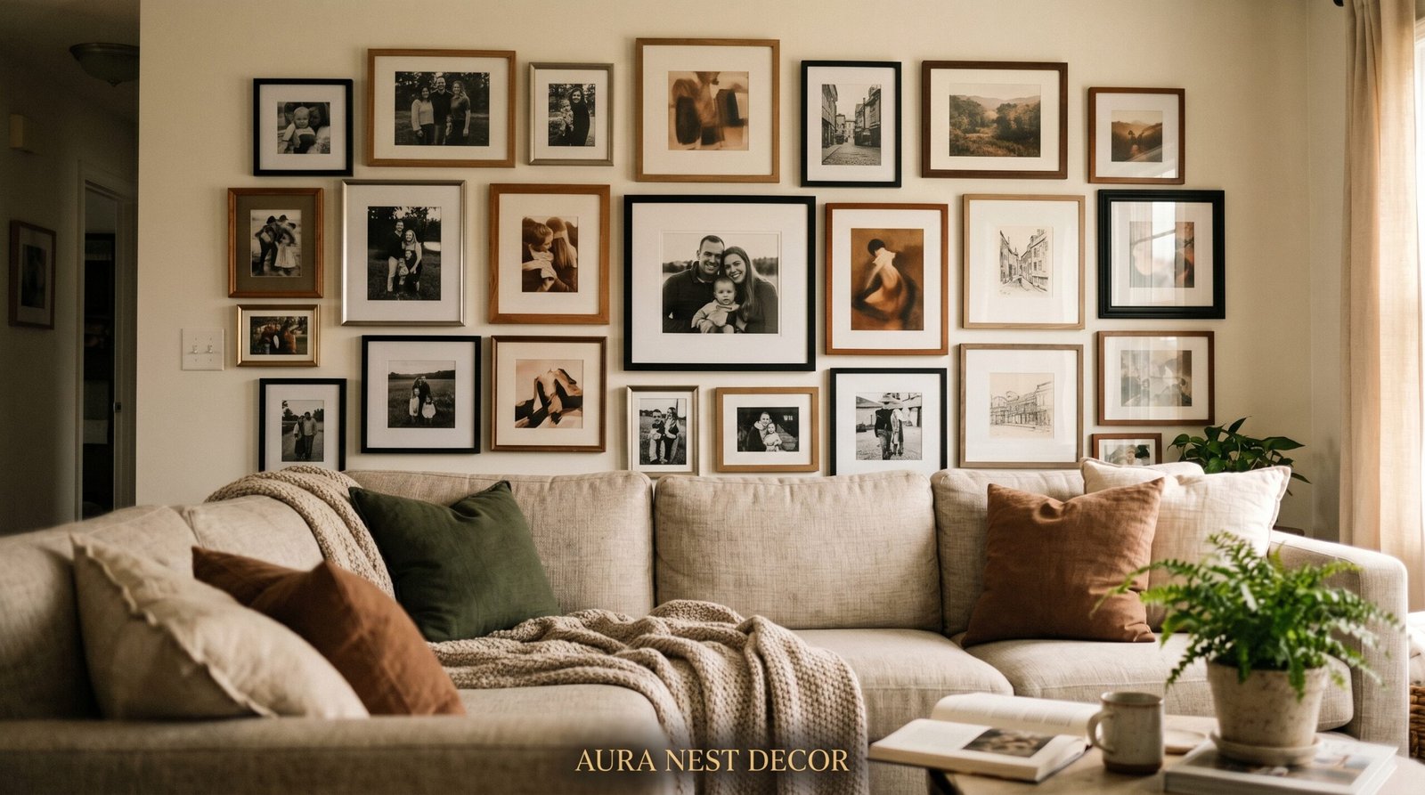
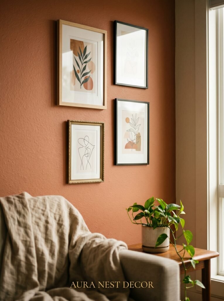
2. The Frame Mix That Interior Designers Actually Use (It’s Not What You Think)
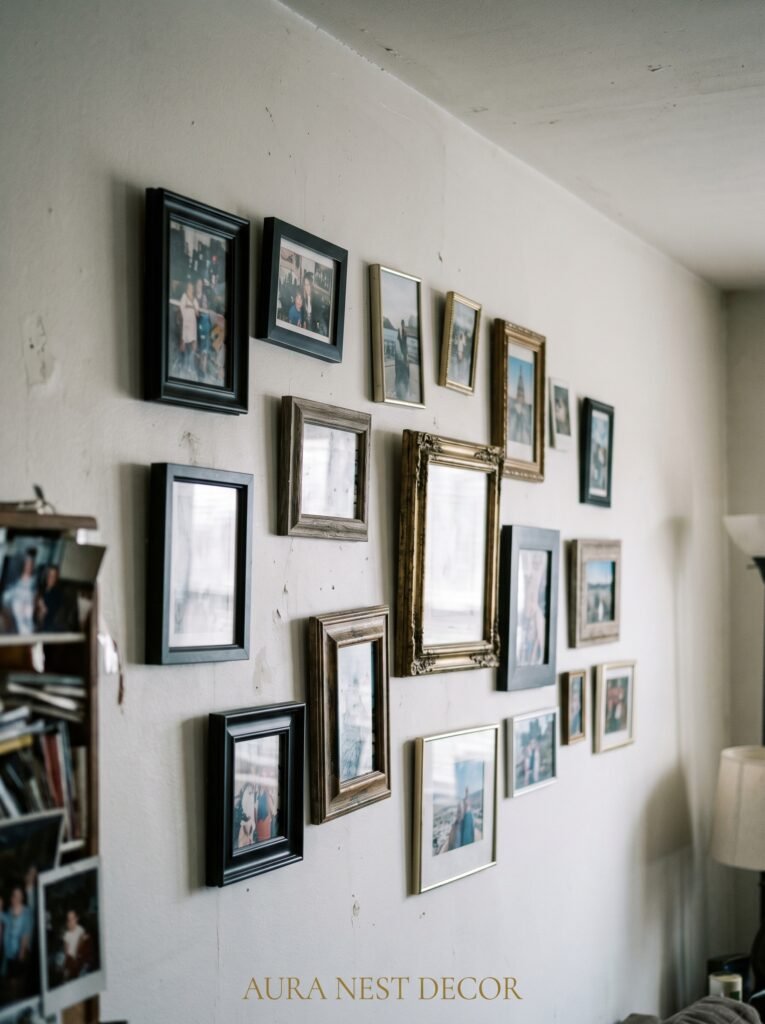
Matching frames feel safe. And that’s exactly the problem.
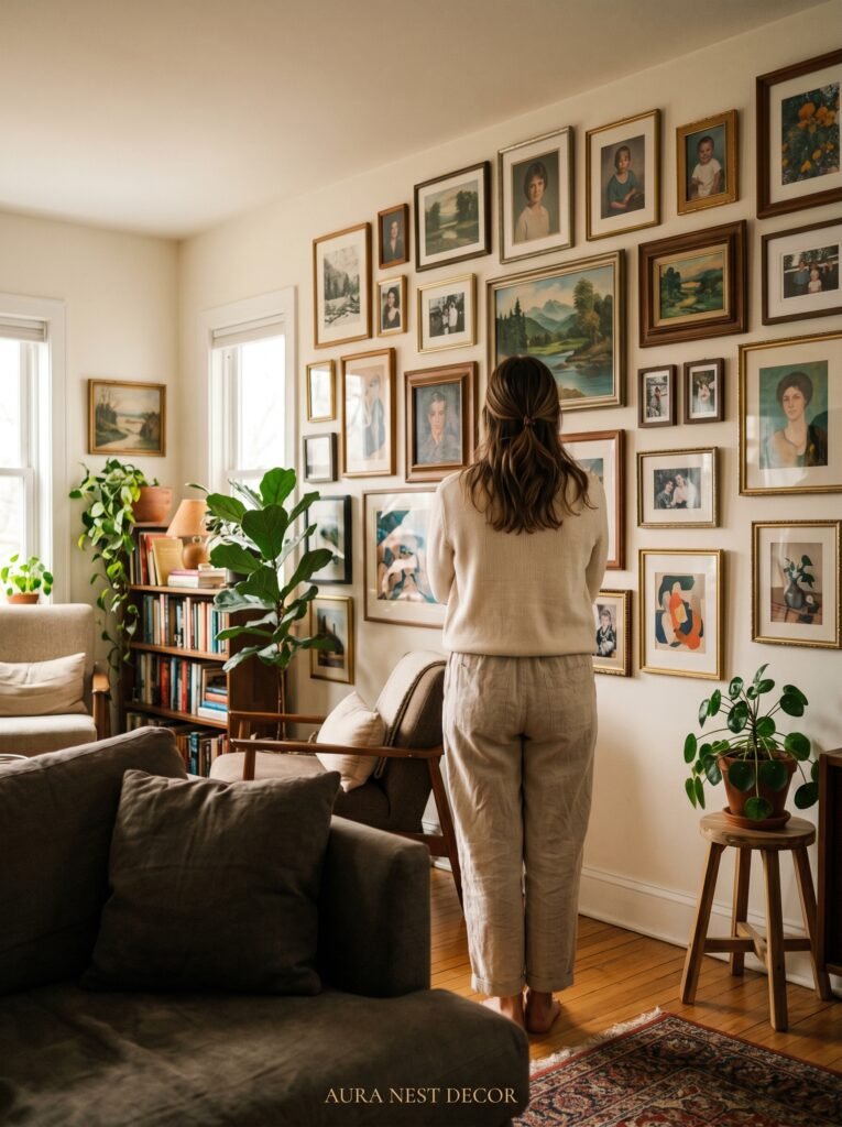
A perfectly matched set of twelve identical black frames can look sharp and intentional — but more often, it looks like you ordered a kit. The rooms that stop people in their tracks on Pinterest almost always have what designers quietly call “controlled chaos” in the framing: two or three dominant frame styles, with one or two unexpected outliers that make the whole thing feel curated rather than purchased.
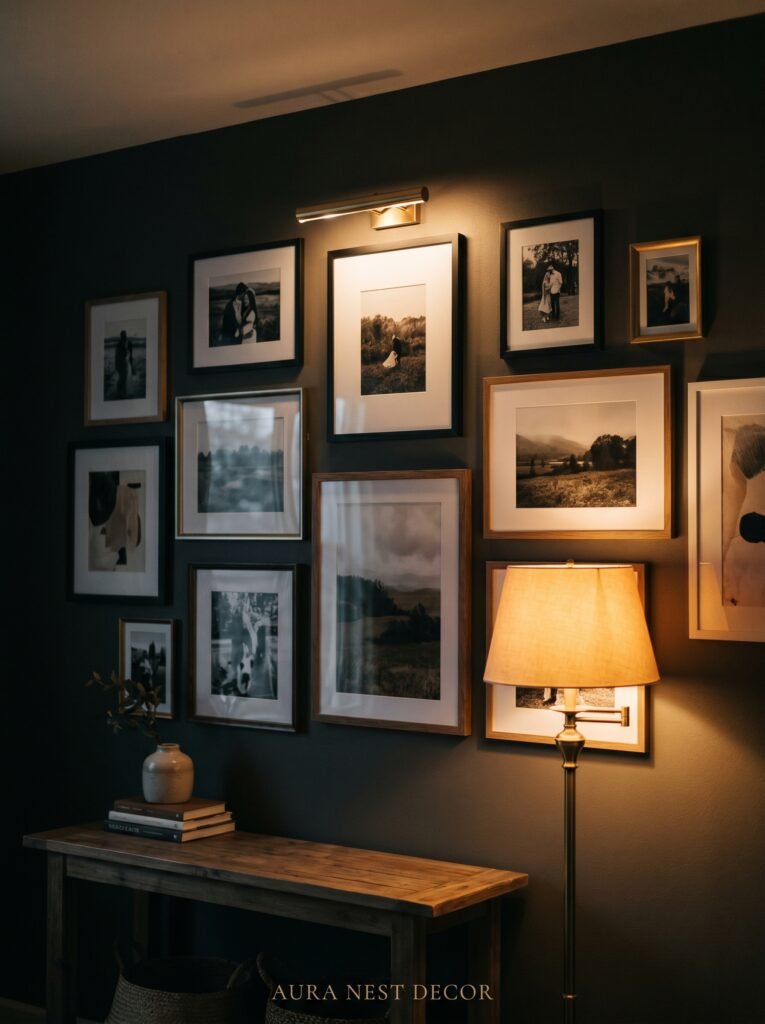
Here’s a formula that works almost every time: pick one metal finish (brushed brass, matte black, antique silver) and let that be your thread. Then vary the frame weight — some chunky, some thin — and mix in one or two natural wood frames to add warmth. That single consistent metallic note ties everything together while the variation keeps the eye moving and interested.
In the UK especially, there’s a long tradition of mixing ornate antique frames with more minimal modern ones — think a heavy gilded frame sitting next to a simple pale oak one. It looks collected. It looks like you’ve had things for years and added to them slowly, which is exactly the kind of authenticity a wall arrangement should project.
Don’t be afraid of odd numbers. Three frames. Five. Seven. There’s a reason designers almost always hang things in odd groupings — even numbers create symmetry, and symmetry, while lovely in certain contexts, can make a photo wall feel static rather than alive.
—
3. The Color That Keeps Showing Up in Every Beautiful Living Room Wall Right Now
Warm cream. Not white. Not beige. The specific color that sits somewhere between a cup of milky tea and morning light on old plaster.
It’s the background color showing up behind gallery walls everywhere right now, and there’s a reason. Pure white walls are unforgiving — they make frames look hard and photos look cold. That particular warm cream does something entirely different. It softens the edges of everything. It makes black-and-white photography look rich instead of stark. It makes color prints glow rather than compete.
If you’re in a rental or can’t repaint, this principle still applies — just lean into it with your print choices. Warm-toned photographs (golden hour shots, film photography with that slight orange cast, landscapes at dusk) will create that same effect against a cooler wall because the warmth is coming from the art itself rather than the wall behind it.
In the US, designers are pulling this color through with Benjamin Moore’s White Dove or Sherwin-Williams Navajo White. In the UK, Farrow & Ball’s Elephant’s Breath and Dimity are doing the same work. They all share that quality of looking almost neutral until you put something against them, and then the room suddenly just works.
One more thing: lighting changes this completely. Look at your wall at 7pm with a lamp on. That’s the version people actually live with. Design for that version.
—
4. Hanging Photos You Took Yourself Without It Looking Amateurish
Personal photographs are the soul of a photo wall. But there’s a version of this that looks deeply personal and beautiful, and a version that looks like someone printed their phone photos at Walgreens and stuck them up.
The difference is almost never about the quality of the photo itself.
It’s about printing and presentation. A gorgeous candid of your family taken on an iPhone looks incredible as a large-format matte print in a proper frame. The same photo as a 4×6 glossy print in a clip frame looks exactly like what it is. Size matters. Finish matters. When you’re printing personal photos for wall display, go matte over glossy every time — it reads as fine art rather than family snapshot, even for the exact same image.
Black and white conversion is your friend here. A photo that feels slightly too casual or brightly colored for your aesthetic often becomes completely at home when converted to black and white. You lose the literal information but gain a timelessness that plays beautifully against other art pieces.
Consider printing some images oversized. One large personal photograph — 16×20 or bigger — surrounded by smaller prints has an anchoring effect that feels both editorial and intimate. It says: this one mattered most. The eye goes there first, and then travels.
“The most beautiful walls aren’t decorated. They’re remembered.”
—
5. The One Rule That Makes Any Arrangement Feel Intentional (Not Random)
There’s a trick that professional interior stylists use when hanging gallery walls, and once you know it you’ll see it everywhere: the invisible line.
Pick one consistent horizontal line and let every single frame either sit on it, above it, or below it — but with their centers aligned to that line. This is called center-line hanging, and it creates a through-line of order beneath the apparent chaos of mixed frames and mixed sizes. The eye perceives the consistency without being able to name it, and the result feels deliberate without being rigid.
You can mark your center line lightly with a pencil or use painter’s tape to map it out before committing to a single nail hole. The center line typically sits at eye level, which in most rooms means roughly 57 to 60 inches from the floor — the standard used in most galleries and museums because it puts the average adult’s eye at the center of the display.
The second option, if you want something more organic, is a ceiling-hang approach: align the tops of all frames rather than the centers. This creates a different mood — slightly more architectural, like the display is growing downward from a fixed point. It works beautifully in rooms with high ceilings where you want to draw the eye upward.
What doesn’t work is randomness without a logic underneath. That’s the thing that looks “off” even when you can’t explain why.
—
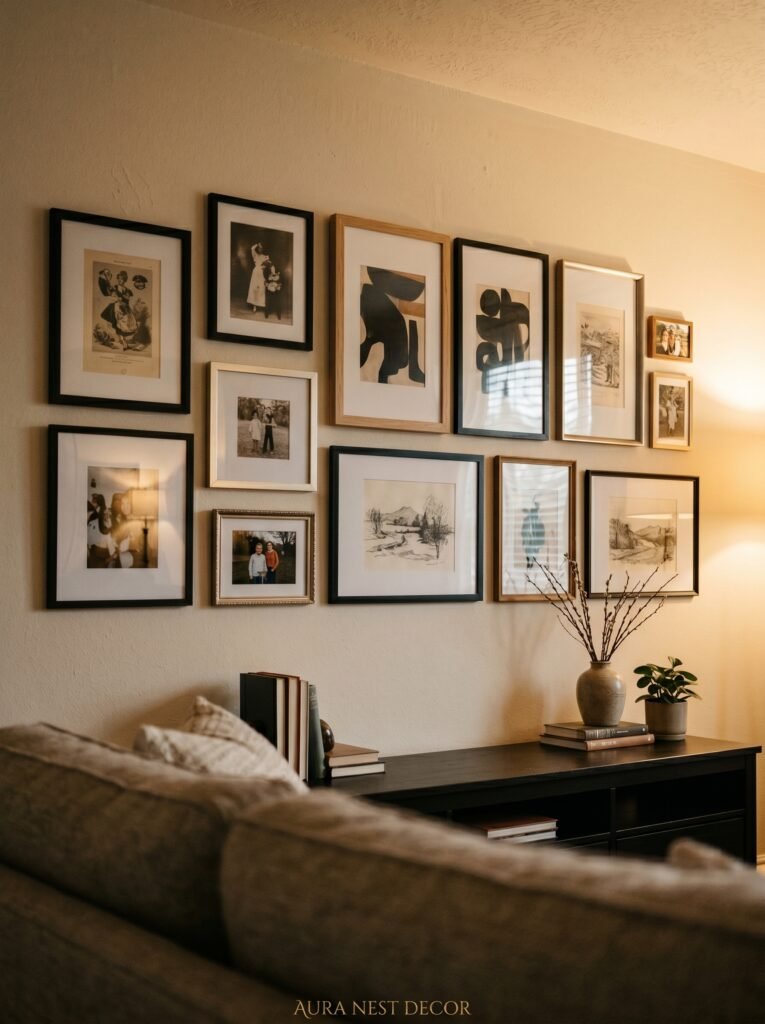
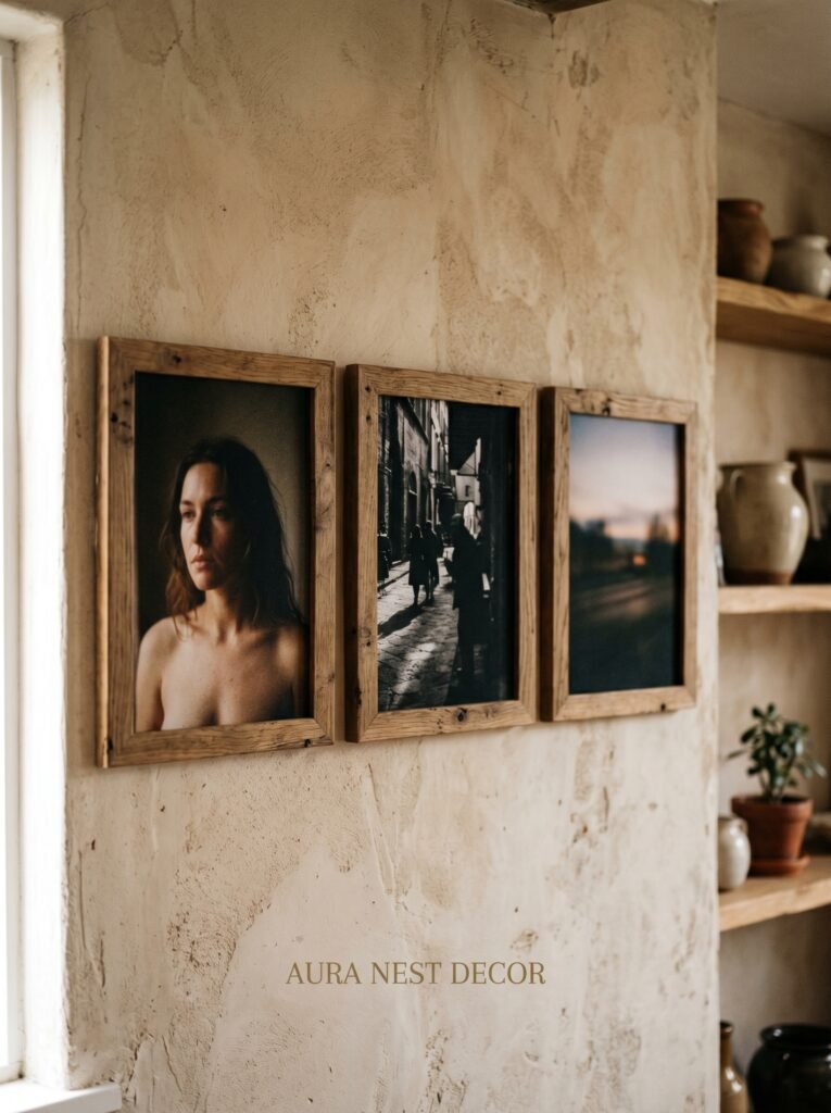
6. Mixing Art Prints and Photos Without Making It Look Like a Jumble Sale
This is where most people get nervous, and understandably so. Putting your holiday photographs next to a botanical print next to a typographic art piece sounds like it should look terrible. And sometimes it does.
But when it works — when it really clicks — it’s because of one principle: tonal cohesion over subject cohesion.
Subjects can be wildly different. A landscape photograph, a line-drawing print, a vintage map, a black-and-white portrait. They don’t need to relate to each other in subject matter at all. What they need is to share a tonal world. If the landscape is warm-toned, the line drawing sits in cream and gold, the map has aged yellowed edges, and the portrait is slightly overexposed with a soft warm cast — they belong together. Remove that tonal relationship and the same pieces feel random.
In practical terms: look at the dominant color temperature of each piece before you buy or print it. Warm? Cool? Neutral? Aim for at least 70% of your pieces to share a temperature, and use the outliers sparingly as accent notes rather than equal players.
Texture in prints also helps. A slightly textured fine-art paper print alongside a smooth photograph and a raised-line poster creates a layered quality that reads as sophisticated rather than random.
—
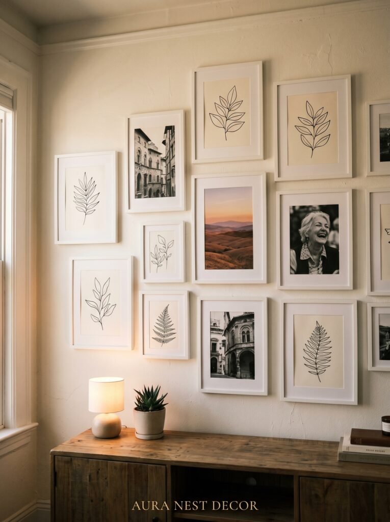
7. The Unexpected Things That Live Beautifully on a Photo Wall
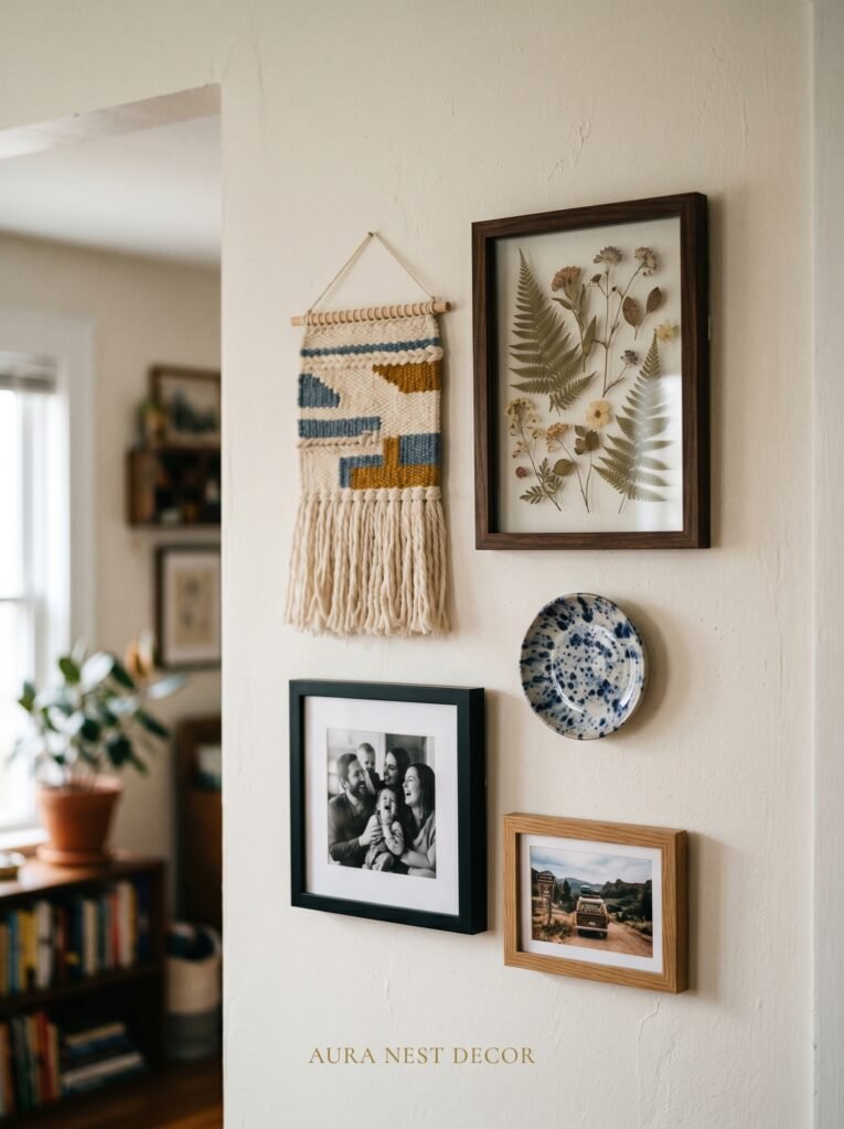
Not everything on a great photo wall is a photograph.
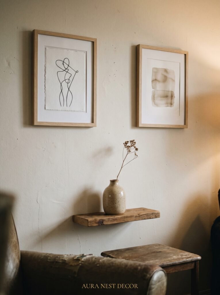
This is one of the most underused pieces of advice in home decor, and it makes an enormous difference to how a wall reads. The best gallery walls I’ve ever stood in front of had objects mixed in with the frames. Three-dimensional elements. Things with weight and material texture that photographs simply cannot replicate.
Small decorative plates, particularly vintage ones with painterly patterns, look extraordinary hung between photo frames. In the UK especially, this has deep roots in traditional interior styling — think delftware, transferware, hand-painted porcelain — and the trend has fully made its way into modern interiors because it works so beautifully. In the US, hand-thrown pottery wall pieces, small ceramic masks, woven fiber art — all of these bring a material richness that a flat wall of frames can never quite achieve alone.
Mirrors, even small ones, are magic in a photo wall. They catch light differently at every hour of the day. They create depth. And practically speaking, they make the wall feel larger and less fixed, which is useful in rooms where you want the arrangement to feel organic rather than static.
Dried botanicals pressed behind glass are having a real moment right now, and for good reason. They bridge the gap between photograph and object, between natural and designed.
“A wall is just a surface. What you put on it is the beginning of a story.”
—
8. How to Make a Rented Flat or House Feel Like Your Own Without Losing Your Deposit
Renting is one of the quiet frustrations of modern life, particularly in cities like London, Manchester, New York, or Chicago where so many people spend years in spaces they can’t truly alter. But a photo wall is more achievable in a rental than almost any other significant design statement — you just need the right approach.
Command strips and picture-hanging strips have genuinely improved to the point where they’ll hold a surprising amount of weight without damaging plaster. For frames under about two pounds, they’re completely reliable if you follow the instructions precisely (which means cleaning the wall first, pressing firmly for 30 seconds, and waiting the full 24 hours before hanging). For heavier frames, look for the heavy-duty versions rated for four to seven pounds.
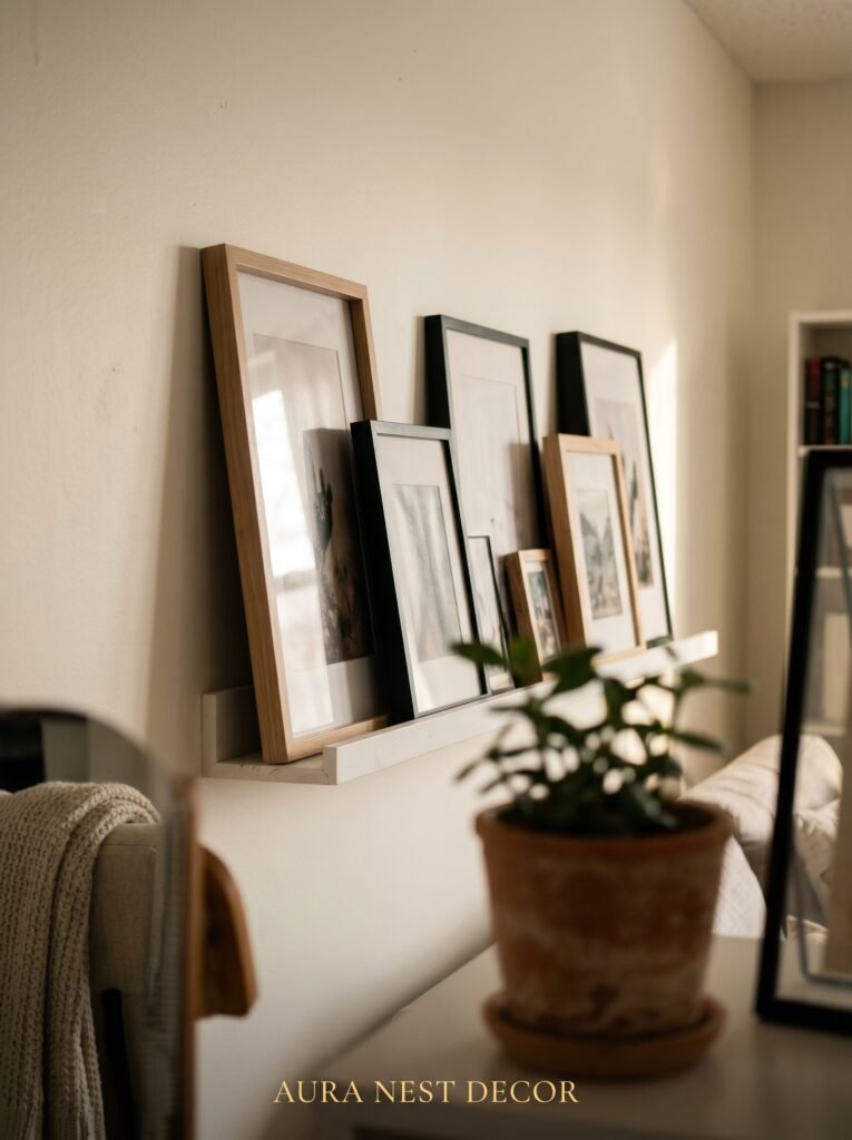
The alternative approach — which is particularly beautiful and rental-friendly — is leaning. A carefully leaned arrangement of frames on a sideboard, shelf, or even directly on the floor against the wall has an effortless quality that hung arrangements sometimes can’t match. Lean a large print or mirror at the back, layer smaller frames in front, add a plant or a candle or a small object, and you have something that looks like it took an hour and cost a fortune. It took twenty minutes and costs nothing to change.
Picture rails, which are much more common in older UK homes and period properties, are an absolute gift. Use them.
—
9. The Size Ratio That Makes a Small Wall Look Intentional and Generous
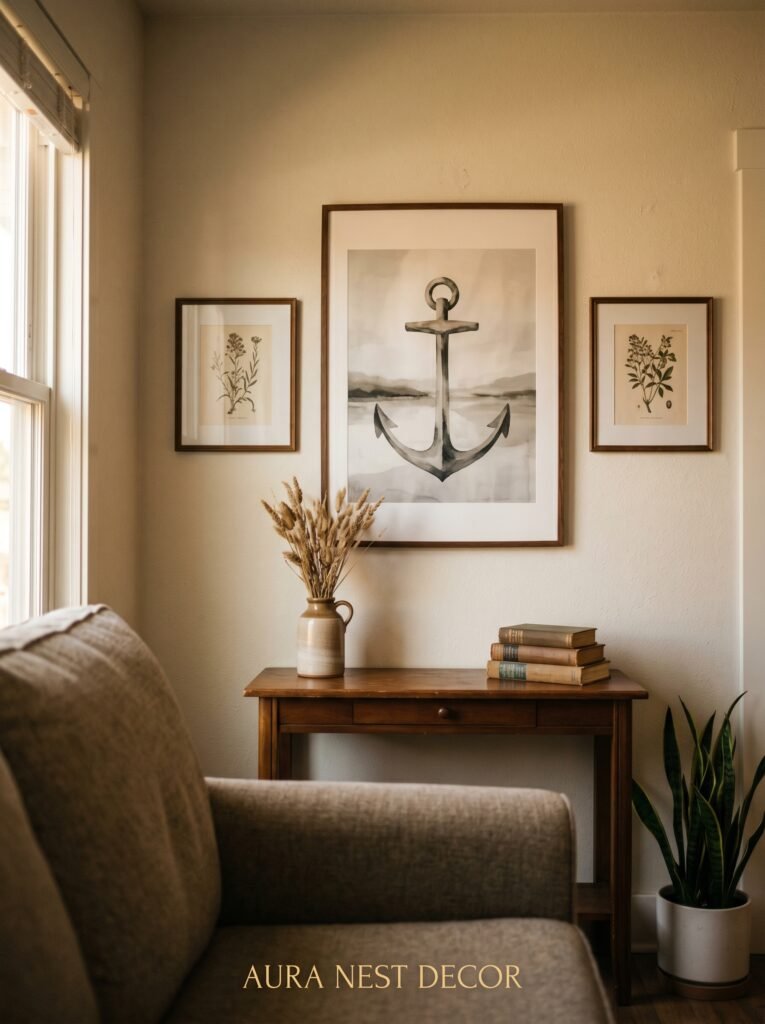
Small walls are tricky. The instinct when you have a small wall is to use small frames, but this is almost always the wrong call. Small frames on a small wall make the space feel cramped and uncertain — like the room doesn’t quite know what it wants to be.
The counter-intuitive truth is that one or two larger pieces on a small wall make it feel more spacious, not less. Scale creates confidence. A 24×30 inch art print centered on a small wall looks decided. It fills the space with intention rather than cluttering it with hesitation.
If you’re working with a narrow wall — the kind you find beside fireplaces, between doorways, or in entrance halls — think vertical. A tall, narrow arrangement using two or three frames stacked on a vertical axis suits the space and draws the eye upward, which always makes a room feel taller and more generous.
The math that works for most standard-sized living room walls: your arrangement should cover roughly 60 to 75 percent of the wall’s width. Smaller than that and it floats. Larger and it crowds. That middle ground is where things feel right.
—
10. Film Photography Prints and Why They’re Different From Everything Else
There’s something that film photography does that digital cannot fully replicate, and it shows up most clearly on a wall.
Grain. Warmth. A slight softness that doesn’t come from being out of focus but from the actual physical process of light on silver emulsion. Film photographs — whether taken by you, shot by a photographer friend, or purchased as prints from a film photographer — bring a specific quality to a photo wall that no filter or Lightroom preset has ever perfectly matched.
I’m not saying your digital photos aren’t beautiful. They absolutely are. But if you’re putting together a photo wall and want it to feel timeless rather than current — the kind of wall that looks as good in ten years as it does today — consider mixing in at least a few film prints.
Disposable camera photos are everywhere right now and genuinely gorgeous printed large. Old family photos, particularly black-and-white ones from the 60s and 70s, look extraordinary and add a layer of story that nothing you took last weekend can compete with. Pull them from boxes, scan them at high resolution, and print them properly. They deserve to be on a wall.
—
11. The Lighting Move That Completely Changes How Your Wall Feels After Dark
Here is a change that will cost you under $40 and will make your living room feel like a completely different space in the evenings.
Picture lights.
Not overhead lighting. Not the main room lamp pointing vaguely in the direction of the wall. A small, directed picture light — either clipped to a single large frame, mounted above a key print, or used as a small gallery rail along the top of an arrangement — changes the experience of a photo wall after dark in a way that no other adjustment comes close to.
The warm directed light creates shadow and dimension. It makes photographs look richer. It makes the wall feel intentional and considered in a way that even expensive art can fail to achieve without proper lighting. In the evenings, when the ambient light drops and lamps come on, a well-lit photo wall becomes the visual anchor of the entire room.
Plug-in picture lights from Amazon and IKEA are affordable and install without any electrical work. Battery-operated LED versions with warm (not cool) bulbs are even simpler. The color temperature you want is between 2700K and 3000K — that’s the warm amber range that reads as candlelight rather than office.
—
12. Starting When You Don’t Have Enough Art Yet (This Is Actually an Advantage)
One of the loveliest things about a photo wall is that it doesn’t have to be finished.
In fact, a wall that looks clearly in-progress — where you can see that pieces have been added over time, where there are a couple of gaps that will eventually be filled — often feels more alive than a perfectly complete arrangement. It says: someone thoughtful lives here, and they’re still paying attention.
Start with what you have. Two frames. Three prints. One large piece that you love more than anything else on your walls right now. Hang them well — using the center-line rule, in frames that suit your room — and leave space deliberately. Not because you don’t know what to do next, but because you’re waiting for the right thing.
Buy prints when you travel. Commission something small from an independent artist (both Etsy and Not on the High Street have incredible options for US and UK buyers). Print a film photograph from five years ago that you’ve been meaning to frame for forever. Let the wall grow at the pace of your actual life rather than the pace of a weekend home project.
The walls that feel most like home are the ones that were never finished all at once.
—
❓ FAQ
Q: How do I arrange a gallery wall without making lots of holes in my wall? A: Lay all your frames on the floor first and arrange them until you love the composition. Then trace each frame onto brown paper or newspaper, cut them out, and tape the paper templates to the wall with painter’s tape to preview exactly where everything will sit before you commit to a single nail hole. It saves enormous amounts of frustration.
Q: What’s the best way to choose a cohesive set of prints if I’m starting from scratch? A: Pick one tonal direction first — warm, cool, or high-contrast monochrome — and shop within that constraint. Sites like Desenio, Society6, and Artifact Uprising (all available to US and UK buyers) let you filter by color palette, which makes it much easier to find pieces that will sit well together before you see them side by side.
Q: How high should I hang photos in a living room? A: The center of your arrangement should sit at approximately 57 to 60 inches from the floor — this is the gallery standard and places the visual center of the display at average adult eye level. The most common mistake is hanging things too high, which disconnects the art from the room and makes the wall feel cold.
—
💭 Final Thoughts
A photo wall is one of the few decorating choices that asks something of you beyond taste and budget. It asks: what do you want to remember? What do you want to see every single day? The rooms that stay with us longest aren’t the most expensive ones — they’re the ones that felt like someone meant every single thing on every single wall.
Start with one piece you love completely. Then let the wall grow from there, slowly, on purpose.
What’s the one photograph you’ve been meaning to frame for years that’s still sitting on your phone?


