
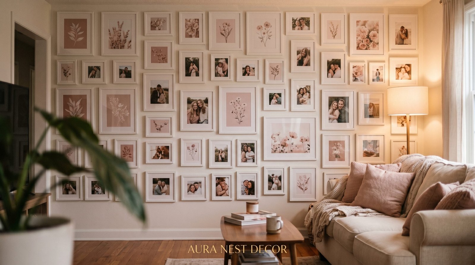
The Pink and White Photo Wall That Made Me Fall Back in Love With My Living Room
You know that feeling when you walk into a room and something just stops you? Not because it’s perfect — but because it feels completely, unmistakably you? That’s what a pink and white photo collage wall can do to a living room when it’s done right. Here’s everything I’ve learned about pulling one off without it looking like a teenager’s bedroom or a discount store display.
—
1. Why Pink and White Photo Walls Are Having Such a Cultural Moment Right Now
Let’s be honest about something. Pink has had a complicated history in home decor. For a long time, it felt like a choice you had to apologize for — softer, quieter, less serious than charcoal or navy or a bold hunter green. And then something shifted.
Dusty rose started appearing in high-end interior shoots. Blush linen showed up on the beds of the design accounts everyone was saving. And then — slowly, then all at once — pink walls started looking less like a phase and more like a point of view.
The pink and white photo collage trend specifically taps into something that photography and printed memories have always done well: they make a house feel like it belongs to actual people. Not a showroom. Not a staging exercise. A real home with real history. When your frames are white and cream and soft gold, and the photos themselves carry hints of warmth and skin tones and natural light, the whole wall starts to breathe in a way that a perfectly curated gallery simply can’t.
There’s also something deeply practical about it. Pink is one of the most forgiving wall colors to photograph against, which matters when you’re pinning inspiration or sharing your space online. It flatters faces. It softens hard architecture. It makes a room feel warm even in the dead of January.
“Pink isn’t a color choice. It’s a decision to live somewhere that feels good every single morning.”
2. The Shade of Pink That Does the Heavy Lifting (and the Ones to Avoid)
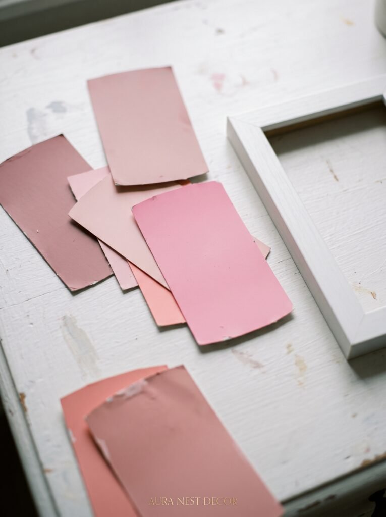
Not all pinks are created equal, and this is where most photo collage walls either sing or suffer.
The pink you’re after for this kind of wall sits somewhere between a barely-there blush and a warm dusty rose. Think: the inside of a shell, or the sky about twenty minutes after sunset. It should feel like the color has been there forever — faded in the best possible way. Benjamin Moore’s Pale Blush and Farrow & Ball’s Pelt diluted significantly are both worth looking at, as is Setting Plaster by F&B if you want something with a little more depth and warmth.
What you want to avoid is anything with too much blue undertone — those pinks can read cold and clinical under certain lighting, especially in UK homes where natural light can be more diffused and grey-toned. You also want to steer clear of hot pink or anything that vibrates too much visually. The goal is a backdrop that makes your photos the main event, not one that competes with them.
White works alongside this in two ways. First, as the dominant color of your frames — which creates cohesion even when the photos themselves vary wildly in subject and tone. Second, as an accent on adjacent walls or trim, which keeps the whole room from tipping into saccharine territory. The contrast is what gives it edge.
Test your pink in at least three different lighting conditions before you commit. Morning light, afternoon light, and evening lamp light. Walls are shape-shifters, and they deserve that level of scrutiny.
3. Building Your Frame Collection Without Spending a Fortune on It
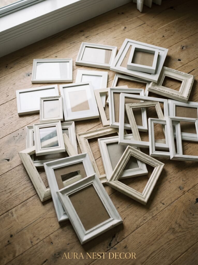
Here’s the thing nobody tells you when you start pinning photo wall inspiration: the frames you see in those beautiful shots are almost never from one single source. They’re layered, collected, hunted. That’s exactly what makes them look real.
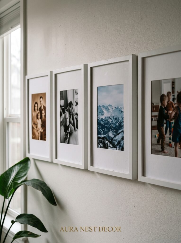
Start with a white base — a mix of crisp white and off-white frames in different sizes. IKEA’s Ribba frames are genuinely excellent for this and have been a quiet staple of good-looking gallery walls for years. Add a few from thrift stores or charity shops and repaint them. White, cream, pale gold — all work together if you let them.
The variety in frame profile matters as much as color. A flat, thin frame next to a chunky, beveled one next to a simple square creates visual rhythm without you having to think too hard about it. Same color family, different personalities. That’s the formula.
For a pink and white aesthetic specifically, try introducing one or two frames in pale pink resin or light rose gold metal. Not many — just enough so the wall itself seems to be part of the color story rather than just a surface the frames hang on. This is the detail that makes the whole thing look intentional rather than accidental.
4. The One Layout Trick That Makes a Collage Look Like Art Instead of Chaos
There’s a reason some photo walls look stunning and others look like an explosion in a craft store. And it almost always comes down to one thing: the relationship between the pieces.
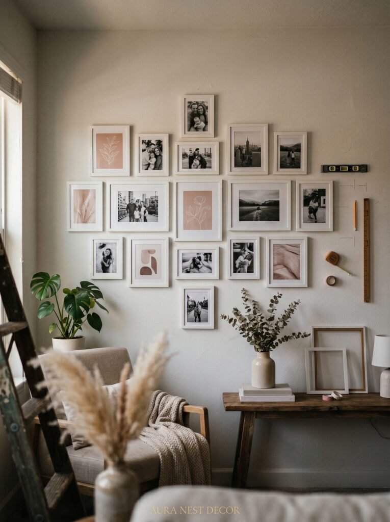
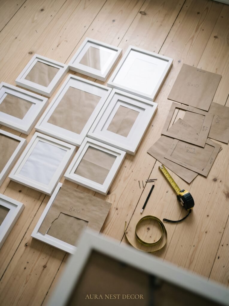
Before you put a single nail in the wall, lay everything out on the floor. Every frame, every print, every piece you’re planning to include. Live with that arrangement for a day. Look at it from across the room. Photograph it on your phone and check the proportions. You’re looking for balance — not symmetry, but balance. Those are different things.
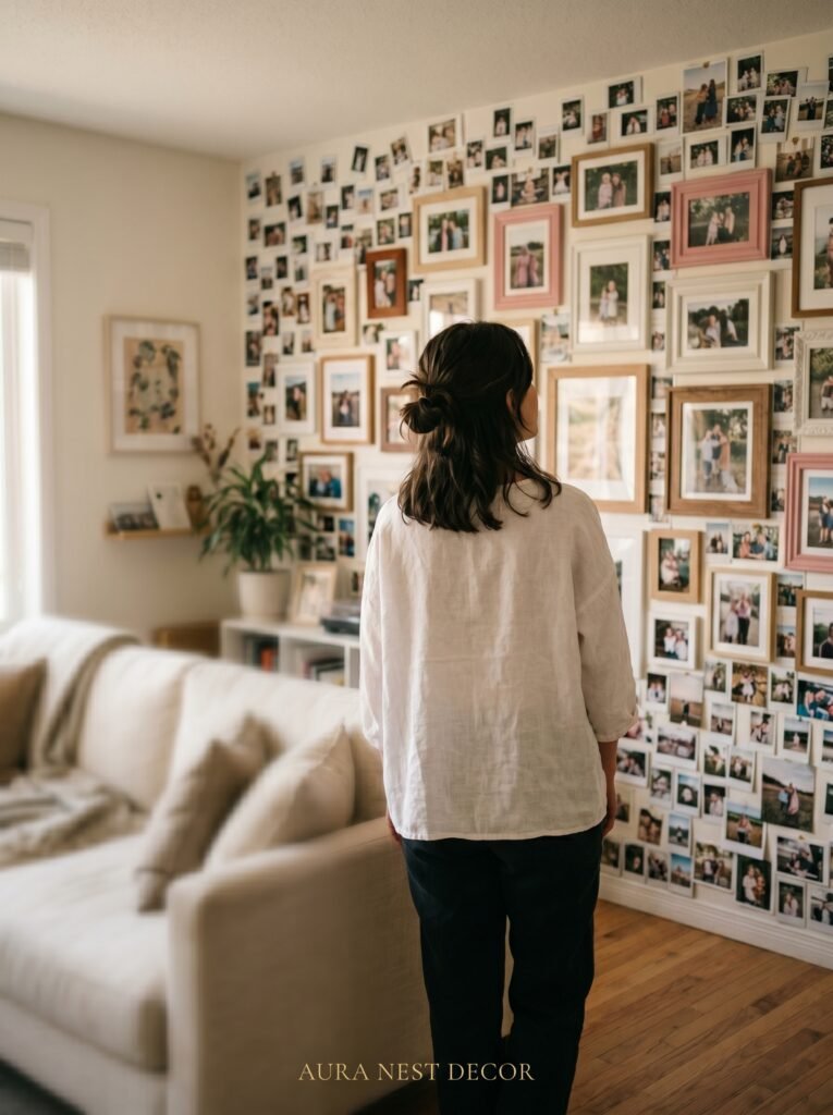
The arrangement that tends to work best for collage walls with a pink and white palette is an organic cluster — sometimes called a salon hang — where frames are spaced roughly two to three inches apart and the overall silhouette of the collection forms a loose rectangle or oval shape. This reads as intentional from a distance and intimate up close.
One anchor piece helps enormously. This should be your largest frame, placed slightly off-center (usually to the left or right of where your eye naturally lands first). Everything else builds around it. Think of it like furniture arrangement — you’d never put your sofa in the middle of a room with nothing to ground it.
“The floor is your rehearsal stage. The wall is opening night. Never skip the rehearsal.”
5. What to Actually Put in the Frames (Beyond Just Family Photos)
This is where pink and white walls become genuinely expressive rather than just pretty.
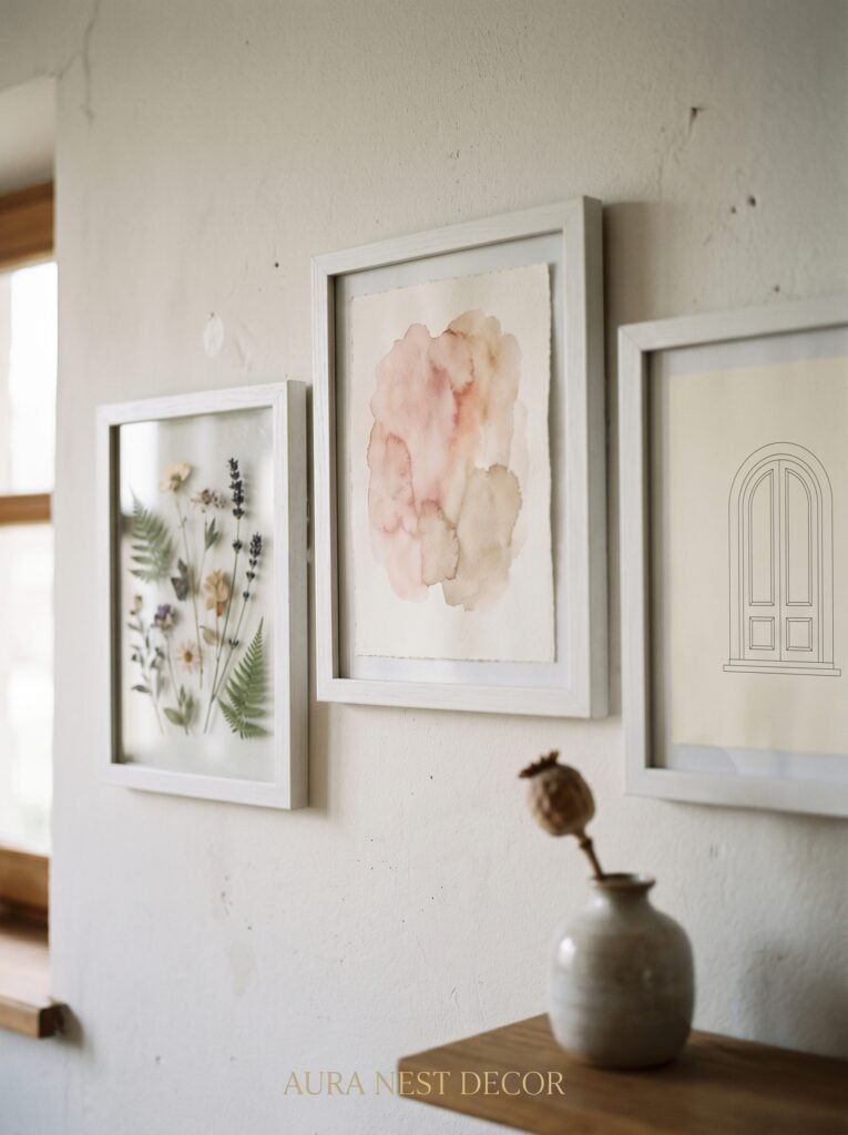
Yes, your photos belong here. But so does a lot more. Botanical prints in soft pink and green work beautifully — pressed flower art especially, which you can frame yourself at a fraction of the cost of buying it ready-made. Watercolor prints in a blush palette are widely available on Etsy and add a handmade softness that photographs can’t provide on their own.
Text pieces earn their place when they say something that actually matters to you. Not mass-produced motivational quotes in script fonts — those have been done to exhaustion. But a line from a poem you love, typeset simply in a font that respects the words. A child’s drawing, framed with the same care you’d give a painting. A vintage map of a place you love, printed in pink-tinted sepia.
The mix is what tells the story. Photos of people you love next to a botanical print next to something handwritten next to a mirror in a white frame that bounces light around the room — this is how a collage wall stops being decoration and starts being biography.
Don’t be afraid of including things that are unfinished or imperfect. A photo with a slight tilt that makes the composition interesting. A print you made yourself on a home printer that you’ve been second-guessing. Those imperfections are what make the wall alive.
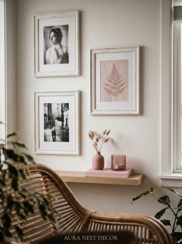
6. How to Use White Matting to Make Budget Prints Look Like Museum Pieces
This is genuinely one of the most underrated tricks in home styling, and it costs almost nothing.
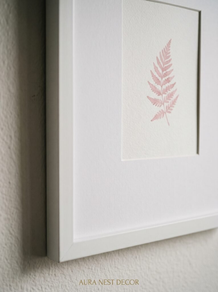
White matting — the thick white border inside a frame, between the glass and the image — does something remarkable to whatever sits inside it. It creates separation. Distance. It forces the eye to appreciate the image on its own terms, the way a gallery would present work of genuine value.
For a pink and white collage wall, white matting serves double duty. It makes every print look more considered and more expensive than it is. And it adds extra white into the color story without requiring more white frames.
The mat width matters. For smaller frames (5×7 and under), a half-inch mat is usually enough. For anything larger — 8×10 and up — you want a full inch or even two. The proportion should feel generous, not squeezed. If the mat looks like an afterthought, it defeats the purpose entirely.
You can buy pre-cut mats at most craft stores and online for very little, and they fit standard frame sizes with no fuss. Cut your prints to fit, add the mat, close the frame, and watch something ordinary become something you’d genuinely stop to look at.
7. The Lighting Detail That Changes Everything After 6pm
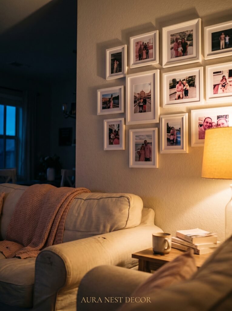
Most people think about what their photo wall looks like in daylight. Almost nobody thinks about what it looks like at night.
This is a mistake. Because evenings are when you’re actually in your living room, relaxed, seeing things slowly. And a pink and white wall under cold overhead lighting looks flat and institutional. Under the right warm light, it looks like a painting.
Picture lights — the small brass or white bar lights that mount above a frame or directly on the wall — are the most elegant solution, but they require some commitment. More accessible is a warm-toned plug-in sconce mounted nearby, or even a simple string of warm Edison fairy lights draped along the top edge of your collage cluster.
The key word in all of this is warm. You want bulbs in the 2700K range — that amber, honey-toned light that makes everyone in the room look like they’re living their best life. Anything cooler than that and your pink wall will look lavender. Anything warmer than about 3000K and you risk yellow.
A dimmer switch, if you have the ability to add one, is one of the best investments you can make in any room that contains a feature wall. The difference between full brightness and sixty percent brightness is the difference between a room you photograph and a room you never want to leave.
“Good lighting doesn’t make a room pretty. It makes a room feel true.”
8. Small Living Room? Here’s How to Scale the Collage So It Doesn’t Swallow the Space
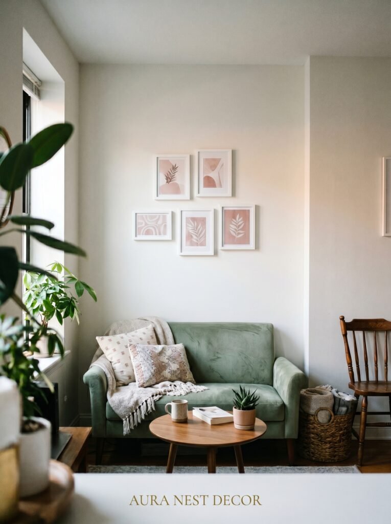
Smaller rooms — and there are a lot of them, especially in UK terraced houses and American city apartments — require a different approach to collage walls. Not a smaller ambition. Just smarter proportions.
The instinct in a small room is to hang fewer, smaller things. Resist this. A single small frame on a large wall makes a room feel more cramped, not less. What works better is a tight cluster of frames that reads as one cohesive piece from a distance, keeping the overall footprint contained even if the individual frames vary in size.
Stick to the wall above a sofa or console table. That natural anchor point does the work of grounding the arrangement, so it doesn’t float or feel disconnected from the room. Keep the cluster no wider than the piece of furniture beneath it — or slightly narrower — for a proportion that feels settled rather than anxious.
Mirrors in white frames mixed into the collage will do more for a small room than almost anything else. They reflect light, they push the walls out visually, and in a pink and white palette they add glimmer without glitter.
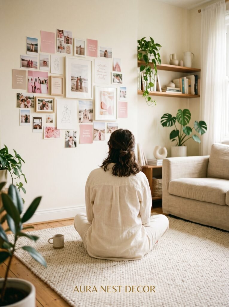
9. The Forgotten Wall That’s Actually Perfect for This
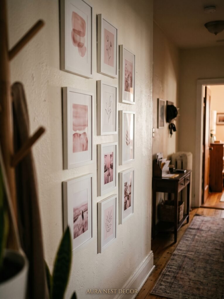
Everyone’s looking at the wall behind the sofa. And yes, that works. But here’s a wall people consistently overlook: the wall you see first when you walk in the room.
That entry-facing wall — the one that catches your eye the moment you step through the door — is where a pink and white collage creates its biggest emotional impact. It’s the first impression the room makes. And it sets the tone for everything that follows.
In a living room with an open layout, this wall often connects to a hallway or foyer, which gives you an opportunity to extend the collage feeling into adjacent spaces. Not matching — just echoing. A few frames in the hallway that share colors with the living room wall create a sense of a home that was designed on purpose rather than assembled by accident.
The wall beside a window is another overlooked gem. The natural light that spills across a photo collage during the day — especially if the frames include any glass or metallic elements — creates a constantly shifting, living quality that a solid interior wall simply can’t offer.
10. Incorporating Shelves Into the Collage Without It Looking Cluttered
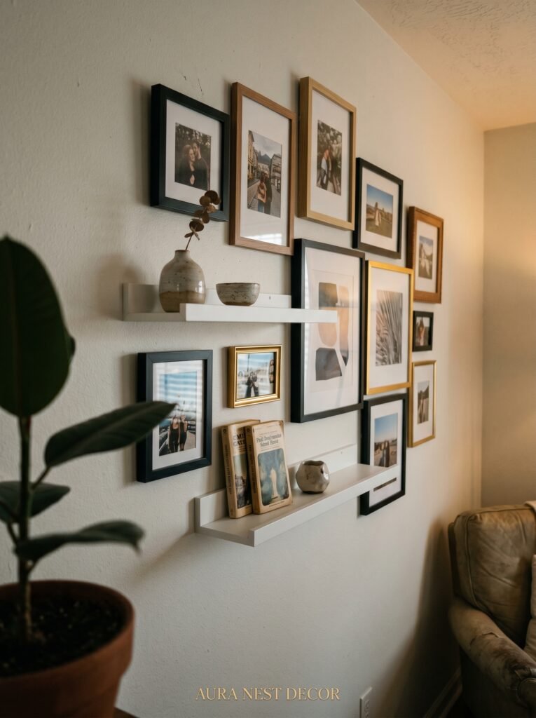
A floating shelf or two woven into a photo collage turns a flat arrangement into something with dimension and depth.
The shelf itself should be white — either painted wood or a simple white-finished bracket style. It doesn’t need to be deep. Four to six inches is enough to hold small objects: a bud vase with a single dried pampas stem, a small ceramic dish, a tiny plant, a stack of two or three books with their spines facing front.
The objects on the shelf should carry the pink and white palette forward. White ceramic. Blush linen ribbon around the book stack. A pink glass candle holder catching whatever light is available. Every object should earn its place by contributing either color or texture or a slight sense of story.
What you want to avoid is loading the shelf with too many things. Restraint is the whole point. Three objects, maximum, on any single shelf. The negative space between them is as important as the objects themselves. Negative space in a collage wall is breathing room — and every arrangement, no matter how full, needs places for the eye to rest.
11. How to Keep It Cohesive When Your Photos Span Different Decades and Color Temperatures
Old photos are warm and golden. New digital prints tend to be cooler and more saturated. Mixing decades and color temperatures in a single collage is one of the most common challenges people run into — and one of the most satisfying to solve.
The simplest answer is to convert everything to black and white. This sounds like a compromise but it’s actually a design decision that often looks more sophisticated than the full-color version. Against a pink wall, black and white photographs become graphic and striking, and the overall arrangement feels considered rather than accidental.
If you want to keep color, have your older photos professionally color-corrected and reprinted — services like Artifact Uprising and Snapfish both offer high-quality prints that can be calibrated to a consistent temperature. It’s worth the cost. Inconsistent color across a collage is the detail that makes something look messy even when the arrangement itself is beautiful.
A third option: embrace the variation, but contain it within the frame. Use white mats generously around photos with strong or warm color casts. The white buffer neutralizes the extremes and keeps the overall impression soft and unified.
12. The Edit You’ll Be Glad You Made Before Committing to a Single Hole in the Wall
Here is the most important piece of advice I can give you about any gallery wall, and it is also the most consistently ignored.
Edit ruthlessly before you hang.
Take everything you’re planning to include. Set it all out. Look at it with honest eyes. Then remove twenty percent of it. Not the pieces you like least — the pieces that are doing the least work. The frames that are pretty but not saying anything. The prints that fit the color palette but don’t mean anything to you. The filler.
What’s left will be stronger. Tighter. More expressive. A collage wall made of thirty frames where every single one earns its place will always outperform a wall of fifty frames where half of them are just there because you had them.
This isn’t about minimalism. It’s about intention. There’s a difference between a wall that’s full and a wall that’s abundant, and the only thing separating them is the quality of the choices you made before you picked up the hammer.
Pin that thought before you pin anything else.
—
❓ FAQ
Q: How many frames do I need for a good-sized photo collage wall? A: For a wall above a standard sofa (roughly 6-8 feet wide), somewhere between 12 and 20 frames tends to work well. Fewer than that can look sparse; more than that starts to compete with the furniture below. A mix of sizes — anchored by one or two larger statement frames — will give you the most visual interest within that range.
Q: Can I do a pink and white photo wall in a rented flat or apartment where I can’t paint? A: Yes, absolutely. The pink wall behind the collage helps, but it isn’t essential — the palette lives primarily in your frames, prints, and the colors within your photos. On a neutral or white wall, the pink comes forward through your choices rather than the background. You can also use removable wallpaper panels behind the arrangement for a temporary color backdrop that won’t damage the walls.
Q: What’s the best way to start planning a gallery wall without committing to holes in the wall first? A: Trace each frame onto brown paper or newspaper, cut out the shapes, and tape them to the wall with painter’s tape. Step back. Live with it for a day or two. Rearrange the paper shapes until the layout feels right, then use the paper as your template — nail right through it and tear it away. This method is forgiving, free, and genuinely prevents the kind of wall full of miscalculated holes that haunt your dreams.
—
💭 Final Thoughts
A pink and white photo collage wall is one of those things that sounds like a trend but lives like a decision about who you are and what you want your home to say. It’s warm without being fussy, personal without being precious, and beautiful in a way that actually holds up over years rather than just seasons. The best version of it will probably surprise you when you finally step back and see it whole.
What story does your living room wall tell right now — and is it the one you actually want to be telling?


