
Why Every Room I Fall in Love With Right Now Has This Exact Warm Neutral Palette
You walk into someone’s living room and something just settles in your chest. It’s not the furniture, exactly. It’s the color — that specific warm, creamy, almost-tan-but-not-quite shade that wraps around you like the best kind of afternoon light.
That’s a neutral warm living room done right. And once you see it, you can’t unsee it.
—
1. The Difference Between Cold Neutral and Warm Neutral (and Why It Changes Everything)
Here’s the thing most people miss when they paint their walls a “neutral” color and then wonder why the room looks flat, sad, or vaguely clinical. Not all neutrals are equal. Not even close.
Cold neutrals pull blue, grey, or green undertones. Think: a cool linen, a stark off-white, anything that looks slightly ashy in natural light. In the right space — a minimalist apartment, a bright coastal home — they’re stunning. But in a living room, where you want people to sit down, exhale, and feel genuinely at ease? Cold neutrals can work against you.
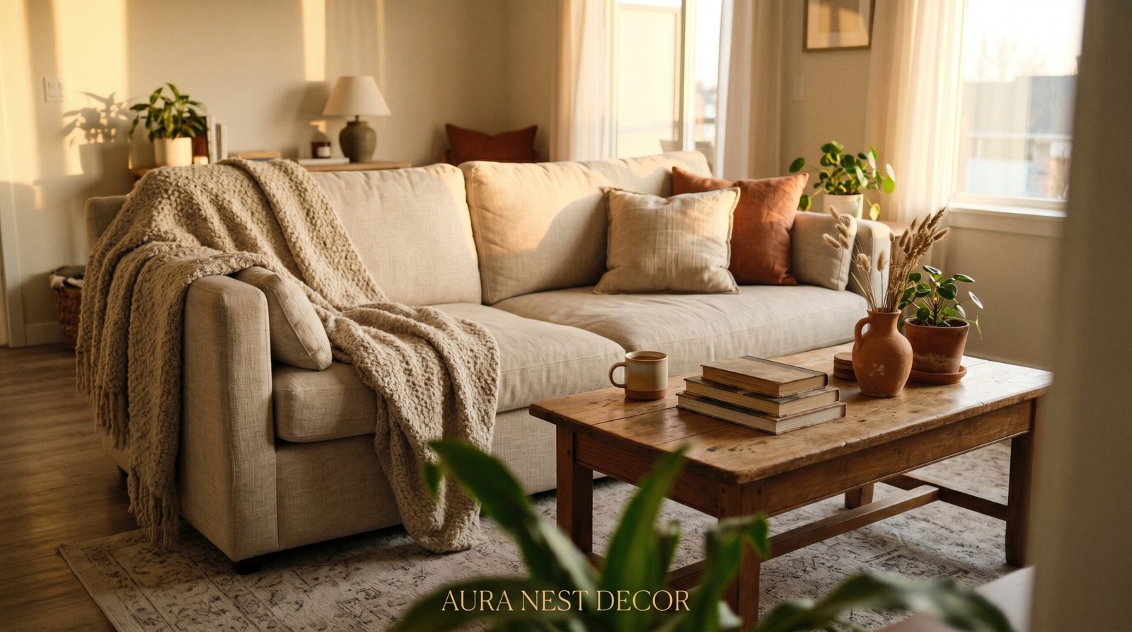
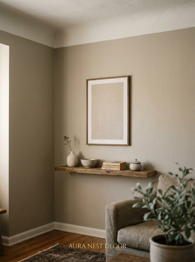
Warm neutrals do the opposite. They carry undertones of amber, ochre, terracotta, blush, or sand. Paint a wall in a warm neutral and watch what happens when the afternoon sun hits it. It glows. It deepens. A room painted in Farrow & Ball’s String or Sherwin-Williams’ Accessible Beige doesn’t look beige at 4pm — it looks golden. It looks like somewhere you actually want to be.
The shift from cold to warm neutral is genuinely one of the most low-effort, high-impact changes you can make in a living room. I’ve seen it turn a perfectly nice, forgettable space into a room that people photograph.
“Warm neutrals don’t just fill a room — they change how the light behaves in it.”
—
2. The Wall Color That Keeps Showing Up in Every Beautiful Living Room Right Now
If you’ve spent any time on Pinterest in the last two years, you already know this palette is everywhere. But what’s interesting is that it’s not one single color. It’s a family of colors moving through the same warm, sandy, quietly earthy range.
In the US, Sherwin-Williams Accessible Beige, Antique White, and Navajo White are being pinned obsessively. Agreeable Gray technically has grey in the name, but its warm undertones have made it one of the most popular living room colors in American homes for years now.
Across the Atlantic, British designers are reaching for Farrow & Ball’s Elephant’s Breath, String, Dimity, and Jitney — names that sound like they belong in a novel, and colors that look extraordinary against original Victorian cornicing or exposed brick. Little Greene’s Slaked Lime and Ragstone are equally beautiful.
The common thread? Every single one of these reads warm in person. Every one shifts slightly depending on the light in your specific room. And every one creates the sensation of a space that is finished without being fussy.
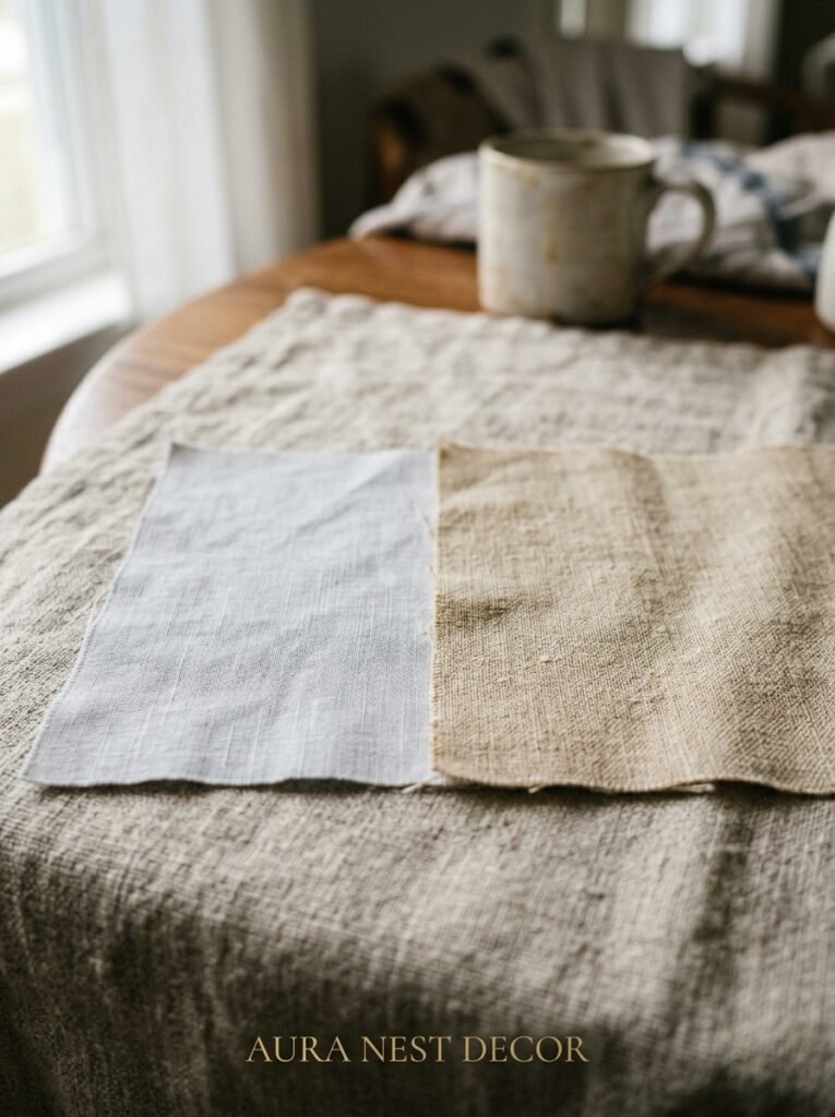
Sample before you commit. Always. A paint chip on a wall in January morning light will look completely different under the lamp at 9pm in winter. Live with it for a full 48 hours before you open the big tin.
—
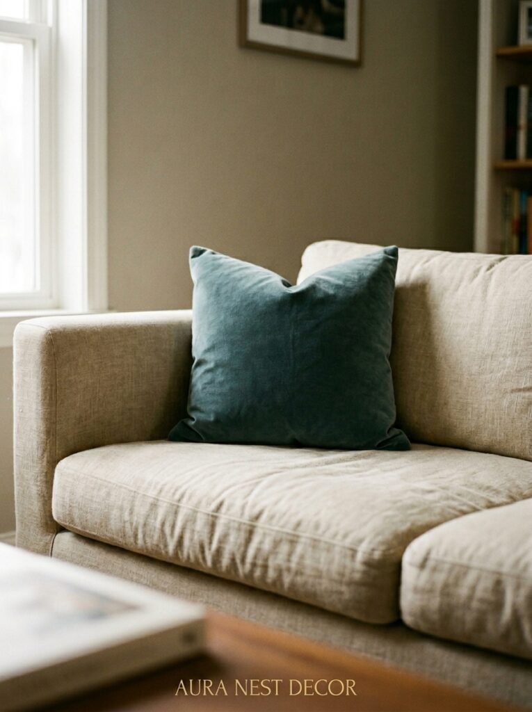
3. The Sofa Color Decision That Makes or Breaks a Warm Neutral Room
You’ve got your walls sorted. Warm, creamy, just right. Now the sofa — and this is where people either nail it or accidentally undo everything.
The temptation is to go white or grey. Resist it.
A cold white sofa against warm neutral walls creates a visual argument. Your eye bounces between the two temperatures and never fully relaxes. It can look intentional in some modern spaces, but in a room you’re trying to make feel genuinely cozy? It fights you.
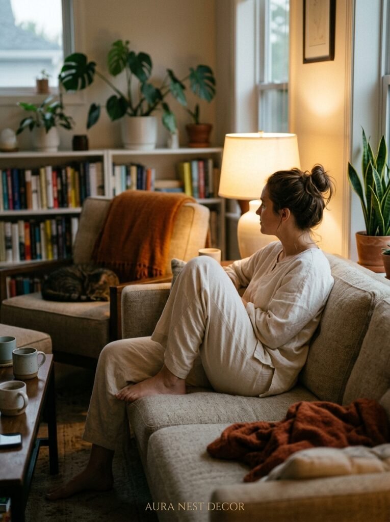
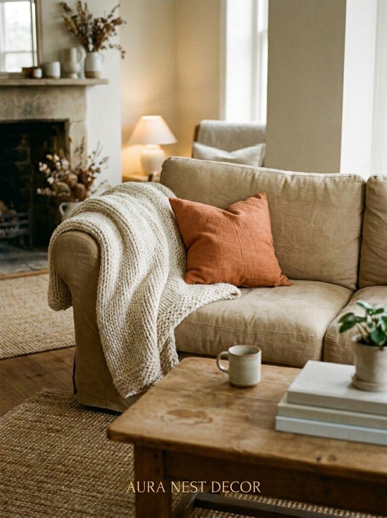
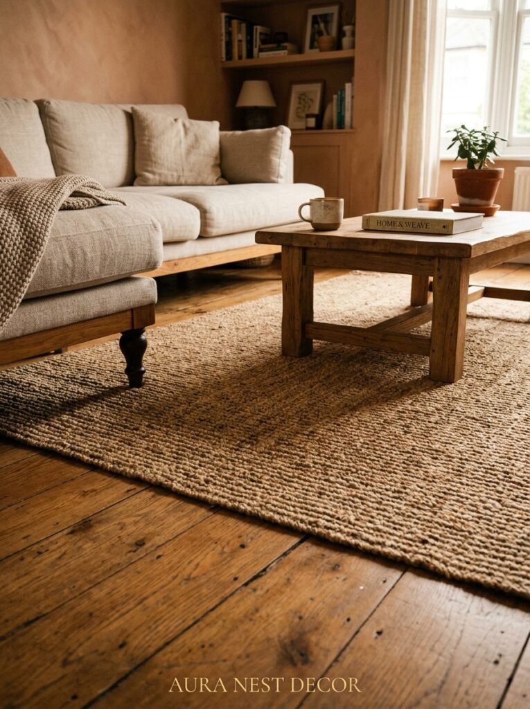
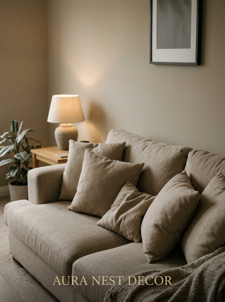
What works: natural linen in warm oat or straw tones, deep camel leather, boucle in an undyed cream, earthy terracotta velvet, dusty sage (it reads warm against the right wall), chocolate brown. These are the sofa shades that make a warm neutral room feel like it was designed rather than decorated.
My personal preference — and this gets me every time — is a battered, soft caramel leather sofa in a room with plaster-toned walls. The leather warms further with age. The walls glow. The whole thing looks like it evolved organically rather than came from a showroom floor.
If you already have a grey sofa, don’t panic. Throw blankets and cushions in warm tones — burnt sienna, rust, warm cream, oatmeal — can bridge the temperature gap beautifully.
—
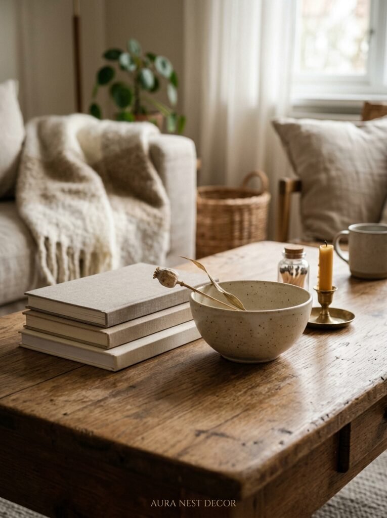
4. Texture Is the Thing That Actually Makes This Palette Feel Expensive
Take every warm neutral in the room and render it in smooth, flat surfaces. Now what do you have? A beige box. Nothing interesting. Nothing tactile. Nothing that makes someone want to reach out and touch it.
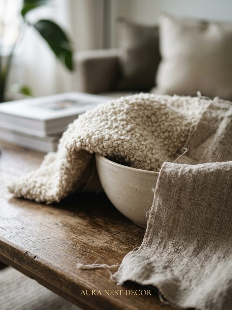
Texture is what separates a “warm neutral living room” from a beautiful warm neutral living room. And the good news is that layering texture costs very little once you know what you’re looking for.
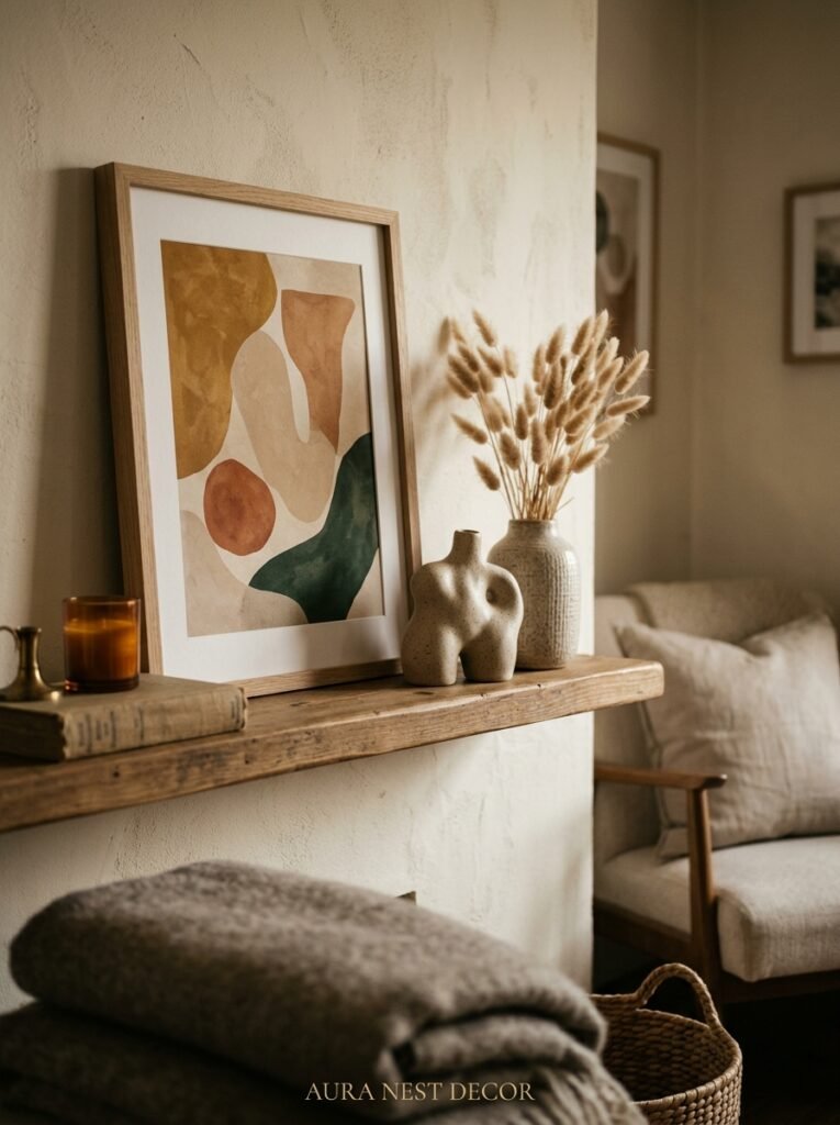
A jute rug underfoot. A chunky knit throw folded at the end of a sofa. Linen curtains with that natural slubby weave. A rattan side table. A rough-hewn wooden bowl. A ceramic lamp base in a matte, slightly uneven finish. Woven cushion covers that look handmade.
None of these have to be expensive. What matters is variety — the interplay between soft and rough, matte and slightly shiny, natural and refined. When you have a jute rug under a smooth plaster-colored coffee table next to a nubby linen sofa, the eye moves happily around the room. It finds things. It stays interested.
“Texture in a neutral room is like seasoning in a recipe — invisible when it’s right, glaringly obvious when it’s missing.”
—
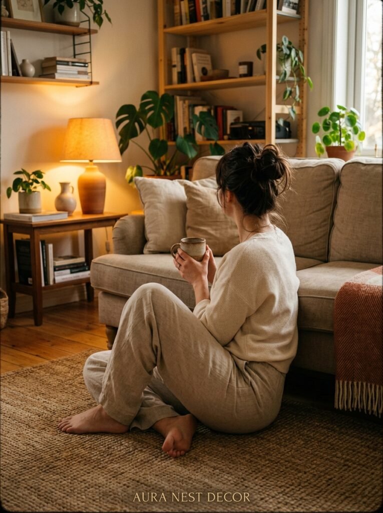
5. The Lighting Setup That Makes Warm Neutrals Look Their Absolute Best
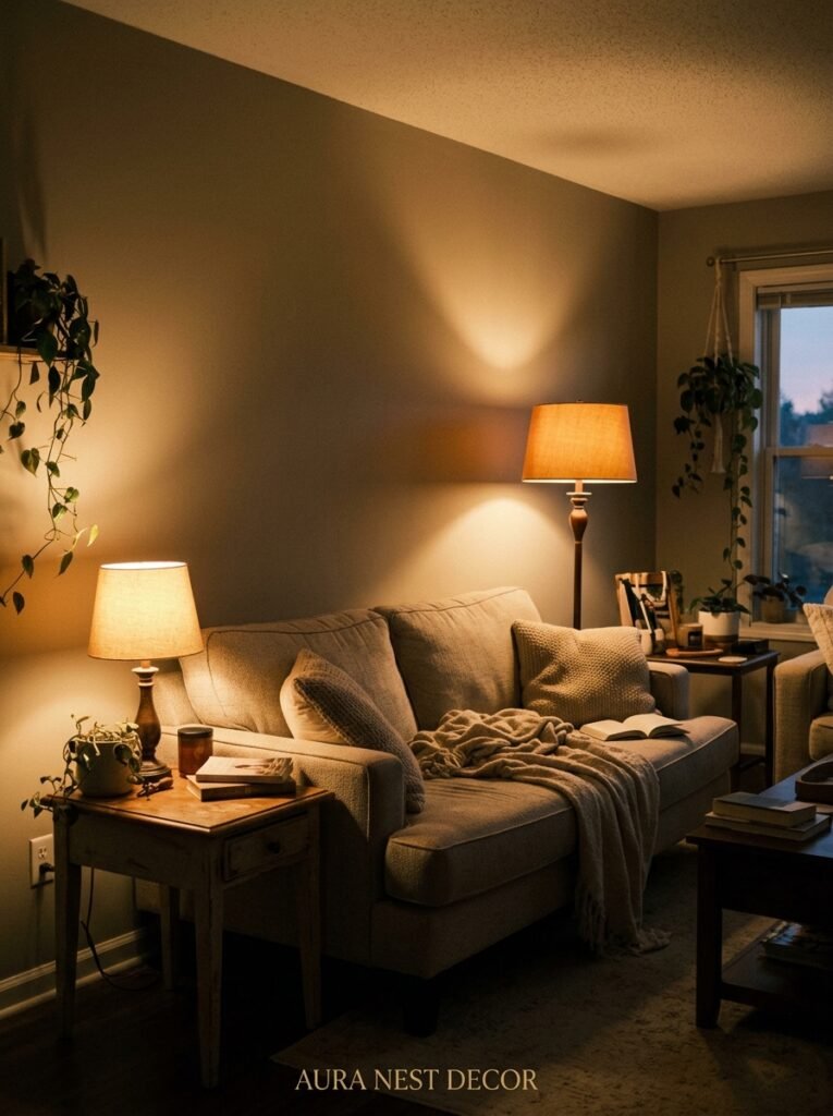
This might actually be the most important section in this entire article. Because you could do everything else perfectly and bad lighting will flatten, grey out, and ruin a warm neutral room faster than anything.
Overhead lighting alone is the enemy. That flat, even ceiling light that illuminates everything equally? It strips depth from a room. It makes warm walls look washed out. It is the sworn opponent of atmosphere.
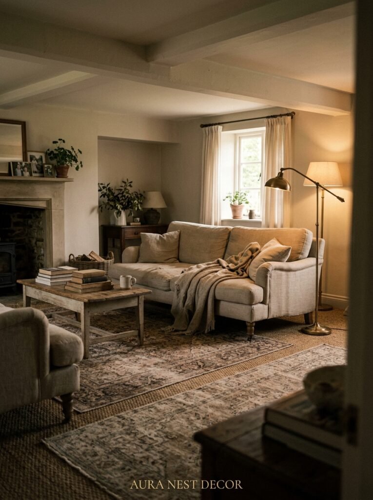
What you want instead: layers. A floor lamp in one corner throwing amber light upward. A table lamp on a side table at seated eye level. Candles — real ones or high-quality battery-operated ones — on the coffee table or mantle. String lights tucked along a bookshelf if you can get away with it without it looking like a student flat.
Bulb temperature matters more than almost anything. Go warm white — 2700K to 3000K. This is the amber glow of an Edison bulb at 7pm. It is, scientifically, the most flattering light that has ever existed for both rooms and human faces. Cool white bulbs (4000K and above) will make your warm walls look greenish or grey. Swap them out. Do it this week.
Dimmer switches, if you can add them, are transformative — genuinely transformative, and yes, that’s the one context where I’ll use that word. A room that looks nice at full brightness looks magical at 40%.
—
6. What to Do with the Floor When Your Walls Are Already Warm
Floors in a warm neutral living room can either anchor the whole look or compete with it. It depends entirely on what you’ve got to work with.
Dark hardwood or oak floors are an absolute gift in this palette. The natural warmth in the wood picks up the wall tones and the whole room reads as cohesive and intentional. In the UK, original pine floorboards — even slightly uneven, slightly scarred ones — are spectacular. In the US, wide-plank oak in a natural or slightly warm stain is the dream.
Pale or grey-toned floors need a rug to warm them up. A jute or sisal rug adds natural texture and earthy warmth. A wool rug in terracotta, sand, or rust tones does the same thing while also making the room feel more formal and considered. Whatever you choose, make sure the rug is big enough — the biggest mistake people make is buying one that barely fits under the coffee table. The rug should anchor the entire seating area. Ideally, all four sofa legs sit on it.
Carpet is less fashionable in both the US and UK right now, but if you have it, a warm oatmeal or biscuit-toned carpet is actually lovely in a neutral warm room. It’s the grey carpets that create problems.
—
7. The Art and Objects That Feel Right in This Kind of Room (and the Ones That Don’t)
Here’s something I’ve noticed: the wrong art can make a warm neutral room look like a beige holding space. The right art can make the exact same room look collected, personal, and alive.
What tends to work beautifully: abstract paintings in ochre, rust, warm brown, and cream. Botanical prints in warm-toned frames. Black and white photography in natural oak or warm wood frames. Ceramics in earthy colors grouped on a shelf or mantle. Vintage mirrors with gold or aged brass frames. Oil paintings, even small ones — there’s something about the texture of oil paint on canvas that reads as warm even before you get to the subject matter.
What tends to work against it: overly cool or icy abstract prints, chrome or silver frames, very stark graphic art in black and white without any warm accent, neon colors, heavily saturated cool-toned photography.
“The objects in a warm neutral room should feel like they chose the room — not like they were placed in it.”
One rule I keep coming back to: buy things you actually love, not things that match. A room where every object feels personally significant, even if the individual pieces are inexpensive, has a warmth that no amount of coordinated styling can replicate. A warm neutral palette forgives a lot. It holds space for your actual belongings rather than demanding that everything conform.
—
8. The Plant Varieties That Complement This Palette Without Clashing
Plants in a warm neutral living room are one of the best decisions you can make — but the variety matters more than people think.
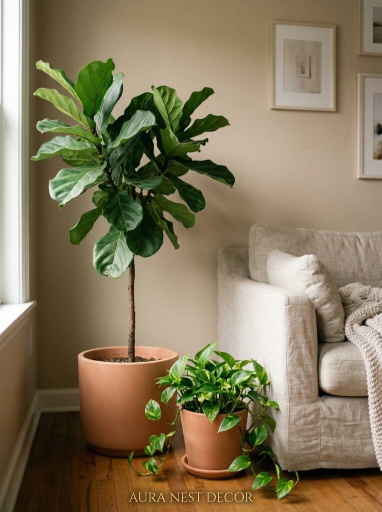
The wrong plant in this palette isn’t bad, exactly. But the right plant makes everything look intentional. Large-leafed tropicals — fiddle leaf figs, monsteras, birds of paradise — add scale and drama. Their deep greens ground the room without fighting the warm tones; they anchor it.
For something softer, olive trees in terracotta pots look extraordinary. The silvery green of olive leaves against warm plaster walls is one of those combinations that photographs beautifully and looks even better in person. Eucalyptus in a tall ceramic vase. Dried pampas grass in a warm cream tone.
Small plants work well grouped together on a windowsill or shelf — trailing pothos, small succulents in handmade clay pots. The key is that the pots matter as much as the plants. Terracotta, unglazed ceramic, woven baskets — these all add to the warm neutral palette. White plastic nursery pots left as-is work against it.
—
9. How British and American Homes Approach This Look Differently (Both Beautiful)
I find the transatlantic differences in how this palette gets used absolutely fascinating. The bones of the homes are different. The light is different. The cultural relationship to “cozy” is different. And it shows in the spaces.
American warm neutral living rooms tend to lean into scale. Higher ceilings, bigger sofas, more generous rugs. There’s often a fireplace as a true focal point. The color palette can run slightly creamier, slightly more open — Accessible Beige on large walls in a suburban home with big windows just glows. The space often has a relaxed confidence to it.
British warm neutral rooms — particularly in older Victorian or Edwardian homes — tend to be more intimate in scale and, in the best possible way, slightly more layered. Lower ceilings, original cornicing, smaller windows that make the warm neutrals feel even more cocooning. Farrow & Ball seems to understand this intuitively; their colors were essentially designed for these rooms, for this light. The result is something that feels deeply, specifically English in the best way.
Both approaches are wonderful. Neither is trying to be the other. The warm neutral palette is democratic like that.
—
10. The Mistakes I See Constantly on Pinterest (Gentle but Honest)
There are a few patterns I keep seeing in “neutral warm living rooms” that are almost right — but not quite. And noticing them is the fastest way to make sure your own room goes from “nice” to “that room.”
The accent color pile-up. People pick warm neutral walls, do everything right, and then add throw pillows in three or four competing accent colors — teal, orange, dusty pink, and olive all on the same sofa. One or two accent tones, maximum. Commit.
The floating rug. A rug too small for the room makes every piece of furniture look like it’s hovering. It breaks the visual grounding of the whole space. Bigger than you think. Every time.
The overhead-light-only situation, which we covered, but it bears repeating because it genuinely ruins more rooms than anything else.
Too many things. A warm neutral room works because it has breathing room. The palette is calm and it needs the objects in the room to honor that. Not empty — layered, but not crowded. There is a difference.
—
11. The One Accent Color That Looks Incredible Against Warm Neutrals (And Most People Don’t Try It)
Most people default to terracotta or rust as their accent in a warm neutral room. And yes — they’re beautiful. But there’s another option that I think is underused and absolutely stunning.
Deep forest green.
I mean a really saturated, almost-black green. Bottle green, hunter green, the kind of green that looks like it came from an old oil painting. Against warm, creamy, sand-toned walls, this color does something extraordinary. It grounds the room. It adds depth and contrast without fighting the warmth. It looks both traditional and genuinely modern depending on how you use it.
A forest green velvet sofa against plaster-pink walls. Deep green linen cushions against a warm oatmeal sofa. A single dark green armchair in the corner. A green ceramic lamp base. Even a small green plant pot, grouping several greens in varying shades.
In UK homes especially, where the warm neutral palette often has historic architectural context, deep green has a long and beautiful tradition. It belongs there.
—
12. The Small Details That Make a Warm Neutral Room Feel Finished, Not Staged
There’s a version of this look that feels polished but cold. A showroom. A hotel. Technically perfect and completely impersonal. And then there’s the version that makes you want to move in immediately.
The difference is always in the smallest details.
A book left open on the coffee table. A candle that’s actually been lit — wax pooled and slightly soft at the edges. A throw that’s been used, folded loosely rather than draped with geometric precision. A tray on the coffee table with three or four objects that clearly belong to someone’s actual life: a small candle, a coaster, a worn-cover book, a ceramic dish with something in it.
Fresh flowers make a room feel lived-in rather than set-dressed, especially in the winter when everything outside is grey and dormant. A single stem in a simple bottle works. It doesn’t have to be elaborate.
The warm neutral palette is forgiving. It asks less of the individual objects than a bold, graphic room would. What it gives in return is the kind of atmosphere that you feel in your whole body when you walk through the door after a long day. A room that doesn’t demand anything of you. A room that just lets you be.
—
❓ FAQ
Q: What’s the best warm neutral paint color for a living room with low natural light? A: In low-light rooms, go slightly warmer and creamier than your instinct tells you — something like Sherwin-Williams Antique White or Farrow & Ball Dimity. Very light warm neutrals can look muddy in low light, so err toward a tone with just a little more depth. Always sample on multiple walls and observe throughout the day.
Q: Can I mix different warm neutrals in the same room, or does it look messy? A: You absolutely can, and in fact it often looks richer than using a single color throughout. The key is staying within the same warm undertone family — all amber-leaning, or all sandy-pink, rather than mixing amber and grey-green neutrals, which will clash. Tone-on-tone layering in a warm neutral room creates depth that a single color can’t achieve.
Q: How do I make a warm neutral living room feel cozy in winter without it looking too dark? A: Layered lighting is your primary tool — add more lamps, use 2700K warm white bulbs, and incorporate candles. Layer textiles more heavily in winter (extra throws, thicker cushions). You can also add a slightly deeper-toned seasonal element — a richer colored cushion, a darker vase — and swap it out again in spring without redecorating.
—
💭 Final Thoughts
A warm neutral living room isn’t a trend, exactly — it’s a feeling. The feeling of a space that’s been thought about and genuinely cared for. Of light behaving beautifully. Of a room that asks nothing of you when you walk in from the world.
Get the light right and the walls right and the rest follows. It’s more forgiving than you think, and more beautiful than it has any right to be.
What’s the one thing you’d change first in your own living room if you were starting this palette from scratch?


