
Why a Dark Living Room Is Actually the Best Decision You’ll Make This Year
You walked into that hotel lobby and you didn’t want to leave. The walls were dark, the lighting was low, and something about it just felt right. Here’s the thing — you can have that at home, and it’s not even that hard.
—
1. The Moment Everyone Stops Being Afraid of Dark Paint
There’s a specific thing that happens when you first commit to a dark living room. You pick the colour, you maybe do a test swatch, and then you stare at it for three days convincing yourself it’s too much. It always looks too much on a sample card. That’s just a fact, and every designer will tell you the same thing.
But here’s what they’ll also tell you: the room you’re imagining in your head — the one that feels heavy, cave-like, depressing — that’s not what actually happens. What actually happens is that the walls sort of dissolve. Your eye stops registering them as surfaces and starts reading the whole room as an atmosphere. The furniture pops. The art finally looks intentional. And the light — even just one lamp — does something it could never do in a white room.
I’ve spoken to so many people who went dark and said some version of the same thing: “I don’t know why I waited so long.” Because once you do it, the before-and-after is so obvious. The room that was fine becomes the room you genuinely don’t want to leave.
So if you’re sitting on the fence right now, this is me telling you to just pick the colour. You can always repaint. But you probably won’t want to.
“The walls didn’t close in. They just got out of the way.”
—
2. Which Dark Colour Actually Works (And It’s Probably Not the One You’re Thinking)
Everyone immediately goes to black. Which, fine, black can be incredible. But it’s also the hardest to pull off because it doesn’t forgive bad lighting at ALL. One weak overhead bulb and you’ve got a dungeon situation.
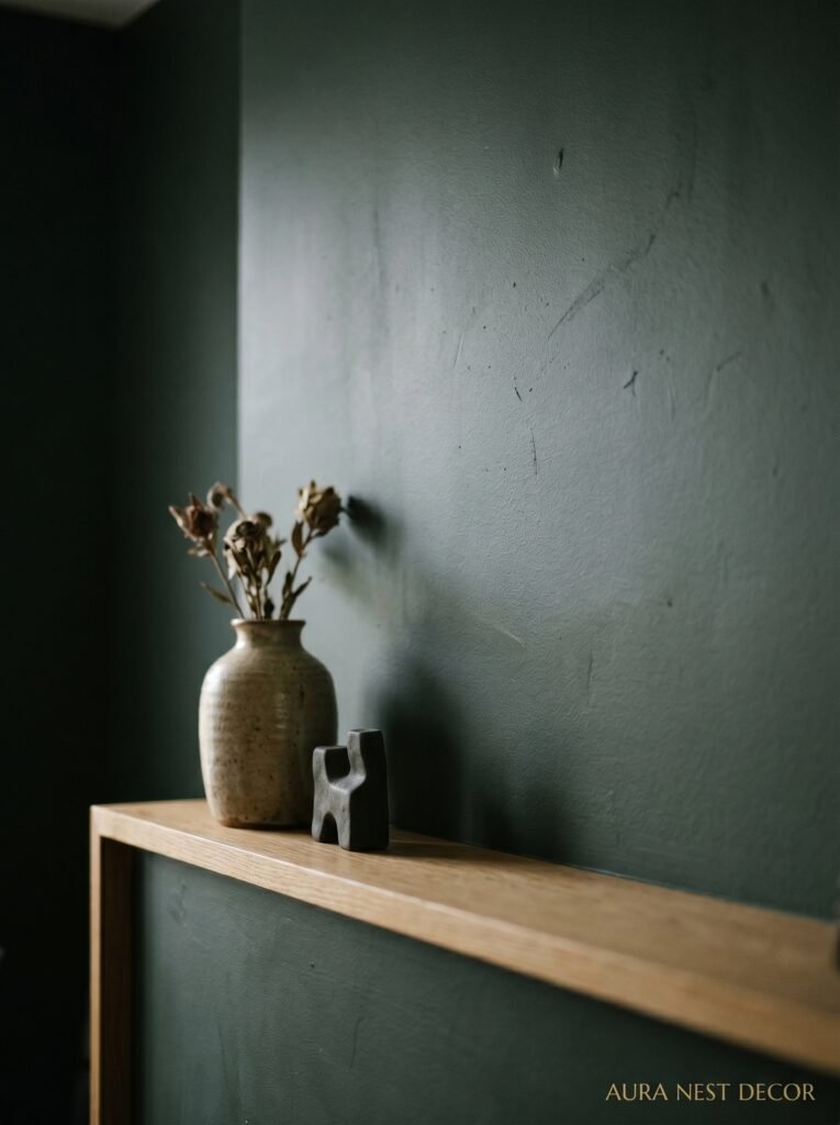
The colours that do the heavy lifting in most dark living rooms are the ones in between — the moody navy blues, the deep forest greens, the charcoals that lean warm instead of cold. Farrow & Ball’s Hague Blue is basically internet-famous at this point and there’s a reason for that. It sits in that specific zone of dark-but-not-oppressive. Benjamin Moore’s Black Forest Green is doing the same thing right now in American homes. So is their Newburyport Blue.
Here’s what I’d actually recommend: stop thinking in terms of what colour it is and start thinking about what undertone it has. A dark paint with red or yellow undertones will make your room feel warm even on a grey London afternoon or a cold January evening in, I don’t know, Minnesota. A dark paint with blue or green undertones reads cooler, more modern, a bit more editorial.
Neither is wrong. But you should know which direction you’re going before you commit.
Side note — don’t skip the finish. A flat or matte finish on dark walls is genuinely stunning, absorbs light in this velvety way that gloss completely destroys. If someone tells you to use satin in a dark room, you’re allowed to quietly disagree.
—
3. The Ceiling Question That Nobody Agrees On
Do you paint the ceiling too? This is where people get really divided and I find it kind of fascinating.
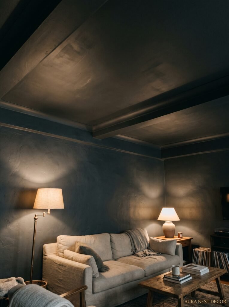
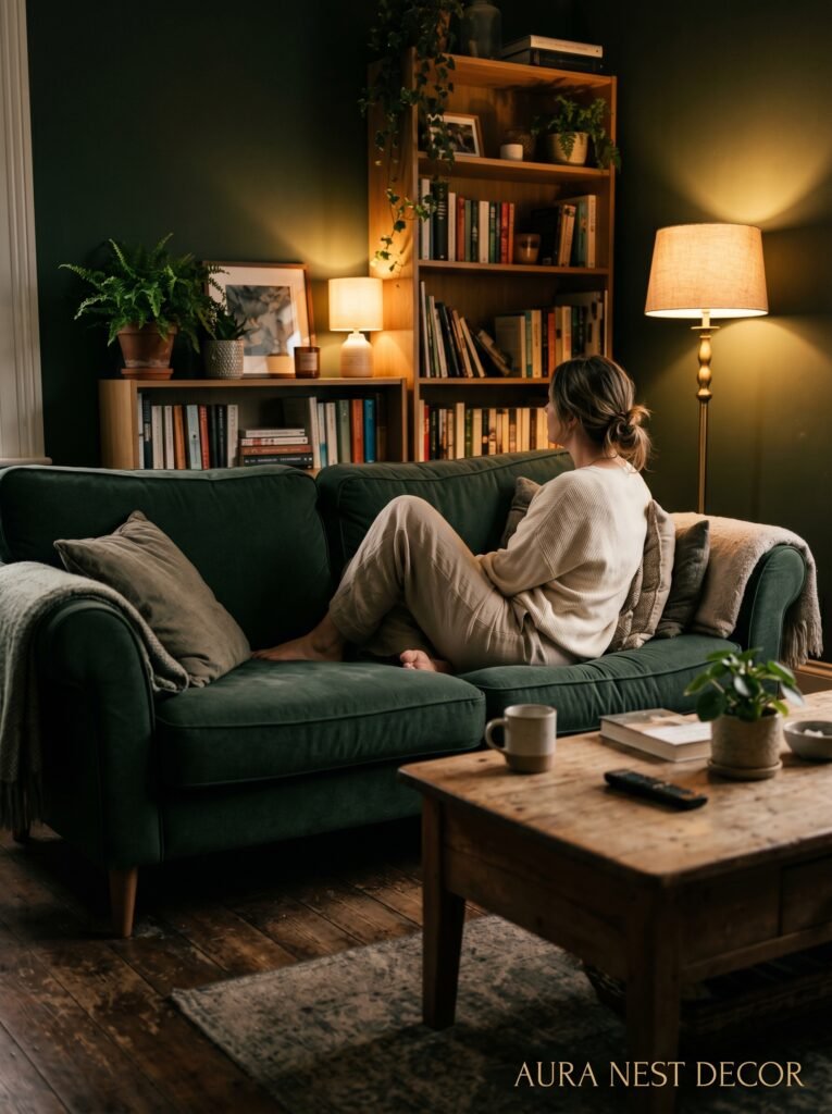
The case for painting it dark: when you go ceiling-to-floor in the same dark colour, something dramatic happens. The room stops feeling like a box and starts feeling like an enclosure in the best possible way — like a den, like a cocoon. It’s what boutique hotels do and it’s why boutique hotels feel so much better than your living room currently does.
The case for keeping the ceiling light: if your room doesn’t have great natural light, or if the ceilings are lower than about nine feet, a dark ceiling can genuinely make things feel compressed. Not cosy — just tight. And you don’t want to be fighting that feeling every time you sit down.
My actual opinion? If you’ve got decent ceiling height and you’re feeling brave, go dark up there too. If you’re not sure, paint everything ELSE dark first — walls, trim, the works — and see how it feels. A lot of people find that’s enough.
—
4. The Lighting Setup That Makes Every Dark Room
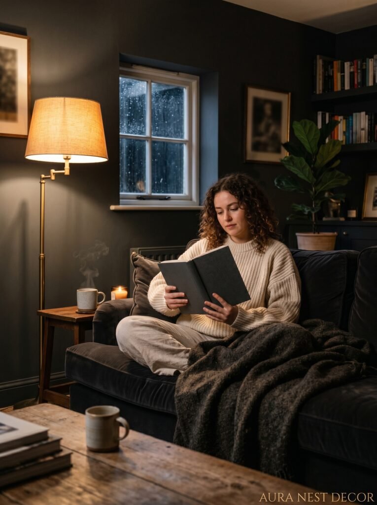
Okay this is the section that actually matters more than the paint colour. I cannot stress this enough. A dark room with bad lighting is just a dark room. A dark room with the right lighting is a completely different thing.
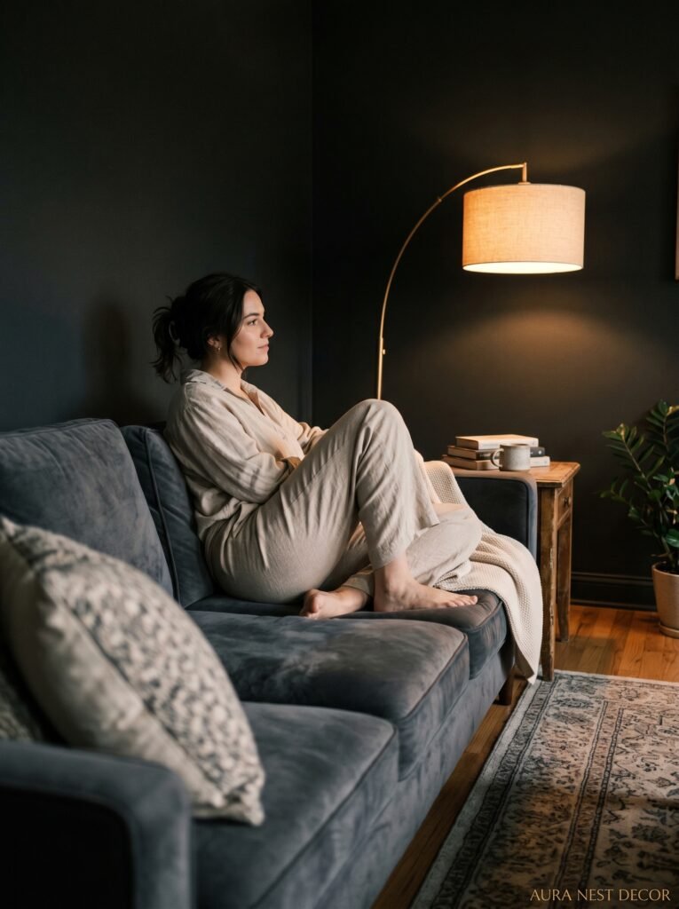
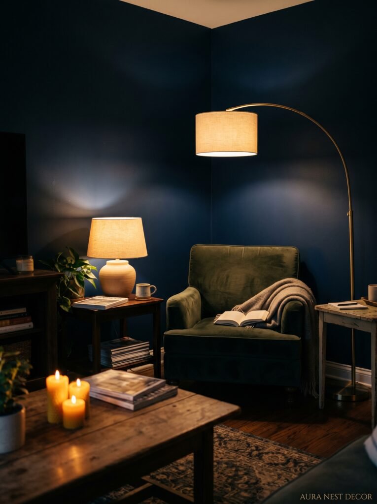
You need layers. Multiple light sources at multiple heights. Not a single overhead fixture doing all the work — that’s the fastest way to make a dark room feel depressing instead of atmospheric. Think of it almost like you’re building a campfire situation: you want the main heat somewhere, then smaller warmer points of light scattered around.
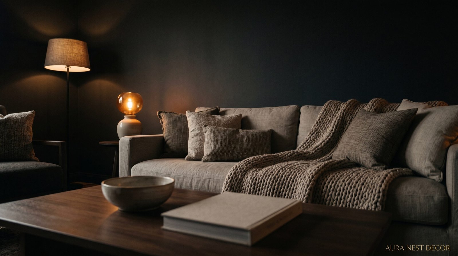
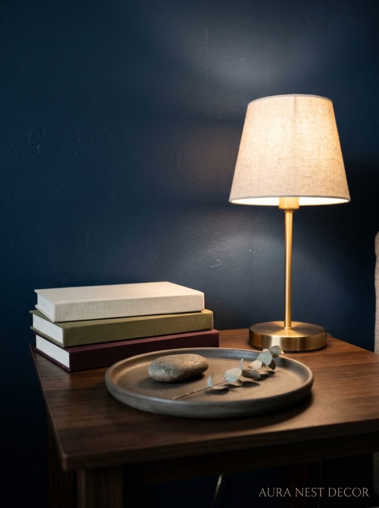
A floor lamp in the corner doing its amber thing at about 6pm. A table lamp on a side table with a linen shade that glows softly. Candles — real ones, not battery-operated — on the coffee table or the mantle. LED strips behind the TV if that’s your vibe, though honestly I think they read a bit too gaming-setup sometimes. Wall sconces if you can manage the wiring.
The bulb temperature matters enormously. You want 2700K or lower. That’s the warm, golden end of the spectrum. Anything higher than that and you’re creeping toward the cold, clinical light that makes a dark room look like a moody office instead of a cosy sanctuary. I’d argue this is actually the single most impactful thing you can do in any living room, dark or otherwise. The paint doesn’t work without the light.
“Overhead lighting in a dark room is basically the enemy. Turn it off and never look back.”
—
5. The Furniture Colours That Don’t Fight the Walls
Here’s where a lot of people make a mistake. They go dark on the walls and then try to balance it out with really light furniture — cream sofa, bleached oak coffee table — thinking it’ll brighten things up. And sometimes it does. But it can also make the room feel disconnected, like the furniture and the walls are in an argument.
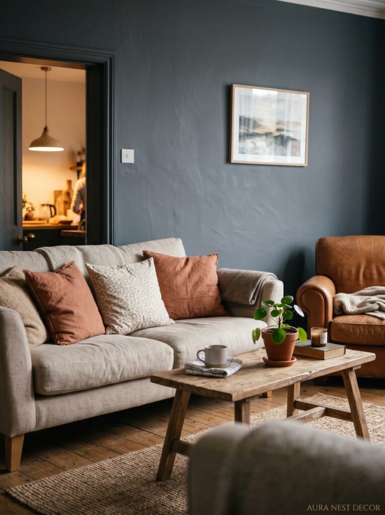
The combinations that tend to look effortlessly good: warm caramel leather or tan leather against deep navy or green. Rust or terracotta fabric against charcoal or black. Cream or off-white linen against dark walls, actually, DOES work — but the key word is off-white. Bright white next to dark walls looks sharp and a bit harsh. Off-white, cream, aged linen — those sit together better.
Rich wood tones are also your best friend in a dark living room. Walnut, oak, even painted or lacquered furniture in a contrasting shade. The warmth of wood against a dark wall is the combination that shows up in basically every beautiful dark living room you’ve ever saved to Pinterest. There’s a reason. It works.
—
6. What to Do When Your Living Room Doesn’t Get Much Natural Light
This is the objection I hear constantly. “I’d love a dark room but we just don’t get the light.” And I understand the hesitation, genuinely. But I also think people are sometimes operating under a misconception, which is that a dark room needs to compete with a light room on brightness terms.
It doesn’t. And it shouldn’t.
A dark room in a north-facing flat in Edinburgh or a basement-level apartment in Chicago isn’t trying to be bright. It’s committing to a different kind of mood entirely. That shift in expectations — that’s the whole game. When you accept that the room isn’t going to flood with sunlight and you design accordingly, everything changes. You invest in more lamps. You lean into texture and warmth. You add more candles. The darkness becomes intentional rather than apologetic.
Honestly, some of the most beautiful dark rooms I’ve come across in design blogs are in exactly these kinds of spaces. Because the designer stopped fighting the light situation and started working with it.
—
7. The Textures That Keep a Dark Room from Feeling Flat
Paint alone doesn’t do it. That’s the thing. A dark living room without texture just looks like a dark room. You want the surfaces in the space to have something going on — something for the eye to catch and the hand to want to reach out and touch.
Boucle. Velvet. Rattan. Leather. Chunky wool throws. A rug with enough pile that it changes shade when you walk across it. These are the things that make a dark room feel rich rather than empty.
A velvet sofa in a mustard or deep teal against dark walls is practically a mood board on its own. Linen cushions with a slightly rough, natural weave. A jute or sisal rug instead of a flat-woven one. An aged leather armchair that’s got some wear to it.
The trick is that texture catches and diffuses light in a way that flat surfaces don’t. So even with low, warm lighting, a room full of different textures will feel layered and alive. Flat surfaces in a dark room can start to feel a bit like a void.
“The difference between a dark room that feels rich and one that feels gloomy is almost always texture.”
—
8. The Case for Dark Trim (Yes, Really)
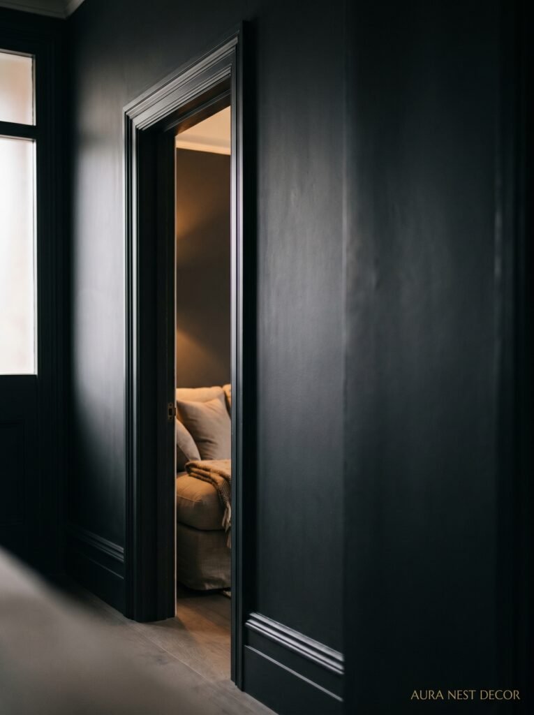
Most of us were raised to paint our skirting boards and window frames white. It’s just what you do. But in a dark living room, keeping the trim white creates this very specific effect where every edge in the room is outlined in bright white — and it can make the room look like a colouring page rather than a designed space.
Try going dark on the trim too. Paint it the same colour as the walls, or even a shade darker. What happens is that the whole room starts to read as one thing, one mood, rather than a patchwork of surfaces. Architectural details — the cornicing, the panel moulding, the door architraves — they start to look dramatic instead of just structural.
This is one of those things that seems extreme until you see it. And then it seems obvious.
—
9. The Art Situation in a Dark Room Is Different
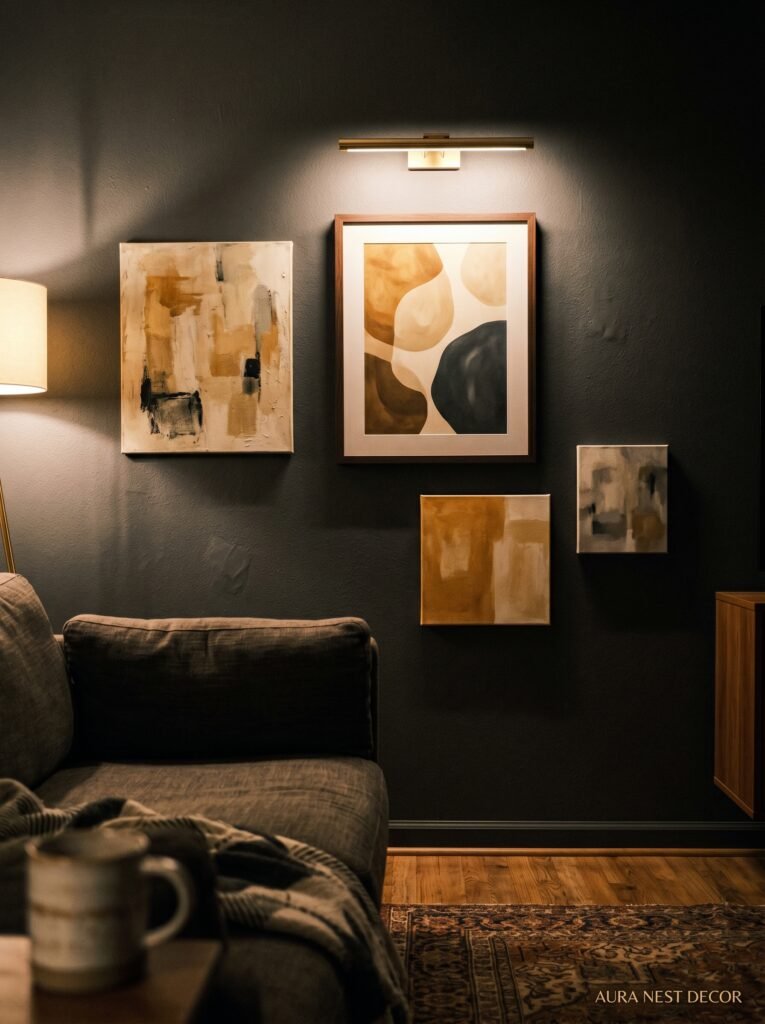
Art pops differently on dark walls and that’s genuinely one of the most underrated reasons to go dark. Light-coloured art — a pale watercolour, a cream-matted print, anything with a lot of white space — jumps off a dark wall in a way that it absolutely cannot on a white or off-white one.
Brass or gold frames. They’re everywhere right now and they look stunning against dark walls, especially in the warm light of a table lamp. The metal catches the light and does something really lovely.
Gallery walls work especially well in dark rooms because each frame becomes its own little illuminated thing. But — and this is important — leave more space between frames than you think you need. In dark rooms, crowded gallery walls can feel heavy. Give each piece room to breathe.
—
10. The Rug Colour Nobody Expects to Work
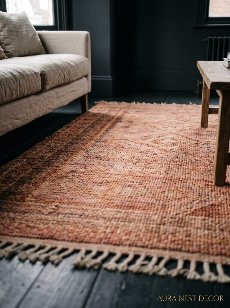
You’d assume you’d want a lighter rug in a dark room to “break it up a bit.” And sometimes that’s true. But there’s a counterintuitive approach that works really well: go dark on the rug too, and then let your furniture and textiles do the lighter work.
A deep Persian rug — burgundy, navy, hunter green — in a dark living room creates this incredible layered effect. It’s moody in a way that a light rug against dark walls just isn’t. The room becomes fully committed to its aesthetic instead of hedging its bets.
If you’re in the UK, these kinds of rugs show up fairly regularly in places like John Lewis, Dunelm, or even smaller vintage shops. In the US, Ruggable does some surprisingly good ones and the washable factor is, not gonna lie, a genuine selling point when you’ve got a properly dark room that you actually WANT to live in and use.
—
11. Why Dark Living Rooms Feel So Good in Winter Specifically
There’s a seasonality to this whole thing that I think is worth talking about. In summer, a bright, airy room feels right. The light is everywhere and you want to meet it. But come October, November, December — when it’s getting dark at 4pm in Manchester or Michigan — a dark living room stops feeling like a design choice and starts feeling like the only sensible response to the season.
You close the curtains, turn on the lamps, and the room doesn’t fight the darkness outside — it joins it. Intentionally. There’s something almost ritual about it. The room becomes the warmth you retreat to rather than a space that’s just trying to push back against winter with sheer brightness.
Velvet curtains help enormously. Full-length, heavy ones in a deep green or dusty plum that pool slightly on the floor. They do something to the room’s acoustics too — quieter, softer, more contained. Which sounds like a small detail until you’re actually in it at 7pm on a Tuesday in November with a cup of tea and you realise you genuinely don’t want to be anywhere else.
—
12. The Small Moves That Make a Dark Room Feel Like It Was Designed, Not Just Painted
A few things that pull everything together without costing much.
Swap out your lampshades. A dark room with white drum shades doesn’t quite sing. Try linen, pleated, or even a dark-coloured shade that glows from inside. The light it throws is completely different — warmer, more directional, more interesting.
Plants. Not in a trendy way, just genuinely — green plants against dark walls do something. A big fiddle leaf fig in a dark rattan basket. A trailing pothos on a shelf. The green pops in a way that feels alive rather than decorative.
Mirrors, but placed thoughtfully. Not to reflect more light exactly — that’s the standard advice — but to reflect a warm lamp or a candle, doubling the warmth sources in a room without adding more furniture.
And finally: just commit. The dark rooms that don’t work are almost always the ones that are hedging. A dark wall with bright white everything else, a single overhead light still doing all the work. The rooms that make you stop scrolling are the ones that went ALL the way in, trusted the aesthetic, and let the darkness do its thing.
—
❓ FAQ
Q: Will a dark living room make my small room feel even smaller? A: Not necessarily — and this surprises people. When the walls recede visually, the eye stops measuring the room’s edges and starts just experiencing the space. With good layered lighting, a small dark room often feels more intentional and cosy than a small light room that’s just trying to fake more square footage. That said, if your ceilings are very low — under 8 feet — keep the ceiling lighter than the walls.
Q: What’s the best dark paint for a living room that doesn’t get much sunlight? A: Lean toward warm-undertoned darks rather than cool ones. Something like Farrow & Ball’s Railings (a warm near-black), Benjamin Moore’s Wrought Iron, or any deep green or navy with a warm undertone. These shades hold up much better in low-light conditions and don’t read as cold or flat the way blue-based charcoals can.
Q: Do I have to repaint when I want to sell the house? A: Not always. Dark rooms photograph well and are genuinely desirable to a lot of buyers — especially right now when maximalist, moody interiors are everywhere. If you’re worried, a very classic shade like a deep navy or forest green is less polarising than, say, black. And honestly, a beautifully styled dark living room in listing photos might be the thing that gets people through the door.
—
💭 Final Thoughts
Going dark isn’t a risk. It’s a commitment — and there’s a difference. The rooms that stay with you, the ones you save and revisit and daydream about, they made a choice and they stuck to it. A dark living room done right isn’t dramatic or intimidating. It’s just deeply, quietly itself.
So — what’s stopping you?


