Your Mantle Is the Most Important Surface in the Room — Here’s Why You Keep Getting It Wrong
You walk past it every day and something feels off, but you can’t name it. The mantle looks fine. Technically fine. But it doesn’t have that thing — that pull, that “wow, who lives here?” quality you see on every Pinterest board you’ve ever saved at midnight. Here’s the truth nobody says out loud: most mantle styling fails not because people have bad taste, but because they’re following rules that were never actually rules.
—
1. The One Styling Mistake That Makes Every Mantle Look Flat
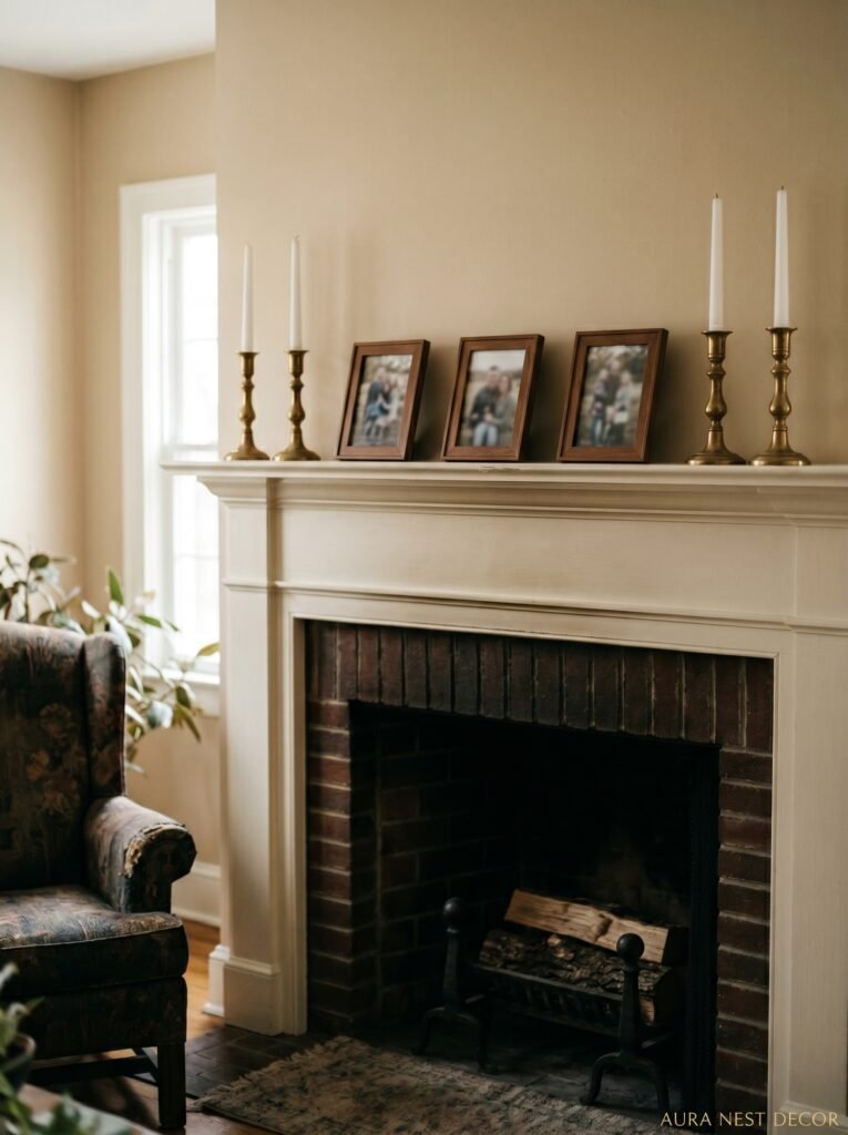
Symmetry. That’s the culprit. I know, I know — matching candlesticks on either end, a large mirror centered above, maybe a plant echoing the one on the other side. It looks intentional. Tidy. But it also looks like a furniture showroom and not a home where someone actually lives.
The thing about perfect symmetry is that your eye clocks it instantly and then… stops. There’s nothing to discover. No small surprise tucked in. And the mantle, of all the surfaces in a room, should have a little mystery to it.
Try this instead: treat your mantle like a still life painting. Move everything to one side mentally and then rebuild from scratch, intentionally imbalancing it. A tall vase on the left, a cluster of smaller objects on the right that together feel roughly as heavy visually, but aren’t a mirror copy. It shouldn’t look like you tried not to match things — it should look like the objects just ended up there over time, collected slowly by someone with a really good eye. That’s the goal. Effortful effortlessness, which sounds annoying but makes total sense once you see it in person.
“Symmetry says ‘showroom.’ Asymmetry says ‘someone interesting lives here.'”
2. Why the Mirror Above Your Mantle Might Actually Be Killing the Vibe
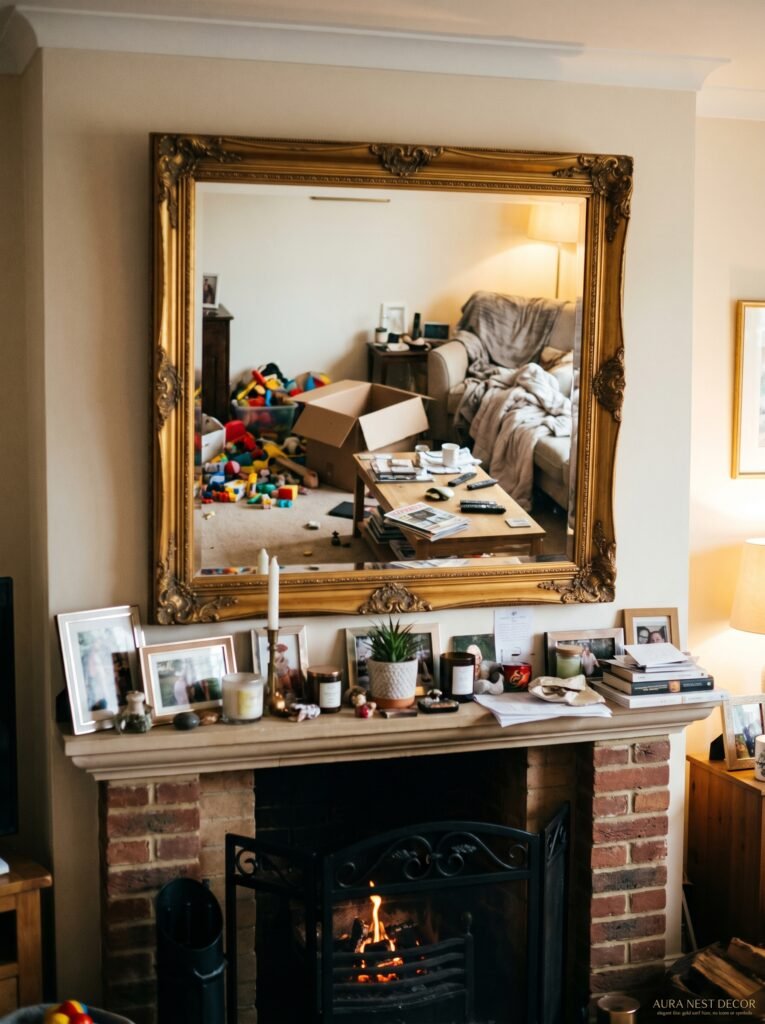
Mirrors above mantles. Classic. Safe. And honestly? A little overdone right now. Don’t come for me — I get why people do it. A large mirror makes a room feel bigger, it bounces light, it fills that vertical space above the shelf without much effort. All true. But when it’s the first thing you reach for, you’re not actually making a decision — you’re just… defaulting.
What if that space got a large piece of art instead? Or an oversized clock that leans slightly rather than hanging perfectly flush? Or absolutely nothing — just the wall itself, if the wall is interesting? The negative space above a mantle is actually doing a lot of work. You don’t have to fill all of it. Some of the best mantles I’ve ever seen in person stopped about two-thirds of the way up and let the wall breathe above them.
If you DO want a mirror — and plenty of rooms genuinely need one — try an arched shape, or one that’s slightly smaller than you think it should be. The unexpected scale does something. Or lean it rather than hang it, which immediately gives it a looser, less-trying quality. A leaned mirror says “I put this here because I liked it.” A perfectly centered, perfectly hung mirror says “I followed the instructions.”
3. The Objects That Always Look Right (and the Ones That Don’t, No Matter How Hard You Try)
Here’s my honest list. Not a rules list — a pattern-I’ve-noticed list.
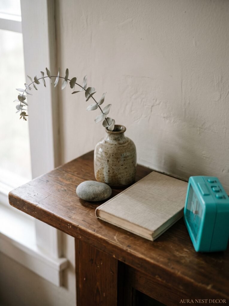
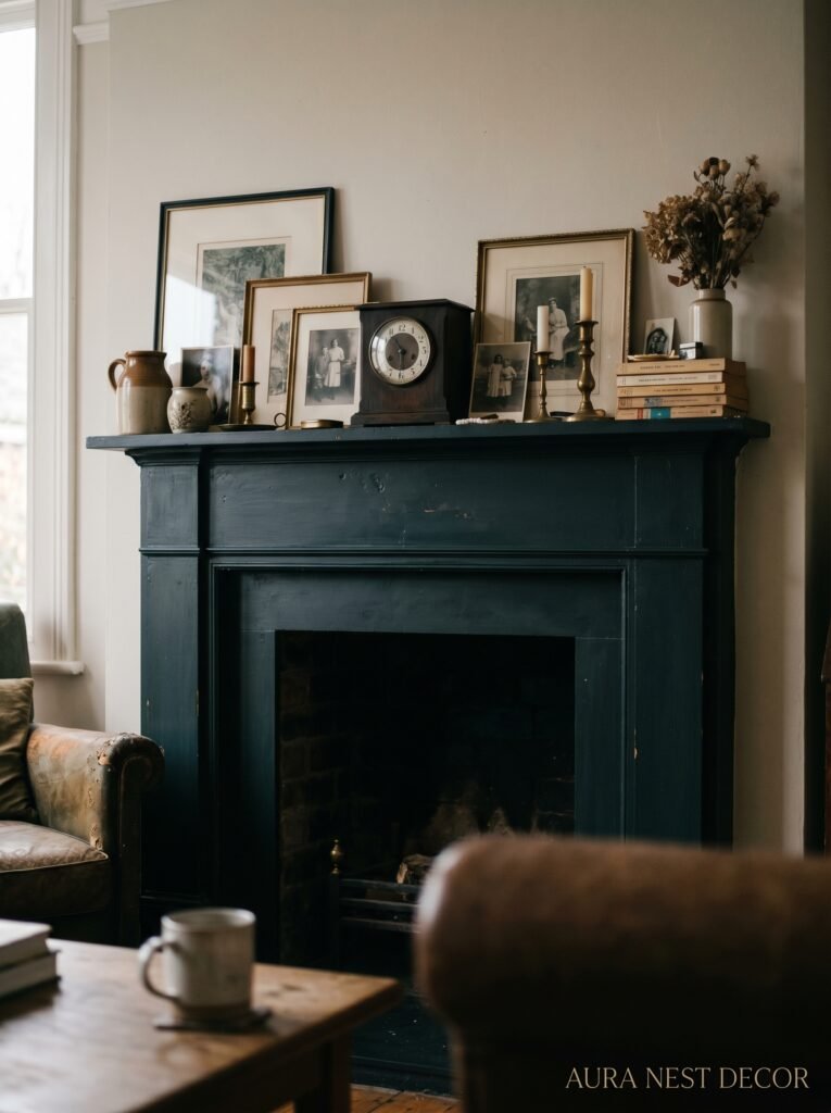
Things that almost always work: anything with an interesting silhouette. A twisted candleholder. An irregular ceramic vase. Books stacked horizontally (not a perfect matched set — actual books you’ve read, ideally). A piece of driftwood. Something old. A framed photo that isn’t perfectly framed — slightly too big for what’s in it, or in a thrift-store frame that’s a little wrong and therefore totally right.
Things that are hard to make work: matching sets of anything. The word “set” is kind of a warning sign when it comes to mantle styling. Matching candlesticks, matching bookends, a matching vase-and-bowl situation from the same product line. They’re not individually ugly, but they announce themselves as a SET and sets look like they were placed, not curated. Side note — this is also why the “mantle styling kit” concept at places like TK Maxx or HomeGoods is a trap. The objects coordinate too well. Real rooms have objects that come from different places, different times, different price points.
Also hard: anything too shiny in a matte room, or anything too matte in a room that needs some gloss. Your mantle objects need to belong to the room, not just to each other.
4. The Height Trick That Interior Designers Use (and Don’t Talk About Enough)
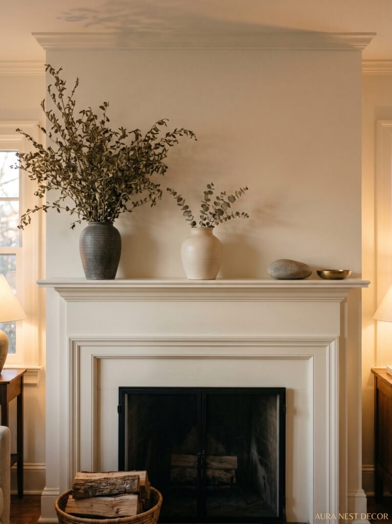
This one’s genuinely useful and I don’t see it mentioned often enough. It’s about varying heights — but more specifically, it’s about making sure at least one item goes significantly higher than the rest. Not just a little bit taller. Significantly.
When everything on a mantle is roughly the same height, the arrangement reads as a line. Your eye goes left-to-right and that’s it. But when you’ve got one element — a tall vase, a piece of art that sits above the shelf, a sculptural branch, an architectural salvage piece — that breaks the silhouette, your eye moves up as well as across. The space becomes three-dimensional. It has a peak. And peaks are interesting.
In practice: if your mantle shelf is, say, 5 inches deep, you want something on it that goes at least 18-24 inches tall. More if the ceiling height can handle it. British Georgian-style rooms can handle enormous scale — high ceilings, deep cornicing, wide chimney breasts. American craftsman-style rooms might want something a bit softer. But the principle holds across both. One tall thing. Everything else builds around it like a landscape with a hill in it.
“Your mantle needs a peak. A single element that makes your eye go up and then want to stay.”
5. Why Seasonal Swaps Feel So Good (and How Often You Actually Need to Do Them)
There’s a kind of low-key satisfaction in moving things around on a mantle that I genuinely look forward to. It’s not a big project. Twenty minutes, maybe thirty. But it resets the whole room.
You don’t need a full “autumn mantle” or a “spring mantle” that requires buying new stuff. What you need is a small collection of objects in rotation — maybe a dozen things in a box somewhere — and the willingness to move two or three things in and out based on the season or just your current mood. In October, the dried botanicals come out and the bright ceramics go in the box. In February, something soft and textural might feel right — a small piece of sheepskin, a beeswax candle that smells like something. In June, a loose arrangement of dried grasses and that sea glass bowl you found at a car boot sale (or a flea market, if you’re American).
The secret is you don’t have to do the full swap every time. Just one or two things shifted can make the whole mantle feel different. A single new candle in a seasonal scent. One branch of something from outside. This is genuinely the lowest-effort, highest-impact home styling habit I know.
6. The Color That Keeps Showing Up in Every Beautiful Mantle Right Now

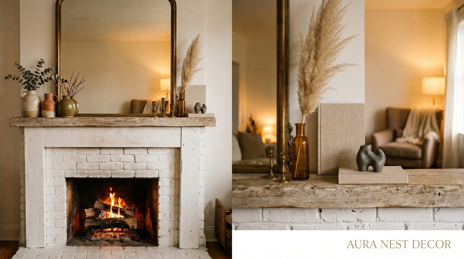
Warm white. But not the chalky, clinical warm white — the creamy, slightly aged kind that looks like it might have taken a paint brush three coats to achieve. That particular shade that sits somewhere between ivory and linen. It’s everywhere right now and it WORKS.
What it does is absorb. It absorbs other colors from around the room without competing. It makes ceramics look more ceramic-y. It makes plants look more plant-y. It makes wood look warmer. If you’ve got a painted mantle or are thinking of repainting one, this is the shade to reach for — and it works equally well in a very white Scandinavian-influenced space (where it adds warmth) and in a darker, more dramatic room (where it provides relief without being jarring).
For the objects themselves: this same creamy tone as a base color, broken up with exactly one or two objects in a contrasting material or color, tends to read as intentional without being overdone. Think a single terracotta piece. One thing in matte black. A small pop of a completely unexpected color — dusty sage, warm rust, a faded coral — that ties to something else in the room.
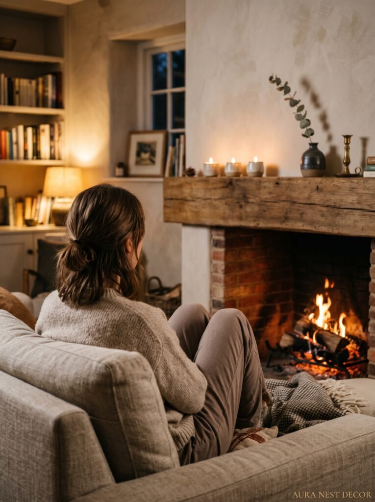
7. The Fireplace That Isn’t Working Makes the Mantle Work Harder — Here’s How
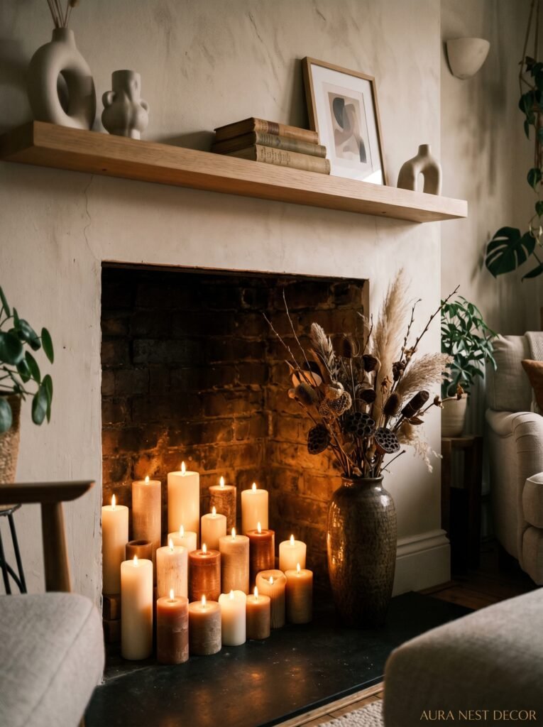
Non-working fireplaces are incredibly common in UK homes especially — Victorian terraces full of them, bricked-up or tiled-over or just sealed and forgotten. American homes too, plenty of decorative-only inserts that haven’t functioned since the ’80s. And here’s the thing: a non-functional fireplace actually needs MORE thought, not less, because without the fire itself providing all that warmth and visual interest, the mantle above it has to do all the heavy lifting.
The opening itself is often ignored. But that grate, that dark rectangle below, is part of the composition. A stack of white pillar candles inside it is the obvious choice (fine, looks great, do it). But also: a big basket of logs even if you’ll never burn them. A large ceramic bowl. Dried pampas or eucalyptus in a vase that sits on the hearth and extends into the opening. Stacked books, which is actually stunning if you do it with enough of them. Even just a large, dramatic plant — a trailing pothos or a monstera with personality — that spills out of the opening a little.
The mantle and the opening below it are one unit. Style them as one unit.
“The fireplace opening isn’t dead space. It’s the foundation the whole mantle is sitting on.”
8. What British Homes Do Better Than American Ones (and Vice Versa)
I’m going there. Because honestly, there are things each side of the Atlantic genuinely does better when it comes to mantles and fireplaces.
British homes tend to do better with: age. An original Victorian tiled surround with a few chips in it, kept and honored rather than replaced. Original cast iron grates. Plaster cornicing that frames the chimney breast. There’s an unselfconsciousness in British homes about old things — they’re just there, they’re part of the house, nobody is trying to make them look antique because they actually ARE antique. That ease is incredibly hard to fake.
American homes, on the other hand, often do scale better. Big rooms, high ceilings, wide mantle shelves — there’s a confidence in the objects chosen, a willingness to go large that British homes sometimes lack. An American craftsman mantle with a single enormous piece of art, bare walls, and three considered objects has a graphic quality that’s genuinely striking. British mantles, even beautiful ones, can sometimes feel a little tentative. A little crowded with small meaningful things.
The ideal is probably somewhere in between. American confidence in scale, British confidence in age and imperfection. If you can steal from both traditions — you’re there.
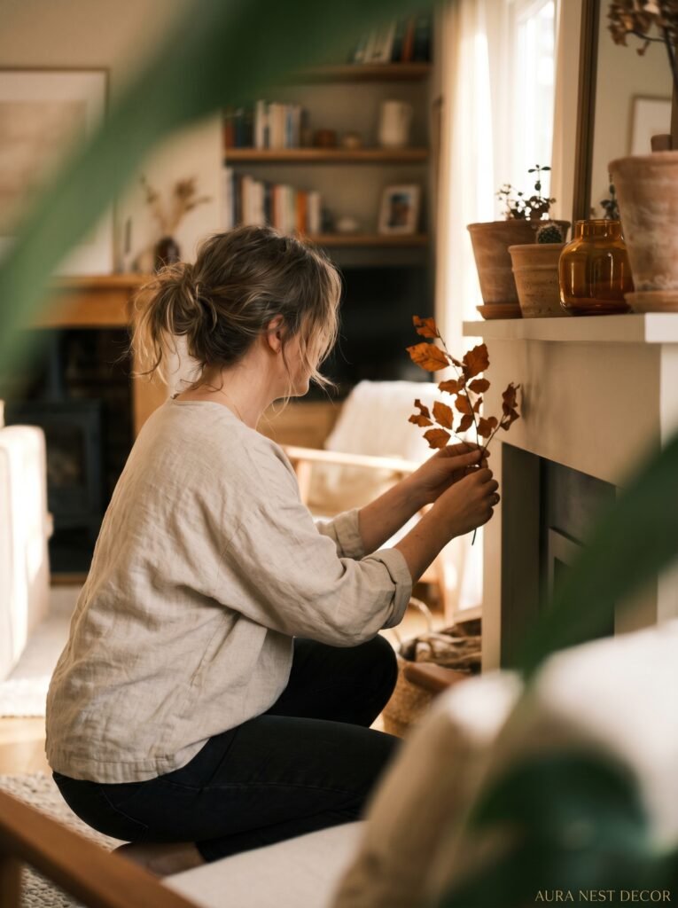
9. The Greenery Rule That Changes Everything
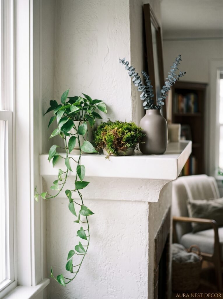
No fake plants on the mantle. I’m drawing a line here. I don’t care how good quality they are or how much they’ve improved — fake plants on a mantle specifically look fake. It’s something about the warmth of the fireplace nearby (even a non-working one), the scale, the close viewing distance. You can see the plastic.
Fresh or dried — those are your options. And honestly dried is having a moment that’s well-deserved, because dried botanicals do something fresh flowers can’t: they stay. They change slowly, which is beautiful. A bunch of dried pampas grass looks incredible for months. Dried lunaria (honesty plant — big in UK cottage gardens, lovely dried) has this translucent silver quality that’s genuinely beautiful. Dried magnolia leaves. Preserved eucalyptus. Dried thistle.
The placement matters enormously. Don’t just put greenery in a vase and center it. Tuck a stem or two at unexpected angles. Let something overhang the shelf slightly. Put a small sprig next to an object that seems like it shouldn’t have greenery near it — next to a candle, tucked under a book. The less placed-looking it is, the better.
10. The Small Objects People Always Forget (That Make the Whole Thing Feel Real)
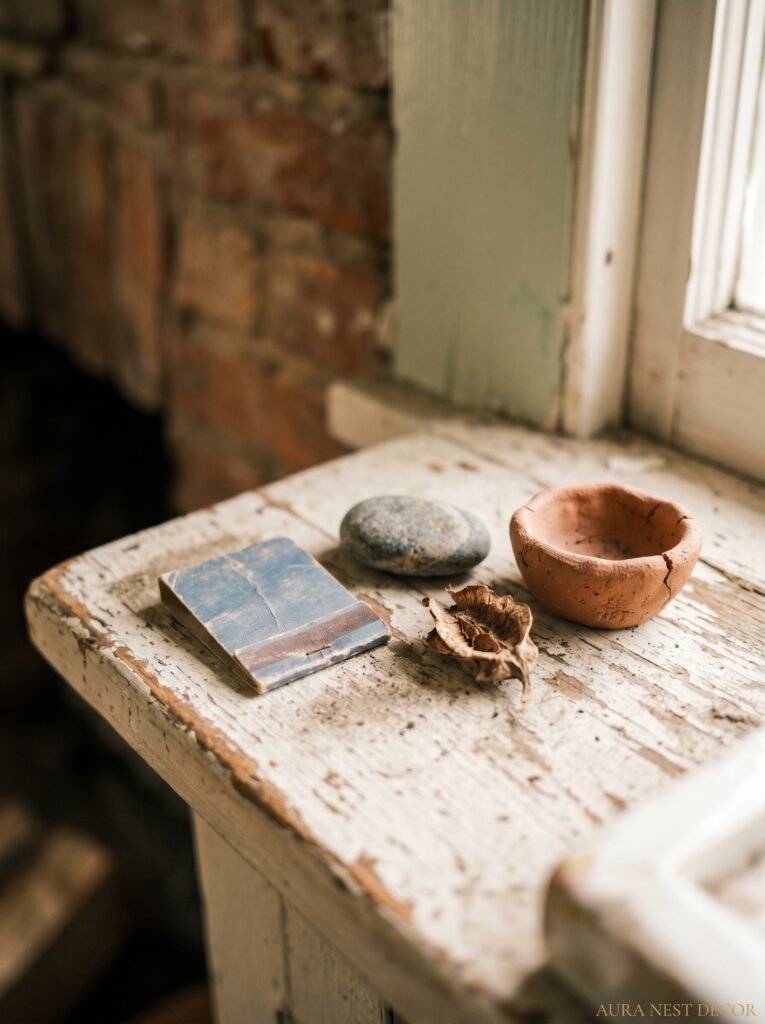
The mantle isn’t just for the big anchor pieces. It’s the small things — placed with intention but feeling totally accidental — that make it look like a real curated space and not a styled set.
A small matchbox. A single coin or two from somewhere you traveled. A piece of sea glass on a little plate. A tiny framed photo that’s too small for the wall but perfect here. A wrapped piece of incense. A river stone with good weight to it. These are the things that make people lean in when they come to your house. They create micro-moments of “oh, what’s that?”
Not gonna lie, this is where mantle styling becomes genuinely personal, which is where it starts to get really good. Big mirrors and tall vases make a statement. The tiny matchbox from that restaurant you loved makes a HOME.
11. One Rule for Styling Over a TV (Yes, Even If You Hate the TV Being There)
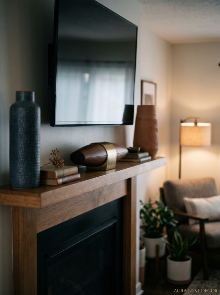
The TV-above-the-fireplace debate is ENDLESS. I won’t relitigate it — ergonomically it’s not ideal, aesthetically it divides opinion. But if you’ve got one up there, here’s the only thing that actually helps: treat the TV frame as part of the composition when it’s off.
This means your mantle styling should look intentional even with a black rectangle above it. Which means: go darker with your palette generally. Richer tones feel at home with a dark screen. Lean into contrast rather than fighting it. A single piece of art that flanks the TV rather than being replaced by it. A gallery wall that includes the TV — yes, actually frames around it — which sounds bizarre but can look genuinely interesting if you commit fully.
When the TV’s on, nobody’s looking at the mantle. When it’s off, the mantle is doing all the work. So that’s what you style for.
12. The Mood Test — How to Know When Your Mantle Is Actually Finished

Here’s the thing about styling: there’s no checklist that ends with “done.” But there IS a feeling, and I think you can test for it.
Stand across the room. Not right in front of it — across the room, the distance you’d naturally be sitting from it. Look at it for ten seconds. Does anything bother you? Does your eye snag on something that doesn’t belong? Is there something demanding attention in the wrong way — too bright, too symmetrical, too obviously placed?
Now look away. Look back quickly. What do you see first? That first thing your eye goes to — is it what you WANT them to see? Because that’s actually what your mantle is saying about the room. The first thing your eye finds is the sentence. Everything else is the supporting paragraph. If the first thing your eye goes to is a bag you left there three days ago or that candle that’s burned down too low — that’s your answer. Fix that one thing and look again.
You’ll know when it’s right. It won’t look like effort. It’ll just look like it was always meant to be that way.
—
❓ FAQ
Q: How many items should be on a mantle? A: Honestly, there’s no magic number — but somewhere between 5 and 9 distinct objects tends to feel right for most mantles. Less than 5 can look sparse unless the objects are very strong. More than 9 starts to feel cluttered unless the mantle is unusually wide or the objects are very small. When in doubt, remove one thing. It’s almost always right.
Q: Can I style a mantle if I don’t have a fireplace? A: Absolutely, yes. A floating shelf at mantle height, a console table against a feature wall, even a freestanding unit with a wide top shelf — these all work with the same principles. The fireplace opening gives you extra composition space, but the mantle shelf itself is what really matters for styling purposes.
Q: What’s the best way to hang art above a mantle without it looking awkward? A: The bottom of the art should be roughly 6-8 inches above the top of the mantle shelf — close enough that it feels related to what’s below, not floating off into the ceiling. If the art’s too large for that, it can sit directly ON the mantle and lean against the wall, which often looks better anyway. Leaning things almost always has more personality than hanging them perfectly.
—
💭 Final Thoughts
Your mantle is the room’s quiet heartbeat. It’s the thing people look at when the conversation goes somewhere uncomfortable, when they’re waiting for you to come back with drinks, when they’re trying to figure out who you are from your home. It should tell the truth about you — not the aspirational, Instagram version, but the real, collected-slowly, loved-for-specific-reasons version of you.
Take everything off it. Start with one thing you love. Build from there.
What’s the one object on your mantle right now that you could never bring yourself to move?