The Living Room Styles People Are Actually Obsessed With Right Now (And Which One You’ll Regret Ignoring)
You scroll past a thousand living rooms a week. Most of them blur together. But every once in a while, one stops you cold — and you don’t even know why. That’s not an accident. That’s style doing what it’s supposed to do.
—
1. The Style Nobody Can Name But Everyone Recognizes the Second They Walk In
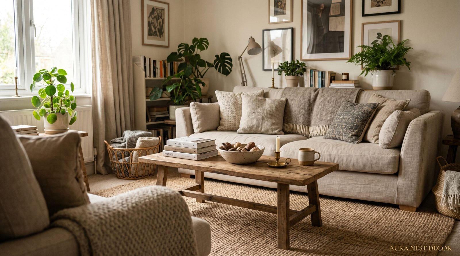
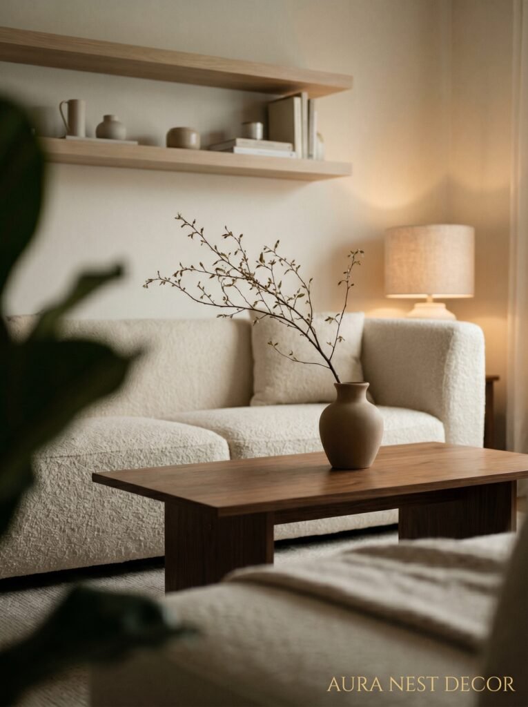
There’s a living room style that doesn’t have a clean label yet, and it’s the most searched thing on Pinterest right now. It’s somewhere between “warm minimalism” and “collected maximalism” — and before you roll your eyes at those words, hear me out, because it’s actually really specific.
Think: a single linen sofa in oatmeal. A stack of books with the spines facing inward (controversial, I know). One genuinely interesting piece of art that’s slightly too big for the wall it’s on. A plant that’s real but not perfectly shaped. This isn’t the curated-to-death look that dominated the last decade. It’s looser. More “I actually live here” and less “I’ve staged this for a magazine.”
The reason people can’t name it is because it resists naming. Cottagecore is too soft. Japandi is too cold. This unnamed style lives in the middle, where most of us actually exist. And the people pulling it off have one thing in common — they stopped trying to make the room look finished. Because a room that looks FINISHED is a room that looks fake.
—
2. Why Japandi Isn’t Going Anywhere (No Matter How Many Times You’ve Heard That Word)
Okay, I know. You’ve read about Japandi. You’re tired of it. But here’s the thing — you’re probably tired of bad Japandi, which is just beige with a sad fiddle-leaf fig.
Real Japandi is different. It’s the negative space that makes your eye rest. It’s the weight of a ceramic bowl on a wooden shelf, and how that combination somehow feels expensive even if neither thing was. American homes do this really well when there’s a fireplace involved — that low, horizontal energy where everything sits close to the ground and the room doesn’t shout. British homes pull it off with bay windows and not enough furniture, which sounds wrong but isn’t.
The key that most people miss? Texture over color. You don’t need the room to be colorful. You need it to feel different in every corner — rough linen here, smooth stone there, matte black somewhere that surprises you. That’s the whole game. Don’t buy more things. Buy fewer things that feel more interesting in your hand.
“A room that needs more stuff usually needs less. A room that needs less stuff usually needs better stuff.”
—
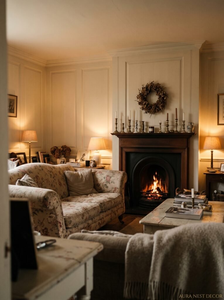
3. The Dark Living Room Trend That British Homes Do Better Than Anyone
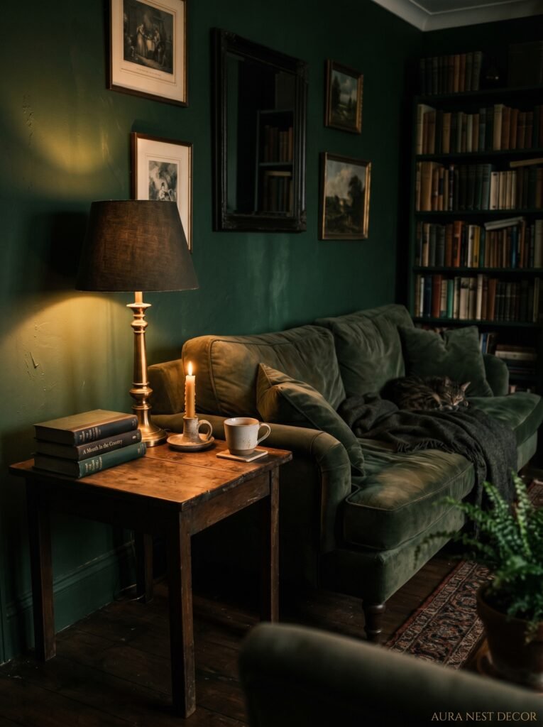
Deep green. Midnight blue. Terracotta that’s almost brown. These aren’t safe colors and that’s exactly the point.
British homeowners have been living with dark, moody rooms for centuries — not because they’re obsessed with drama but because the light is different there. That northern grey light coming through a sash window actually MAKES a dark room look intentional. In the US, it can read the same way, especially in older homes with smaller windows, east-facing rooms, or spaces that never get direct sun anyway.
So instead of fighting it, lean in. A room that’s naturally dim doesn’t want white walls. It wants Forest Green No.79 or Railings or Hague Blue or whatever deep color makes you slightly nervous. That nervousness? That’s how you know it’s right.
Side note — the people who do this best always have one warm light source they love. Not “warm lighting” as a concept, but a SPECIFIC lamp. The amber glow of an Edison bulb at 7pm turns a dark green room into somewhere you never want to leave. That’s the whole trick.
—
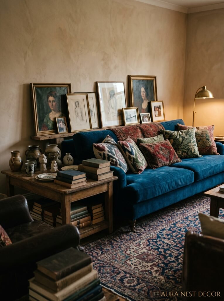
4. Maximalism for People Who Thought They Hated Maximalism
Not everyone is a maximalist. But a lot of people think they’re minimalists when they’re actually just scared.
Maximalism done right doesn’t mean clutter. It means density of meaning. Every object in the room has a reason — it’s from somewhere, or it makes you feel something, or it cost you nothing and looks like it cost everything. The mistake most people make is buying MAXIMALIST THINGS instead of just keeping the things that already have weight to them.
Your grandmother’s side table counts. That print you bought at a market for fifteen dollars counts. The collection of mismatched candlesticks that you keep apologizing for? Stop apologizing. They’re the best thing in the room.
American maximalism tends to go big — larger furniture, louder textiles, more surface area covered. British maximalism does something different; it goes TALL and VERTICAL, filling walls instead of floors, books stacked above eye level, art hung in groups that feel slightly chaotic but somehow work. Both are valid. But knowing which version fits your space is half the battle.
—
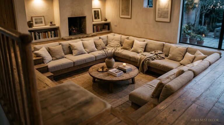
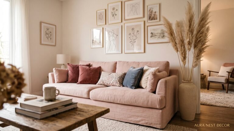
5. The Sofa Decision That Changes Everything Else in the Room
There’s a version of this article where I talk about sofas last. That would be wrong.
Your sofa is not a supporting character. It’s the entire plot. And the biggest mistake people make — in the US and the UK both, I’ve seen it everywhere — is buying a sofa that’s too small for the room and then wondering why nothing feels right.
A sofa that’s too small makes every other piece of furniture look randomly placed. A sofa that’s appropriately large makes the room look intentional even if nothing else is. It anchors everything. So if you’re starting from scratch, or you’re redoing a room that’s never felt cohesive, START here. Not with the rug. Not with the paint color. The sofa.
Linen holds up better than you think. Boucle is everywhere right now and there’s a reason. Velvet was a moment two years ago and it’s still a moment in certain rooms — jewel-toned velvet sofas in small British living rooms with picture rails and cornicing look genuinely extraordinary, and I’ll die on that hill.
“The sofa you’re afraid to commit to is usually the sofa that would have made the whole room.”
—
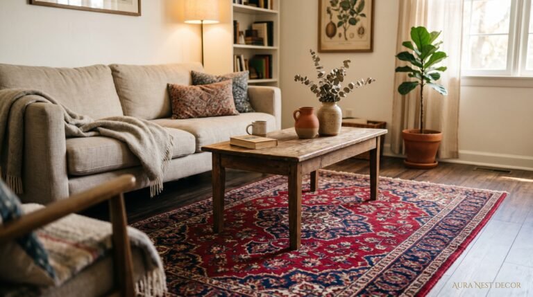
6. The Rule About Rugs That Nobody Tells You Until It’s Too Late
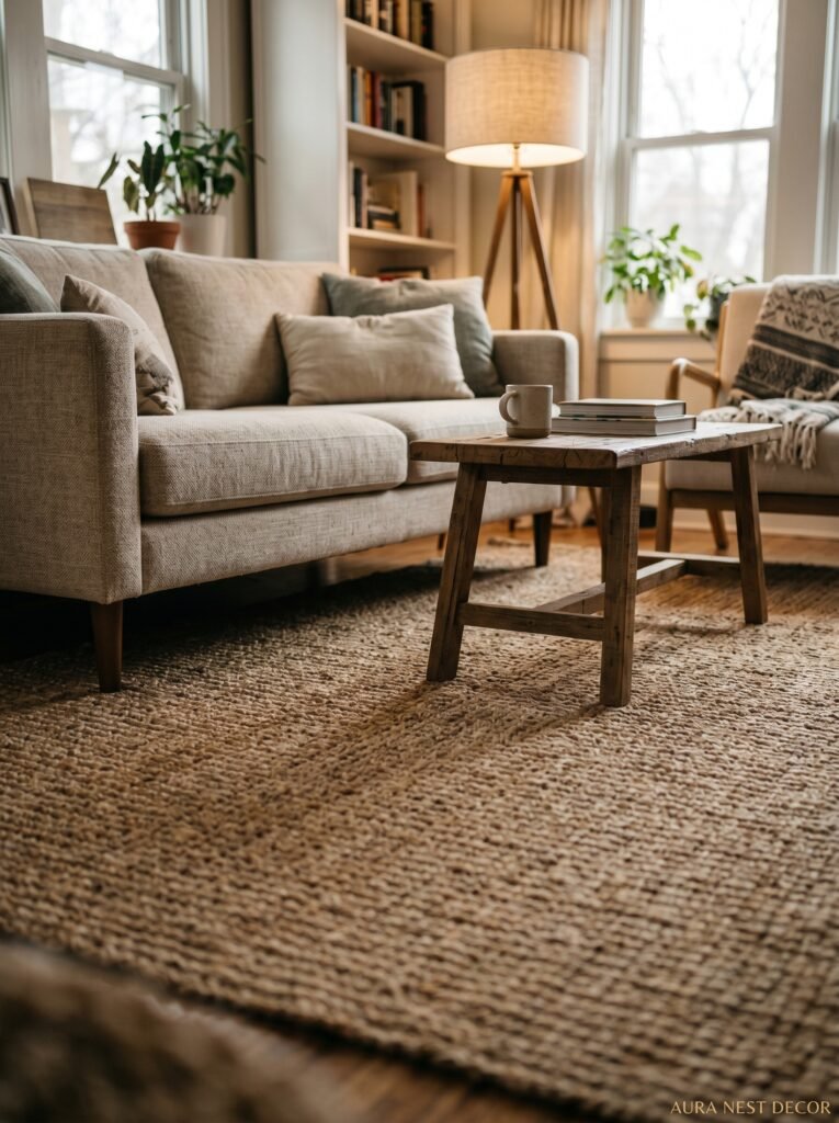
Your rug is probably too small. I say this with love.
The number one thing that makes a living room look like a furniture showroom instead of an actual home is a rug that doesn’t reach under the front legs of the sofa. It makes every piece of furniture look like it’s floating. Disconnected. Like the room is full of individual objects that happened to end up in the same place.
The fix is annoyingly simple: bigger rug. Most people go for the 5×8 when they need the 8×10. Most people go for the 8×10 when they need the 9×12. This is also one of those places where secondhand genuinely wins — vintage rugs from marketplaces and estate sales are often larger, more interesting in color, and priced better than anything new.
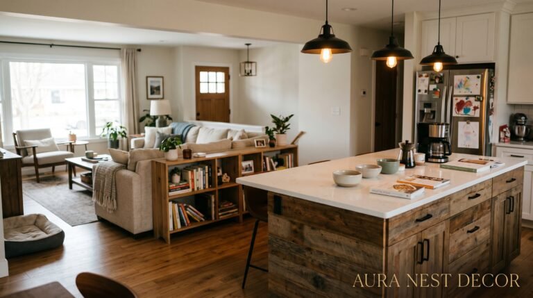
In the US, this is especially true in open-plan spaces where the living area bleeds into the kitchen or dining room. The rug is the thing that tells the room where it starts and stops. Don’t underestimate it.
—
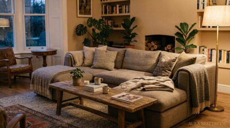
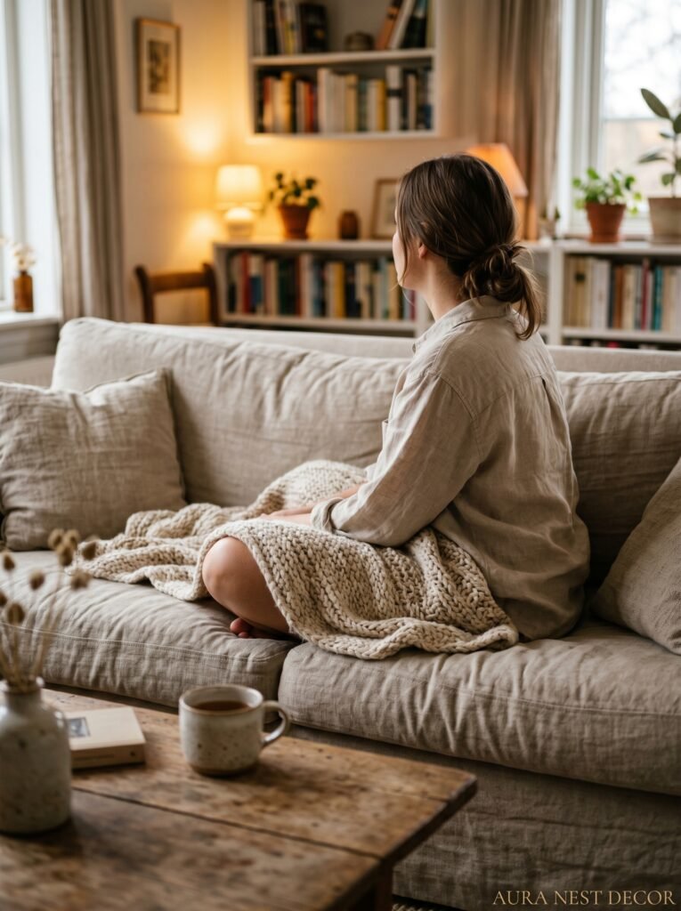
7. What “Cozy” Actually Means in 2025 (It’s Not What You Think)
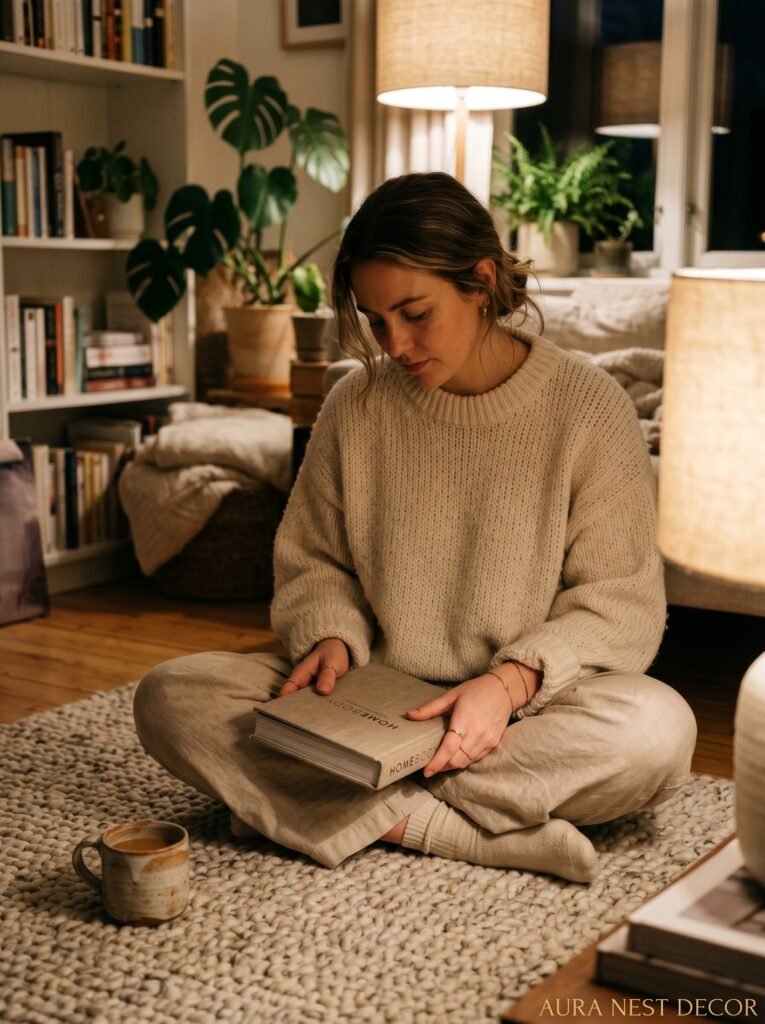
Hygge had a moment and then became a candle scent. Cozy went the same way — it became a mood board category full of chunky knit throws and hot cocoa stock photos.
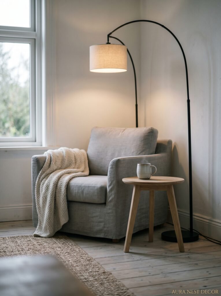
But actual coziness in a room is a structural thing. It’s about sight lines and scale. A cozy room doesn’t have furniture shoved against the walls (yes, I know everyone does this, no, it doesn’t make the room feel bigger, it makes it feel hollow). A cozy room has furniture pulled slightly into the space, creating a conversation zone that feels intentional.
A cozy room has at least one lamp that’s lower than eye level when you’re sitting down. It has something soft underfoot. It has a surface within arm’s reach of wherever you sit most often, because having to get up to put your mug down makes a room feel inconvenient, not cozy. That sounds small. It’s not.
“Cozy isn’t a look. It’s an answer to: does this room feel good to be IN, or just good to photograph?”
—
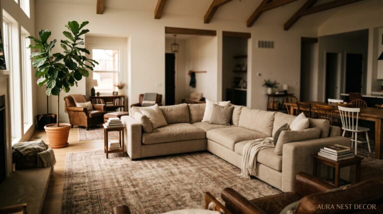
8. The Mid-Century Modern Comeback You’re Either Gonna Love or Find Exhausting
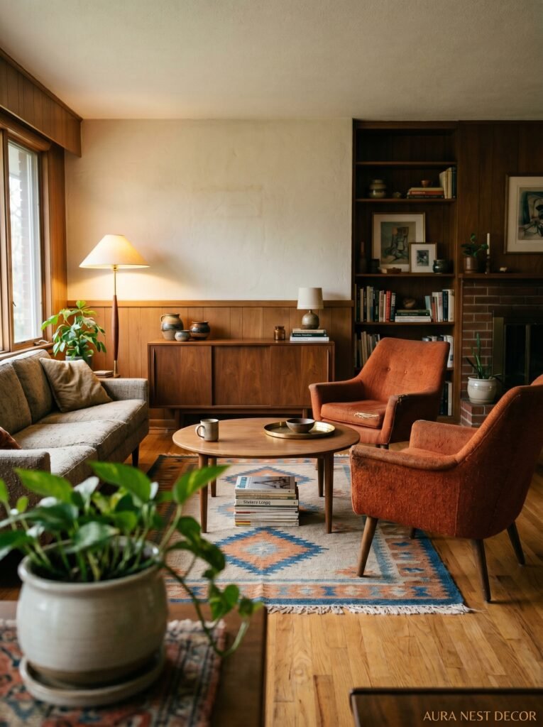
It’s back. Properly back, not just “one Eames-inspired chair in the corner” back.
Mid-century modern in 2025 looks different from the last wave. There’s more color — mustard, rust, that specific olive green that appears in every vintage apartment scene ever filmed in a 1960s movie. There’s more mixing. You don’t need a pure MCM room; in fact, pure MCM rooms look a bit museum-y. What works is taking the BONES of MCM — low furniture, tapered legs, clean lines — and layering in things that are softer or older or more personal.
A mid-century sofa against a plaster wall with a woven pendant light and a 19th-century oil painting above the fireplace. That’s the combination people are saving right now. It shouldn’t work and it absolutely does.
—
9. The One Thing Scandinavian Style Gets Right That We Keep Ignoring
Natural light. That’s it, honestly.
Scandinavian interiors are obsessed with maximizing whatever light comes into the room, because for large parts of the year there isn’t much. And the habits that develop from that — keeping window sills clear, avoiding heavy curtains that eat into the window frame, using mirrors strategically, choosing reflective surfaces and pale floors — those habits make ANY room better.
You don’t have to love the blonde wood and the all-white aesthetic to steal this principle. Just stop blocking your windows. Stop hanging curtains too low and too narrow. Let the light in from as many angles as you can and then use that light to warm a room with color instead of hiding a dim room with pale paint. That last part is where most people get it backwards.
—
10. The Art Mistake That’s Instantly Aging Your Living Room
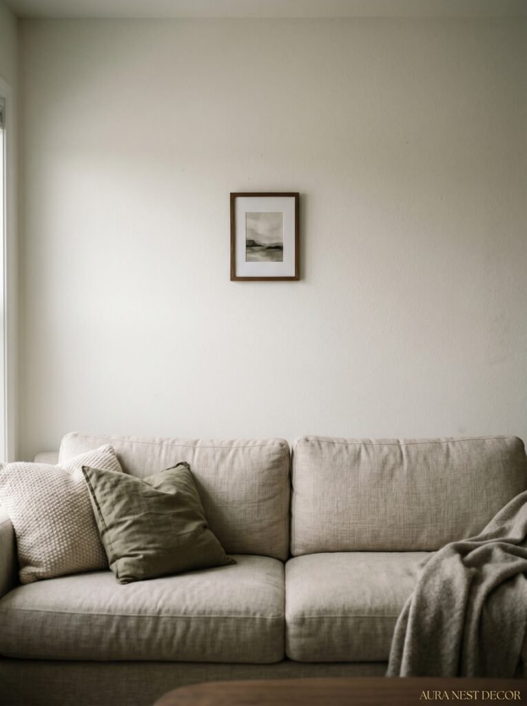
Hanging art at eye level sounds correct. In practice, it usually means everything ends up too high.
Eye level when you’re STANDING is not eye level when you’re sitting on your sofa, and you spend most of your time in a living room sitting. Sit down. Look at your walls. That’s where the art should be. Lower than you think. More centered to your seated sightline than your standing one.
The second mistake? Hanging one piece alone with too much wall around it. Unless it’s something genuinely large and genuinely interesting, single small-to-medium pieces floating on a big wall look lonely. Gallery walls done well — which means with intention and variation in frame size, not just “all frames from the same shop” — look complete. There’s a difference between curated and matched, and it’s a big one.
—
11. The Living Room Style American Homes Underuse and British Homes Can’t Stop Using
Built-ins. Alcoves. Structural shelving that feels like it grew out of the walls.
British terraced houses and Victorian semis often have original alcoves on either side of a chimney breast, and the way people use these — for books, for records, for art, for a single good lamp — is something American open-plan homes genuinely miss. Because built-ins don’t just store things. They make a room feel SETTLED. Like the room knows what it is.
If you’ve got alcoves, use them fully. If you don’t, there are ways to fake it — floor-to-ceiling shelving on a single wall can do the same thing, especially when you don’t fill every inch (leave gaps, leave breathing room, let the objects you choose have space around them). Anyway, the point is that vertical storage that feels intentional is one of the most underrated things in any living room.
—
12. The Trend That’s Replacing “Gallery Walls” and Feels Much More Personal
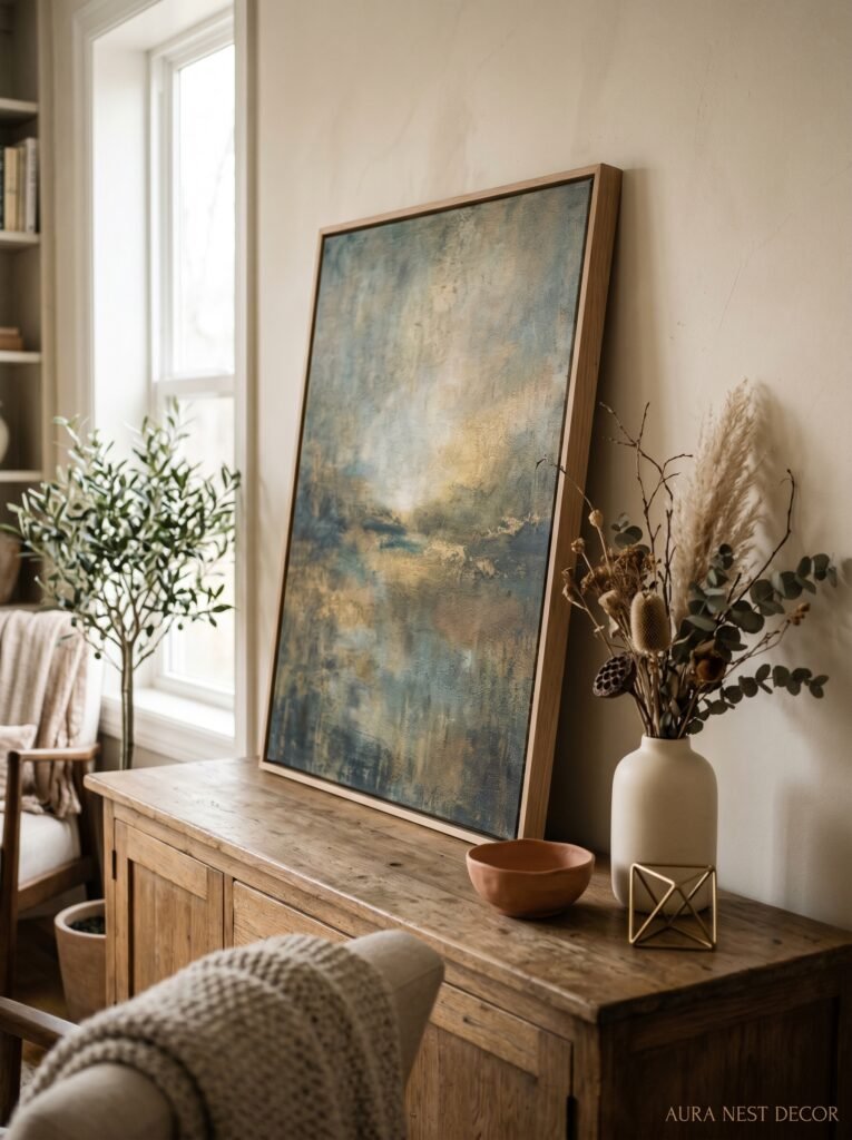
Statement objects. One thing. Big, weird, interesting, yours.
Gallery walls aren’t dying but they’ve been done. The shift happening now — and you can see it all over Pinterest if you look at what’s getting saved in the last six months — is toward a single object or a very small grouping that does ALL the visual work in the room. A large-scale textile. An oversized ceramic. A sculpture that lives on the floor instead of a shelf. One painting that takes up more wall space than feels comfortable.
This is honestly harder than a gallery wall because there’s nowhere to hide. One object either works or it doesn’t. But when it works, it makes the whole room feel like it belongs to somebody specific. Not a mood board. Not a style category. Somebody’s actual home. Which is, at the end of the day, the thing that makes people stop scrolling.
—
❓ FAQ
Q: What’s the most popular living room style in the US right now? A: Warm minimalism with natural materials is the broadest trend — think linen, wood, a little rattan, muted colors with one bolder accent. But “collected” and slightly maximalist rooms are gaining fast, especially among people who’ve spent years doing the all-white thing and found it cold.
Q: How do I make a small living room look intentional instead of cramped? A: Don’t push furniture against the walls — it actually makes small rooms feel more cramped, not less. Use a rug that’s larger than you think you need, keep the curtains hung high and wide, and pick ONE statement piece rather than filling every surface. Intentional empty space reads as a choice.
Q: What living room colors are working well in UK homes specifically? A: Deep, moody tones are doing incredibly well — Farrow and Ball deep blues, greens, and off-blacks work beautifully with British natural light. But warm ochres and earthy terracottas are just as popular right now, especially in period homes where the original features (cornicing, skirting boards, picture rails) give the color something to push against.
—
💭 Final Thoughts
There’s no wrong living room style, there’s just rooms that feel like they were designed for the person in them and rooms that don’t. The styles that are resonating right now — with American and British homeowners both — all have one thing in common: they look like decisions were made, not defaults. Like someone actually chose this, and meant it.
Start with the one thing in your living room you genuinely love. Build outward from there. What would make the room feel more like that one thing, and less like everything else?