The Kitchen-Living Room Combo That Actually Feels Like a Home (Not a Floor Plan)
You know that moment when you walk into someone’s open-plan space and it just works — the kitchen and the living room feel like one gorgeous, intentional room instead of two awkward halves ignoring each other? Yeah. That’s what we’re doing today.
—
1. Why Most Open-Plan Spaces Feel Like a Furniture Showroom (And How to Fix It)
Here’s the honest truth: most kitchen-living rooms fail not because of the furniture, not because of the layout, and not because of the budget. They fail because nobody decided what the room is for.
Is it for Sunday morning pancakes eaten on the sofa? Is it for dinner parties where the cook doesn’t miss the conversation? Is it for a family where the kids do homework at the island while someone makes pasta? All of those are valid. But a room that tries to be all three without any deliberate thought just ends up feeling like a waiting area.
The fix is weirdly simple. Pick one activity that the room should do better than anything else. One. Not three. Lead every single design decision with that activity in mind — the sofa placement, the island height, the lighting zones, all of it. Everything else arranges itself around that core purpose, and suddenly the room has a personality. It has a reason to be the way it is.
I’ve seen tiny 400-square-foot London flats pull this off better than massive American open-plans three times the size. Square footage doesn’t give you personality. Intention does.
—
2. The Invisible Line That Every Great Kitchen-Living Room Has
There’s a line in every well-designed open-plan space. You can’t see it, but you can FEEL it.
It’s the moment where the kitchen stops and the living room begins — not marked by a wall, because there isn’t one, but by a shift in materials, lighting, or texture. Cross it and your brain says “I’m somewhere different now.” Stay on one side and the whole room reads wrong, like someone copy-pasted the same energy into every corner.
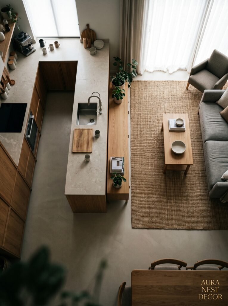
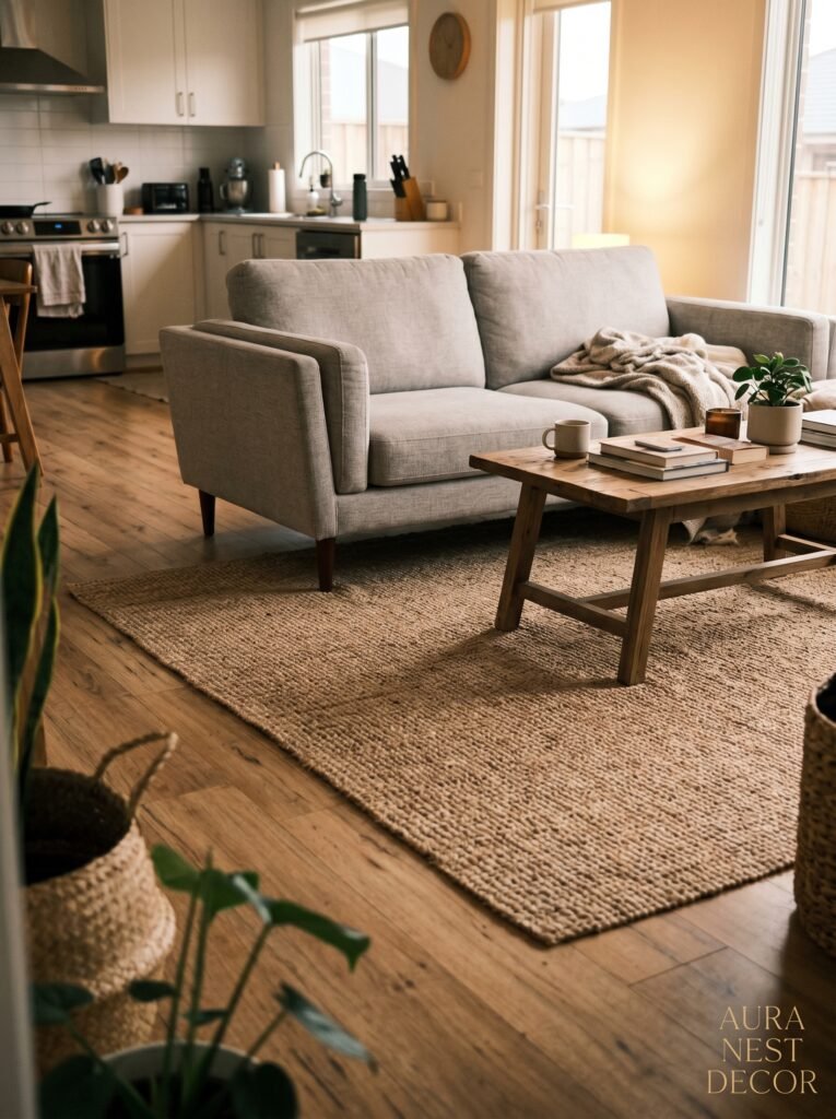
In practical terms, that line might be the edge of a rug. Or it might be where the pendant lights above the island give way to a floor lamp by the sofa. It might be where the hard tile floor becomes warm wood. You don’t need architecture to create it. You need contrast.
A stone-topped island in a matte kitchen feels completely different from a linen sofa three feet away — and that difference is the point. The contrast is what makes each zone feel generous instead of cramped. It’s the single thing I’d tell anyone designing one of these spaces from scratch: don’t try to make the kitchen and living room match. Let them speak the same language but say different things.
—
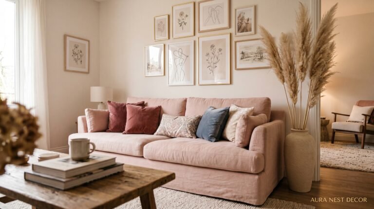
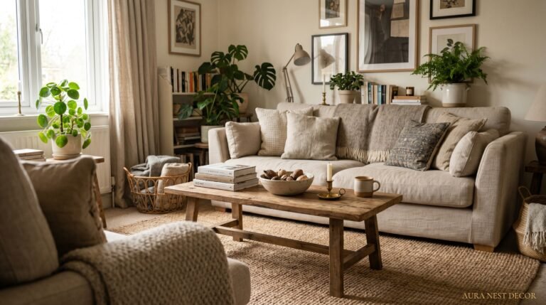
3. The Color That Keeps Showing Up in Every Beautiful Kitchen-Living Room Right Now

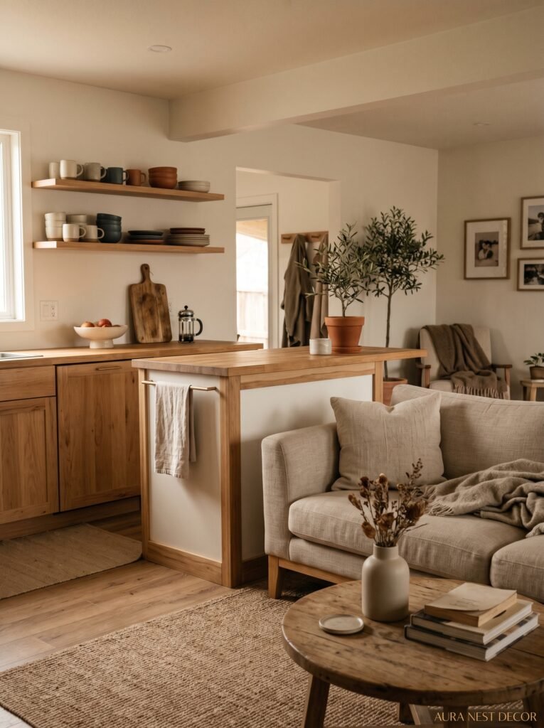
Okay so. I’ve been deep in the interior design rabbit hole for a while now, and there’s a color combination I keep seeing in spaces that stop me mid-scroll. Warm whites paired with something earthy and unexpected — a terracotta-toned island, a dusty sage cabinetry unit, deep walnut shelving against a creamy wall.
It’s not a trend in the exhausting, here-today-gone-tomorrow sense. It’s more like everyone collectively realized that kitchens don’t have to be cold and clinical, and living rooms don’t have to be beige and safe. The earthy tones do something specific: they ground the space. They make a room that spans two functions feel like it has a single, coherent mood.
In the US right now, dusty blue-green cabinetry is absolutely everywhere, and it works especially well when the adjacent living room has warm neutrals — think oatmeal, cream, raw linen. In the UK, I’m seeing a lot of forest green kitchens with off-white walls bleeding into living rooms with dark wood floors and caramel-colored leather. Both versions are doing the same thing: using one bold choice to anchor everything else.
The mistake most people make is playing it too safe on both sides. If your kitchen is neutral and your living room is also neutral, the space doesn’t flow — it just… coexists quietly.
“The earthy tones do something specific: they ground the space. They make a room that spans two functions feel like it has a single, coherent mood.”
—
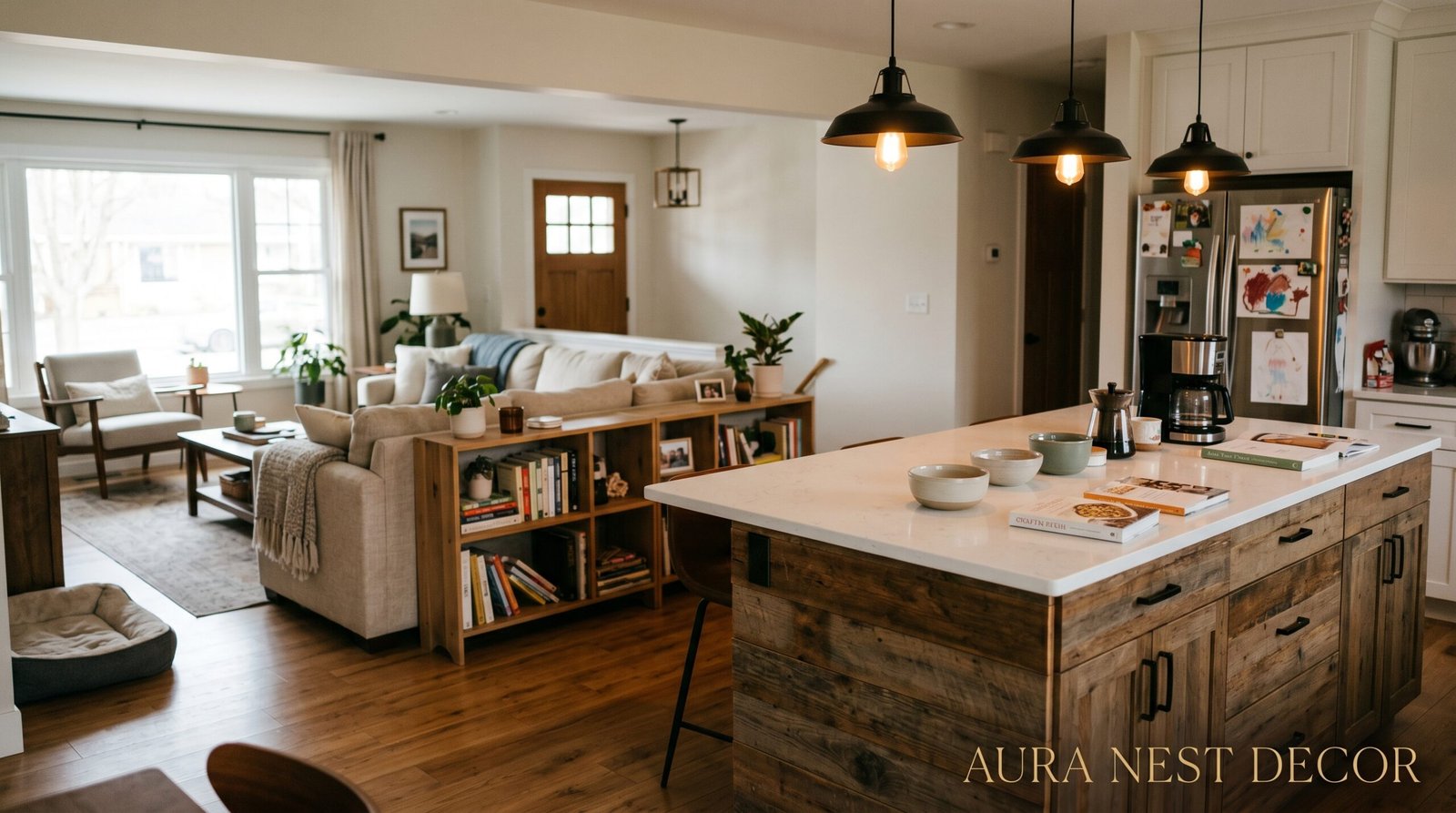
4. Your Island Is Doing More Work Than You Think
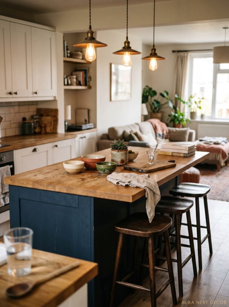
Not gonna lie, the kitchen island might be the most important piece of furniture in an open-plan space. And I don’t mean that in a vague “it’s functional!” way. I mean it’s literally the architectural element that decides how the two zones relate to each other.
An island with seating on the living room side is an invitation. It says: come closer, sit down, talk to me while I cook. An island positioned perpendicular to the sofa creates a kind of soft divide — you’re still connected but the layout suggests two different activities happening at once. Both are valid. But the decision should be intentional, not accidental.
Overhang depth matters more than most people realize. A 12-inch overhang means someone’s sitting with their knees awkwardly pressed against the side of the island. A 15-inch overhang is the minimum for comfort, and 18 inches is honestly luxurious. Also — and this is something nobody talks about — the stool height affects the whole visual weight of the room. Low stools keep the sightlines open. Counter-height stools can end up blocking the kitchen from the living room entirely, which defeats the whole point of an open plan.
Side note: if you’re putting pendants above your island, three pendants in a row is fine but two larger ones are better. Less busy. The kitchen already has a lot going on.
—
5. The One Rule That Makes Any Kitchen-Living Room Feel Intentional
Here it is. Ready?
Repeat one material — just one — across both zones.
That’s it. That’s the whole rule.
It sounds almost too simple, but here’s why it works: when the brain spots the same material appearing in two different contexts, it reads the space as designed rather than assembled. A brass cabinet handle in the kitchen that reappears as a floor lamp base in the living room. Rattan in a kitchen pendant light that shows up again in a side table. Raw linen on bar stools echoed in the sofa cushions.
You’re not creating a matchy-matchy interior. You’re creating a throughline. A visual whisper that connects the room to itself. Designers do this unconsciously — or maybe very consciously — and it’s one of those tricks that costs nothing if you already own the pieces and not much if you’re shopping new.
I’ve started noticing it everywhere now and I cannot unsee it. Walk into any truly beautiful open-plan kitchen-living room and look for the repeated material. It’s there. It’s always there.
—
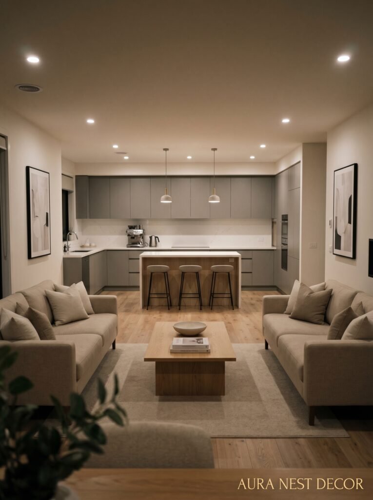
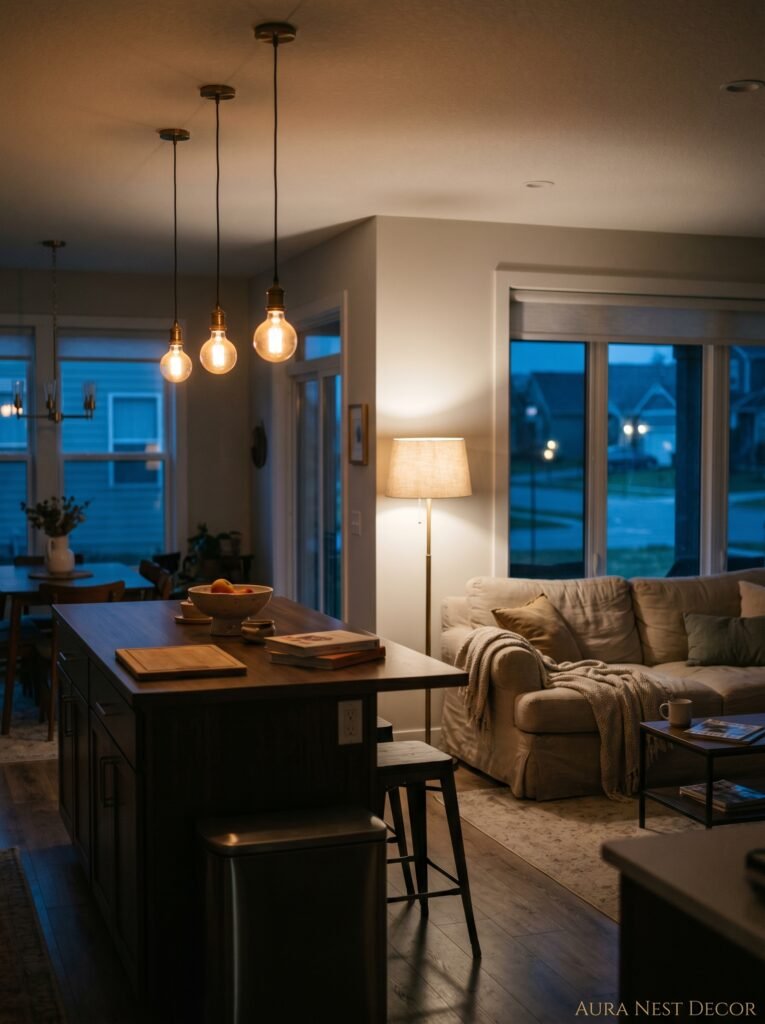
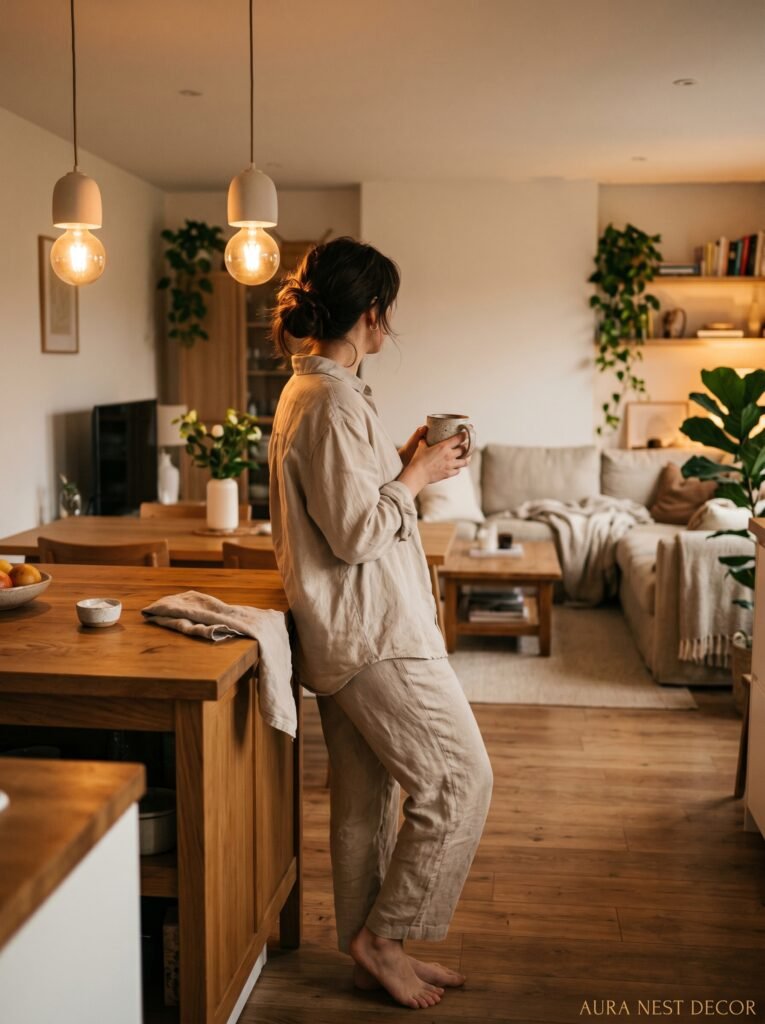
6. Lighting Zones Are What Separate “Nice” From “Magazine-Worthy”
This is where most open-plan spaces leave money on the table. Literally and figuratively.
A single overhead light in a combined kitchen-living room makes everything feel flat. And not flat in a nice, Scandinavian, intentional way — flat like a waiting room at 2pm on a Tuesday. The problem is that a kitchen needs task lighting and a living room needs ambient lighting, and those are almost opposite requirements. So when you try to serve both with one overhead fixture, you end up serving neither particularly well.
The solution is layers. Recessed task lighting over the prep area. Pendants above the island — lower than you think, around 30 to 36 inches above the countertop. Then, on the living room side, you want something warm and low. A floor lamp in the corner that throws light upward. A table lamp on a side table. Maybe a wall sconce if you’ve got the wiring for it.
The amber glow of a warm-toned bulb at about 2700K in the evening changes the entire character of a room. At 7pm when someone dims the kitchen lights and the floor lamp clicks on in the corner, that space becomes somewhere you want to be. That transition — that moment the room shifts from daytime functional to evening cozy — that’s what good layered lighting does. It’s not a luxury. It’s a necessity.
“At 7pm when someone dims the kitchen lights and the floor lamp clicks on in the corner, that space becomes somewhere you want to be.”
—
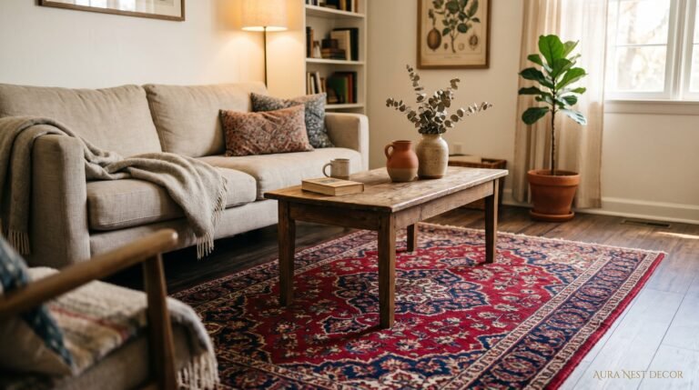
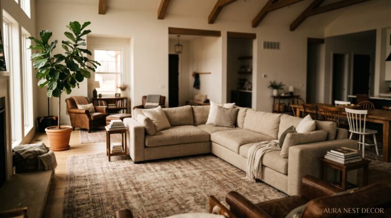
7. Rugs: Why Getting This Wrong Ruins the Whole Room
The rug is, without exaggeration, the most misunderstood element in an open-plan kitchen-living room.
Here’s what people do wrong: they buy a rug that’s too small. The sofa legs sit on the rug, but the armchairs are floating off it, and the coffee table is half-on half-off, and the whole living area looks like it’s in denial about its own size. A rug that’s too small makes a living room zone look apologetic in a space that needs to be confident.
In a combined kitchen-living room, the rug has an extra job: it’s defining the boundary of the living zone. It’s the invisible line we talked about earlier, made visible. So it needs to be big enough to actually contain the seating area — all of it, ideally — and it needs to be a material that makes sense next to a kitchen. Natural fibers like jute or a low-pile wool can work beautifully close to a kitchen. Thick shag? Not so much. You’ll spend your life picking crumbs out of it and resenting yourself.
In the US, a standard living room rug is often around 8×10 or 9×12. In a UK open-plan where space is tighter, a 6×9 can work if the furniture is scaled accordingly. But whatever the size, it needs to be committed. Go big or the room goes wrong.
—
8. The Kitchen Smell Problem Nobody Talks About When Designing This Space
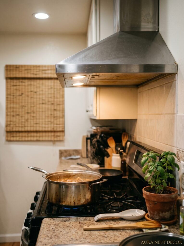
Oh, here’s a thing. When you connect your kitchen and living room into one space, you also connect their air. Which is mostly wonderful — the smell of garlic and butter and roasting chicken drifting into the room where your guests are sitting is genuinely one of the great domestic pleasures. Honestly. I’m not being dramatic.
But. There’s a but.
Burnt toast at 7am. The lingering smell of last night’s fish curry. Bacon grease on a Sunday morning when you’d rather be in a living room that smells like candles. Open-plan living connects you to the kitchen’s full range of olfactory experiences, not just the nice ones.
This is why ventilation is genuinely a design consideration, not just a practical one. A good range hood that actually exhausts outside (not just recirculates) is non-negotiable. So are windows positioned to create cross-ventilation when the weather allows. And honestly, a candle or diffuser on the coffee table isn’t just decorative — it’s functional. It’s setting the olfactory scene for the living room half of the space the same way a rug sets the visual scene.
Worth thinking about before you knock that wall down, basically.
—
9. Shelving That Earns Its Place on Both Sides
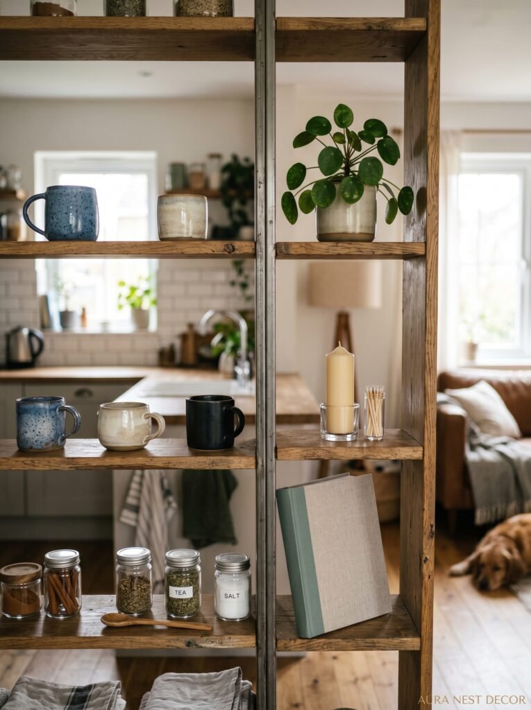
Built-in shelving in an open-plan kitchen-living room is one of those details that separates a space that feels designed from a space that just happened. And the placement is everything.
Open shelving in the kitchen — I know, controversial — works when it’s curated. Not every plate you own. Not the mismatched mugs from every coffee shop you’ve visited. The good stuff. Two or three large ceramic bowls, a stack of linen napkins, maybe a small trailing plant in a simple pot. The kitchen side of the shelving should look like someone made deliberate choices, not like a cupboard door was removed.
On the living room side, the shelving tells a different story. Books, objects, maybe a framed print leaning casually, a candle that’s been used. It should look lived-in but not random. The trick — and this is genuinely useful — is to group things in odd numbers and vary the height. Three items at different heights always looks more intentional than five items all lined up at the same level.
When the kitchen shelving and the living room shelving share the same material (say, both use white-oiled oak brackets, or both use the same tone of painted wood), the whole wall becomes a design feature instead of two separate bits of storage.
—
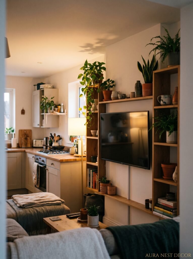
10. What to Do When the TV Is Ruining Your Open-Plan Flow
The TV is a problem. I’m going to say it plainly.
In a normal living room it’s fine — everyone accepts that the TV is the focal point and you arrange the room around it. But in an open-plan kitchen-living room, a big black rectangle mounted on a wall that faces the kitchen pulls the eye in a completely different direction than the room’s natural flow. It competes with everything.
There are a few ways to handle this. A TV unit on a wall that’s perpendicular to the kitchen rather than directly facing it tends to work better — you’re not making eye contact with the screen while you’re cooking. Some people are going full cabinet-door situations where the TV lives behind wooden or rattan panels and only reveals itself when you actually want to watch. This is a slightly more effort-intensive solution but the effect is genuinely lovely.
Swivel TV stands are also underrated. The ability to angle the screen toward the sofa when you’re watching and tuck it back when you’re not keeps the room feeling like a room rather than a cinema with a kitchen attached.
—
11. The Small Details That People Notice Without Knowing Why

You know how you walk into someone’s home and it just feels good, but you can’t put your finger on exactly why? It’s almost always the small stuff.
Matching the finish on kitchen fixtures to living room hardware is one of them. Brushed brass taps in the kitchen and gold-toned picture frames in the living room. Matte black cabinet handles echoed in a black-framed mirror on the adjacent wall. These things cost nothing to plan and they create a cohesion that’s felt more than seen.
Plants do something similar. A large fiddle-leaf fig or a monstera on the living room side and a smaller herb pot or a trailing pothos on the kitchen windowsill creates a sort of visual conversation between the two zones. Living things make spaces feel inhabited, not staged.
And honestly — clutter management. Not minimalism, not “clear every surface,” but edited living. A few intentional objects rather than everything out at once. The kitchen counter that has three things on it feels completely different from the counter that has seventeen things on it, even if those seventeen things are all beautiful individually.
“A few intentional objects rather than everything out at once. That’s the difference between a kitchen-living room that photographs well and one that actually feels good to be in.”
—
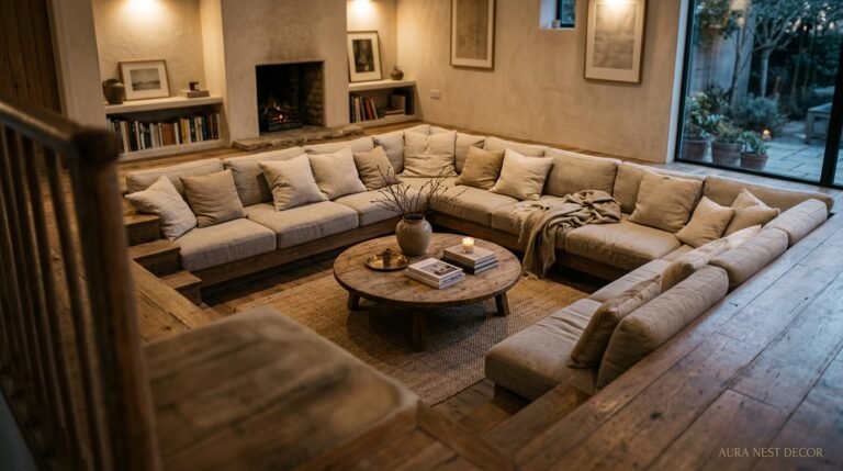
12. The Conversation Corner You Didn’t Know Your Open Plan Was Missing
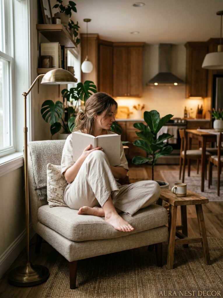
Here’s something I’ve noticed in the best kitchen-living rooms: they have a pocket. A corner, a nook, a spot that feels slightly separate from the main flow of the room without being cut off from it.
Sometimes it’s a pair of chairs angled toward each other near a window, slightly away from the main sofa arrangement. Sometimes it’s a window seat with cushions tucked into a bay. Sometimes it’s just a reading chair with a floor lamp and a small side table, positioned in a way that says “this spot is for one person to exist quietly.”
In open-plan living, most of the space is shared and social. But humans also need a corner. We need somewhere that feels like it has a back to it, something protective. A spot where you can be in the room without being on display in the room.
If your kitchen-living room doesn’t have one, make one. Pull a chair into a corner. Add a lamp. Put a small stack of books on the floor next to it. You’ll use it more than you expect, and your guests will drift toward it instinctively. Because even in the most gorgeous, open, connected spaces — we’re all just looking for our corner.
—
❓ FAQ
Q: How do I stop my open-plan kitchen-living room from smelling like cooking all the time? A: A properly venting range hood is the first fix — one that exhausts outside, not just recirculates the air. Beyond that, cross-ventilation from windows on opposite walls helps a lot, and keeping a diffuser or quality candle in the living zone gives that side of the room its own olfactory identity.
Q: What size rug should I use in an open-plan kitchen-living room? A: Bigger than you think. In the US, an 8×10 is really a minimum for most sofa arrangements, and a 9×12 is better if you’ve got the floor space. The rug should contain the entire seating area — all four legs of the sofa and ideally the front legs of every chair. In smaller UK spaces a 6×9 can work, but only if the furniture is scaled down to match.
Q: Is it a mistake to use the same flooring throughout the entire open-plan space? A: Not a mistake at all — consistent flooring actually reads as more spacious and is especially useful in smaller homes. But if you do use the same floor throughout, you’ll need to work harder with other elements (rugs, lighting, furniture scale) to make the two zones feel distinct. Without a floor change to mark the boundary, those other contrasts have to do the work instead.
—
💭 Final Thoughts
A kitchen-living room done well isn’t about having the biggest space or the most expensive finishes. It’s about understanding that you’re asking one room to hold two lives — the practical life of cooking and the emotional life of resting — and designing with that tension in mind rather than pretending it doesn’t exist.
The most beautiful ones I’ve ever seen always feel a little imperfect. A worn edge on the island, a sofa that’s clearly been sat in, a window covered in fingerprints from kids. That’s not a flaw. That’s the room doing its job.
So what does your kitchen-living room need to do better — and what’s the one thing standing in its way?