
The Blue That Makes a Modern Farmhouse Living Room Look Like It Was Always Meant to Be
You know that moment when you walk into a room and everything just settles? Not decorated — settled. That’s what blue does in a modern farmhouse living room when you get it right. And most people get it slightly wrong, not because they chose a bad shade, but because nobody told them which blue to actually reach for.
—
1. Why Blue Keeps Winning in Modern Farmhouse Rooms (and It’s Not About Trends)
Here’s the thing about blue in a farmhouse context: it’s not a trend. It never really was. Farmers painted their barns and shutters with iron-oxide blue and slate-washed indigo long before anyone put it on a mood board. This color has always belonged to spaces that work hard and still manage to look beautiful.
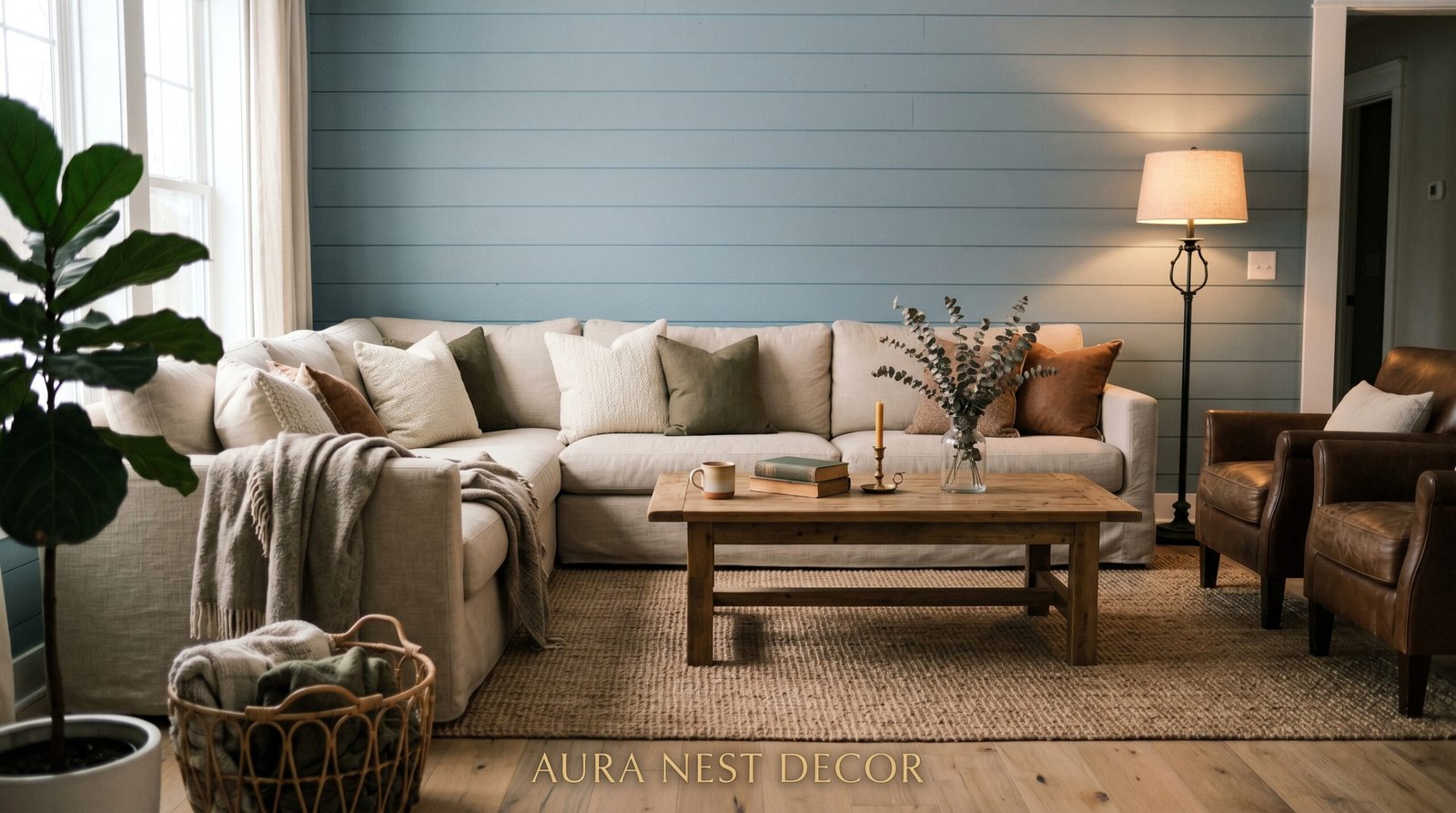
The reason blue lands so well in a modern farmhouse living room specifically is that it sits right at the intersection of warmth and restraint. It doesn’t scream. It doesn’t compete with your reclaimed wood beam or your linen sofa or your galvanized metal lamp. It simply anchors everything around it, giving your eye a place to rest after bouncing around all those gorgeous textures.
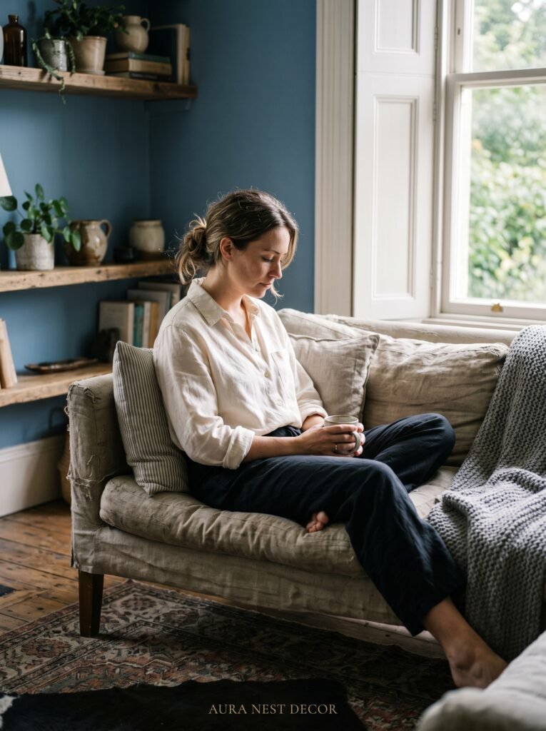
And there’s a psychological dimension to this too. Blue — particularly the deeper, quieter shades — has a long association with trust and calm. In a living room, the place where you’re supposed to actually exhale at the end of the day, that matters more than people admit. You don’t just want a room that photographs well. You want a room that feels like putting your feet up.
The modern farmhouse aesthetic already does a lot of heavy lifting through natural materials, clean lines, and a kind of studied simplicity. Blue steps in as the emotional layer. It’s the detail that makes the whole thing feel considered rather than assembled.
“Blue in a farmhouse room isn’t a color choice. It’s a commitment to calm.”
—
2. The Exact Shades That Actually Work — and the Ones That Quietly Ruin Everything
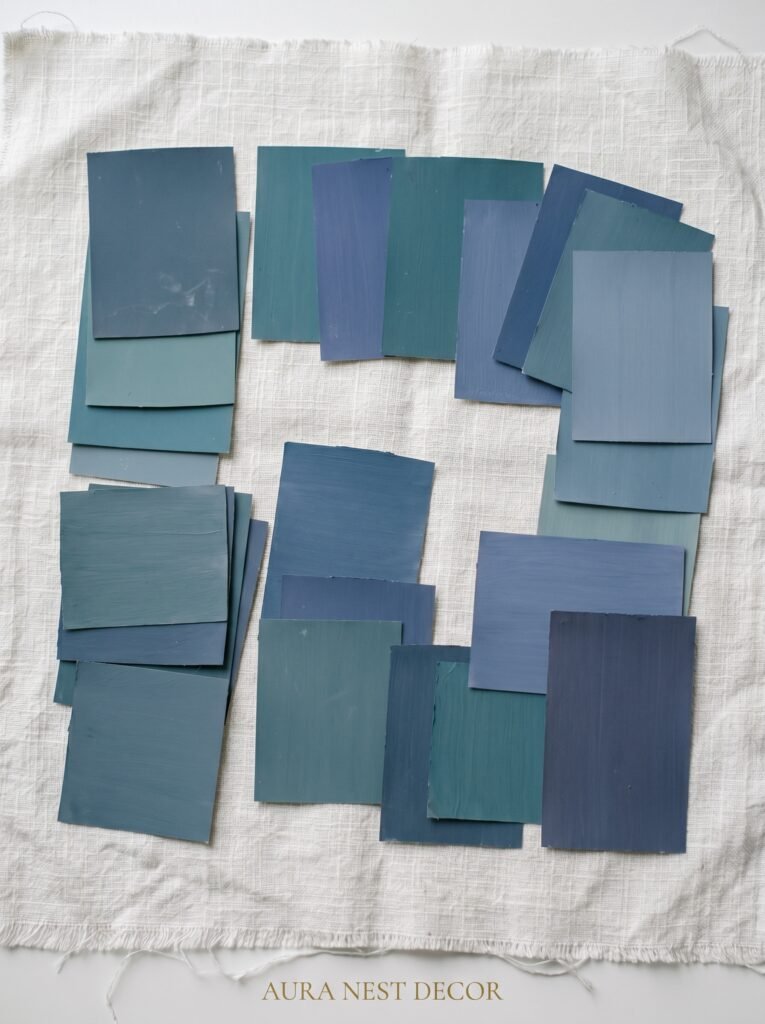
Let’s talk specifics, because “blue” covers a lot of ground. Navy works. Dusty slate works. Washed denim works. Bright cobalt? That’s a different conversation.
For modern farmhouse living rooms, you’re looking for blues that have been aged, muted, or deepened in some way. Think of the color of old denim left in the sun for a summer. Think of the sea on an overcast morning off the Cornish coast, or the winter sky over rural Tennessee just before the temperature drops. These are blues that carry a little history in them.
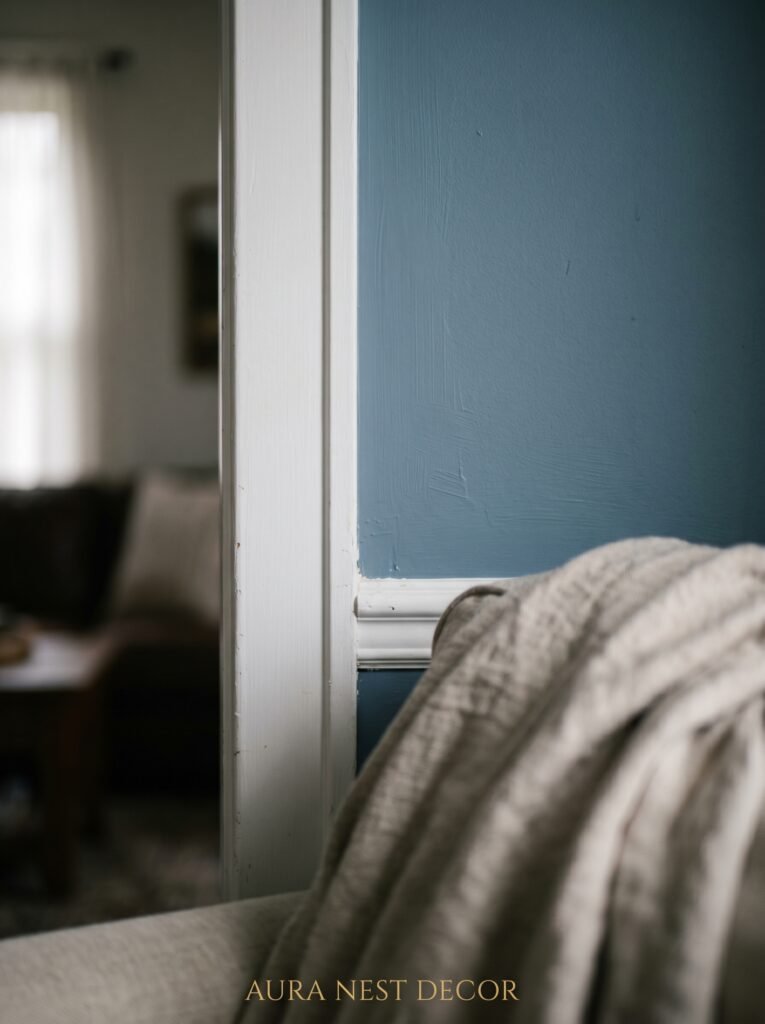
Specific shades worth hunting down: Farrow & Ball’s Hague Blue is extraordinary on a single accent wall — it’s deep without being oppressive. Their Oval Room Blue is softer, more silvery, and works beautifully in rooms that get strong natural light. Benjamin Moore’s Van Deusen Blue is a great American equivalent — rich, saturated, but with enough grey in it to stay grounded. Slate Blue and Dusty Miller (both available from various US and UK paint brands) read almost like a neutral in certain lights, which is exactly the kind of magic you want.
What to avoid: anything that leans too turquoise, too bright, or too clean. Aqua and electric blue don’t carry the quietness that farmhouse style asks for. They read as coastal or maximalist, which is a gorgeous aesthetic but a different one entirely.
—
3. The Accent Wall Argument, and When to Ignore It Completely
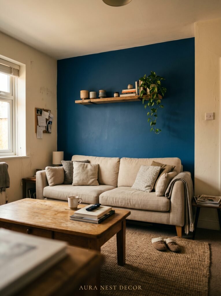
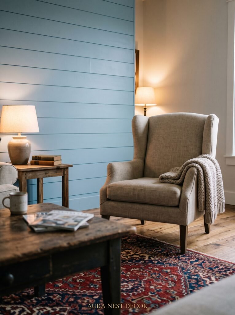
Someone in your life has probably told you to “just do one accent wall” with a bold color. And sometimes that’s right. But in a modern farmhouse living room, the more interesting option is often to go further — or to abandon the accent wall idea altogether in favor of something subtler.
Consider painting your fireplace surround in a deep blue instead. Or your built-in bookshelves. Or just the lower half of your walls in a blue that transitions into white shiplap above a picture rail. These choices give you the color impact without the room feeling like a Pinterest recreation of itself.
On the other hand, if you have a generous living room with high ceilings and a wall that catches afternoon light, going full blue on one wall can be stunning. The key is choosing the wall that gets the most interesting light, not just the wall behind the sofa because that’s where the photo is going to be taken. The light matters more than the Instagram composition.
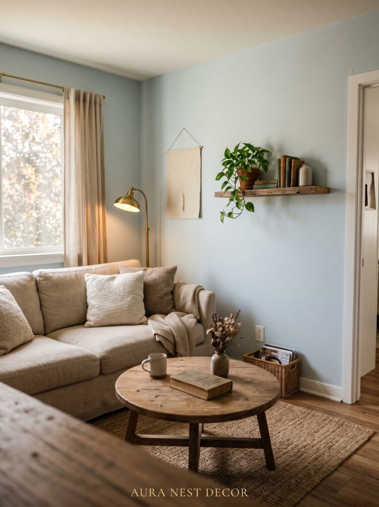
In smaller living rooms, dusty blue works beautifully on all four walls, especially if your trim stays crisp white. It sounds counterintuitive — shouldn’t you use lighter colors in small rooms? — but the enveloping effect of a soft muted blue creates coziness that actually makes a room feel intentional rather than cramped.
—
4. The Furniture Pairing That Makes Blue Farmhouse Rooms Look Expensive Without Costing It
This is where a lot of people get derailed. They find their perfect blue and then style around it with furniture that fights it rather than resting alongside it.
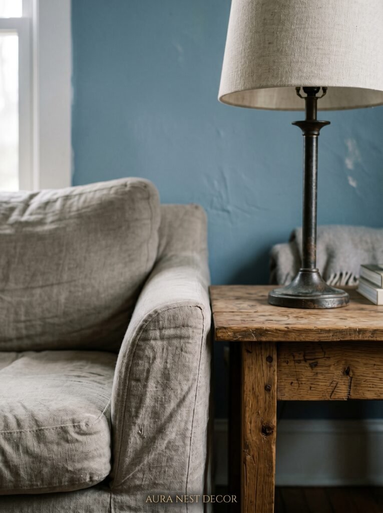
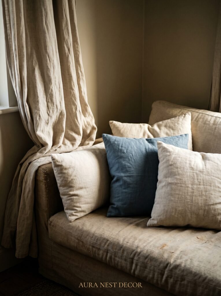
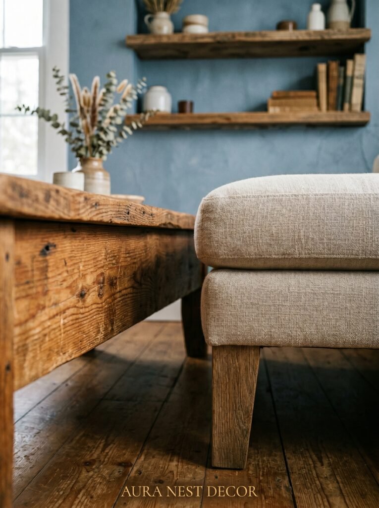
The colors that live happily next to farmhouse blue are the ones that feel organic. Raw linen in oat and sand tones. Warm wood — particularly lighter oak, reclaimed pine with its grey undertones, or walnut if you want something richer. Wrought iron and brushed brass. Leather in caramel or cognac. Off-white cotton. Cream wool.
What you’re building is a palette that feels like it came from the land, with blue as the sky element. It sounds a bit romantic but it actually works as a practical guide when you’re standing in a furniture showroom trying to decide between a sofa.
A slipcovered sofa in natural linen against a navy wall is one of the most quietly beautiful combinations in modern farmhouse design. The looseness of the slipcover softens the depth of the wall. It creates that lived-in, intentional tension that makes a room feel like a real home and not a showroom.
“The furniture doesn’t need to match the blue. It just needs to not argue with it.”
—
5. How Shiplap and Blue Work Together Without Looking Like a Fixer Upper Rip-Off
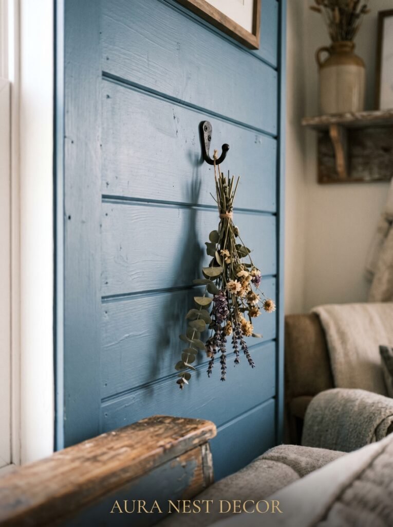
Let’s name the elephant in the room. Shiplap. White shiplap specifically. After years of renovation TV, it’s become almost a cliché, and yet — it still works. Especially with blue.
The reason shiplap and blue are such a reliable pairing is contrast and texture. The horizontal lines of shiplap give the eye something to move along, which makes even a simple room feel dynamic. When that texture sits behind or beside a blue element — a blue armchair, blue painted built-ins, a blue linen curtain — the combination reads as layered rather than flat.
The trick to keeping it from looking dated is restraint. Not every wall. Not every surface. One shiplap wall or a shiplap fireplace surround is plenty. Let the blue do more of the visual work. Let the shiplap be the supporting character.
In UK homes where shiplap isn’t traditional, a similar effect can be achieved with beadboard wainscoting painted in a dusty white, paired with a blue painted upper half. The principle is the same: horizontal rhythm, textural interest, a quiet backdrop for blue to shine against.
—
6. The Lighting That Makes Blue Look Warm Instead of Cold
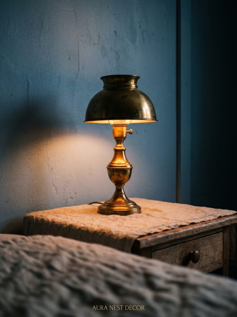
This is arguably the most misunderstood part of working with blue in a home. People choose a gorgeous dusty blue, paint their room, and then stand under cool white overhead light wondering why it looks vaguely clinical. The blue didn’t fail you. The lighting did.
Blue is profoundly reactive to light temperature. Under cool white or daylight bulbs, almost any blue will read as colder, crisper, a little harder. Under warm white bulbs — the amber glow of an Edison bulb at 7pm, or the honey-tone of a proper incandescent-equivalent — blue warms up completely. It gains depth. It starts to feel like shelter rather than hospital.
For a modern farmhouse living room, aim for bulbs in the 2700K range at maximum. Layer your lighting: an overhead fixture (ideally on a dimmer), a couple of table lamps at eye level, and a floor lamp if the space allows. That layered, low-to-the-ground approach to lighting is what makes rooms feel intimate and alive after dark. It’s also what makes your blue walls look like something from an architectural magazine rather than a waiting room.
—
7. Curtains, Cushions, and the Art of Not Overdoing the Blue
Once you’ve committed to blue in your living room — on the walls, in a piece of furniture, on the built-ins — the instinct is to carry it through every textile. Resist this with everything you have.
The room needs contrast to breathe. If your walls are slate blue, your cushions shouldn’t be navy. If your sofa is in a denim-washed linen, your curtains don’t need to be blue too. The whole space will collapse inward into a monotone that feels heavy rather than cozy.
Instead, use textiles to introduce your second and third palette notes. Rust and terracotta look extraordinary against blue — they’re complementary colors, warm against cool, and they give farmhouse spaces a kind of European country warmth that feels very current. Cream and ivory soften. Forest green adds depth. Even a muted burnt orange throw over a blue-painted bench can be the detail that makes the whole room.
Curtains in particular should almost always be lighter than your walls in a blue farmhouse room. Linen curtains in natural, unbleached tones are perfect. They let the light in softly, they move beautifully, and they don’t compete with your blue for attention.
“Blue is the anchor. Everything else is the tide.”
—
8. The Farmhouse Objects That Actually Belong in a Modern Version of This Style
Modern farmhouse is not the same as traditional farmhouse. It’s worth saying this clearly because the decor objects you reach for make all the difference.
In a modern farmhouse living room with blue tones, you’re not looking for mason jars with twine and a chalkboard sign that says “gather.” That’s a different decade. What you’re looking for is the real thing — or objects that feel like they could be.
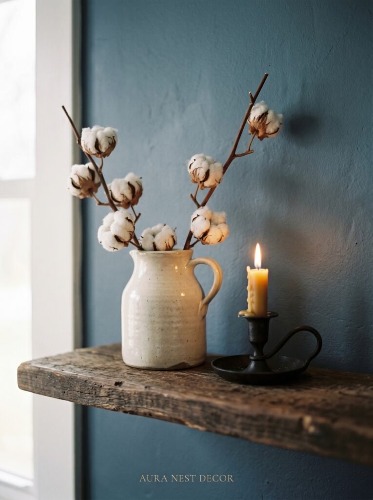
Think: a single oversized ceramic vase in a matte finish, in a blue or cream glaze. A weathered wooden tray on the coffee table holding a couple of candles and a small plant. A basket with texture — seagrass, rattan, or woven wool — tucked by the fireplace. An old-looking clock on the mantle. Books stacked horizontally on open shelves, with small ceramic objects between them.
The detail that separates modern farmhouse from its more earnest predecessor is editing. Every object earns its place. Nothing is there to be cute. The room has fewer things, and each thing is better.
—
9. Fireplaces and Blue: The Combination You Haven’t Tried Yet
If your living room has a fireplace — and many UK sitting rooms and older American homes do — this is your biggest opportunity with blue, and most people walk right past it.
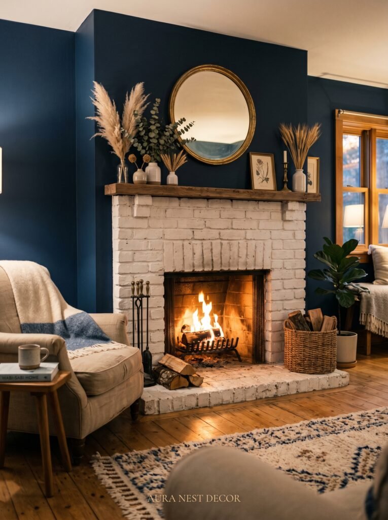
Painting your fireplace surround or mantle in a deep, dramatic blue while keeping the walls neutral is a showstopping move. It turns the fireplace — which is already the natural focal point of the room — into something that feels designed rather than just present. It looks intentional. It looks like someone who knows what they’re doing made a decision.
Hague Blue on a fireplace surround with white walls and a raw oak mantle shelf is one of the most beautiful combinations in modern farmhouse interiors. In UK homes with original Victorian or Edwardian fireplaces, this treatment honors the architecture while modernizing the whole room. In American ranch-style homes, a painted brick fireplace in a dusty slate blue reads as genuinely sophisticated.
The surrounding objects matter here too: a simple vase, a couple of pillar candles, maybe a small piece of pottery. Let the blue do the talking. The mantle styling should be spare.
—
10. Small Living Rooms: The One Rule That Makes Every Choice Easier
When you’re working with a small living room and you want to bring in blue, the rule is this: commit fully or use blue as an accent only. The in-between — a sort of cautious, hedge-your-bets approach — is what creates the muddled, unfinished feeling that plagues small rooms.
If you’re committing: wrap the room in a single muted dusty blue. Keep trim white. Keep furniture light in tone and lean in silhouette. The result is cocooning in the best way — a room that feels complete, intentional, and much larger than its dimensions suggest.
If you’re using blue as an accent: make it count. One significant blue element — a statement armchair, a painted sideboard, a piece of artwork — against otherwise neutral walls and furniture. The blue becomes the thing the eye goes to first, which gives a small room a clear point of focus, which actually makes it feel more organized and spacious.
What doesn’t work in a small room: blue walls and a blue sofa and blue cushions. It removes the contrast that creates visual depth. Give the blue some space to be the thing it is.
—
11. What American and British Readers Approach Differently (and What They Can Learn From Each Other)
This is something not many decor writers talk about, but it’s real. American homeowners and British homeowners tend to approach color in living rooms from slightly different angles, and both have something the other is quietly missing.
American modern farmhouse interiors tend to be bigger, brighter, and more open-plan — which means blue has to work harder to create warmth across a large space. The instinct is often to go lighter, safer, more wall-paint-commercial. The rooms look clean but sometimes feel a little cold.
British sitting rooms are often smaller, colder in natural light (let’s be honest about the weather), and come with original architectural features — cornicing, ceiling roses, sash windows — that give blue a much more elegant context to work within. British designers are generally more confident with a darker, richer blue. But they can sometimes be timid about mixing in the warmer, rougher textures — the worn leather, the rough linen, the raw wood — that give the modern farmhouse aesthetic its personality.
The middle ground — British confidence with deep color, American ease with layered texture — is where the most beautiful modern farmhouse living rooms actually live.
—
12. The Detail Nobody Mentions That Ties the Whole Room Together
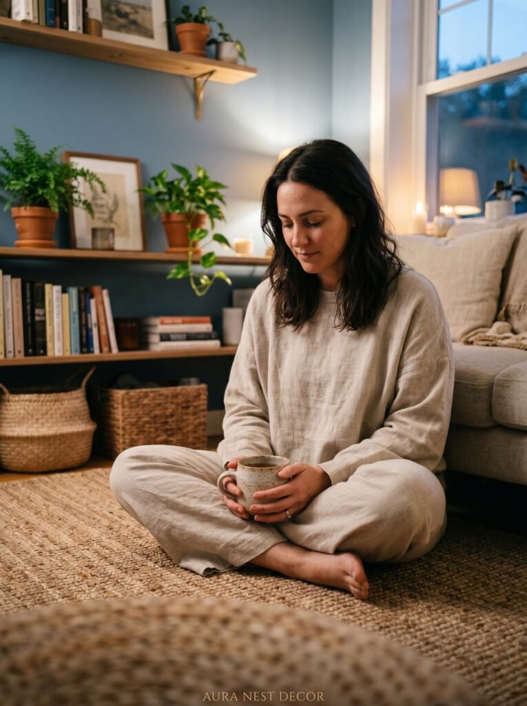
Here it is, the thing that rarely makes it into decor articles because it sounds too small to matter. It’s books.
A modern farmhouse living room with blue tones needs books. Not as decoration — as evidence of a life. Stacked on the coffee table. Arranged on open shelves with the spines facing out. A single stack on the floor next to an armchair with a reading lamp above it. The presence of books grounds a room. It makes the blue feel lived with rather than installed.
The specific magic in a blue farmhouse room is that books — with their varied spines and worn edges — introduce a hundred little colors into the space without demanding attention. They give the room history. And in a modern farmhouse interior, where so much of the aesthetic is about finding the soul inside the simplicity, that history is everything.
Put a glass of water on the side table. Let there be a throw slightly rumpled over the arm of the sofa. Make the room look like someone was just sitting in it.
That’s the point.
—
❓ FAQ
Q: What is the best shade of blue for a modern farmhouse living room? A: For most spaces, a muted, slightly grey-toned blue works best — think dusty slate, soft denim, or a deep blue-grey like Farrow & Ball’s Hague Blue or Benjamin Moore’s Van Deusen Blue. These shades read as warm rather than cold and work across both bright and low-light rooms.
Q: Can I use blue in a small farmhouse living room without it feeling dark? A: Absolutely. The trick is keeping your trim bright white, choosing a dusty or pale blue rather than a deep navy, and layering your lighting with warm-toned bulbs. A muted blue wrapping all four walls of a small room often creates coziness rather than claustrophobia.
Q: Does blue work with the warm tones typically found in farmhouse decor like wood and leather? A: It’s one of the best pairings in the style. Cool blue against warm wood, caramel leather, and cream linen creates that contrast and balance that makes a farmhouse living room feel complete. The key is making sure your blue has some grey or depth to it so it reads as grounded rather than bright.
—
💭 Final Thoughts
The most beautiful farmhouse living rooms I’ve ever come across — in a renovation outside of Nashville, in a converted stone cottage in the Cotswolds, in a Brooklyn brownstone with the original wide-plank floors — all had one thing in common. They felt like the color had always been there. Not chosen. Decided.
That’s what blue can do in a modern farmhouse living room when you trust it. It doesn’t announce itself. It settles in. It makes everything around it look better without asking for credit.
What’s the one blue you’ve been afraid to commit to?


