
The Living Room Colour Combinations That Will Make You Fall in Love With Your Home All Over Again
There’s a moment — maybe you’ve felt it — where you walk into someone’s living room and something just stops you. Not a particular piece of furniture, not an expensive light fixture. It’s the colour. It wraps around you like a warm embrace, and suddenly you understand why people spend weeks, sometimes months, choosing the perfect palette. The right living room colour combination doesn’t just decorate a room — it transforms how you feel inside it.
—
1. Why Colour Is the Most Powerful Design Decision You’ll Ever Make in Your Living Room
Before you move a single piece of furniture or hang a single frame, understand this: colour is the invisible architect of every room. It shapes the mood before you even sit down. It determines whether your living room feels expansive or cosy, energising or restful, sophisticated or playful. Colour psychology isn’t a design school concept locked behind a textbook — it’s the reason you feel inexplicably at ease in certain spaces and vaguely unsettled in others.
Warm tones like terracotta, amber, and deep ochre stimulate conversation and create a sense of togetherness. Cool tones like sage green, slate blue, and soft grey slow the nervous system down and encourage calm. Neutral palettes — think warm white, linen, and sand — offer a blank emotional canvas that allows you and your furniture to take centre stage. Understanding this is the first step to choosing a colour combination that doesn’t just look good in a photo, but genuinely serves your life.
“The right colour doesn’t just paint the walls — it paints the mood of every moment you spend inside that room.”
2. The Timeless Elegance of Warm Neutrals: Linen, Camel, and Soft Ivory
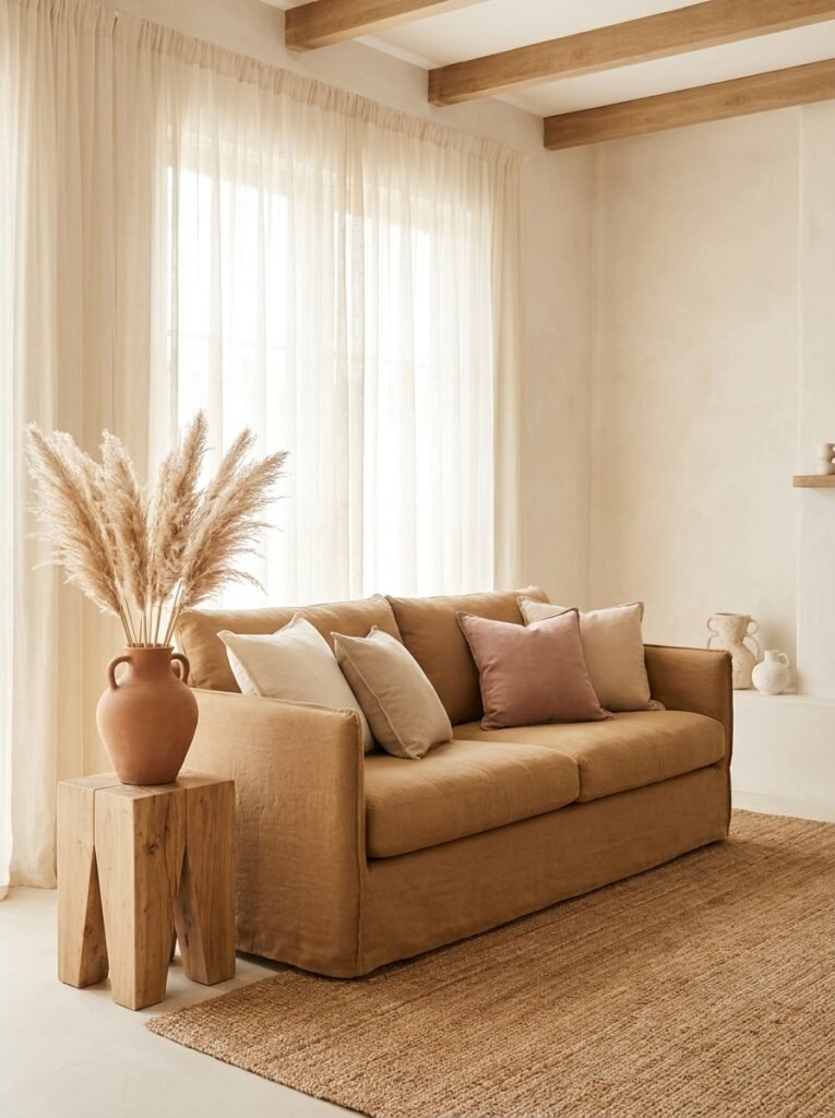
If there’s one palette that never truly goes out of style — one that photographs beautifully, ages gracefully, and welcomes every season — it’s the warm neutral family. Picture soft ivory walls paired with a camel-toned sofa, layered with linen cushions in dusty blush and warm taupe. Add a jute rug underfoot and a few sprigs of dried pampas grass in a terracotta vase. Suddenly, your living room feels like a page torn from the most comforting magazine you’ve ever read.
The reason warm neutrals work so universally is their emotional versatility. They’re simultaneously elegant and approachable. They make small rooms feel larger without the coldness that comes with stark white. They make large rooms feel curated rather than cavernous. And critically — they act as a perfect backdrop for whatever accent colour you want to introduce seasonally. Swap out cushion covers and throws as the year turns, and the room transforms with almost no effort.
3. Navy Blue and Warm White: The Combination That Feels Like a Deep Breath
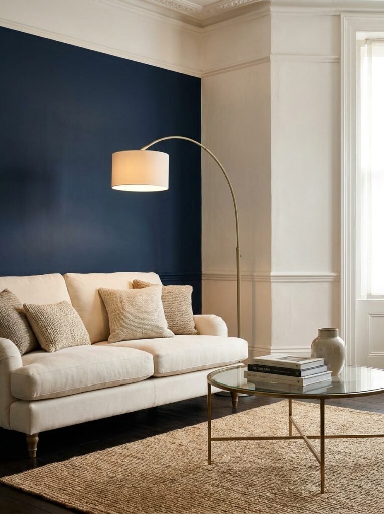
If you’ve ever scrolled past a navy and white living room on Pinterest and found yourself lingering a little longer than expected, you already understand the power of this pairing. Navy blue is one of those rare colours that manages to feel simultaneously bold and restful. It has depth. It has presence. And when paired with warm white or cream rather than a stark, clinical white, it becomes something truly beautiful.
Think navy walls — perhaps just one feature wall to avoid the room feeling heavy — paired with warm white plasterwork, cream upholstery, and accents in natural wood and woven textures. Add in touches of muted gold in a floor lamp or coffee table legs, and you’ve created a living room that feels both classic and current. Navy doesn’t shout. It anchors. And in a world that often feels chaotic, a room that anchors you is worth its weight in gold.
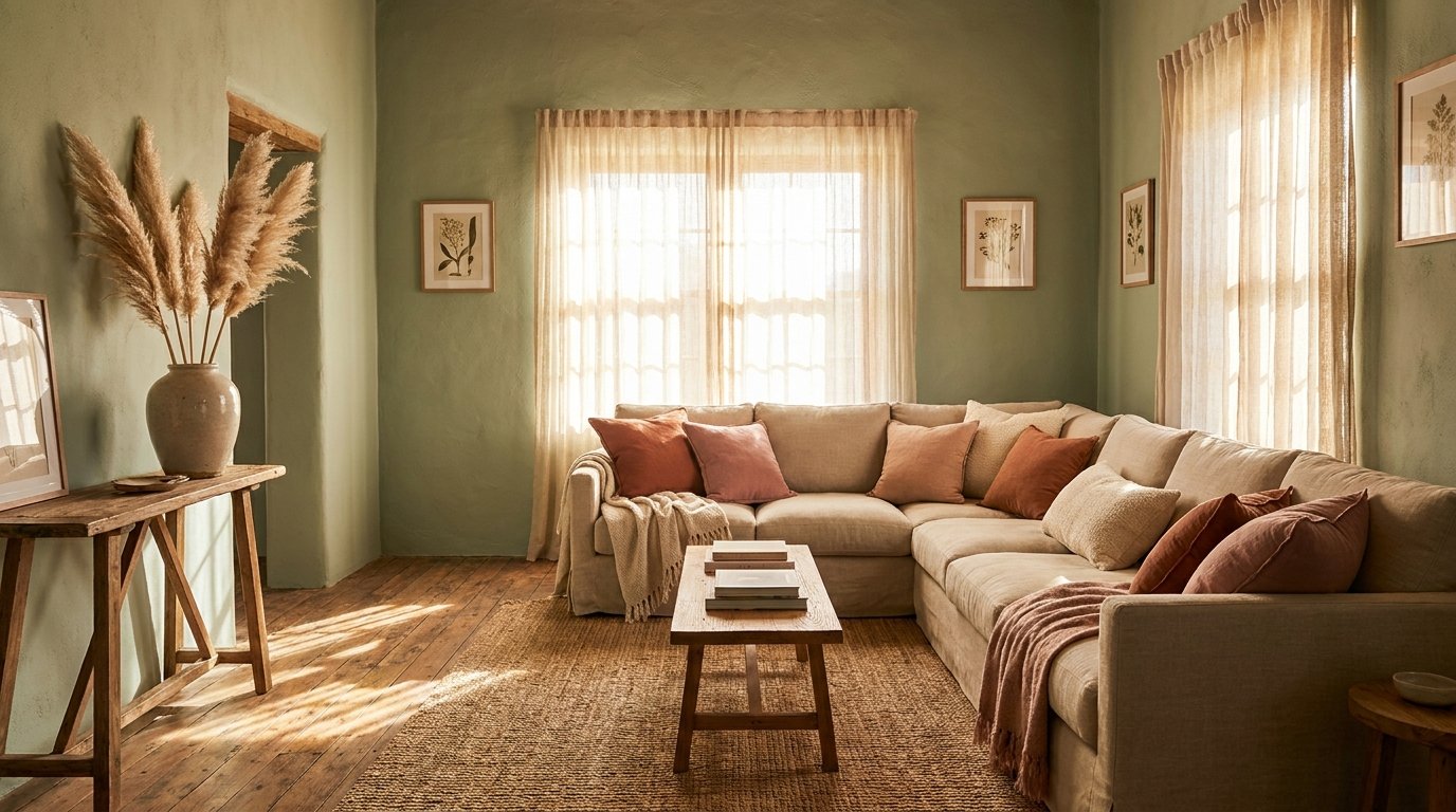
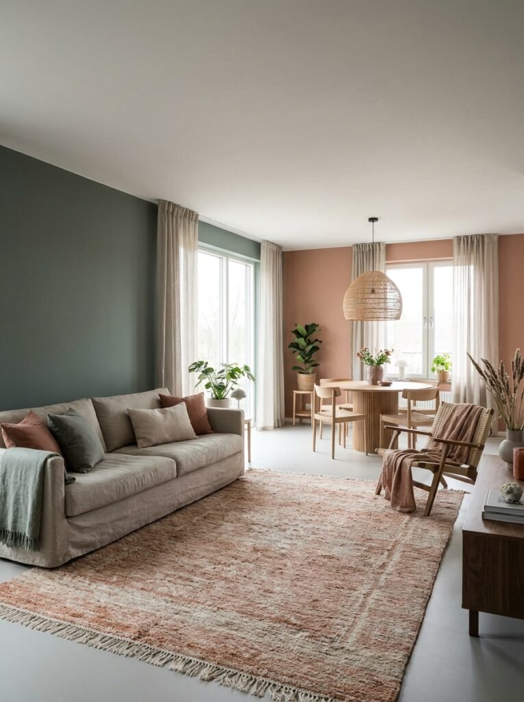
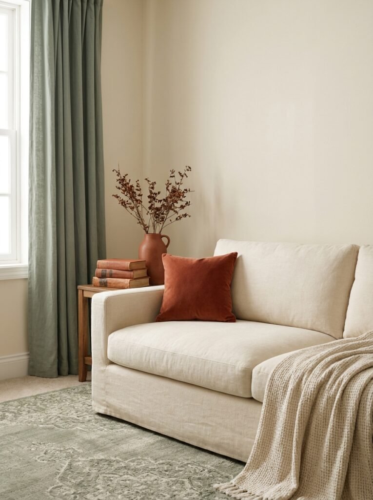
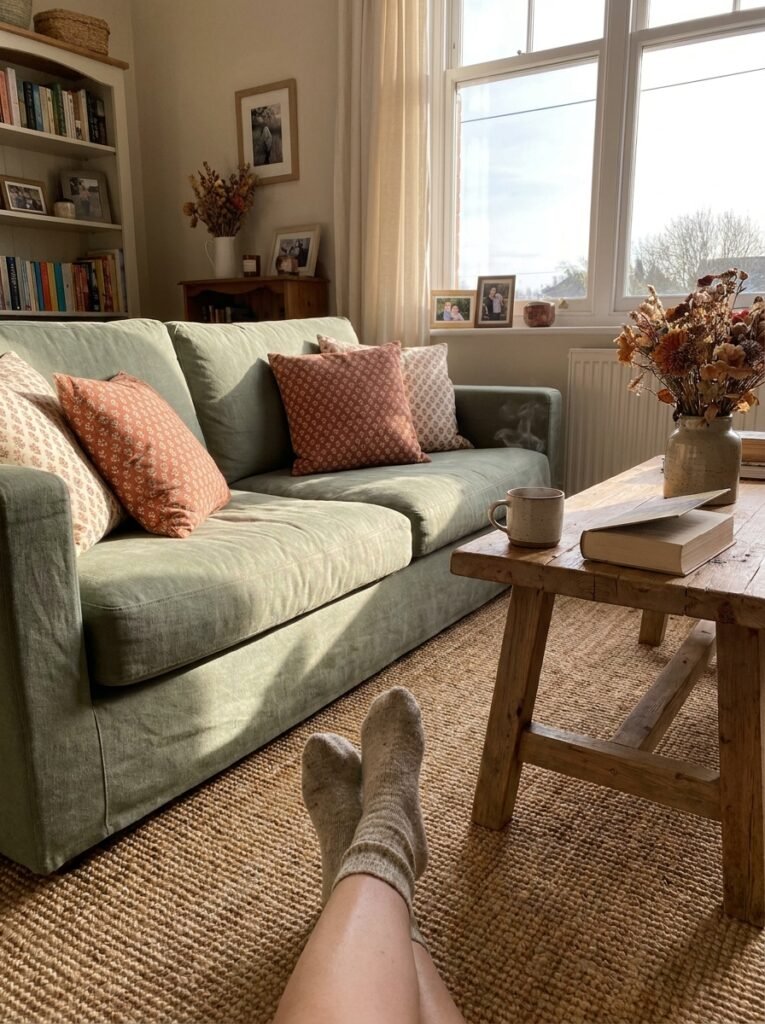
4. Sage Green and Terracotta: The Earthy Palette That Feels Like Coming Home
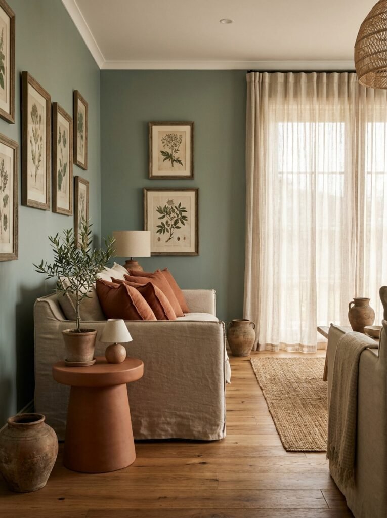
There’s something almost ancestral about the combination of sage green and terracotta. These are the colours of the earth itself — of sun-baked clay and overgrown herb gardens, of old Mediterranean farmhouses and morning light filtering through botanical prints. Together, they create a living room that doesn’t just look beautiful; it feels alive.
Sage green works best in a muted, dusty tone rather than anything bright or limey. Think of the colour you’d find on the underside of a eucalyptus leaf, or the patina on an old garden wall. Pair this with terracotta in cushions, a ceramic side table, or even an accent wall in a deeper burnt sienna. Ground the palette with warm timber floors or a linen sofa in oat, and you have a combination that is simultaneously on-trend and deeply timeless. This is the palette that turns a house into a home.
5. How to Use White Without Making Your Living Room Feel Like a Hospital
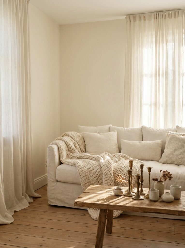
White living rooms are having a moment — and for good reason. A well-executed white palette is airy, light-filled, and endlessly sophisticated. But there’s a world of difference between a white room that feels like a serene sanctuary and one that feels sterile and cold. The secret lies in understanding that white is not one colour — it’s hundreds.
Cool whites have blue or grey undertones and work beautifully in rooms with plenty of natural light and a more contemporary aesthetic. Warm whites have yellow or pink undertones and create an immediately cosier atmosphere, especially in rooms with limited natural light. The real trick, though, is layering. A white room stays interesting and warm through texture — chunky knit throws, linen curtains that pool slightly on the floor, a raw-edge wooden coffee table, aged brass accents. Texture catches light differently throughout the day, meaning your white room is never truly static.
“White is not the absence of colour — it’s the presence of possibility. The trick is filling that possibility with texture, warmth, and intention.”
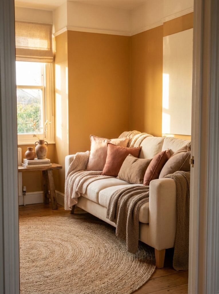
6. Dusty Pink and Grey: The Palette That Refuses to Apologise for Being Soft
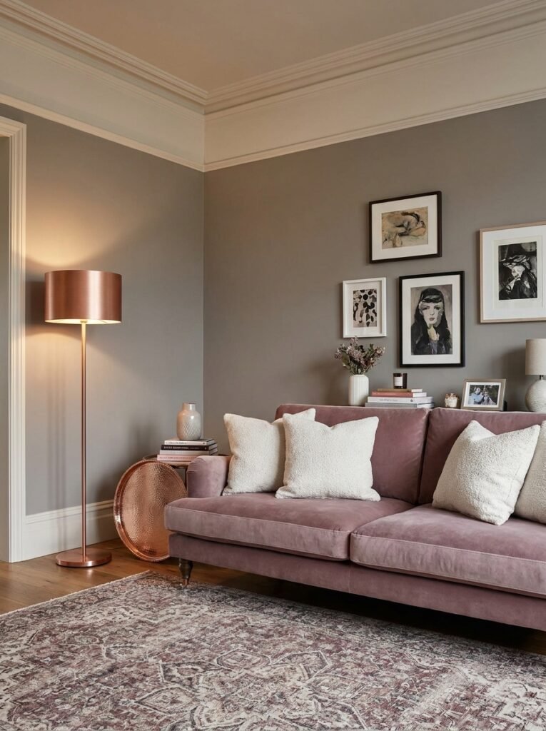
Dusty pink has had to fight its corner in interior design. Too often dismissed as exclusively feminine or frivolous, it is in fact one of the most psychologically sophisticated colours you can bring into a living room. Dusty pink — not bubblegum, not millennial pink, but the muted, complex, almost mauve version of pink — communicates warmth, creativity, and calm all at once.
Paired with mid-tone grey — specifically a grey that leans warm rather than cool — this combination becomes something genuinely compelling. The grey provides structure and grounding, while the dusty pink prevents the palette from feeling cold or detached. Add in accents of brushed copper or rose gold, soft off-white for the ceiling and trim, and a vintage-style rug with threads of burgundy and cream, and you have a living room that manages to feel both contemporary and deeply personal.
7. Bold Jewel Tones: When Your Living Room Dares to Be Different
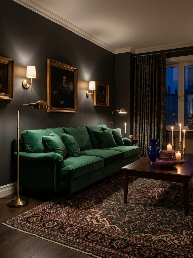
Not everyone wants a living room that whispers. Some rooms are meant to speak, to declare something about the person who inhabits them. If that resonates with you, then jewel tones are your love language. Deep emerald green, rich sapphire blue, luxurious plum, and smouldering burnt orange — these are colours that stop conversations and start new ones.
The key to making jewel tones work in a living room without overwhelming the space is selectivity. Choose one dominant jewel tone — an emerald green velvet sofa, for instance — and build around it with quieter companions. Warm charcoal on the walls, a Persian rug with threads of the same green alongside deep burgundy and ivory, and brushed gold or antique brass accents will bring the whole scheme together without tipping into excess. Be brave, but be considered.
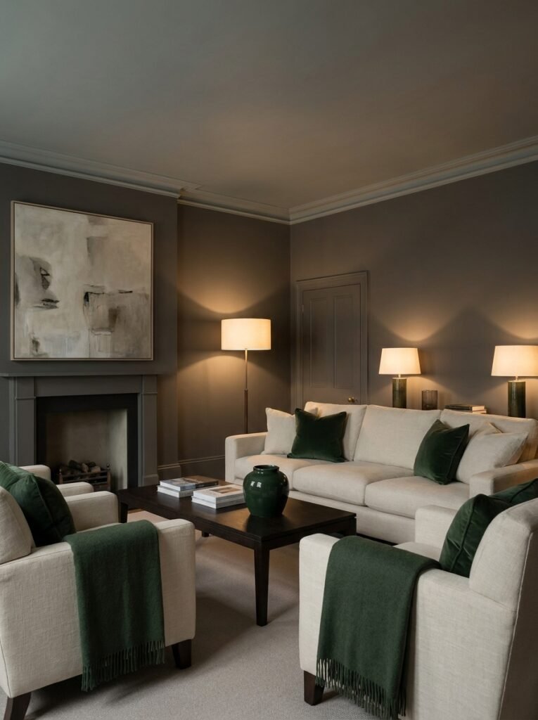
8. The Unexpected Power of Warm Charcoal as a Base Colour
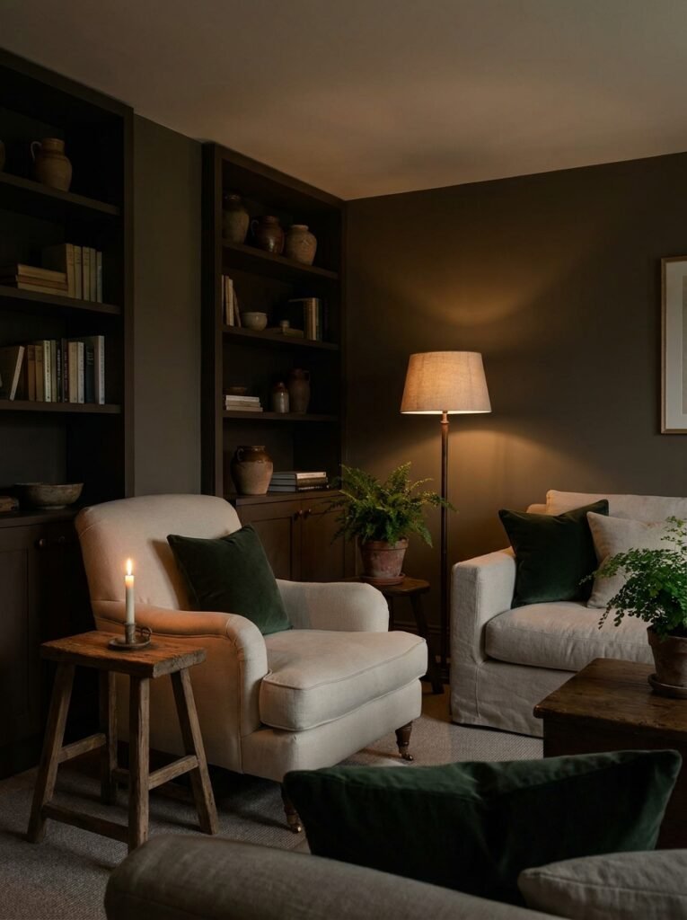
Charcoal is not grey. This is a distinction worth making. While grey can sometimes feel cool and aloof, warm charcoal — a deep, slightly brownish, slightly greenish dark neutral — is something else entirely. It’s enveloping. It’s sophisticated. And when used thoughtfully in a living room, it creates an intimacy that lighter palettes simply cannot achieve.
Charcoal walls paired with warm cream upholstery, rich timber accents, and touches of forest green create a living room that feels like the best kind of evening — candlelit, unhurried, full of good conversation. This palette works exceptionally well in rooms used primarily in the evening, or in living rooms that lean into a more moody, atmospheric aesthetic. It’s not for everyone, but for those it speaks to, it speaks very clearly.
9. Colour Zoning: How to Use Combinations to Define Space in Open-Plan Living
Open-plan living rooms present a unique challenge. Without walls to naturally divide kitchen from dining area from lounge, you need other tools to create a sense of distinct, purposeful zones. Colour is one of the most powerful of these tools — and using it strategically can make an open-plan space feel both expansive and intentional.
Consider using a slightly deeper or more saturated version of your main colour on the wall behind your sofa, creating a visual anchor for the seating zone. A different tone — perhaps a complementary colour from the same palette — can then be introduced through the rug, effectively drawing a visual boundary around the lounge area. In the dining zone, pendant lighting and a statement wall in a tone that references but doesn’t duplicate the lounge palette will create cohesion without uniformity.
“In an open-plan home, colour doesn’t just decorate — it organises. It tells you, without a single word, where each part of life is meant to happen.”
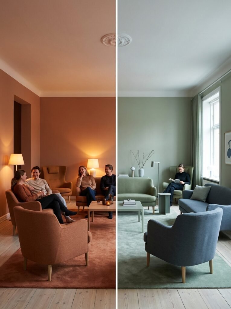
10. How Natural Light Should Influence Every Colour Decision You Make
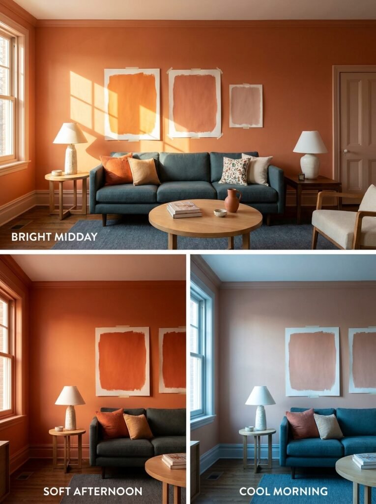
This cannot be overstated: the same paint colour will look entirely different depending on which direction your living room faces, and what time of day you’re in the room. A south-facing room floods with warm, golden light throughout the day and can handle cooler tones beautifully — the light will warm them naturally. A north-facing room receives cooler, more diffused light and needs warmer tones to prevent the room from feeling cold and flat.
Before committing to any colour combination, buy sample pots and paint large swatches — at least A3 size — on different walls. Observe them at different times: 8am, noon, 4pm, and under artificial evening light. The colour that sang in the paint shop under fluorescent lighting may look entirely different in your home. This step cannot be skipped, no matter how certain you feel in the moment.
11. Accent Colours: The Small Details That Make the Whole Palette Sing
Think of your base colour combination as the melody and your accent colours as the harmony. Get the harmony right, and the whole room resonates. Get it wrong, and even a beautiful base palette feels somehow incomplete. Accent colours are introduced through cushions, artwork, vases, books, candles, plants, and small decorative objects — the things that are relatively easy and inexpensive to change.
The rule of thirds is a useful starting point: 60% dominant colour (walls, large upholstery), 30% secondary colour (rugs, curtains, secondary furniture), and 10% accent colour (decorative objects, cushions, art). But rules are starting points, not sentences. The most beautiful rooms often break the 60-30-10 rule with confidence — because the person who decorated them trusted their own instincts more than any formula.
12. The Mistakes Even Clever People Make With Living Room Colour (And How to Avoid Them)
The most common mistake is choosing a colour in isolation. Colour exists in relationship — with the light, with the furniture, with the adjoining rooms, with the ceiling height. Always consider the full context before committing. The second most common mistake is playing it so safe that the room has no personality at all. A beige room with beige furniture and beige accessories isn’t timeless — it’s just unresolved. True timelessness comes from confident simplicity, not from avoiding all decisions.
A third mistake worth naming is ignoring the ceiling. The ceiling is the fifth wall, and its colour dramatically affects how a room feels. A ceiling painted in the same tone as the walls — just two shades lighter — creates a sense of enveloping warmth and makes the room feel taller. A stark white ceiling on dark walls can feel disconnected. Consider the ceiling as part of your colour combination, not an afterthought.
—
🌿 How to Take Care of Your Living Room Colour Combination
Choosing colours is just the beginning — maintaining the harmony over time is what keeps a room feeling intentional and alive.
First, revisit your palette seasonally. You don’t need to repaint — simply rotate cushion covers, throws, and small decorative objects to reflect the season. Deep amber and forest green for autumn, soft blues and crisp whites for summer. Your base palette stays constant while the accent layer breathes and evolves.
Second, protect your painted walls. High-traffic living rooms benefit enormously from using an eggshell or satin finish rather than flat matte — especially on lower wall sections. These finishes are far easier to clean and maintain their colour integrity over time.
Third, be thoughtful about fading. Rooms with strong direct sunlight will cause fabrics and even paint to shift colour over years. Invest in UV-filtering window treatments if this applies to your space, and choose fade-resistant fabrics for large upholstered pieces.
Fourth, every few years, step back and assess the whole room with fresh eyes. Colours that once felt perfect can start to feel dated or simply no longer reflect who you are. This isn’t failure — it’s growth. Don’t be afraid to evolve.
—
❓ FAQ
Q: What is the most timeless living room colour combination? A: Warm neutrals — specifically combinations of ivory, warm white, camel, and linen — are consistently the most enduring palettes in living room design. They photograph beautifully, age gracefully, and act as a perfect backdrop for seasonal accent changes. They’ve been popular for decades and show no signs of fading.
Q: How do I choose a colour combination for a small living room? A: In smaller living rooms, light and cohesion are your best friends. Opt for a palette where the walls, trim, and ceiling are all in related light tones — this removes visual interruptions that make a room feel smaller. Use one or two accent colours introduced through accessories rather than large furniture pieces, and lean toward warm whites, soft sage, or pale dusty blue as your dominant tone.
Q: Can I mix warm and cool tones in one living room colour scheme? A: Absolutely — in fact, the most sophisticated palettes almost always include both. The key is finding a bridge between them. A warm sage green (which contains both the warmth of yellow and the coolness of green) pairs beautifully with both warm cream and cool grey. A dusty blush sits comfortably alongside both warm timber and cool marble. Look for complex, muted tones that carry hints of both warm and cool, and they’ll naturally mediate between the two.
—
💭 Final Thought
Choosing a living room colour combination is one of the most deeply personal decisions you’ll make in your home. It’s not about following trends or passing a design test — it’s about creating a space that holds your real life well. The Sunday mornings, the difficult conversations, the ordinary Tuesday evenings that somehow become the moments you remember. The right colours make all of that feel a little more beautiful, a little more intentional, a little more like yours. So as you look around your living room today, ask yourself this: does the colour you’re living with make you feel the way you want to feel — or is it simply the colour that was already there when you moved in?