
The Small Living Room Rules That Interior Designers Actually Break
You walk into a tiny living room and immediately want to shrink the furniture, keep everything light, and hang the TV on the wall to save space. Every instinct points the same direction. And almost every instinct is wrong.
—
1. The Sofa Size Myth That’s Making Your Small Room Look Smaller
This is the one that trips everyone up. You have a small room, so you buy a small sofa. Logical, right? Except when you walk in, the room feels cramped, cluttered, and oddly apologetic — like it’s embarrassed about its own size.
Here’s what’s actually happening. A small sofa in a small room creates visual clutter. Your eye has nowhere to rest. It bounces between the little couch, the little coffee table, the little side chairs, and it reads the whole thing as chaos rather than coziness.
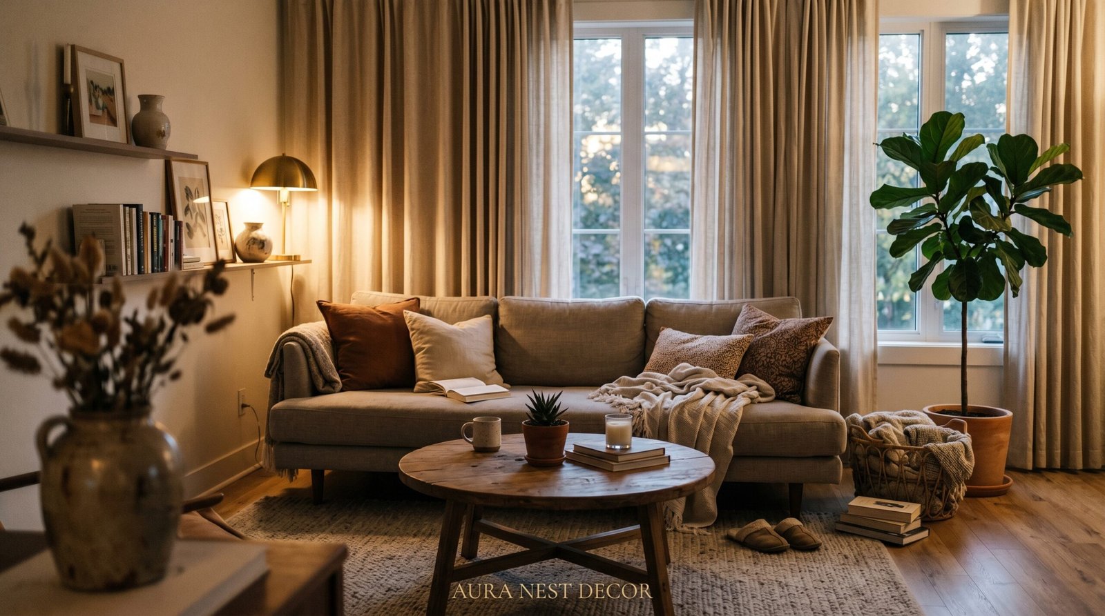
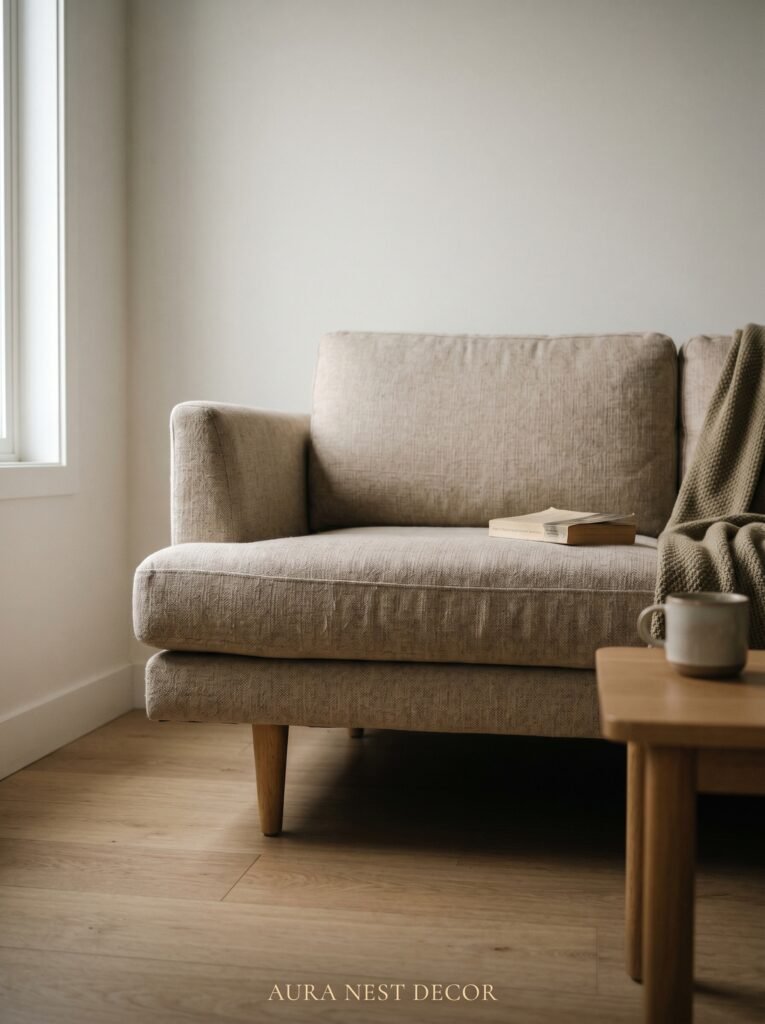
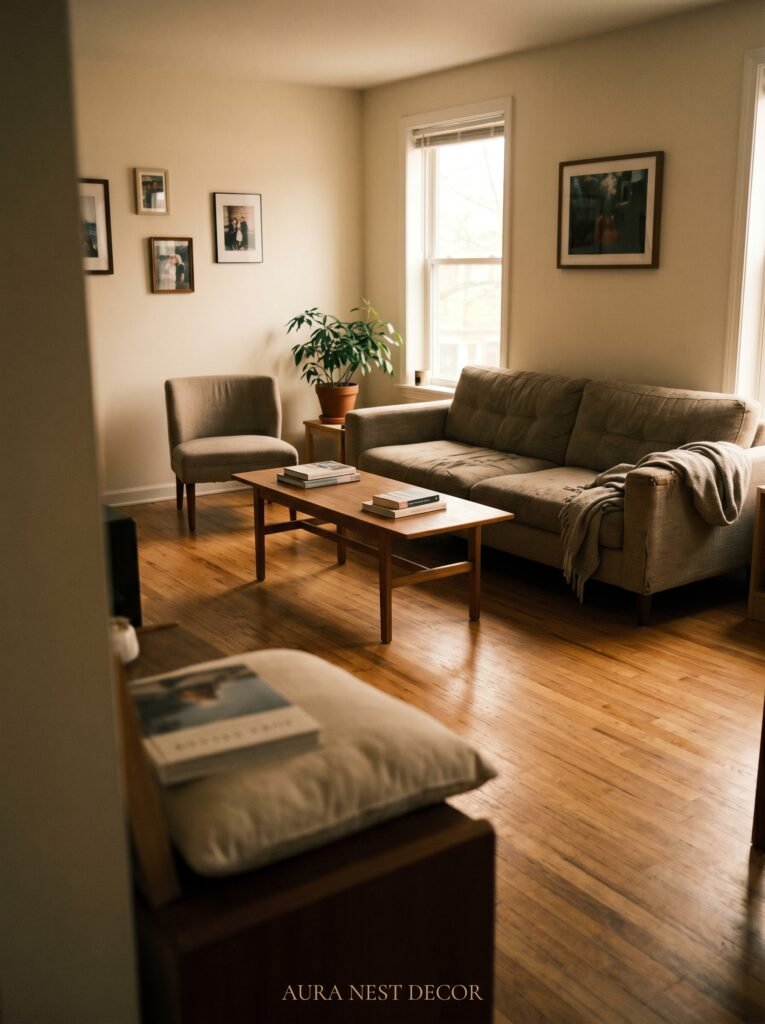
What works instead is one large, anchoring piece. A deep, generous sofa — the kind you actually want to collapse into on a Sunday morning — gives the room a reason to exist. It becomes the statement. Everything else orbits it. The room suddenly has hierarchy, and hierarchy reads as intentional design rather than afterthought.
In the UK, where Victorian terraces and converted flats mean living rooms are often genuinely tiny, this is the trick that interior stylists keep coming back to. One big, beautiful sofa in a rich fabric — a dusty olive velvet, a warm oatmeal boucle — and suddenly the room has a personality that a collection of small, safe furniture never could.
Go bigger than you think you should. Leave more floor space around it than feels comfortable. Watch the room breathe.
“One great piece of furniture does more for a small room than ten perfectly practical ones.”
2. The Color That Keeps Showing Up in Every Beautiful Compact Living Room Right Now
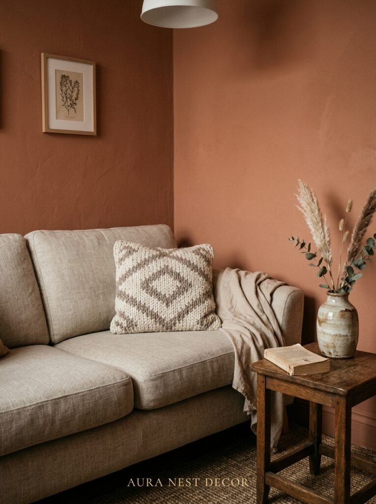
It’s not white. It’s not the greige that dominated the last decade. What keeps appearing on the most-saved living room pins, in the most beautiful compact spaces from Brooklyn to Bristol, is dark color on the walls.
Deep navy. Soft charcoal. Warm forest green. The kind of shade that makes your gut say too much before your eye adjusts and says oh. Oh, that’s beautiful.
Dark walls in a small room don’t make it feel smaller. They make it feel intimate. There’s a difference, and it matters. A white room that’s small just looks like a white room that’s small. A room painted in deep teal with good lighting and warm textiles looks like a jewel box. Like someone made a choice. Like it was designed rather than defaulted into.
The key is warmth. Cool darks — icy grey, stark charcoal — can feel clinical. But warm darks, the ones with underlying red or yellow or green undertones, make a small space feel deliberate and inviting. Farrow & Ball’s Hague Blue. Benjamin Moore’s Black Forest Green. Sherwin-Williams’ Cavern Clay if you’re leaning into earthy warmth rather than drama.
Paint the ceiling the same color or one shade lighter. The room will feel like a room rather than a box with a lid.
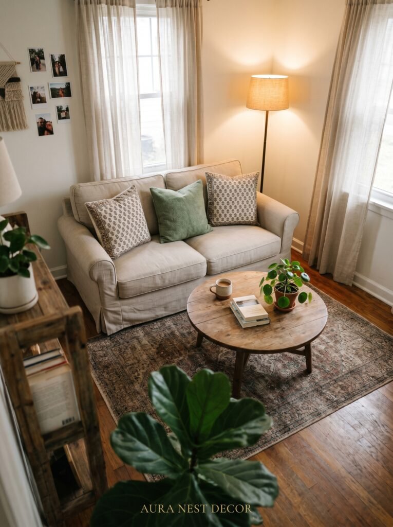
3. What Lighting Is Actually Doing to Your Space (and It’s Not What You Think)
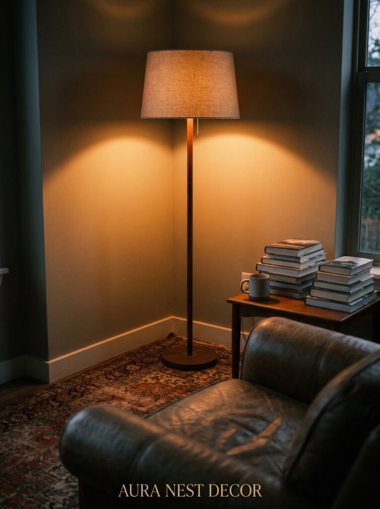
Most small living rooms are lit from one overhead fixture in the center of the ceiling. This is the single biggest design mistake in British and American homes. One central light does two devastating things: it flattens the room and it makes the corners disappear.
Corners are where rooms feel big.
When a corner is dark, your brain registers it as non-space. The room feels the size of what’s lit. Flood three or four corners with pools of warm light and suddenly the room feels like it has depth — like it extends beyond what you can immediately see.
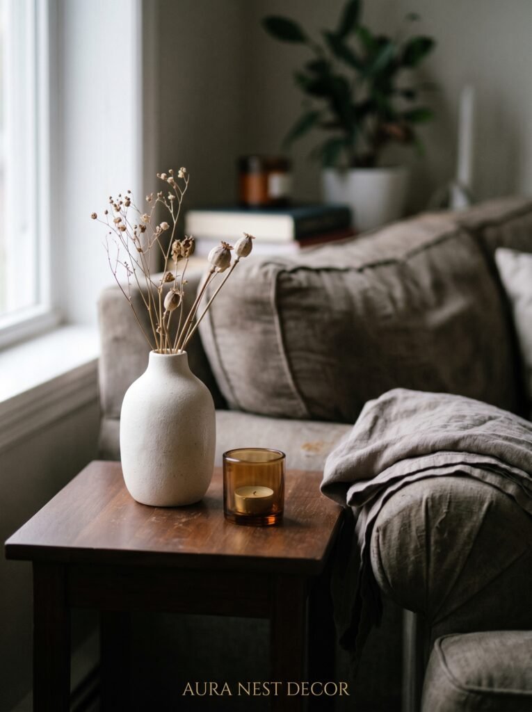
Three lamps at different heights will do more for a small living room than a renovation. A tall arc lamp behind the sofa. A small table lamp on a side table at eye level when you’re seated. A low lamp tucked near the floor on a bookshelf or a step. Layer them. Put them all on dimmers if you can, though even without dimmers, the effect of multiple light sources versus one overhead is extraordinary.
The amber glow of an Edison bulb at 7pm in a small, dark-walled living room with textured cushions and a woven throw is not just beautiful. It’s the reason people fall in love with a space the first time they see it.
4. The One Rule That Makes Any Tiny Room Feel Intentional
Edit more than you think you need to.
Not minimalism — that’s a different thing entirely. Minimalism can feel cold and performative. Editing is warmer. It’s about removing the things that don’t earn their place and keeping everything that does.
In a small living room, every single object is visible from almost every angle. There’s no sprawling space where a mediocre piece gets lost. Everything is seen. So everything needs to count.
The ceramic vase you sort of like but didn’t choose thoughtfully? It’s robbing you. The throw pillow that doesn’t quite go? Everyone can see it doesn’t quite go. The stack of random magazines on the coffee table that you’re keeping for no real reason? Clutter doesn’t just look messy — it physically makes rooms feel smaller because it fragments the eye’s movement across the space.
Here’s the edit test: look at each item in your living room and ask whether you’d keep it if you were styling the room for a photograph. Not because you’re going to photograph it, but because that question forces honesty. The things that fail that test are the things making your room feel crowded.
“A small room edited down to what you love becomes a curated room. A small room full of everything becomes a storage unit.”
5. Why Your Coffee Table Shape Is a Bigger Decision Than It Looks
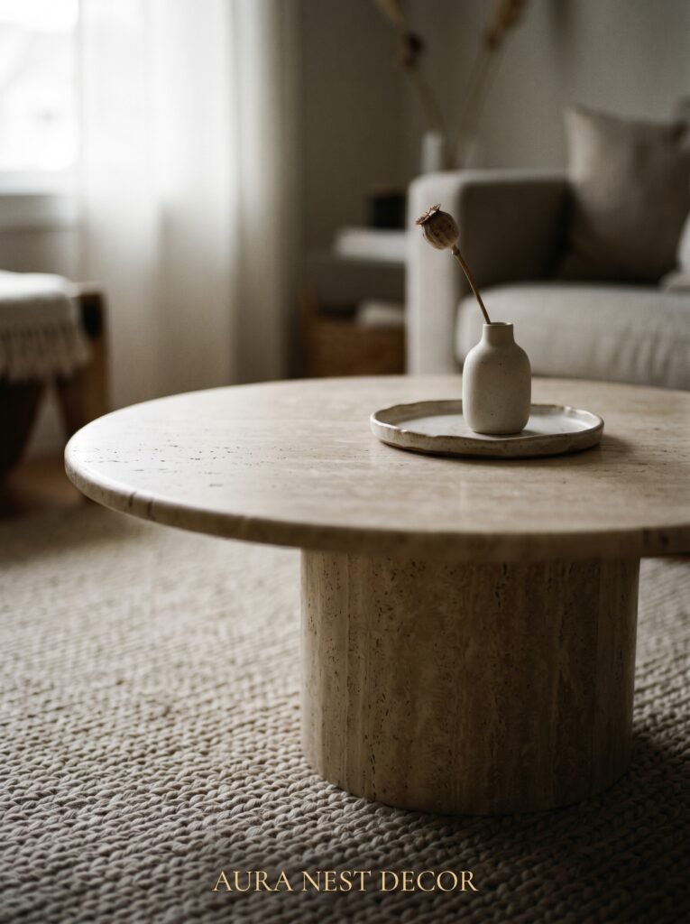
Rectangle is not always right. In a small living room, a rectangular coffee table often cuts the space into two halves that feel awkward to navigate. You’re either squeezing around it or sitting too far back from the sofa to comfortably reach it.
Round and oval coffee tables genuinely change the feel of a tight space. They soften the geometry. They make circulation easier — you can move around them naturally rather than skirting sharp corners. In a room where every inch matters, the way furniture lets you move through the space matters enormously.
There’s also a visual lightness argument. Glass tops, slim legs, open bases — these allow the floor to remain visible beneath the furniture, which makes the room feel less filled. A solid, chunky coffee table planted on the floor reads as mass. A round table with slender legs or a lucite top seems to float. Both can be beautiful, but in a room under 200 square feet, floating will almost always serve you better.
A tray on top of an open coffee table lets you style the surface intentionally — a candle, a small plant, a book you’re actually reading — without it becoming a dumping ground.
6. The Mirror Placement That Actually Works Versus the One That Doesn’t
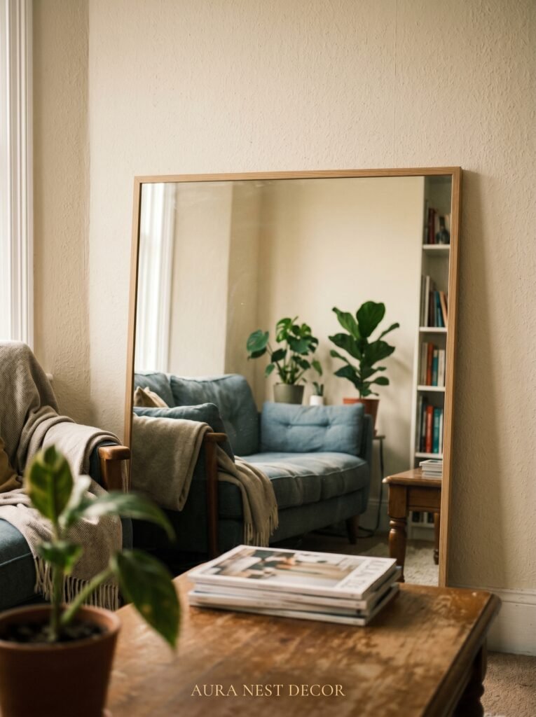
Every article about small rooms says use mirrors to reflect light and create depth. This is true. What those articles rarely say is that mirror placement is everything, and a badly placed mirror does absolutely nothing useful.
Hanging a mirror where it reflects a wall doesn’t help. Hanging a mirror where it reflects another mirror doesn’t help. Hanging a mirror too high so it only reflects the ceiling doesn’t help.
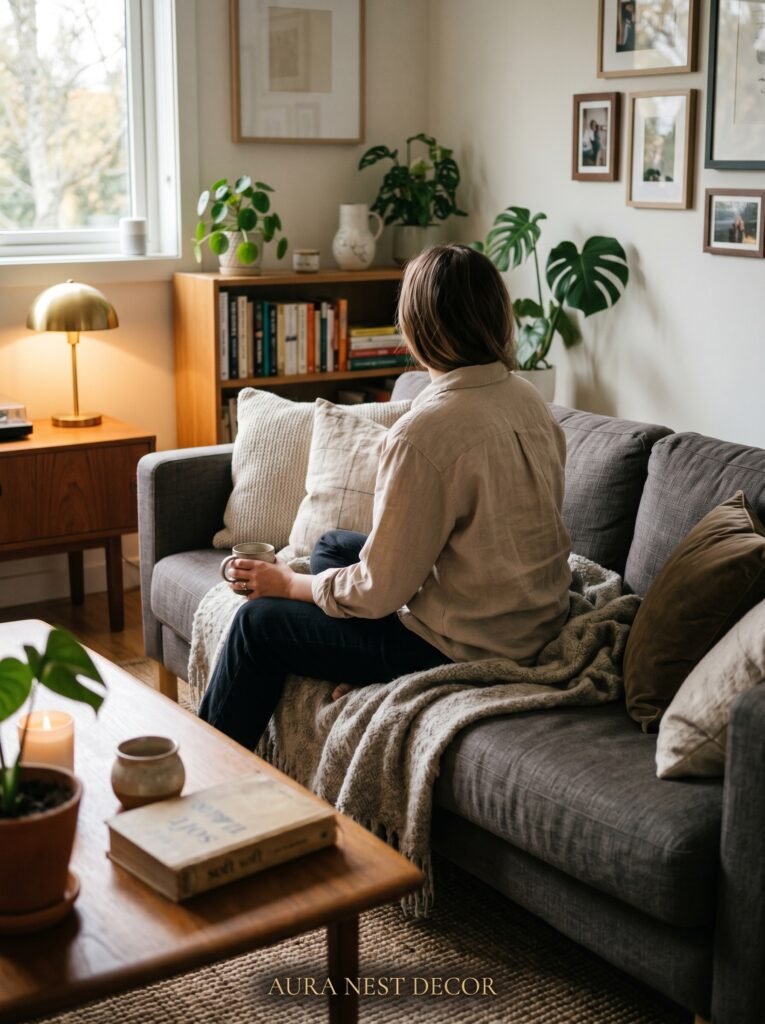
What works: a large mirror positioned opposite a window, at the right height to reflect the window itself. The glass catches the daylight, doubles it, and pushes it back across the room. You see light where you expect to see wall, and the room seems to extend.
What also works: a full-length leaning mirror in a corner. Leaned rather than hung, it softens the corner, reflects the room diagonally, and adds a casual, lived-in quality that a rigidly hung mirror can’t quite match.
In British terrace houses where natural light comes from one end of the room only, this single change — one large mirror opposite the main window — is often the most dramatic improvement you can make without touching a single piece of furniture.
7. Curtains Are Quietly Doing Architectural Work
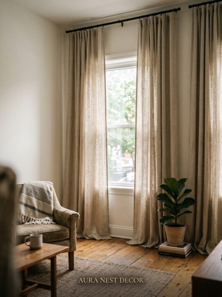
Hang them at the ceiling. Not at the top of the window frame. At the ceiling, or as close to it as possible.
This is one of those things that sounds minor and turns out to be staggering. Floor-to-ceiling curtains make the ceiling feel higher, which makes the room feel bigger, which makes everything else feel more spacious. The curtain rod mounted just above the window frame caps the visual height of the room at exactly the wrong point. The rod mounted near the ceiling pulls the eye upward and lies convincingly about how tall the room is.
Also: let the curtains extend past the window frame on each side. When they’re closed, they should just cover the wall beside the window, not the window glass. This way, when they’re open, the full window is visible and the curtains frame it without eating into it. The room feels more open because you’re actually seeing the full extent of the window.
Fabric matters too. Heavy fabrics pool on the floor and look rich and intentional. Sheer linens move beautifully in a breeze and filter light in a way that feels like living inside a photograph.
“The curtain rod is a height trick disguised as hardware. Where you mount it is a design decision, not an afterthought.”
8. The Gallery Wall Approach That Doesn’t Make Small Rooms Feel Chaotic
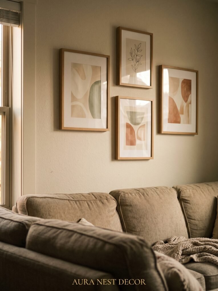
Gallery walls in small rooms are a risk. Done badly, they add to the visual noise. Done right, they’re the thing you can’t stop looking at.
The key is treating the wall as one object rather than a collection of many. This means choosing a consistent frame color — all black, all natural wood, all white — so the individual frames read as a unified piece rather than a mismatched collection. It means keeping mats consistent in width. It means deciding on a shape for the overall arrangement — a tight rectangle, a deliberate cluster — rather than letting pieces drift loosely across the wall.
Fewer, larger pieces almost always beat many small ones in a compact space. Three prints in large frames with plenty of breathing room between them feel considered. Fifteen small frames crammed together feel like a flea market stall.
One oversized single print — a bold botanical illustration, a moody architectural photograph, an abstract in your room’s palette — can anchor an entire wall in a small space and become the piece around which everything else is oriented.
9. What Rugs Are Really Doing to Your Floor Plan
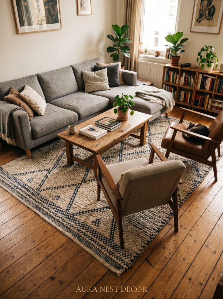
The rug needs to be bigger than you think. This is the furniture rule’s identical twin, and it gets ignored just as often.
A small rug in a small room makes the room look like a small room with a small rug in it. A large rug — one where all the key furniture legs sit on it — makes the room look like a room that happens to have a rug in it. One is decorative, one is architectural. The difference in feel is significant.
If budget is the concern (and a large, quality rug is a genuine investment), layer a smaller vintage or woven rug on top of a large jute or sisal base. You get the visual layering and the floor coverage without the cost of one expensive statement rug.
Avoid very busy, high-contrast patterns in a small space. The rug is the room’s visual floor. If it’s fighting for attention, it fragments the space. Subtle patterns — tone-on-tone, muted geometrics, soft abstracts — give texture without competition.
10. The Bookshelf Trick That Doubles as Architecture
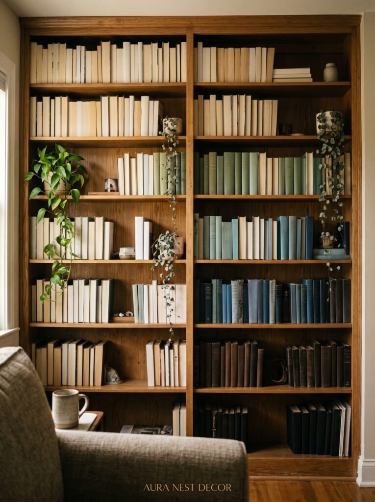
Floor-to-ceiling shelving in a small room is not too much. It’s often exactly right.
A wall of built-in or freestanding shelves does several things at once. It provides storage without occupying floor space in a way that blocks circulation. It draws the eye upward, creating the same ceiling-height illusion as the tall curtains. And when styled thoughtfully — books arranged by color or spine-in, objects chosen for shape and texture, plants tucked in where light allows — it becomes the room’s focal point.
The styling is where people hesitate. Shelves crammed with every book you own and every object you’ve collected look crowded. But shelves that are curated — where a third of the space is left deliberately empty, where objects are arranged in deliberate small groupings — feel like something out of an Architectural Digest shoot and genuinely make you feel good to be in the room.
In the US and UK, this is one of the most-saved living room styles on Pinterest for a reason. A beautifully styled bookshelf wall in a small room is both practical and aspirational. That combination is rare and worth pursuing.
11. The Floor Space Rule That Changes How the Room Feels to Live In
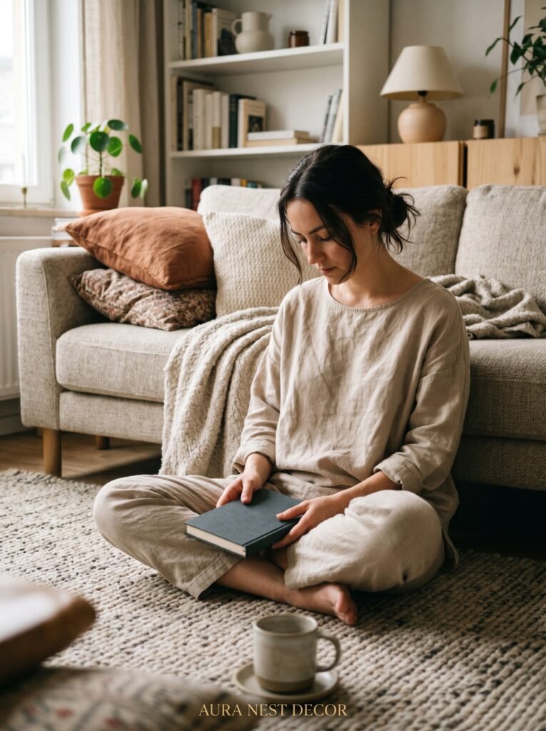
You want to be able to see floor. This isn’t about having an empty room. It’s about allowing the eye to read the space as larger than it is by leaving clear paths between pieces.
Interior designers call it negative space. What it actually feels like in practice is breathing room. When you walk into a small living room and can see the rug from wall to sofa, from sofa to window, in clear unobstructed stretches, the room feels bigger even if the measurements haven’t changed.
Keep paths at least 30-36 inches wide. In the US, that’s a comfortable single-person walkway. In the UK, Victorian proportions sometimes make this challenging, but even 28 inches is navigable and feels intentional.
Resist the urge to fill corners with furniture just because they’re there. An empty corner with a tall floor lamp and a small plant reads as designed breathing space. A corner stuffed with a side chair that no one sits in just reads as stuff.
12. The Final Layer That Pulls It All Together Without Adding Clutter
Texture is doing the work that pattern can’t do safely in a small space.
When a room is compact, pattern risks overwhelming it. But texture — a nubby boucle throw, a linen cushion cover, a rattan side table, a ceramic lamp base with a hand-thrown surface, a wool rug with a low pile — adds richness without visual noise.
The difference between a small room that looks expensive and intentional and one that looks merely small often comes down to this. Smooth surfaces feel clean but cold. Layered textures feel warm, lived-in, considered. They make the light interesting — because different textures catch and reflect light differently — and they make the room feel full in a way that’s about quality rather than quantity.
Three different textures on a sofa alone (a smooth linen cushion, a chunky knit throw, a velvet pillow) create the kind of layered richness that makes people photograph their living rooms and post them on Pinterest. And in a small room, you don’t need much. The space is working in your favor — everything is close, everything is visible, and all that texture is right there within arm’s reach.
—
❓ FAQ
Q: What’s the best layout for a small rectangular living room? A: Place your sofa against the longest wall and float it a few inches away from it rather than pushing it flush. This creates a sense of depth behind the sofa and makes the room feel more curated. Position seating so conversation is easy — don’t let the TV dictate the entire layout.
Q: Can I use dark colors in a north-facing room in the UK? A: Yes, though choose shades with warm undertones. A dark color with cool undertones in a north-facing room can tip into feeling gloomy. Dark green, deep terracotta, and warm navy all work well because they read warmly even in lower light. Layer your artificial lighting carefully.
Q: How do I make a small living room feel modern without it feeling cold? A: The modern-warm balance is about material choices. Modern lines — low-profile furniture, clean shapes — combined with warm materials like wood, boucle, linen, and ceramic keep the room feeling current without the sterile quality that overly minimal modern spaces can have. Let the forms be modern. Let the materials be warm.
—
💭 Final Thoughts
A small living room isn’t a design problem to solve. It’s a design constraint to work with — and constraints, in the right hands, produce more interesting results than endless space ever does. The best small rooms aren’t the ones that successfully pretend to be large. They’re the ones that are so deeply themselves that size stops being the thing you notice.
What would you change about your living room first?


