Why a Colorful Home Interior Might Be the Most Honest Thing You Can Do for Yourself
There’s a quiet kind of courage in choosing color for your home — in refusing to play it safe, in saying this is who I am through the walls you live within. If you’ve ever walked into a room painted deep emerald green and felt your shoulders drop, or stepped into a sunshine-yellow kitchen and suddenly wanted to make pancakes from scratch, you already understand something profound: color doesn’t just decorate a space. It changes you inside it.
—
Table Of Content
1. The Psychology Behind Why Color Transforms Every Room You Enter
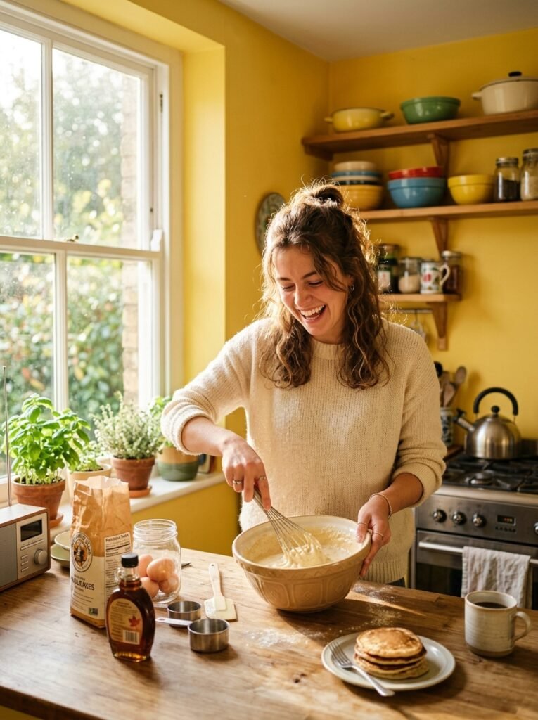
Before we talk about paint swatches or throw pillow combinations, we need to talk about what’s actually happening in your brain when you walk into a colorful room. Color psychology isn’t a soft, vague concept — it’s a well-studied field that interior designers, architects, and even hospital planners use intentionally. Warm tones like terracotta, mustard, and rust activate the part of your nervous system associated with energy and warmth. They’re the reason you feel more alive in a kitchen painted a deep, burnt amber than in one coated in flat, institutional white.
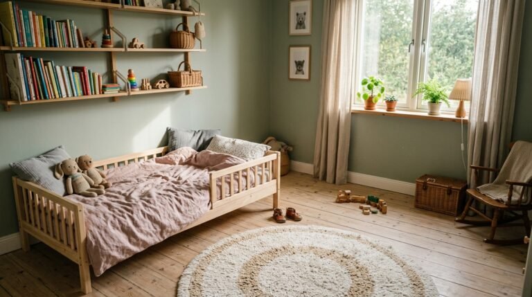
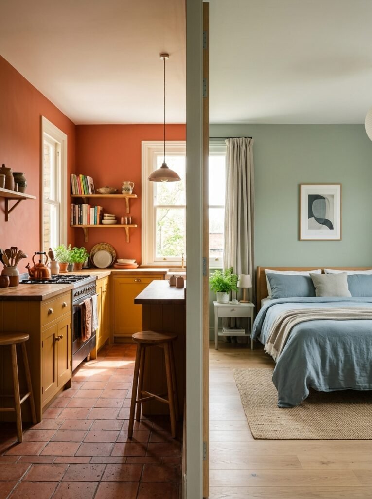
Cool tones — sage green, dusty blue, soft lavender — do the opposite. They slow the heart rate slightly, cue the body to relax, and create a sensation of spaciousness even in smaller rooms. This is why color-savvy designers often reach for muted blues and greens in bedrooms and reading nooks. It’s not arbitrary — it’s neuroscience wearing a beautiful coat.
“Color is the first thing a room says before you’ve even read the furniture.”
What makes a colorful interior feel cohesive rather than chaotic is understanding that each color carries an emotional frequency. When you choose colors intentionally — not just because they’re trending on Pinterest — you’re essentially programming the emotional experience of every person who walks through your door, including yourself.
—
2. The Biggest Myth About Colorful Interiors That’s Keeping Your Home Beige
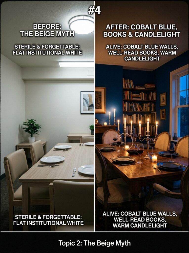
Let’s address it directly: somewhere along the way, a well-meaning design magazine convinced millions of people that neutral = sophisticated and colorful = overwhelming. That myth has left a staggering number of homes looking like extended-stay hotels — inoffensive, forgettable, and deeply disconnected from the people living in them.
The truth is that a thoughtfully colorful interior requires more skill and intention than an all-white room, not less. When you choose to live in color, you’re making deliberate decisions about mood, proportion, light, and personality. Neutral rooms can hide indecision. A colorful room has nowhere to hide — and that vulnerability is exactly what makes it stunning.
The homes that get saved and reshared on Pinterest by the thousands aren’t the ones with white shiplap and matching gray sofas. They’re the ones with a cobalt blue dining room that makes you want to sit down for a four-hour dinner, or a living room where the walls are the color of aged cognac and the bookshelves are filled with real, read books.
—
3. How to Choose Your Color Story Before You Buy a Single Can of Paint
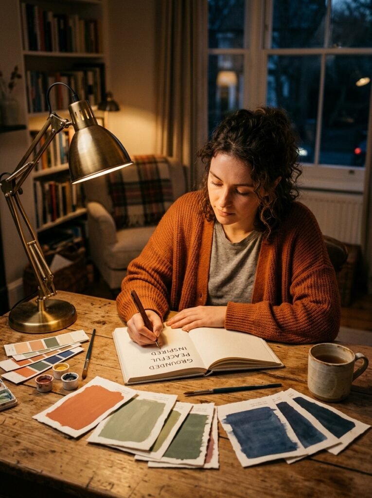
Every beautiful colorful home starts with a story — not a mood board, not a trending palette, but a genuine emotional narrative. Ask yourself: how do you want to feel in this room? Not how do you want it to look, but how do you want your body and mind to respond when you walk into it at 7am, at noon, and at 10pm under lamplight?
That question will do more for your interior design choices than any algorithm. A room you want to feel energized in at breakfast calls for different colors than one where you want to decompress after a hard day. Write down three words that describe your ideal emotional experience in each space. Then — and only then — start looking at color swatches.
The most enduring colorful interiors usually follow what designers call an anchor, accent, and atmosphere approach. One dominant color anchors the room and gives it identity. One or two accent colors add visual tension and interest. And the overall atmosphere — influenced by natural light, material textures, and finish sheens — ties it all into something that feels complete rather than assembled.
—
4. The Rooms Where Color Is Most Transformative (And Why)
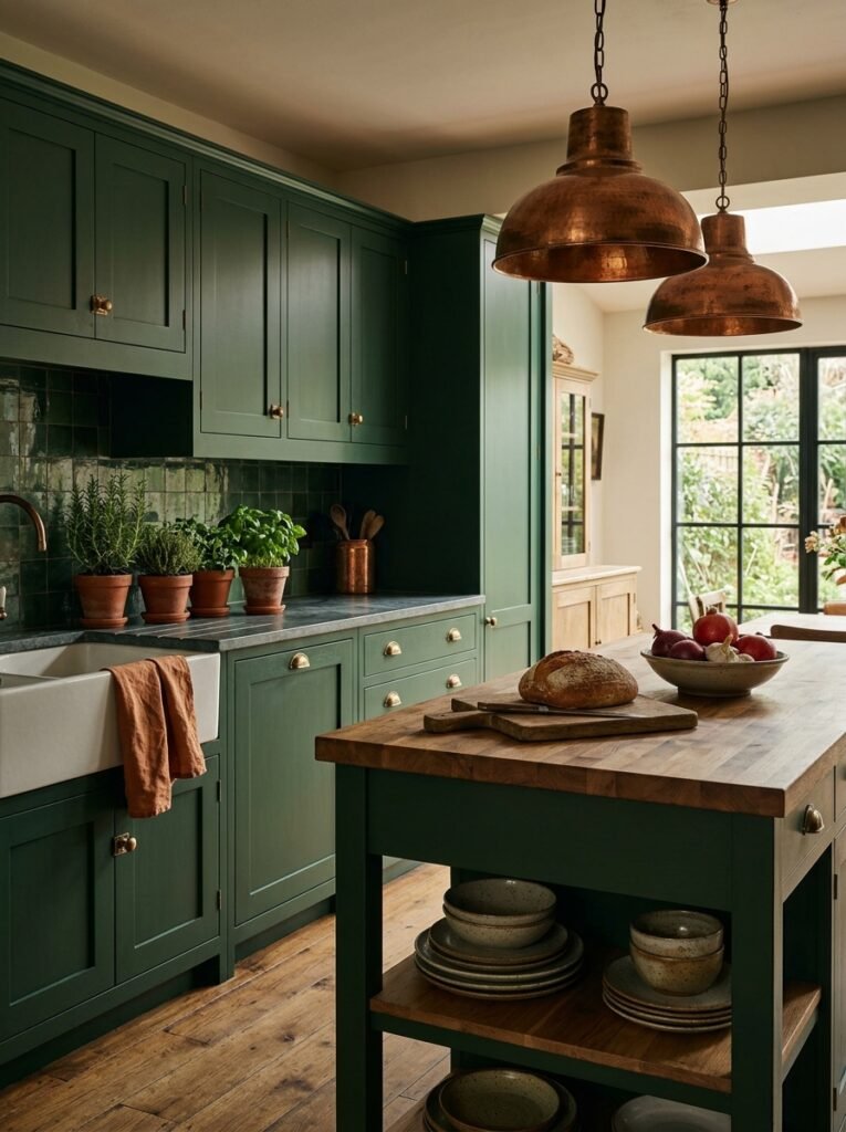
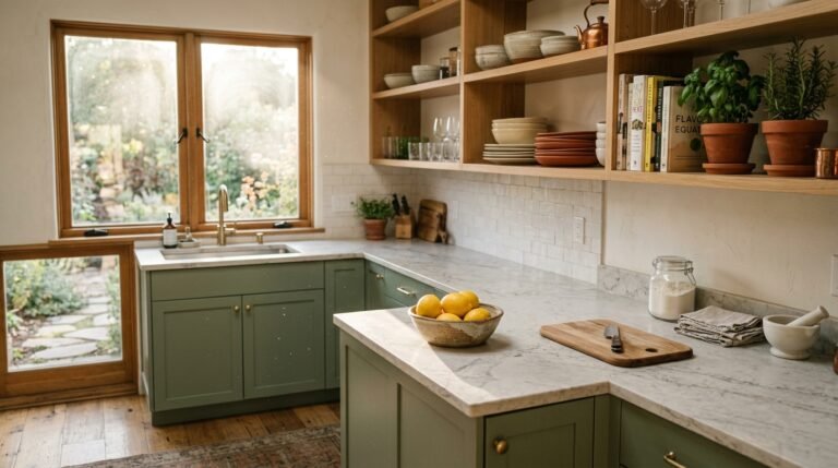
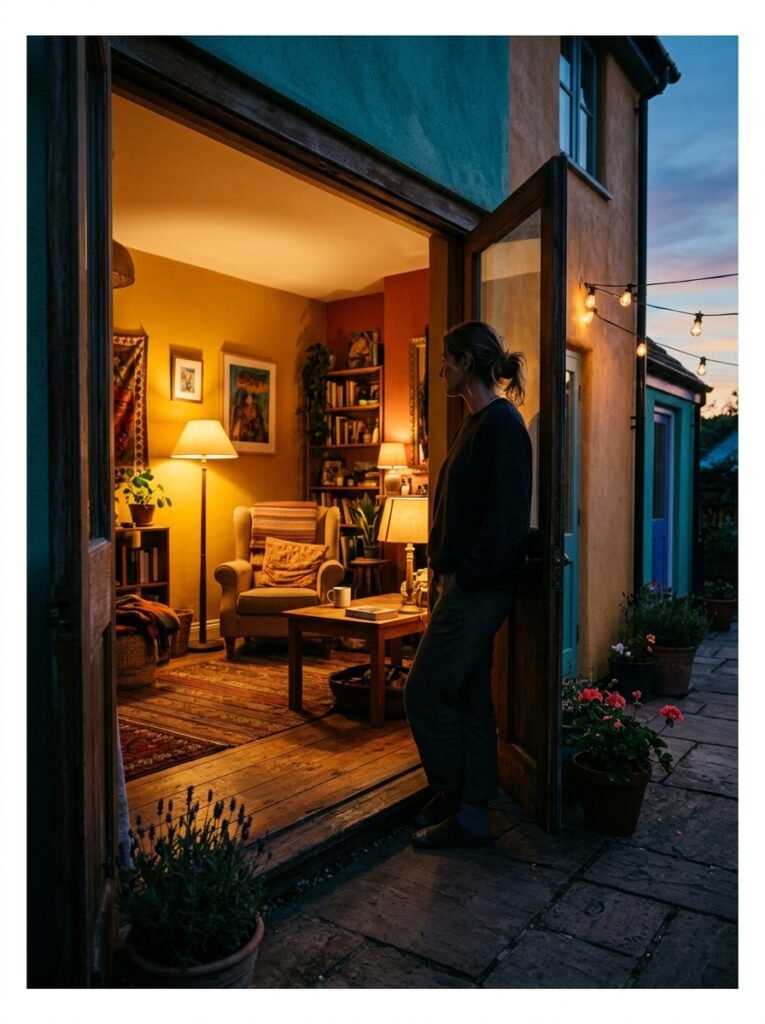
Not every room responds to color the same way, and understanding where color has the highest emotional return on investment can help you focus your energy and budget. Kitchens are perhaps the most powerful space for color experimentation — and the most underutilized. Because kitchens are often transitional spaces (we move through them quickly, we use them with our hands, we’re often distracted), a bold color choice there tends to cut through the noise and create genuine moments of joy.
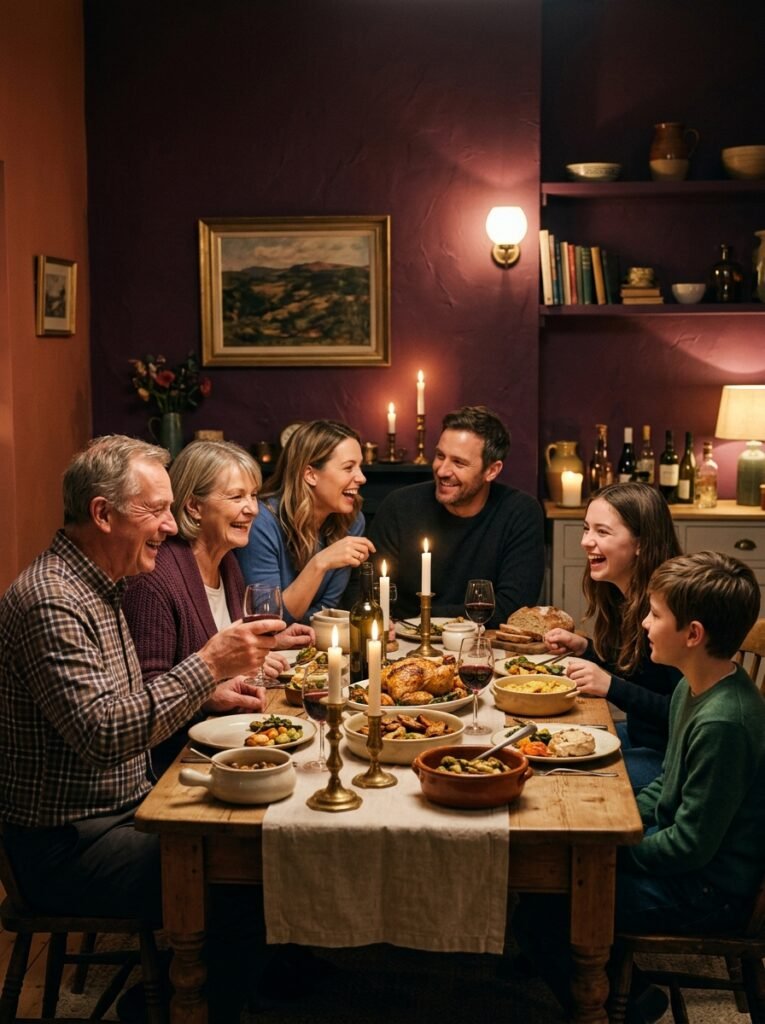
A deep forest green kitchen with brass hardware isn’t just beautiful — it’s grounding. A kitchen painted a warm, paprika red doesn’t just look spirited — it actually makes cooking feel more celebratory. Dining rooms come in at a close second. There’s a long-held design principle that people are more comfortable lingering in a dining room that uses warm, rich tones — deep plums, terracotta, burgundy, or warm coral. These colors mirror the warmth of candlelight and subconsciously signal that this is a space designed for staying, not rushing.
“The dining room should make guests forget what time it is — and the right color can do exactly that.”
Hallways and entryways are wildly underestimated color opportunities. Because they’re transitional spaces seen briefly, you can push color further in these zones without it feeling oppressive. A deeply saturated entryway — think indigo or deep teal — creates a theatrical sense of arrival that makes your whole home feel more intentional and curated.
—
5. Understanding the Color Wheel Like a Designer, Not a Student
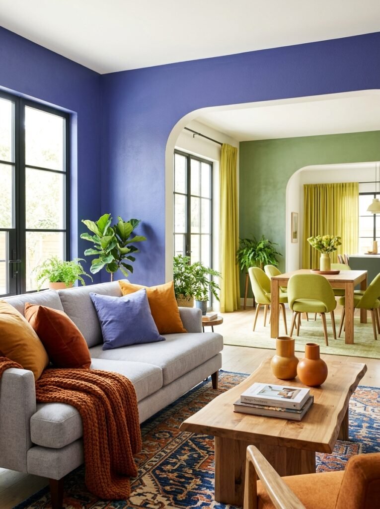
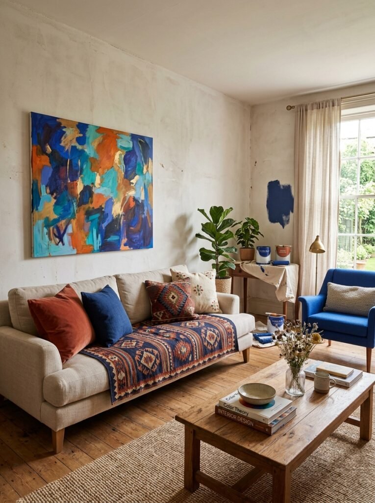
You don’t need a design degree to use the color wheel intelligently. The three relationships you need to understand are complementary, analogous, and triadic color combinations. Complementary colors sit opposite each other on the wheel — blue and orange, yellow and purple, red and green. Used in a home interior, complementary pairings create vibrant visual tension. They’re exciting, dynamic, and almost impossible to make look flat or boring.
Analogous combinations use colors that sit next to each other on the wheel — like yellow, yellow-green, and green, or blue, blue-violet, and violet. These create a sense of harmony and visual flow. They’re perfect for open-plan spaces where one room flows visually into another. Triadic combinations use three colors evenly spaced around the wheel. They’re playful, energetic, and — when balanced with neutrals — create a space that feels both sophisticated and joyful.
—
6. The Secret Power of Color Layering Beyond Just Paint
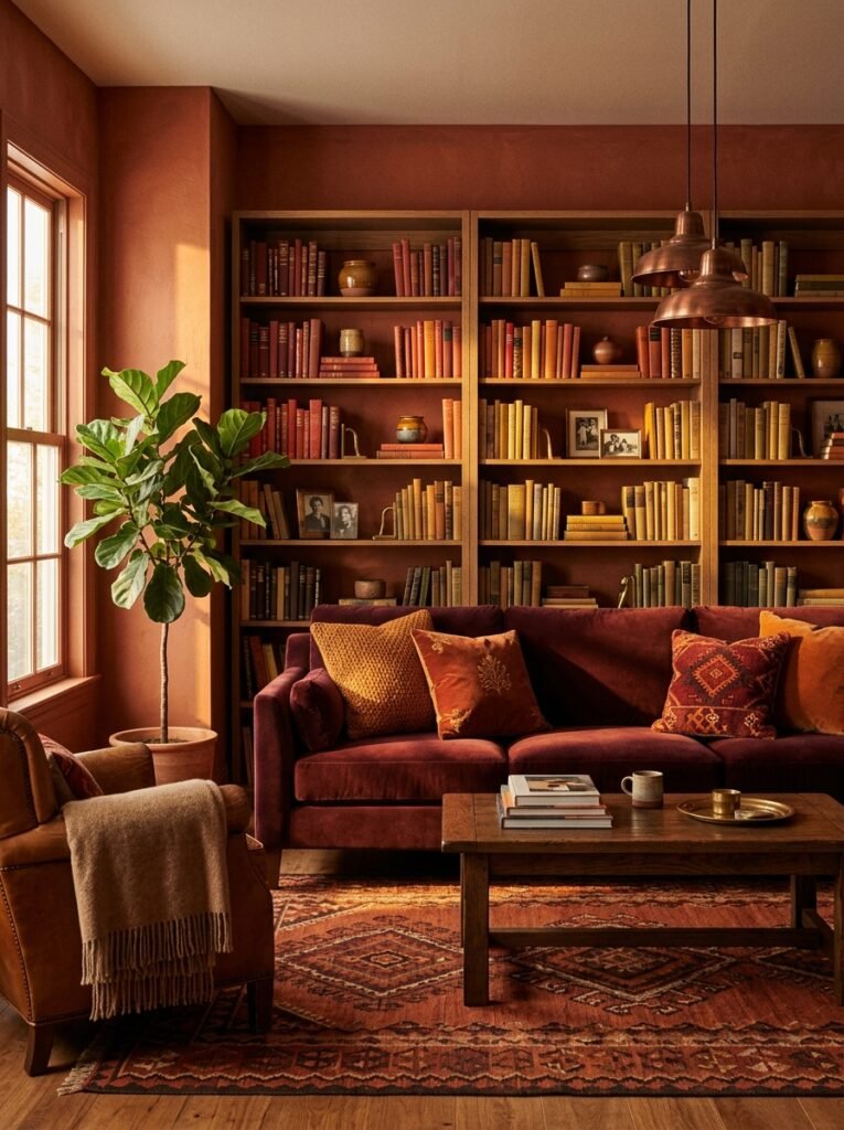
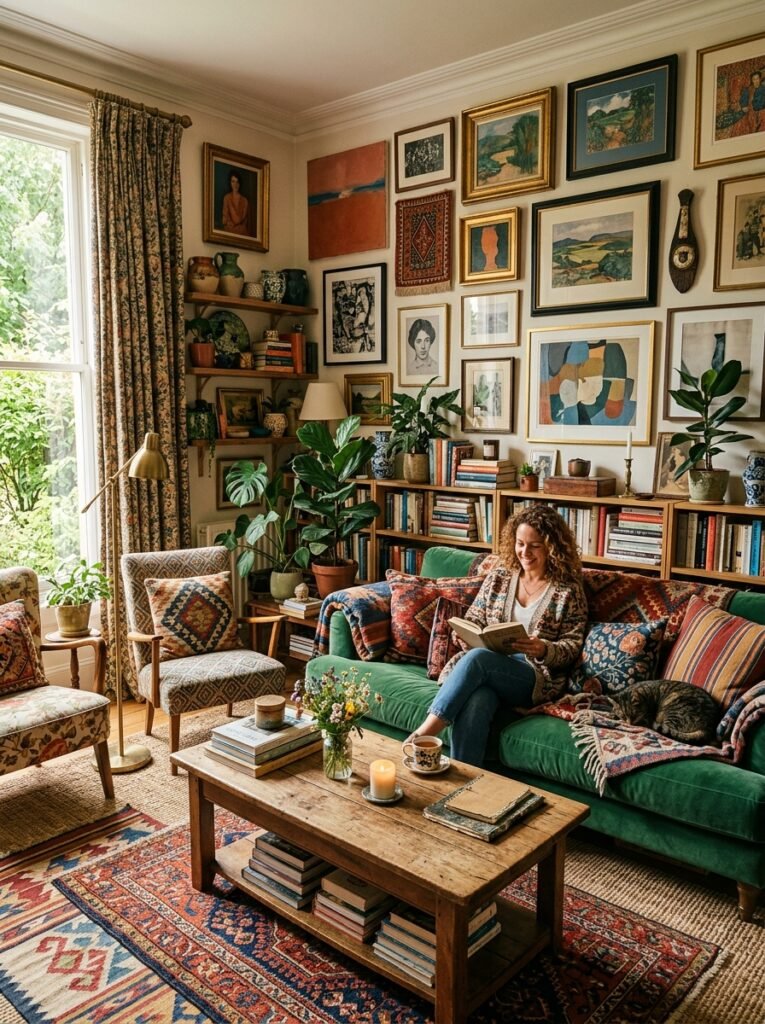
Here’s something that separates beginner decorators from skilled ones: the most beautiful colorful interiors aren’t just about wall color. They’re about the layering of color across every surface, texture, and object in the room. A wall painted in warm terracotta is one thing. That same terracotta wall paired with a deep burgundy velvet sofa, a rust-toned kilim rug, copper pendant lights, and bookshelves filled with books in warm spines — that’s a room that breathes.
Color layering means treating every element in a room as a contributor to the color conversation. Textiles are particularly powerful because they introduce color in a soft, approachable way. A room with neutral walls can still sing with color if the throw blankets, cushion covers, curtains, and art are chosen with intention and consistency. Art is another frequently overlooked color vehicle — a single large painting can introduce a color palette to an otherwise restrained room and give it an anchor it was missing.
—
7. Why Natural Light Is the Silent Co-Designer of Every Colorful Room
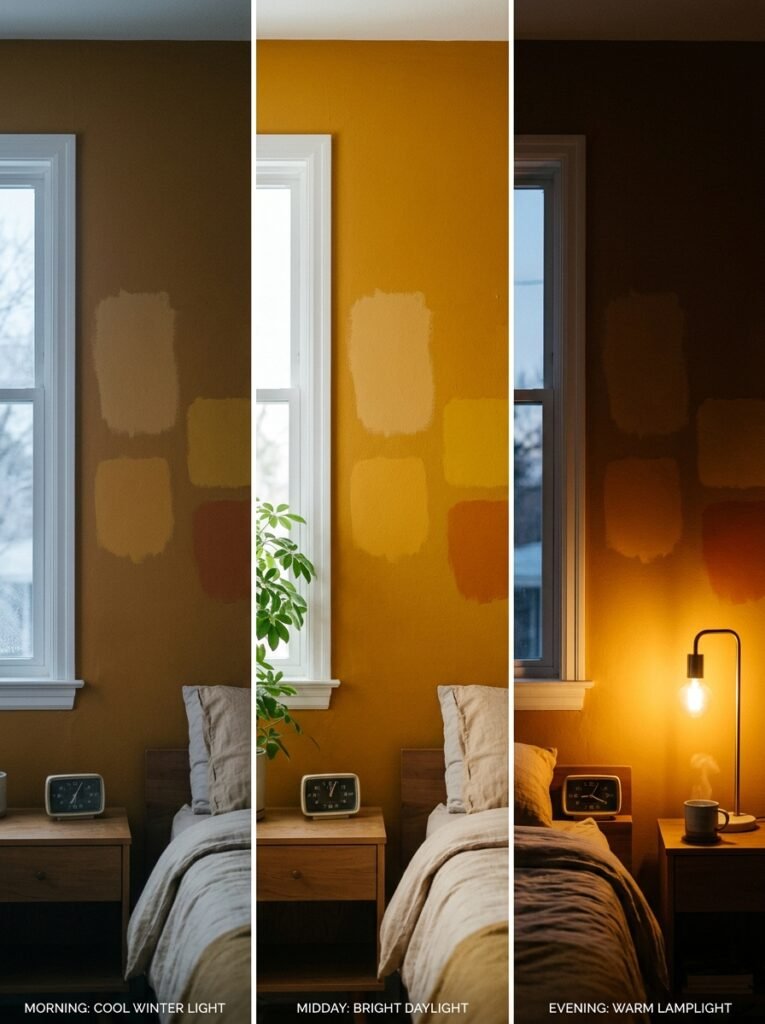
No article about colorful interiors is complete without talking about light — because light changes color, and color changes with light, sometimes dramatically. A paint chip you fall in love with at the hardware store can look completely different on your north-facing bedroom wall in January. This isn’t a mistake or a flaw in the paint. It’s physics.
North-facing rooms receive cool, indirect light and tend to amplify the cooler, bluer undertones in any color. Warm tones can feel slightly muted in these rooms, which is why many designers actually recommend leaning into warm, saturated colors in north-facing spaces — not away from them. South-facing rooms receive the most direct light throughout the day and tend to make colors look brighter, richer, and more saturated. You can often get away with slightly lighter, softer versions of bold colors in these rooms.
East and west-facing rooms shift throughout the day — golden and warm in the morning or evening, cooler and more neutral at midday. Before committing to any color, paint large swatches directly on the wall and observe them at different times of day for at least 48 hours. It’s the single most important step most people skip.
—
8. Small Spaces and Saturated Color — Why the Rules You Learned Are Wrong
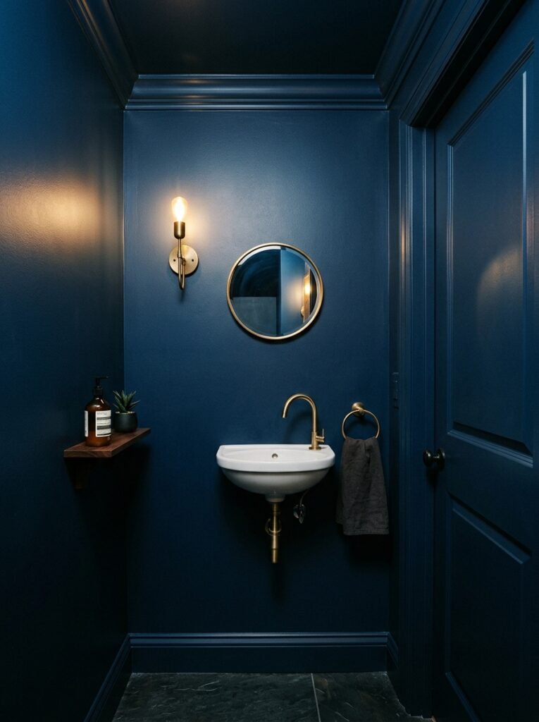
The conventional wisdom says small rooms should be painted white or light colors to feel bigger. While there’s a grain of truth to this in terms of perceived square footage, it misses something crucial: a small room painted white that lacks character doesn’t feel bigger, it just feels emptier. A small room painted a deep, rich color — like midnight navy or forest green — can feel intimate, jewel-like, and intentionally cozy in a way that white simply cannot achieve.
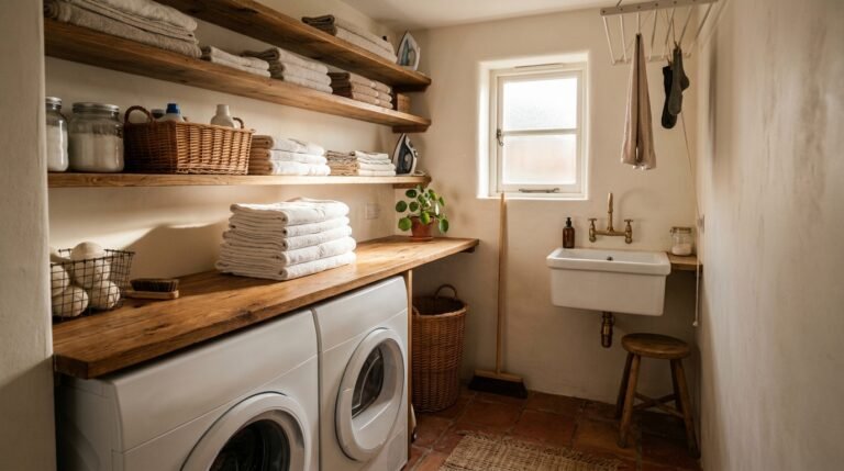
The key is using color consistently in small spaces. When walls, trim, and even ceiling are painted the same deep tone — a technique called color drenching — the absence of visual contrast actually makes the room feel more expansive, not less. It removes the eye’s ability to measure the space and replaces it with pure atmosphere. Small bathrooms, powder rooms, and reading nooks are perfect candidates for this approach.
“A room doesn’t need to feel large — it needs to feel intentional.”
—
9. The Most Timeless Color Palettes for a Colorful Home Interior
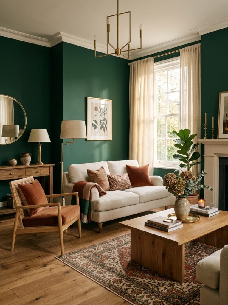
Trends come and go — and Pinterest trends move faster than almost any other platform. But some color combinations have demonstrated staying power across decades of interior design because they tap into something emotionally and aesthetically universal. Deep emerald green with warm brass and natural wood tones creates a palette that feels simultaneously traditional and modern — it photographs beautifully and ages gracefully. Terracotta with cream, sage, and rust creates a palette rooted in the natural world, evoking warmth without becoming cloying.
Navy blue anchored with white and warmed with natural wood or rattan is a pairing that has never really fallen out of favor — it balances freshness with depth, formality with comfort. Dusty rose paired with muted gold and cream creates a palette that is romantic without being saccharine. Each of these palettes works because they have internal logic — they tell a coherent emotional story from the first moment you walk in.
—
10. How to Introduce Color Gradually If You’re Not Ready for Full Commitment
Not everyone is ready to paint their entire home cobalt blue, and that’s completely valid. Color is personal, and rushing it rarely produces results you’ll love five years from now. The good news is that you can build a colorful interior incrementally — and often the most interesting, layered rooms are the ones that evolved over time rather than being executed all at once.
Start with textiles. A set of bold, patterned cushion covers or a richly colored throw blanket can shift the emotional temperature of a room without touching a single wall. Add art next — a large print or painting with a strong color story becomes an anchor around which you can build. Then consider smaller furniture pieces: a colorful accent chair, a painted side table, or a bright ceramic lamp base. By the time you’re ready to paint the walls, you already know exactly what color you need because the room has been quietly telling you.
—
11. How a Colorful Interior Changes the Way You Cook, Eat, and Live
This might be the most overlooked dimension of a colorful home: it changes your behavior. Not in a dramatic or sudden way, but in the accumulated small moments of daily life. When your kitchen walls are a deep, cheerful color that makes you smile every time you walk in, you cook more. When your dining room is warm and inviting, you eat at the table instead of in front of a screen. When your living room feels genuinely beautiful and personal, you’re more likely to invite people over — and more likely to stay home when staying home is exactly what you need.
The relationship between our physical environments and our emotional habits is well-documented in environmental psychology. We are profoundly influenced by the spaces we occupy. A colorful home isn’t a luxury or an indulgence — it’s a daily investment in your own quality of life.
—
12. The Unexpected Joy of Letting Your Home Tell the Truth About Who You Are
At the heart of every truly beautiful colorful interior is an act of courage — the decision to let your home reflect who you actually are rather than who you think you should be. The homes that stop people mid-scroll on Pinterest, the ones that generate thousands of saves and comments from strangers saying I want to live here, are never the most expensive or the most perfectly executed. They’re the ones that feel genuinely inhabited. The ones that look like someone lives there and loves living there.
If you love books, let the shelves overflow. If yellow makes your heart lift, paint the wall yellow. If you’ve always been secretly drawn to maximalism — the layered rugs, the gallery walls, the mix of patterns — stop apologizing for it and start living it. Your home has the capacity to be the most honest physical expression of who you are in the world. Color is simply the language it uses to say so.
—
🌿 How to Take Care of a Colorful Home Interior
Maintaining a colorful home so that it continues to feel intentional and vibrant rather than faded or chaotic takes a little ongoing attention — but it’s simpler than most people think. First, protect your wall color by keeping a small amount of touch-up paint in a labeled jar — colorful walls show scuffs more visibly than white ones, and a quick five-minute touch-up keeps them looking fresh for years. Second, rotate your textiles seasonally. Swapping cushion covers and throws with the season is an inexpensive way to keep the color story feeling alive and responsive to the time of year. Third, clean your windows regularly — colorful rooms depend on natural light to perform at their best, and even modest improvements in light quality can make a noticeable difference in how colors look and feel. Fourth, audit the room twice a year and remove anything that no longer belongs to the color story. Colorful rooms can tip into visual chaos if they accumulate too many objects over time. Edit with kindness but honesty.
—
❓ FAQ
Q: Will colorful walls make my home harder to sell? A: This is a very common concern, but the reality is more nuanced than the conventional wisdom suggests. A beautifully executed colorful interior can actually increase perceived value by making a home more memorable and photographically distinctive. That said, highly personal or extremely saturated color choices in major rooms may require repainting before sale — which is a relatively minor investment compared to the years of joy a color you love can bring you while you live there.
Q: How do I choose the right color if I’m not confident about design? A: Start by identifying three colors that appear repeatedly in things you already love — your wardrobe, your favorite art, the ceramics you reach for. These colors are telling you something about your natural aesthetic. From there, look for interior spaces online that make you feel the way you want your room to feel, and trace the common color threads between them. Color confidence comes with practice and observation, not innate talent.
Q: Can I mix patterns and colors without the room looking busy? A: Absolutely — in fact, some of the most beautiful colorful interiors use multiple patterns simultaneously. The key is to vary the scale of the patterns (one large, one medium, one small) and keep them within a consistent color palette. When the colors speak the same language, patterns can coexist beautifully without competing.
—
💭 Final Thought
A colorful home isn’t a design choice — it’s a declaration. It says that you believe your daily surroundings are worth caring about, that beauty is not frivolous, and that the space you return to every evening deserves to feel as alive as you do. The walls, the textiles, the layers of color you choose are all quiet acts of self-expression that accumulate over time into something genuinely meaningful.
So here’s the question worth sitting with: if your home is a reflection of who you are right now — not who you used to be, not who you’re trying to impress — what colors would it be?