The Small Living Room Glow-Up That Doesn’t Require a Single Wall Knocked Down
You moved into the apartment with good bones and big dreams. Then you stood in the living room with a tape measure and a slowly sinking feeling. But here’s what nobody tells you: the most beautiful apartments I’ve ever seen have been the smallest ones.
—
1. The Color That’s Replacing Greige in Every Apartment I’m Saving Right Now
For the past few years, greige ruled. That safe, neither-here-nor-there blend of grey and beige that matched everything and offended no one. And honestly? It served its purpose. But something has shifted.
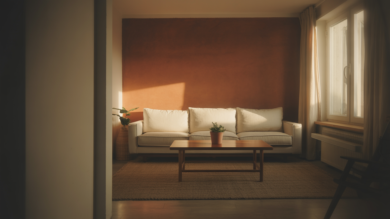
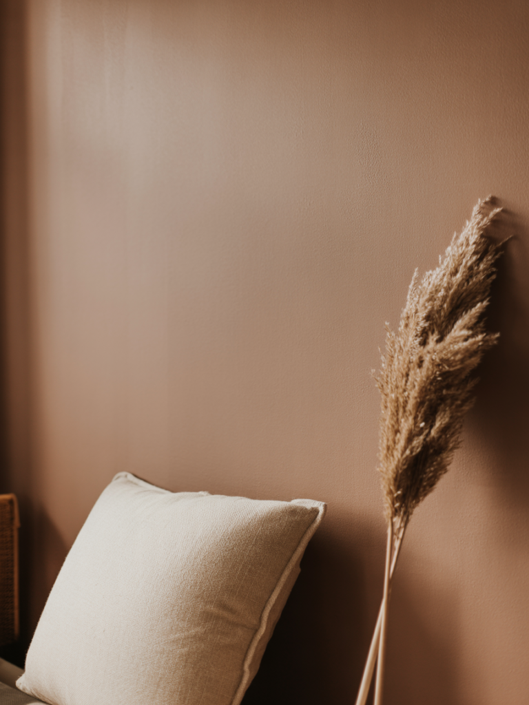
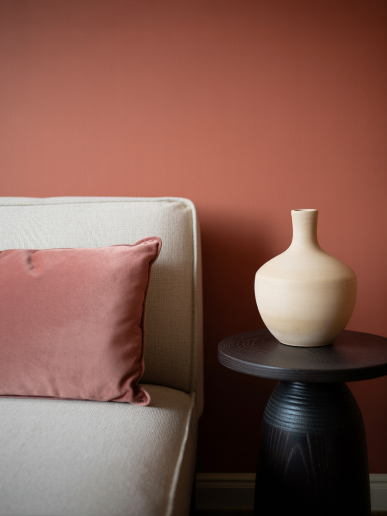
The color showing up in every beautiful small apartment on my feed right now is warm terracotta — but not the aggressively Southwestern version from 2019. This is softer. More dusty. More like the inside of a sun-warmed clay pot than a Tex-Mex restaurant.
Here’s why it works so brilliantly in apartments specifically. Terracotta is one of those rare colours that reflects light rather than absorbing it, despite being a mid-depth tone. It bounces warmth back into the room. At midday, your walls look peachy and bright. At 7pm under an Edison bulb, they look like something from a boutique hotel in Porto.
It pairs with cream, with olive, with rust, with aged brass, with natural wood. It doesn’t fight with your furniture. It hosts it.
If you’re in a rental and can’t paint, get a terracotta-toned throw, a few terracotta cushions, and a piece of art in those tones. The eye reads color from multiple sources and stitches together its own story. Your room will feel warm and considered without a single coat of paint.
“Terracotta doesn’t decorate a room. It heats it from the inside.”
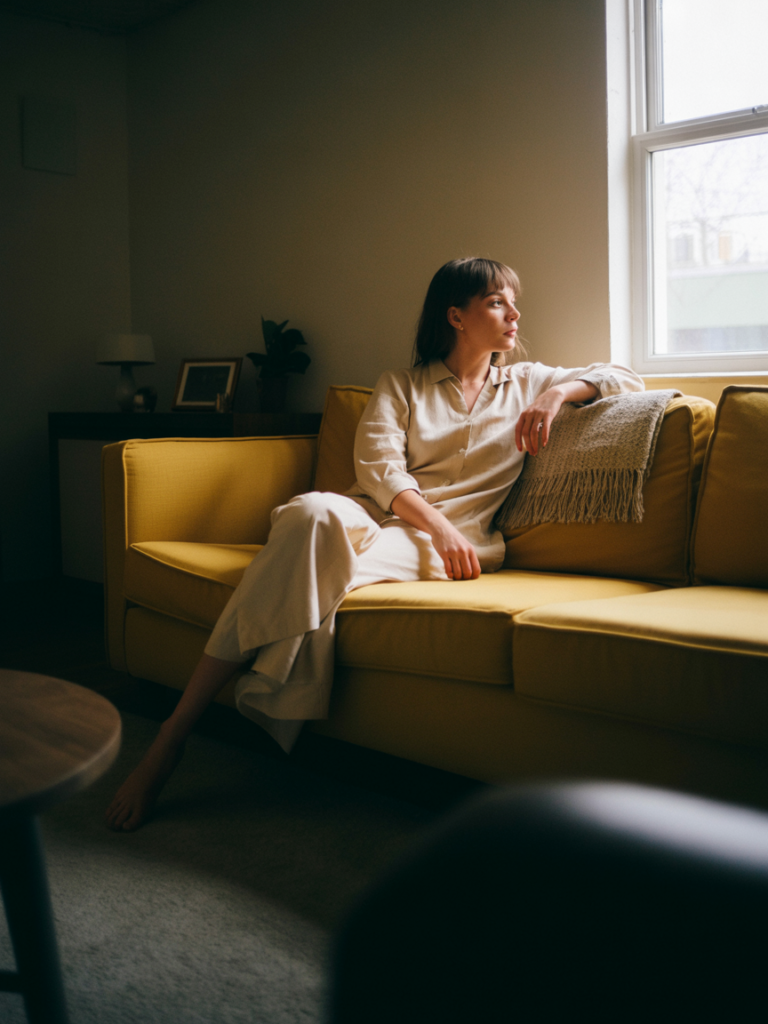
2. Why Your Sofa Color Is the Most Important Decision You’ll Make in This Space
People agonize over paint. They forget entirely about the sofa. This is the mistake.
Your sofa is almost certainly the largest single object in your living room. It occupies more visual real estate than your walls, your floor, your shelving — all of it. Which means whatever color it is, that color is your room’s mood.
If you have a grey sofa right now and your room feels cold and flat, that’s why.
The apartments that look the most Pinterest-ready in 2024 and heading into 2025 are leaning into sofas in dusty sage, warm camel, deep forest green, and off-white boucle. If you’re renting and committed to a grey sofa you already own, the fix is contrast. A large rust-toned throw draped over one armrest. Two deep green velvet cushions. A chunky knit blanket in cream tossed deliberately over the back.
The sofa doesn’t have to be the problem. It just has to have company.
And if you’re shopping for a new one? Please resist the light grey option even when it’s on sale and seems like the safe choice. Safe furniture doesn’t make beautiful rooms. Pick the camel. Pick the green. You’ll thank yourself every single evening when you sit down in a room that actually feels like somewhere you chose to be.
3. The Rule About Rugs That Interior Designers Never Explain Clearly Enough
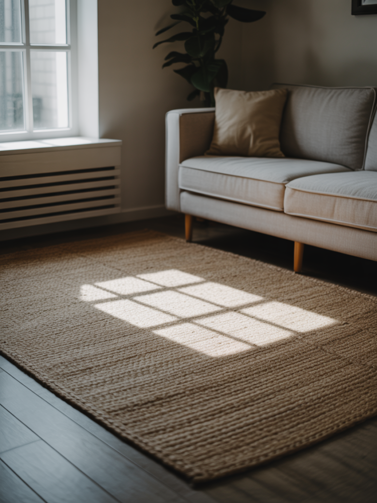
Your rug is almost certainly too small. I say this with love.
The number one reason apartment living rooms look choppy and disconnected — even when everything in them is individually nice — is that the rug is floating in the middle of the room like a postage stamp on a letter. It’s touching nothing. It’s anchoring nothing. It’s just… there.
The rule is simple but it changes everything: in a living room, your rug should be large enough for all of your main seating furniture to have at least its front legs sitting on it. All front legs on the rug. Not some of them. All.
This visually ties the whole seating arrangement together. It tells the eye that this is a room, with intention and cohesion, not just a collection of things that ended up next to each other.
In a small apartment, go larger than feels logical. A 8×10 rug in a small room sounds wrong. It isn’t. A rug that’s too large creates the optical illusion of more floor space, not less, because it grounds the furniture and makes the walls look further away.
For color, right now I’m particularly drawn to rugs in warm cream with a subtle woven texture, anything in faded Turkish or Moroccan patterns, and deep forest green flatweaves. All of them work with the terracotta/sage/boucle palette I keep describing.
4. Lighting Is a Mood, Not a Feature — Here’s How to Actually Get It Right
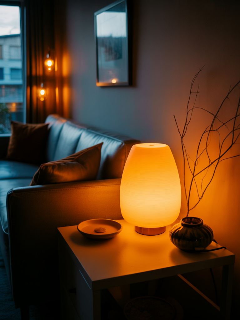
Nobody wants to talk about overhead lighting but we need to talk about overhead lighting. Because the ceiling fixture that came with your apartment rental — that single central globe of cool white light — is murdering the atmosphere in your room every single evening.
You can’t always remove it. But you can stop using it.
The goal is to get your light sources low and warm and spread throughout the room rather than blasting down from one point above. Three lamps placed at different corners of a room create the same amount of usable light as one overhead fixture, but the result looks completely different. It looks lived in. It looks chosen.
Invest in at least one floor lamp with a warm-toned shade. A table lamp on a side table or console. Candles — real ones, in the evening. String lights if they feel right for your aesthetic, though they’re less necessary when you have proper lamps.
The amber glow of an Edison bulb at 7pm is one of the most powerful decorating tools you own and it costs about $8. Change every bulb in your living room to a warm white, 2700K maximum. You’ll feel the difference the moment you switch them on.
“Three lamps beats one overhead every single time. Change this first.”
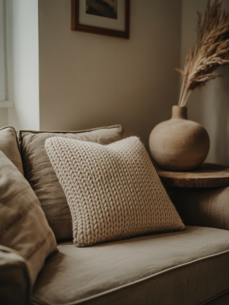
5. The Art of Layering Textures Without Making the Room Feel Cluttered
There’s a version of texture-layering that looks expensive and intentional. There’s another version that looks like a craft fair exploded in your living room. The difference is restraint and repetition.
Restraint means you’re not adding every texture you like. You’re choosing three or four and letting them breathe. Say: smooth linen, nubby boucle, rough natural wood, and hammered brass. That’s a complete texture story. It doesn’t need jute rope and velvet and ceramic and rattan all in the same room.
Repetition means each texture appears more than once. Your boucle cushion gets echoed by a boucle throw. Your natural wood coffee table gets echoed by a wooden tray on the shelves. When a texture appears twice, it looks deliberate. Once, and it looks like an accident.
In apartments specifically, I love the combination of a smooth velvet sofa (in any deep tone), linen curtains in cream or warm white, and a chunky knit throw. The three textures are completely different in weight and weave. They keep the eye interested. And they all belong to the same warm, considered family.
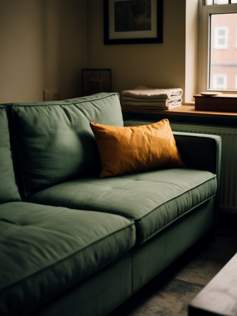
6. Exactly How to Use Green Without It Looking Like a Plant Shop
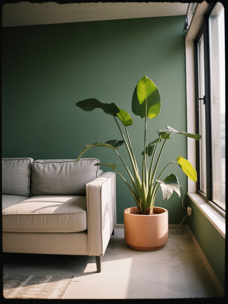
Green is having its moment — and it deserves every second of it. But apartment green done wrong looks either clinical (think stark lime on feature walls) or like you’ve simply surrounded yourself with plants and called it decor.
Green done right in a small living room is about tone and placement.
For walls or large pieces, you want either a very deep green (think hunter, forest, bottle green) or a very muted green (sage, eucalyptus, silvery-grey-green). The in-between greens — the bright ones, the yellow-toned ones — read as too loud in small rooms.
Deep green walls in an apartment sound scary. They’re not. Dark walls make small rooms feel cozy and intimate rather than small and cramped, provided you have warm lighting doing its job. Forest green with cream furniture, natural wood accents, and amber lighting is one of the most beautiful combinations I’ve ever seen in a small space.
For renters, olive and sage as accent colours work beautifully. A sage velvet armchair in the corner. Olive linen cushions on a neutral sofa. A dark green throw draped over a chair arm. It adds up to the same effect without any commitment.
7. What to Put on the Walls When You Have No Idea What to Put on the Walls
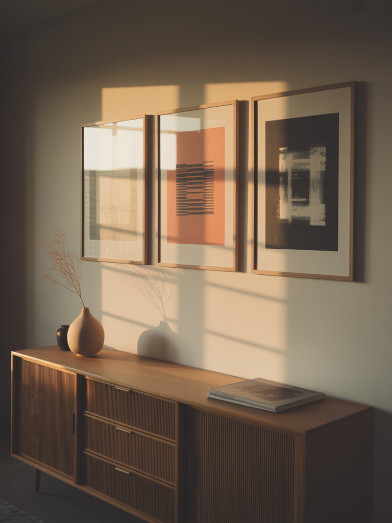
Blank walls are the thing people ask me about most often. They know they need something. They have no idea what. They panic, buy three things that don’t relate to each other, hang them randomly, and then wonder why it still looks off.
Here’s the actual approach.
Pick one main piece — a large print, a painting, a framed photograph — that contains at least two colors from your room’s palette. This becomes your anchor. Everything else grows from it.
Then decide: are you doing a gallery wall or are you doing intentional single pieces? Both are beautiful. A gallery wall needs a unifying element — the same frame color, or the same mat color, or the same general aesthetic. Mixed frames with matching mat colors work wonderfully. All different frames and all different mat colors looks chaotic.
Single pieces hung well are often more impactful than gallery walls in small rooms. One large piece at eye level above a sofa or console. One piece in an unexpected spot (the corner between two walls reads beautifully). Don’t pepper the room with small things at random heights.
“One large piece of art does more work than six small ones hung badly.”
8. The Specific Trick That Makes Small Apartment Living Rooms Look Bigger Instantly
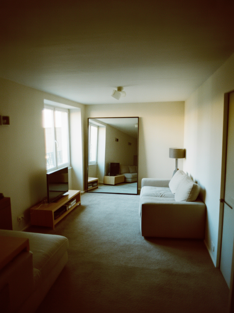
Mirrors. Obviously. But I’m going to tell you something slightly more specific than “hang a mirror.”
The placement is everything. A mirror only creates the illusion of depth and space if it reflects something worth looking at. A mirror that reflects a blank wall gives you a doubled blank wall. A mirror that reflects your window gives you what looks like a second window.
Put your largest mirror on the wall adjacent to your main window. Not opposite it — adjacent. This bounces the natural light sideways across the room rather than straight back at you, which creates a brighter, more even glow throughout the space.
For apartment aesthetics, lean a large mirror against the wall rather than hanging it. Leaning feels less permanent and more curated — like a piece that belongs in the room rather than an installation. An arch-shaped mirror leaning against the wall beside a window is one of those looks that photographs beautifully and also actually works in practice.
9. Bookshelves, Styling, and the One Thing You Need to Remove Immediately
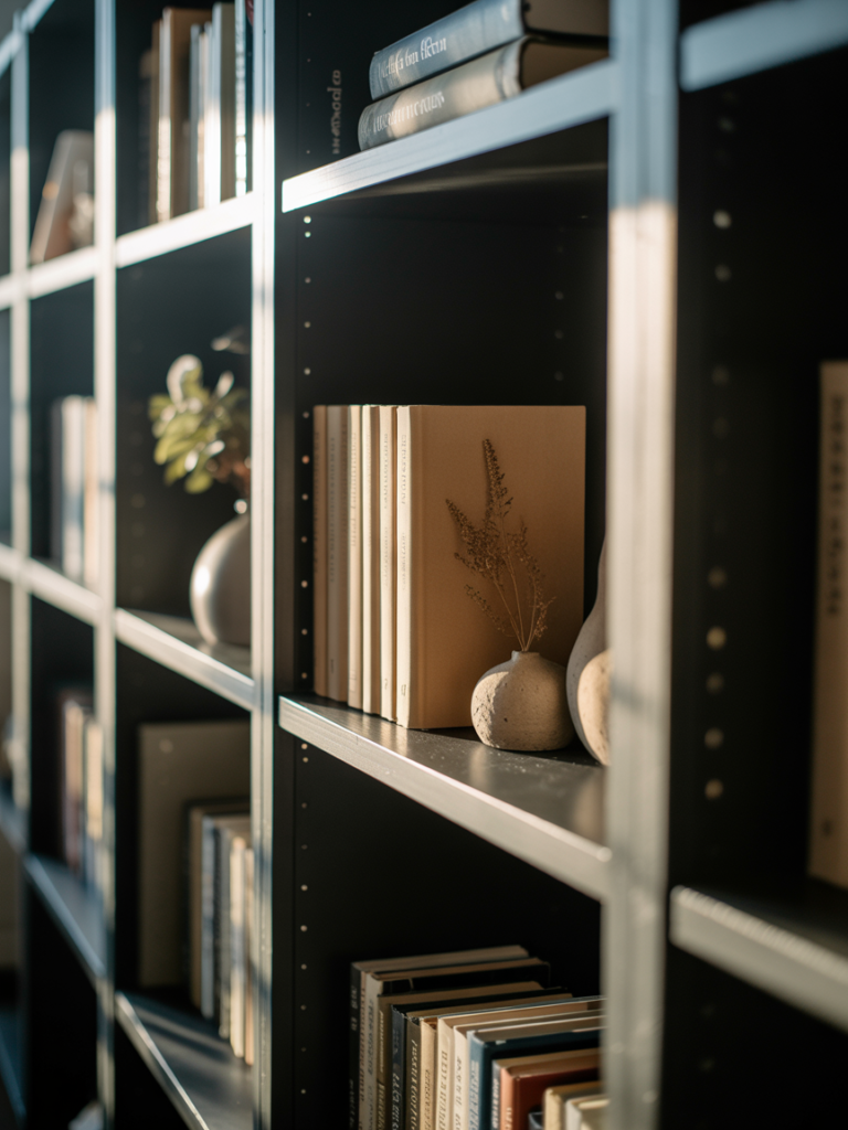
The things that are making your bookshelf look messy aren’t the books. They’re the random small objects that accumulated there because the shelf needed “filling.”
A bookshelf doesn’t need filling. It needs editing.
Remove everything. Start with the books themselves, arranged however makes sense — by size, by color, by genre, whatever you prefer. Leave some breathing room. Not every inch needs to be occupied.
Then add objects in groups of three — always odd numbers. A small vase, a candle, and a framed photo. A stack of books laid horizontally with a small sculptural object on top. A trailing plant that drapes over the shelf edge.
The rule I swear by: for every three objects you want to put back on the shelf, only put back two. That remaining space is doing more work than the third object ever could.
10. Curtains: The One Upgrade That Delivers More Impact Than Almost Anything Else
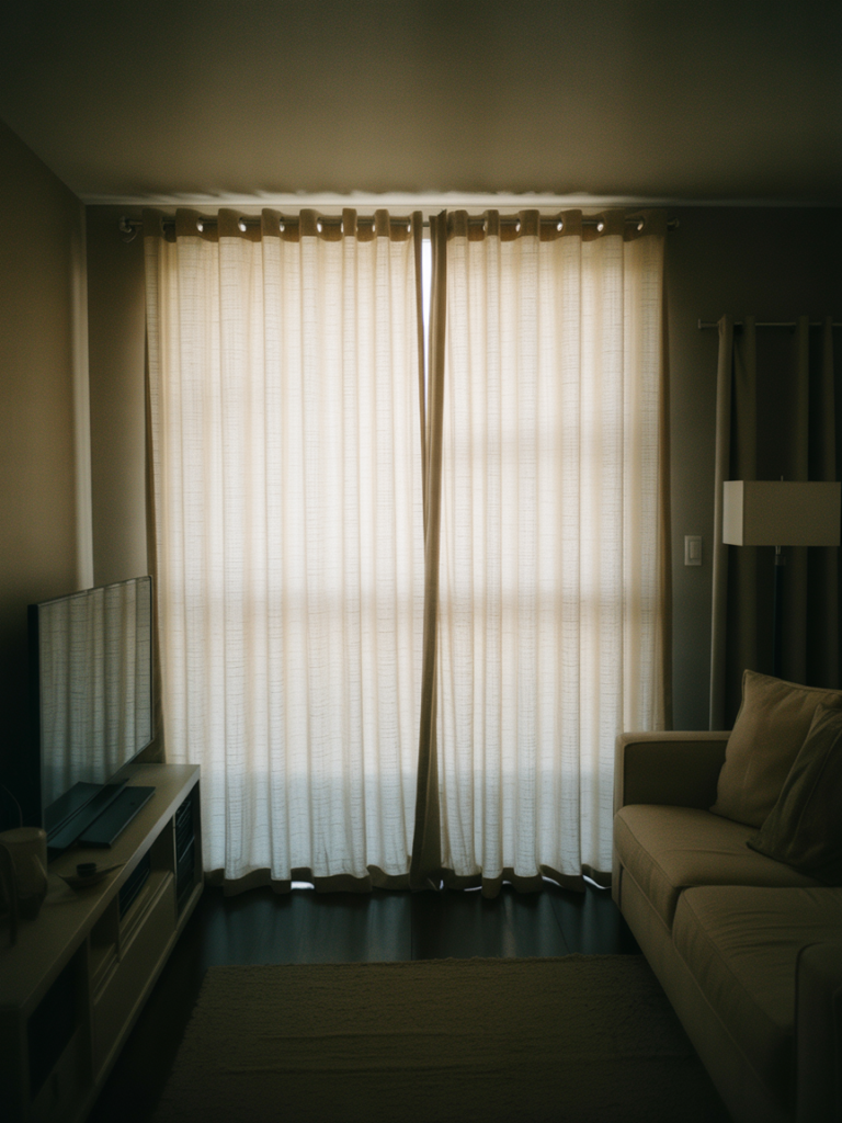
I have a theory that cheap curtains are ruining more living rooms than any other single factor. Not because the curtains themselves are ugly — some inexpensive curtains are perfectly fine. But because of how they’re hung.
Curtains are almost always hung too low and too narrow. The hardware goes right above the window frame, and the panels are just wide enough to cover the glass. This shrinks your windows. It makes your ceilings feel lower. It makes the whole room feel compressed.
The correct method: hang your curtain rod as close to the ceiling as possible. Let the curtains fall from ceiling to floor. Make your panels at least 1.5 times the width of your window — ideally double.
This frames the window like a piece of architecture rather than an afterthought. It makes ceilings feel taller. And in an apartment where you can’t change the windows themselves, it is the closest thing to a structural improvement you can achieve with fabric and two brackets.
For colour in 2024 going forward: cream, warm white, dusty linen, and deep forest green are all working beautifully.
11. How to Style a Coffee Table So It Doesn’t Look Like a Waiting Room
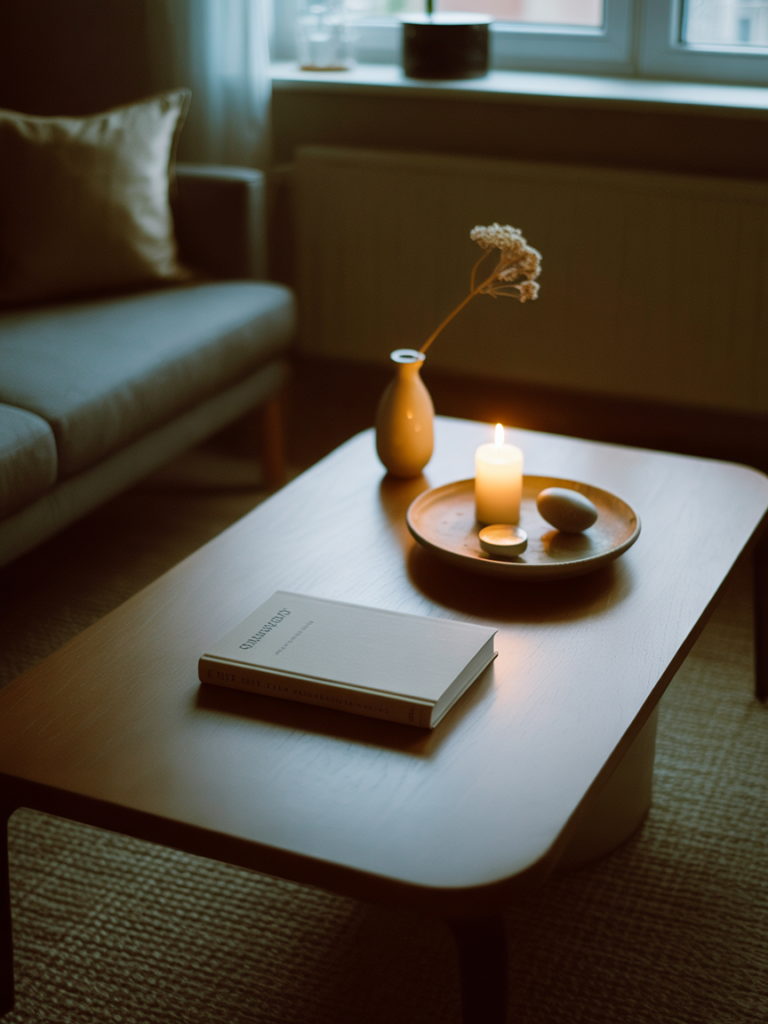
The coffee table is the living room’s centerpiece, and most people either leave it completely empty (clinical) or pile it with things (chaotic). The middle ground is styling — and it follows the same logic as bookshelf editing.
Work in zones and layers. A tray creates a contained zone. Inside the tray: a candle, a small sculptural object, maybe a coaster stack. Outside the tray: a stack of two or three coffee table books and a small potted plant or a single stem in a bud vase.
That’s it. That’s the whole formula.
The books are important — they add color, personality, and physical height variation. But they need to be books you actually love, not just books that looked good in the shop. People notice when the coffee table books are performative.
For apartment living rooms, I lean toward round or oval coffee tables over rectangular ones. They take up the same floor space but leave more visual breathing room because there are no corners catching the eye.
12. The Color Combination That’s Going to Be Everywhere Next Year (Save This Now)
I’ve been watching enough rooms, enough mood boards, and enough actual apartment reveals to feel confident saying this: the color combination taking over aesthetic apartment living rooms right now is warm terracotta + deep olive green + aged cream + touches of rust.
It sounds earthy. It is earthy. But it’s also warm, rich, interesting, and utterly cozy in a way that the cool grey-white-black palette of the last decade never quite managed to be.
Think: cream boucle sofa, a single deep olive accent chair, terracotta cushions in two different sizes and textures, a faded cream and rust vintage-style rug, natural wood surfaces, and aged brass hardware. Linen curtains in warm white dropping from ceiling to floor. A large arch mirror leaning against one wall. A trailing pothos on the bookshelf.
This is not a trend that photographs beautifully and then looks weird in person. It looks better in person. It looks like a room built around comfort and warmth rather than Instagram performance.
Which is exactly what your apartment living room should be.
—
🌿 Quick Tips
Swap every bulb in your living room to a warm white (2700K) before you buy a single new piece of decor. It costs almost nothing and it changes everything. Your room’s existing furniture will immediately look better.
Stop buying small decorative objects to “add personality.” Personality comes from large, specific pieces that mean something — one great print, one unusual lamp, one beautiful throw. Clutter doesn’t feel curated, it just feels like clutter with effort.
If your sofa feels dated, a sofa cover in a bouclé or linen texture is worth the gamble. A well-fitted cover in cream or sage can completely reset the energy of a room for under $100.
Always buy your curtains longer than you think you need. Floor length, always. Curtains that stop above the floor date a room faster than almost anything else.
Group your plants together rather than scattering them. Three plants in the same corner creates a moment. Three plants dotted randomly around the room just reads as houseplants.
—
❓ FAQ
Q: What’s the best paint color for a dark apartment living room? A: Counterintuitively, going darker often works better than trying to fake lightness with white. A warm greige, dusty terracotta, or even a deep sage can make a dark room feel intimate and deliberate rather than just gloomy. If you’re set on light, choose a warm white with yellow or pink undertones rather than a cool stark white — cool whites look grey in low natural light.
Q: How do I make my apartment living room look expensive on a budget? A: Spend on the things the eye dwells on longest: the rug, the curtains, one main piece of art, and the lighting. Everything else can be inexpensive. A cheap sofa with a great throw and real cushions in quality fabric looks far more expensive than a cheap sofa with cheap accessories. Edit ruthlessly and stop filling space for the sake of it.
Q: Can I really use dark colors in a small living room without it feeling claustrophobic? A: Yes — with two conditions. First, your lighting needs to be warm, layered, and coming from multiple low sources rather than one cold overhead. Second, your larger textiles (curtains, sofa, rug) should maintain some contrast so the room doesn’t become a single tone from floor to ceiling. Dark walls with a cream sofa and warm lighting is a deeply beautiful combination in small rooms.
—
💭 Final Thought
The best apartment living rooms I’ve ever seen weren’t decorated by people who spent the most or had the most space. They were created by people who made a decision about how they wanted their room to feel — and then made every single choice in service of that feeling.
Cozy, warm, considered. Like somewhere you genuinely want to be at the end of a long day.
What feeling are you designing your living room around?