The Color Rules Nobody Told You About (That Are Making Apartment Living Rooms Look This Good)
You moved in. The walls are white. The floors are beige. And somehow the whole place feels like a waiting room. You know color is the answer — you’ve pinned a hundred rooms that made your heart do something — but you don’t know where to start without it looking chaotic or accidental. This is where we start.
—
1. Why “Just Add a Colorful Throw” Is Terrible Advice (And What Actually Works)
Here’s the thing about colorful throws: they’re not wrong. They’re just not enough. A folded blanket on a beige sofa in a beige room doesn’t add color — it whispers into the void. Real color in a living room isn’t about accessories. It’s about committing.
The rooms that stop you mid-scroll on Pinterest aren’t wearing color the way you’d wear a necklace. They’re wearing it the way you’d wear a coat — it is the outfit. That might mean a sofa in deep teal or dusty terracotta. It might mean painting the inside of a bookshelf a completely unexpected shade of forest green while the walls stay white. It might mean a rug so rich and saturated that everything else just orbits around it.
What doesn’t work is hedging. When you put a pale blush pillow on a grey sofa against a grey wall, you’re not doing minimalism. You’re doing indecision. And there’s a difference.
Start by identifying the one color you’d be genuinely excited to live with every day. Not the one that feels safest. The one you keep coming back to when you’re scrolling at midnight. Build from there.
“The rooms that make you stop scrolling aren’t dabbling in color — they’re committed to it.”
—
2. The Unexpected Color Combo That’s All Over Every Beautiful Living Room Right Now
Burnt orange and dusty pink. Stop. I know. Stay with me.
These two colors together feel like late afternoon in September. They’re warm without being aggressive, bold without being loud. And they look extraordinary in apartments where the bones are neutral — white walls, light wood floors, nothing dramatic happening structurally. Because those rooms need warmth more than anything else, and this combination delivers it in spades.
You don’t need to go all in at once. A rust-colored velvet sofa paired with a blush linen armchair is enough. Add a terracotta pot or two, a warm-toned gallery wall, maybe a patterned rug that bridges the two shades — something with ochre threading through it — and suddenly the room has a personality. A season. A feeling.
This pairing works in UK terrace houses and American apartments alike because it doesn’t fight with period features or modern ones. It plays nicely with wooden floors, exposed brick, painted radiators, and bare concrete. It’s the color story that works when nothing else seems to.
—
3. The One Wall Treatment That Makes a Rented Apartment Feel Like a Home You Own
You can’t always paint. That’s the rental reality for most of us, on both sides of the Atlantic. But a feature wall doesn’t require paint. It requires a commitment to a single surface — and the willingness to do something intentional with it.
Large-format removable wallpaper has gotten genuinely good. Not the slightly sticky, slightly shiny stuff from a decade ago. Real, beautiful, pattern-forward wallpaper that goes up clean and comes down without a fight. A floor-to-ceiling botanical print in deep sage and cream can completely transform a blank white wall. A geometric pattern in cobalt and terracotta can give a small living room the kind of depth that even actual paint sometimes doesn’t achieve.
If wallpaper isn’t your thing, consider gallery walls done with serious intention. Not a cluster of mismatched frames in slightly different sizes — a curated collection with a clear color palette, consistent matting, and thoughtful spacing. The frames can vary, but the story they tell should feel unified. Pick artwork that uses your room’s core palette and let the wall become a piece of the room, not just something hanging on it.
Even a collection of large-scale woven wall hangings in natural fibers can warm a rental wall dramatically, especially against white. The texture alone does half the work.
—
4. The Color That Photographs Beautifully, Lives Beautifully, and Still Surprises Everyone Who Sees It
Sage green. It’s been having its moment for a while now — but unlike a lot of trends, this one hasn’t aged badly. It looks beautiful in morning light. It looks beautiful at night. It makes every plant in the room look intentionally placed. It makes neutral furniture look considered rather than lazy.
What makes sage green work so well in apartments specifically is its flexibility. It’s not demanding. A sage green sofa in a small space doesn’t swallow the room the way a navy or forest green can. It reads as sophisticated but not heavy, colorful but not chaotic. Pair it with warm woods, aged brass hardware, off-white linen, and a cream-colored rug and you have a room that feels like it cost three times more than it did.
“Sage green is the color that makes everything around it look like it was chosen on purpose.”
In the UK, it plays beautifully with period properties — it has a heritage softness that suits Victorian terrace houses, Georgian flats, and mid-century semis without trying too hard. In US apartments, it brings an organic softness to boxier modern spaces. Either way: it earns its place.
—
5. The Rug Trick That Interior Designers Use to Make Small Living Rooms Feel Bigger and More Colorful at Once
Go bigger than you think you should. Always.
This is the note every interior designer gives and every homeowner ignores because large rugs feel like a commitment and a budget stretch. But a small rug floating in the center of a living room — with the sofa legs hanging off the edges — is one of the most reliable ways to make a room feel cheap and unfinished, no matter how nice the furniture is.
A large, colorful rug anchors the whole room. It defines the space. In open-plan apartments where the living area bleeds into a kitchen or dining space, a rug is the only thing that creates a psychological boundary. And when that rug has color — a Moroccan-style beni ourain with bold geometric patterns, a vintage-inspired kilim in warm reds and mustard, a deep jewel-toned Persian — the whole room shifts.
The rule is simple: all the front legs of your sofa and chairs should sit on the rug. Ideally all four legs of everything. The rug should be large enough that it doesn’t look like a postage stamp in the space. An 8×10 is a good starting point for most living rooms. If you can go larger, go larger.
—
6. Velvet Is Still the Best Fabric You Can Buy for a Colorful Living Room. Here’s Why.
It holds color differently than any other fabric. That’s the whole answer, really.
A velvet sofa in forest green looks like it’s lit from within. A velvet cushion in cobalt blue catches light in a way that makes the color almost three-dimensional. Velvet doesn’t just display color — it performs it. And in a living room where you’re trying to make color the central character, that performance matters.
It’s also incredibly practical in a way people forget. Good quality velvet is durable, easy to wipe down (counterintuitively), and tends to age gracefully rather than pilling or fading quickly. A velvet sofa bought five years ago often looks better than a fabric one bought at the same time.
For apartments specifically, a velvet sofa in a bold color is one of the highest-impact single purchases you can make. It doesn’t require you to paint walls or invest in expensive art. The sofa becomes the statement. Everything around it — neutral cushions, a wooden coffee table, a simple floor lamp — supports the color rather than competing with it.
Go emerald. Go mustard. Go a deep, moody plum. Just go.
—
7. How to Use Maximalism Without Making Your Living Room Look Cluttered
The difference between maximalism and clutter is intention.
Clutter happens when things accumulate without a story. Maximalism happens when things accumulate with one. In a maximalist living room, every object has been chosen — the quirky vintage lamp, the stack of art books on the floor, the collection of ceramic vases in graduating shades of blue, the heavily patterned throw that shouldn’t work with the patterned rug but somehow does. None of it is accidental.
The practical rule is this: repeat your colors. If you have mustard in the rug, have mustard somewhere on the shelves, in a candle, in a piece of art, in a plant pot. Colors that echo across a room are what make maximalism feel curated rather than chaotic. The eye travels around the room and recognizes a conversation happening. That recognition is what people mean when they say a room “flows.”
“Maximalism isn’t about having everything. It’s about making everything mean something.”
Also: height. Maximalist rooms that feel intentional use vertical space. Tall bookshelves, stacked artwork, large floor plants, curtains that run from ceiling to floor. The vertical drama signals choice, not accumulation.
—
8. The Color Combinations That Feel Fresh Right Now (Not Five Years Ago, Right Now)
Cobalt blue and natural linen. This is the combination that keeps appearing in the rooms I find most exciting at the moment — deeply saturated blue against soft, undyed fabric. It’s graphic without being cold, natural without being boring.
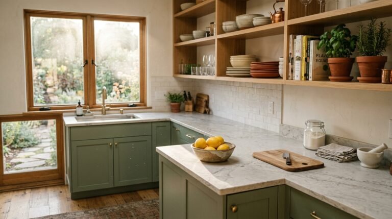
Terracotta and sage green together are still going strong, and I don’t think they’re going anywhere. There’s something almost botanical about them — like the earth and the plant growing out of it. They work in small doses or large ones.
Deep plum paired with blush pink is more unexpected than it sounds. The plum anchors the pink and stops it from feeling too sweet. Together they feel grown-up and a little glamorous without trying too hard.
Mustard and navy is the combination that was everywhere a few years ago and has now settled into genuine classic status. It’s reliable in the way that stripes are reliable — you can almost always make it work.
And the one I’m personally excited about right now: dusty lilac paired with warm wood tones. Lavender has been waiting for its interior moment for years, and the dusty, grayed-down version of it is finally delivering.
—
9. Plants as Color — The Part Most People Forget Entirely
Green is a color. Obviously. But most people treat their houseplants as accoutrements rather than as part of the room’s color story — and then wonder why the palette feels incomplete.
A large fiddle-leaf fig in the corner of a living room adds a specific, saturated green that no cushion or rug can replicate. A cluster of trailing pothos on a high shelf brings movement and a lighter, more playful green into the upper part of the room. A collection of succulents in terracotta pots on a windowsill bridges the room’s palette with the exterior light.
If your living room has a warm palette — terracotta, burnt orange, mustard — choose plants with deep, dark green leaves to create contrast. Rubber plants, ZZ plants, and monstera all do this beautifully. If your palette is cooler — sage, dusty blue, blush — lighter greens work better. Pothos, string of pearls, and maiden hair ferns have a softer, more muted green that harmonizes rather than fights.
The pots matter as much as the plants. Terracotta is always beautiful. Matte ceramics in warm whites and creams are easy. But an unexpected pot — a cobalt blue one, a hand-painted Moroccan one, a vintage brass planter — can anchor a plant as a genuine piece of decor rather than an afterthought.
—
10. The Gallery Wall Approach That Actually Looks Intentional (Not Just Busy)
The problem with most gallery walls is that they try to include everything. Every print from every trip, every framed photo, every piece of art accumulated over a decade of adulthood — all on one wall, in frames bought separately at different times, in sizes that don’t quite harmonize.
The gallery walls that stop you on Pinterest do something different. They choose a palette and stick to it. Three to four colors, maximum, across all the artwork. They choose a frame style — whether that’s matching black frames for graphic impact, mismatched antique frames for an eclectic feel, or a mix of framed and unframed canvases for a more organic look — and they commit. They include at least one large piece that anchors everything else, so the wall doesn’t feel like a collection of small things nervously clustered together.
For a colorful living room, your gallery wall should amplify the room’s core palette, not introduce new ones. If you’re building a room around teal and warm woods, your gallery wall shouldn’t suddenly introduce the entire rainbow. Pull from your palette, deepen it, use art to show what your color story looks like in different textures and proportions.
—
11. The Lighting Change That Makes Every Color in Your Living Room Richer
Swap your white daylight bulbs for warm white ones. Do it this weekend. It costs almost nothing and it will change the way your room looks at every hour after five pm.
Warm white bulbs — around 2700K on the color temperature scale — cast light that does something extraordinary to saturated colors. That teal sofa gets richer. The mustard cushions glow. The terracotta walls (or terracotta pots, or terracotta throw) look like they’re lit from within. The amber warmth of the light amplifies warm tones and softens cool ones in a way that makes the whole room feel inhabited, considered, alive.
Ceiling lights are rarely the answer in a living room. What you want is layered light — a floor lamp in one corner, a table lamp on a side table, perhaps a small lamp on a bookshelf. Multiple light sources at different heights create pools of warmth throughout the room rather than a single flat wash from above. In the evenings, that layered warmth is the thing that makes a colorful room feel genuinely inviting rather than just interesting.
—
12. The Small Detail That Pulls Every Colorful Living Room Together (Most People Skip It)
Your curtains.
I mean it. Curtains — or rather, the absence of good curtains — are what lets down more colorful, carefully styled living rooms than almost any other single element. Thin, short, beige curtains in an otherwise vibrant room are like wearing trainers with a dress. Technically fine. But it shows.
Curtains should be floor-length. Always. They should hang from as close to the ceiling as you can manage, which makes the room feel dramatically taller. And in a colorful room, they should do something — whether that’s a bold patterned fabric that brings your whole palette together, a deeply saturated solid that echoes your accent color, or a rich textured linen that adds warmth and movement without competing.
In rental apartments where you can’t drill into the wall freely, tension rods and adhesive curtain brackets have both improved significantly. The investment in decent curtains is one of the highest-return home updates you can make. They change the scale of the room. They frame the light. They make the space feel finished in a way that no number of cushions or candles can replicate on their own.
—
🌿 Quick Tips
Repeat each color at least three times around the room — on different surfaces, in different textures — or the color will feel accidental rather than intentional. Your eye needs to travel to feel settled.
If you’re nervous about a bold sofa color, test the depth of your commitment by buying a large piece of art in that color first. Live with it for a month. If you love it that much, the sofa will feel easy.
Don’t match your metals. Mixed metallurgy — brass lamp, chrome candle holders, copper picture frames — reads as collected and considered, not mismatched. The key is to have one dominant metal and let the others be supporting characters.
Bookshelves are an underused opportunity for color. Paint the backs of your shelves a deep, moody color — navy, forest green, deep burgundy — and suddenly your book collection becomes part of a styled vignette rather than just a pile of books.
Scent and color are linked in the brain more strongly than you’d think. A room that smells of sandalwood, cedar, or amber feels warmer, and warm rooms feel more colorful. Don’t overlook it.
—
❓ FAQ
Q: How do I add color to a living room when my landlord won’t let me paint? A: You have more options than you think. Large removable wallpaper (look for peel-and-stick options from brands like Chasing Paper or Sian Zeng in the UK) is excellent now. Beyond that, the most impactful moves are a bold, colorful sofa or large rug, floor-length colorful curtains, and a considered gallery wall. These four elements together will completely transform a rented white-walled room without touching a single surface permanently.
Q: Can I mix patterns and bold colors without it looking chaotic? A: Yes — the trick is to keep your color palette tight. You can mix a striped cushion, a floral rug, and a geometric throw as long as they’re all pulling from the same three or four colors. Vary the scale of the patterns too: a large bold print pairs well with a smaller repeat pattern and a simple solid. The variety in pattern with consistency in color is what makes it feel layered rather than loud.
Q: What’s the best way to introduce color if I’m genuinely nervous about committing? A: Start with a rug. A colorful rug is the single safest bet because it sits below eye level, doesn’t dominate the visual field the way a sofa or wall does, and can be rolled up and moved if you change your mind. Buy the most colorful rug you feel genuinely excited about — not the one that feels safest — and let everything else respond to it. Most people find that once the rug is down, adding more color everywhere else starts to feel natural.
—
💭 Final Thought
Color in a living room is ultimately about having the confidence to say: this is how I want to feel in this space. Not how a staging guide thinks you should feel. Not how it’ll look to someone else on a theoretical viewing day. How you want to feel at seven in the evening when you’re tired and you come home and you sit down and you look around.
The rooms that stay with you — the ones you’ve pinned a hundred times — are the ones where someone made a decision and meant it.
So what’s the color you keep coming back to?