The Small Living Room Color Rules Nobody Told You (That Actually Work)
You walk into a tiny living room and immediately feel it — that squeeze. Not just physical, but psychological. Like the walls are quietly closing a deal you didn’t agree to. Here’s the thing nobody says out loud: the furniture isn’t your biggest problem. The color is.
—
1. Why Your Small Living Room Feels Smaller Than It Actually Is
It’s almost never the square footage. I’ve been inside 280-square-foot studio apartments in New York and 320-square-foot flats in South London that felt genuinely spacious, even generous. And I’ve stood in living rooms with plenty of floor space that felt suffocating the second you walked through the door.
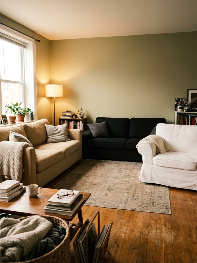
The culprit, almost every single time, is visual fragmentation. Too many colors competing. Too many tones that don’t speak to each other. A gray sofa here, warm beige walls there, a cool-toned rug underneath, and suddenly your eye doesn’t know where to land. It keeps moving, restlessly, looking for rest it can’t find. That constant visual searching is exactly what creates the claustrophobic feeling you blame on size.
The fix isn’t painting everything white. It isn’t removing everything you love. It’s about creating a visual conversation between the colors in your room so that your eye moves through the space with ease rather than tripping over contrast at every turn. Once you understand this, everything else about decorating small spaces starts to make sense.
“The room isn’t too small. The colors are just arguing with each other.”
2. The Color That Keeps Showing Up in Every Beautiful Small Living Room Right Now
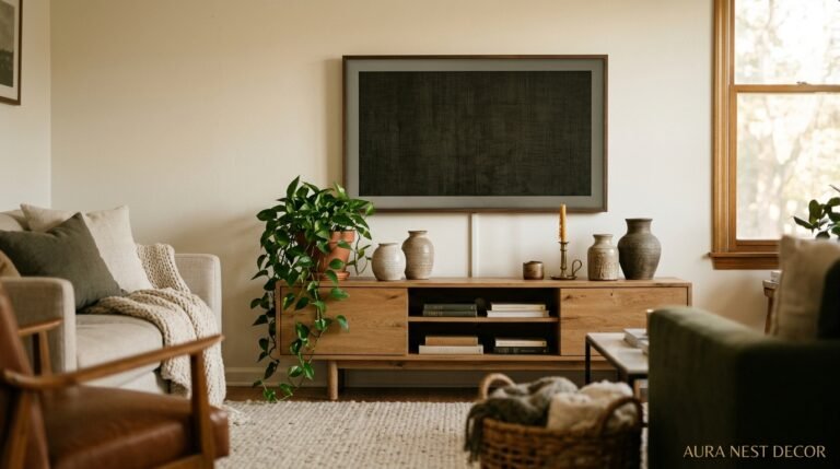
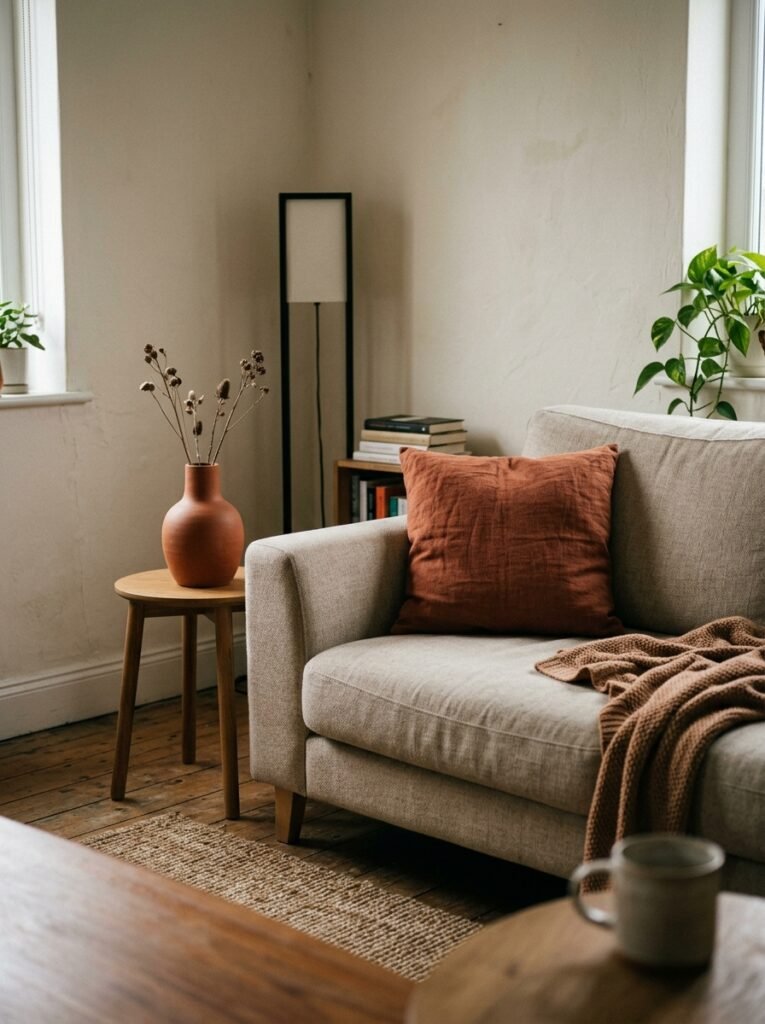
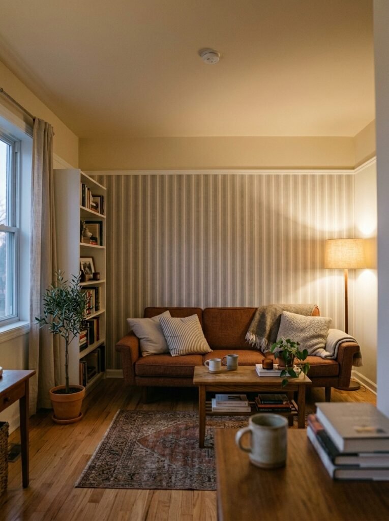
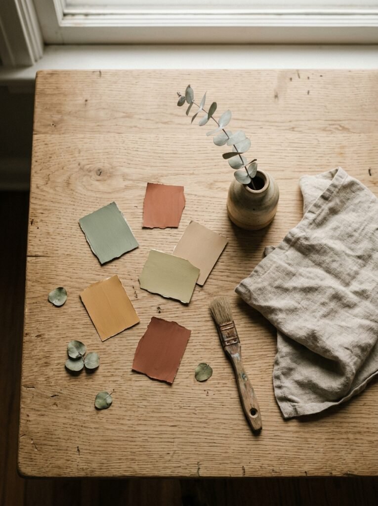
Warm putty. Not beige, not greige, not cream — putty. There’s a specific undertone we’re talking about here: slightly pink, faintly dusty, with just enough warmth that it catches afternoon light and glows without being loud. It’s the color your walls look in a photograph you didn’t even mean to take but saved anyway.
Benjamin Moore’s “Pale Oak” does it. So does Farrow & Ball’s “Peignoir,” which skews a little more lavender depending on your light. “Elephant’s Breath” — one of Farrow & Ball’s most beloved shades — sits right in this family. These aren’t white. They’re not quite neutral. They’re something better: a color that makes everything else in the room look intentional.
What makes putty work in small spaces is that it doesn’t fight. It lets your furniture be the point of interest. It creates a seamless visual flow across the walls so that your eye glides rather than stops. And because it’s warm, it makes a room feel inhabited and cozy rather than clinical. If you’ve been bouncing between paint samples for months, start here. You probably won’t leave.
3. The One-Color-Three-Tones Rule That Makes Tiny Rooms Feel Intentional
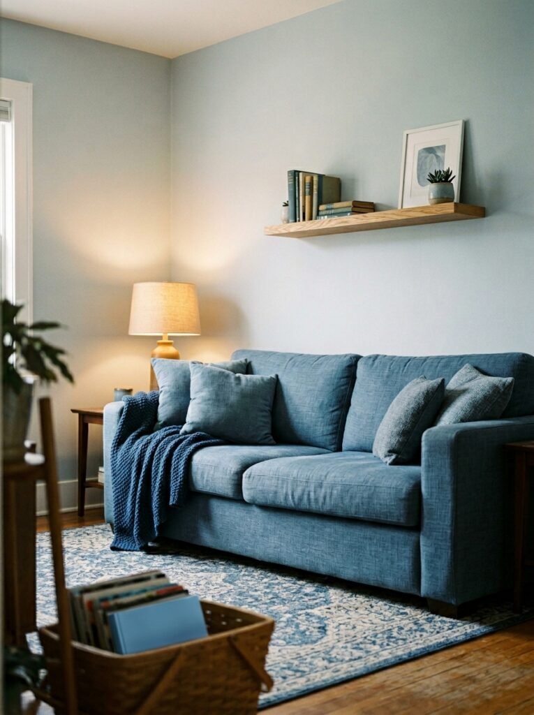
Here’s the principle that changed how I think about small space color: choose one color family, then layer three tones of it. A deep version, a mid version, and an almost-neutral version. All from the same color parent.
Say you love dusty blue. Your deep tone goes on a single accent wall or a piece of furniture — something like Valspar’s “Slate Quarry.” Your mid tone becomes a throw, a lampshade, a set of cushion covers. Your near-neutral version — a soft, barely-there blue-gray — goes on the walls. Everything in the room is essentially one color, but the layering creates depth and dimension that reads as sophisticated rather than monotonous.
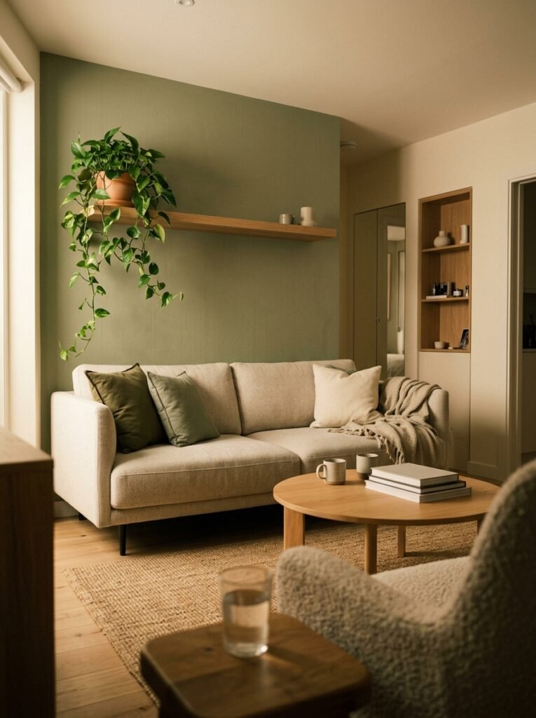
This works for every color family. Sage and forest green with a barely-there mint on the walls. Warm terracotta with caramel and a pale blush base. Charcoal with steel and soft silver. The key is that every element is in conversation with the others. There’s no visual interruption. And in a small room, that uninterrupted flow is what makes the space feel twice as large as it measures.
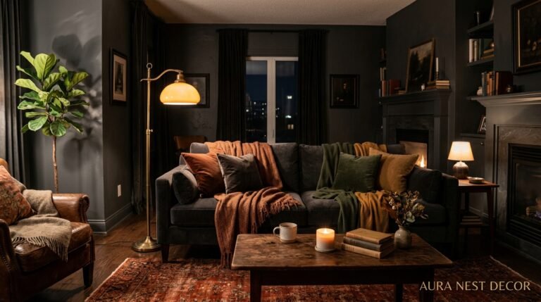
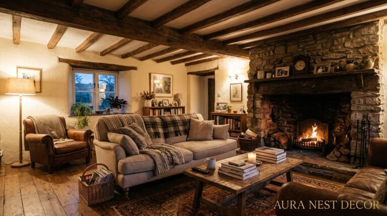
4. What to Do With a Dark North-Facing Room (Because White Won’t Save You)
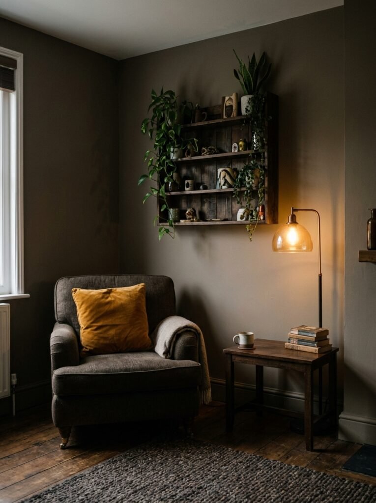
North-facing rooms in the UK especially — and plenty across the northern US — get a cold, blue-gray light that makes white walls look actively depressing. I cannot tell you how many times I’ve seen someone paint a north-facing room white to “brighten it up” and end up with something that looks like a hospital waiting room at 4pm in November.
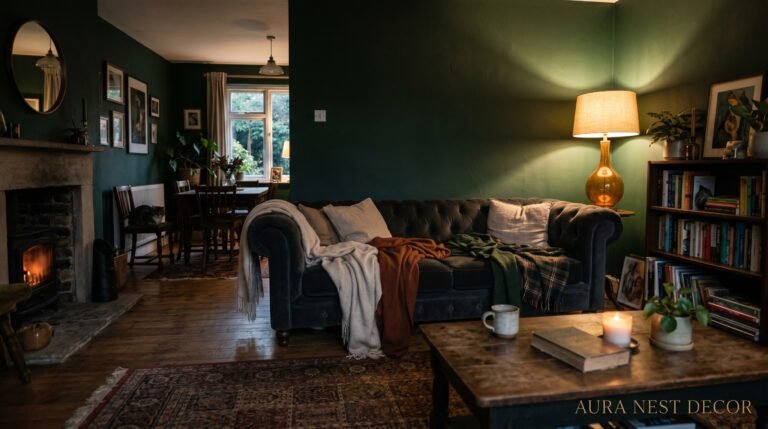
The counterintuitive answer is to go warm and deep. A rich terracotta. A deep warm olive. A burnt amber. Lean into the coziness that the room is naturally pulling toward rather than fighting it. Rooms with low light don’t become bright with white — they become cold and flat. But paint them in Farrow & Ball’s “Eating Room Red” or Little Greene’s “Aged Copper” and suddenly that darkness becomes atmosphere.
“A north-facing room isn’t a design problem. It’s an invitation to go dramatic.”
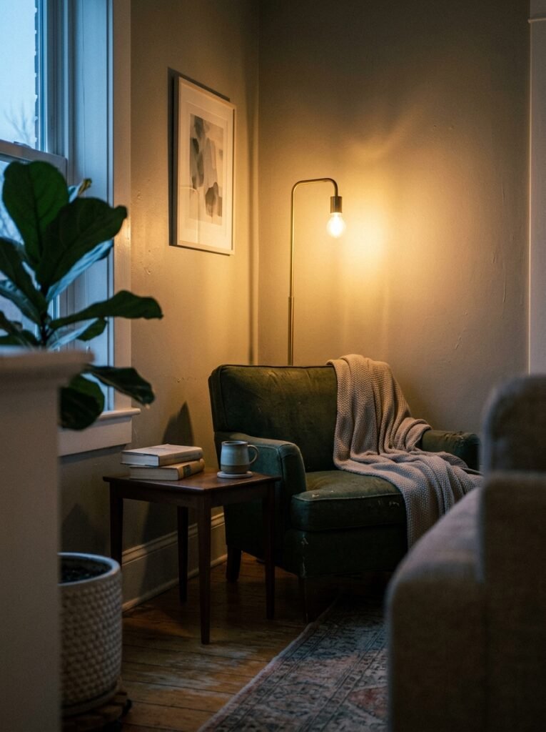
For furniture, choose pieces in warm woods — oak, walnut, anything with amber undertones. Keep your lighting layered: an overhead light is never enough in a north-facing room. Add floor lamps, table lamps, maybe a wall sconce or two. That amber glow of a warm-toned bulb at 7pm against a deep-painted wall is one of the most beautiful things a small living room can achieve.
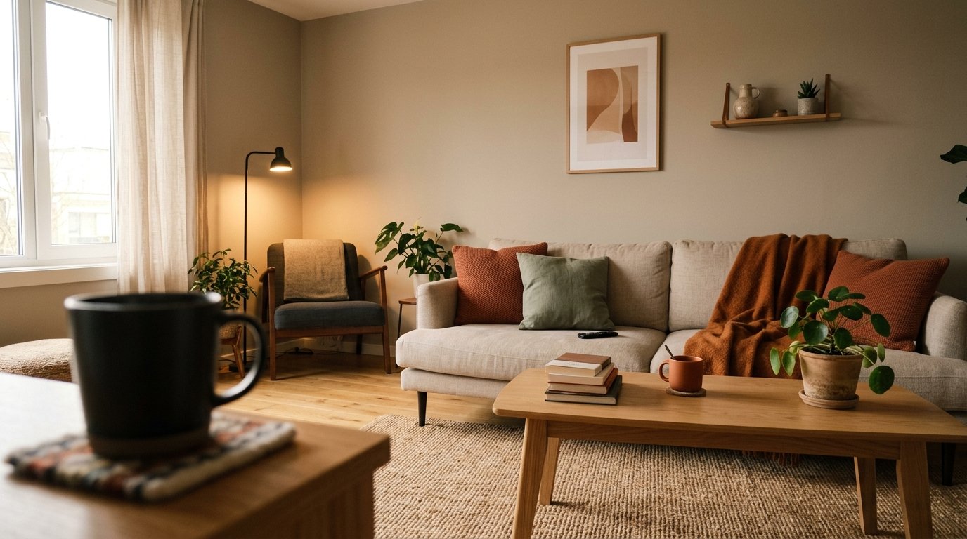
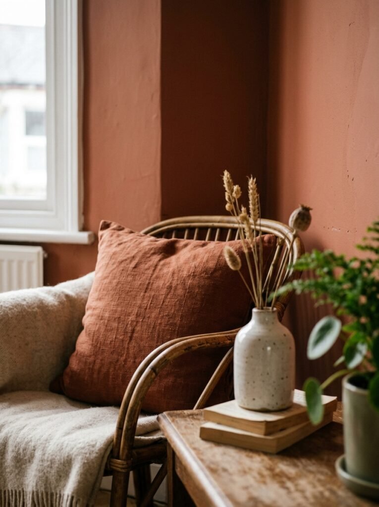
5. The Accent Color Formula That Pinterest’s Most-Saved Rooms Always Follow
Look at the small living rooms that stop your scroll. Save fifty of them and compare. I promise you’ll find a pattern. Almost every single one uses the same underlying formula for accent color: one warm neutral base, one mid-tone anchor color, and one deeply saturated pop used sparingly — maybe twice in the room, never more than three times.
The pop is what people call the accent color. But what most people get wrong is using it too freely. An accent color loses all its power when it’s everywhere. One terracotta throw pillow and a terracotta ceramic vase on the shelf — that’s enough. It’ll sing. Add a terracotta rug and terracotta curtains and terracotta candle holders and suddenly nothing is accented; everything is just orange.
The rooms that people save obsessively are the ones where the accent color feels like punctuation. A comma. A period. Not the whole sentence. Think of it like a dot of really good hot sauce — used right, it makes everything better. Used everywhere, it’s just heat with no flavor.
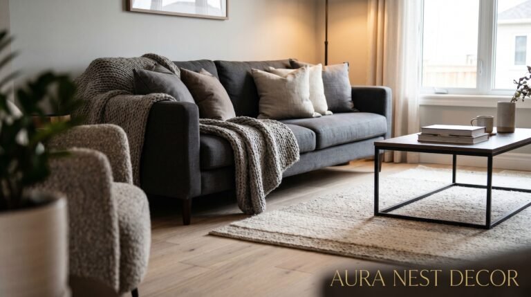
6. Why Monochrome Isn’t Boring — You’re Just Doing It Wrong
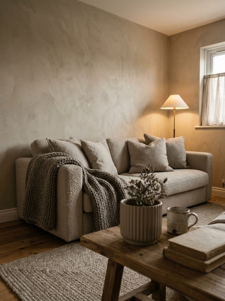
Monochrome gets a bad reputation in the small-space conversation because people imagine it means flat. One color. Nothing going on. But monochrome done well is actually one of the most dynamic and visually interesting approaches you can take in a small room, because it forces you to do something most people skip entirely: vary texture aggressively.
When your entire room is shades of warm cream — cream linen sofa, cream knit throw, cream plaster-effect walls, brass accessories — the texture becomes the decoration. The weave of the cushion fabric. The shine of a ceramic lamp base. The roughness of a jute rug against the smoothness of a marble side table. All of that sensory variety happens within a single color palette, and it creates a richness that a room with five competing colors rarely achieves.
This is the secret to why those Scandinavian and Japandi-influenced rooms look so serene and so beautiful. It’s not restraint for its own sake. It’s restraint in color so that texture and form can do the heavy lifting.
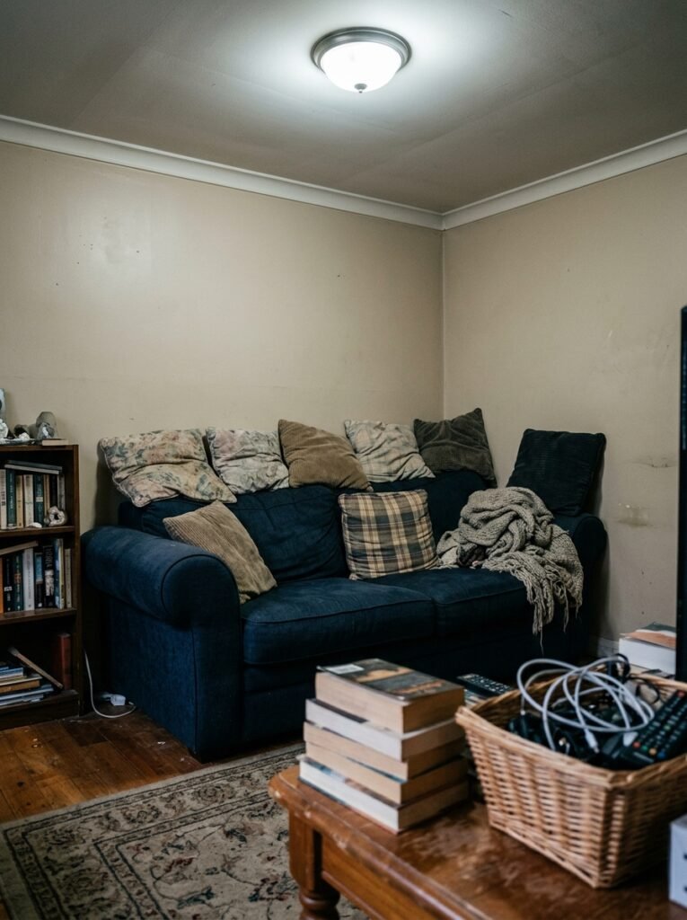
7. The Sofa Color That Works in Every Small Living Room (And Two That Don’t)
Your sofa is taking up 30% of the visual real estate in a small living room. The color you pick is the most important color decision in the whole room — not the walls, not the rug.
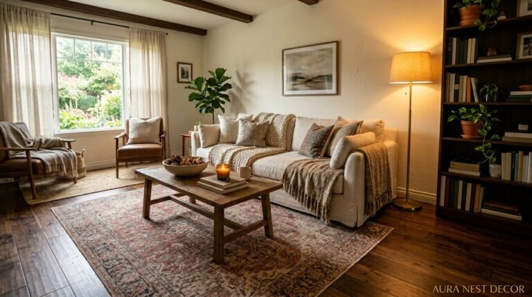
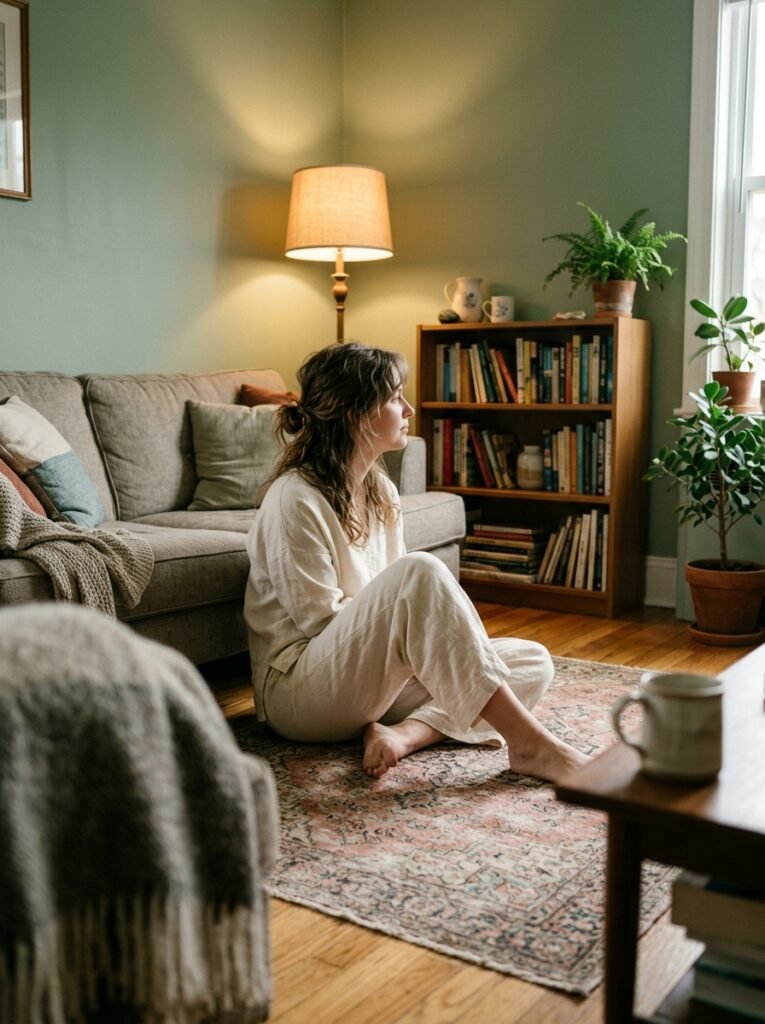
The one that works almost universally? A warm mid-tone. Think dusty linen, camel, mushroom, or a soft sage. Something that has color and personality but doesn’t shout. These tones anchor the room without dominating it. They’re warm enough to feel inviting, neutral enough to let you change everything around them without buying a new sofa.
“Your sofa is the sun. Everything else orbits it.”
The two that cause problems in small rooms: pure white or cream (marks, stress, constant anxiety — not worth it unless you live alone and never eat near it), and very dark charcoal or navy on a sofa that faces a dark wall. That combination absorbs light and makes the room feel smaller than a tent. It can absolutely work — but you need to compensate hard with very warm, very layered lighting. The room can’t afford any more light-eating after that.
8. How to Use Pattern Without Making a Small Room Feel Chaotic
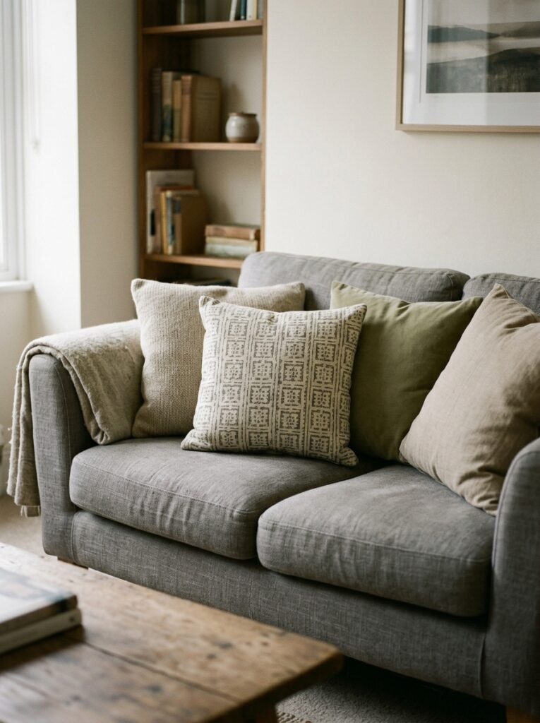
Pattern is not the enemy of small rooms. Bad pattern placement is. The rule I’ve come back to again and again: keep pattern below eye level whenever possible. Rugs, cushions, a single patterned footstool. Pattern at floor or seat level adds visual interest without making the walls close in.
If you’re putting pattern on the walls — wallpaper or an accent wall — go for something vertical. A narrow stripe, a tall botanical print, a geometric that reads upward. Vertical lines draw the eye up toward the ceiling, which visually adds height. That perceived height changes how large the room feels in the most immediate and satisfying way.
And scale matters more than people realize. A small pattern on a big sofa disappears into noise. A large-scale pattern — oversized florals, bold geometric — on one cushion or in a small frame looks confident and considered. Scale the pattern to the item, not the room.
9. The Color Trick That Makes Low Ceilings Disappear
Paint your ceiling the same color as your walls — or go a shade lighter. This breaks every rule you learned in design school or from your mother, and it’s worth it every single time.
When the ceiling is bright white and the walls are any other color, you’ve created a visual box. The white ceiling sits like a lid on the room. The eye sees exactly where the room ends. But when the ceiling flows seamlessly into the same warm tone as the walls — or transitions so gently you barely notice it — the boundaries of the room become ambiguous. The eye can’t find the edge. The room feels bigger because the ceiling feels higher.
This works especially well with the warm putty tones we talked about earlier. A ceiling in Pale Oak or Peignoir, walls in the same shade, feels soft and enveloping rather than oppressive. Add crown molding painted in a barely lighter version of the same color and the effect is genuinely stunning. I’ve done this in a room with 7.5-foot ceilings and people have guessed it was over nine feet.
10. The Lighting Color Temperature That Changes Everything
This is where so many otherwise-beautiful small living rooms fall apart. The colors on the walls, the furniture, the textiles — they all look the way they look based on the light hitting them. And most people are living under the wrong light.
Warm white bulbs — around 2700K to 3000K — are what you want in a living room. Not cool white, not daylight. Warm white. The difference between a 2700K bulb and a 4000K bulb in a small living room is the difference between candlelight warmth and a GP surgery waiting room. The warm tone makes every color in the room look richer, deeper, more considered.
Dimmable bulbs change things even further. A living room that looks merely nice at full brightness becomes genuinely beautiful at 60% dimmed. The shadows soften. The colors deepen. The room suddenly has mood. This is the single cheapest upgrade you can make and it improves everything — the paint, the furniture, the whole room — without touching any of it.
11. The Modern Color Schemes Actually Working in Small Spaces Right Now
Forget the millennial-gray-and-white combo. It’s done. What’s working now — and showing up absolutely everywhere on Pinterest in both the US and UK — is warm modernism: the combination of contemporary clean lines with earthy, rooted, organic color.
The specific schemes getting the most saves right now: warm terracotta with aged brass and muted olive, on walls that are a barely-there sand. Sage green with natural linen and dark walnut, where the only real accent is a single piece of rich burgundy — a cushion, a small art print. And the warm cream monochrome we talked about, when done with genuinely interesting textures, is still having its moment and showing no signs of stopping.
What ties these together is that they all feel warm and collected rather than styled and decorated. There’s a deliberate sense that these rooms have been lived in, chosen slowly, added to over time. That “curated but imperfect” feeling is exactly what modern means in small spaces right now — not cold and minimal, but intentional and breathing.
12. The First Thing to Change If You Hate Your Living Room Colors Right Now
Don’t repaint. Not yet.
Before you commit to a new wall color — before you buy sample pots and tape squares and spend a weekend second-guessing yourself — change the soft furnishings. Swap your cushion covers. Add a new throw in a color you’ve been too nervous to try. Put a different rug in if you can. Take something away that’s been bothering you without you naming it.
You’ll be surprised how dramatically the room changes, and how much more clearly you can then see what the walls actually need. Sometimes it turns out the walls are completely fine and the problem was a rug that was pulling everything cold. Sometimes you confirm that yes, the walls absolutely need to go, but now you know exactly what color will work because you’ve already introduced it in a more forgiving way. Color in a room is a system. Change one part, and the whole thing recalibrates.
—
🌿 Quick Tips
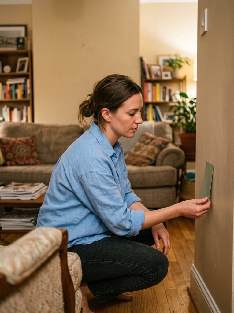
Start with one sample pot before you commit to a full wall — and test it in the actual light conditions of the room, morning and evening, not just midday.
If your room gets low light, avoid pure whites; go warm or go deep, because the in-between gray-whites look worst of all in cool light.
The curtains should always run from ceiling to floor — not from the window frame. Full-length curtains draw the eye up and make every room feel taller immediately.
When in doubt about an accent color, pull it from something already in the room — a book cover, a piece of art, a plant pot. The room already told you what it wants.
Keep your largest piece of furniture as close to your dominant wall color as possible. The less contrast between sofa and wall, the more expansive the room feels.
—
❓ FAQ
Q: What color should I paint a small living room to make it look bigger? A: Warm, mid-tone neutrals — putty, warm greige, pale sage — consistently outperform white in small rooms. The key is warmth and consistency: a color that flows across walls without interruption and plays nicely with your lighting. White only works if your light is naturally warm and your furnishings have enough texture to stop it looking clinical.
Q: Can dark colors work in a small living room? A: Absolutely — and often better than you’d expect. Dark colors work best in small rooms when they’re used with intention: all four walls, warm artificial lighting, and furnishings in warm wood tones or natural textures. The trick is committing fully. A half-hearted dark accent wall often looks worse than going all-in.
Q: How do I make a modern small living room feel cozy without it looking cluttered? A: Layer your textures rather than your objects. A cozy feeling comes from sensory richness — linen, knits, ceramic, wood — not from quantity of things. Choose furniture with soft edges or curved lines, keep lighting warm and layered, and let your color palette stay cohesive. Cozy and minimal are not opposites; they’re actually natural partners.
—
💭 Final Thought
Small rooms are not a consolation prize. They are, in some ways, the more interesting design challenge — the one that asks you to be more deliberate, more decisive, more you. Every color you choose matters more. Every piece earns its place. And when you get it right, a small living room can feel like the most considered, most personal, most quietly beautiful space in the whole house.
What’s the one color you’ve always wanted to try but talked yourself out of?