
How to Use Orange in Your Apartment Living Room Without It Feeling Like a Fast Food Chain
There’s a moment — maybe you’ve had it too — when you walk into someone’s living room and something just feels right. The light is warm, the colors hum together, and you leave thinking: I want my home to feel like that. Orange might not be the first color that comes to mind when you’re chasing that feeling. But it absolutely should be.
—
1. Why Orange Deserves a Second Chance in Your Living Room
Orange has a reputation problem. Somewhere between the avocado kitchens of the 1970s and fast-casual restaurant chains, orange got unfairly typecast as loud, overwhelming, or — worst of all — tacky. But here’s what interior designers on both sides of the Atlantic quietly know: orange, used thoughtfully, is one of the most emotionally intelligent colors you can bring into a living room.
It’s warm without being aggressive, vibrant without screaming for attention, and deeply rooted in some of the most beautiful design traditions in the world — from Moroccan riads to mid-century Scandinavian apartments. The secret isn’t the color itself. It’s how you use it.
If you’re living in a rented apartment in Chicago, a flat in East London, or a starter home in the suburbs, orange gives you something that perfectly curated beige rooms simply can’t: personality. And in a space where you’re spending most of your indoor hours, that matters more than you might think.
“Orange doesn’t decorate a room — it animates it.”
2. Understanding the Orange Spectrum Before You Commit to Anything
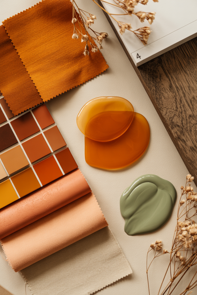
Before you buy a single cushion or commit to a paint tin, spend a week noticing orange in the world around you. Not all oranges are created equal, and this is where most people go wrong — they think of orange as one thing when it’s actually an entire family of distinct tones, each with its own mood and personality.
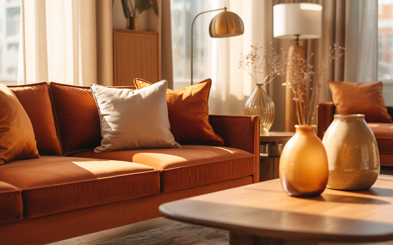
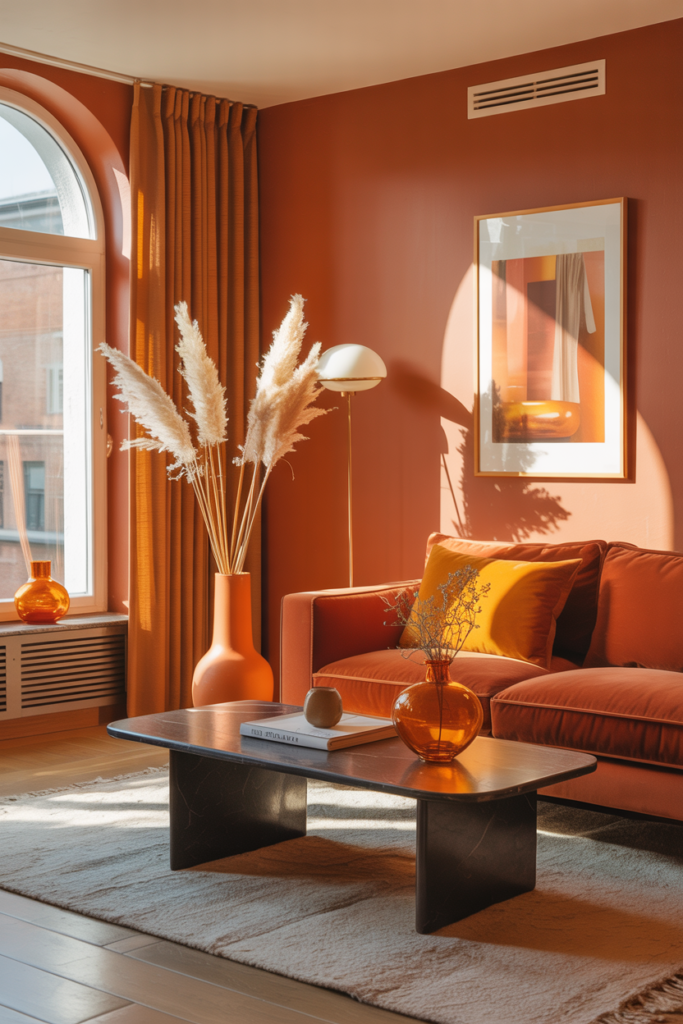
Burnt orange is deep, earthy, and sophisticated — think autumn leaves or the clay walls of Santa Fe. It sits beautifully alongside dusty greens, warm creams, and dark wood tones. Terracotta leans towards rust and red, evoking Mediterranean terraces and sun-dried earth — it’s the color that made every British interior magazine’s shortlist in 2023 and hasn’t left since. Amber is more golden, almost honeyed, and works like a sunset trapped in your living room. Peach sits at the softer, more feminine end of the orange family — approachable, fresh, and surprisingly versatile.
For apartment living, burnt orange and terracotta tend to be the most forgiving. They read as neutral-adjacent in certain lights, which means you can use them generously without the room feeling like a Halloween display. Knowing which orange speaks to you is the entire foundation of getting this right.
3. The 60-30-10 Rule and Why It’s Your Best Friend Here
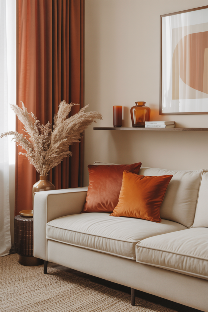
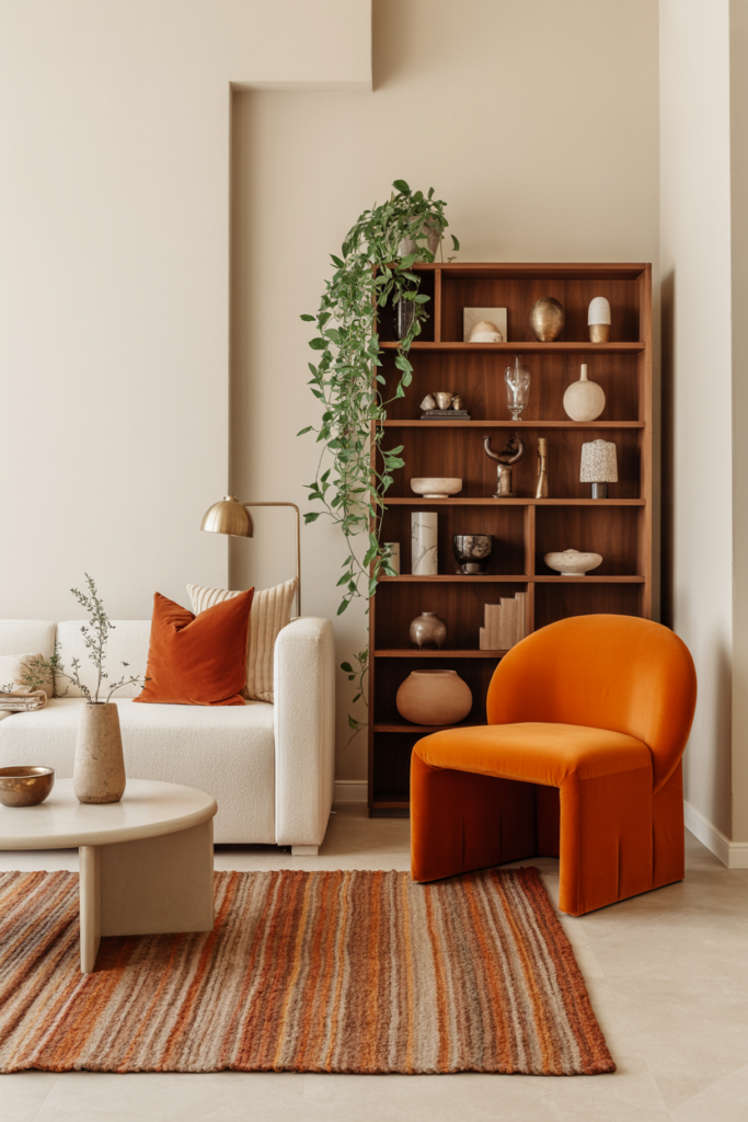
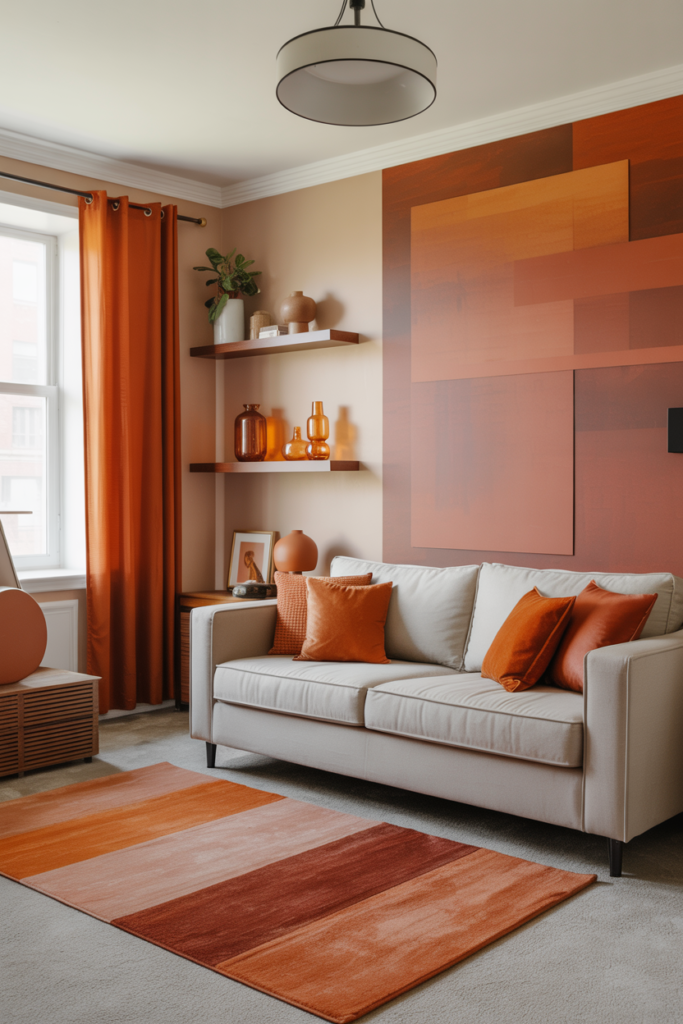
Interior designers rely on the 60-30-10 rule for a reason — it works, especially when you’re working with a bold color in a limited space. The idea is beautifully simple: 60% of your room is your dominant neutral (walls, large sofa, rug), 30% is your secondary color (curtains, accent chairs, shelving), and 10% is your accent color — in this case, your orange.
In a typical apartment living room, this might look like: warm white or oat-colored walls (the dominant 60%), a sage green sofa or linen-upholstered chair as your secondary (30%), and then burnt orange throw cushions, a ceramic lamp, a small side table, or a woven blanket as your vivid 10%. The result is a room that feels layered and intentional rather than saturated and chaotic.
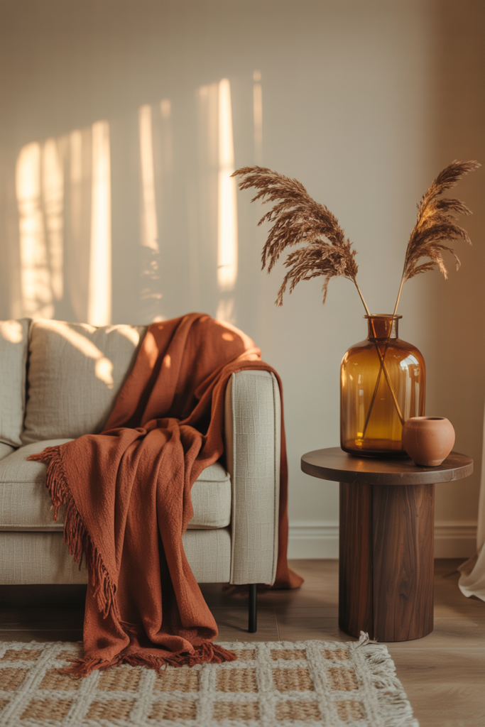
What’s wonderful about this approach for renters is that your 10% orange can be entirely portable. You don’t need to paint a single wall or drill a single hole to let orange do its work. A cashmere throw from M&S, a set of terracotta cushion covers from Anthropologie, or a hand-thrown ceramic vase from a local market — any of these applied in the right proportion can entirely transform the emotional register of a room.
4. How to Pair Orange With Other Colors Without Making a Mistake
Color pairing is where apartments succeed or fail, and orange is a generous color to work with once you understand its natural companions. The most reliably beautiful combinations tend to fall into a few categories.
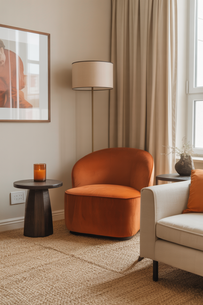
Orange and navy is a classic for good reason — the contrast is dramatic but not jarring, and it carries a vaguely nautical, tailored quality that feels equally at home in a Brooklyn studio or a south London flat. Orange and forest green is perhaps even more exciting — it’s botanical, lush, and draws on nature’s own pairings in autumn woodland. Orange and cream or warm white creates a softer, more relaxed feel that suits Scandi-inspired apartments and open-plan spaces.
If you’re feeling braver, orange and dusty pink is a pairing that designers have quietly championed for several years — it sounds improbable but achieves something deeply warm and a little romantic without tipping into saccharine territory. And then there’s the quiet confidence of orange with deep charcoal or dark slate, which grounds the warmth of orange and gives even a small apartment a dramatic, pulled-together feeling.
What to avoid: orange and bright yellow together, orange with electric blue (unless you’re going for a very specific retro look), and orange against cold, brilliant white — the contrast can feel harsh rather than fresh.
5. Small Apartment? Here’s How Orange Actually Makes It Feel Bigger
This one surprises people. Warm colors, including orange, are often assumed to make spaces feel smaller — the conventional wisdom being that cool colors recede while warm colors advance. But the reality is more nuanced, and for apartment dwellers working with compact living rooms, it’s worth understanding why.
When orange is used in accents and accessories rather than on large surfaces, it draws the eye inward and creates focal points that give a room visual depth. A terracotta vase on a shelf, a burnt orange rug anchoring a seating area, a warm amber lamp casting a pool of light in the corner — these elements make a small room feel curated and deliberate rather than tight and cramped. The eye follows the color story around the room, which creates an impression of space.
“Small spaces don’t need less color — they need smarter color.”
Combine this with mirrors (which actually do expand perceived space by bouncing light), low-profile furniture, and clear surfaces, and your orange accents will feel like intentional warmth rather than visual clutter. In UK apartments especially, where rooms tend to be on the smaller side, this approach is genuinely transformative.
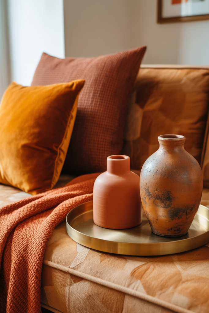
6. The Orange Rug — One of the Most Underestimated Apartment Investments
If you could make one orange investment in your apartment living room, make it a rug. A well-chosen rug does more for a room than almost any other single element — it anchors the furniture, defines the seating area, introduces texture and warmth underfoot, and sets the entire color story for the space.
A burnt orange Moroccan-style Beni Ourain rug brings pattern, texture, and color simultaneously — it’s a workhorse of a piece and it photographs beautifully, which matters if you’re creating a Pinterest-worthy home. A flatweave kilim in terracotta and cream is more relaxed and leans into bohemian, free-spirited styling. A solid, deep orange wool rug from a brand like Dash & Albert or Ikea’s HAMPEN range is budget-conscious and surprisingly sophisticated when paired with the right neutrals.
In the US and UK alike, vintage and secondhand rugs are having a genuine cultural moment — and orange-toned Turkish or Persian vintage rugs are relatively accessible at estate sales, eBay, or specialist vintage home shops. Finding one gives your apartment something no flatpack furniture can: a genuine sense of history and character.
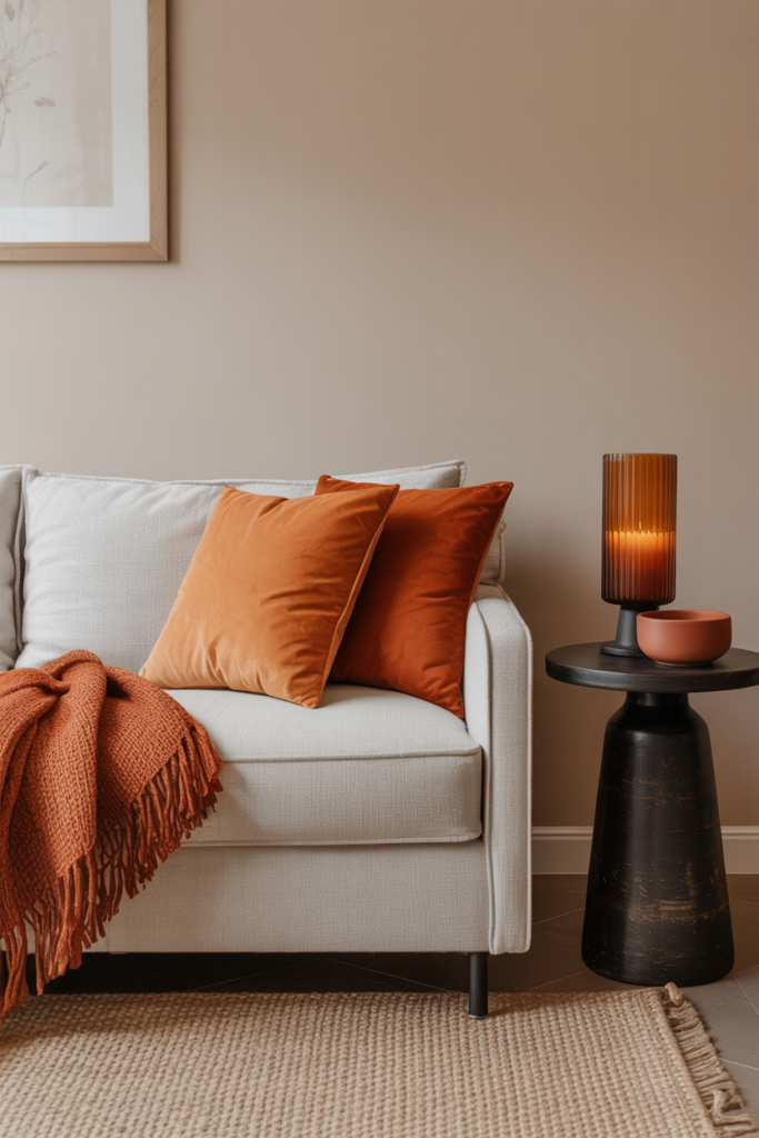
7. Textiles and Cushions — The Lowest-Commitment, Highest-Impact Route
For renters, students, or anyone not yet ready to commit to a full color scheme, textiles are the single most flexible tool you have. Cushion covers, throw blankets, curtains, and table runners are the parts of your apartment that can change with your mood, your season, and your budget.
A set of three burnt orange linen cushion covers — stagger the sizes between 45x45cm and 60x60cm — can recalibrate an entire neutral sofa in about ten minutes. If you’re in the US, brands like Society6, Target’s Studio McGee collaboration, and Pottery Barn all offer genuinely beautiful terracotta and burnt orange textile options. UK-based shoppers will find Dunelm, Oliver Bonas, and H&M Home consistently deliver in this color story without the premium price tag.
Layering is everything. A cream sofa with a chunky knit orange throw, two burnt orange linen cushions, and one amber velvet cushion creates something that looks deliberate and expensive — even when each individual item was entirely affordable.
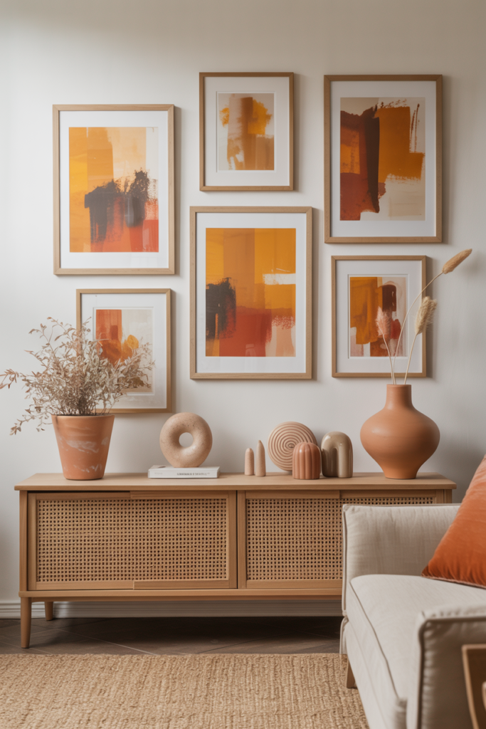
8. Orange Artwork and Prints — Creating a Gallery Wall That Actually Works
One of the most underused ways to introduce orange into an apartment living room is through wall art. A single large print with warm amber, burnt sienna, or terracotta tones does double duty — it adds visual interest and it pulls the room’s color story together without requiring any permanent changes to your walls.
The trick to a gallery wall that works rather than simply being busy is to choose a consistent color family across all your prints. If orange is your thread, let it appear in every frame — even if some pieces are predominantly neutral, a sliver of rust or amber in each one creates coherence. Abstract prints with warm tones, botanical illustrations of autumnal leaves, desert landscapes, and vintage travel posters featuring terracotta-toned architecture are all reliable choices.
For apartment dwellers in the UK and US who want affordable options, Desenio, Etsy, and IKEA’s art prints offer genuinely beautiful options. Frames matter too — warm wood, brushed brass, or matte black all complement orange tones more effectively than cold chrome or stark white.
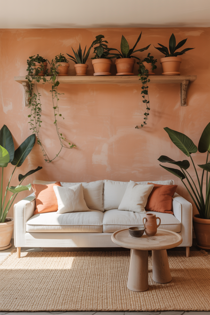
9. Plants and Natural Elements That Amplify Orange Tones
Orange and green belong together — in nature, they’ve been paired for millions of years, and your living room is no different. Introducing plants alongside your orange accents doesn’t just add life and air quality to your apartment; it creates a natural visual counterbalance that makes the orange feel more organic and less deliberate.
“A room with plants and warm color doesn’t just look alive — it feels alive.”
Warm-toned plants like the Autumn Fern, Croton (which literally produces leaves in orange, yellow, and green), and prayer plants with reddish undersides actively reinforce your orange color story. Even plain green plants like Monstera or fiddle-leaf figs create the green-orange contrast that feels botanical and sophisticated. Display them in terracotta pots — real ones, from a garden center or craft shop — and the connection between plant and palette becomes something beautifully complete.
In the UK, Dobbies, Wyevale, and online retailers like Patch Plants offer gorgeous options delivered to your door. In the US, The Sill and local nurseries are excellent starting points.
10. Lighting — The Hidden Variable That Changes Everything About Orange
Orange is one of those colors that is profoundly affected by light — more so than many others. In cool northern light (a frequent reality for UK apartments and many US cities during winter months), orange can look muted or even slightly muddy. In warm evening light, it sings.
This means your lighting choices are arguably as important as the orange pieces themselves. Warm-toned bulbs — LED bulbs with a color temperature of 2700K–3000K — are the single upgrade that will make your burnt orange cushions, rug, and throws glow with the warmth you were hoping for. Cold daylight bulbs will make them look flat and a little sad.
Layered lighting matters too. An overhead light is rarely your friend in a small apartment living room. Replace it with a combination of floor lamps with warm shades, table lamps with amber or cream diffusers, and even candles when the season allows. The result is a room that shifts from practical daytime space to deeply cozy evening retreat — and your orange elements are what make that evening mood feel so alive.
11. Trending Orange Styles You’ll See Everywhere in 2025
Interior design trends on Pinterest and Instagram are converging around a few distinct styles that make orange a natural fit, and understanding them can help you articulate your own vision for your apartment.
Warm minimalism — the antithesis of cold, stark Scandi minimalism — is defined by clean lines, natural materials, and a warm, carefully considered color palette where terracotta and burnt orange feature heavily. Biophilic design, which emphasizes natural materials, living plants, and organic shapes, pairs almost inevitably with earthy orange tones. And the continued rise of the maximalist-bohemian style — layered textiles, global influences, rich colors — puts orange at its absolute center.
In the UK, the influence of the late great interior designer Ilse Crawford has permeated mainstream taste toward warmth, humanity, and sensory richness in interiors — all values that orange naturally embodies. In the US, the California desert aesthetic that has dominated design conversation for several years keeps terracotta and burnt sienna firmly in play.
12. Making Orange Feel Personal, Not Pinterest-Perfect
Here is the final and perhaps most important thought about decorating with orange: the goal is never to recreate someone else’s living room. It’s to make your own space feel unmistakably like you.
The danger of Pinterest inspiration — and it’s a real one — is that it can seduce you into chasing an aesthetic that lives on a screen rather than building a home that lives in your actual life. Orange, at its best, is a deeply human color. It’s the color of firelight, of autumn harvests, of sun-warmed earth. It is, historically, the color of warmth, abundance, and welcome.
When you bring it into your apartment, do it the way you’d make your home feel ready for someone you love to visit. Put the throw where you actually curl up to read. Hang the print that genuinely moved you in the gallery, not just the one that matches. Choose the cushions in the orange that makes you exhale when you look at it. That’s not interior design — that’s homemaking. And there’s a quiet but important difference.
—
🌿 How to Take Care of Your Orange Apartment Living Room
Keeping an orange-accented living room feeling fresh and intentional requires less effort than you’d think, but a little consistency goes a long way.
Rotate your textiles seasonally — your burnt orange velvet cushions that feel perfect in October can be swapped for a lighter amber linen version in spring, keeping the color story alive without the room feeling static. Clean your terracotta and ceramic pieces with a barely-damp cloth rather than chemical sprays, which can dull the matte finish that makes them beautiful. If you have real terracotta pots, seal them once a year to prevent moisture damage. Regularly assess your orange elements — a color that once felt exciting can become invisible once you’re used to it. Add a new small piece occasionally to refresh your eye and keep the room feeling considered.
—
❓ FAQ
Q: Will orange make my small apartment living room feel even smaller? A: Not if you use it as an accent rather than a dominant color. Burnt orange and terracotta tones used in cushions, rugs, and accessories create warmth and focal points without closing in the walls. Pair with light neutrals and mirrors to keep the room feeling open and airy.
Q: What’s the best orange shade for a north-facing room with limited natural light? A: Warmer, deeper shades like burnt orange or terracotta actually perform better in low-light rooms than cooler, brighter oranges, which can look washed out. Pair them with warm-toned artificial lighting at 2700K–3000K to ensure the color glows rather than dulls.
Q: Can I use orange if my apartment already has a lot of wood furniture? A: Absolutely — orange and warm wood tones are natural companions. The key is to make sure your orange pieces lean slightly cooler (more terracotta, less peachy) if your wood is very red-toned, to avoid the combination feeling too heavy. Mid-tone or pale woods like ash, beech, or light oak pair especially beautifully with burnt orange accents.
—
💭 Final Thought
Your apartment, however small, however temporary, deserves to feel like something you chose — not something that happened to you. Orange is one of those rare colors that asks you to be a little brave and rewards you with a room that feels genuinely, unmistakably warm. It doesn’t take a big budget or a permanent wall color. It takes a little intention and the willingness to trust that warmth is never the wrong choice.
So here’s the question worth sitting with: if your living room could make every person who walks into it feel immediately at home — what color would that room be?


