The Grey-Blue Living Room: Why This Color Combination Is Quietly Taking Over Every Beautiful Home Right Now
You’ve seen it on Pinterest. You’ve screenshotted it at midnight. That living room with the walls the color of a rainy afternoon in October, paired with sofas in something between slate and ocean — and it just works in a way you can’t quite explain. This isn’t a trend. It’s a feeling.
—
1. Why Grey-Blue Hits Different Than Either Color on Its Own
Grey alone can feel cold. Clinical. Like a dentist’s waiting room with better lighting. Blue alone can feel too bold, too nautical, or — if you get it wrong — like you’ve accidentally moved into a beach shack. But grey-blue? It sits in the exact middle of composed and alive.
The magic is in the undertone. Grey-blue pulls warmth out of a room while still keeping things calm. It’s the visual equivalent of a deep breath. When morning light hits a grey-blue wall, it reads almost lilac. By evening, under warm lamp light, it deepens into something close to denim or storm cloud. The color is different at every hour of the day, which means your room never gets boring.
It layers naturally with wood, with linen, with brass and aged copper. It doesn’t fight for attention. It’s the color that makes everything around it look more intentional.
That’s why it keeps showing up everywhere right now — not because it’s fashionable, but because it solves problems. It modernizes without being aggressive. It soothes without disappearing.
“Grey-blue is the one color that looks expensive even before you buy a single piece of furniture.”
2. The Specific Shade That Actually Works in Real Living Rooms (Not Just On Screens)
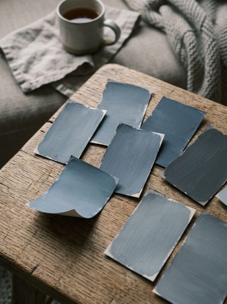
Here’s the honest truth: grey-blue covers a huge family of colors, and about half of them will look completely different on your walls than they did in the swatch fan.
The shades that consistently win are the mid-tones with a blue-dominant base and just enough grey to keep them from looking like nursery walls. Think Farrow & Ball’s Oval Room Blue — dusty, complex, slightly faded. Or Benjamin Moore’s Quiet Moments, which does exactly what the name says. Dulux’s Denim Drift is everywhere in UK living rooms right now, and rightly so. It’s confident without being loud.
Avoid anything that tips too purple (you’ll only notice once the paint is dry and the sun hits it sideways), and avoid anything too icy or silvery — it starts to feel cold in winter, especially in north-facing rooms.
If you’re testing a shade, paint a large piece of card — at least 12 inches square — and move it around the room at different times of day. Stick it near your sofa. Hold it against your curtains. Let it sit there for three days before you commit. This is not overthinking. This is how people end up with rooms they love instead of rooms they repaint.
3. The North-Facing Room Problem (And Why Grey-Blue Solves It Better Than You’d Expect)
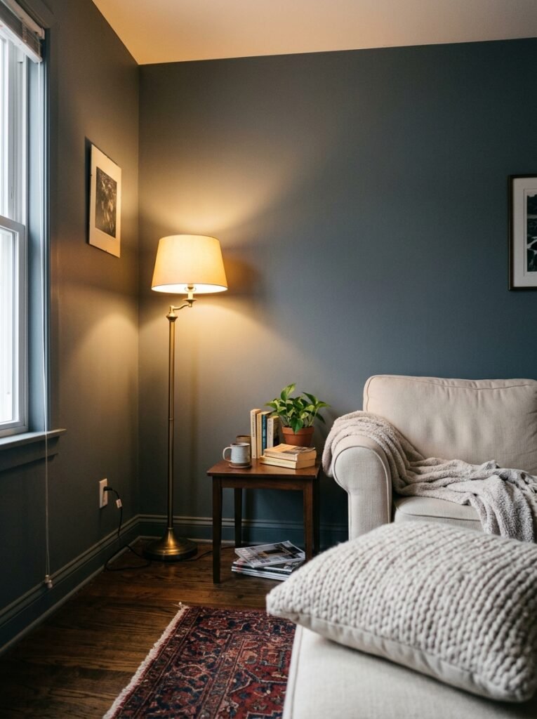
North-facing rooms have a reputation for being hopeless. Not enough natural light, cool shadows all day, and every warm color you try looks flat and sad against a grey sky. Interior designers have been fighting this battle for decades.
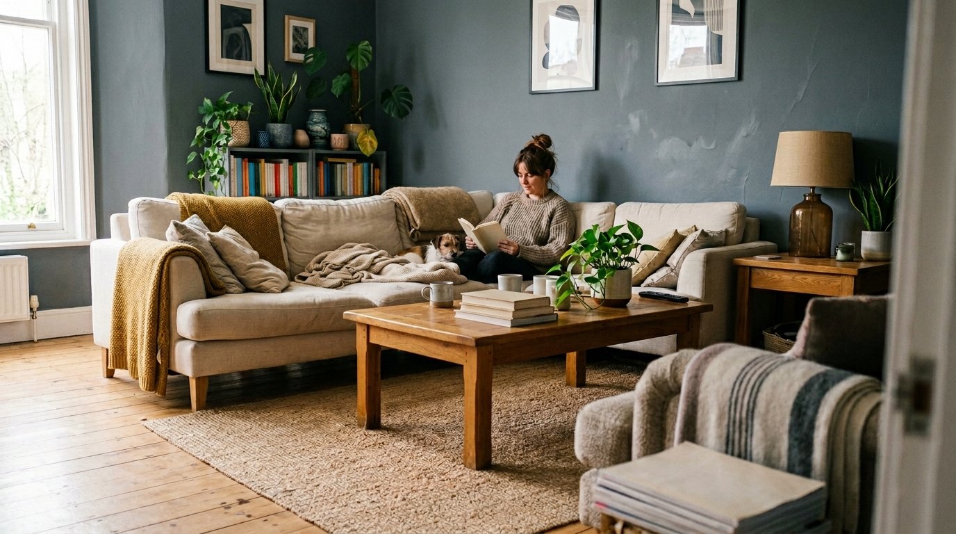
Grey-blue is counterintuitive here, and that’s exactly why it works. Instead of trying to trick a dark room into looking sunny — which never really works — you lean into the coolness. You make it intentional. A north-facing living room in Hague Blue or Muted Sage adjacent grey-blue becomes moody in the best possible way. You’re not fighting the light. You’re decorating with it.
Layer in warm textures to balance the cool tones: chunky knit throws in cream or oatmeal, wooden side tables, terracotta plant pots, brass picture frames. The cool walls and warm accessories create a tension that feels curated and genuinely beautiful.
South-facing rooms, for the record, are where grey-blue becomes utterly magical. The warm natural light turns it golden in the late afternoon and it looks like nothing you’ve ever seen in a paint swatch.
4. The Sofa Decision That Either Makes or Breaks the Whole Room
The sofa is where most people get stuck. And honestly, it’s the most important call you’ll make in a grey-blue living room.
The temptation is to go safe — a mid-grey sofa that “goes with everything.” But safe is not the same as beautiful. In a grey-blue room, a mid-grey sofa disappears. You’ve got a wall and a sofa that are both just kind of… grey, and the whole thing becomes flat.
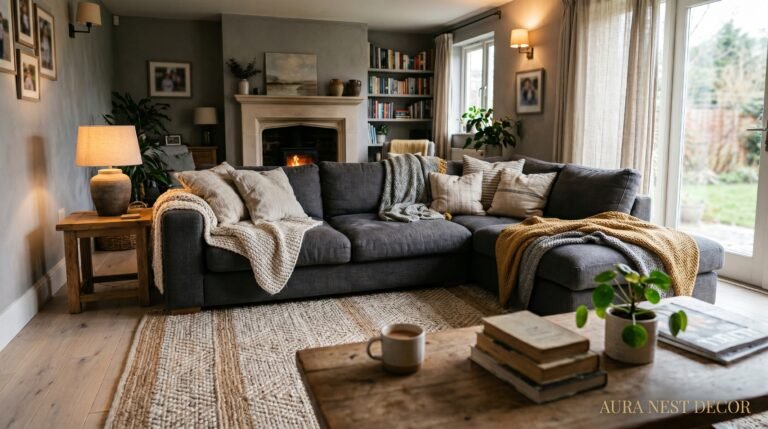
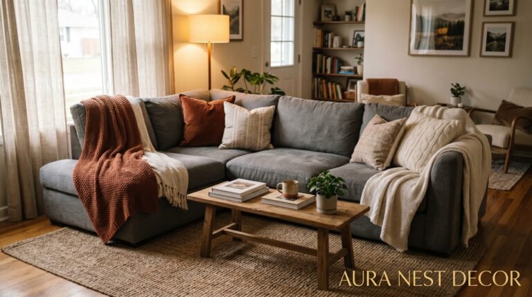
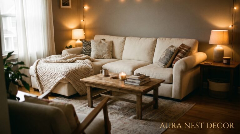
Here’s what actually works. A warm-toned sofa: caramel leather, terracotta linen, rust velvet, even a deep forest green. These create contrast that feels alive rather than matched. The grey-blue wall behind a burnt-orange velvet sofa? It’s the kind of thing people photograph and post without a filter.
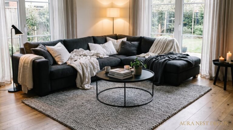
If you genuinely want to stay in the cool family, go darker than the walls. A deep navy or charcoal sofa against a light grey-blue wall gives you tonal layering — different values of the same family, rather than everything sitting at the same intensity. That depth is what distinguishes a designed room from a decorated one.
“The sofa that ‘matches’ everything is usually the one that completes nothing.”
5. Flooring That Doesn’t Fight With Your Walls
Let’s talk about what’s underfoot, because it matters more than people admit.
Grey-blue walls and cold grey floors — think cool-toned tile or pale grey laminate — will make your room feel like a very stylish airport. All surface, no soul. You need warmth coming up from the floor to anchor everything.
Honey-toned or medium oak wood flooring is the classic pairing for a reason. It’s warm, natural, and the yellow undertones in the wood push back against the cool of the wall in exactly the right way. Dark walnut works too, especially in rooms where you want drama.
For carpeted rooms — very common in UK living rooms, slightly less so in American ones — a warm oatmeal, biscuit, or soft beige will do the same job wood does. Avoid anything with a pink undertone, which will clash oddly with grey-blue walls.
Area rugs are where you get to have some fun. A thick, textured wool rug in cream and caramel over wood floors, or a vintage-style Persian in faded terracotta and blue over a neutral carpet. Both work. Both add that layer of visual warmth that makes a grey-blue room feel like somewhere you want to stay all weekend.
6. The Lighting Setup That Makes Grey-Blue Walls Look Like a Magazine Shoot
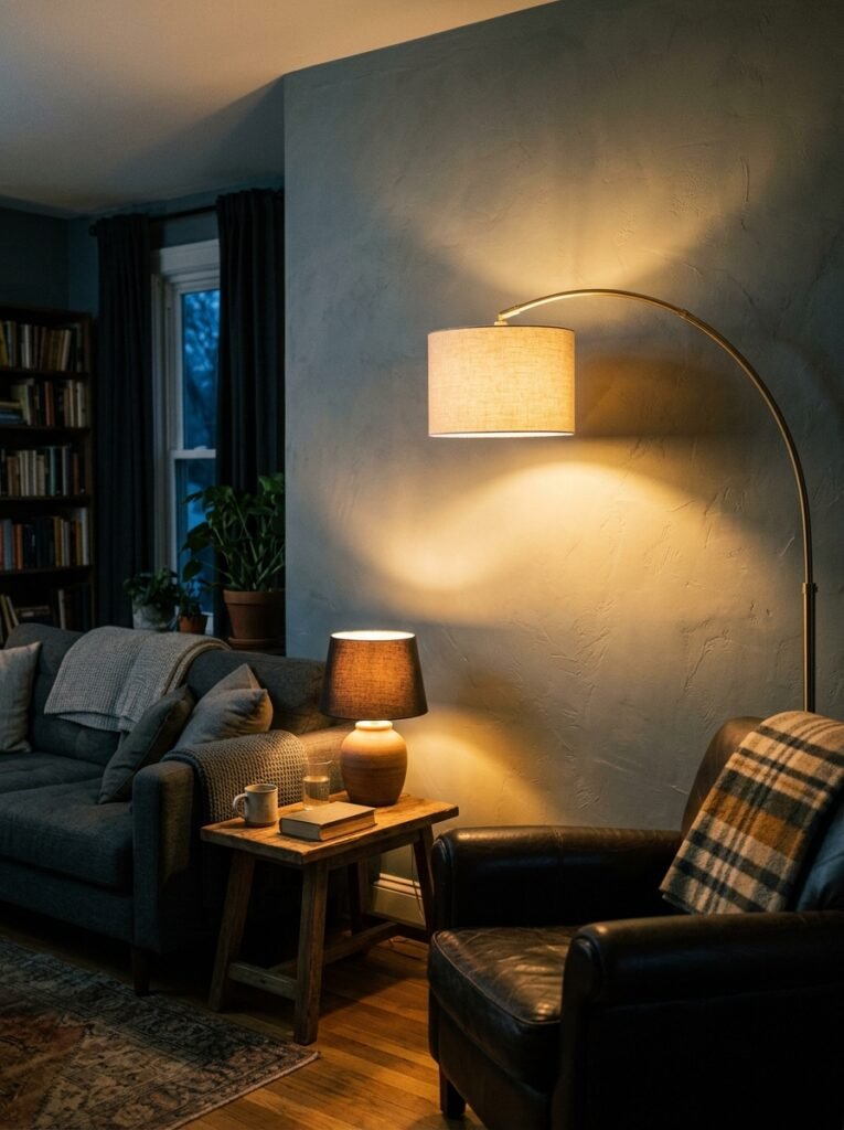
You could have the perfect color on your walls and completely ruin it with the wrong light.
Overhead lighting is your first problem. A single bright overhead bulb washes grey-blue walls out and makes them look flat. No shadows, no depth, no mood. The color looks almost white at its worst. You need layers.
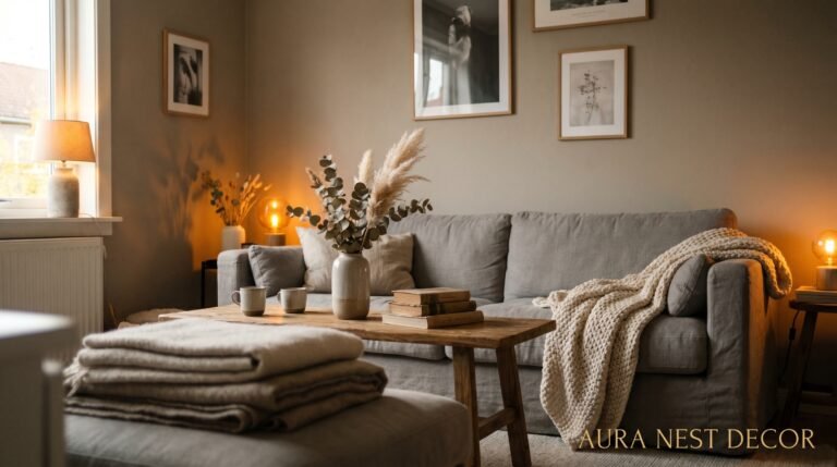
Start with table lamps. Two at sofa height, placed symmetrically or asymmetrically — either works — in warm-toned bulbs around 2700K. Not the cool daylight bulbs. The amber ones. At 7pm with those lamps on and the overhead off, your grey-blue walls will deepen and glow in a way that feels genuinely cinematic.
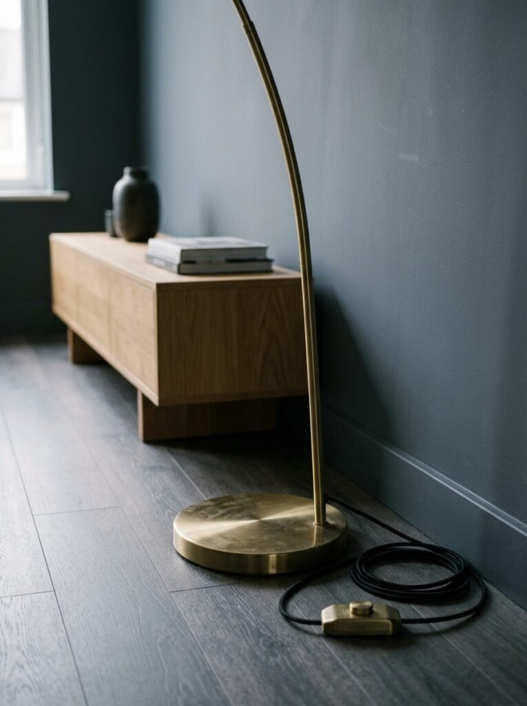
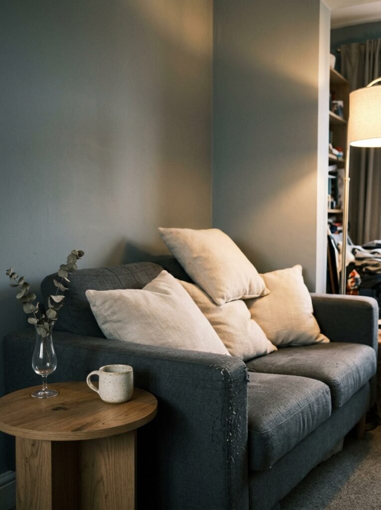
Add a floor lamp if the room allows — something with an arc or a slim column, ideally in brass or matte black depending on your other metals. A floor lamp in the corner of a grey-blue room creates a pocket of light that makes the whole space feel larger and more layered.
Candles count. Real ones on the mantelpiece or coffee table. Not just for smell — for the way they move and warm everything they touch.
7. The One Textile Decision That Ties Every Grey-Blue Room Together
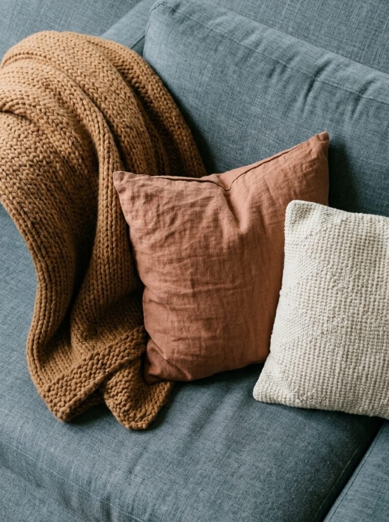
Cushions and throws get treated like an afterthought. They’re not. They’re the thing people notice in your room photos even if they can’t explain why some rooms feel rich and others feel sparse.
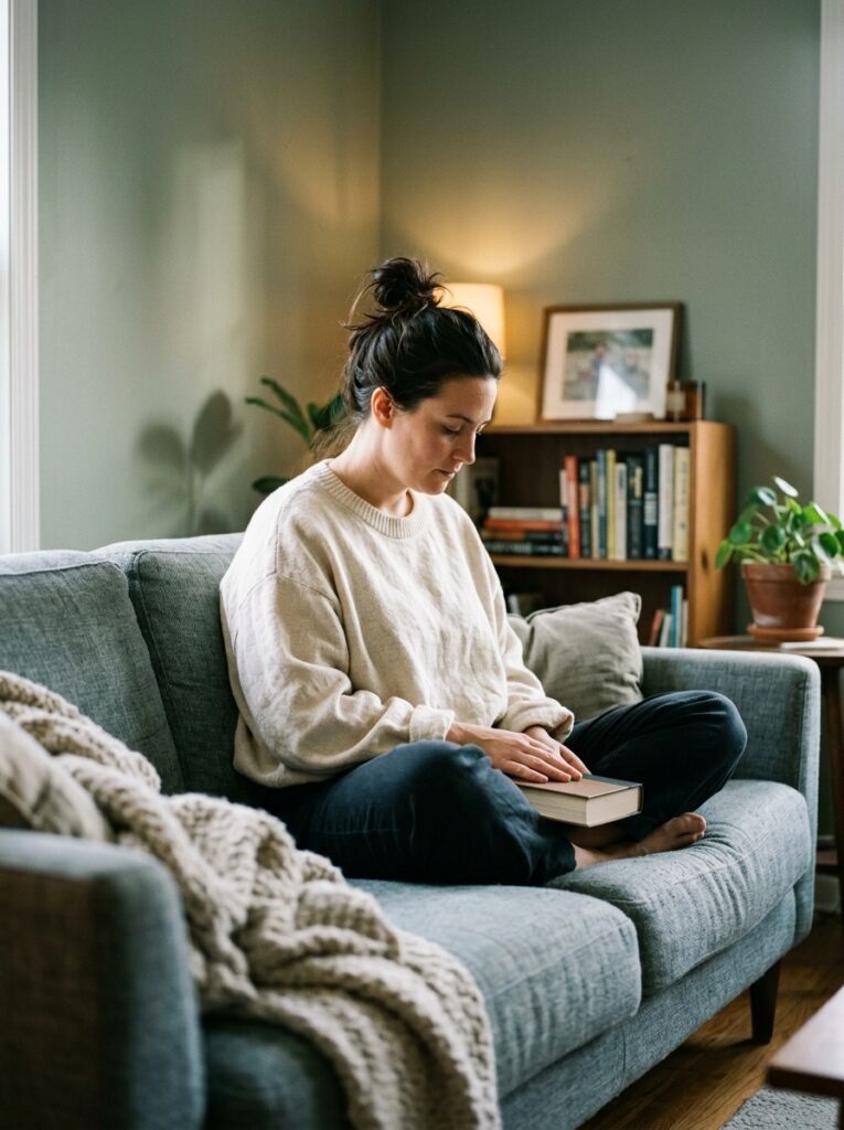
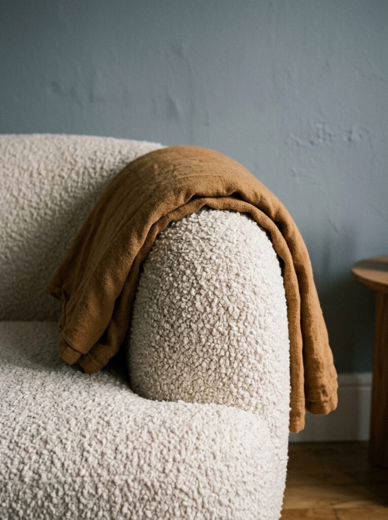
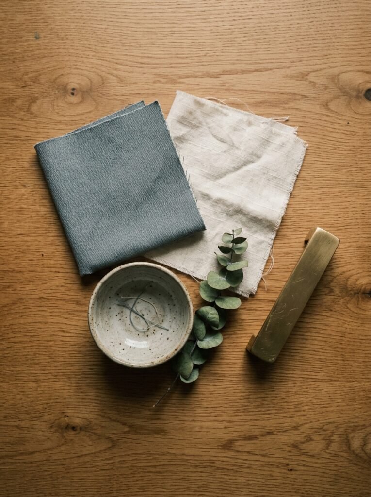
In a grey-blue room, your textiles need to do one thing: bring texture and contrast without competing. A linen cushion in dusty pink — not hot pink, dusty pink — against a grey-blue sofa is quietly perfect. Chunky knit in natural cream. Velvet in a warm teal or olive. A throw in brushed cotton or waffle knit in off-white draped casually over one arm.
The key word is casually. Perfectly arranged cushions look staged. Cushions that look like someone sat among them, moved things around, and left — that looks lived in.
Layering is everything here. Two different cushion sizes. Different textures side by side. A throw that’s slightly rumpled. This is the difference between a room you want to sit in and a room you want to photograph and leave.
“The lived-in look isn’t accidental. It takes a very specific kind of intention.”
8. What to Put on Your Walls That Doesn’t Look Like a Gallery Cliché
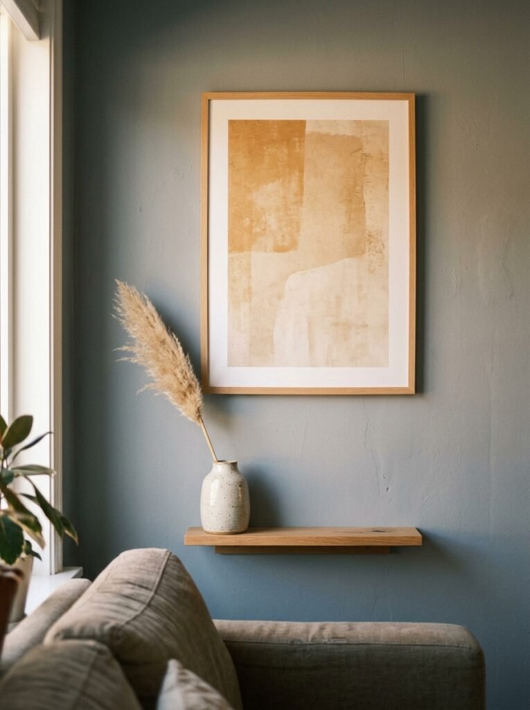
Every Pinterest board for grey-blue living rooms has the same thing: a large piece of abstract art in complementary tones, gallery wall with matching black frames, some kind of botanical print. And none of it is wrong, exactly — but it’s everywhere.
Here’s how to do it differently. Lean something large against the wall instead of hanging it. A big mirror, a canvas, a piece of driftwood. Something leaned feels current and intentional in a way that perfectly hung things sometimes don’t.
Choose one large statement piece rather than twelve small ones. A single artwork that takes up half the wall is more confident than a gallery of eight prints you pulled from the same Etsy shop. And in a grey-blue room specifically, look for work with warm tones in it — a painting with ochre or rust or cream will connect the art to your soft furnishings and make the whole room feel considered.
For UK rooms: vintage maps and antique botanical prints work beautifully against grey-blue, especially in older properties. There’s something about the aged paper and faded ink against a cool-toned wall that feels like time collapsed in the best possible way.
For American spaces: large-scale photography, especially landscape or architectural, reads incredibly well in grey-blue rooms. Black and white photography gains incredible depth against a grey-blue backdrop.
9. Plants, Natural Materials, and the Thing Living Rooms Too Often Miss
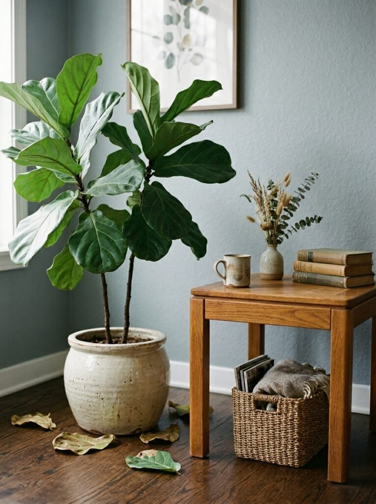
This might be the section that changes your room most dramatically, and it’s not about buying more stuff. It’s about bringing in something living.
Plants do more work in a grey-blue room than in almost any other color scheme. The green against the blue is nature’s own color theory — think of slate-grey ocean cliffs with moss and ferns growing in the crevices. It’s inherently beautiful because it’s real. A large fiddle-leaf fig or olive tree in a terracotta pot. Trailing pothos on a high shelf. A bunch of dried pampas grass or eucalyptus in a ceramic vase.
Beyond plants: natural materials are essential. Rattan, jute, linen, raw wood, unglazed ceramics. A grey-blue room full of synthetic materials feels slightly off in a way that’s hard to name but impossible to ignore. The natural stuff grounds it. Makes it breathe.
A woven jute rug, a rattan side table, a stoneware vase — these things cost less than people expect and do more work than almost anything else in the room.
10. The Modern Detail That Keeps Grey-Blue From Feeling Like a Country Cottage
Grey-blue has a natural lean toward the cottagey, the vintage, the soft. If that’s your style, wonderful — lean into it fully. But if you want something more modern, more architectural, more 2024-looking, there are specific choices that pull the aesthetic firmly into contemporary territory.
Clean lines. Simple, geometric furniture silhouettes rather than curved or ornate. A low-profile sofa with visible legs rather than one that sits directly on the floor. A coffee table with a metal base — matte black or brushed brass — rather than a chunky wooden block.
Contrast stitching on cushions. Minimal window treatments: simple linen panels in a tone slightly lighter than the walls, rather than thick curtains with ties and patterns. Or no curtains at all if you have shutters, which is one of the cleanest looks available in any living room style.
Metallic accents in brass or warm gold keep the room feeling warm while the clean lines keep it modern. One brass lamp, one brass candle holder, a few brass picture frames. Not a brass explosion — just enough to catch light and add richness.
11. The Budget Version That Still Looks Expensive
Not everyone is repainting walls and buying new sofas. That’s fine. Grey-blue can come into a room gradually, and the right version of it can look more intentional than a full expensive overhaul.
Start with paint if you can do any wall at all. An accent wall behind the sofa in a good grey-blue changes the entire character of a room for the cost of a weekend afternoon. One wall does the work of four.
If painting isn’t an option — renting, listed buildings, a landlord who absolutely will not budge — then bring grey-blue in through textiles. A grey-blue sofa throw. Cushions in two or three complementary shades. A grey-blue vase or ceramic object on the shelf. It accumulates.
Thrift shops and second-hand marketplaces are full of frames, ceramics, lamps, and occasional tables that look genuinely expensive once they’re inside a considered color scheme. A basic brass lamp that cost $12 at a charity shop looks like a designer piece against a grey-blue wall.
This is the thing about color: it makes everything around it read differently. Buy the paint before you buy anything else.
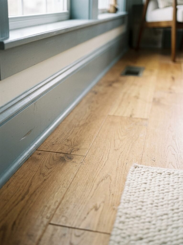
12. The Finishing Detail Most People Forget — and Why It Matters More Than the Big Stuff
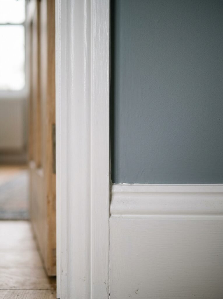
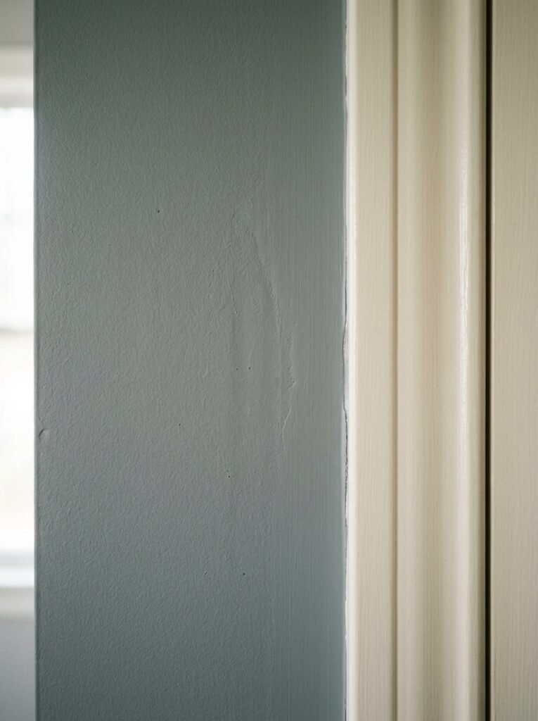
Trim color. Skirting boards. Door frames. Most people paint them white and move on. And white works, always. But it’s not the only choice, and in a grey-blue room, it might not even be the best one.
Painting your trim in a crisp, bright white against grey-blue walls creates high contrast and a slightly more traditional look. It emphasizes the architecture of the room. Great for older homes, Victorian terraces, properties with good cornicing.
For a more modern, quieter look: paint the trim in the same grey-blue as the walls, or in a slightly deeper version of it. This is called “drenching” and it does something remarkable — it makes the walls feel like architecture rather than decoration. The room feels finished in a completely different way.
Warm white trim — closer to cream or off-white — splits the difference. Less stark than brilliant white, still provides contrast, works in almost any living room style.
It’s the smallest change on this whole list, and it’s one of the ones that makes people walk into your living room and say, with genuine confusion, “I don’t know what you did but this room just feels right.”
—
🌿 Quick Tips
Start with one large paint swatch card and live with it for three days in different lighting before committing to any shade of grey-blue — what looks perfect at noon might surprise you at dusk.
Keep your metals consistent: pick one — brass, matte black, or brushed nickel — and let it run through the whole room. Mixed metals in small spaces reads chaotic rather than curated.
If your room lacks natural light, add a large mirror opposite the main window. In a grey-blue room specifically, mirrors amplify the way the color shifts through the day, and it’s genuinely beautiful.
Buy your cushions and throws in odd numbers — three cushions almost always looks better than four, and five looks more considered than six.
Don’t style your shelves all at once. Add one thing at a time over a few weeks. You’ll make better decisions and the result will look less like a staged set and more like a real room.
—
❓ FAQ
Q: What color curtains go best with grey-blue walls in a living room? A: Natural linen in warm white, oatmeal, or cream is the most versatile option — it softens the cool tones of the wall without competing. If you want more drama, a deep navy or forest green velvet curtain creates a beautiful tonal contrast and adds a sense of luxury that works especially well in the evening.
Q: Does grey-blue work in a small living room or will it make it feel smaller? A: This is one of the great myths in interior design. A deeper, richer grey-blue in a small room can actually feel more intimate and cocooning — more like a designed space and less like a box. Light grey-blue works too, especially with good lighting. The key is contrast in your textiles and furniture so the room has visual layers, rather than everything blending into a flat grey-blue wash.
Q: What are the best grey-blue paint colors for a living room available in the US and UK? A: In the UK, Farrow & Ball’s Oval Room Blue and Dulux’s Denim Drift are consistently beautiful. In the US, Benjamin Moore’s Quiet Moments and Sherwin-Williams’ Misty are reliable choices that photograph well and work across different light conditions. Always test in your specific room — the same color reads completely differently in a London terrace versus a sun-filled American suburban living room.
—
💭 Final Thought
Grey-blue is not a safe choice dressed up as a bold one. It’s genuinely considered — a color that rewards patience, layering, and a willingness to live with a room rather than finish it overnight. The best grey-blue living rooms didn’t happen in a weekend. They grew.
What’s the one piece in your living room right now that you’d build everything else around?