
The Living Room Wall That Finally Feels Like You: Modern Classic Ideas That Actually Work
You know that feeling when you walk into someone’s home and the walls just make sense? Everything feels considered, not cluttered. Calm, not bare. That’s not luck — that’s a decision.
Here’s how to make that decision for your own living room.
—
1. Why “Modern Classic” Is the Most Liveable Style Nobody Talks About Enough
Let’s get something clear. Modern classic isn’t a compromise. It isn’t “I couldn’t decide between contemporary and traditional, so I split the difference.” It’s a fully realized aesthetic — one that takes the clean lines and restraint of modern design and grounds them with the warmth, texture, and story that classical styles have always done so well.
Think of it this way. A stark white gallery wall with no warmth feels like a showroom. A wall crowded with ornate gold-framed portraits feels like a country manor you didn’t inherit. But a single large oil-style print in a simple black frame, hung at exactly the right height over a low linen sofa? That feels like a home.
Modern classic design trusts itself. It doesn’t over-explain. It borrows the architectural weight of classical proportions — symmetry, depth, deliberate placement — and strips away anything fussy or precious. The result is a living room wall that feels genuinely timeless. Not trending. Not dated. Just permanently right.
This is the sweet spot that US and UK homeowners are quietly falling in love with, and once you see it, you cannot unsee it.
“Modern classic isn’t about picking a side. It’s about knowing which rules to keep and which ones to quietly ignore.”
2. The One Wall You Should Obsess Over First (and It Isn’t the One You Think)
Most people walk into a living room and immediately look at the fireplace wall or the sofa wall. Those are the obvious ones. But the wall that actually sets the tone for the whole room is the one you see the moment you step through the door.
The entry-facing wall is the first impression your living room makes on every single person who walks in, including you, every day. And yet it’s almost always the most neglected.
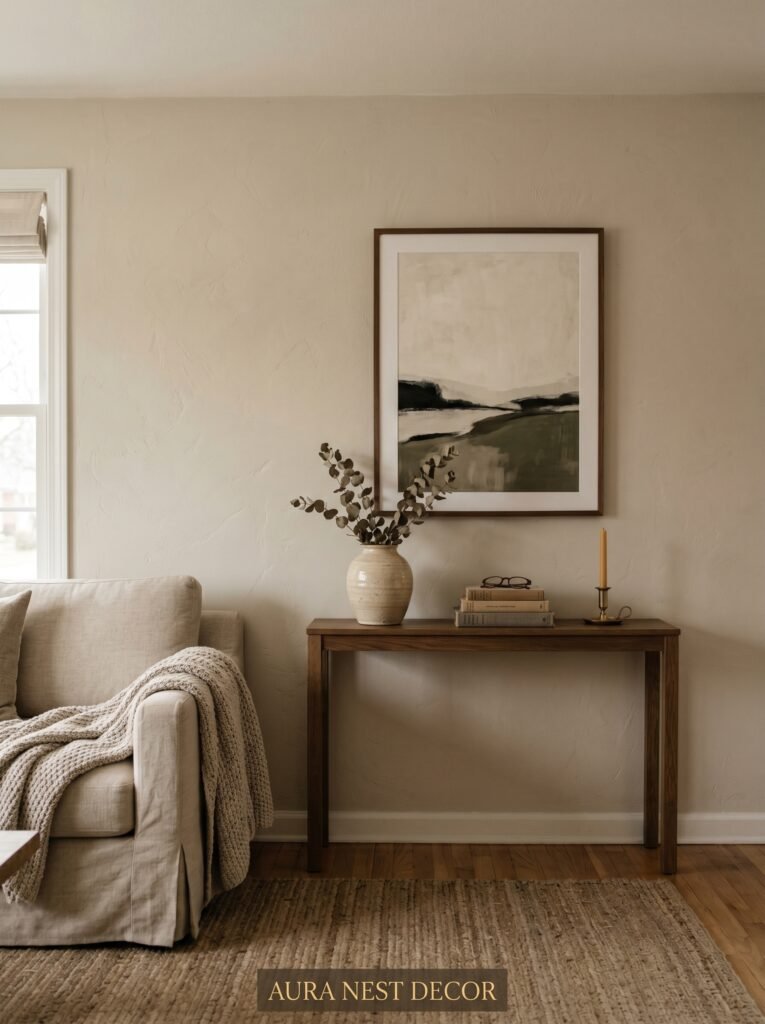
In a modern classic scheme, this wall deserves one strong, considered statement. Not a gallery of six different frames. Not a floating shelf loaded with candles and a faux succulent. One piece, or one very deliberate grouping, that stops you in your tracks for a second before you settle into the room.
This could be a large-scale architectural print — think Roman columns, Paris rooftops, a Georgian doorway rendered in soft charcoal. It could be a single oversized antique-style mirror with a matte black or aged brass frame. It could be a canvas that has texture, depth, real presence.
The point is: commit. One bold, beautiful thing. The rest of the room will organize itself around it.
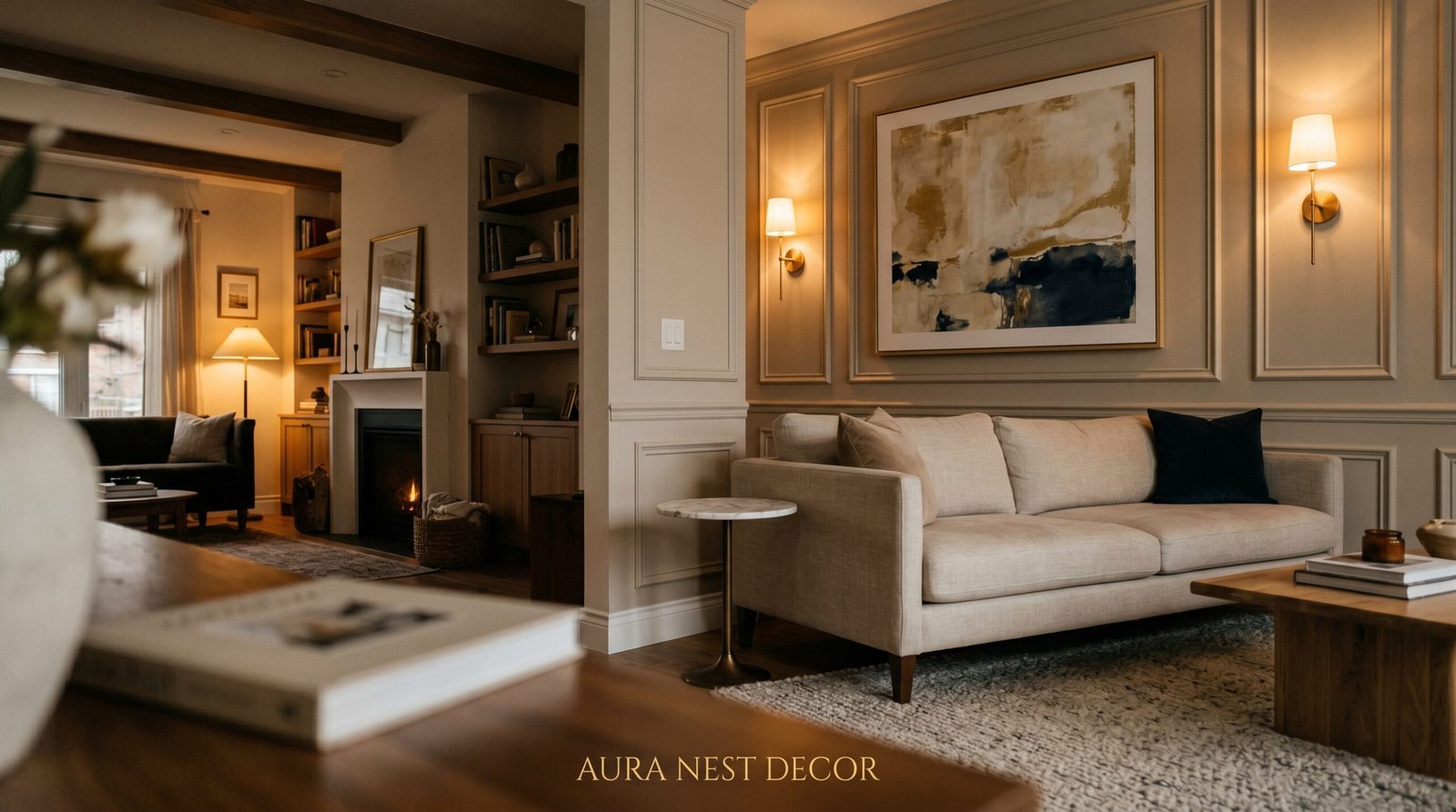
3. The Color That Keeps Showing Up in Every Beautiful Modern Classic Living Room Right Now
Aged white. Not brilliant white. Not cream. Something in between — a white that looks like it has lived somewhere for thirty years and is better for it.
This is the wall color that makes everything else work in a modern classic living room, and it’s showing up everywhere from Brooklyn brownstones to Edinburgh new-builds. The reason is simple. It reflects light without being harsh. It reads as neutral without being cold. And crucially, it makes art look like it belongs rather than like it was just hung last Tuesday.
Against aged white walls, dark wood frames sing. Black metal frames feel architectural rather than industrial. Gilded frames look genuinely antique rather than costume. Even a simple unframed canvas in muted earth tones takes on a quiet authority.
If you’re in the UK and your walls have that classic Victorian-era depth to them — picture rails, high ceilings, plaster cornicing — aged white is especially powerful. It doesn’t fight the architecture. It serves it. In an American open-plan space, the same color creates the illusion of a room that has always been there, always been loved.
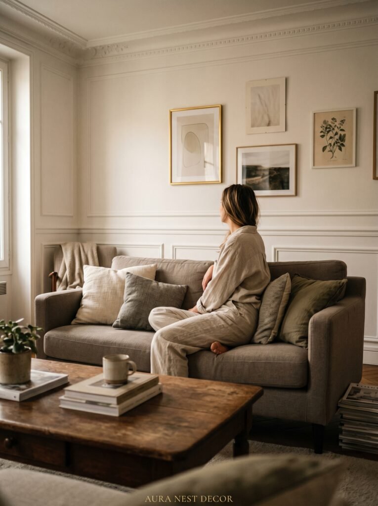
4. Gallery Walls That Feel Curated, Not Chaotic
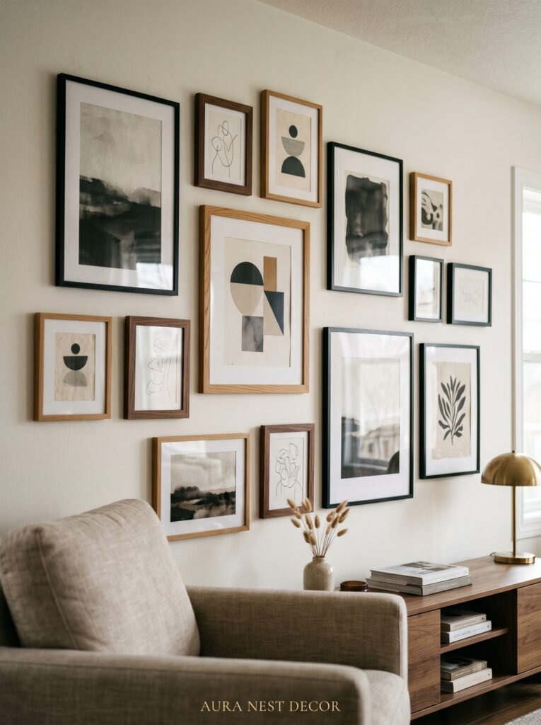
The internet will tell you to print a template, tape it to the floor, and measure everything obsessively before you drive a single nail. Ignore that. What actually makes a gallery wall look curated is the logic behind the selection, not the precision of the execution.
In a modern classic gallery wall, the logic is this: every piece should belong to the same emotional family, even if the frames differ slightly, even if the subjects vary. An eighteenth-century botanical print, a black-and-white architectural photograph, and a minimal abstract can absolutely share a wall — if they share a palette, a mood, a sense of restraint.
What breaks a gallery wall isn’t mismatched frames. It’s mismatched energy. A motivational quote print next to a serious portrait. A bright pop-art piece next to a sepia landscape. These things don’t argue with each other gracefully; they just argue.
For a modern classic feel, stick to: muted tones, natural subjects (botanicals, landscapes, architectural details), and a frame family that has one thing in common — either the material (all black, all wood, all brass) or the weight (all thin and simple, all wide and substantial). Then hang with confidence, adjust once, and leave it alone.
“A gallery wall isn’t a collection. It’s a conversation. Make sure every piece has something to say to the one next to it.”
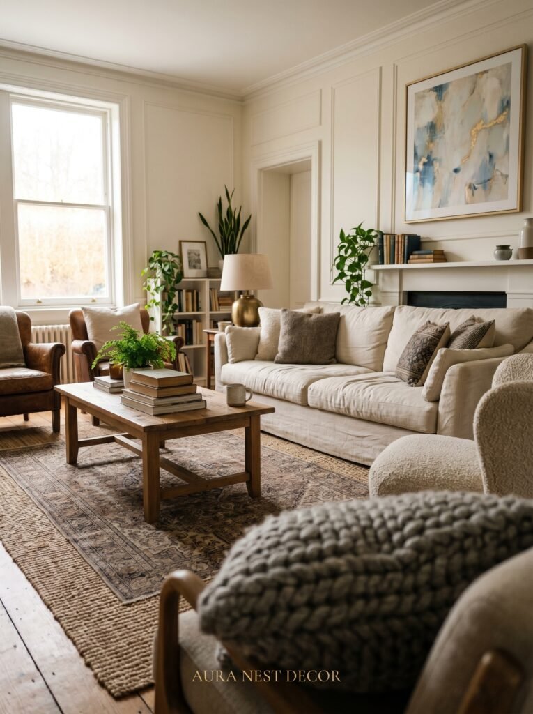
5. The Rule About Scale That Nobody Tells You Until It’s Too Late
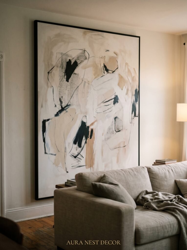
Here it is: the art should always feel slightly too big for the space.
Not actually too big. Slightly. There should be a moment when you’re hanging it where you think, is this too much? And then you step back, and you realize it’s exactly right.
Small art on a large wall is one of the most common and most fixable mistakes in living room decorating, on both sides of the Atlantic. A little 8×10 print above a full-length sofa looks like a note someone left behind. It doesn’t anchor the room. It doesn’t do anything.
The standard guideline is to aim for artwork that fills roughly two-thirds of the width of the furniture beneath it. But for a modern classic feel, I’d push that further. Fill the wall. Let a large mirror take up real estate. Let a canvas breathe into the space around it. A wall that’s slightly overpowered by its art feels intentional. It feels like someone made a choice.
Oversized prints, large-format photography, even a single enormous antique map — these are the elements that make a modern classic living room wall stop feeling like a background and start feeling like a destination.
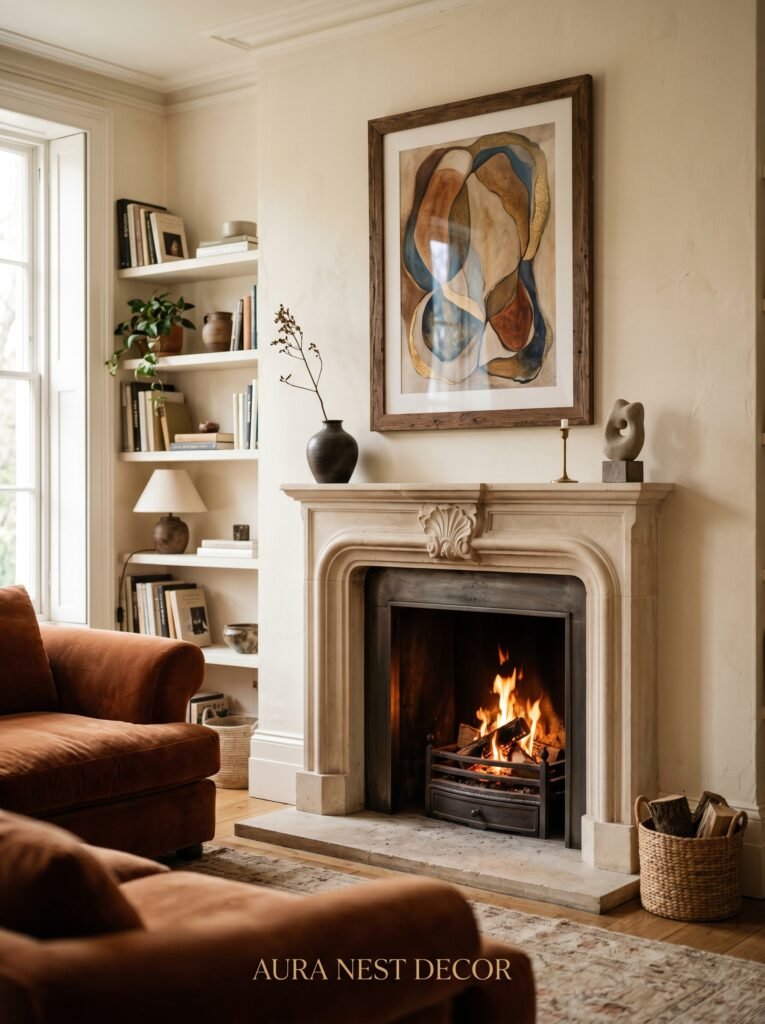
6. Plaster, Paneling, and the Architecture You Can Add to Any Wall
Before you hang a single piece of art, consider what the wall itself is doing. A flat, featureless drywall rectangle is starting from zero. But add some architectural interest — even subtle, even inexpensive — and suddenly every piece of art you hang against it looks more deliberate, more embedded, more right.
In the US, board and batten paneling in the lower half of a living room wall, painted the same color as the upper wall, creates an instant sense of classical proportion without feeling period-specific. In the UK, dado rails, picture rails, and simple wooden battens can be added to any wall for very little money and transform a modern box room into something with genuine depth.
Limewash paint is having a significant moment right now for exactly this reason. It adds texture, movement, depth — the wall becomes a feature without demanding attention. Hang a simple framed piece against limewash plaster and it looks like it came with the house.
Even a subtle geometric plaster effect in one corner, or a single wall treated with a matte, chalky finish while the others stay smooth, gives the room the kind of layered, considered quality that makes guests feel like they’ve entered somewhere special.
7. Mirrors That Don’t Look Like They Came From a Big Box Store
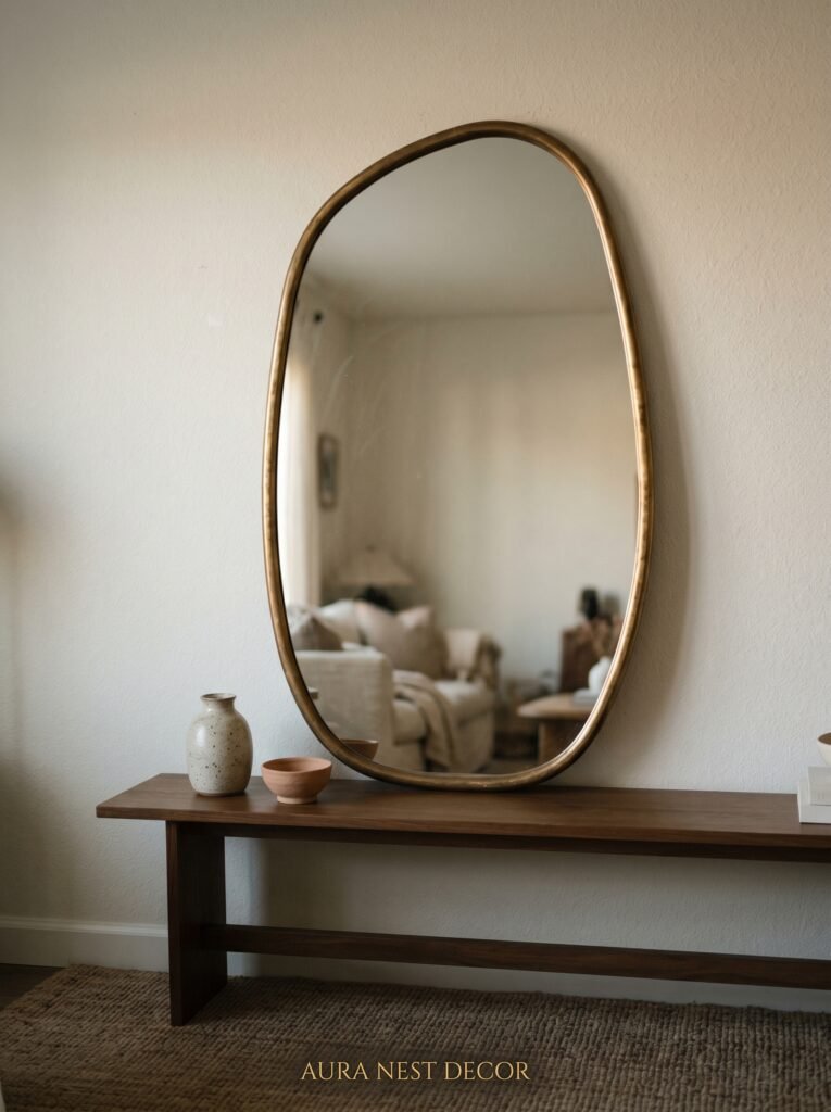
Let’s talk about mirrors, because modern classic living rooms use them brilliantly and most people use them badly. A mirror in a living room should do two things: add light and add character. A frameless rectangle floating above a console does neither.
The mirrors that work in a modern classic space are the ones that look like they have a past. An arched mirror in aged brass or dark iron. A sunburst mirror in matte black or antique gold, hung where it catches the afternoon light. A panel mirror framed in thick dark wood, large enough to reflect the whole room back at itself.
In both US and UK homes, the fireplace wall is the classic placement for a large statement mirror — and there’s a reason that cliché exists. It works. It doubles the depth of the room. It catches the flicker of candles or the glow of a fire. It makes the mantle feel like an altar to beautiful living.
But don’t stop there. A large mirror hung on a wall with no furniture in front of it, just space, creates the most extraordinary sense of roominess in smaller living rooms. British terrace houses and American apartment living rooms especially benefit from this trick. The wall becomes three-dimensional. The room expands without moving a single wall.
“A good mirror doesn’t just reflect the room. It improves it.”
8. The Case for Leaving One Wall Completely Bare
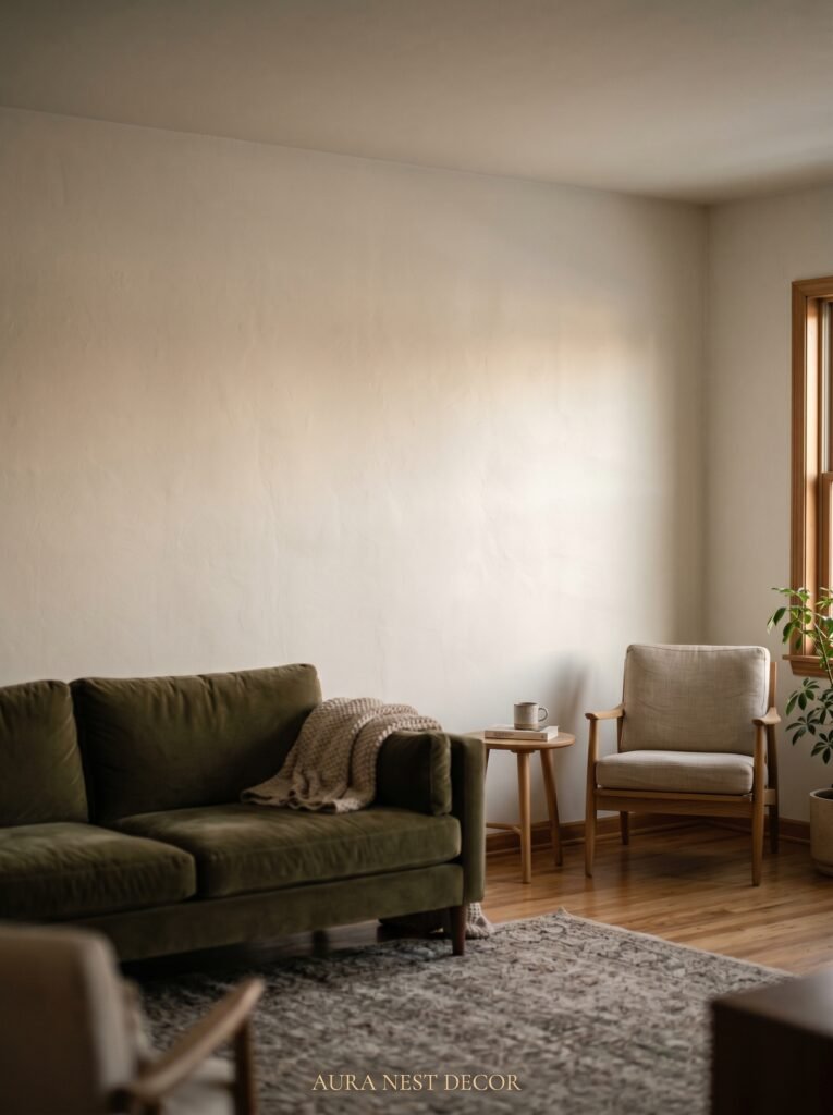
This is the most counter-intuitive thing I’ll say in this entire article: sometimes the most powerful thing you can do for your living room walls is leave one of them completely alone.
Not every wall needs to perform. In a modern classic room, the negative space between elements is part of the design. An expanse of beautiful painted wall, with nothing on it, nothing near it — just color and light and plaster — can be as much of a statement as the gallery wall opposite it.
This is especially true in rooms that have strong architectural features doing the work. If your living room has tall windows letting in extraordinary light, a deep-set fireplace, or a beautifully detailed ceiling, those elements are already filling the visual field. A bare wall in that context isn’t unfinished. It’s breathing room.
The Japanese concept of ma — the beauty of intentional empty space — applies here. A room with one deliberately bare wall feels considered and intelligent. It says the person who designed this knew when to stop. That restraint is, in itself, a form of sophistication. Let one wall simply be a wall. Let the light move across it. Let it rest.
9. Textiles on Walls: The Move That Separates Good Rooms from Great Ones
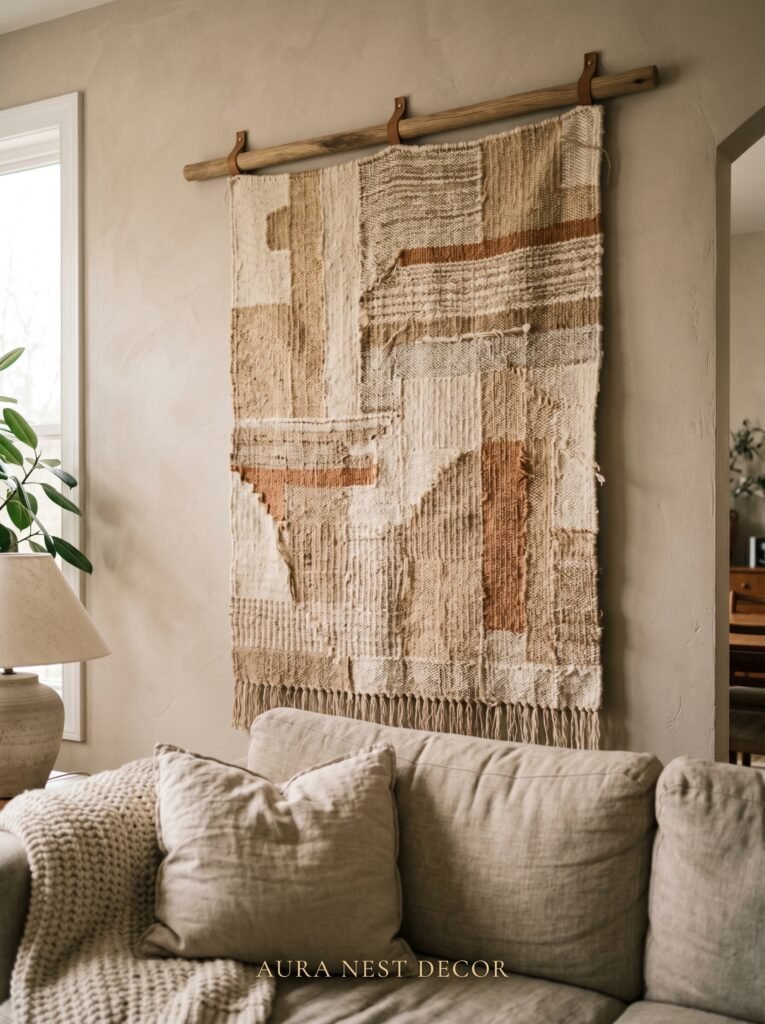
Fabric on walls sounds maximalist. In the right hands, it’s anything but.
A single large woven textile — a kilim-style wall hanging, a piece of antique tapestry, a length of naturally-dyed linen pinned with the simplest wooden dowel — adds texture, sound absorption, and warmth to a living room wall in a way that no print on paper ever quite manages. You feel it in the room, even if you’re not looking directly at it.
For a modern classic space, the key is keeping it simple and letting the material do the talking. No neon macramé. No inspirational words woven in yarn. Think naturally dyed wool, aged linen, subtly geometric patterns in terracotta, sage, and off-white. Hang it centered and low, so it feels grounded rather than decorative.
In UK homes with high ceilings, a long vertical textile can have extraordinary presence — almost like a column, anchoring the wall. In lower-ceilinged American rooms, a wide horizontal piece creates the sense of an extended horizon, making the room feel broader and more settled.
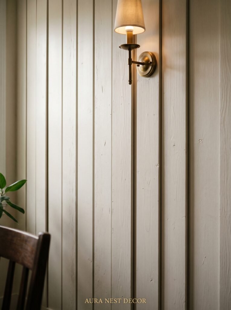
10. Lighting That Makes Your Wall Decor Look Like It’s in a Museum
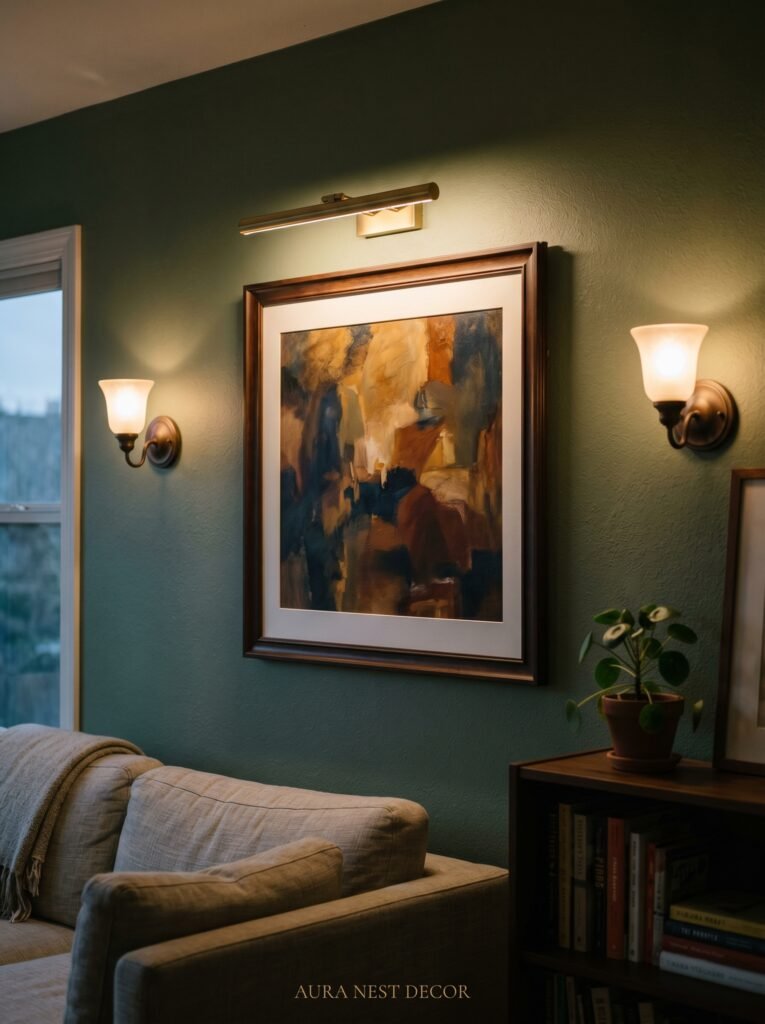
The art is only as good as the light that hits it. This is the single most underdiscussed element of living room wall decor, and getting it right is what separates rooms that photograph beautifully from rooms that feel beautiful when you’re actually standing in them.
Picture lights — those small adjustable lamps that mount directly above a frame — used to feel formal and stuffy. They’ve been redesigned completely. A simple brass picture light above a large oil-style print, or a black plug-in picture light above a framed architectural photograph, creates a pool of warm focused light that makes art feel genuinely precious.
For gallery walls, small directional spotlights on a track (available in both surface-mount and recessed versions for both new and older UK and US homes) can wash the whole arrangement in warm, gallery-quality light. The amber glow of an Edison bulb at 7pm on a carefully arranged wall is, genuinely, one of the most satisfying things a home can offer.
Don’t underestimate candle sconces flanking a large mirror or central piece. In a modern classic room, sconces at eye level on either side of a fireplace mirror are architectural, beautiful, and completely functional. They’re the lighting equivalent of the room clearing its throat quietly and saying: look here.
11. The Small Details That Make a Wall Feel Finished, Not Decorated
There’s a difference between a decorated wall and a finished wall. Decorated says: I bought some things and put them up. Finished says: I thought about this. Even the small choices matter.
The gap between the top of your sofa and the bottom of your art should be 6-8 inches — not 3, not 18. The center of your primary piece should sit at eye level, which is roughly 57-60 inches from the floor, whether you’re measuring in an American suburb or a London flat.
Frames should be the same finish or one step apart — all matte, or a mix of matte and satin, never matte next to high gloss. If you’re mixing metal and wood frames, make sure the wood tones are in the same family — all dark, or all natural, not a dark walnut next to a bleached ash.
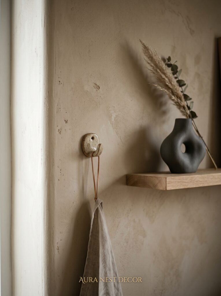
Small ledge shelves, when used minimally — one candle, one small vessel, one folded card — can make a wall feel curated rather than flat. But the moment you add the fourth thing, it tips into shelf-as-storage, which is a different look entirely.
Every detail earns its place. Every gap is a decision. Treat the finished wall the way you’d treat a sentence you’re really proud of — nothing left in that doesn’t need to be there.
12. The Piece You Haven’t Considered Yet That Might Be the Best Thing on Your Wall
I want to leave you with this: the most interesting modern classic living room walls I’ve ever seen — the ones I’ve photographed on my phone because I knew I’d want to think about them later — all had one thing that nobody expected.
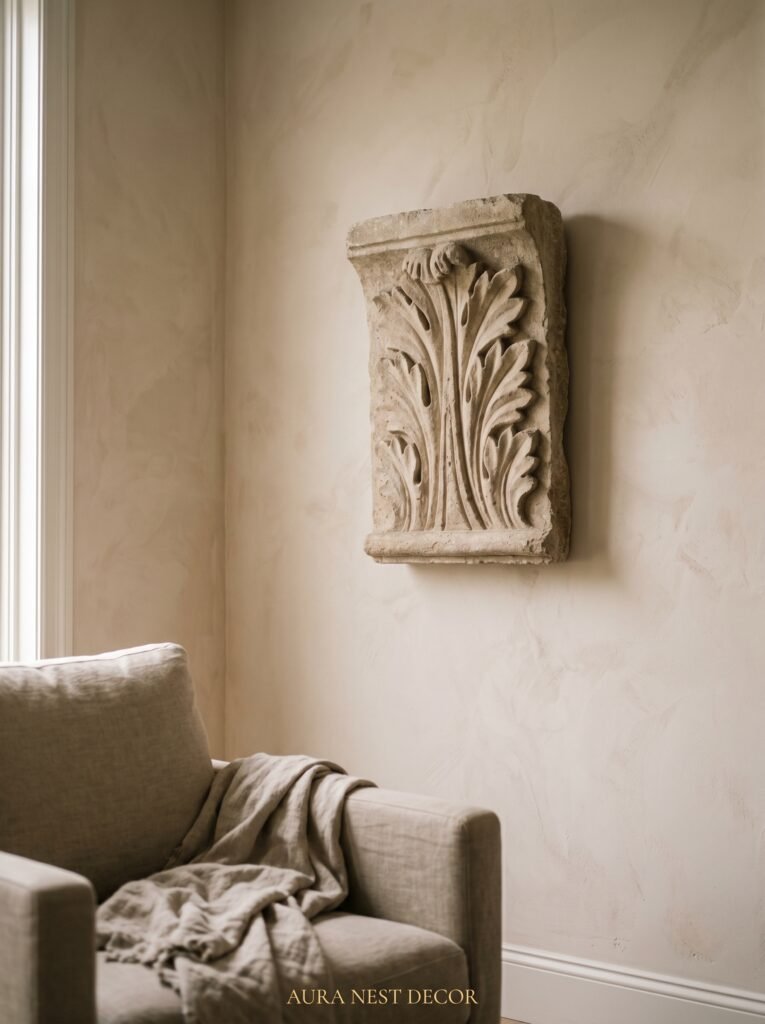
Not a gallery. Not a mirror. Something left of center. A single large architectural salvage piece — an original Victorian shop sign, a carved wooden architectural fragment, a section of iron railing mounted flat. A giant framed vintage map of a city someone loves. A collection of three black-painted plaster casts of classical faces, arranged as deliberately as punctuation.
The point isn’t the thing itself. The point is the commitment to it. A living room wall that has one unexpected, deeply personal element suddenly feels alive in a way that a carefully coordinated scheme never quite manages. It says: a real person lives here. Someone who loves something enough to hang it on a wall and not second-guess it.
That’s what modern classic design, at its best, is really doing. It gives you the structure and the restraint to let the things that matter actually matter.
—
❓ FAQ
Q: How do I make a small living room wall look more impressive without overcrowding it? A: Go bigger with fewer pieces rather than smaller with more. One large statement piece — a mirror, a single oversized print, a substantial artwork — will make the wall feel architectural and intentional. Clustering lots of small items in a small space just emphasizes how small the space is.
Q: What’s the best way to mix old and new pieces on a modern classic gallery wall? A: Keep the palette consistent. If your newer pieces are in muted, neutral tones and your vintage pieces share that same quiet palette, they’ll sit together easily regardless of their age. It’s clashing color and energy that breaks the harmony — not the difference in era.
Q: How high should wall art be hung in a living room? A: The center of the piece should sit at approximately 57-60 inches from the floor — that’s roughly eye level for most people when standing. When hanging art above a sofa, leave about 6-8 inches between the top of the sofa back and the bottom of the frame, so the art reads as connected to the furniture rather than floating loose on the wall.
—
💭 Final Thoughts

The best living room walls aren’t designed in a day. They’re edited over time — a piece removed here, something unexpected added there, the light adjusted, the arrangement reconsidered. What makes a modern classic wall feel so enduring is that it was never trying to be finished. It was trying to be right.
Give yourself permission to make one strong decision and then let the room tell you what it needs next. What’s the one thing on your walls right now that genuinely stops you and makes you glad it’s there?


