
The Living Room Wall That Finally Looks Like You (Not Like a Showroom)
You know that feeling when you walk into someone’s home and their walls just tell a story? Not in a contrived, “I bought this whole set at a furniture store” way — but in a way that feels layered and alive and completely theirs. That’s what we’re chasing. And the good news? You can make it happen yourself, with more intention and less money than you’d think.
—
1. The Mistake Almost Everyone Makes Before They Even Pick Up a Hammer
Most people start with the art and work backward. They find something they like, hang it, and then wonder why the whole wall feels off.
The actual starting point is the wall itself — its width, its light, its relationship to the furniture in front of it. Before you buy a single frame or mix a drop of paint, stand in your living room at different times of day. Morning light hits differently than late afternoon. The wall that looks creamy white at noon can turn almost lavender at dusk depending on which direction your windows face. In the US, a south-facing room gets warm, consistent light. In the UK, a south-facing room is basically gold — use it.
Measure the wall. Not because you’ll fill every inch, but because you need to know your canvas. A common rule that actually holds up: your art grouping should cover roughly 60 to 75 percent of the width of the sofa or console beneath it. Wider than that and it floats. Narrower and it looks like an afterthought.
That’s the foundation. Now the fun starts.
“Your wall doesn’t need more art. It needs the right art, hung with intention.”
—
2. The Color That Keeps Showing Up in Every Beautiful Living Room Right Now
It’s not white. It’s not even off-white. It’s that muddy, sophisticated middle ground — raw linen, warm greige, the color of old paper — and it’s showing up as a painted accent wall, as a backdrop for framed prints, as the base color in DIY abstract canvases everywhere from Brooklyn apartments to Cotswolds cottages.
The reason it works is chemistry. Cool-toned art pops against a warm neutral wall. Warm-toned art (think ochre, terracotta, dusty rose) sinks into it beautifully, creating that layered, collected look. Pick your battle: do you want contrast or cohesion? Neither is wrong. Both are stunning when done with intention.
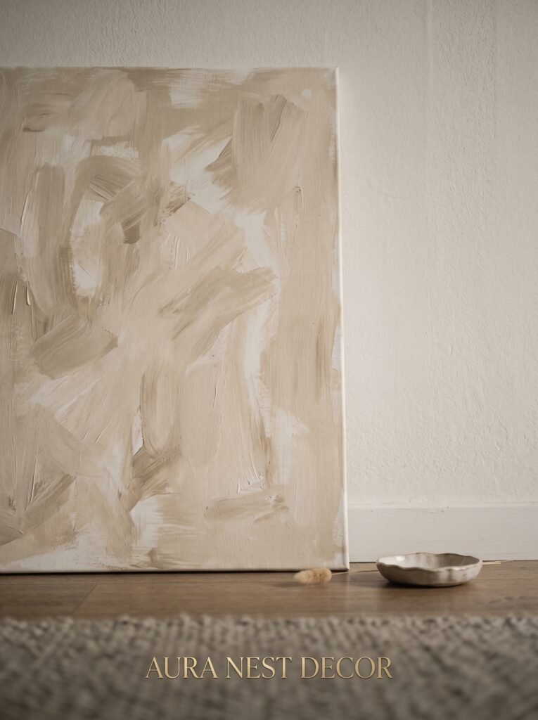
If you’re doing a DIY painted canvas, start with a base coat in that warm neutral — Benjamin Moore’s “White Dove” or Farrow & Ball’s “Elephant’s Breath” are both brilliant starting points. Then layer. Thin washes of raw umber, a drag of titanium white, a dry-brush pass of something unexpected like sage green. You’re not making a painting. You’re making a texture that lives with your room.
—
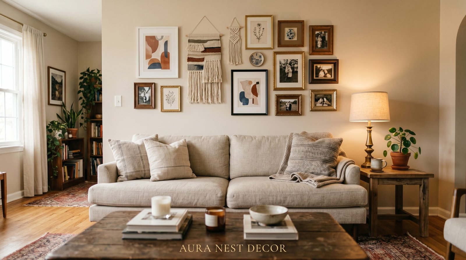
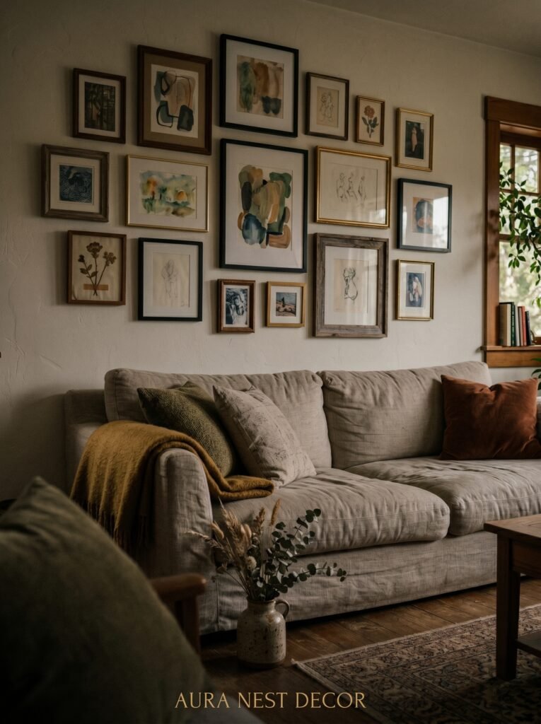
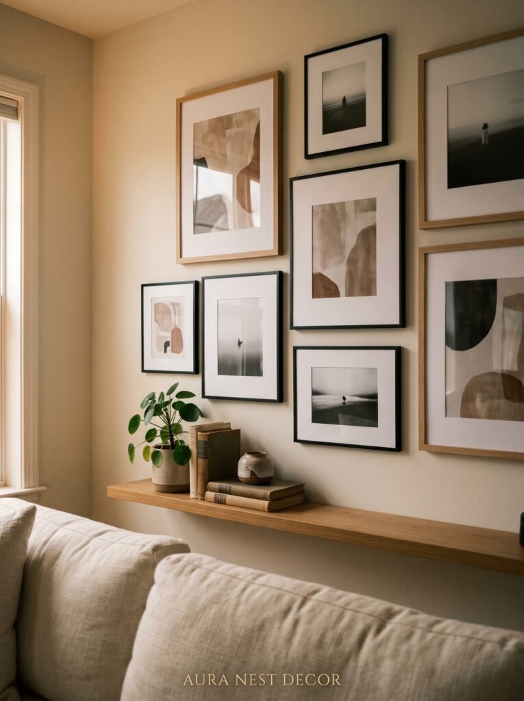
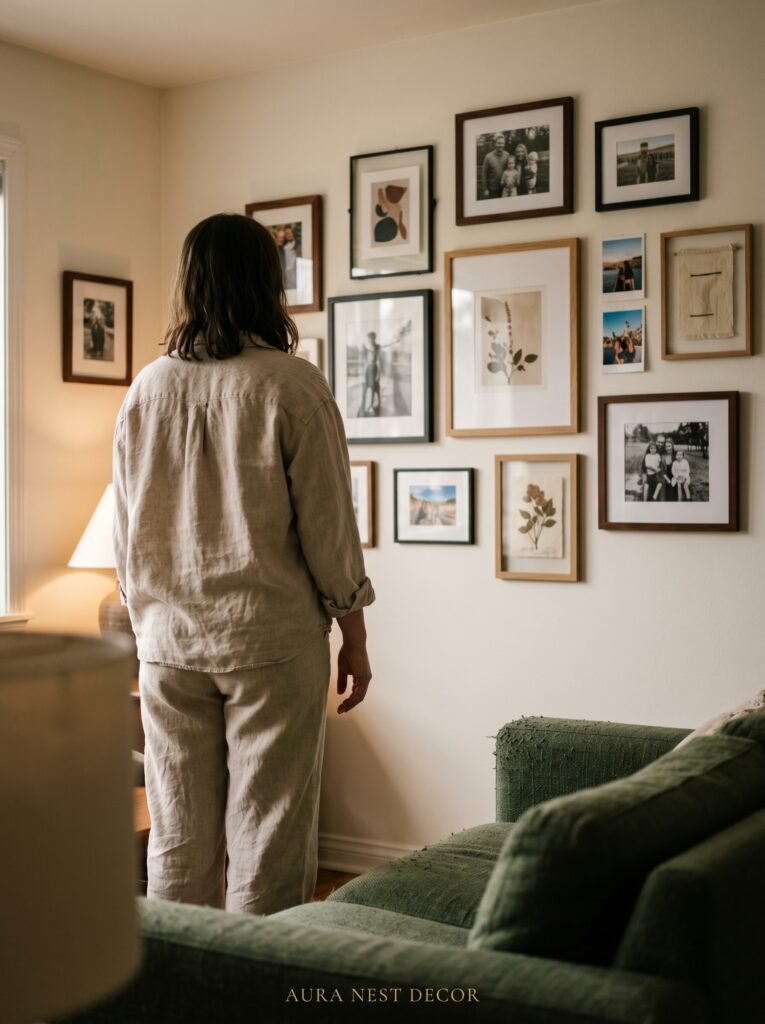
3. Why a Gallery Wall Fails (And the One Layout That Never Does)
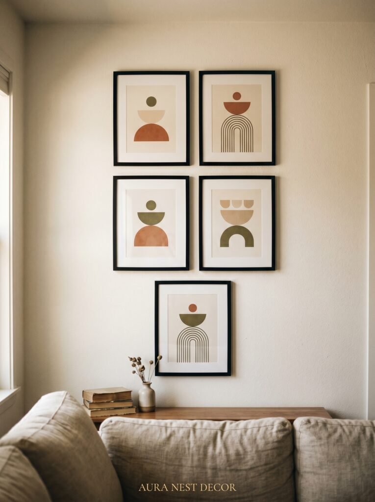
The gallery wall has been done to death. But here’s the thing — it only looks bad when it’s done without a spine.
Every successful gallery wall has an anchor piece. One large, dominant item — a canvas, a mirror, a textile, an oversized print — and everything else orbits it. Without an anchor, your eye has nowhere to rest and the whole thing reads as chaos. With one, it reads as curated.
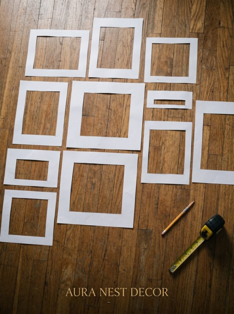
Lay everything out on the floor first. Photograph it from above. Then look at that photo on your phone — small screen, honest perspective. Does it feel balanced? Is there a clear center of gravity? If yes, transfer it to the wall using painter’s tape to mark the positions before you commit a single nail hole.
Mix frames, but keep one consistent element. Same finish (all black, all natural wood, all brass), or same mat color (all white, all cream), or same frame style (all thin-profile). One shared thread is all you need. It creates cohesion without matching, and matching is, honestly, the death of personality.
—
4. The DIY Art That Looks Expensive and Takes 45 Minutes
Dried botanicals in clip frames.
I know. It sounds like it belongs in a Pinterest board from 2015. But when you do it right, it looks nothing like that era. The difference is scale and selection.
You want large stems — eucalyptus branches, dried pampas, pressed magnolia leaves, bundles of wheat or lavender — and you want them in oversized frames. We’re talking A2 or even A1 in UK sizing, or 18×24 inches for US readers. Single stems, well-pressed, floated against a linen or textured paper background rather than white card.
The framing matters enormously. Deep black frames make dried botanicals look editorial. Thin brass frames make them look warm and antique. Wide white mats make them look like a natural history museum display, which is a genuine compliment.
Press your own botanicals between heavy books for two to three weeks, or buy pre-dried stems from a florist or craft shop. Group three frames together in a cluster rather than a straight line. The slight offset — one slightly higher, one lower, one centered — is what makes it look intentional rather than identical.
“The most beautiful walls aren’t perfectly symmetrical. They’re perfectly considered.”
—
5. Macramé’s Quiet Comeback (And How to Not Make It Look Like a Boho Cliché)
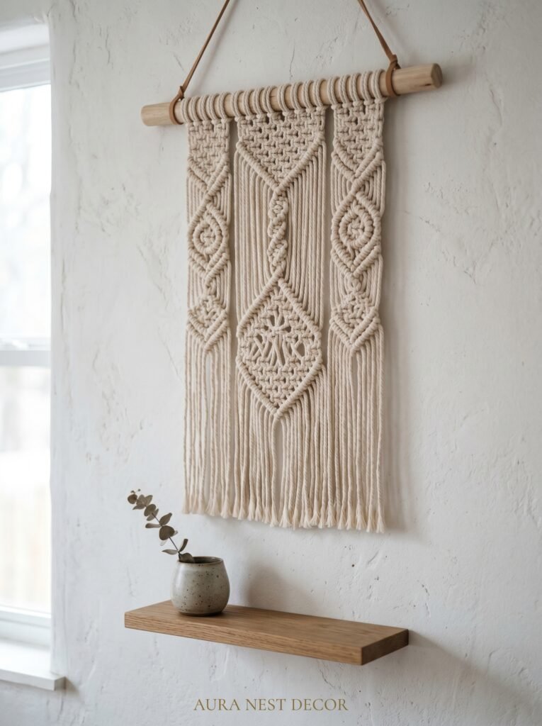
Macramé never actually left. It just got more sophisticated. The key shift is in the palette and the scale.
Forget natural jute. Go for cotton rope in undyed white or, even better, in a single muted tone — dusty blush, aged grey, warm oat. The texture reads as textile art, which it absolutely is, and the color keeps it from screaming “boho starter pack.”
Size matters even more here than with framed art. A small macramé piece on a large wall looks like a lost sock on a clothesline. Go big — genuinely big. A piece that’s 24 inches wide and 36 inches long will hold its own. Or cluster three narrower hangings at different heights to create rhythm on a blank wall.
Basic macramé knots are genuinely learnable in a weekend. The square knot and the lark’s head knot will carry you through 90 percent of designs you’ll find in tutorials. A simple wooden dowel, a bundle of 4mm cotton rope, and two hours on a Sunday afternoon. The result hangs on your wall and tells visitors you made something with your hands. That is, quietly, one of the most impressive things a room can say.
—
6. The Rule That Makes Any Tiny Living Room Feel Intentional
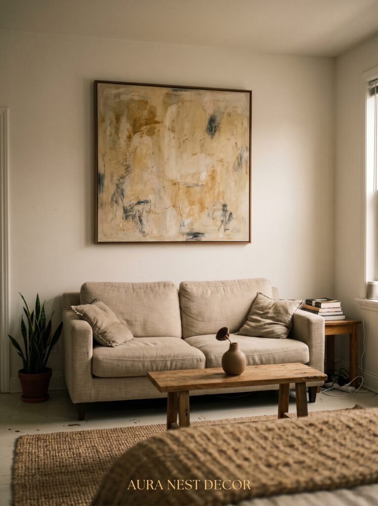
One large piece of art will always, always make a small room feel bigger than four small pieces grouped together.
This is counterintuitive. We tend to think small room equals small everything. But scale is about proportion, not absolute size. A single large canvas — say, 30 by 40 inches — hung on the main wall of a small living room gives the eye something to travel to and rest on. The room feels anchored. It feels deliberate.
Four small pieces crowded on the same wall create visual clutter, which makes the space feel tight and fussy. The brain reads “more” as “busy” and “busy” as “small.”
If you’re working with a small UK terraced house living room, or a New York apartment with walls that feel barely wider than a door, try this: DIY one large canvas. Stretch a canvas from an art supply store, prime it with gesso, and create a simple abstract in two or three tones that pull from your room’s palette. It doesn’t need to be complicated. Broad horizontal brushstrokes in complementary neutrals. A single field of color with texture. A gestural mark or two. The size does the heavy lifting. You just have to be brave enough to go big.
—
7. Wallpaper Panels You Can Move When You Change Your Mind
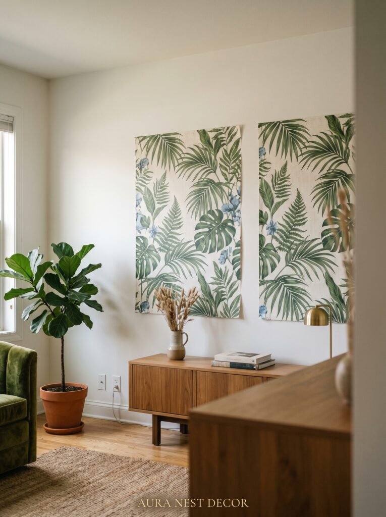
Peel-and-stick wallpaper has genuinely gotten beautiful. And the most interesting way to use it isn’t to cover a whole wall — it’s to create panels.
Pick a print you love — a large-scale botanical, a geometric, a subtle linen texture — and cut it into three or four tall panels, each about 18 to 24 inches wide. Space them evenly across your main wall with a few inches of painted wall showing between each panel. The result looks intentional and architectural, like built-in art, and it costs a fraction of a framed piece at that scale.
The other advantage of panels: you can rearrange them. Move them to a different wall when the mood shifts. Take them with you when you move. Try a new print without the commitment of full-wall wallpaper.
For UK Victorian homes or US craftsman-style houses with picture rails, you can hang fabric panels from the rail using curtain clips — no adhesive, no damage, and the slight movement of fabric on a wall creates something almost sculptural.
“The best home decor doesn’t cost the most. It takes the most thought.”
—
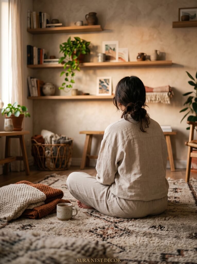
8. The Shelf Wall That Works Harder Than Any Picture
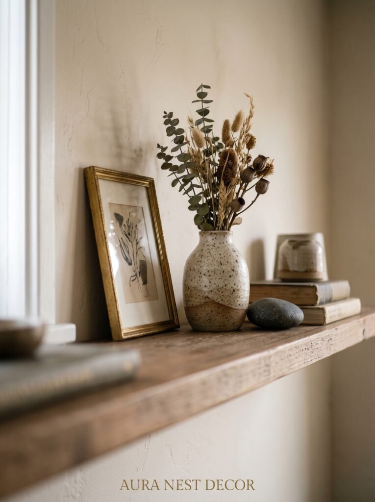
Floating shelves arranged as a wall display are doing double duty — they’re decorative and functional, which gives them an earned place in a room rather than just a decorative one.
The mistake is loading them with too much. Three items per shelf, maximum. One tall, one medium, one small. Repeat that formula with variation — different objects, same rhythm — and the whole arrangement reads as cohesive. Books turned spine-out (yes, really), a small potted trailing plant, a candleholder, a framed print propped rather than hung. Propped prints feel more casual and human than perfectly hung ones.
Paint the shelves the same color as the wall they sit against for a seamless, modern look — the objects float rather than the shelf structure drawing attention. Or contrast them: natural walnut against a dark navy wall, white against a warm terracotta. Either choice is valid when it’s made on purpose.
Leave some space. Empty shelf space is not wasted — it’s breathing room, and breathing room is what separates a styled shelf from a cluttered one. American homes tend toward maximalism; British homes tend toward restraint. Somewhere in between is usually the answer.
—
9. Painting Directly on the Wall (Less Scary Than It Sounds)
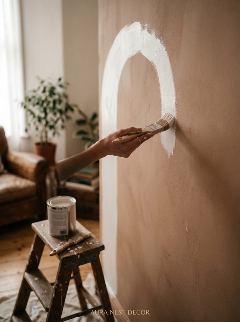
An arched paint panel. A color-blocked section. A freehand mural. These are not as intimidating as they look in a finished photo.
The arch is the easiest entry point. Mark the top of a doorway or the space above a console table. Use a piece of string and a pencil as a compass to draw a perfect half-circle at your chosen width. Tape the edge carefully — precision here is everything — and paint the interior in a contrasting or complementary color. Deep green behind a natural linen sofa. Terracotta behind a white mantel. Warm plum behind a console with brass details.
The effect is architectural in the best way. It looks like something the house was built with, not something you added on a Sunday. And if you ever change your mind, it’s two coats of the original wall color to reverse it completely.
For the braver among us: a simple organic mural. Freehand branches, leaves, a few gestural shapes. Use a pencil first, lightly. Go slowly. It’s not about perfection — slightly uneven lines look hand-done and alive. That’s the point.
—
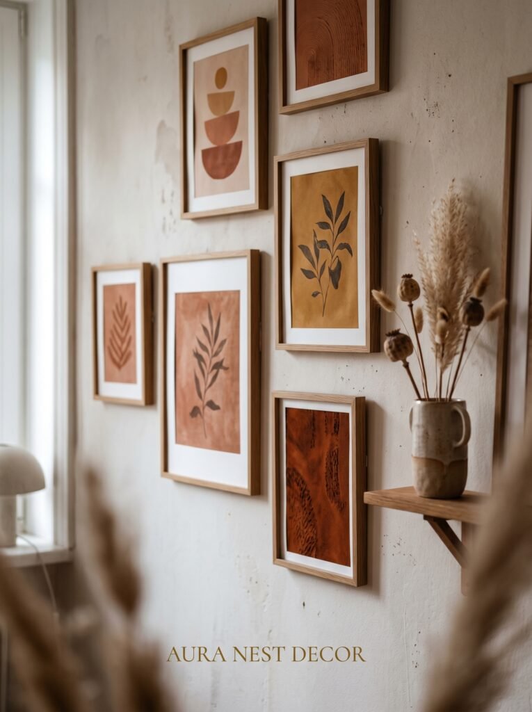
10. The Frame Color Nobody Talks About Enough
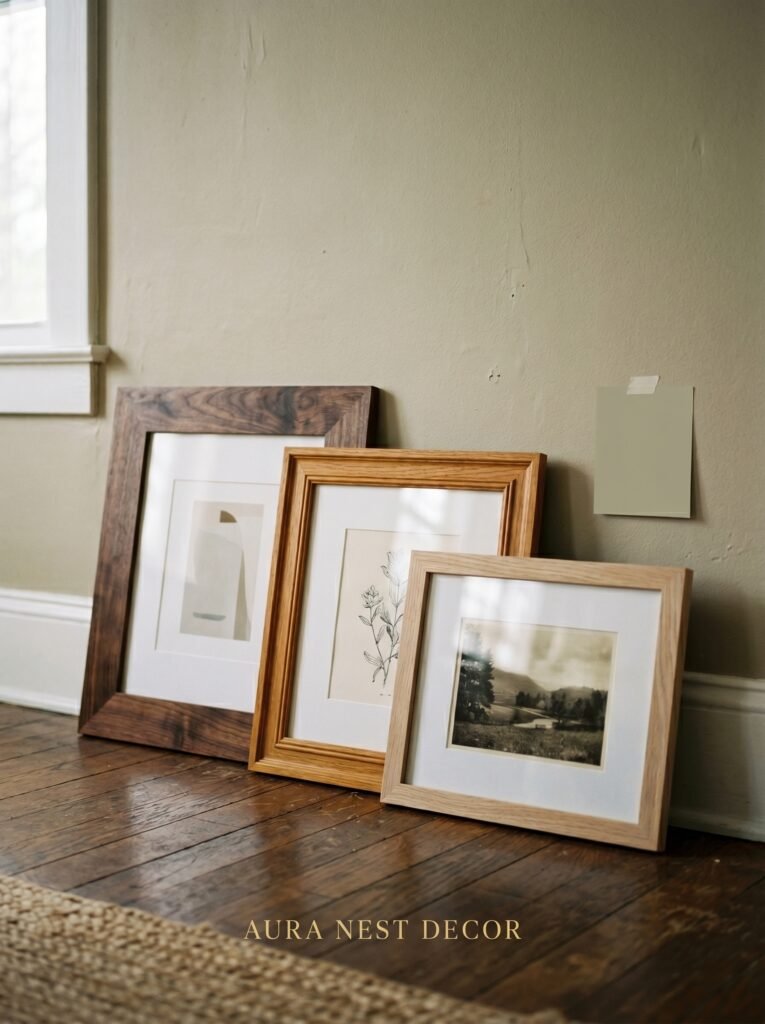
Everyone debates black frames vs. white frames vs. natural wood. Fine. But the real underdog is the dark brown — almost walnut, almost chocolate — frame.
Dark brown frames sit differently on a wall than black. Black is graphic, modern, high contrast. Dark brown is warm, collected, like something you found at a market rather than ordered in bulk. It works in nearly any living room, pairs with almost any print or canvas, and it especially sings in rooms with warm neutrals, wood furniture, or any vintage or vintage-adjacent pieces.
In the UK, the Victorian and Edwardian interior tradition is full of this warm dark wood, and a dark brown frame on a cream wall in a period property is one of those combinations that just belongs in the way that’s hard to manufacture. In the US, it reads as relaxed, layered, lived-in.
You can paint frames from a charity shop or thrift store in dark walnut brown with a matt finish spray paint. Honestly. The results look like something from a boutique interior shop.
—
11. The One Thing That Makes a DIY Wall Look Completely Finished
Lighting. Specifically, directional lighting aimed at the wall.
A beautiful gallery wall in flat overhead lighting looks flat. The same wall with a picture light above the anchor piece, or an angled wall sconce throwing warm light across the surface, becomes something else entirely. The texture in a canvas comes alive. The shadows in a botanical print deepen. The whole composition reads three-dimensional.
Picture lights have come down enormously in price — you can find battery-operated, hardwire-free versions that look beautiful and install in minutes. Aim for a warm bulb (2700K or lower) rather than cool white. The amber glow of warm light at 7pm, spilling across a wall you made yourself, is one of those small daily luxuries that costs almost nothing and means a lot.
This is the detail that separates “I decorated my wall” from “I designed my living room.” It’s that specific.
—
12. How to Know When You’re Done
This is the hardest part and nobody talks about it.
There’s a tipping point — a point at which adding one more thing tips the wall from layered and intentional to busy and effortful. Knowing where that point is before you reach it is a skill, and you build it by sitting with what you have.
After hanging or arranging anything new, leave it for 48 hours before adding more. Live with it at different times of day. Look at it in the morning with fresh eyes. Photograph it. Look at the photo. Your eye is more honest in a photo than in person — we tend to see what we want to see when we’re standing in the room. A photo shows you what’s actually there.
When you look at your wall and feel something — that quiet satisfaction, that sense that it’s yours and it’s right and it doesn’t need explanation — you’re done. That feeling is the finish line. Not a checklist, not a trend. Just that.
—
❓ FAQ
Q: What’s the easiest DIY wall art for a beginner with no art skills? A: Dried botanicals in oversized frames are genuinely foolproof — no painting skills required, and the result looks stunning at any skill level. Abstract poured or brushed canvases are also very forgiving because imperfection is part of the aesthetic.
Q: How do I hang a gallery wall without making lots of holes in the walls? A: Lay everything out on the floor first to finalize the arrangement, then use painter’s tape to mark each frame’s position on the wall before committing. For rental properties or plaster walls in older UK homes, adhesive picture-hanging strips (Command strips) rated for the weight of your frames are a genuinely reliable option.
Q: How do I make DIY wall art look cohesive rather than random? A: Pick one repeated element — a consistent frame finish, a shared color palette in the prints, or one repeated material like natural wood — and let everything else vary. That single thread of consistency is what ties a collected, eclectic wall together without making it feel matchy or lifeless.
—
💭 Final Thoughts
The walls in your living room are the first thing people feel when they walk in — not see, feel. They set the temperature of the whole space. And the ones that stay in your memory are never the expensive ones or the perfectly styled ones. They’re the ones that feel like someone actually lives there, loves their home, and made something with care.
What would your walls say about you if they could talk?


