
The Sitting Room Glow-Up: 12 Modern Living Room Ideas That Actually Feel Like You
You walk into someone’s house and the sitting room stops you cold. Not because it’s expensive. Because it feels right — every corner considered, every texture chosen with intention. That’s the feeling we’re chasing. Here’s exactly how to get there.
—
1. The Specific Shade of Warm White That’s Quietly Replacing Greige Everywhere
We need to talk about white. Not the cold, clinical white of a hospital corridor. The warm, almost-cream white that catches afternoon light and turns every hour of the day into something you want to photograph.
Designers have been moving away from greige — that safe beige-grey that dominated for a decade — and toward something softer and more intentional. Think Benjamin Moore’s White Dove. Think Farrow & Ball’s All White mixed with a breath of Cornforth White on the ceiling. The difference is subtle until it isn’t, and then it’s everything.
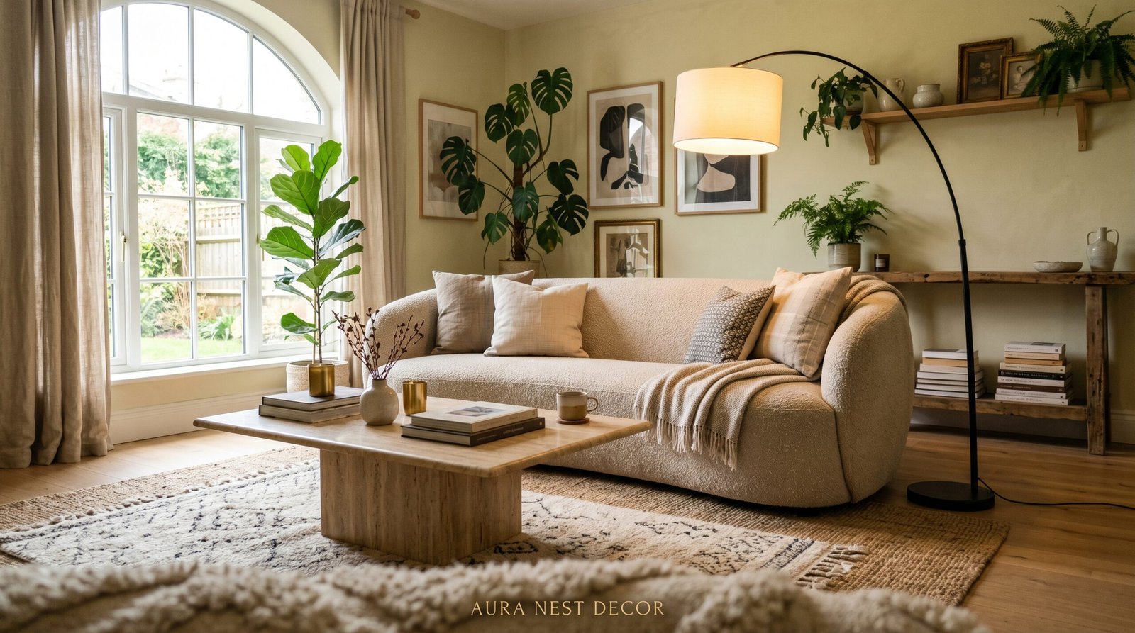
What makes this shift feel modern rather than old-fashioned is the contrast. Warm whites work because they’re paired with something dark and deliberate — a deep terracotta throw, a charcoal linen sofa, a single black-framed window that draws your eye outside. The warmth of the wall makes everything else in the room feel intentional rather than accidental.
If your sitting room has been living in a beige fog, try this: paint one wall in a warm, barely-there white and see how the room reorganizes itself around it. You’ll notice things you never saw before.
“The most expensive-looking rooms aren’t painted bold — they’re painted with absolute precision.”
—
2. Why Every Beautiful Sitting Room Has One Piece That Doesn’t Belong
Here’s a design rule that gets ignored in almost every magazine feature: the rooms that feel genuinely interesting always have one thing that looks like it arrived from a completely different world.
A mid-century modern chair in a traditional English cottage sitting room. A rough-hewn wooden side table next to a streamlined contemporary sofa. An antique oil painting propped (not hung — propped) against a white shiplap wall. This is called juxtaposition and it’s the difference between a room that looks designed and a room that looks lived in.
American homeowners tend to match too hard — every piece coordinating, every finish aligned. British interiors often do the opposite naturally, partly out of necessity (old houses, inherited furniture, layers of history), but that instinct is worth stealing. The sofa doesn’t have to love the armchair. They just have to coexist with a certain confidence.
Look at your sitting room right now and ask: what’s the most surprising thing in this space? If the answer is “nothing,” that’s your next project. Find one unexpected object — a sculptural lamp, a vintage kilim, a piece of art that raises a quiet eyebrow — and place it somewhere it has room to be noticed. That’s it. That’s the whole trick.
—
3. The Window Treatment That’s So Simple It Looks Custom
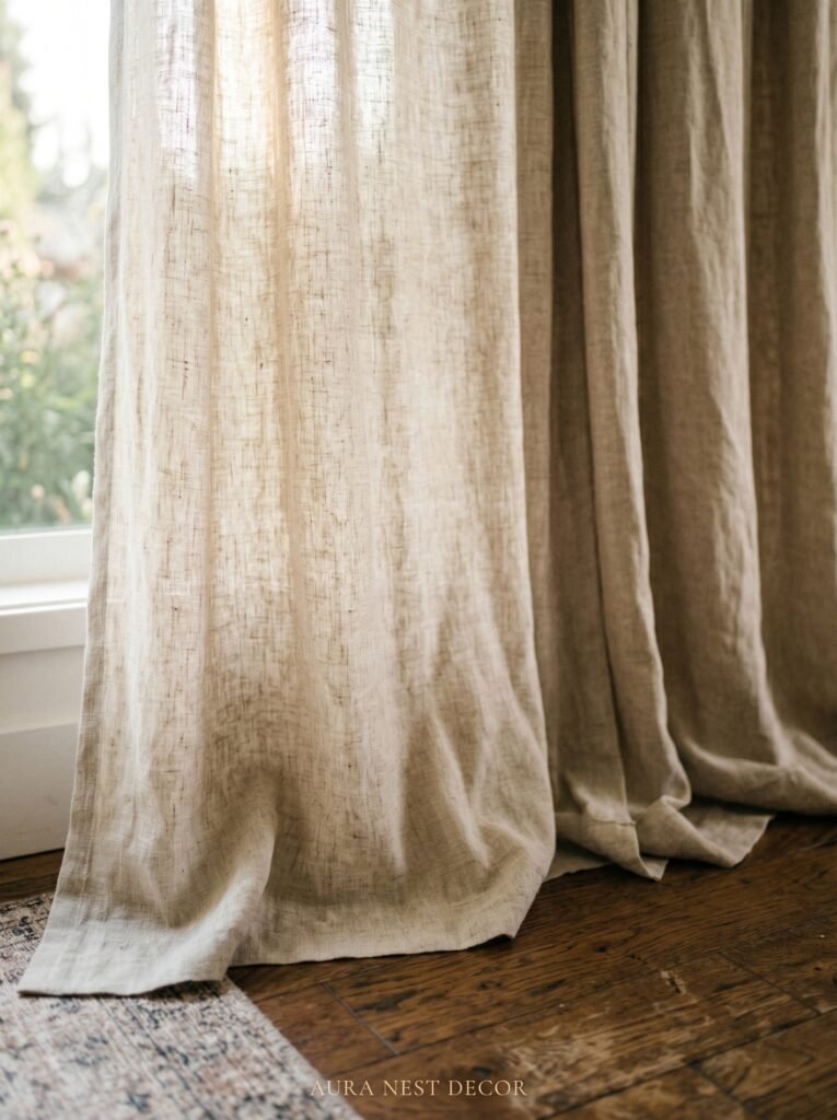
Floor-to-ceiling curtains hung as high as possible — not at the top of the window frame, but at the very top of the wall.
I know. Everyone says this. And yet the majority of sitting rooms in both the US and UK still have curtains hanging two inches above the window frame, cutting the wall in half and making the ceiling feel like it’s pressing down.
Hang them high. Hang them wider than the window, so the fabric pools at the sides and lets the maximum amount of light in when they’re open. Use a heavyweight linen or velvet in a colour that feels like it came from nature — dusty sage, faded ochre, the blue-grey of the North Sea on a still morning.
The visual effect is architectural. It adds height to any room, regardless of the actual ceiling height. A sitting room with eight-foot ceilings can feel like it has ten when the curtains are placed correctly. And in a British terrace house or an American colonial where every room comes with its own particular ceiling drama, this matters.
The fabric pools slightly on the floor. Not a dramatic puddle — just an inch or two. Enough to look intentional. That small detail signals that someone thought about this room.
—
4. The Color That Keeps Showing Up in Every Beautiful Living Room Right Now
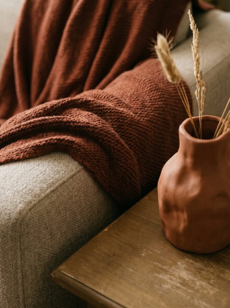
Terracotta. Deep, dusty, brick-at-dusk terracotta. Not the bright orange-rust of the early 2000s — something more muted, more mineral, like old tiles in a Portuguese farmhouse or a sun-baked courtyard in New Mexico.
It’s everywhere in interior design right now, and it earns its place. Terracotta works in sitting rooms because it’s warm without being aggressive. It doesn’t shout. It hums. And against white walls or natural wood, it creates a contrast that reads as simultaneously modern and ancient — which is exactly the combination that makes a room feel layered.
You don’t need to commit fully. A terracotta linen throw draped over one arm of the sofa. Terracotta-glazed vessels on the coffee table. Even a single terracotta-toned candle on the mantelpiece shifts the atmosphere of a room.
If you’re ready to go bigger, consider a terracotta accent wall — especially in an alcove beside a fireplace or behind built-in shelving. In a sitting room with natural light, that wall will change its personality throughout the day. At noon it’s grounded. At 7pm, in the amber glow of a single Edison bulb, it turns molten.
“Terracotta doesn’t decorate a room. It warms it from the inside.”
—
5. The One Rule That Makes Even a Tiny Sitting Room Feel Intentional
Scale. Every other rule in interior design is negotiable. Scale is not.
When furniture is too small for the room, the room feels hollow. When it’s too large, it feels aggressive. But when the scale is right — when the sofa is proportionate to the rug, when the rug defines the seating area without disappearing under the furniture, when the artwork is large enough to matter — the room clicks into place.
The most common mistake in small sitting rooms isn’t choosing big furniture. It’s choosing small furniture because it feels safer. A tiny sofa in a small room actually makes the room feel smaller. A properly scaled sofa (ideally with legs, which allow visual space to pass underneath) creates the illusion that the room is larger than it is.
The rug is where people especially go wrong. It should anchor the entire seating arrangement, with at least the front legs of every piece of furniture resting on it. An 8×10 rug in what feels like a “small” room is almost always the right choice. Smaller than that and the rug becomes a floating accent, adrift in the middle of the floor, and the room falls apart.
—
6. What the Most-Saved Sitting Rooms on Pinterest All Have in Common
I’ve spent more time than is probably healthy studying which sitting room photos get saved obsessively on Pinterest. There’s a pattern.
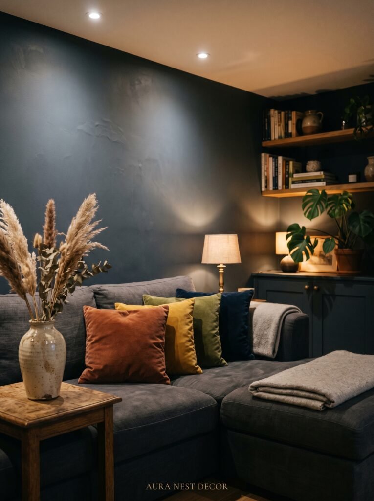
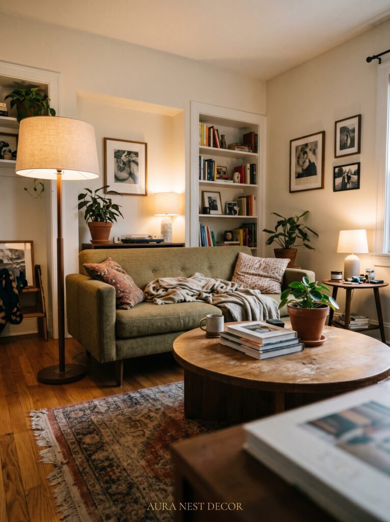
It’s not about price. It’s not about square footage. The most-saved rooms share a specific quality: they look like they have a light source story. Not just overhead lighting. Layers. A floor lamp in the corner throwing a cone of warm light. A table lamp on the side table next to the sofa. Candles on the coffee table. Perhaps string lights wound through something unexpected.
Overhead lighting should almost never be used alone in a sitting room after 4pm. The flat, even brightness of a ceiling light is efficient and totally soulless. It makes people look tired and rooms look functional rather than beautiful.
Switch your overhead off. Turn on every other light source in the room. Notice what happens. The room becomes smaller in the best possible way — more contained, more intimate, more like somewhere you’d actually choose to spend an evening.
British homeowners already understand this intuitively. The proliferation of side lamps in a traditional British front room isn’t accidental — it’s a response to the long grey winter and the desire to make every evening feel like a retreat.
—
7. The Shelf Styling Secret That Interior Designers Actually Use
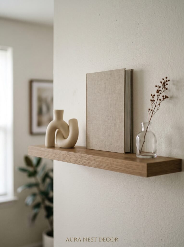
Empty space is not wasted space.
This is the thing nobody tells you when you’re staring at your own bookshelves, wondering why they look cluttered no matter how you arrange them. The objects aren’t the problem. The density is.
Interior designers style shelves by removing about a third of what you’d naturally put there. Then they group items in odd numbers (threes and fives read as deliberate; fours and sixes read as symmetrical and slightly corporate). They vary height within each group — something tall, something medium, something low. And they leave breathing room. Actual empty shelf space that allows each group to be noticed.
Books should be stacked sometimes, not just stood upright. A horizontal stack of three or four books with a small object balanced on top creates visual weight and breaks the monotony of a row of spines. Mix in objects that have nothing to do with reading — a piece of stone, a small sculpture, a single dried branch in a narrow vessel.
The shelves that look effortless took about forty-five minutes of adjustment and stepping back. That’s the part they don’t show you.
“Great shelf styling is 30% what you put there and 70% what you leave out.”
—
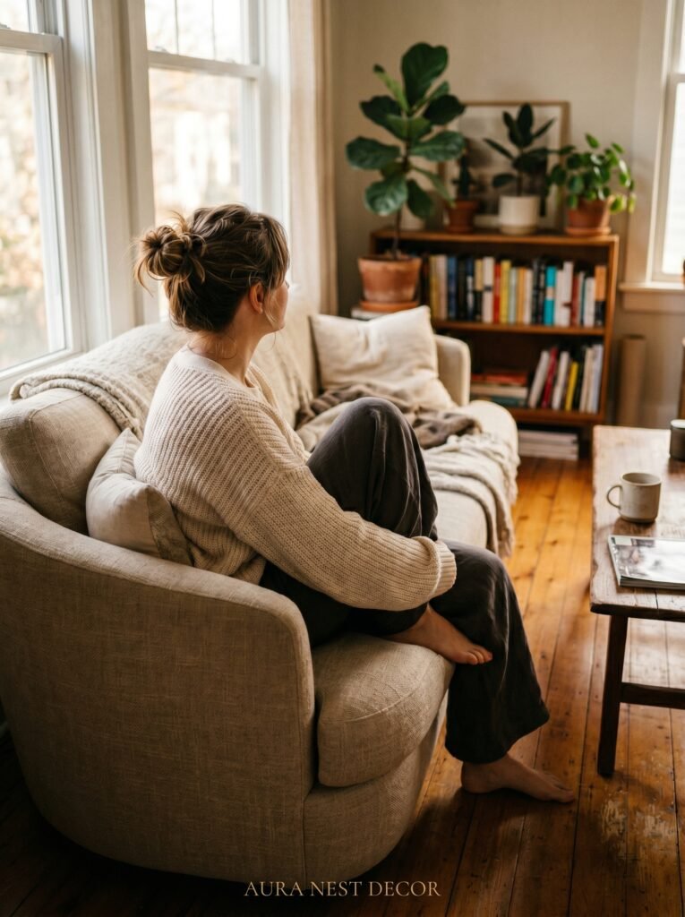
8. The Sofa Shape That’s Dominating Modern British and American Living Rooms
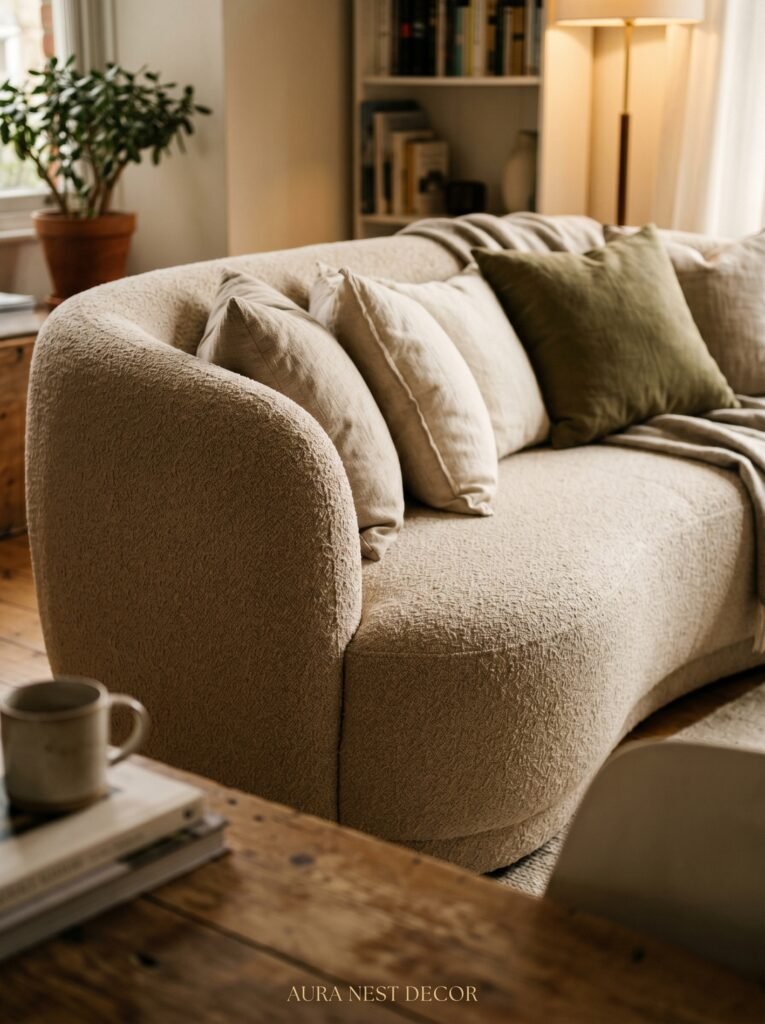
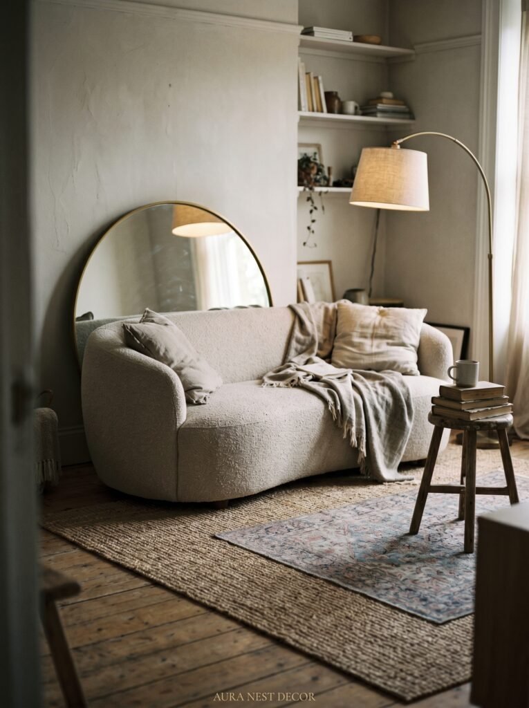
The low-back, loose-cushion sofa. Often in a natural linen. Sometimes with curved arms, sometimes with none at all.
It’s everywhere, and it’s earned its dominance. Low-back sofas make a room feel more open and European — they don’t block sightlines, they don’t dominate the visual field, and they invite a particular kind of relaxed sprawl that high-back, stiff-cushion sofas simply don’t.
The linen fabric is doing a lot of work in the current moment. It wrinkles. It softens with use. It has an inherent texture that velvet and performance fabrics don’t — a kind of honesty. And in a well-lit sitting room, the way linen catches light across its weave is genuinely beautiful.
If you’re considering replacing your sofa, think about whether you’re choosing for how it looks in the showroom or for how it’ll look at 9pm in lamplight when someone’s sitting in it with a glass of wine. Those are often different things entirely. The sofa that photographs beautifully in showroom lighting — firm, symmetrical, high-backed — is often the one that makes a room feel stiff. The one that looks slightly underdone in the shop? That’s often the one that makes a home.
—
9. Mixing Metals Like You Mean It (Not Like You’re Scared)
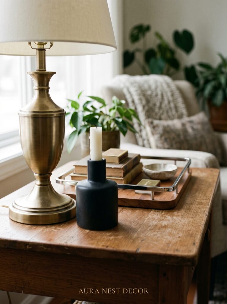
The old rule was: pick one metal and stick to it. Brass or chrome or matte black, all the way through a room.
That rule is finished.
Modern sitting rooms mix metals confidently and the result is rooms that feel lived in, layered, and unafraid. Warm brass on the lamp base. Matte black on the picture frames. A brushed nickel on the side table. The key isn’t matching — it’s proportion. One metal leads (usually the warmest one), and the others support.
Brass is having a sustained moment that shows no sign of slowing. The reason isn’t trendy — brass is warm in the way chrome will never be. Under lamplight it glows. Against a dark wall it pops. Against a pale wall it hums. It works in traditional British interiors and in stripped-back modern American spaces with equal ease.
If you’ve been afraid to mix metals, start with this: keep your hardware and your lighting in the same metal family, and let your decorative objects — frames, vessels, candle holders — bring in something different. That’s enough contrast to make the room feel intentional without tipping into chaos.
—
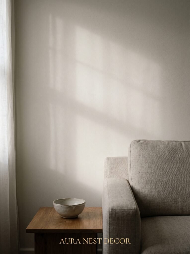
10. The Case for Leaving One Wall Completely Alone
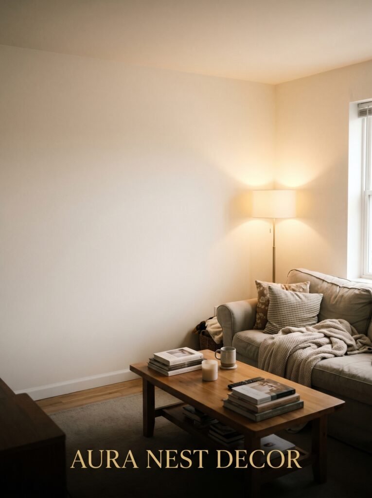
Not every wall needs something on it.
This is perhaps the hardest thing to accept when you love your home and want every inch to feel intentional. But a bare wall — properly bare, with nothing hung, nothing leaning, nothing placed in front of it — can do more for a room than a gallery wall of twenty carefully chosen prints.
The bare wall becomes the breath in the room. It gives the eye somewhere to rest. It makes everything else you’ve placed — the sofa, the art on the opposite wall, the arrangement on the shelf — feel more deliberate.
In small British terrace houses especially, where rooms stack function and feeling into tight square footage, one bare wall can make the difference between a sitting room that feels packed and one that feels considered. In an American open-plan home, a bare wall becomes an architectural element, a pause between one visual zone and the next.
If you’re going to leave a wall bare, choose it on purpose. Usually it’s the wall you don’t immediately face when you enter the room — the lateral wall, often called the “servant wall” in traditional architecture, which exists to support the space rather than to perform in it.
—
11. The Coffee Table Rule Nobody Tells You (But Every Stylist Follows)
Two surfaces, never just one.
A coffee table with a single flat surface and four objects arranged symmetrically on it is fine. But a coffee table styled with two levels of height — objects on the tabletop and something beneath, on a shelf or tray underneath — is the difference between “tidy” and “styled.”
Underneath the coffee table: a stack of art books or thick interiors magazines (the real ones — Architectural Digest, The World of Interiors, House & Garden — not the free ones from the dentist). A single sculptural object that doesn’t mind being low to the ground.
On top: group things in threes. One tall thing (a vase with a single stem, a candlestick). One medium thing (a small bowl, a vessel, a stone). One flat thing (a small book, a tray to corral the smaller pieces). Vary the texture. Vary the material. And leave 40% of the surface completely empty, because the empty space is part of the composition.
The difference between a coffee table that looks like a surface and one that looks like it was placed by someone who thinks about rooms for a living is usually just that: a second level of height and the discipline to stop adding things.
—
12. The Small Detail That Changes Everything About How a Sitting Room Feels at Night
Dimmer switches.
That’s it. That’s the detail. Every single light source in your sitting room should be on a dimmer, and if it isn’t, that’s the first renovation you should prioritize above almost anything else.
The difference between a sitting room at full brightness and the same room at 60% is the difference between a room you use and a room you inhabit. Dimmed light is warmer in tone, more flattering to both people and surfaces, and creates the specific quality of atmosphere that makes sitting rooms feel like destinations rather than corridors you pass through on the way to somewhere else.
In the UK, where the tradition of table lamps and side lighting is already strong, adding dimmers to the overhead circuit amplifies what’s already working. In American homes, where overhead recessed lighting often dominates, installing dimmers is genuinely life-changing. It costs very little, requires about an hour with an electrician, and immediately makes your home feel more expensive and more intentional.
Come 6pm, dim everything to 50%. Add a candle. Pour something worth drinking. Sit in your sitting room and see it the way a guest would. That’s the version of your home you’re decorating for.
—
❓ FAQ
Q: How do I make a modern sitting room feel cozy without it looking overdone? A: Layer your textures before you add more objects — a nubby throw, a woven cushion, a smooth ceramic, a rough wooden tray. Texture creates warmth without visual clutter. Then edit everything back by about 20%, because the restraint is what makes the coziness feel curated rather than accumulated.
Q: What’s the best rug size for a living room with a sectional sofa? A: For most sectional arrangements, a 9×12 rug is the minimum — you want at least the front legs of every sofa section sitting on the rug. If your sectional is large, go up to 10×14. The rug should define the seating area, not just float decoratively in the center of it.
Q: Can I mix modern furniture with older or antique pieces in the same sitting room? A: Not only can you — you should. Rooms that mix periods have a life to them that all-matching schemes rarely achieve. The one rule: let each piece have enough visual breathing room to be noticed on its own terms. Crowding a beautiful antique chair next to a busy modern sofa means neither piece gets to speak.
—
💭 Final Thoughts
The sitting rooms that stay with you — the ones you think about later, the ones that feel like a full exhale when you walk in — aren’t the result of spending more. They’re the result of deciding, slowly and deliberately, what the room is really for. Comfort first, beauty always, and enough restraint to let the good things breathe.
What would your sitting room feel like if you took one thing away instead of adding something new?


