
The Wall That Changes Everything: Farmhouse-Meets-Luxury Living Room Decor Ideas You’ll Actually Want to Live With
You walk into a living room and something just clicks. The walls aren’t blank, but they’re not overdone. There’s texture, warmth, intention — and somehow it feels both collected and calm. That’s the sweet spot between farmhouse soul and modern luxury, and once you find it, you never go back.
—
1. Why the Blank Wall Is a Missed Opportunity Most People Don’t Realize They’re Making
Here’s the thing nobody tells you when you move into a new place: the furniture gets sorted first, the walls get forgotten, and then six months later you’re still staring at a cream expanse that makes your whole room feel like a waiting room.
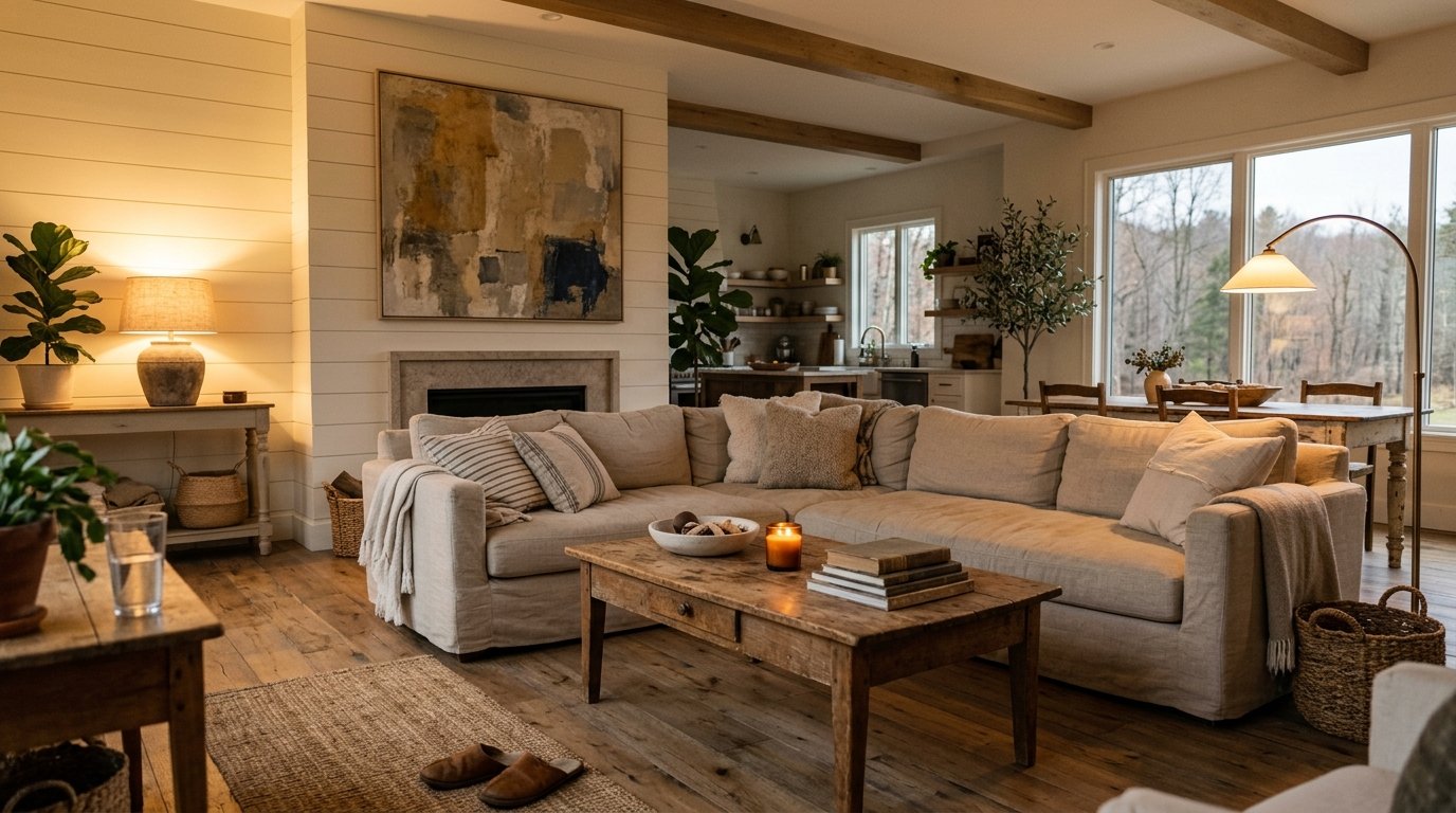
The wall is not an afterthought. It’s the backdrop for everything else you’ve already spent money on. A beautifully curated living room wall in the farmhouse-meets-luxury style doesn’t just decorate a space — it anchors it. It tells the room what it is.
Think about what you’re working with here. That expanse above your sofa, beside your fireplace, flanking your window — each one is a canvas that’s currently doing nothing. And in this particular design space, where the warmth of a working farmhouse meets the polish of a high-end boutique hotel, that wall is your single biggest opportunity to set the tone for the whole house.
Start by standing in your living room and looking at your walls the way a stranger would. What’s the first thing your eye goes to? What does the room say before anyone sits down?
“The wall is the first thing guests see and the last thing homeowners actually think about.”
—
2. The Shiplap Moment — When to Use It and When to Walk Away
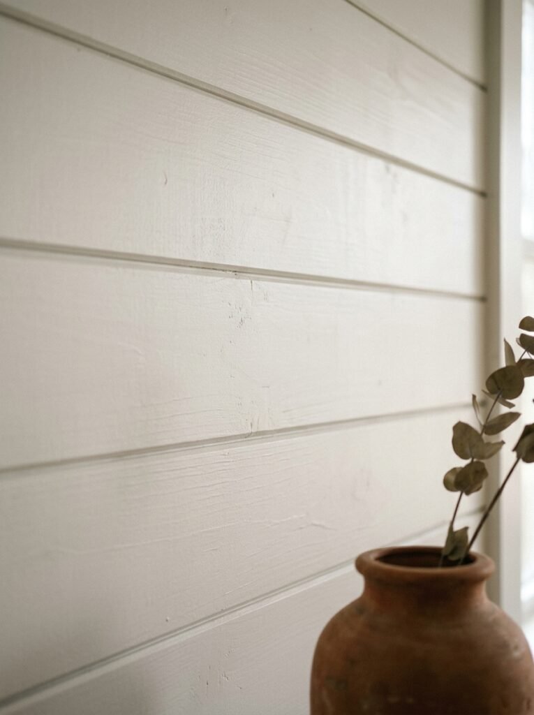
Shiplap has had its moment. Actually, it’s had about five moments. And it’s still going, which tells you something.
But there’s shiplap, and then there’s good shiplap. The kind that belongs in a modern farmhouse luxury living room isn’t painted stark white and slapped on every surface like a Fixer Upper fever dream. It’s either left in a warm, slightly weathered natural tone, or painted in a moody, complex color — think Benjamin Moore’s Hale Navy or Farrow & Ball’s Down Pipe — and used on a single feature wall rather than wrapped around the room.
When shiplap works in this aesthetic, it does so because it brings texture without noise. It’s a quiet statement. Run horizontally behind a gallery wall arrangement, it creates a layered look that feels genuinely considered. Run vertically behind a fireplace surround, it draws the eye up and makes your ceilings feel taller.
Walk away from shiplap if your space already has a lot of competing textures — exposed brick, heavy curtain fabric, a large patterned rug. It will fight everything else for attention and win in the worst possible way.
The rule: one statement texture per wall. Shiplap is that texture. Honor it or skip it.
—
3. The Color That Keeps Showing Up in Every Beautiful Farmhouse Luxury Living Room Right Now
It’s not white. It’s not gray. It’s not greige (thankfully).
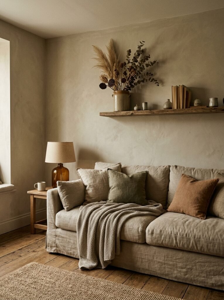
The shade that keeps appearing in the most beautiful American and British living rooms right now sits in that warm, dusty neutral zone — think soft clay, warm putty, pale terracotta. These tones read as neither cold nor sugary. They have weight without darkness. They feel expensive without trying.
In the US, homeowners are reaching for colors like Sherwin-Williams Accessible Beige and Antique White. In the UK, Farrow & Ball’s Elephant’s Breath and Dead Salmon are having a quiet, sustained moment. None of these colors are trendy in the loud sense — they’re the colors that look better and better as natural light shifts through the day.
Paint your walls in one of these tones and immediately your white art, your dark wood frames, your linen cushions, your terracotta pottery — all of it suddenly looks curated. Like it belonged there.
This is the color that makes your other choices look intentional.
—
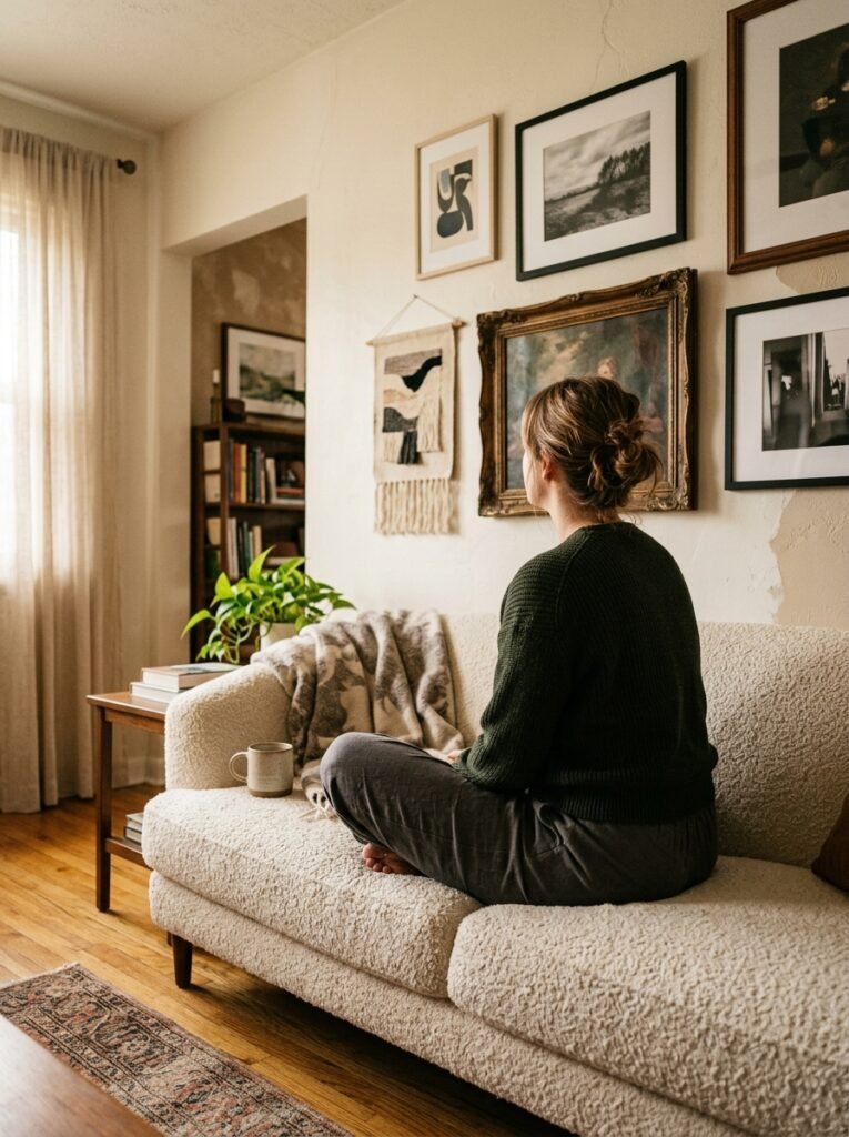
4. Gallery Walls That Don’t Look Like Everyone Else’s Gallery Wall
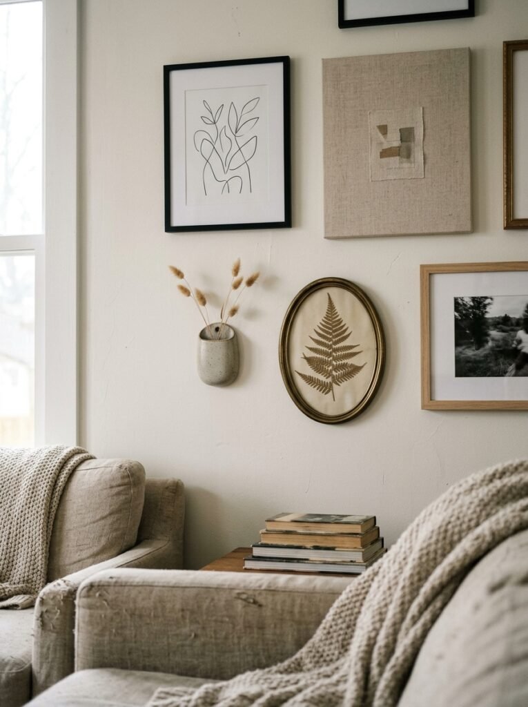
The gallery wall trend is so well-worn it’s practically furniture at this point. But there’s a reason it’s lasted: done right, it’s genuinely the most personal, interesting thing you can put on a wall.
Done wrong, it’s a Pinterest graveyard of mismatched frames and stock photography downloaded in 2019.
The farmhouse luxury version of a gallery wall has a few specific rules. First: commit to a palette. Two or three frame finishes, maximum. Matte black and aged brass. Natural wood and antique gold. White and weathered silver. Pick your combination and stick to it the way you’d stick to a capsule wardrobe.
Second: mix your content intentionally. A vintage botanical print beside a moody black-and-white landscape photograph beside a simple piece of handwritten calligraphy — that combination tells a story. Three motivational quotes in matching frames tell no story at all.
Third: lay it out on the floor before a single nail goes into your wall. Take a photo from above. Live with that photo for two days. You’ll immediately see what’s missing or what needs to move.
“A gallery wall should look like it was collected over a lifetime, not assembled in an afternoon.”
—
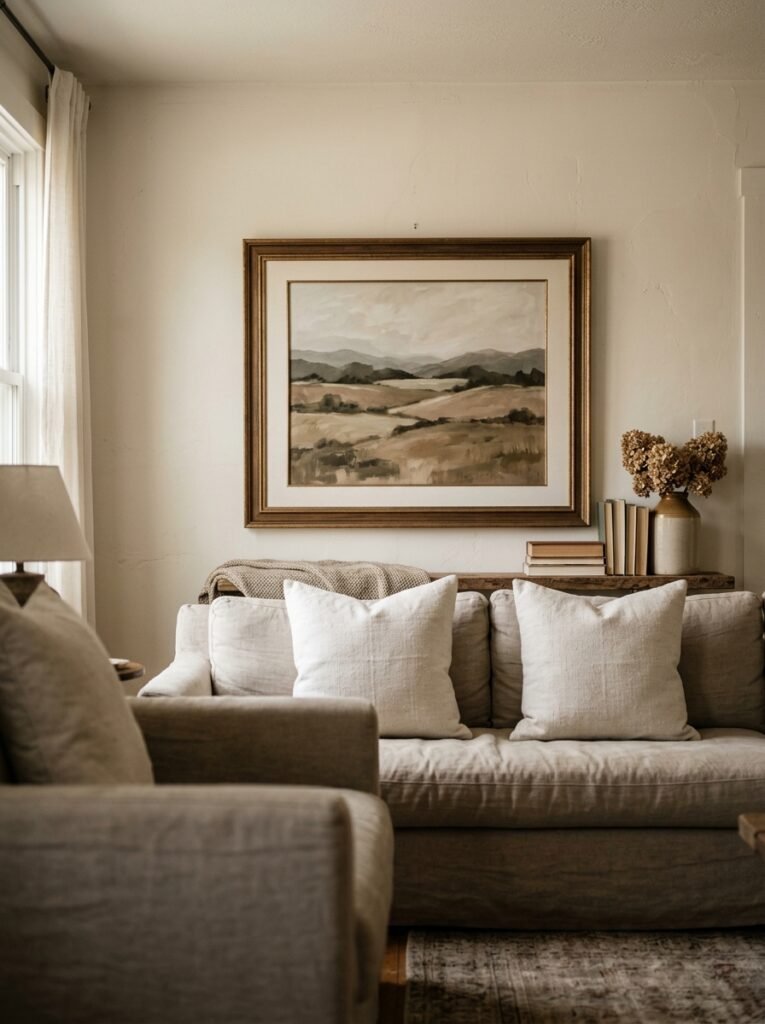
5. The Case for One Single, Enormous Piece of Art (and Why It’s More Farmhouse Than You Think)
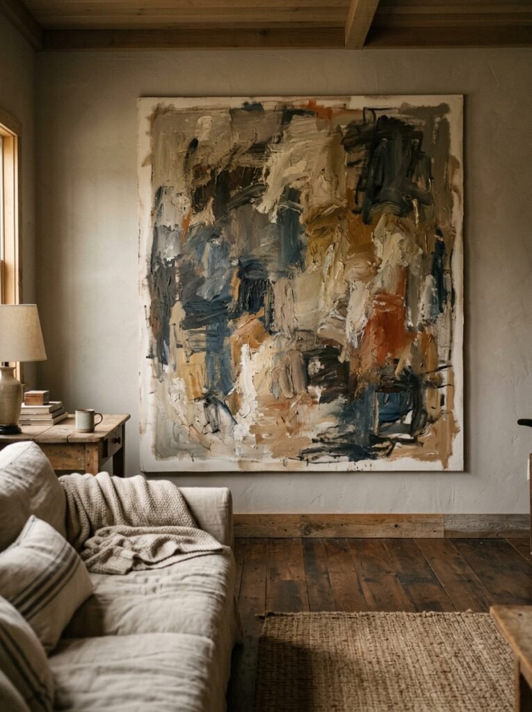
Counterpoint to everything above: skip the gallery wall entirely.
One large-format piece of art — and I mean large, 40 inches wide at minimum — does something a gallery wall simply cannot. It creates a moment of visual silence. A pause. In a room full of texture and warmth, one quiet, oversized piece of art is the thing that makes everything else breathe.
This is where the luxury element of this aesthetic comes in most strongly. Think of an abstract canvas in warm ochre and cream. A large-scale botanical illustration in a wide, simple frame. A dramatic charcoal landscape in an ornate vintage frame that somehow looks completely at home against shiplap.
This approach is actually deeply rooted in traditional farmhouse aesthetics too — think of the large paintings that hung in old English country homes, or the oversized portrait above an American colonial fireplace. Scale has always communicated importance.
You can source large art prints affordably through Etsy sellers, Society6, or Desenio and frame them yourself. The key is the frame. Invest in the frame. A mediocre print in an extraordinary frame will always outperform a beautiful print in a cheap one.
—
6. Leaning Is Underrated: The Styling Trick That Immediately Reads as Relaxed and Expensive
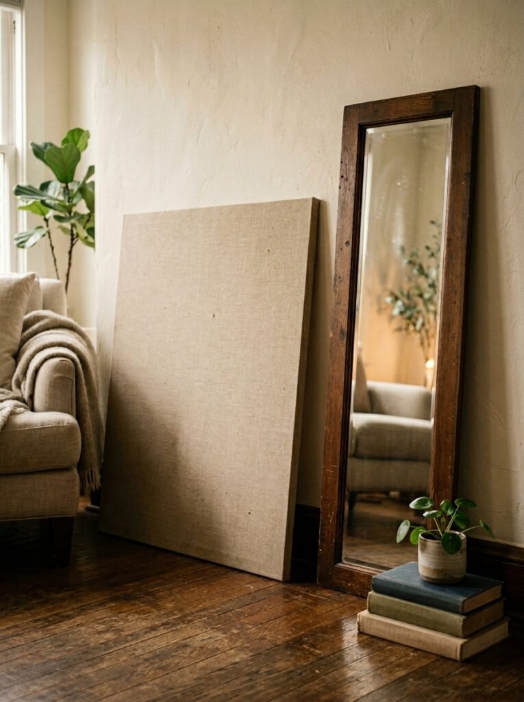
Nothing on a wall has to be on the wall.
A large mirror leaned against the wall behind a console table. A framed vintage map leaned against a fireplace surround. A canvas propped against the baseboard on a low shelf. Leaning creates an effortless quality that hanging simply cannot replicate — it looks like the piece found its way there naturally.
In British interiors especially, this technique has been a staple of the country house aesthetic for decades. That slightly undone, unlabored quality is exactly what the farmhouse luxury crossover is reaching for. It says: someone with excellent taste lives here and they’re comfortable enough not to overthink it.
For American homes, particularly those with open-plan living spaces, leaned pieces create visual rest points that balance the scale of larger, more architectural rooms. A leaned mirror on a long, otherwise empty wall can do the work of an entire console arrangement.
Just make sure anything large is secured properly, especially if you have children or pets. Safety first, aesthetics second. Always.
—
7. What Macramé Got Right (Even If You Never Wanted to Admit It)
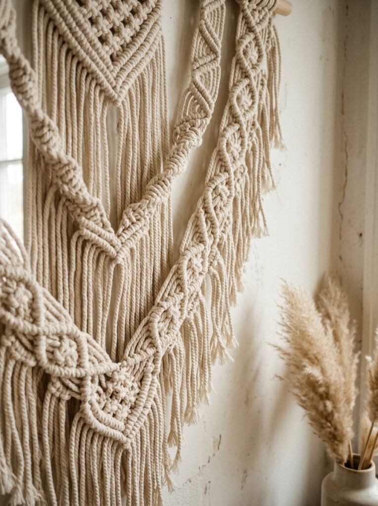
Before you scroll past — hear this out.
The macramé trend felt deeply earnest and a little folksy, and for a while it was everywhere in a way that made even its biggest fans wince. But look at the best versions — the tighter knotwork in natural, undyed cotton, the pieces with real craft and scale — and you see something genuinely beautiful.
In a farmhouse luxury living room, wall-hung textile is one of the most powerful tools you have. Not macramé specifically, necessarily — but woven wall hangings, tapestry fragments, or even a length of beautiful linen or vintage kilim mounted and hung flat. These pieces bring warmth, depth, and sound absorption in a way no flat artwork can.
The key is quality and restraint. One textile piece, chosen carefully, in a muted natural colorway, can anchor a room in a way that feels both ancient and completely current. Think raw-edge linen stretched over a branch. A vintage Swedish textile in cream and rust. A simple knotted piece in organic cotton with a raw hem.
“Texture on a wall doesn’t just change how a room looks — it changes how it sounds and feels.”
—
8. Mirrors: The Shape Matters More Than the Frame Right Now
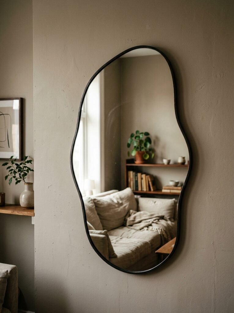
Round mirrors with a thin metal frame. Arch-top mirrors in aged brass. Irregular, sunburst mirrors in hand-hammered metal. The shape of a mirror in this design moment matters enormously — and the shapes that are working hardest right now are all a little organic, a little imperfect, a little architectural.
The classic rectangular mirror above a fireplace is never wrong. But if you want your living room to feel current within this aesthetic, consider an arched mirror above a sideboard, or a cluster of three small convex mirrors arranged as a group on a narrow wall.
Mirrors in a farmhouse luxury living room do triple duty: they add reflective light, they add visual depth, and they add personality in a way that a piece of art can’t. A mirror invites the room into itself.
For British homes where natural light can be limited in autumn and winter, a well-placed large mirror on a north-facing wall is genuinely practical. For American homes with strong afternoon sun, a mirror placed to catch that light will fill the room with warmth for hours.
The frame finish: aged brass, unlacquered bronze, or a simple raw wood all sit perfectly within this aesthetic. Avoid anything too shiny or too ornate. You want the mirror to feel like it was discovered, not purchased.
—
9. The Fireplace Surround as the Main Event (Even If Yours Is Gas or Electric)
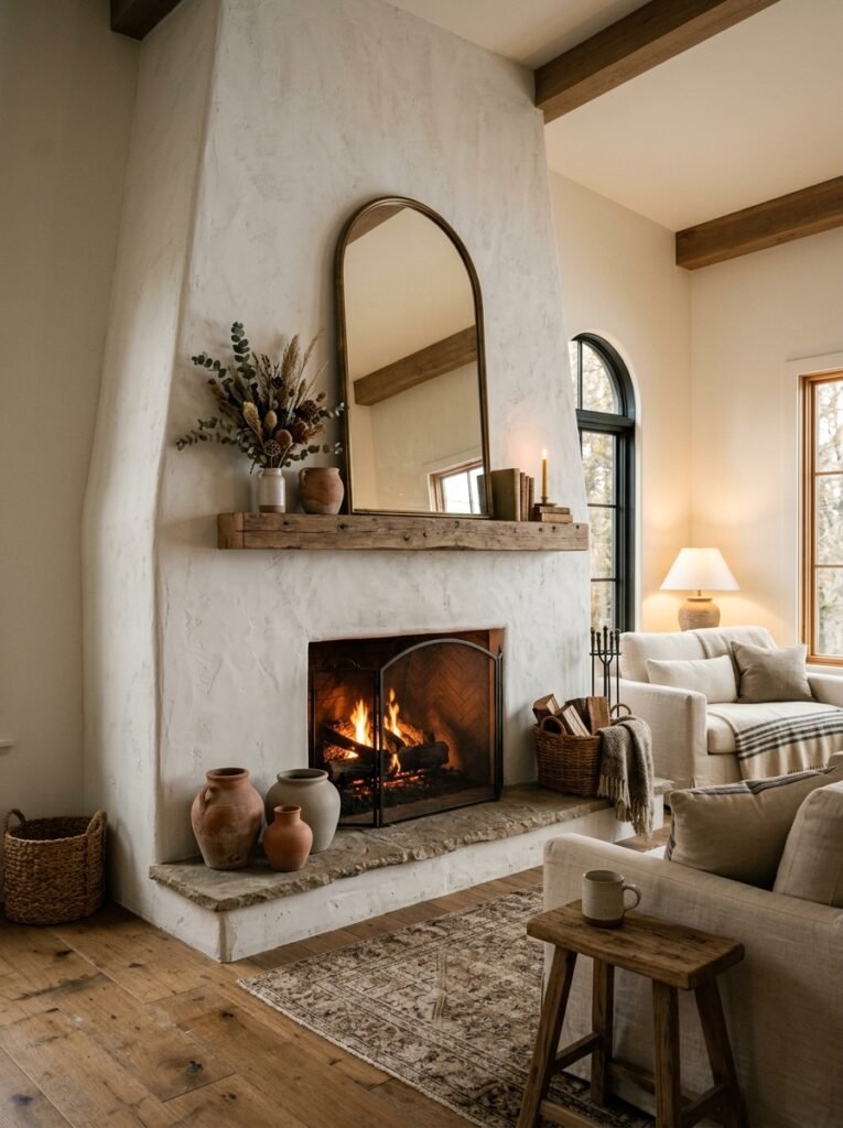
If you have a fireplace in your living room, the wall question is largely answered. Everything else on the walls serves the fireplace. It is the centerpiece, the anchor, the reason the room exists.
But the surround itself is part of the wall decor equation. A plain white painted surround is a starting point, not a destination. Consider painting it a contrasting shade — a deep sage green, a soft charcoal — while leaving the walls lighter. Or layer the mantel with carefully chosen objects: a large clock, trailing dried botanicals, a stack of art books, a single sculptural ceramic.
For gas or electric fireplaces, the styling above and around it becomes even more important because the fireplace itself is doing less expressive work. This is where a large piece of art, a dramatic mirror, or a carefully composed shelf arrangement earns its place most clearly.
American-style fireplaces tend to have larger, deeper mantels — use that depth. Stack objects at different heights. British fireplaces often have narrower surrounds — think vertically, and let the art above do more of the work.
—
10. Floating Shelves That Look Intentional Instead of Afterthought-y
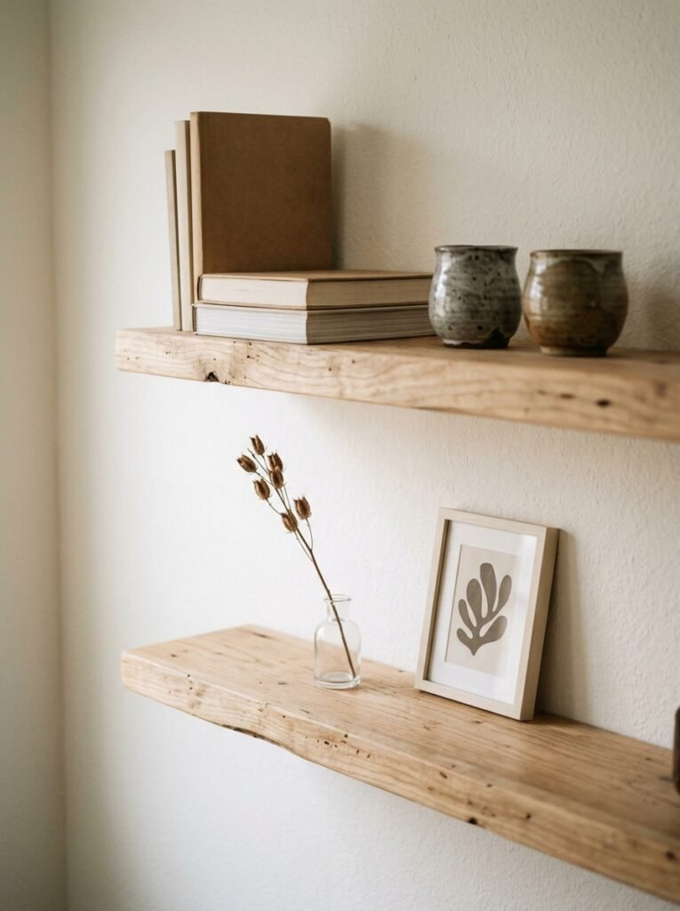
The floating shelf problem is real. Most living rooms have them. Most of them are populated with a rotating cast of objects that never quite cohere — a candle, a random plant, a book turned the wrong way, a photo in a frame that doesn’t match anything else.
Here’s how a floating shelf becomes wall decor in the farmhouse luxury sense: you treat it like a still life. Three to five objects. An odd number. Varying heights. A mix of organic and sculptural — a piece of pottery beside a plant, beside a stack of two or three beautiful books laid flat, beside one framed photograph.
The wood of the shelf matters too. A chunky, live-edge shelf in walnut looks intentionally luxe against a painted wall. A simple white shelf disappears, which is only useful if you want the objects on it to do all the talking.
Keep negative space on the shelf. Empty space is not wasted space — in this aesthetic, it’s a deliberate choice that reads as confidence.
—
11. The One Rule That Makes Any Living Room Wall Feel Intentional
Every single designer and stylist who works in this space will tell you the same thing, and it is so simple it almost sounds wrong.
Pick a point of view and commit to it completely.
That’s it. That’s the rule.
A wall that feels like a decision — even if that decision is one single mirror on an otherwise bare wall — reads as confident and considered. A wall covered in a little of everything, added over time without a unifying vision, reads as undecided. And undecided is the opposite of the feeling you’re going for.
In practical terms: before you add anything to your walls, ask yourself whether it belongs to the same visual story as everything else. Does it share a finish, a tone, a material, a feeling? If the answer is no, it needs to either earn its place with a clear reason or find a different room.
A point of view doesn’t require a big budget. It requires certainty. And certainty is free.
—
12. The Small Details That Make a Wall Look Like It Was Styled by Someone Who Does This for a Living
The gap between a lovely wall and a photographed-for-a-magazine wall is almost always in the details.
Hang your art at the right height. The center of any framed piece should sit at roughly 57 inches from the floor — that’s the average human eye level, and it’s the museum standard for a reason. Most people hang art too high. Lower it.
Use proper picture hooks, not tape, not Command strips for anything over a few pounds. The slight angle a proper hook creates actually makes frames sit flatter against the wall.
Mind the space between frames in a gallery arrangement — 2 to 3 inches between pieces reads as intentional. More than that and they start to feel unrelated. Less and it starts to feel crowded.
Dust your frames. Clean your mirrors. A smudgy mirror and a dusty frame will undo every other good decision you’ve made.
And finally: step back. Always step back. What a wall looks like from twelve inches away is irrelevant. What matters is what it looks like from the sofa, from the doorway, from across the room. That’s where you live. That’s what you’re designing for.
—
🌿 Quick Tips
Think of your largest wall piece first and work everything else around it — not the other way around. That one decision will make every other choice easier.
For an instant farmhouse-luxury feel, replace any plastic or cheap frames currently on your wall with simple wood or metal alternatives. You don’t need new art, just new frames.
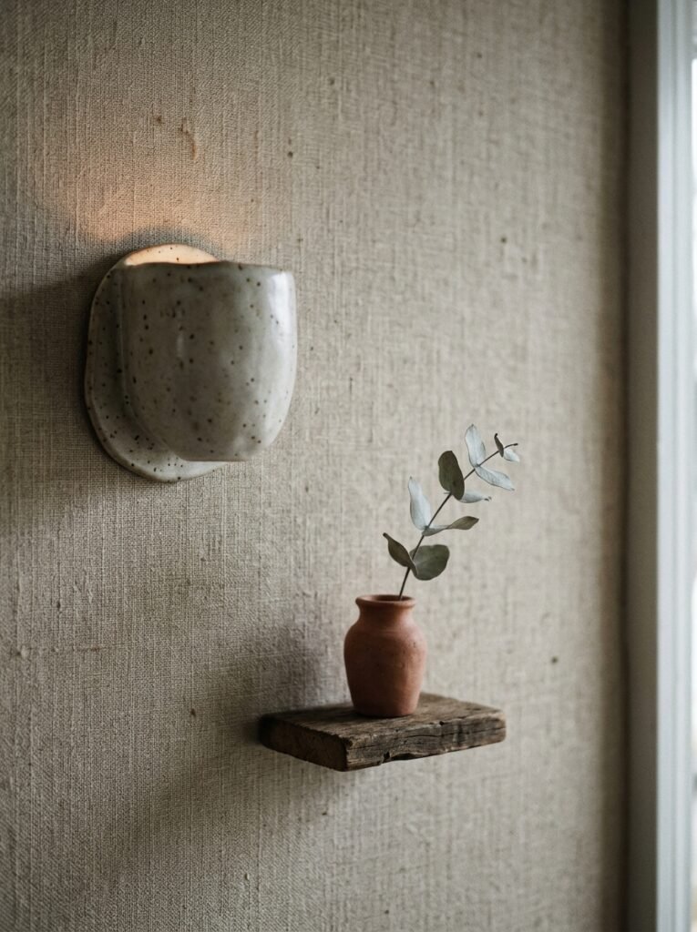
Dried botanicals — pampas grass, dried eucalyptus, magnolia stems — in a large, simple vase on a shelf or mantel add organic texture at almost no cost and photograph beautifully.
If you’re renting and can’t make nail holes, a single large leaned piece is your best friend. A big vintage mirror or an oversized framed print leaned against the main wall makes as much visual impact as anything hung.
Buy the lamp before you style the shelf. The light changes everything. The warm glow of a well-placed lamp on a lower shelf will make your arrangement look intentional in a way that overhead lighting never will.
—
❓ FAQ
Q: How do I mix farmhouse and modern luxury without it looking like two different rooms fought each other? A: The secret is a shared material palette — natural wood, matte metal, linen, cotton, stone. Keep your textures earthy and your finishes either matte or warmly reflective. Modern luxury brings clean lines and quality; farmhouse brings warmth and character. When they share materials, they speak the same language.
Q: What’s the best way to find affordable large-format art that looks high-end? A: Etsy is genuinely excellent for this — search for printable art in large sizes, download, and take the file to a local print shop for a fraction of what a gallery charges. Charity shops and car boot sales in the UK, and thrift stores and estate sales in the US, are still some of the best sources for vintage frames and interesting one-off prints that feel completely original.
Q: My living room walls are textured plaster or Artex — how do I decorate around that? A: Lean and layer rather than hang where possible, and use the texture as a feature rather than fighting it. Deep-colored paint actually shows off textured walls beautifully. If you’re in the UK dealing with Artex specifically, a layer of lining paper and a fresh paint job in one of those warm putty tones can make a profound difference before you add anything at all.
—
💭 Final Thought
The most beautiful living rooms aren’t the ones with the biggest budgets or the most art on the walls. They’re the ones that feel like someone made real choices — chose this, said no to that, and built something with a genuine point of view.
Your walls are already there. They’re already waiting. The question is just what story you want them to tell.
What’s the one wall in your living room that’s been waiting the longest for your attention?


