The Colors Living on Your Walls Are Quietly Shaping Who You Are
There’s a moment — you’ve probably had it — where you walk into someone else’s home and immediately feel something shift inside you. A calm you didn’t expect. A warmth you can’t quite explain. Chances are, the walls did that. Interior paint color schemes are one of the most underestimated forces in how we experience daily life, and most of us have never stopped to really think about why.
—
Table Of Content
1. The Room That Made You Feel Safe (and You Never Knew Why)
Think back to a place that made you exhale. A grandmother’s sitting room, a cozy café corner, a hotel suite that felt like a hug. There’s almost always a color story behind that feeling. Color psychology isn’t fringe science — it’s been studied for decades and woven into everything from hospital design to restaurant branding. The paint on your walls communicates to your nervous system before your brain even catches up.
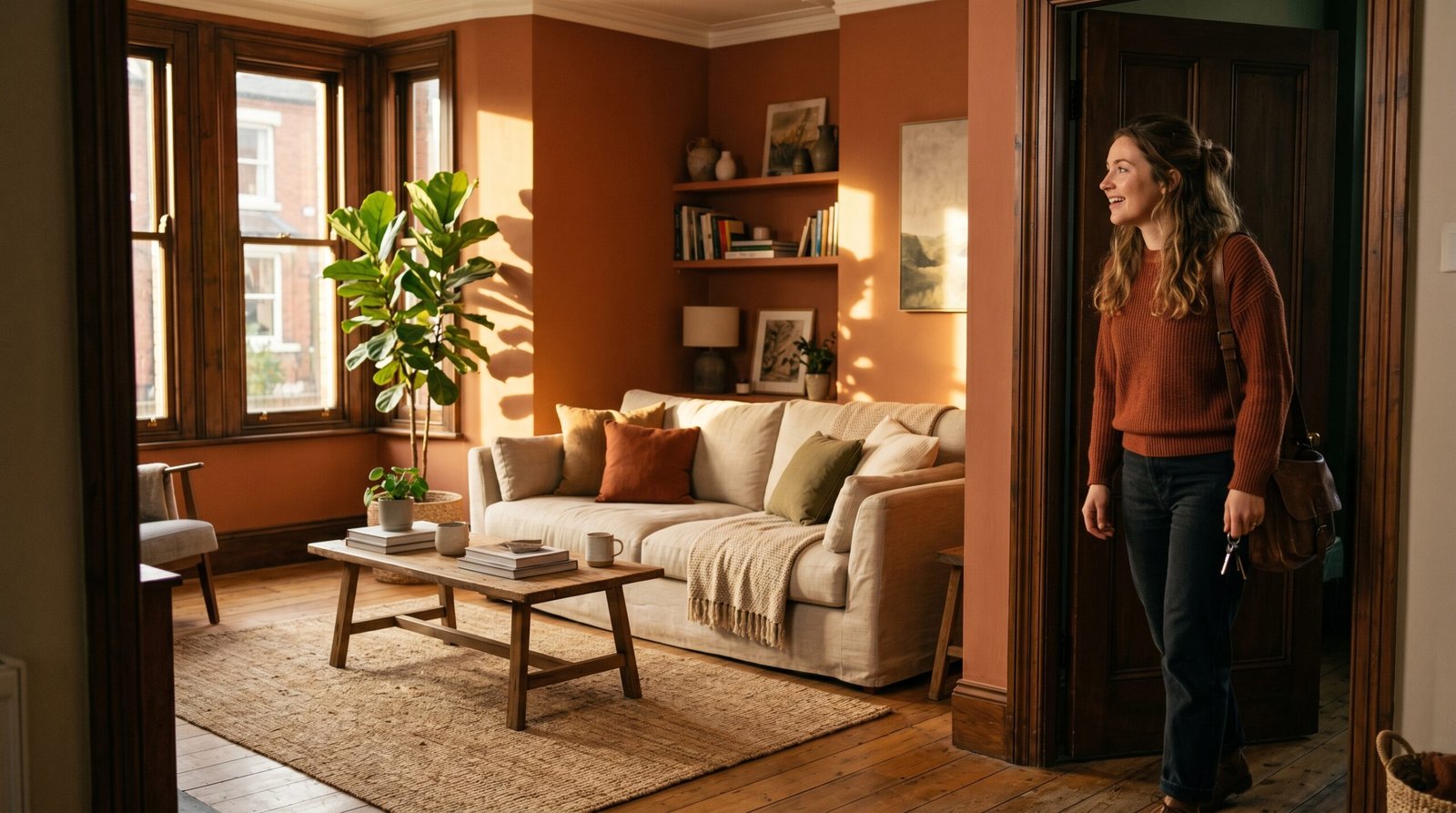
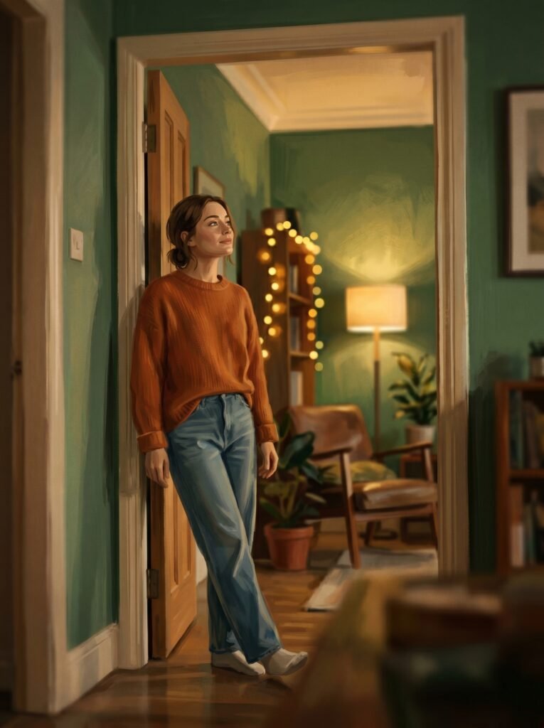
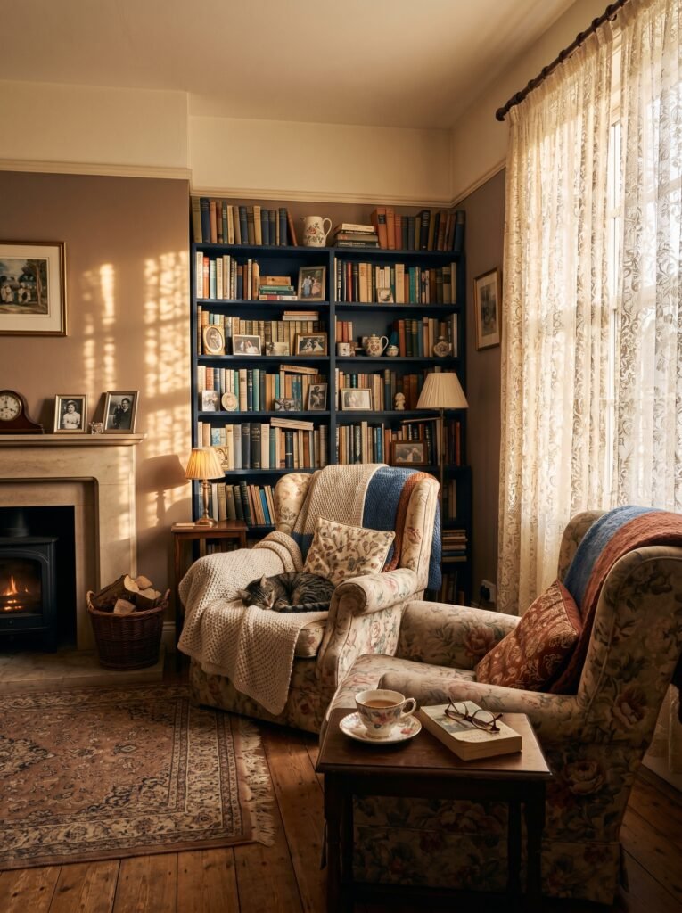
Warm neutrals like soft cream, sand, and warm taupe create the psychological equivalent of a wool blanket — they wrap you without demanding your attention. Cool blues and sage greens lower cortisol levels and invite stillness. Deep jewel tones like navy or forest green create a sense of enclosure and security. Your walls, right now, are speaking to you. The question is whether they’re saying what you want them to say.
“The right wall color doesn’t decorate a room — it transforms the emotional temperature of an entire life lived inside it.”
2. What “Color Scheme” Actually Means (and Why Most People Get It Wrong)

A color scheme isn’t just picking a color you like and painting everything with it. It’s a relationship between colors — a conversation that either flows or clashes. Interior designers typically work with four foundational schemes: monochromatic (varying shades of one color), analogous (neighboring colors on the color wheel), complementary (colors sitting opposite each other), and triadic (three evenly spaced colors).
The most livable spaces tend to use the 60-30-10 rule: 60% of the room in a dominant color (usually walls), 30% in a secondary color (furniture, curtains), and 10% in an accent color (cushions, art, accessories). This gives the eye a natural place to rest while keeping things visually interesting. It sounds technical, but once you see it in action, it becomes something you can feel rather than calculate.
3. Why White Is Never Just White
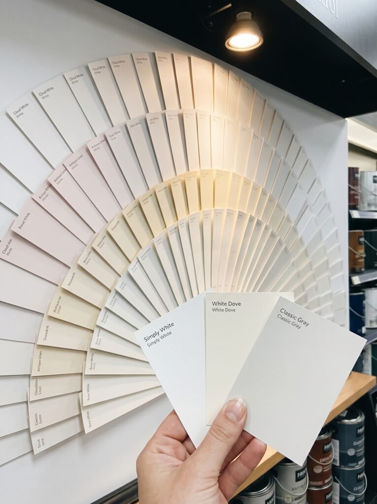
Walk into a paint store and ask for white. The person behind the counter will hand you a fan deck with over 200 options. This is either maddening or deeply reassuring, depending on your relationship with detail. The reason is light — and light changes everything.
A white with pink undertones turns rosy and romantic in afternoon sun. A white with gray undertones reads crisp and modern. A white with yellow undertones feels vintage and warm. The most famous example is Farrow & Ball’s “All White” versus “Strong White” versus “Pointing” — three whites that look almost identical on a chip and feel completely different on a wall. Before you dismiss a room as “just white,” understand that someone made a very deliberate choice to make you feel exactly what you’re feeling.
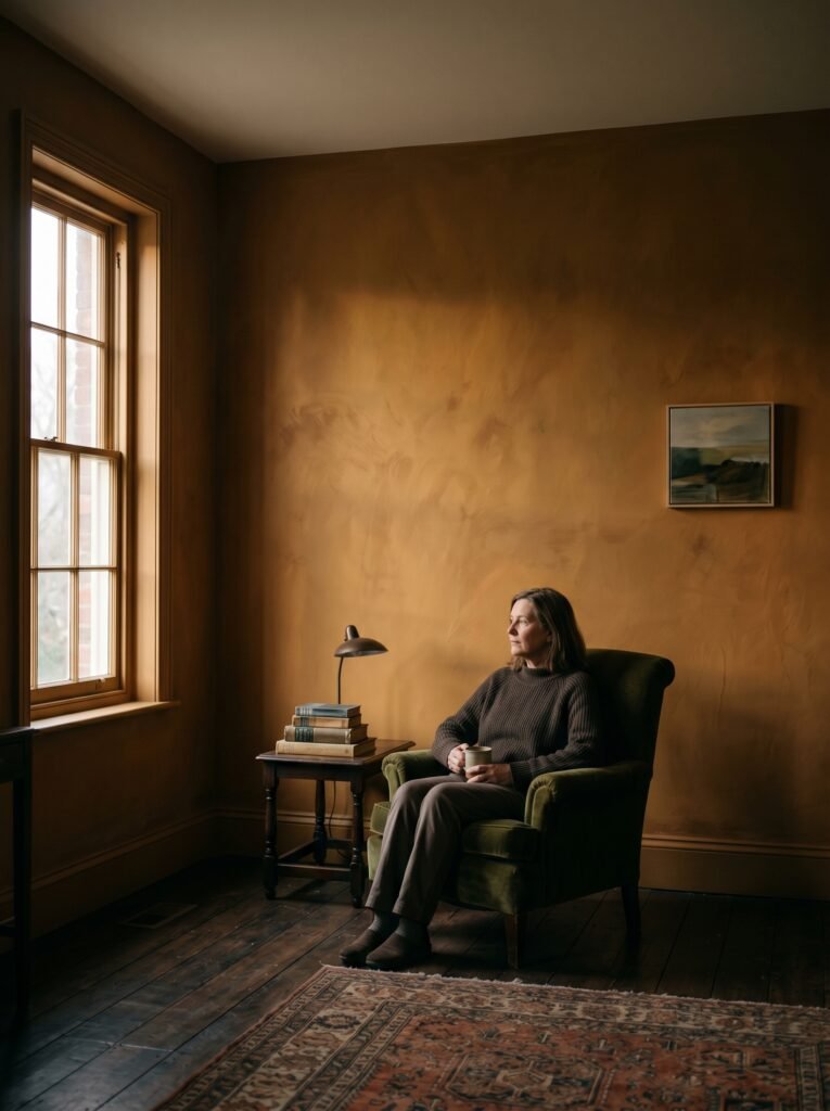
4. The Psychological Superpower of Dark Walls
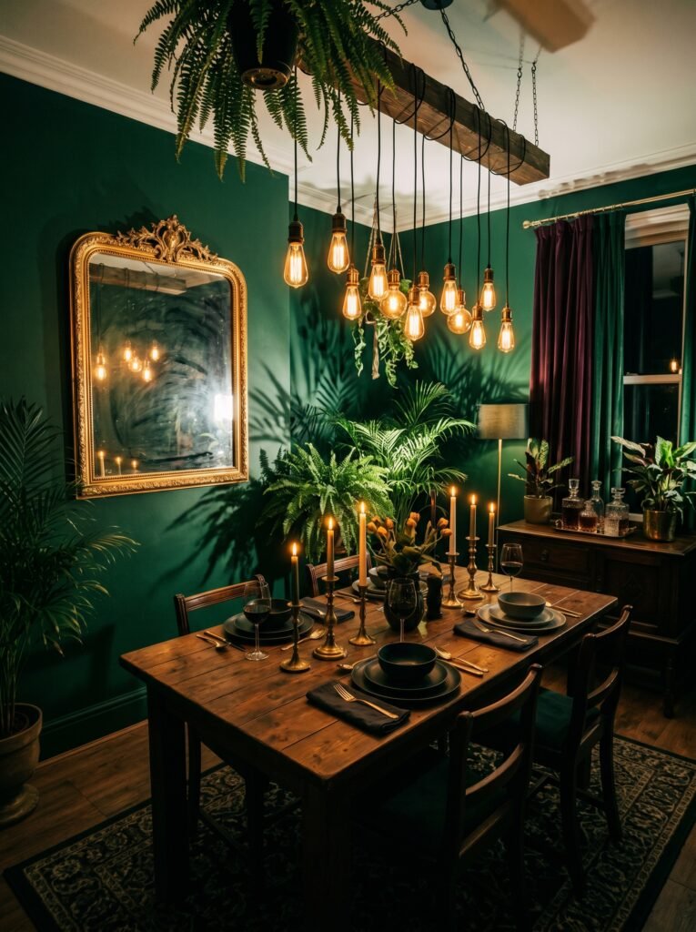
Somewhere along the way, interior design culture decided that light walls make a room feel bigger, and dark walls make it feel smaller, and that smaller is always bad. This is incomplete advice. Dark walls — deep charcoal, midnight blue, hunter green, plum — do something that light walls rarely accomplish: they create depth, drama, and an almost theatrical sense of presence.
A dining room painted in deep forest green feels like dining inside a terrarium. A home office in charcoal feels serious and productive in the best possible way. The secret with dark colors is that they work best when paired with warm lighting, rich textures, and reflective surfaces like mirrors or metallic accents. Used well, dark walls don’t shrink a room — they give it a soul.
5. The Rooms That Deserve Their Own Color Logic
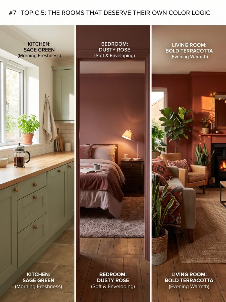
Not every room in your home should be fighting for the same emotional identity. A bathroom needs something different from a living room. A child’s bedroom needs something different from a master suite. Interior designers call this “flow with variation” — a cohesive thread through the home that still gives each space permission to be itself.
“A well-designed home doesn’t feel coordinated — it feels like a story where each room is a different chapter.”
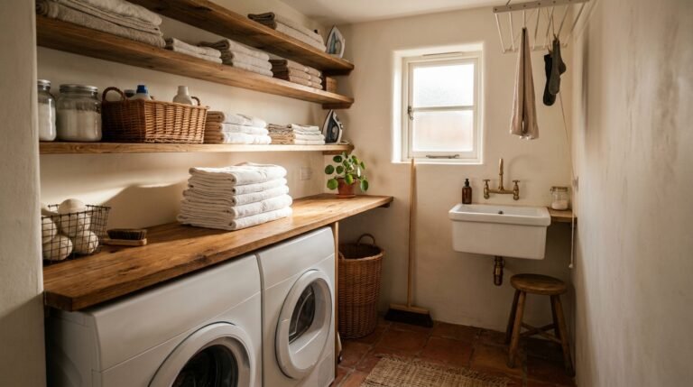
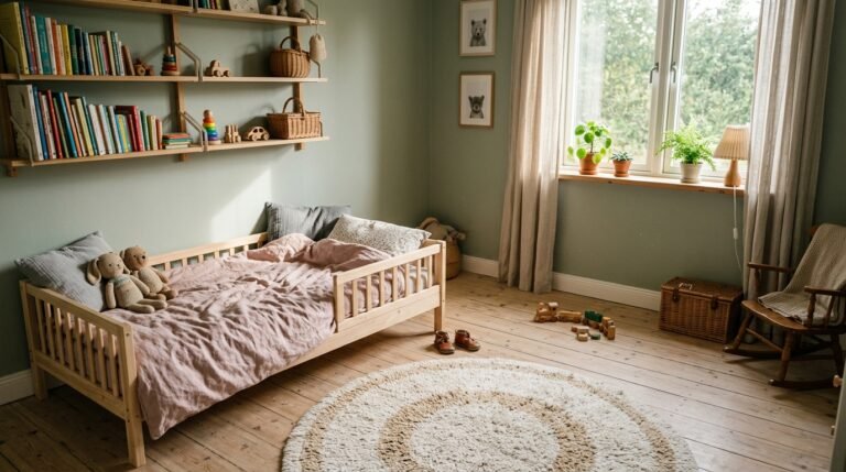
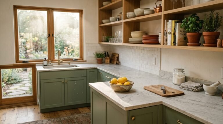
Kitchens often do beautifully with warm whites, soft yellows, or sage green — colors that feel fresh and appetizing without being sterile. Bedrooms benefit from muted tones: dusty rose, soft blue, warm lavender, greige. Living rooms, where people gather and entertain, can handle bolder choices — terracotta, deep teal, warm cognac. Bathrooms are a wonderful place to experiment precisely because they’re small; a bold color in a small space feels adventurous rather than overwhelming.
6. The Underrated Magic of Undertones
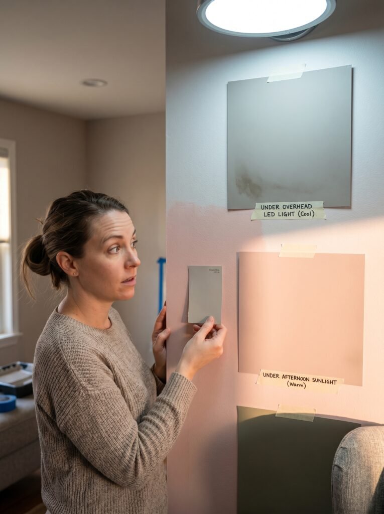
Here’s something that trips up almost every first-time painter: undertones. Every paint color carries a secondary hue hiding beneath its surface, and it only reveals itself once it’s on your wall surrounded by your furniture, your floors, and your light. A beige that looked creamy and warm in the store turns pink on your walls. A gray that looked sophisticated turns lavender. A green that looked sage turns lime.
The trick is to test your paint samples on large swatches — at least 12×12 inches — and observe them at different times of day and under different lighting conditions. Natural morning light, afternoon sun, overhead artificial light, and lamplight will each tell you something different about the color you’ve chosen. Never commit to a gallon based on a chip alone.
7. How Natural Light Rewrites Every Color Decision
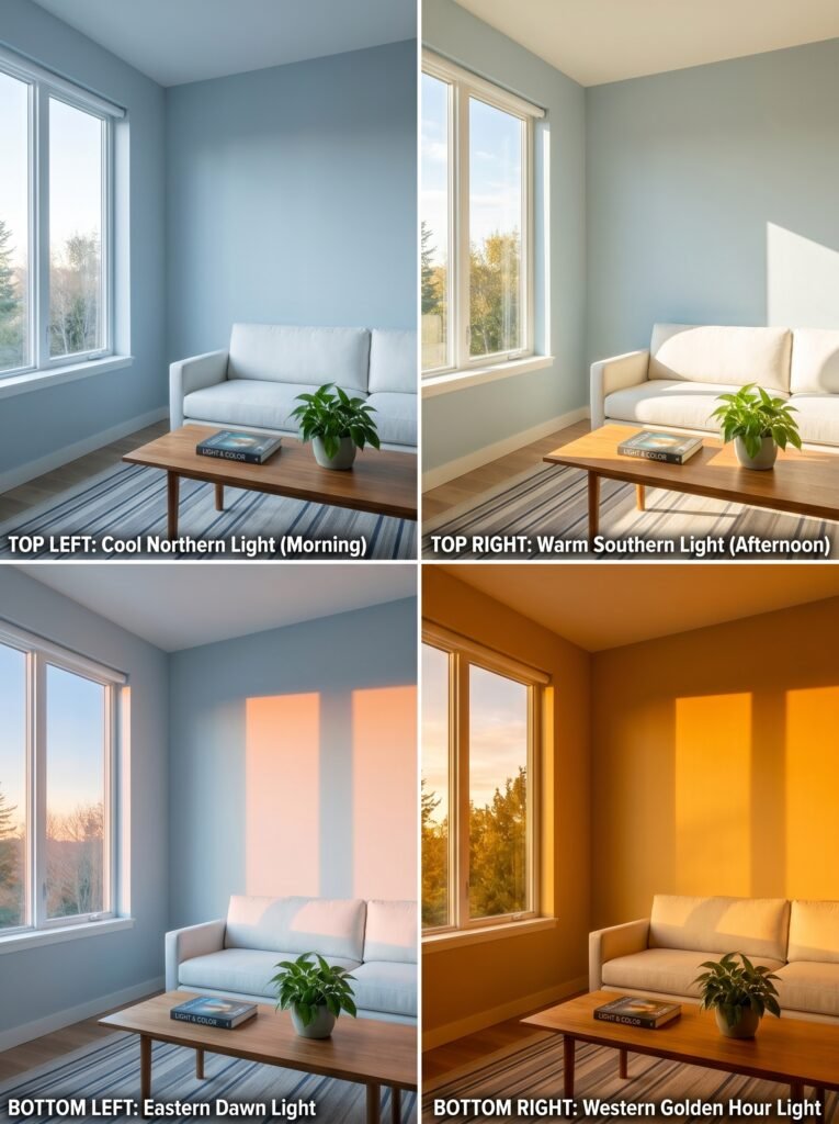
Two homes can use the exact same paint color and experience it as two entirely different hues. The reason is the direction your windows face. North-facing rooms receive cool, indirect light that can make warm colors feel muted and cool colors feel stark. South-facing rooms are bathed in warm, consistent light and can handle almost anything beautifully. East-facing rooms glow in the morning and go flat by afternoon. West-facing rooms are cool in the morning and golden in the evening.
Understanding your light is arguably more important than understanding your color preferences. A color that felt perfect in someone else’s south-facing living room might feel cold and depressing in your north-facing one. This isn’t a failure of taste — it’s physics.
8. Trending Palettes That Are Actually Worth Knowing About
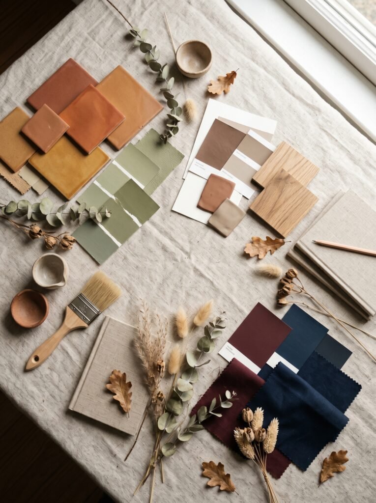
Interior color trends shift more slowly than fashion, which is a mercy. As of the mid-2020s, several palettes have dominated in ways that feel substantive rather than fleeting. Earthy, grounded tones — terracotta, warm ochre, clay, raw umber — have become a dominant force, reflecting a collective desire to reconnect with natural materials and slower living.
Alongside them, muted greens have taken over: sage, olive, moss, dusty jade. These colors work because they reference nature without trying too hard, and they pair naturally with wood tones, linen, and organic textures. Warm beige and greige (a gray-beige blend) have replaced the cold gray dominance of the 2010s, feeling both modern and timeless. And for the brave: moody, saturated colors — deep burgundy, inky blue, forest green — are showing up in kitchens and dining rooms with stunning effect.
9. When Accent Walls Work (and When They Don’t)
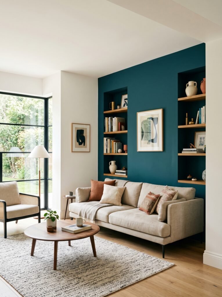
The accent wall is one of interior design’s most debated concepts. Done well, it anchors a room, adds visual interest, and creates a focal point that makes the space feel intentional. Done poorly, it looks like someone ran out of paint.
“An accent wall only works when it’s the wall that was already asking to be noticed.”
The key is choosing the right wall — typically the one your eye naturally lands on first when entering the room, often the wall behind a headboard, sofa, or fireplace. The color should be deeply related to the room’s other colors, not randomly chosen. And the wall itself should have architectural merit — a plain flat wall with no features becomes more awkward with an accent color, while a wall with windows, built-ins, or a fireplace becomes more beautiful.
10. The Ceiling: The Fifth Wall That Most People Forget
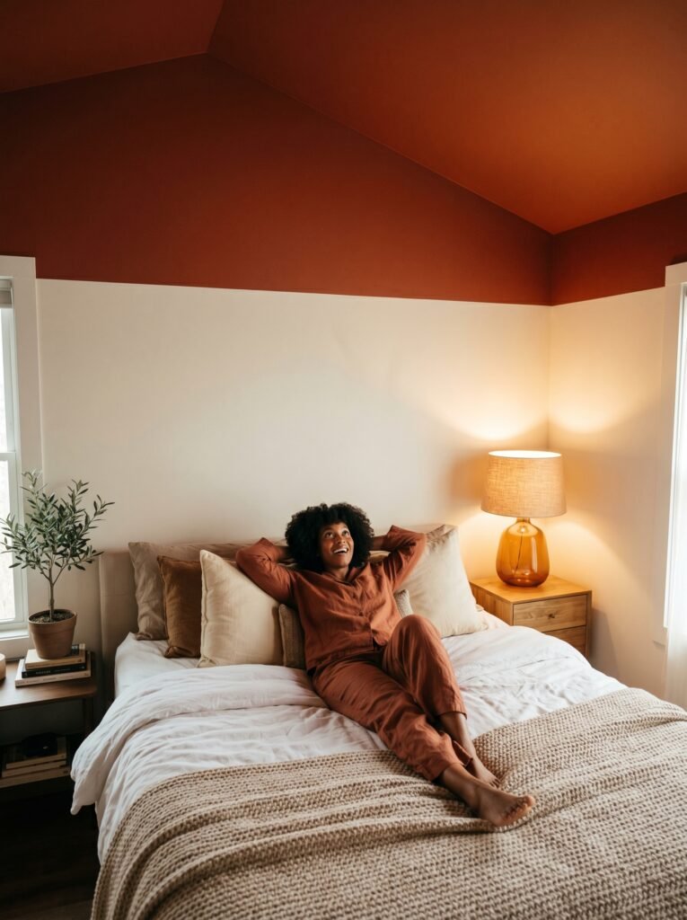
Ceilings are one of the most underused design canvases in the average home. Painting the ceiling white is a safe choice. Painting it the same color as your walls creates a cozy, enveloping effect — designers call this “color drenching,” and it’s having a major moment. Painting it a shade slightly lighter than your walls gives the room a lifted, airy quality.
Going bold with the ceiling — a dramatic navy, a warm terracotta, even a pale blush — can be one of the most joyful, unexpected design decisions a room has ever experienced. Look up. That blank white canvas has been waiting for permission.
11. Colors That Make Small Rooms Feel Larger (and It’s Not Always White)

The conventional wisdom says paint small rooms white to make them feel bigger. The actual wisdom is more nuanced. Light colors do reflect more light, which visually expands a space. But so do single-color, tone-on-tone approaches — painting walls, trim, and ceiling the same color removes visual breaks that make a room feel choppy and contained.
Mirrors, sheen level (a semi-gloss or satin finish reflects more light than flat), and keeping furniture low-profile all contribute to spatial perception alongside color. A small room painted in a rich, dark color with good lighting and reflective surfaces can actually feel more expansive than a poorly lit white room. Context, as always, is everything.
12. The Emotional Legacy You Leave in Every Room
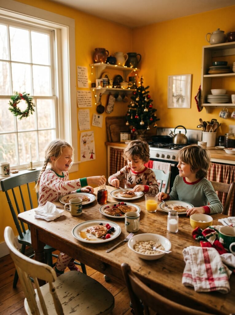
Here’s something worth sitting with: the colors you choose for your home become the backdrop of your memories. The warm yellow kitchen becomes the kitchen in every holiday morning memory your children carry into adulthood. The sage green bedroom becomes the place they remember feeling held and peaceful during hard years. The deep blue dining room becomes the room they picture when they think of the years your family ate dinner together.
Color isn’t just decoration. It’s the emotional container of a life. That’s not a small thing. That might be one of the most significant design decisions you ever make — and most of us make it in an afternoon with a fan deck and a half-formed idea of what we like.
—
🌿 How to Choose an Interior Paint Color Scheme That Actually Works
The best advice doesn’t come from a design magazine — it comes from standing in your actual room, in your actual light, with your actual furniture. Start there. Here are five things worth doing before you open a single can of paint.
Start by pulling from something you already love — a rug, a piece of art, a throw pillow — and build your palette outward from it. The room will feel cohesive because the colors already have a relationship. Test your colors large and live with them for at least a week across different lighting conditions before committing. Think about the mood you want the room to create, not just the aesthetic — calm, energized, focused, playful — and choose colors that serve that emotional goal. Don’t ignore your trim; white trim crisps and defines, while tone-on-tone trim softens and envelops. And finally, trust your gut over trends — if a color makes you feel something good when you look at it, that’s not nothing. That might be everything.
—
❓ FAQ
Q: What’s the most timeless interior paint color scheme? A: A warm neutral base — think soft white, warm greige, or muted beige — paired with natural wood tones and one or two anchoring accent colors (deep blue, sage green, or terracotta) has remained beautiful across decades of changing trends. It doesn’t feel dated because it references nature rather than a specific design era.
Q: How do I know if a color will look good in my specific room? A: The only reliable way is to test it. Purchase sample pots and paint large swatches (at least a foot square) directly on your wall. Observe the color in morning light, afternoon light, evening lamplight, and under your overhead lighting. A color that looks perfect in all four conditions is a keeper.
Q: Can I use dark colors in a small room without making it feel cramped? A: Yes — and sometimes it actually helps. A small room painted in one deep, saturated color from floor to ceiling, with warm lighting and reflective surfaces, can feel more intimate and interesting than a stark white box. The key is committing fully rather than using dark color on just one wall, which can feel unfinished.
—
💭 Final Thought
The home you live in is quietly and constantly shaping your mood, your memories, and the emotional texture of your everyday life. The colors on your walls aren’t background noise — they’re part of the conversation you’re having with yourself every single morning you wake up inside them. Choose them the way you’d choose anything that matters: carefully, honestly, and with a little bit of feeling.
So here’s something worth thinking about: if the walls of your home could say exactly what you need to hear right now — what color would they be?