The Light Green Interior Trend That’s Quietly Changing How We Feel at Home
There’s a moment — maybe you’ve had it — when you walk into a room and something inside you just… exhales. Not because the furniture is expensive or the layout is perfect, but because the color on the walls seems to breathe alongside you. That’s exactly what a light green interior does. It doesn’t shout for attention. It simply makes you feel like you’ve arrived somewhere that actually wants you there.
—
Table Of Content
1. Why Light Green Feels Like the Color Your Home Has Always Been Missing
We spend years chasing the perfect neutral — endless swatches of greige, warm white, and soft beige pinned to mood boards and painted on test patches. And yet, something always feels slightly… absent. A little flat. A little safe in the wrong way.
Light green changes that equation entirely. It sits right at the intersection of neutral and alive — warm enough to feel cozy, cool enough to feel fresh, natural enough to feel like you didn’t try too hard. Interior designers often describe sage green, celadon, and mint as the “breathing neutrals” because they do something ivory and taupe simply cannot: they remind the nervous system of the outdoors.
Color psychology research has consistently shown that green is one of the most restful colors the human eye can process. It requires almost no adjustment — no squinting, no tension — because our eyes are so deeply calibrated to the wavelengths of nature. When you bring light green into your home, you’re not decorating. You’re essentially telling your body that it’s safe to slow down.
“Light green doesn’t just decorate a room — it changes the emotional temperature of it.”
That’s the quiet power behind this trend. And once you feel it, beige starts to look like a very polite apology.
2. The Many Shades of Light Green — and How Each One Tells a Different Story
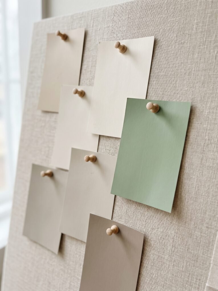
Not all light greens are created equal, and the distinction matters far more than most people realize when they’re standing in a paint store overwhelmed by chips that all look suspiciously similar under fluorescent lighting.
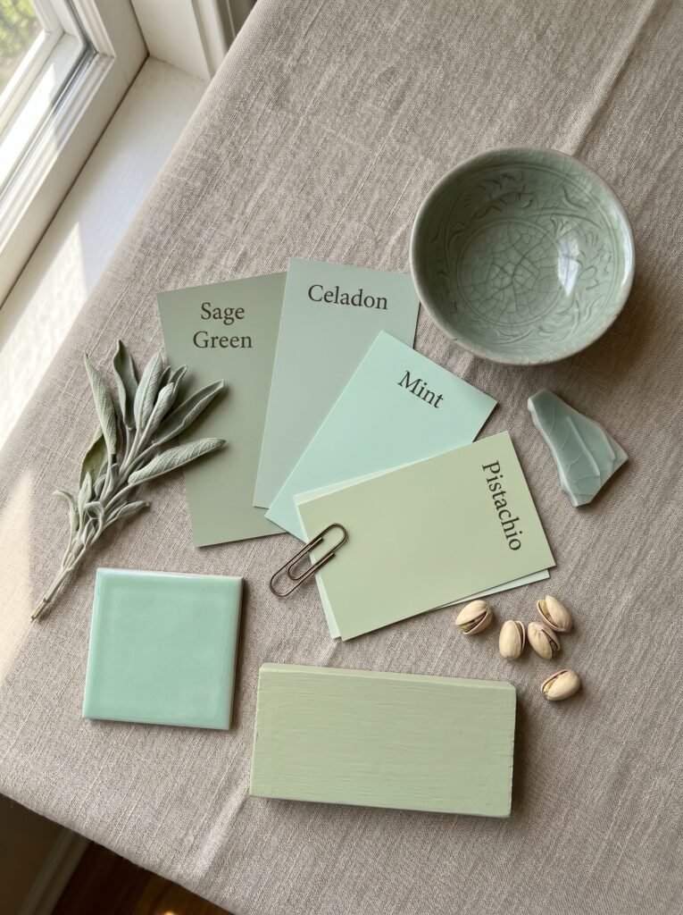
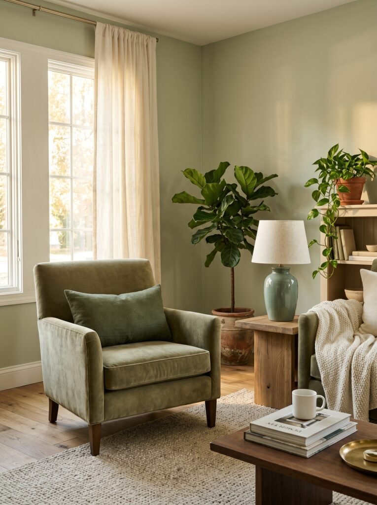
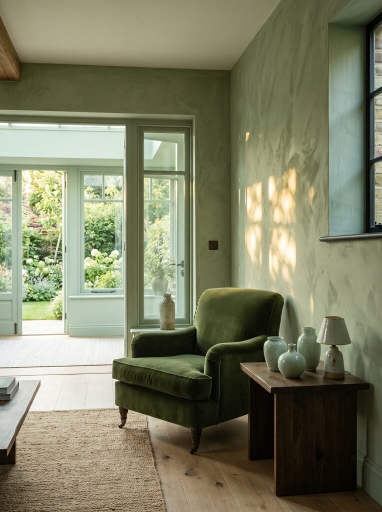
Sage green carries warmth. It leans slightly grey and earthy, evoking the dry, sun-touched herb itself. It’s the shade you want in a living room that needs to feel grounded, contemplative, or just a little bit literary — the kind of room where you drink tea and actually finish books.
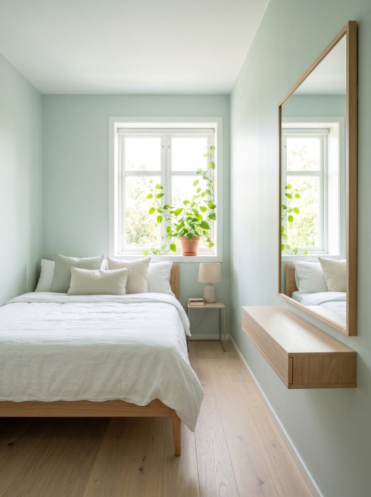
Celadon is cooler and more luminous, borrowing its name from the ancient glazed pottery of East Asia. It has a watery, almost translucent quality that makes smaller rooms feel like they have a hidden light source. Celadon in a bathroom or bedroom creates the sensation of being wrapped in something both clean and calm.
Mint leans brighter and crisper, with a touch of blue that adds an energetic lift without tipping into aggressive. It’s perfect for kitchens, home offices, and children’s rooms — anywhere you want gentle alertness rather than deep rest.
Pistachio sits somewhere between mint and sage, with a creamy, almost edible softness that’s having an enormous moment right now in dining rooms and entryways.
Choosing the right undertone for your light green is perhaps the single most important design decision you’ll make — more important than furniture, more important than hardware. Get the undertone right, and every other choice in the room becomes easier.
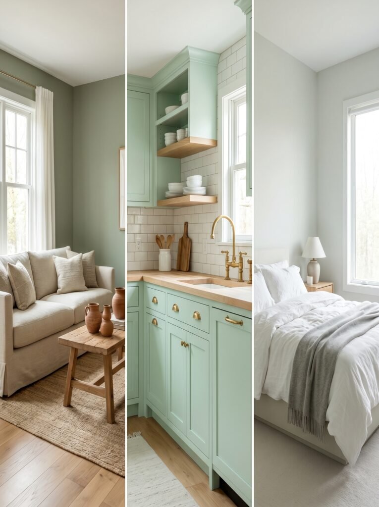
3. The Rooms Where Light Green Works the Hardest (and Feels the Most Beautiful)
Some colors are one-room wonders. Light green is not one of them. It moves through a home with remarkable fluency, transforming the mood of each space while maintaining a visual thread that makes the whole house feel intentional and cohesive.
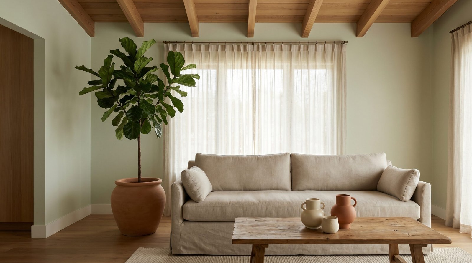
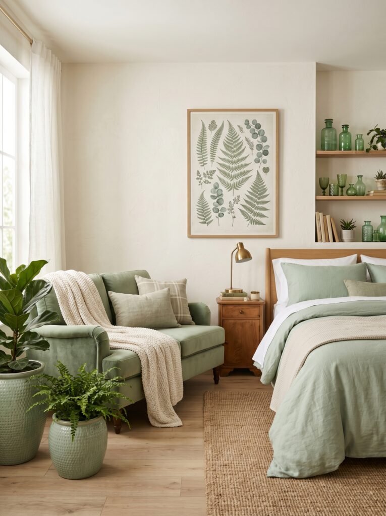
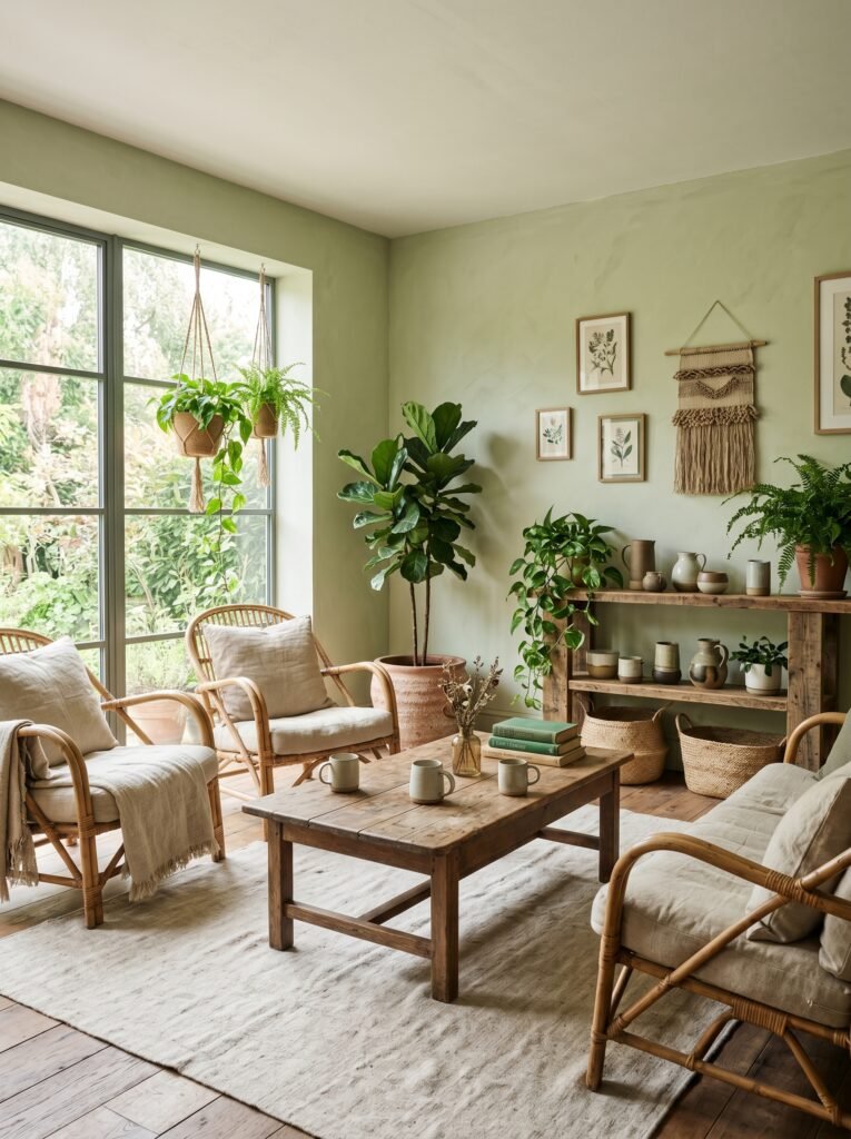
In living rooms, light green walls create a backdrop that feels both sophisticated and livable — the design equivalent of a friend who’s stylish but never makes you feel underdressed. Natural linen sofas, warm wood tones, ceramic vessels in cream and terracotta, and a single oversized plant become a complete composition almost without effort.
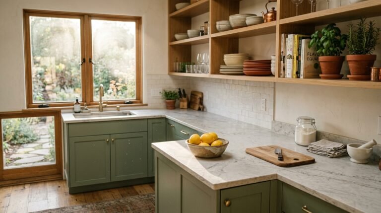
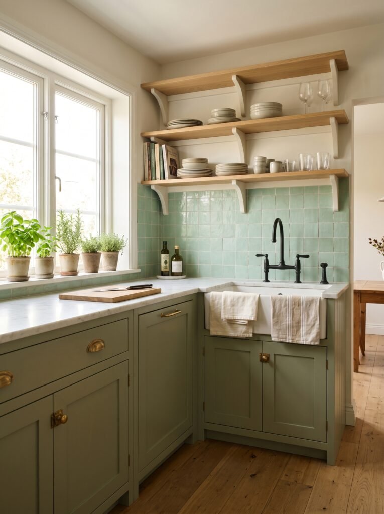
In kitchens, light green cabinetry has become one of the most pinned and saved aesthetic choices of the past three years — and for very good reason. Against white subway tile or unlacquered brass hardware, sage or mint cabinets strike a balance between vintage charm and modern freshness that photographs beautifully and ages even better in real life.
Bedrooms painted in celadon or soft sage become genuine sanctuaries. There’s clinical evidence that green environments promote lower cortisol levels and better sleep onset — meaning your light green bedroom isn’t just beautiful, it’s actually working for your health while you rest.
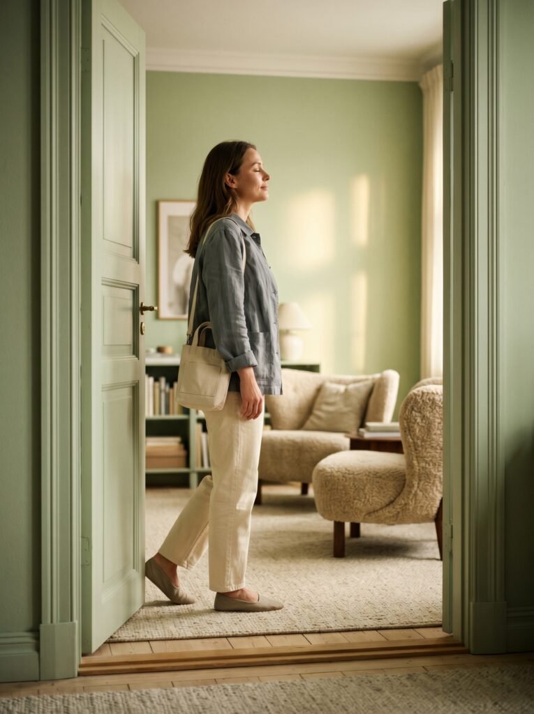
Even hallways and entryways, so often treated as afterthoughts, become genuinely welcoming spaces when given a coat of warm pistachio or sage. You’re setting an emotional tone the moment someone crosses your threshold.
4. How to Layer Light Green Without Making Your Home Look Like a Greenhouse
The hesitation most people feel about committing to green interiors usually comes down to one fear: going too far. What if it looks like I’m trying to live inside a salad? Fair concern. Here’s how you avoid it.
The golden rule of layering green is variation in tone and texture, not just quantity. One flat shade of green repeated across walls, cushions, curtains, and plants will absolutely feel overwhelming. But a muted sage wall paired with a slightly cooler green ceramic lamp, a dusty olive velvet cushion, and the deep emerald of actual living plants creates depth rather than visual monotony.
Green also layers beautifully with near-neutrals. Warm whites, soft creams, weathered wood, natural rattan, and raw linen all provide visual breathing room between green elements. Terracotta and rust act as complementary accents that ground the green without competing with it.
A simple framework: choose one dominant light green (usually walls or large furniture), one secondary green that’s either darker or lighter in tone, and let natural green — plants, flowers, foliage — be your third layer. That three-tier approach creates rooms that feel curated rather than decorated.
5. The Unexpected Pairings That Make Light Green Interiors Look Like They Belong in a Magazine
Some color combinations are reliable. Sage and white. Mint and wood. These work, and they work well. But it’s the unexpected pairings that separate a beautiful room from a truly memorable one.
“The rooms that stop you mid-scroll always have at least one combination you didn’t see coming.”
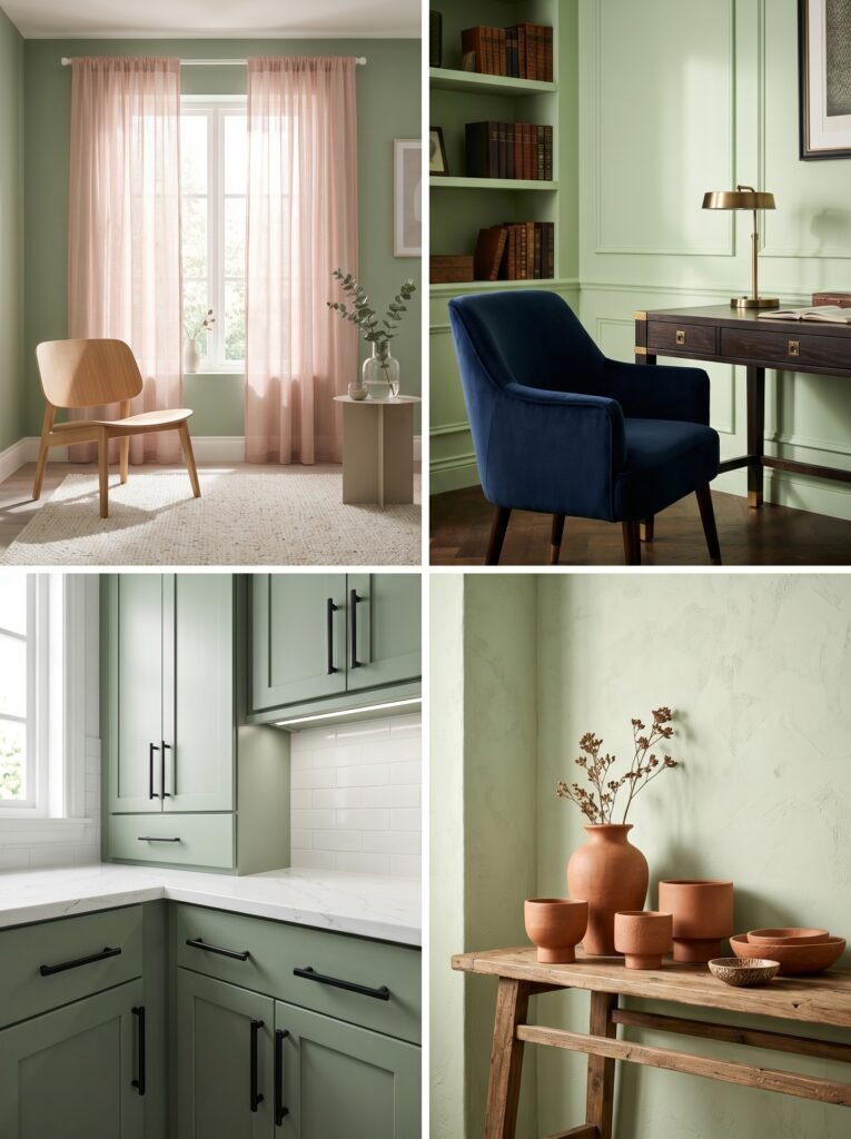
Light green and blush pink is a pairing that sounds risky and lands brilliantly. The cool freshness of sage tempers what could be saccharine about pink, while the warmth of blush pulls sage away from severity. Together, they feel like early morning light through gauze curtains — soft, a little dreamy, and somehow deeply optimistic.
Light green and deep navy creates a more graphic, sophisticated contrast — almost colonial in its confidence. Use it in a study or a formal dining room where you want visual tension and intellectual weight.
Light green and black is perhaps the most underrated combination. Black hardware on sage green cabinets, black picture frames on pistachio walls, black iron light fixtures in a mint-painted kitchen — the contrast is precise, elegant, and resists looking dated in ways that trendy brass-and-green combinations sometimes don’t.
Light green and warm terracotta is the combination having its absolute moment right now, and with good reason. It references the earth — clay pottery, dried herbs, garden walls — in a way that feels both ancient and completely contemporary.
6. Light Green Kitchen Ideas That Make You Actually Want to Cook
There’s a reason the light green kitchen has become something of a cultural phenomenon on Pinterest and design blogs. It’s not just aesthetic — it’s psychological. Green kitchens feel alive in a way that white kitchens, for all their crispness, often don’t.
Sage green lower cabinets paired with open upper shelves in warm white is perhaps the most widely loved configuration. It grounds the kitchen visually — all that warm, earthy sage anchoring the space — while keeping the upper half light and open. It photographs well and, more importantly, it lives well.
Mint green tiles used as a backsplash behind matte black fixtures are a sharper, more contemporary approach — the kind of kitchen that feels like it belongs to someone who knows exactly who they are.
For those renting or on tight budgets, light green paint on a kitchen island, light green appliances in the increasingly popular retro-style range, or even green open shelving can introduce the color without a full renovation commitment.
The key detail that elevates any green kitchen is hardware. Unlacquered brass ages beautifully against sage and warms the whole palette. Matte black creates crisp definition. Brushed nickel reads as more casual and modern. Choose one metal and commit to it throughout.
7. Small Space? Here’s Why Light Green Might Actually Be Your Best Friend
There’s a persistent myth in interior design that small rooms need white walls to feel larger. It’s understandable — logic suggests that reflection equals space. But design practice tells a more interesting story.
Light green in a small room does something white simply can’t: it creates the perception of depth. The eye reads green as natural, and natural space feels expansive — even in a 9 x 10 bedroom. It’s the same phenomenon that makes a small garden feel larger than a small parking lot, even if the square footage is identical. We process greenery differently. We process it as belonging to a larger world.
Celadon and soft sage are particularly effective in small rooms because their slight translucency seems to push walls outward rather than pull them inward. Pair with large mirrors, natural light, and furniture on legs that expose the floor, and the room breathes in a way that basic white walls rarely achieve.
8. Bringing Light Green In Without Painting a Single Wall
Commitment is intimidating. A full repaint is a weekend, a financial decision, and — perhaps most importantly — a permanent statement about who you are and what you want. Not everyone is ready for that. And honestly? You don’t have to be.
Light green can enter a room gently and quietly through objects, textiles, and plants before you ever crack open a single tin of paint. A sage velvet sofa is an anchor piece that transforms everything else in the room. Green linen bedding creates the same bedroom atmosphere as painted walls at a fraction of the commitment. Vintage green glassware displayed on open shelving brings the color into a kitchen with warmth and personality.
Large ceramic planters in celadon or sage, an oversized piece of botanical artwork, a single vintage jug in warm green glaze — all of these introduce the palette gradually. And sometimes, the gradual approach teaches you exactly which shade of green and exactly how much of it feels right in your specific home, with your specific light.
9. The Lighting Truth No One Tells You About Green Interiors
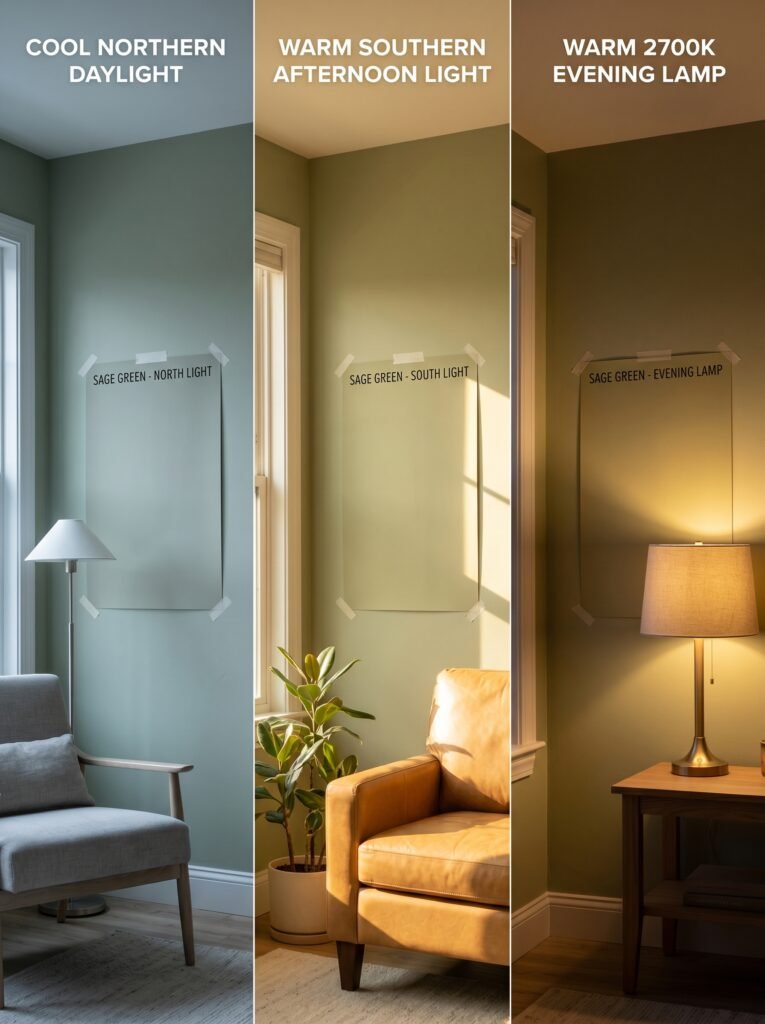
This is the section that saves people from expensive mistakes and lingering disappointment. Light changes green more dramatically than it changes almost any other color — and getting this wrong is how a room that looked perfect in the store winds up looking wrong in your home.
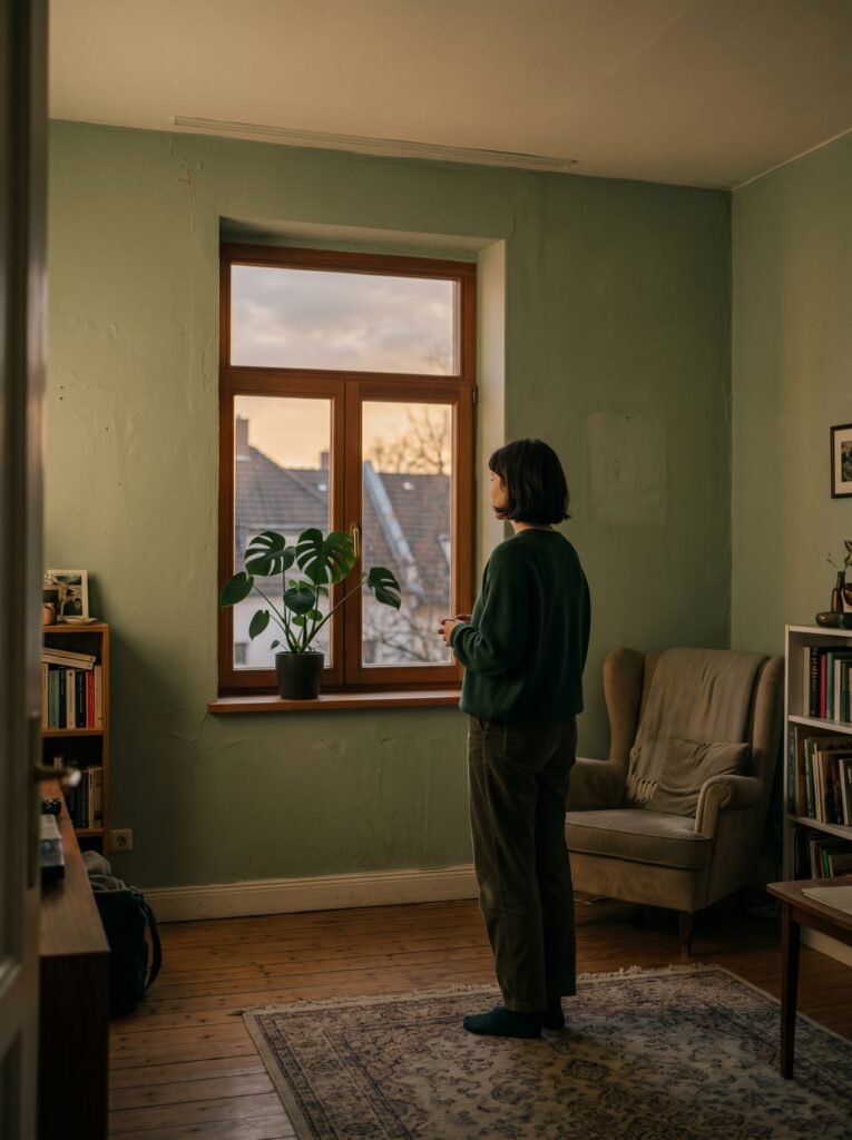
North-facing rooms receive cool, bluish natural light, which will push your sage green toward grey and your mint toward blue. In these rooms, you want a green with warm yellow undertones to compensate — look at swatches that read almost yellow-green in the store.
South-facing rooms flood with warm golden light, which enriches green beautifully. Here you have more freedom — cool greens won’t feel clinical, and warm greens will glow.
“The color on the chip is a suggestion. The color on your wall in your light is the truth.”
Artificial lighting matters equally. Warm-toned bulbs (2700K–3000K) enrich sage and pistachio tones beautifully, making them feel cozy and golden-hued in the evenings. Cooler bulbs push green toward clinical brightness — which can work in a bathroom or kitchen but rarely feels restful in a living room or bedroom.
Always — always — test a paint swatch on your actual wall, in a large patch, and observe it across morning light, afternoon light, and evening lamplight before committing.
10. How to Style Light Green Rooms for Pinterest Photos That Actually Get Saved
If you’re creating content around your light green interior — or simply want your home to photograph as beautifully as it lives — a few specific styling principles will dramatically change how your images perform.
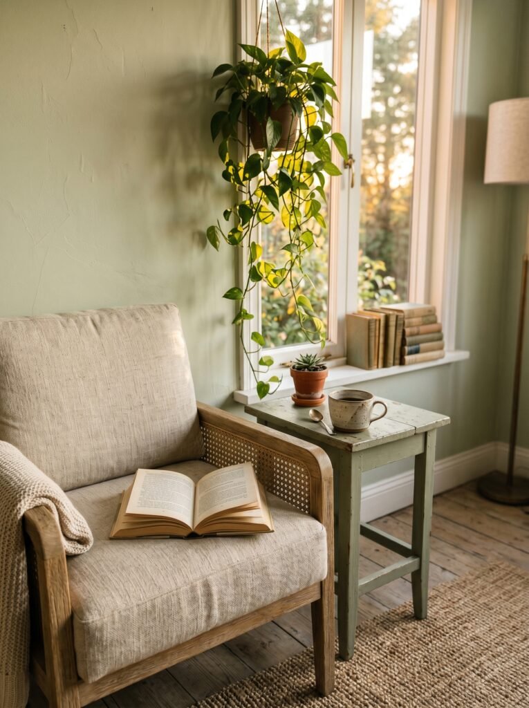
Natural light is non-negotiable. Shoot in the two hours after sunrise or the two hours before golden hour for the warmest, most flattering light on green tones. Midday light tends to flatten color and create harsh shadows.
Embrace the imperfect. Rooms that look too styled — too symmetrical, too coordinated — actually underperform on Pinterest compared to rooms that look genuinely lived in. A book left open on a linen cushion, a half-drunk cup of coffee on a sage green side table, a trailing plant reaching toward the window — these signals of real life make people save images because they can see themselves there.
Texture is your best photography tool. Flat surfaces disappear in photographs, but linen, terracotta, rattan, rough ceramics, and natural wood gain dimension and richness. Layer textures deliberately in your light green rooms and your photographs will have a depth that smooth, polished spaces simply can’t replicate.
11. The Sustainability Story Behind the Light Green Interior Movement
It would be easy to dismiss the light green interior trend as purely aesthetic — another Pinterest moment that will feel dated in three years. But there’s a deeper cultural current running beneath it that suggests this one has more permanence than most.
The widespread embrace of green interiors is inseparable from a broader movement toward biophilic design — the intentional incorporation of natural elements, textures, and colors into living spaces. Research in environmental psychology consistently demonstrates that biophilic environments reduce stress, improve cognitive function, lower blood pressure, and increase general wellbeing.
People choosing light green walls aren’t just following a trend. They’re responding — often intuitively — to a genuine need to feel more connected to the natural world, particularly as so much of modern life unfolds on screens in urban environments. The green room becomes a small act of self-preservation.
Paired with sustainable material choices — natural linen, reclaimed wood, ethically made ceramics, second-hand furniture — a light green interior becomes a complete philosophy of living rather than a decoration decision.
12. The Future of Light Green Interiors — Where This Trend Is Heading
Every design movement evolves, and light green is no exception. The sage-and-linen aesthetic that dominated the early 2020s is already giving way to more complex, layered interpretations that feel richer and more personal.
Expect to see more painterly, textured wall treatments — limewash, plaster, and wash finishes — that give light green walls the depth and irregularity of natural stone or aged fresco. These finishes catch light differently at different times of day, making the same room feel like multiple rooms across a single day.
Deeper, more complex greens are beginning to appear alongside the lighter, softer shades — not replacing them, but adding dimension. A room might now feature sage walls, a single deep moss velvet chair, and pale celadon ceramics, creating a tonal range that feels genuinely sophisticated.
Green in outdoor and transition spaces — mudrooms, sunrooms, covered porches — is also growing rapidly, blurring the boundary between the cultivated garden and the designed interior. This inside-outside approach feels like the natural next chapter for a color that has always belonged, at its core, to the natural world.
—
🌿 How to Take Care of Your Light Green Interior
Maintaining a light green interior is less about renovation and more about mindful curation over time — the way you’d tend a garden rather than manage a project.
Refresh seasonally by rotating textiles. Swap heavier linen and velvet in winter for lighter cotton and natural weaves in summer. The green stays constant; the textures shift with the light and the season, keeping the room feeling alive.
Keep plants genuinely healthy. Nothing undermines a biophilic interior faster than struggling, yellowing houseplants. A few thriving plants are worth ten times more — aesthetically and emotionally — than twenty neglected ones.
Edit ruthlessly and regularly. Light green interiors depend on a certain visual calm to function properly. When surfaces become cluttered, the restfulness disappears. A quarterly edit — removing what doesn’t earn its place, introducing one or two new pieces thoughtfully — keeps the room feeling curated rather than accumulated.
Repaint accent walls or statement pieces every few years as your relationship with the space deepens and your understanding of which shade truly feels like yours becomes clearer.
—
❓ FAQ
Q: Is light green a good color for small rooms? A: Absolutely — and perhaps counterintuitively, it can make small rooms feel more spacious than white. The eye processes green as a natural color associated with openness and depth, which creates a psychological sense of expanded space. Choose shades with cool undertones like celadon for the greatest perceived spaciousness.
Q: What colors go best with light green walls? A: Light green is remarkably versatile as a wall color. Warm neutrals like cream, linen, and warm white create soft, harmonious rooms. Terracotta and rust add warmth and earthiness. Deep navy creates sophisticated contrast. Blush pink offers a dreamy, unexpected pairing. Natural wood tones work with virtually every shade of light green.
Q: Will light green look dated quickly? A: Unlike highly specific trend colors that rise and fall within a single design cycle, light green draws from deep natural and cultural roots that give it remarkable longevity. Sage and celadon in particular have appeared in beautiful interiors across centuries and cultures. While specific expressions of the trend — certain furniture silhouettes, particular hardware finishes — will evolve, the fundamental appeal of green as a living, breathing interior color is far more permanent than most people assume.
—
💭 Final Thought
A light green room isn’t a statement about following trends. It’s a quiet declaration that you want to feel something when you come home — that you’ve decided your walls should work for your wellbeing, not just your camera roll. There’s something deeply human about reaching for the color of living things when you’re arranging the space where your real life unfolds.
So as you look around the room you’re in right now — what would change if its walls exhaled a little more green?