How a Few Coats of Paint Completely Transformed the Way My Home Felt — And How It Can Do the Same for Yours
There’s a moment — maybe you’ve felt it too — when you walk into someone’s home and something just stops you. The colors feel intentional. The walls seem to breathe. Every room tells a quiet story about the person who lives there. More often than not, that feeling comes down to something deceptively simple: paint.
—
Table Of Content
1. The Emotional Power of a Painted Interior Most People Underestimate
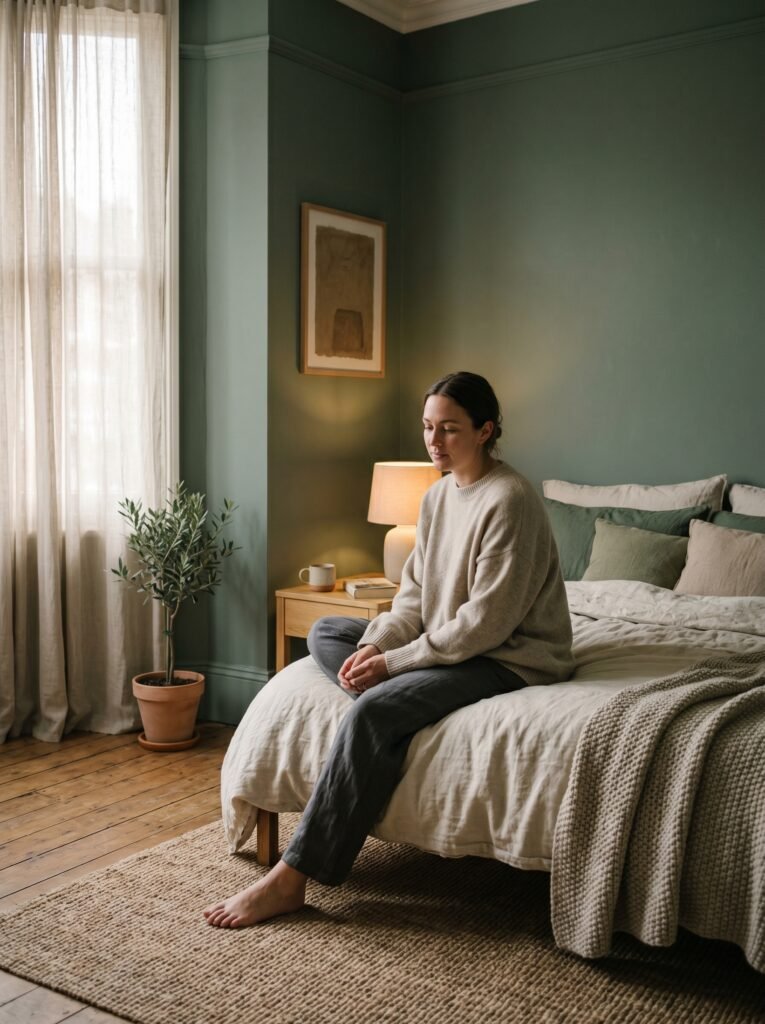
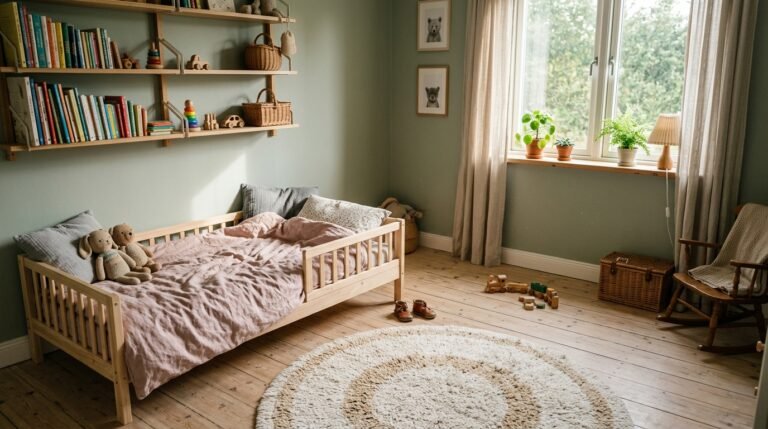
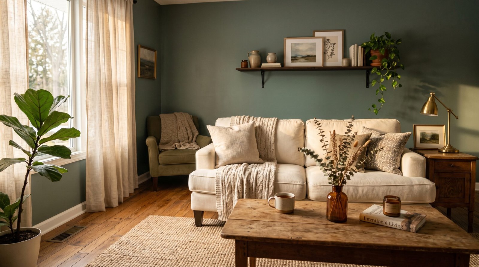
Walk into a room painted in deep, dusty sage green, and your shoulders drop. Your breathing slows. You feel — almost inexplicably — at home. Now walk into a room drenched in stark white with no warmth, and you feel a subtle tension, a sense that you’re waiting for something to happen. That’s not imagination. That’s color psychology working on you in real time.
Paint is the single most transformative design tool available to homeowners, and yet it’s routinely underestimated. People agonize over furniture and fixtures, spending thousands of dollars trying to get their interiors right, while overlooking the thing that literally surrounds every single moment spent in that room — the walls. Color creates mood before your eyes have even registered the furniture. It sets the emotional temperature of a space before you’ve sat down.
“Your walls aren’t just a backdrop — they’re the emotional foundation of every room you live in.”
The homes that feel most alive, most personal, most beautiful on Pinterest aren’t just well-decorated. They’re thoughtfully painted. And understanding that distinction is the first step toward a home that genuinely moves you.
2. Why Painted Interiors Are Dominating Pinterest Right Now
Open Pinterest on any given day and the most-saved home interior images share one thing in common: they are saturated with color, intention, and personality. The era of all-white, minimalist interiors — while still beautiful — is giving way to something richer, warmer, and far more layered. Painted house interiors are trending for reasons that go far deeper than aesthetics.
People are spending more time at home than ever before. Remote work, home cooking, intentional living — all of it has shifted our relationship with domestic space. When your home is where you work, rest, cook, raise children, and seek peace, you need it to feel like something. You need the walls to do emotional heavy lifting. And that’s exactly what a thoughtfully painted interior accomplishes.
Pinterest data consistently shows that color-forward interiors — terracotta dining rooms, navy blue studies, soft butter-yellow kitchens — receive dramatically higher save rates than their neutral counterparts. People aren’t just admiring these spaces. They’re saving them with the quiet, determined hope of one day having the courage to do the same thing in their own homes.
3. Choosing Paint Colors That Actually Work With Your Light

Here’s the conversation that most design blogs skip over, and it’s the one that matters most: paint color doesn’t exist in a vacuum. The same shade of pale blue that looked ethereal in a design studio can turn gray and cold in your north-facing bedroom. The warm terracotta you fell in love with on Pinterest might edge toward orange under your specific lighting conditions. Paint color is a relationship — between the pigment, your light source, and your room’s orientation.
Before committing to any color for a painted house interior, spend time observing your natural light throughout the day. A south-facing room receives warm, golden light for most of the day and can handle cooler tones beautifully — the light will balance them. A north-facing room receives cool, indirect light and needs warm undertones in paint to compensate. East-facing rooms glow in the morning and soften by afternoon. West-facing rooms come alive at golden hour.
This isn’t a rule system to follow blindly — it’s information to help you make choices that feel right rather than choices you’ll regret after spending a weekend painting. Always — always — test paint samples on your actual walls in large swatches, at least 12 by 12 inches, and observe them for at least 48 hours before deciding. The difference between a color you love and a color you’ll grow to resent often comes down to this single step.
4. The Rooms That Respond Most Dramatically to Bold Paint Choices
Not every room in your home will transform equally with paint. Some spaces are natural canvases for bold, dramatic color choices — and knowing which rooms those are can save you from an expensive and exhausting mistake.
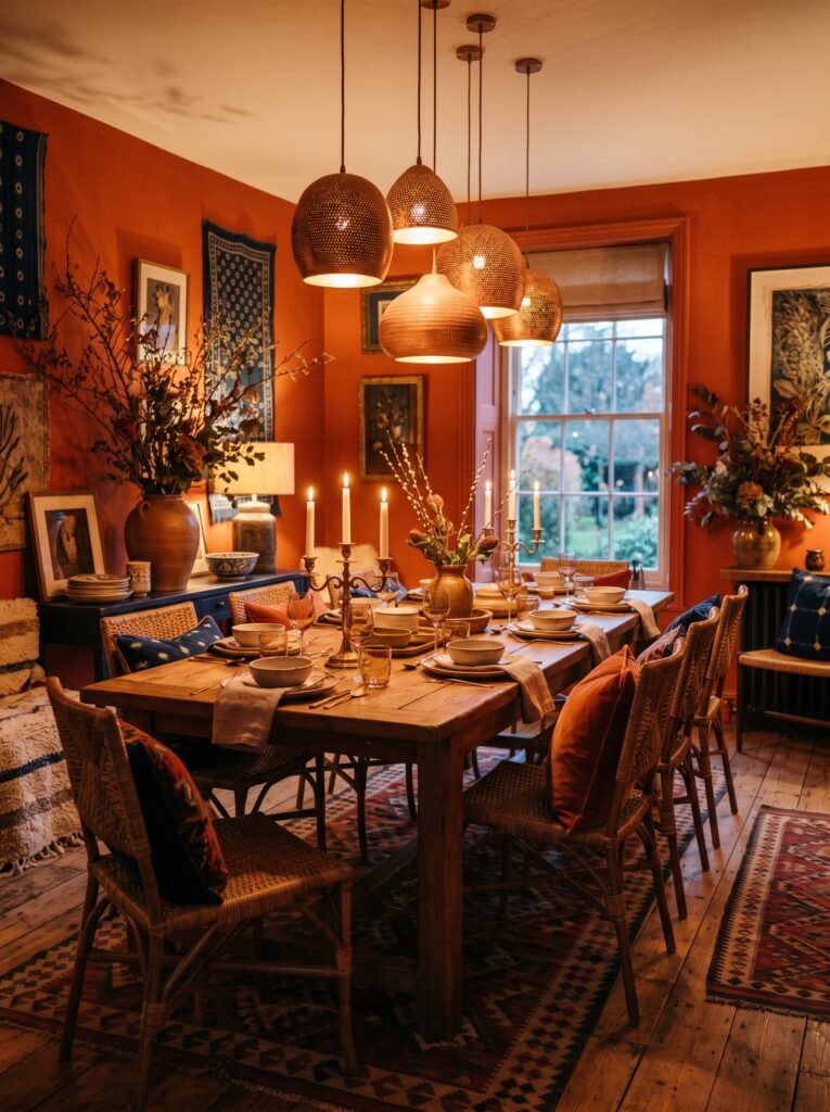
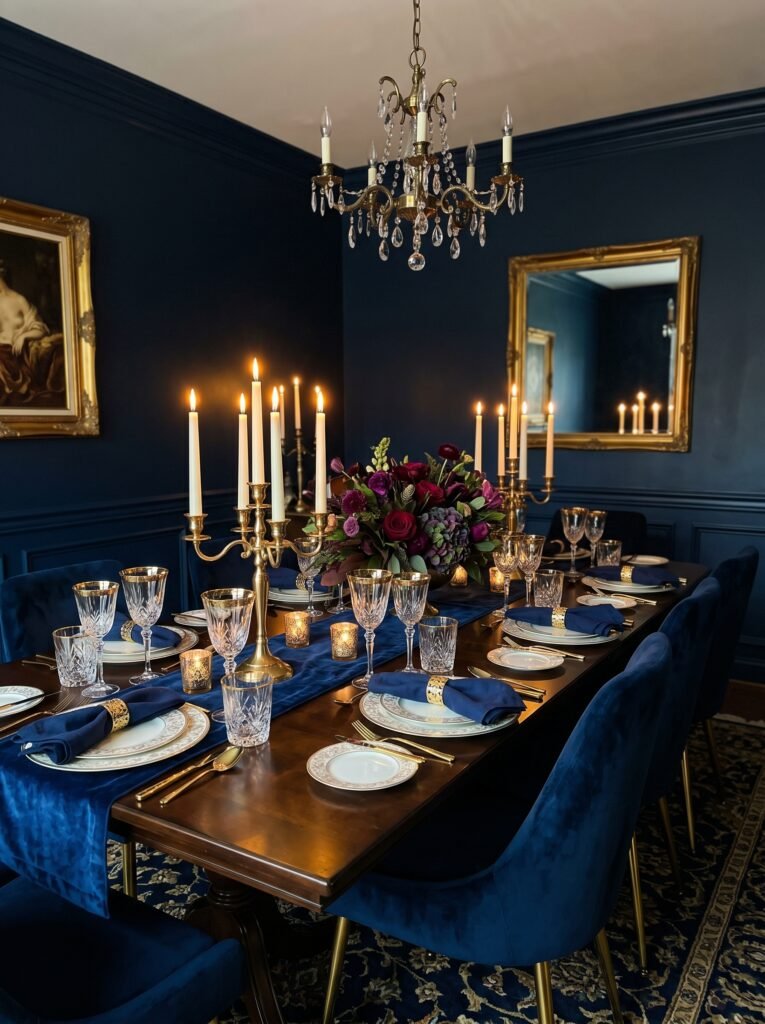
Dining rooms are perhaps the boldest success story in painted house interiors. They’re used for relatively short periods of time — meals, gatherings, celebrations — which means a rich, saturated color won’t overwhelm you the way it might in a bedroom where you spend eight hours in relative stillness. Deep jewel tones like forest green, burgundy, eggplant, or midnight blue in a dining room feel romantic and intentional. They make every meal feel like a special occasion.
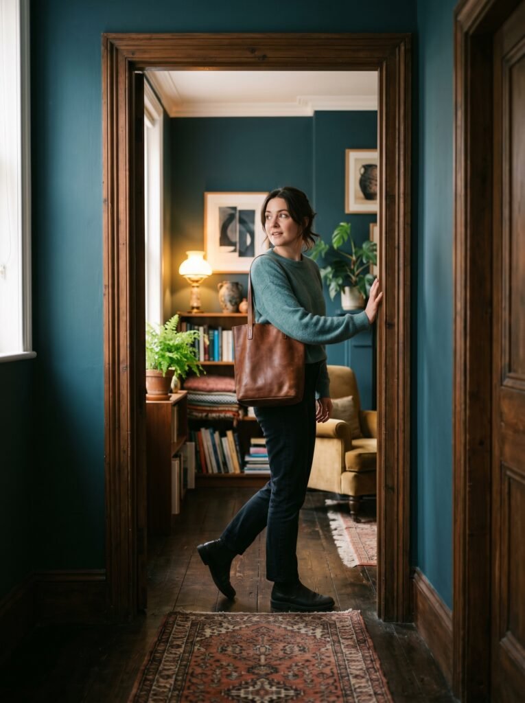
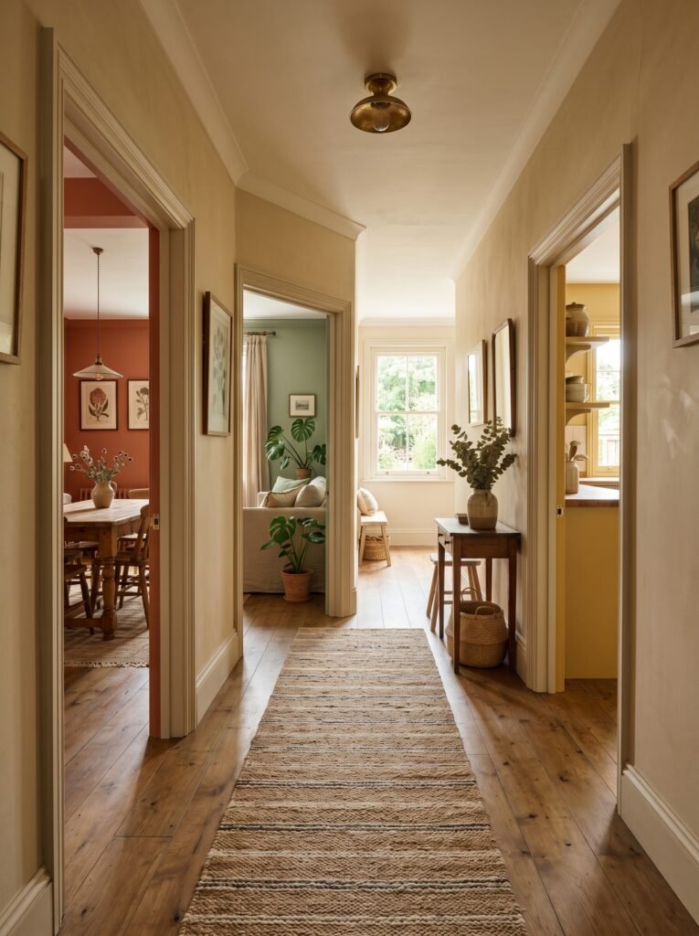
Hallways and entryways are another underused canvas. Because these spaces are transitional — you move through rather than linger in them — they can carry dramatic color beautifully. A boldly painted entryway sets the emotional tone for your entire home before a guest has even stepped fully inside.
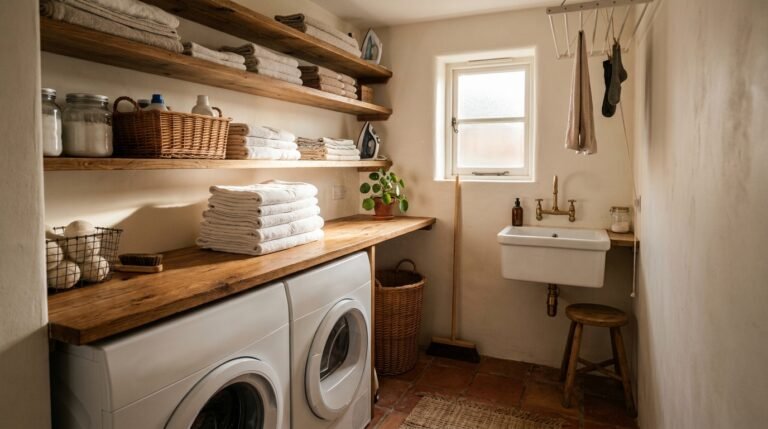
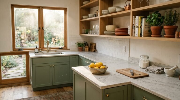
Kitchens respond extraordinarily well to warm, energizing colors. Soft yellows, creamy whites with warm undertones, sage greens, and even terracotta accents all create an atmosphere of abundance and welcome — the feeling that something good is always being made here.
5. Understanding Paint Finishes — The Detail That Changes Everything
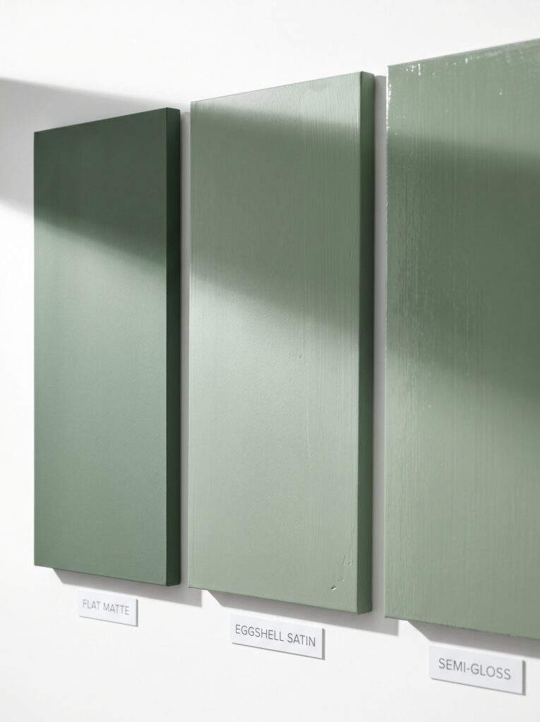
This is the information that even experienced home decorators sometimes overlook, and it explains why two rooms painted with the exact same color can look and feel completely different. Paint finish — the level of sheen or matte quality — dramatically affects how a color reads on your walls and how that wall interacts with light.
Flat or matte finishes absorb light. They create soft, velvety surfaces that make color look rich and deep. They’re ideal for living rooms and bedrooms where you want a cocooning, intimate feel. The trade-off is that they’re harder to clean and show marks more readily.
Eggshell and satin finishes have a subtle, low-level sheen that allows walls to be wiped down without damage. They’re the workhorses of interior painting — practical for kitchens, hallways, children’s rooms, and anywhere life happens actively. They also make colors appear slightly lighter than matte finishes.
Semi-gloss and gloss finishes are reserved for trim, cabinetry, and architectural details. Used on walls, they can feel clinical, but on baseboards, door frames, window casings, and kitchen cabinets, they create crisp, clean definition that makes an entire room feel more polished and intentional.
“The right finish can make a color sing. The wrong one can make a perfect color fall completely flat.”
6. Two-Tone and Color-Drenching Techniques That Pinterest Loves
One of the most exciting developments in painted house interiors over recent years is the move away from the single, safe wall color applied uniformly throughout a room. Two techniques in particular have taken over Pinterest boards and design magazines with good reason: two-tone painting and color drenching.
Two-tone painting involves painting the upper and lower halves of a wall in different — but complementary — colors. The most classic approach uses a chair rail or a painted division line to separate a deeper, grounding color below from a lighter, airier tone above. This technique creates visual interest and architectural character in rooms that might otherwise feel flat and featureless. It works beautifully in entryways, dining rooms, and bedrooms.
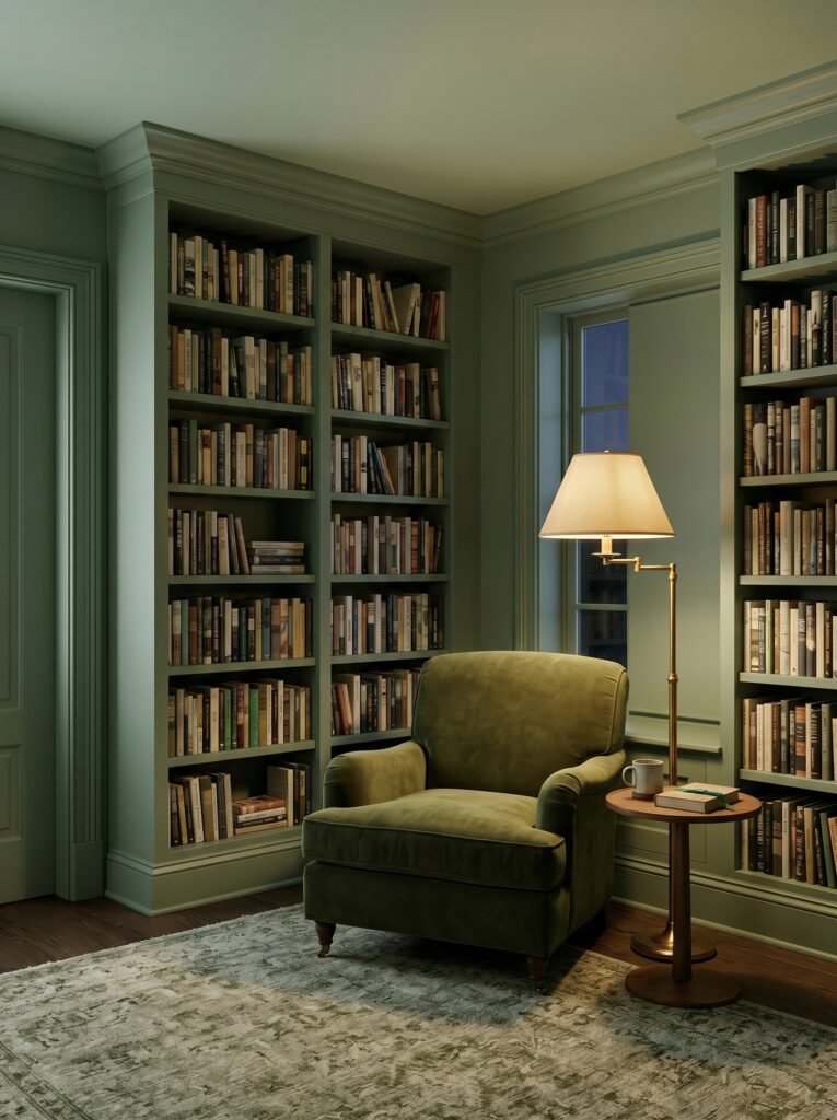
Color drenching is the bolder, more committed version: painting the walls, ceiling, trim, and even built-in furniture all in the same color, or in tonal variations of the same hue. The effect is immersive and deeply satisfying — like stepping inside a mood rather than a room. A sage-green-drenched study, where every surface exists in harmony, feels meditative and complete in a way that no single painted wall ever could.
7. The Surprising Psychology of White — and Why It Isn’t as Simple as You Think
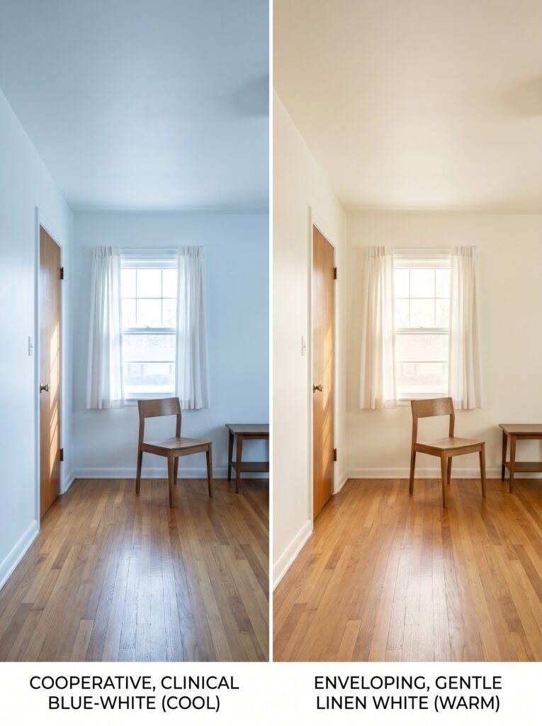
White is the default choice for so many homeowners — it feels safe, timeless, clean. And yet, there is no such thing as simply “white” when it comes to interior paint. There are hundreds of whites, and they differ dramatically in undertone, warmth, and character.
Bright, cool whites with blue or gray undertones can feel sterile and cold — particularly in rooms with limited natural light. They create a clinical atmosphere that reads more like a waiting room than a home. Warm whites with yellow, pink, or beige undertones — creamy whites, linen whites, antique whites — feel enveloping and gentle. They make rooms feel larger while still maintaining genuine warmth.
The most beloved white in interior design history, Benjamin Moore’s Chantilly Lace, became a phenomenon precisely because it walks the line between crisp and warm without veering into either coldness or yellowing. Understanding your specific white’s undertone, and how it interacts with your flooring, furniture, and light, is as nuanced as choosing any bold color.
8. Painting Ceilings — The Fifth Wall You’re Probably Ignoring
Here is a design secret that professional interior designers use consistently, and that most homeowners never discover: the ceiling is a room’s fifth wall, and painting it thoughtfully can fundamentally change the perceived proportions and atmosphere of an entire space.
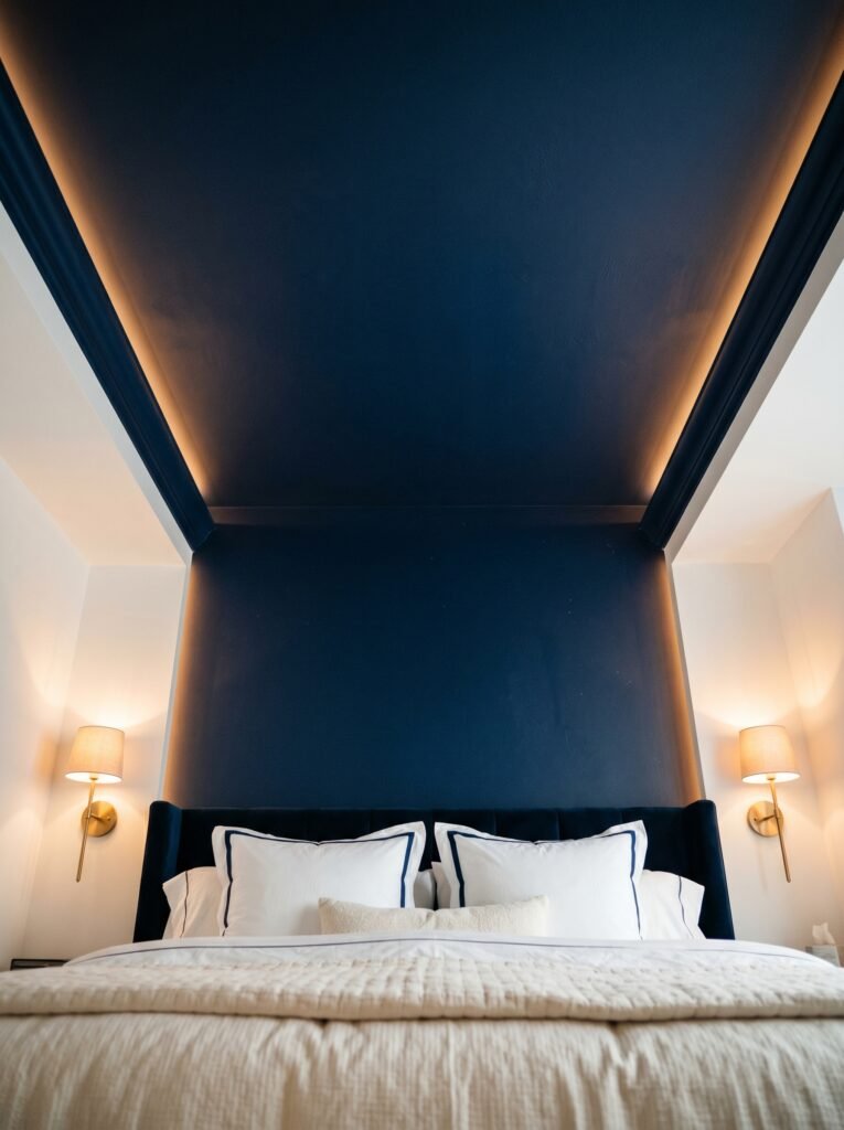
The conventional wisdom has long been to paint ceilings white — bright white, always white. But this rule deserves to be challenged. A ceiling painted in the same color as your walls, just two shades lighter, creates a seamless, cocoon-like quality that makes a room feel simultaneously larger and more intimate. A ceiling painted in a rich, deep tone — navy blue, charcoal, forest green — creates a sense of drama and enclosure that can feel extraordinarily luxurious, like sleeping under a night sky.
Low-ceilinged rooms benefit from pale ceiling colors that visually push the surface upward. High-ceilinged rooms can carry deeper ceiling tones without feeling claustrophobic. Don’t overlook your ceiling the next time you plan a room refresh — it may be the single change that makes everything else fall into place.
“Paint the ceiling, and you haven’t just decorated a room — you’ve redesigned how it feels to be inside it.”
9. How Painted Trim and Architectural Details Create a Finished, Magazine-Worthy Look
One of the most common reasons a freshly painted room still doesn’t quite look right is neglected trim. Baseboards, door frames, window casings, crown molding — these architectural details are the bones of your room’s visual structure. When they’re painted thoughtlessly, or simply left in whatever condition they were in before, the whole room reads as unfinished.
Painting trim in a crisp, clean white or a soft off-white creates contrast and definition — it gives the eye a clean boundary between surfaces and makes the room feel intentional and complete. Alternatively, painting trim in the same color as your walls — just in a higher sheen — creates an enveloping, seamless effect that feels modern and sophisticated.
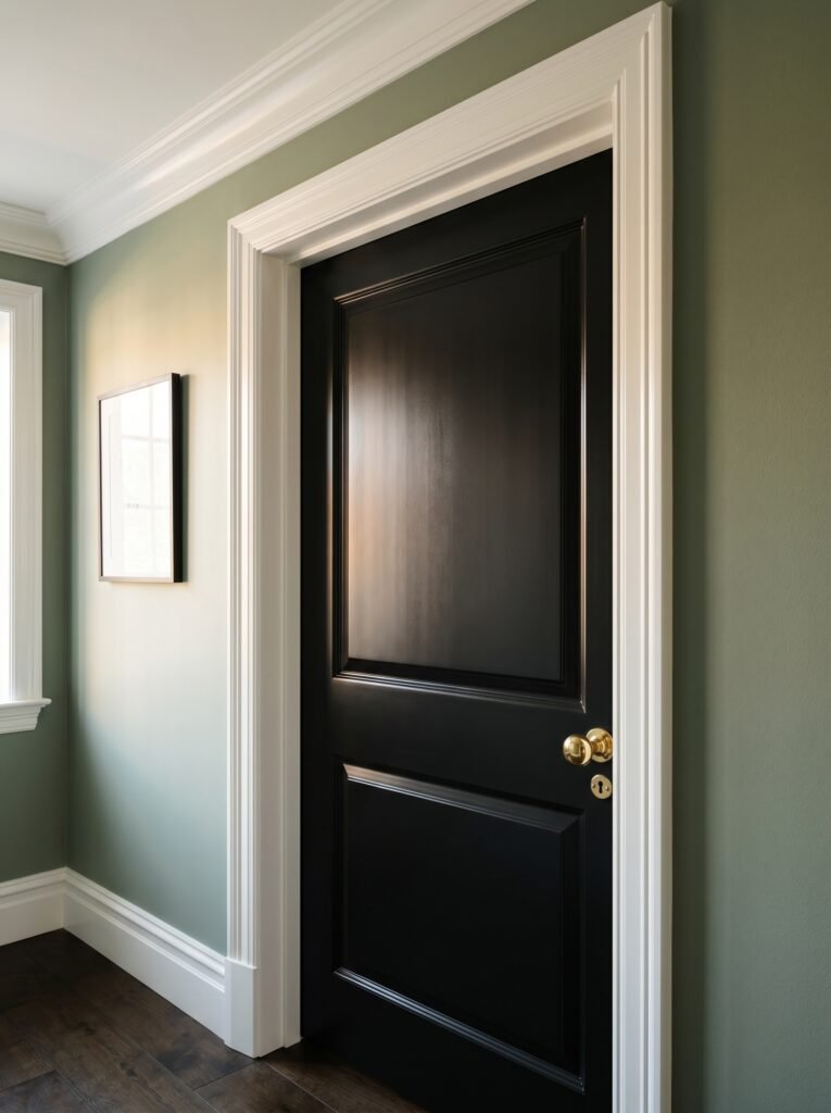
Don’t overlook interior doors, either. A painted interior door — in a contrasting color, or even in a deep, dramatic shade like black or navy — becomes a statement piece. It adds personality without requiring significant investment or renovation.
10. Budget-Friendly Ways to Transform Your Home with Paint
Paint remains one of the most cost-effective design investments available, but even within that category, there are smart ways to maximize impact without overspending. A single gallon of quality paint — typically covering around 400 square feet — costs between $40 and $80. Considering the transformation it can create, that is an extraordinary return on investment.
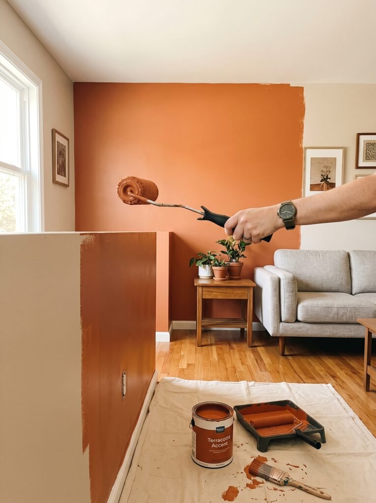
If budget is genuinely tight, prioritize the rooms where you spend the most time — the living room, kitchen, or bedroom. A single room painted with intention and care will shift how your entire home feels in daily life. Accent walls, while sometimes overused, can still be deeply effective when chosen thoughtfully — paint one wall in a rich color and allow it to anchor the room without requiring the commitment of an entire room makeover.
Quality matters more than most people realize. Cheap paint often requires multiple coats, has inconsistent coverage, and fades faster — negating any initial savings. Investing in a reputable brand like Farrow and Ball, Benjamin Moore, or Sherwin-Williams for at least your primary living spaces will pay for itself in longevity, depth of color, and ease of application.
11. Common Painted Interior Mistakes — and How to Avoid Them
Even the most well-intentioned painted house interior can go wrong without careful planning. The most common mistake is skipping primer — especially when painting over dark colors, fresh drywall, or stained surfaces. Primer creates adhesion, evens out surface variations, and ensures that your chosen color appears true and even. Skipping it almost always results in patchy, uneven coverage that requires more coats of paint to fix, ultimately costing more time and money.
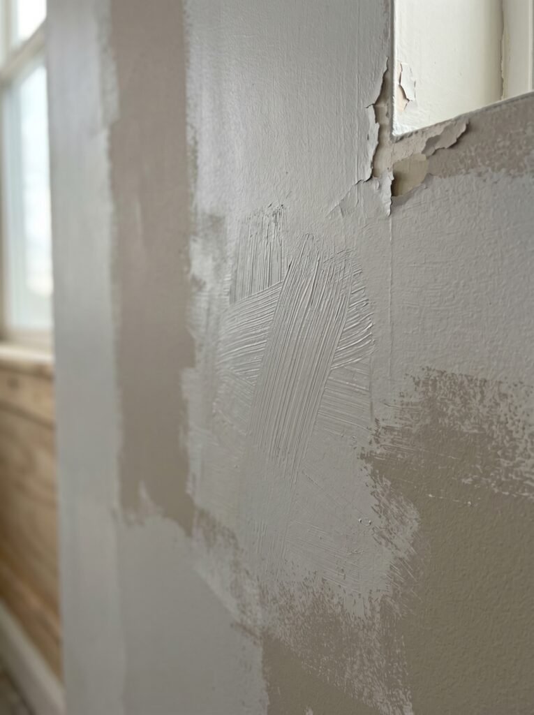
Painting without proper preparation — failing to clean walls, fill holes, sand rough patches, or tape edges carefully — creates a result that looks amateur regardless of how beautiful the color itself is. The preparation is the invisible work that makes the visible work look effortless.
Choosing colors based solely on the small paint chip in the store is another reliable path to disappointment. Paint chips are tiny, and your brain cannot accurately extrapolate how a color will feel across 400 square feet of wall space. Always sample. Always observe in your own light. Always give yourself time before committing.
12. Creating Cohesion — How to Make Every Painted Room Flow Into the Next
A home where every room is painted in a completely unrelated color can feel chaotic and disjointed — like wandering through a series of disconnected experiences rather than moving through a unified, intentional home. Creating visual cohesion across a painted house interior requires a strategy that allows for individuality within each room while maintaining a sense of belonging throughout.
One of the simplest approaches is choosing a neutral anchor color — a warm white, a soft greige, a gentle linen — for your hallways and transitional spaces, and allowing each individual room to have its own distinct color identity that harmonizes with that neutral. The neutral hallway acts as a visual breath between rooms, preventing the jarring collision of contrasting colors.
Another approach is to pull from a single color family across the whole home — varying the depth and saturation, but maintaining a tonal connection. A home where every room lives within the same warm, earthy palette of terracotta, rust, sage, and cream feels unified without feeling monotonous.
—
🌿 How to Take Care of Your Painted Interior
Once you’ve invested the time, love, and energy into a beautifully painted home, maintaining it is simpler than most people expect — and it starts with the right approach from the very beginning.
Always use washable paint in high-traffic areas — kitchens, hallways, children’s rooms, and bathrooms. Eggshell and satin finishes in these spaces allow you to gently wipe down marks without damaging the finish. For spot cleaning, use a soft, slightly damp cloth and mild soap, and always blot rather than scrub.
Touch-up paint is something every homeowner should keep. Store leftover paint in an airtight container, labeled clearly with the color name, brand, and the room it belongs to. Minor scuffs and marks can be touched up invisibly when the original paint is available — and this small habit keeps your walls looking freshly painted for years longer than they otherwise would.
Repaint rooms on a cycle of every five to seven years in low-traffic areas, and every three to five years in high-use spaces. Paint fades, yellows, and accumulates a kind of visual fatigue over time — a refresh doesn’t always mean a new color, but it always means a renewed sense of life in the room.
—
❓ FAQ
Q: How do I choose the right paint color if I’m not naturally good at design? A: Start by identifying three to five images of interiors you love — on Pinterest, in magazines, anywhere — and look for the colors that appear consistently across all of them. That overlap is your color intuition speaking. Once you have a direction, narrow it down with physical paint samples tested in your own home over 48 hours before making a final decision.
Q: Is it worth hiring a professional painter, or can I do it myself? A: For straightforward rooms with standard wall height, careful DIY painting can absolutely achieve professional-looking results with the right preparation and tools — a quality roller, good brushes, painter’s tape, and patience. For rooms with complex architectural details, very high ceilings, or extensive surface preparation needs, the investment in a professional painter is often worth it for the quality and time saved.
Q: How many coats of paint does a room actually need? A: Most quality paints require two coats for complete, even coverage — and always require a minimum of one coat of primer on fresh or previously unpainted surfaces. Painting over a dramatically different color (especially going from dark to light) may require three coats. Resist the temptation to apply thick coats to speed up the process — thin, even coats dry faster and look significantly better.
—
💭 Final Thought
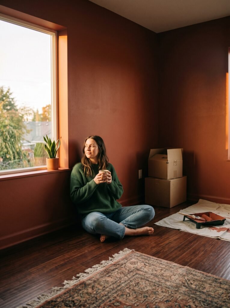
A painted house interior is, at its heart, an act of self-expression. It’s the quiet decision to make your home feel like you — not like the previous owners, not like the default rental beige that’s been there since no one can remember. Every color choice is a small declaration: this is how I want to feel when I wake up in the morning, when I cook dinner, when I finally sit down at the end of a long day.
The walls of your home hold your daily life. Doesn’t it seem worth spending a weekend making them hold it beautifully?