The Walls That Shape You: What the Colours in Your Home Are Quietly Doing to Your Mind
You didn’t think much about it when you painted the bedroom that shade of dusty blue. You just liked it. But six months later, you sleep better, feel calmer, and somehow dread Monday mornings a little less. Coincidence? Probably not.
—
Table Of Content
1. The Invisible Language Your Walls Are Speaking
Colour doesn’t shout. It whispers. And the whisper is constant — from the moment you open your eyes in the morning to the last thing you see before sleep pulls you under. Interior colour is one of the most underestimated forces in daily life, quietly shaping your mood, energy, appetite, focus, and even how you perceive time.
Researchers in environmental psychology have long understood that the colours surrounding us aren’t just decorative choices. They’re sensory inputs that the brain processes in real time, triggering emotional and physiological responses that happen faster than conscious thought. A red room genuinely raises your heart rate. A green space genuinely lowers cortisol. These aren’t feelings — they’re measurable facts.
“Your home isn’t just where you live. It’s what you feel, every single day.”
The trouble is, most of us choose wall colours the way we choose socks — quickly, instinctively, and without fully understanding the consequences. And then we wonder why one room feels draining while another feels like a hug.
2. Why Colour Hits You Before You Even Realise It
Imagine walking into a room painted entirely in deep crimson. Before you’ve looked at a single piece of furniture, before you’ve sat down, before you’ve said a word — something in you has already reacted. Your pupils have adjusted. Your pulse has shifted. Your brain has begun constructing a story about this space.
This happens because colour perception is processed in the visual cortex and immediately linked to the limbic system — the brain’s emotional hub. The science of colour psychology isn’t mysticism. It’s neuroscience. Different wavelengths of light activate different neural pathways, and those pathways connect directly to memory, emotion, and arousal.
This is why hospital designers don’t use hot orange walls. It’s why fast food chains historically favoured red and yellow — colours that stimulate appetite and subtly encourage fast turnover. And it’s why the rooms you remember most vividly from childhood often had a specific, dominant colour that became emotionally coded in your memory.
3. The Warmth Spectrum: Reds, Oranges, and Yellows

Warm colours carry energy. They advance visually — meaning they make walls feel closer, rooms feel smaller and more intimate. Used thoughtfully, this is a gift. Used carelessly, it’s a headache.
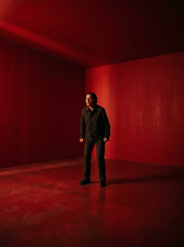
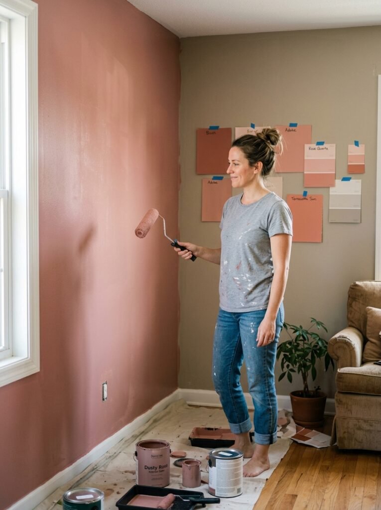
Red is the most emotionally charged colour in the spectrum. It stimulates the nervous system, increases appetite, and creates a sense of urgency. In a dining room where conversation should flow and appetites should flourish, deep terracotta or warm burgundy can be genuinely wonderful. In a home office where focus and calm are the priority? Red is more likely to work against you.
Orange sits in a fascinating middle ground — it carries the energy of red but tempered with the optimism of yellow. Burnt orange, rust, and amber tones feel grounded and sociable, making them excellent for living rooms where people gather. Yellow, at its best, is the colour of morning light and mental clarity. At its worst — in its more saturated, electric forms — it can feel aggressive and overstimulating.
4. The Cool Spectrum: Blues, Greens, and Purples
If warm colours advance, cool colours recede. They open rooms up, slow the heartbeat, and invite the mind to settle. There’s a reason that when people describe feeling peaceful somewhere, the word “blue” or “green” often isn’t far behind.
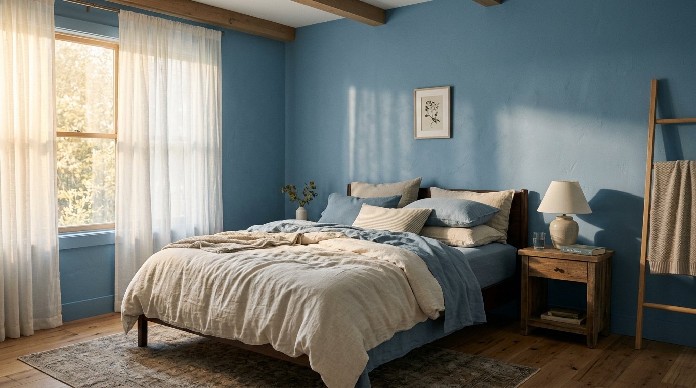
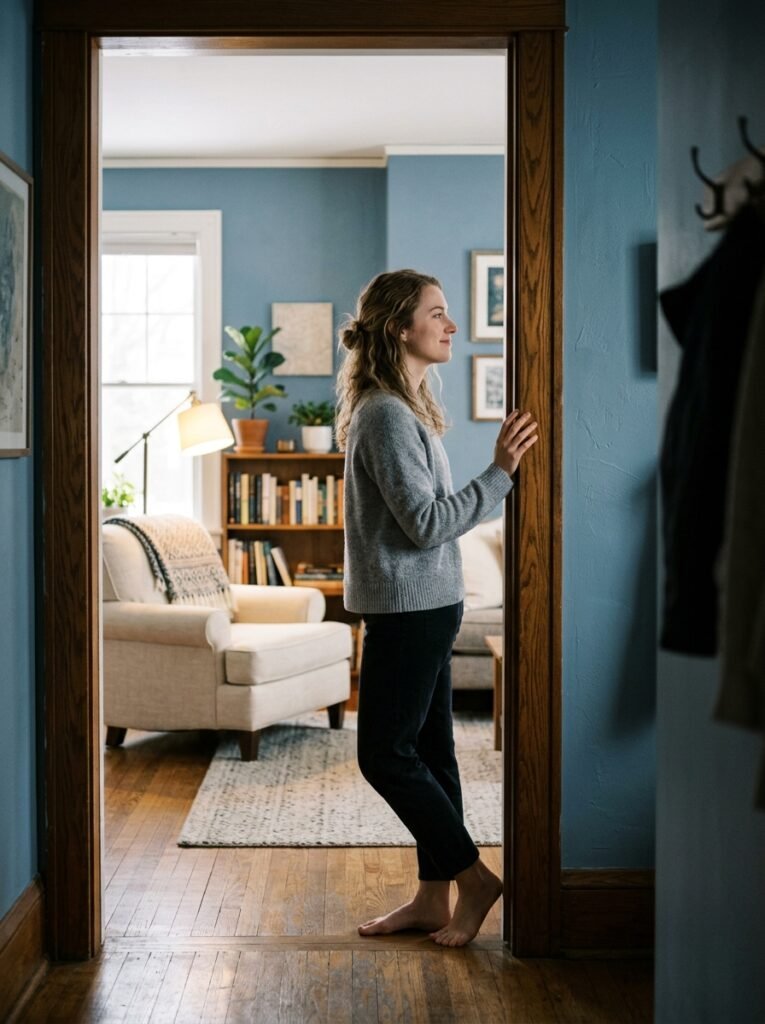
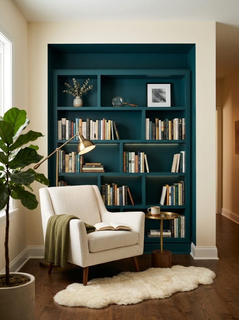
Blue is the world’s most universally liked colour, and its effect on the interior is profound. Soft blues — think dusty dove, muted slate, pale sky — lower blood pressure and encourage a sense of safety. They’re ideal for bedrooms and bathrooms. Deeper blues like navy create sophistication and focus, which is why they work beautifully in studies and libraries.
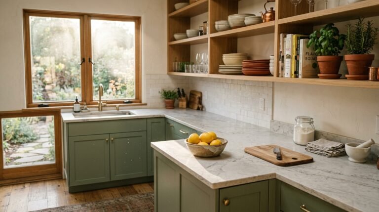
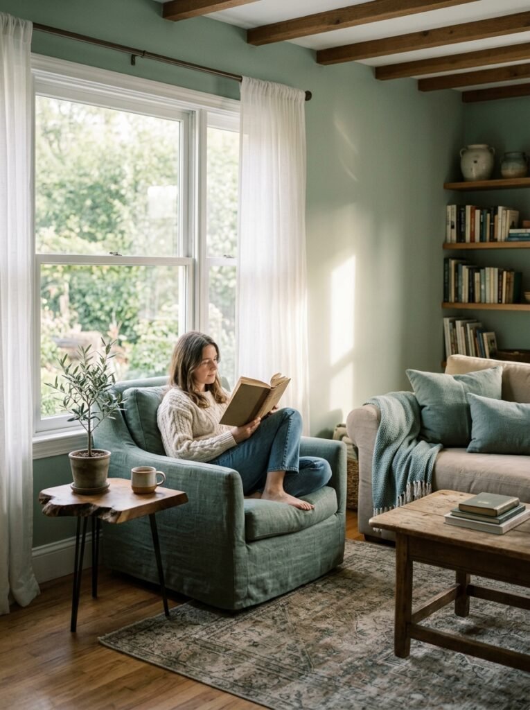
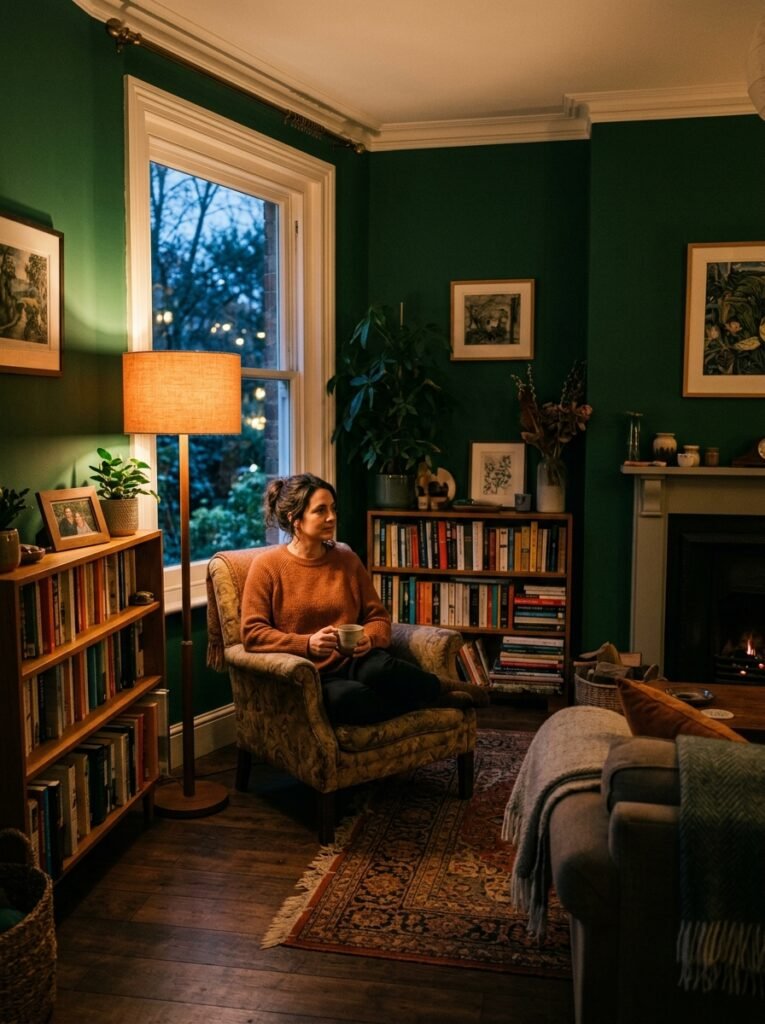
Green is uniquely restorative. Evolutionarily, green signified safety — water nearby, shelter, life. The brain still reads it that way. Sage, olive, forest, and eucalyptus tones bring a sense of balance and renewal that no other colour quite replicates. A green kitchen or living room doesn’t just look beautiful. It feels nourishing in a way that’s hard to name but impossible to deny.
Purple, historically associated with royalty and contemplation, works best in its softer iterations — lavender, mauve, dusty lilac — for spaces meant for rest or creativity.
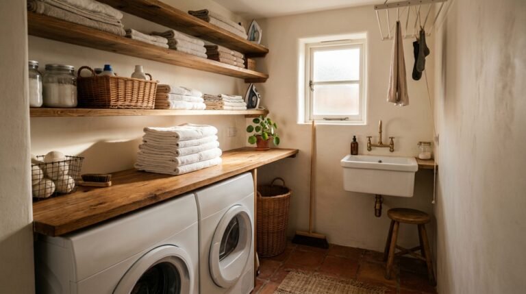
5. The Neutrals: Quiet Strength Most People Underestimate
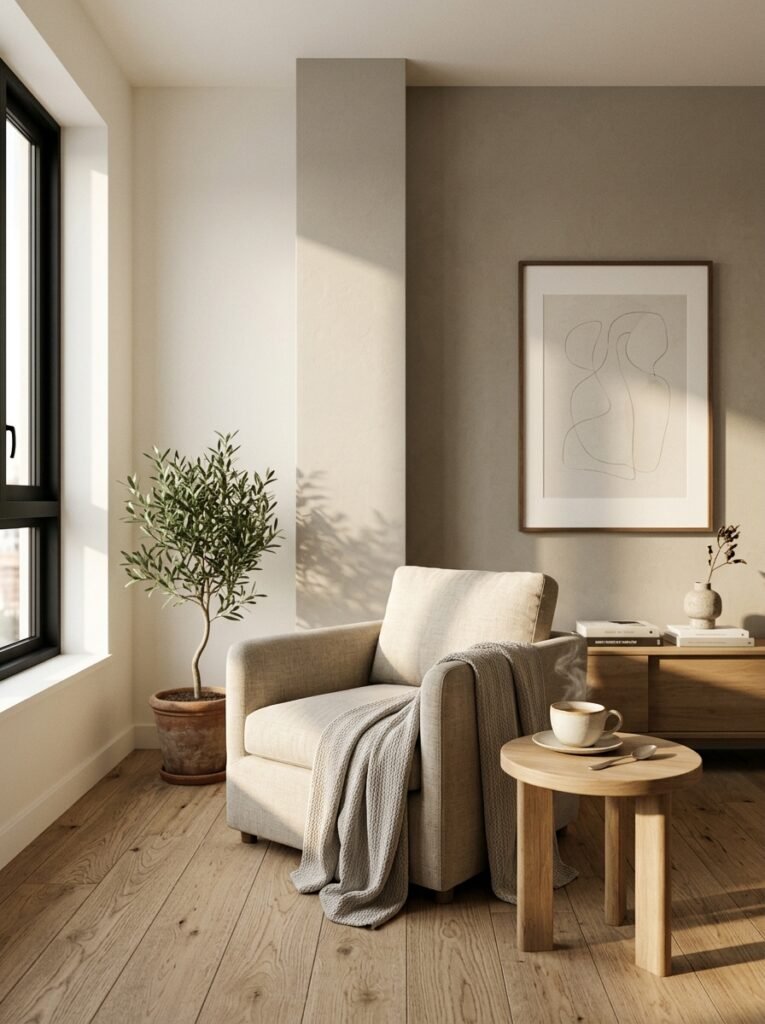
Here’s a truth that interior designers know but rarely say loudly enough: neutrals are not boring. They are, in fact, among the most emotionally intelligent choices you can make.
White isn’t just the absence of colour — it’s the presence of light, openness, and clarity. It makes small spaces breathe and gives the mind permission to exhale. But pure, stark white can feel cold and clinical. The secret is to look for whites with undertones — creamy whites feel warm and welcoming, grey-whites feel modern and calm, pinkish whites feel soft and romantic.
“Choosing the right neutral isn’t playing it safe. It’s playing it smart.”
Greige — that endlessly popular blend of grey and beige — remains a staple of interior design because it is genuinely versatile and genuinely calming. It doesn’t demand anything of you. In a world that demands everything of you constantly, that is no small thing.
Charcoal and deep grey, used well, add gravitas and warmth. They’re the colours of candlelit rooms, late conversations, and the feeling that something meaningful is happening here.
6. The Forgotten Factor: Light Changes Everything
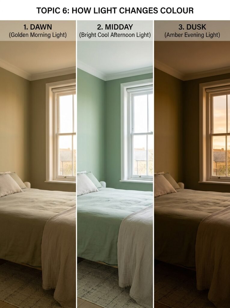
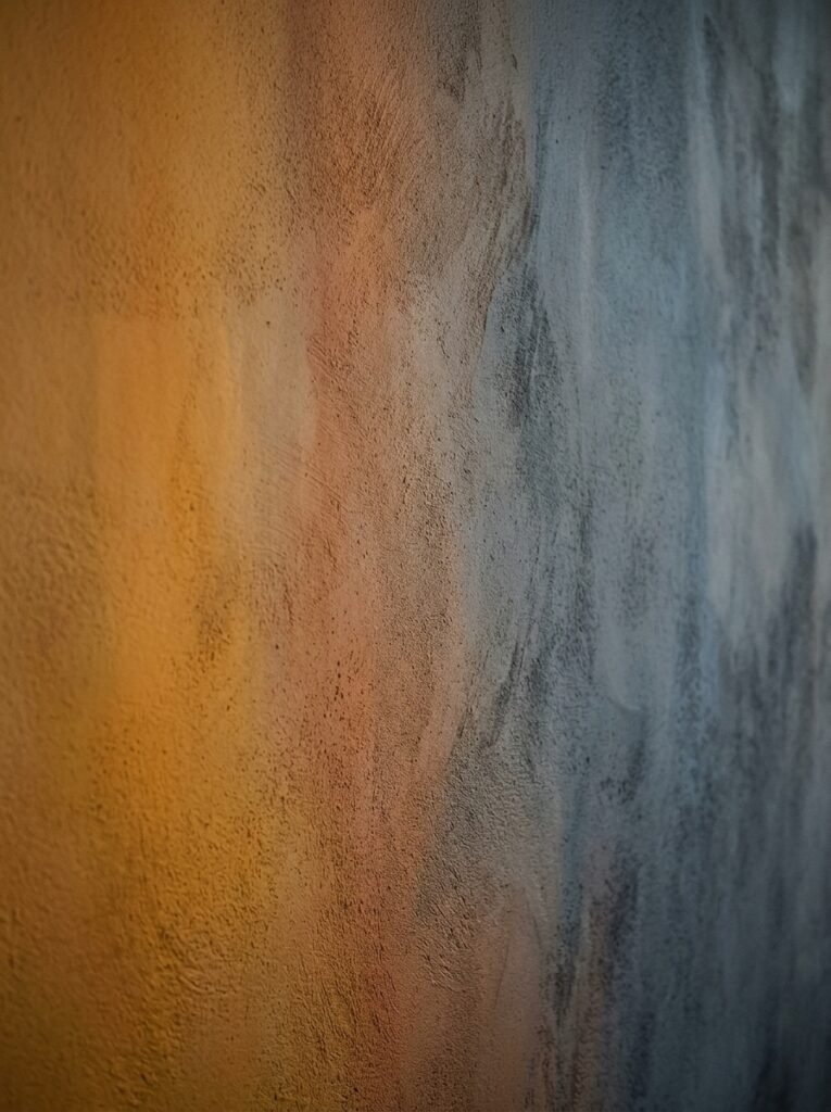
Here’s where many colour decisions go wrong, and it’s not the fault of the colour itself. A shade of sage green that looks sublime in a north-facing showroom can look murky and sad in a north-facing bedroom with limited natural light. The colour hasn’t changed. The light has.
Natural light is not uniform. Morning light is soft and golden. Afternoon light is bright and slightly cool. Evening light is amber and forgiving. A room’s orientation affects which kind of light dominates — and that changes how every colour on your walls will read at different hours of the day.
The practical lesson: always test paint samples in the actual room, at multiple times of day, before committing. The little swatch card in the hardware store is one of the great lies of home improvement.
7. Colour and the Illusion of Space
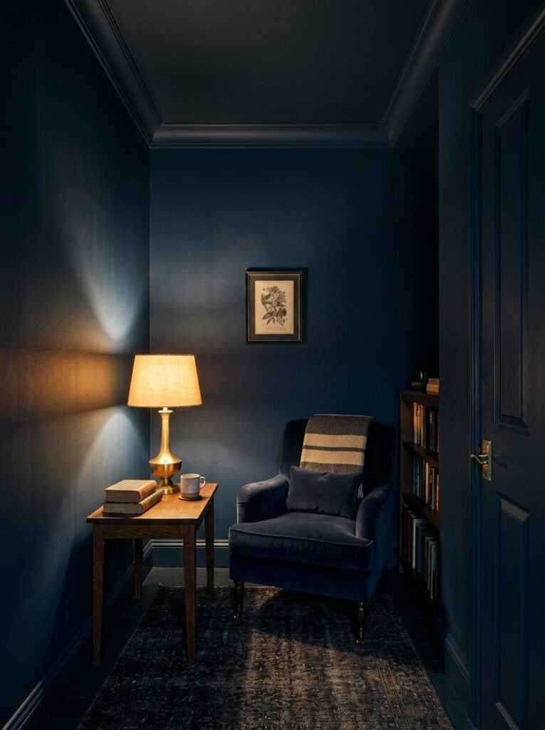
Interior colour is one of the most powerful spatial tools available — and it costs the same as a tin of paint. Dark colours make walls recede in a different way than you might expect: rather than making rooms feel smaller, deep, rich tones on all four walls create a cocooning effect that can make a small room feel deliberately intimate rather than merely cramped.
Light colours reflect light and genuinely make rooms feel larger and more open. Painting the ceiling a slightly lighter tone than the walls adds height. Painting the floor a darker tone grounds a space and adds visual weight. These are simple tricks, but they work because they play on the brain’s tendency to use colour contrast as a spatial cue.
8. The Psychology of Accent Walls
The accent wall — one wall painted differently from the rest — has been celebrated, mocked, and resurrected many times in interior design culture. The truth is that it works when it serves a purpose and fails when it’s merely arbitrary.
An accent wall makes sense when it draws attention to an architectural feature — a fireplace, a headboard, a reading nook. It works when the contrast adds depth rather than confusion. It fails when it’s simply the wall behind the television, chosen because someone thought it should be different without knowing why.
The more sophisticated modern approach is to use colour blocking — painting architectural elements, trims, and architectural alcoves in different tones to add dimension and intention without the bluntness of a single feature wall.
9. How Cultural Background Shapes Colour Perception
Colour psychology is real, but it isn’t universal in every dimension. The emotional associations we carry for specific colours are shaped partly by biology and partly by culture, and it’s worth being honest about both.
White is associated with purity and cleanliness in Western cultures. In parts of East Asia, it is the colour of mourning. Red signifies danger in some contexts and celebration and good fortune in others. Green carries environmental associations in contemporary Western design; in other traditions, it carries religious significance.
“The most beautiful interior isn’t the one from the magazine. It’s the one that feels like you.”
This matters in interior design because a colour that feels deeply right to one person may carry emotional weight for another that overrides any universal psychological effect. Your home should reflect your story, not just follow a trend.
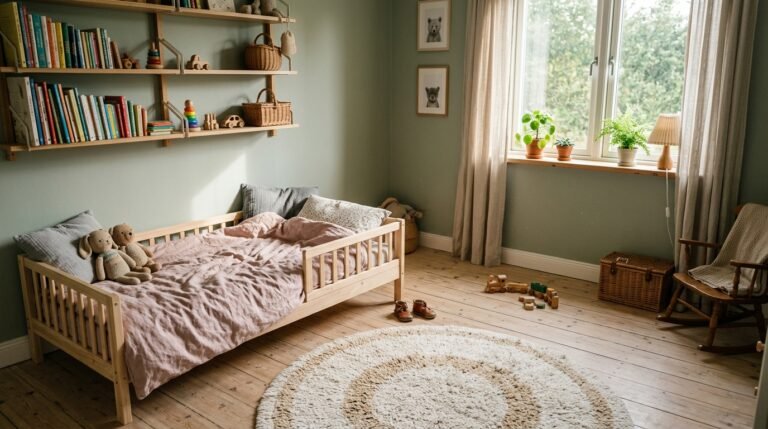
10. Children’s Rooms: A Case Where Colour Really Does Matter
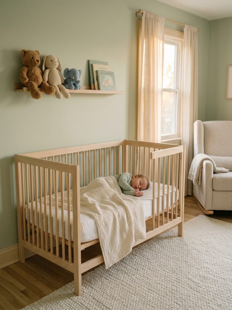
The rooms children grow up in shape their emotional development in ways we’re only beginning to fully understand. Very young children respond strongly to colour — bright primaries stimulate visual development and curiosity, but overstimulating environments can also contribute to restlessness and difficulty settling.
Research suggests that softer, muted tones in children’s bedrooms — pale greens, soft blues, warm creams — support better sleep and calmer behaviour. Vibrant colours work beautifully in playrooms and creative spaces where stimulation is the goal. The key is to match the colour to the function of the space, not simply to what looks cheerful on a mood board.
11. Colour Trends Versus Timeless Choices
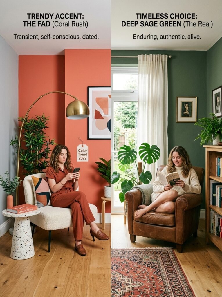
Every year, paint brands announce the Colour of the Year with considerable fanfare. And every year, a portion of the population repaints something in that colour, feels very current, and then — a few years later — repaints it again because trends have moved on.
The more meaningful question is not “what’s trending?” but “what do I actually feel in this colour?” Trends emerge from collective cultural mood, and they can be informative. But the most enduring interiors are built on personal resonance, not trend cycles. A room painted in a colour that genuinely moves you will feel right in ten years. A room painted in last year’s trend will feel dated.
12. Starting Over: How to Rethink Your Relationship With Your Home’s Colour
Many people live for years with colours they chose quickly, colours inherited from previous tenants, or colours that made sense once and no longer do. The idea of changing it feels enormous. It isn’t.
Start with the room where you spend the most time or sleep. Ask yourself honestly: does this colour make me feel energised or drained? At home or on edge? Calm or restless? Then start small — a single room, a weekend, a few test pots. Observe how you feel after a week. The data you need isn’t in any book. It’s in your own nervous system.
—
🌿 How to Take Care of Your Colour Choices
Choosing interior colour is less about getting it right the first time and more about paying attention and being willing to adjust. Here’s how to approach it like a thoughtful human rather than an overwhelmed one.
Test before you commit. Paint at least two or three large swatches (at least A4 size) directly on the wall. Live with them for several days across different lighting conditions before buying full tins. The small swatch card is nearly useless in practice.
Work with your existing light, not against it. Assess whether your room gets predominantly warm or cool light, and choose colours that complement rather than fight it. A cool-toned green in a warm-light room will sing. In a cold room, it may look clinical.
Consider the emotional journey through your home. Think about how colours flow from room to room. Abrupt, clashing transitions between spaces can feel disorienting. A loose palette — three to five complementary tones used across the whole home — creates a sense of harmony and intention.
Don’t underestimate finish. Matte paint absorbs light and feels soft and warm. Satin and eggshell reflect light and feel slightly more energised. Gloss is reflective and dramatic. The same colour in different finishes can feel like entirely different choices.
Trust your body. If you stand in a room painted a certain colour and something in you relaxes, pay attention to that. Your nervous system is an excellent interior designer.
—
❓ FAQ
Q: Does interior colour really affect mood, or is that just a design myth? A: The connection between colour and mood is well-established in environmental psychology and neuroscience. Colour is processed in the brain’s emotional centres, and specific colours reliably produce measurable physiological responses — from changes in heart rate to shifts in cortisol levels. It’s not a myth; it’s biology working quietly in the background.
Q: What is the best colour for a bedroom to improve sleep? A: Soft, muted cool tones — particularly dusty blues, gentle greens, and warm greys — consistently support better sleep environments. These colours lower mental arousal and signal to the nervous system that it’s safe to rest. Avoid saturated warm tones like bright red or vivid orange in spaces intended for sleep.
Q: How do I choose interior colours if I’m renting and can’t paint the walls? A: Colour still reaches you through textiles, soft furnishings, art, rugs, curtains, and plants. A room with white walls can feel dramatically different depending on whether you dress it in terracotta linens or deep teal cushions. Focus on the colours that surround you at eye level and within arm’s reach — the wall is only one part of the palette.
—
💭 Final Thought
The colours in your home are not passive. They are in constant conversation with you — with your mood, your memory, your sense of safety, and your capacity to rest. Most of us choose them once and then forget about them, living inside a decision made on a Saturday afternoon without fully understanding its reach.
You spend more time inside your home than almost anywhere else on earth. The colour of those walls matters more than we tend to admit.
So here’s a question worth sitting with: if your home’s colours could describe how you feel in your life right now, what would they say — and is that really the story you want to be living inside?